Freelancers using Figma in Barranco
Sign Up
Post a job
Sign Up
Log In
Filters
2
Projects
People
Leticia Padilla
pro
San Isidro, Peru
Brand Design & Art Direction for Beauty, Food and Lifestyle
$1k+
Earned
4x
Hired
5.0
Rating
73
Followers
Follow
Message
Brand Design & Art Direction for Beauty, Food and Lifestyle
0
Vetday — Veterinary Brand Identity
0
15
1
Fimaki — Fintech Brand Identity System
1
15
1
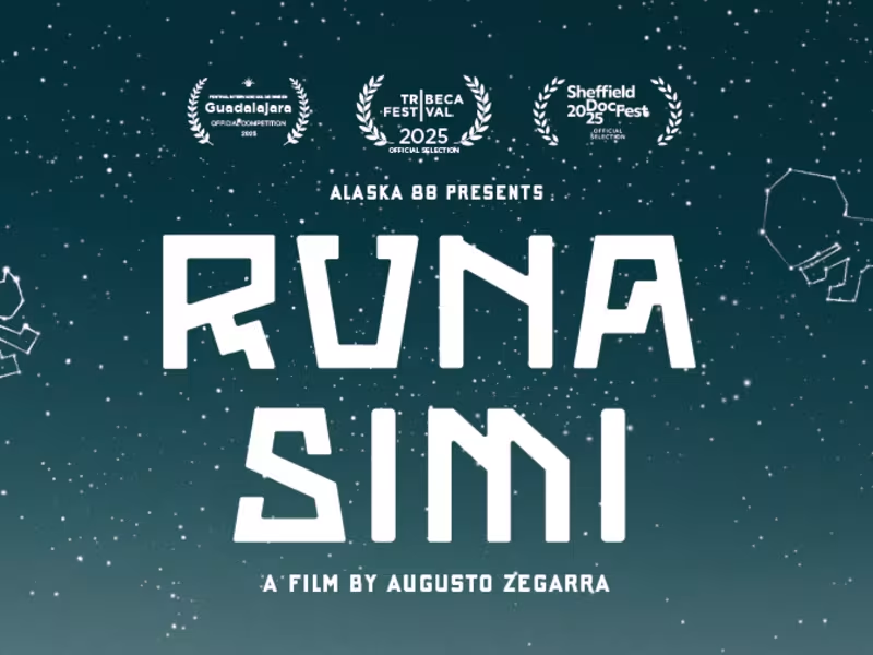
Runa Simi — Cinematic UI for a Tribeca-Winning Film
1
1
34
23
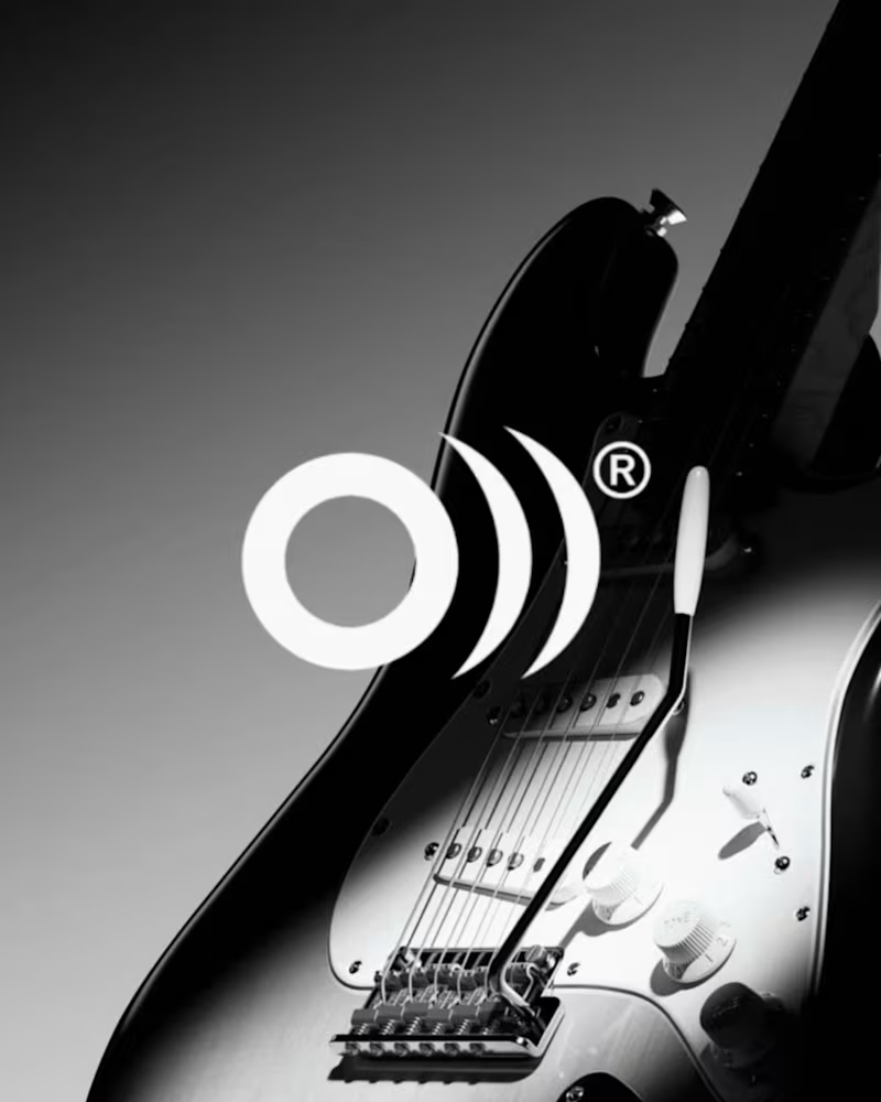
The sound behind the symbol. A preview of the visual identity for La Original, a brand that has connected musicians with authentic instruments and trusted brands since 1979. The identity begins with a simple observation: instruments may change, styles may evolve, but they all share the same purpose. Sound. The symbol combines the initial O from Original with expanding sound waves, expressing the moment where every musical experience begins. It avoids representing a single instrument because the brand has never belonged to just one. It belongs to everything that makes music possible. Its simplified form allows the symbol to adapt across every touchpoint while preserving its clarity over time. Like music itself, the symbol is not only meant to be seen. It is meant to be felt.
18
23
1.2K
Figma
(7)
Follow
Message
Jhan Piere Torres A.
pro
Rimac, Peru
UI Designer & Framer Developer
$1k+
Earned
2x
Hired
55
Followers
expert
Follow
Message
UI Designer & Framer Developer
0
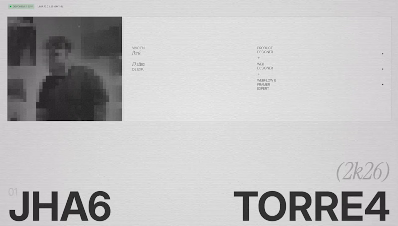
Which works section layout works better?
0
5
2
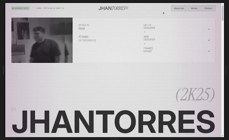
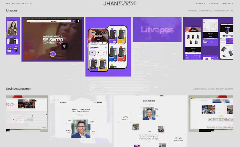
My first post of the year! 😊 2025 left me with several wonderful things I learned, and 2026 started strong. Not only did I become a father, but I also had more work and, with it, more responsibilities. That's why, at least in my free time, I was able to finish my portfolio in one week. 😅 The procrastination of always putting off the portfolio until next Monday has to stop, that's what I told myself, and well, here's the result. PS: I'm open to criticism; there are still several things to improve, but you have to start somewhere 🫡 Cheers!!! www.jhantorres.com (http://www.jhantorres.com)
2
2
189
1
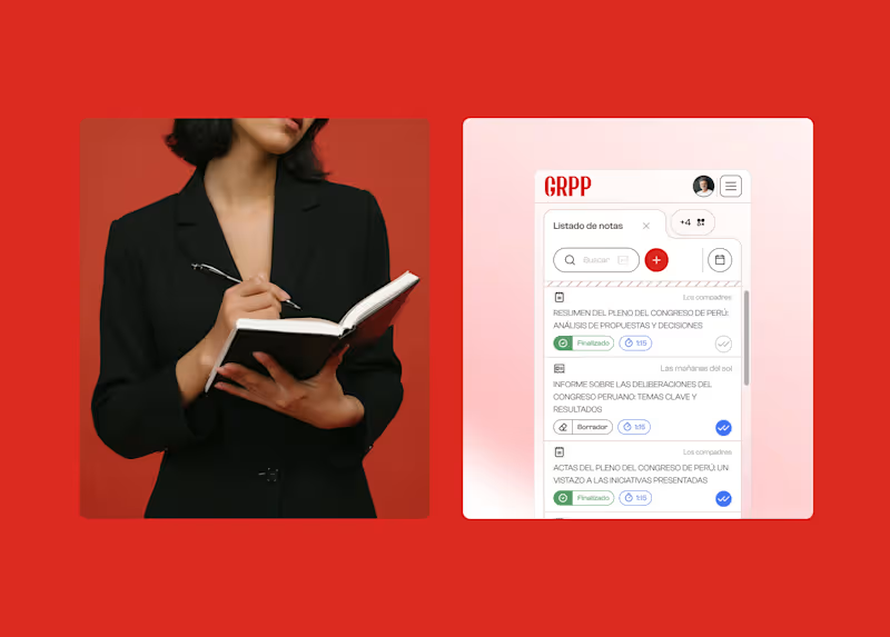
GRPP Platform | CMS | SaaS | Website | UI - UX
1
9
36
Hello Contra World! I'm sharing a bit of my Framer portfolio work with you! If you'd like to see more UX/UI or Framer work, check out my profile. I hope you like it. This is my second project on Framer, where I'm the client (the most demanding client in the world, haha). Enjoy!🔥
6
36
490
Figma
(9)
Follow
Message
Jordan Collao
pro
Lima, Peru
Crafting Interactions, UX/UI Design & Motion Video
Follow
Message
Crafting Interactions, UX/UI Design & Motion Video
0
Mobile App Onboarding & UI Motion Tutorial
0
3
0
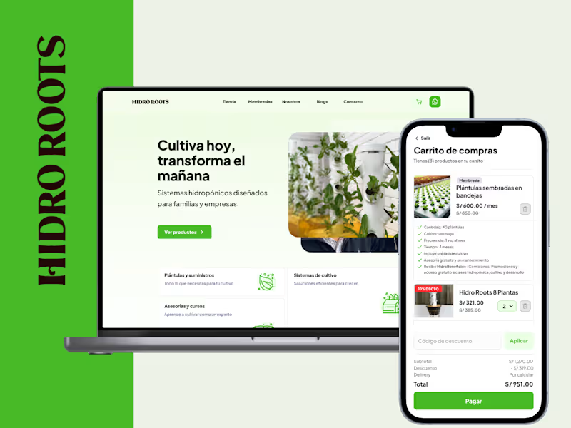
HidroRoots Website Responsive
0
5
0
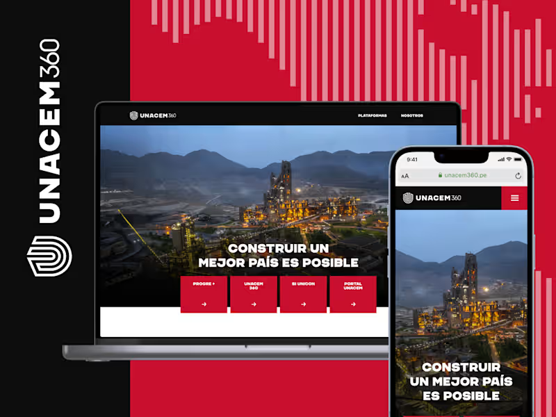
Landing Page for UNACEM 360
0
5
2
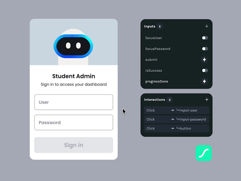
Interactive Login Experience 🚀 I built a fully interactive login experience structured entirely through State Machine logic. • Focus-driven transitions (User / Password) • Conditional error handling when submitting incomplete fields • Event-based Processing flow • Controlled loop states • Success feedback and clean reset logic • Prevention of unintended state persistence The goal wasn’t just visual polish. It was to build interaction behavior through motion. 👉 You can explore the full interactive project here: https://lottiefiles.com/free-animation/interactive-login-state-machine-ux-motion-DfMw2epFjC I’m currently exploring collaborations where UX Motion and State Machines can elevate real product experiences. Are you interested? Let’s connect 😊
1
2
306
Figma
(7)
Follow
Message
Mather Angulo
Lima, Peru
Freelance Product Designer for Hire
1x
Hired
1
Followers
Follow
Message
Freelance Product Designer for Hire

0
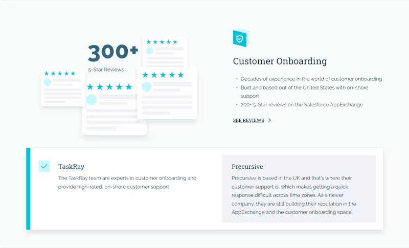
TaskRay Website
0
19
0
App for closing gaps in care
0
34
0
CRM for Whatsapp, Facebook and Instagram
0
37
0
Medical Video Consultation App
0
10
Figma
(5)
Follow
Message
Marco Ponce de León
San Isidro, Peru
Creative Director | Branding + Motion + Web Design
5.0
Rating
5
Followers
Follow
Message
Creative Director | Branding + Motion + Web Design
2
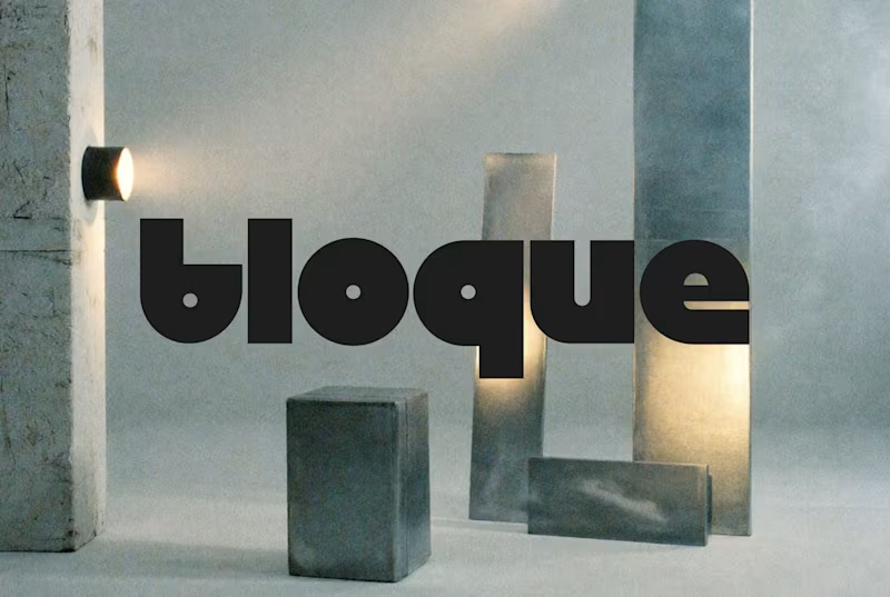
Branding for BLOQUE™. An Architect and Interiorism Studio based in Lima. 2026®
2
317
1
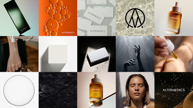
Some bits of an option that didn't make it but I definitely love making. Altermedics, a skincare brand based in AUS.
1
188
5
Logo & animation design for Auren®
6
5
407
3
DUMBSCROLL What problem am I solving? In 2004, the average person could focus on a screen for two and a half minutes. Today it's 47 seconds. We touch our phones 228 times a day, 10 seconds each. We don't have a screen-time problem — we have an attention problem. Most apps fight this by blocking or lecturing you, which just makes you close them. The Idea Dumbscroll is an app that sits on top of any feed you already use — TikTok, Instagram, X. The moment it detects you're doomscrolling (skipping past content faster than your set attention threshold), it starts pixelating the feed. The more you scroll without paying attention, the more it degrades, until there's nothing left to look at. Stop, actually watch something, and it clears. It never blocks you. The only thing that speaks to you is the Dynamic Island, quietly, in real time. Workflow Designed every screen, the pixel icon, and the bitmap type system in Figma Design. Built the interactive flow, the decay mechanic, and the Dynamic Island states in Figma Make. Motion and refinement in After Effects. Built with Figma Make for the Config Makeathon 2026. Live Project: https://myrtle-chili-19109389.figma.site/ Community File: https://www.figma.com/make/beMQ3yvEFAN1GZpgRHQxeQ/Dumbscroll---Doomscrolling-Detection-Prototype?t=2j1Ei7KuV4SRERI1-1 Social Post: Instagram (https://<https://www.instagram.com/reel/DZvnAa1TulU/?igsh=c3Y3ZDgxOGthcWY5>) - X/Twitter (https://x.com/poncedeleonstud/status/2067737437816987898?s=20)
3
225
Figma
(5)
Follow
Message
Gean Pierre Chumpitaz Ato
Barranco, Peru
Motion Designer for SaaS, Tech and Modern Brands.
5.0
Rating
4
Followers
Follow
Message
Motion Designer for SaaS, Tech and Modern Brands.

0
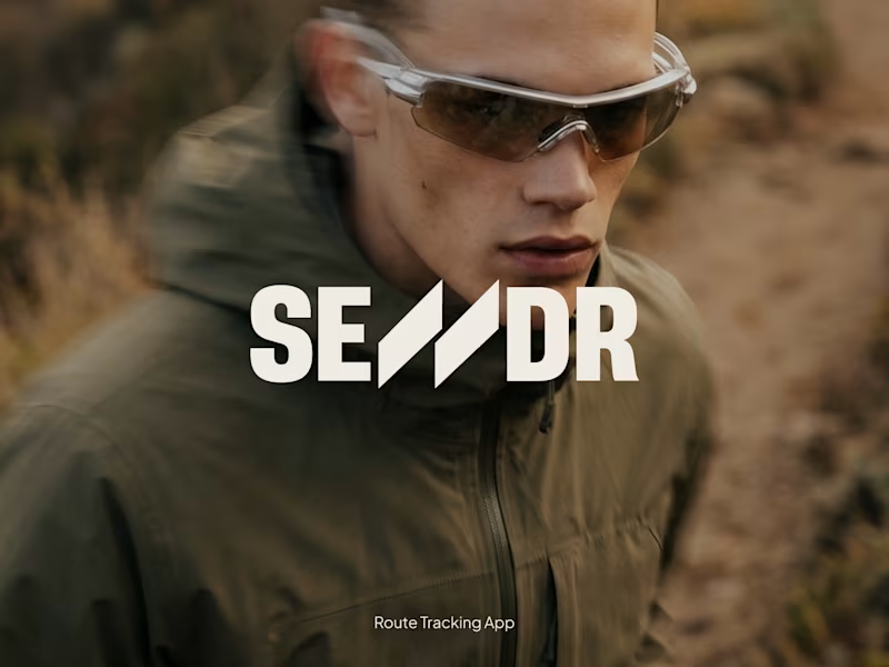
SENDR — Brand Identity & Fitness App Design
0
9
0
Iko OS — Motion Design for SaaS
0
2
0
Kelo Design — Motion Identity Project
0
4
2
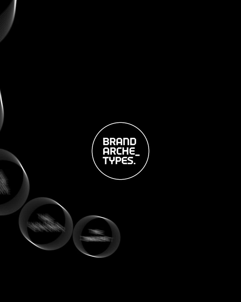
Unpopular opinion: Minimalism is harder than complexity. Anyone can add more effects. The real challenge is knowing what to remove. This small Brand Archetypes exploration reminded me that the strongest motion often comes from restraint. Fewer elements. Clearer hierarchy. Intentional movement. The goal isn’t to impress with animation. It’s to make the idea impossible to miss. Less motion. More meaning.
1
2
175
Figma
(1)
Follow
Message
Steve Castillo
Lima, Peru
Full-Stack Developer for web apps and business systems
6
Followers
Follow
Message
Full-Stack Developer for web apps and business systems
0
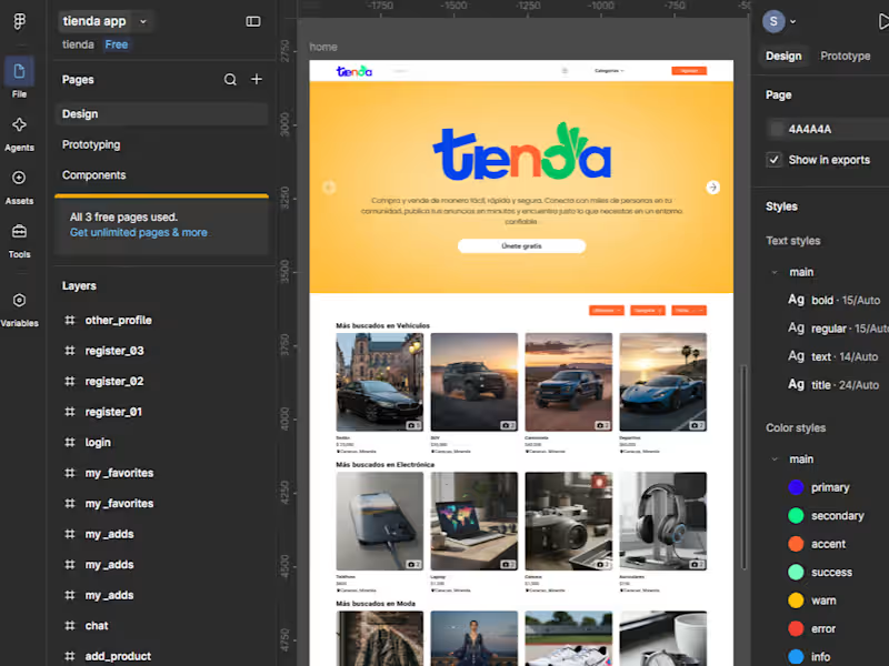
Created a complete Figma design for an online marketplace, including a responsive landing page, product discovery sections, authentication flows, favorites, chat, and publishing screens. The design was structured with reusable components, clear visual hierarchy, responsive behavior, and a consistent design system. I help businesses transform Figma designs into production-ready landing pages and web applications using Next.js, Astro, React, TypeScript, and Tailwind CSS. My work covers responsive implementation, clean frontend architecture, forms, animations, API integration, SEO basics, performance optimization, and deployment.
0
76
1
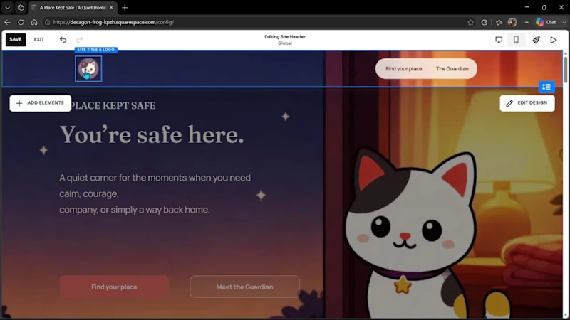
Can a website feel like a safe place? That question became A Place Kept Safe, a digital experience created for moments when someone needs calm, courage, company, or simply a reminder of what it feels like to be home. The little cat is not merely a decorative mascot. I made her The Guardian because cats have a unique way of caring: they do not ask questions, try to fix everything, or demand attention. They simply stay close. Sometimes, that quiet presence is exactly what we need. The entire experience was designed around that idea. Visitors can choose the emotional space they need and explore a series of illustrated scenes shaped by a warm color palette, editorial typography, and deliberately gentle motion. The Guardian remains the narrative thread connecting every part of the journey. Finish Layer helped translate this visual direction into a responsive design system using Stacks, Block Hiding, Block Transforms, and Block Animations. I created device-specific compositions, structured content hierarchies, subtle visual offsets, and progressive entrances to preserve the rhythm of the experience without overwhelming the visitor. For the final scene, I developed a custom interaction in JavaScript and CSS: a sequence of 24 transparent frames synchronized with scroll progress, in which The Guardian follows a light, moves forward, gradually slows down, and finally rests. The implementation combines normalized scroll progress, smooth interpolation, requestAnimationFrame, IntersectionObserver, GPU-accelerated translate3d transforms, and independent motion paths for different screen sizes. It also includes a prefers-reduced-motion fallback, preserving the narrative for visitors who prefer a more static experience. The result is not intended to give advice or solve what someone may be feeling. It simply keeps a light on, offers a quiet journey, and reminds us that some forms of care are understood through what they quietly do. A Place Kept Safe is an emotional idea brought to life as an interactive, responsive, and technically crafted web experience. Private website: https://decagon-frog-kpzh.squarespace.com/ Password: 123
1
148
0
Provided technical consulting for an existing software platform, focusing on code quality, maintainability, architecture, and engineering standards. I reviewed pull requests and existing implementations to identify technical debt, recurring code issues, architectural risks, and opportunities for improvement. My work included defining code conventions and development guidelines, evaluating technical trade-offs, supporting architectural decisions, and proposing improvements based on scalability, performance, maintainability, and delivery constraints. I also contributed to the design of REST API endpoints for transactional business modules, including virtual wallet operations, payment splitting, and mixed-payment flows requiring data consistency and atomic transactions. This is a confidential case study. Client source code, internal documentation, credentials, proprietary business rules, and sensitive platform information are not displayed.
0
78
0
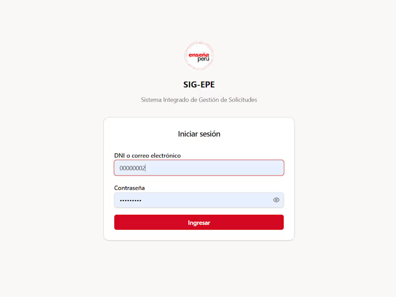
Developed and improved a responsive institutional platform for managing budget requests, payments, expense reports, POA processes, approvals, documents, and administrative reporting. I worked across the full stack, implementing frontend interfaces with Next.js and TypeScript, backend APIs with NestJS, role-based access control, and PostgreSQL data management. The platform includes operational dashboards, advanced filters, Excel exports, document workflows integrated with Google Drive, and performance optimizations for frequently accessed views and queries. This project is presented as a confidential case study. Sensitive data, credentials, proprietary business rules, and internal information are not displayed.
0
93
Figma
(1)
Follow
Message
María Moya
San Isidro, Peru
UX/UI
Follow
Message
UX/UI
0
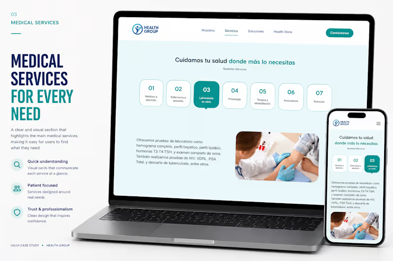
Health Group — Healthcare Website Design Health Group is a modern healthcare platform designed to simplify access to home medical services and corporate healthcare solutions through a clean, trustworthy, and conversion-focused digital experience. Over a three-week timeline, I led the complete UX/UI design process—from the initial kickoff and discovery sessions to information architecture, wireframing, high-fidelity interfaces, responsive design, validation, and final implementation. The goal was to transform a wide range of medical services into an intuitive experience that helps users quickly understand the offering, navigate effortlessly, and request care with confidence. The website was designed with a strong emphasis on usability, accessibility, and visual hierarchy, ensuring that patients and businesses can easily find the right service across desktop and mobile devices. Every interaction was carefully crafted to reduce friction, improve readability, and reinforce trust through a modern healthcare aesthetic. Project Highlights • End-to-end UX/UI Design • Discovery Workshop & Kickoff Sessions • User Flows & Information Architecture • Low & High Fidelity Wireframes • Responsive Design (Desktop & Mobile) • Design System & UI Components • Landing Page & Multi-page Website Design • Figma Make Implementation • UX Validation & Design Iterations Outcome The final product delivers a scalable healthcare website capable of presenting multiple service categories—from home medical visits and laboratory testing to occupational health and corporate solutions—within a cohesive, easy-to-navigate experience. By combining strategic UX thinking with polished UI design, the platform improves information discoverability, strengthens brand credibility, and creates a seamless journey that encourages users to explore services and contact the healthcare team. Timeline: 3 Weeks Role: UX/UI Designer Tools: Figma · Figma Make Deliverables: UX Research · Information Architecture · Wireframes · Responsive UI · Design System · Interactive Prototype · Implementation
0
23
2
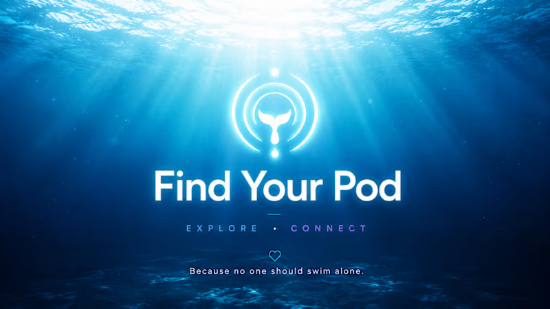
🐋 Find Your Pod Belong. Explore. Connect. We have never been more connected. Yet millions of people feel increasingly alone. Social media was built for attention. Not for belonging. What if we learned from the most social creatures on Earth? Whales live in pods. They sing to each other across thousands of miles. They migrate together. They form bonds that last a lifetime. Find Your Pod is an immersive ocean experience. You don't scroll a feed. You dive. 🐋 Take a quiz → discover your whale archetype 🌊 Dive through 5 ocean regions → discover real species 🫂 Find your Pod → a small community matched by curiosity 🎵 Send an Echo → not a message, an ocean signal No likes. No followers. No algorithms. Just your people. The current version shows the vision — how users would dive, discover, connect and send Echoes. The ocean is waiting to be built. 🌊 Tools: Figma Make · Figma Agents · AI image generation 🔗 https://hut-chomp-73225360.figma.site Made with 🐋 from Trujillo, Perú 🇵🇪 #ConfigMakeathon @figma
1
2
218
0
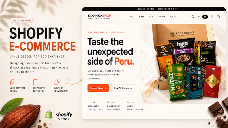
EcoInkaShop — Shopify E-commerce UX/UI Shopify · UX/UI Design · E-commerce · Responsive Web Design · Product Design EcoInkaShop is a Shopify e-commerce experience designed for selling curated Peruvian products to customers in the US. I designed the UX/UI of the storefront with a focus on product discovery, clear navigation, conversion, trust, and an easy shopping experience. The experience includes: Homepage and e-commerce navigation Product discovery by collections Search, filters and sorting Product listing pages Product detail experience Shopping cart UX Gift options Shopify checkout flow Payment gateway configuration, including card payments and PayPal Shipping destinations and delivery configuration Responsive desktop and mobile experience The visual direction combines a clean contemporary e-commerce interface with the origin and personality of Peruvian products, helping users understand what they are buying while keeping the purchase journey simple. My role: UX/UI Design · E-commerce Design · Shopify Design · Responsive Design
0
5
0
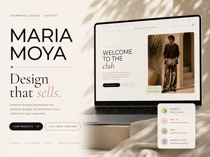
Welcome to the Club UX/UI Design · Shopify Ecommerce Welcome to the Club is a premium Shopify ecommerce designed for a fashion brand looking to create a refined online shopping experience that reflects its identity while remaining intuitive, responsive, and conversion-focused. The project covered the complete design and implementation process—from initial discovery sessions to a fully functional Shopify storefront—delivered in approximately three weeks. Every interaction was designed to balance editorial aesthetics with usability, ensuring customers could browse collections, explore products, and complete purchases effortlessly across desktop and mobile devices. The Challenge The goal was to transform the brand into a premium digital shopping experience without relying on generic ecommerce templates. The website needed to communicate the brand's personality while providing a seamless customer journey, scalable architecture, and an optimized shopping experience. My Role I was responsible for the project from end to end, including: Discovery & Kick-off Workshops UX Strategy Information Architecture User Flows Wireframes UI Design Responsive Design Shopify Store Implementation Design Validation Quality Assurance before Launch Design Process Discovery Understanding the business, target audience, product catalog, and brand positioning. UX Strategy Defining navigation, collections, shopping flow, and the overall customer journey. UI Design Designing a clean editorial interface focused on usability, readability, and premium visual storytelling. Validation Reviewing prototypes with the client, gathering feedback, and refining the experience before development. Development Building the ecommerce using Shopify, ensuring responsiveness, accessibility, and performance across devices. Deliverables Responsive Ecommerce Website UX Research Information Architecture Wireframes High-Fidelity UI Shopify Development Product Pages Collection Pages Cart & Checkout Experience Mobile Optimization Launch-ready Website Tools Figma Shopify Lovable AI (to accelerate frontend implementation while maintaining design consistency) Timeline 3 Weeks Week 1 — Discovery & UX Strategy Week 2 — UX/UI Design & Validation Week 3 — Shopify Development & Launch Live Project welcometotheclub.online (http://welcometotheclub.online)
0
40
Figma
(2)
Follow
Message
Explore people