SENDR — Brand Identity & Fitness App Design
Gean Pierre Chumpitaz Ato
Overview
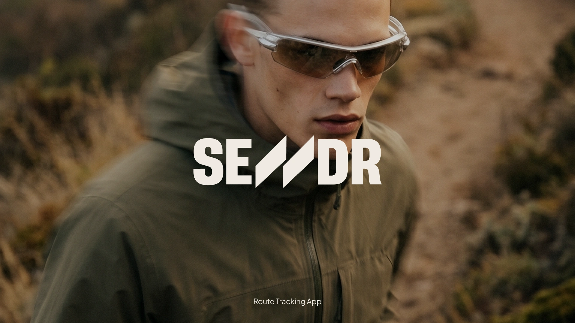
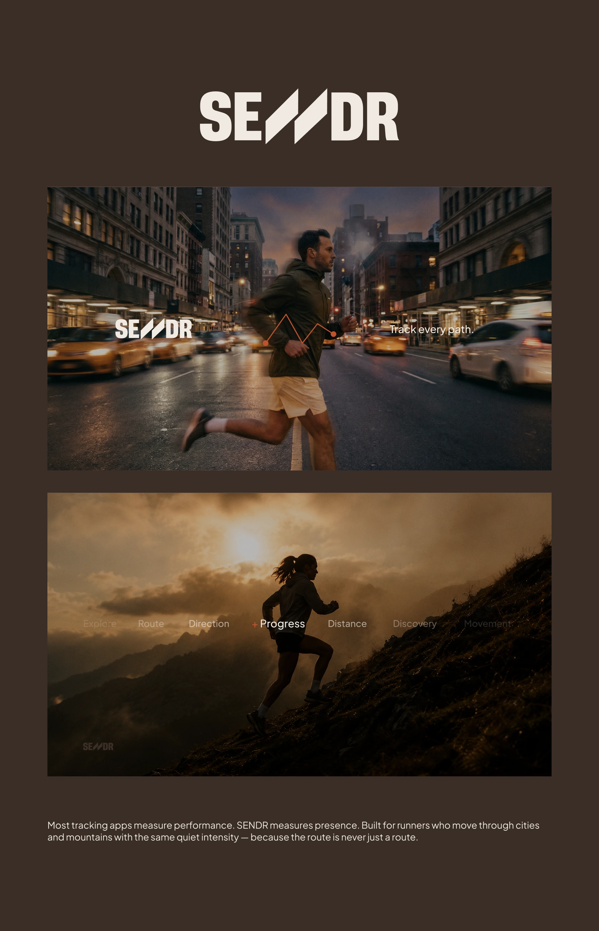
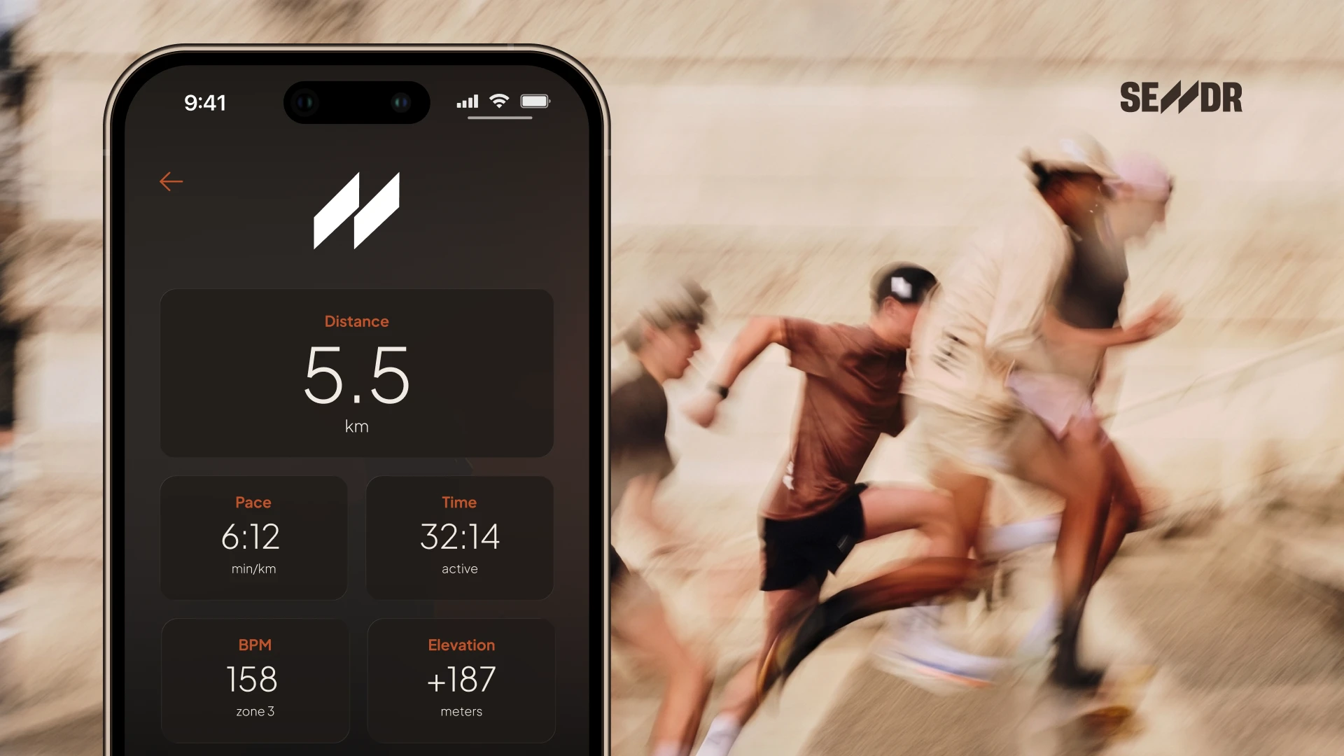
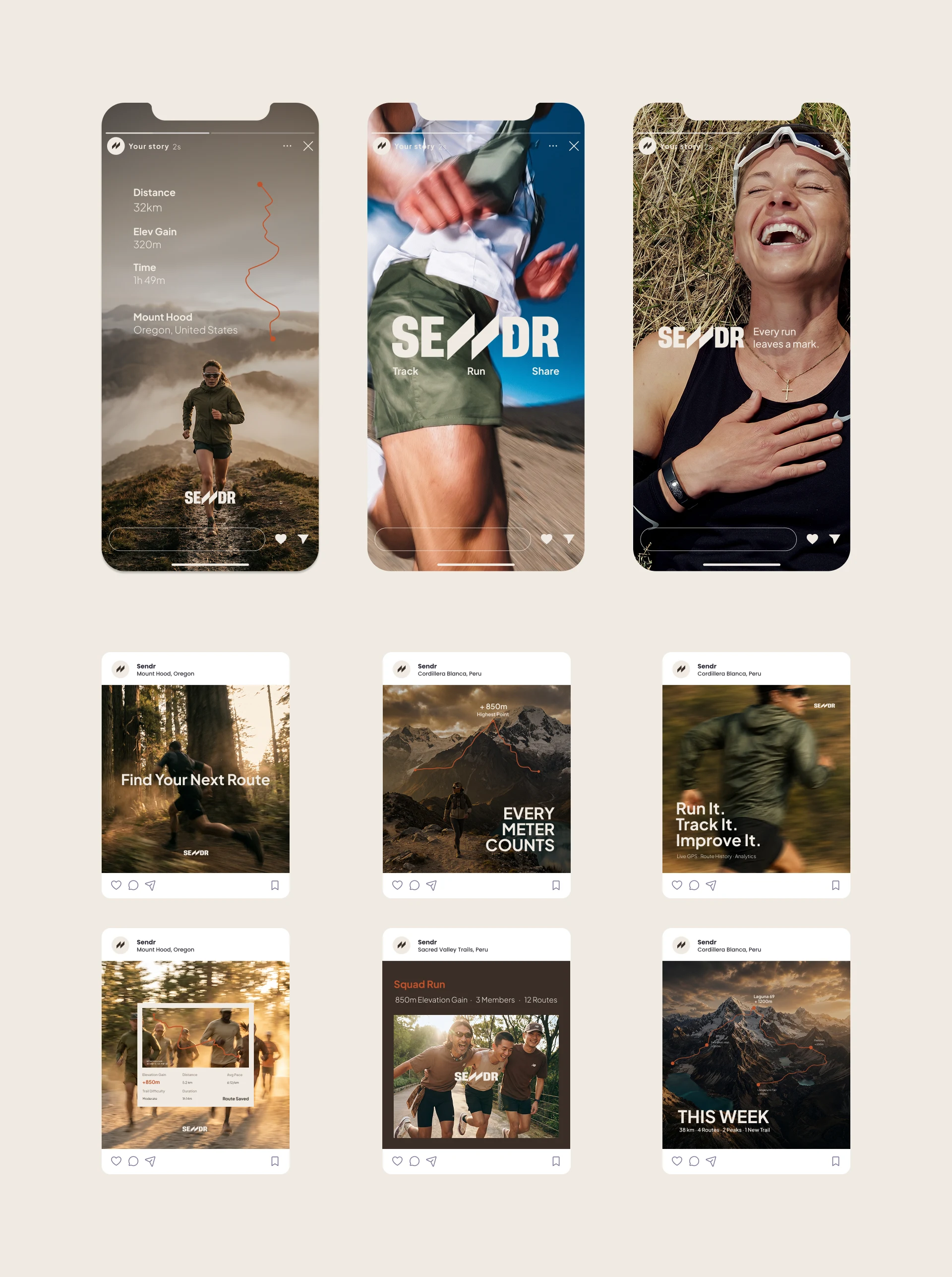
SENDR is a conceptual fitness and route-tracking app designed for runners, trail athletes and outdoor explorers. The goal was to create a premium brand and digital experience that combines performance analytics, route discovery and community engagement in a clean and modern ecosystem.
Challenge
Most fitness applications focus heavily on data but often lack a strong emotional connection with athletes. The challenge was to develop a brand identity that felt technical and performance-driven while remaining aspirational and lifestyle-oriented.
Solution
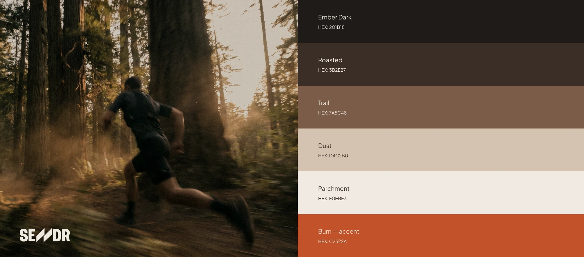
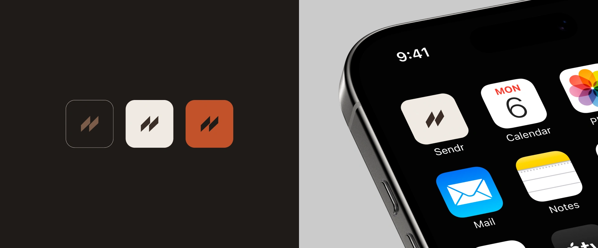
The visual identity was built around the concept of movement and navigation. The custom “N” in the wordmark was inspired by real GPS route paths, transforming running data into a recognizable brand element. The design system combines bold typography, outdoor-inspired imagery and minimal interface components to create a premium experience for both road and trail runners.
My Role
Brand Identity Design
Creative Direction
Art Direction
Motion Design
Visual System Development
Marketing Assets
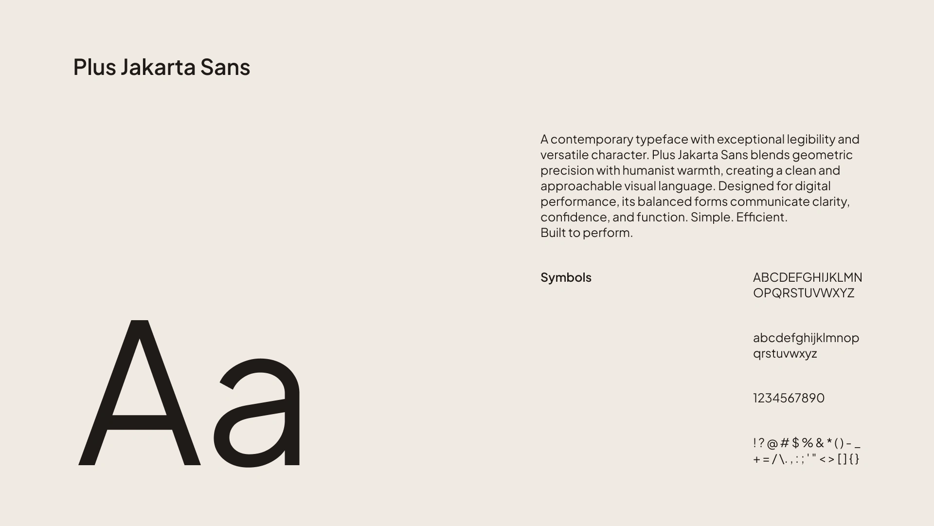
Tools
Adobe Illustrator
Adobe Photoshop
Adobe After Effects
Figma
Outcome
The project resulted in a complete conceptual brand system including logo design, visual identity guidelines, mobile app concepts, social media assets and motion graphics explorations.

Like this project
Posted Jun 15, 2026
Conceptual running app and brand focused on performance tracking. A premium experience combining clean UX, data visualization and identity.