Task Management App UI — Productivity Mobile Design

Imran Khan
UX Designer
Product Designer
Mobile Designer
UI Designer
Data Visualizer
Operations Manager
Executive Assistant
Project Manager
Operations Lead
Personal Assistant
iOS Developer
Flutter Developer

UXPin

Sketch

Dash Plotly

Tailwind CSS

iOS

FlutterFlow

ClickUp

Adobe Workfront

Google Calendar

Todoist

Pivotal Tracker

Jira

Asana

Daily

MeisterTask

Alfred
Task Manager App for iPhone Duo:
Task Details Screen ✅

Posted Oct 25, 2026
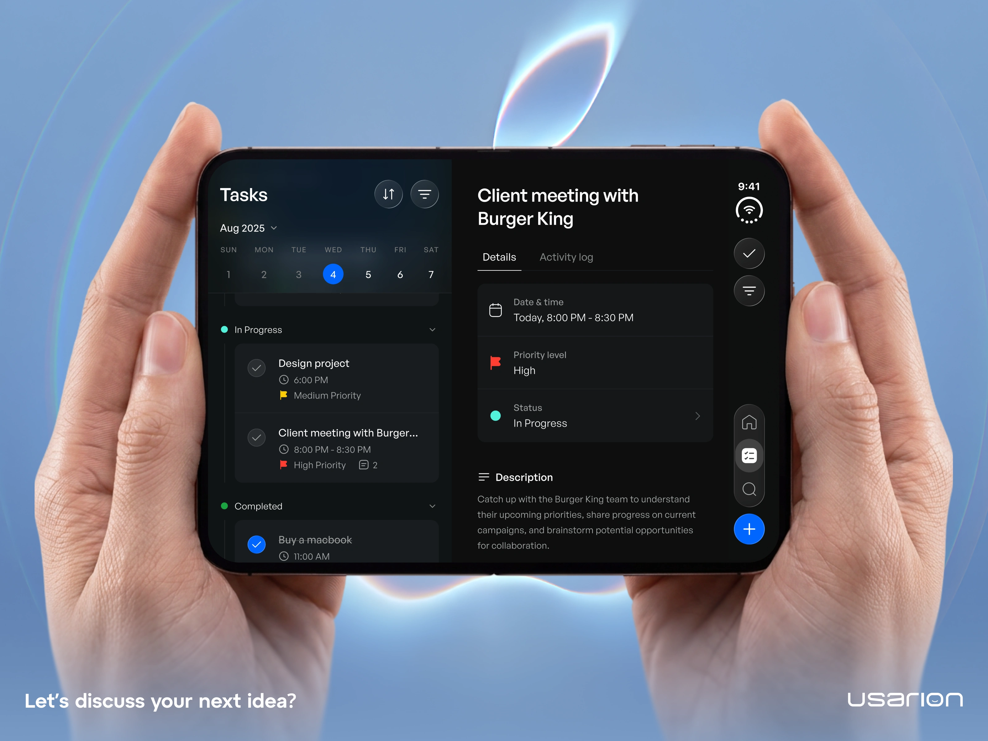
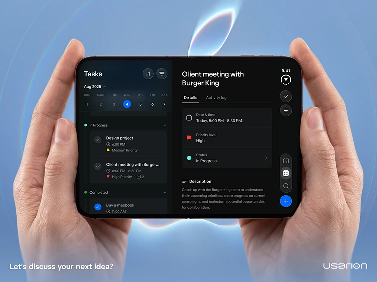
Task Manager App for iPhone Duo: Task Details Screen ✅ Switching between a task list and task details slows you down on a regular phone. On the iPhone Duo, we placed both side by side so you can browse your day and dive into any task without losing context. Left panel: your day at a glance. A weekly date picker with tasks grouped by status (In Progress and Completed), each showing time, priority level, and comment count. Right panel: everything about the selected task. Date and time, priority, status, and a full description, with a separate activity log tab to follow updates over time. We went with a dark interface for focus and calm, using color only where it carries meaning: red and yellow flags for priority, teal for progress, and blue for primary actions. A floating side rail keeps navigation and the add button within thumb reach. How do you plan your day: list first or calendar first? Let us know in the comments 👇 Have a product idea? Let's build it together. 🌐 Usarion: Product Design & UX for startups worldwide Press "L" if you like it ❤️
0
0
UX Designer
Product Designer
Mobile Designer
UI Designer
Data Visualizer
Operations Manager
Executive Assistant
Project Manager
Operations Lead
Personal Assistant
iOS Developer
Flutter Developer
UXPin
Sketch
Dash Plotly
Tailwind CSS
iOS
FlutterFlow
ClickUp
Adobe Workfront
Google Calendar
Todoist
Pivotal Tracker
Jira
Asana
Daily
MeisterTask
Alfred