Contra - A professional network for the jobs and skills of the future
Discover
Sign Up
Post a job
Sign Up
Log In
Filters
Projects
People
Filters
Featured
Web developers
Content creators
Graphic designers
Product designers
AI developers
Motion designers
Social media marketers
Animators
Video editors
Projects we love
Projects we love
Standout projects making waves around the web
View more
Message
25
Anna Peredelskaia
pro
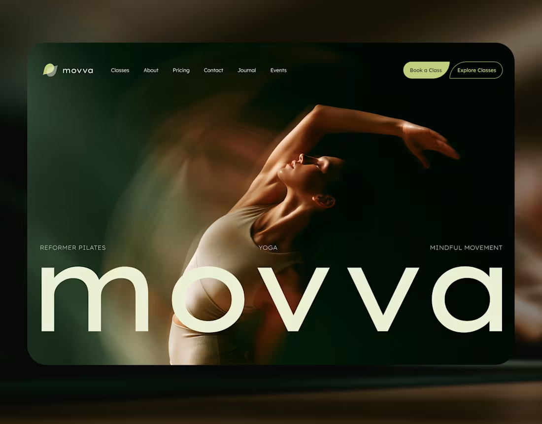
MOVVA — Yoga & Pilates Website Design and Webflow Development
1
25
355
Message
40
Maxim Zvarici
pro
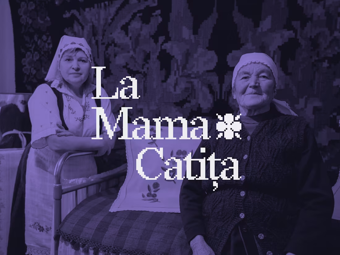
La Mama Catița Visual Identity Design
1
40
793
Message
24
Sasha Beglova
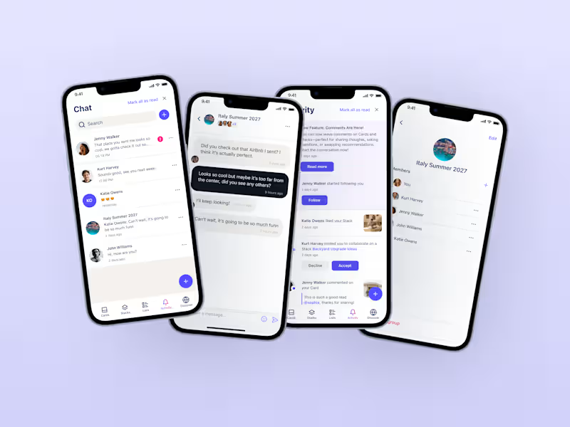
Stacklist | UI/UX & Graphic Design
24
552
Message
34
Flávia Jackeline
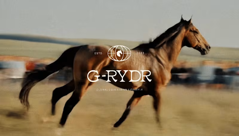
Visual Identity Design for G-RYDR — Equestrian Lifestyle
1
34
394
Web design projects using Framer
Framer
The best modern websites built on the leading web design tool, Framer
View more
Message
34
Kyle Panilan
max
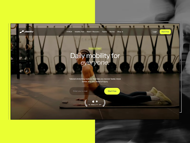
Framer Website for pliability: the #1 Mobility App in the World
1
34
752
Message
8
Domenico Griffo
pro
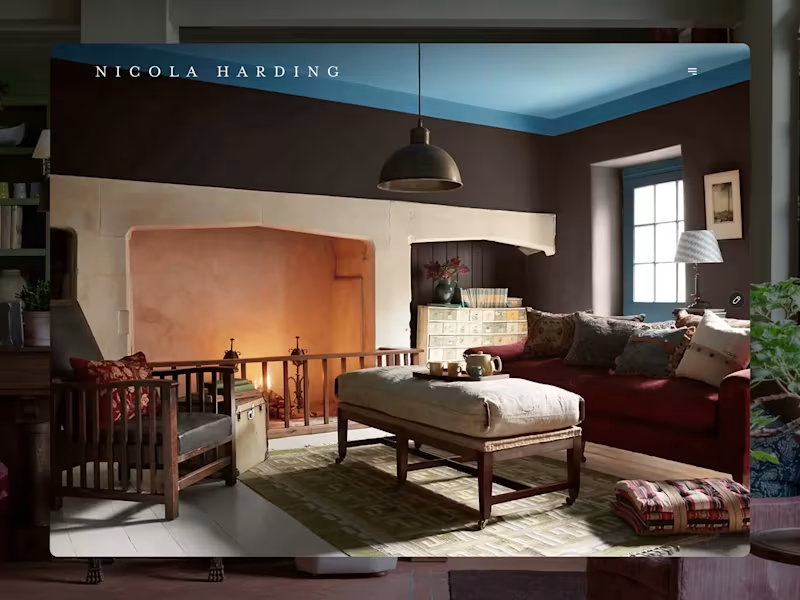
Nicola Harding & Co
8
160
Message
6
Rachel Cohen
pro
Starfish Studios Website Redesign
6
151
Message
14
Studio Ilker
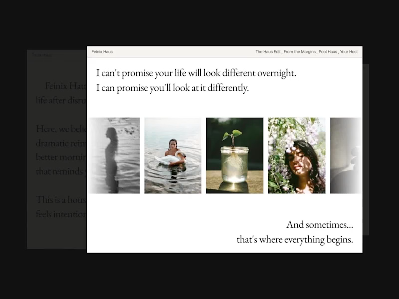
Feinix Haus Website
14
691
AI projects
AI
New projects from the best AI creators
View more
Message
12
Lisa Demchenko
max
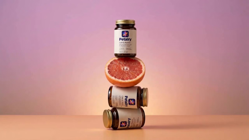
Petalry Brand Identity Development - Kittl exploration
12
393
Message
10
Alexandru Köllo
max
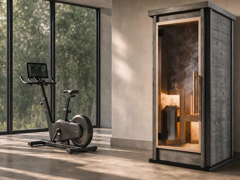
AI Product Visuals: Luxury Sauna Collection
10
162
Message
21
Darya Batyr ✦
max
Kotoba: Giving Voice AI a Human Visual Identity
21
348
Message
4
Viktor Gavrilovic
pro
MatchPro: Building soccer tournament schedules in seconds
4
123
Brand design projects
Brand design
Bold visual identities and branding systems created by top independent designers
View more
Message
13
Chantal Jemmott
pro
Label Redesign
13
216
Message
11
Olga & Joyd Branding ✦ Web Design
pro
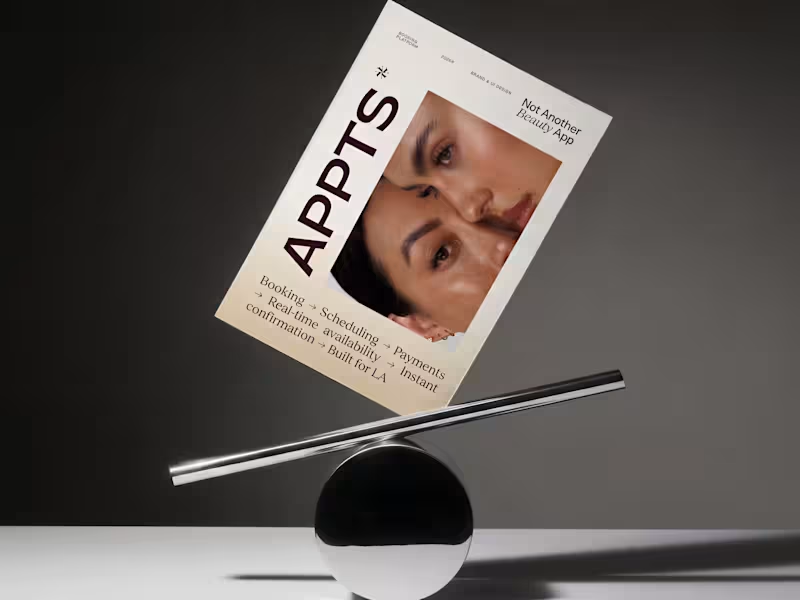
APPTS — Brand Identity & Mobile App Design
11
159
Message
8
Dane Kowachek
pro
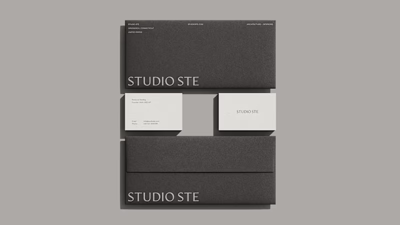
Brand Identity Development for Studio STE
8
97
Message
26
Daniel G Bright
max
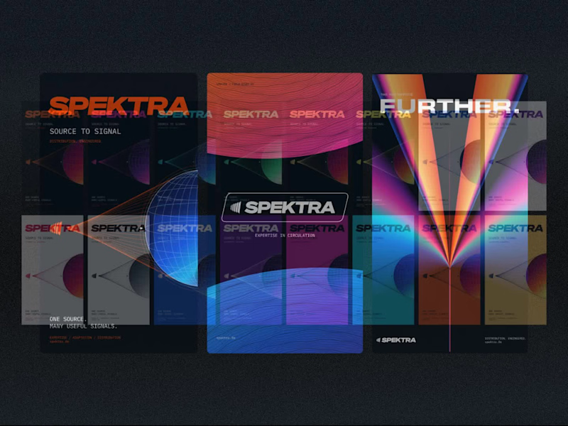
Spektra Visual Identity Development
26
490
Video editor projects
Video editing
Creative video edits made using today’s best editing tools
View more
Message
15
Jen Lai
pro
Gritzy | Social Media + OOH Animations
15
274
Message
14
Mykola Malyhin
pro
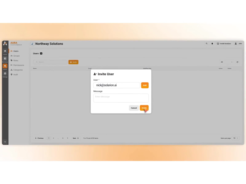
Aura | AI SaaS Explainer Video & Real UI Product Demo
14
130
Message
13
Bohdan Serdiuk
pro
Bolt New Slides V2 launch video
13
144
Message
11
Blahomyr Popok
max
Explainer video for PerformancePay - a motion design explainer
11
192
Standout projects
Standout projects
More projects we love that are making waves across the web
Message
25
Alex Lombrozo
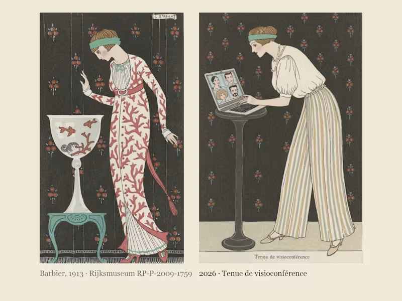
Costumes Parisiens 2026: George Barbier's Paris fashion plates of 1913, dressed for the way we live now. In 1913 George Barbier drew the latest Paris fashion for the Journal des Dames et des Modes: flat stencil colour, one elegant figure per plate, and a caption announcing the look, like "Robe d'intérieur" or "Manteau de théâtre". I found his Costumes Parisiens plates at the Rijksmuseum, where they are in the public domain, cropped ten of them down to the bare stencil and built a Recraft V4 Style from them. Costumes Parisiens 2026 keeps his poses and his captions and dresses them for how we actually live now: a silk blouse over pyjama trousers for the video call, a red delivery backpack worn over a fur-trimmed coat, a theatre coat embroidered with 99 unread badges, a necklace of charging cables, earbuds worn as pearl drops, a ring light carried like a parasol. Same magazine, a hundred and thirteen years later; only the accessories have changed.
10
25
1.4K
Message
22
Artem Prokhorov
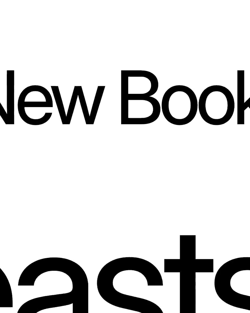
The New Book of Beasts A Medieval Bestiary of Modern Human Nature What if medieval bestiaries described the habits of modern people instead of mythical creatures? For the Recraft × Contra Styles Challenge, I created Illuminated Bestiary, a custom Recraft Style inspired by public-domain illustrations from 13th–15th-century manuscripts. I used historical references from the Public Domain Image Archive to explore medieval animal anatomy, ornamental details, ink drawings, and muted natural pigments. Then I applied the style to eight imaginary beasts, each representing a familiar modern behavior: overthinking, people-pleasing, doomscrolling, procrastination, ghosting, perfectionism, attention-seeking, and impostor syndrome. The result is a collection of creatures that look like they belong in a centuries-old manuscript, even though their habits are very much our own. Recraft project (https://www.recraft.ai/project/d06723de-c5da-43bb-99c5-75e5272d81e4) Custom Style (https://www.recraft.ai/styles/322e5547-e4ac-4689-baed-db70dc04d9a3) Historical Sources (https://<https://pdimagearchive.org/>) Social Post (https://www.linkedin.com/feed/update/urn:li:activity:7519324821240045569/)
10
22
1.3K
Message
2
Francisc Toth
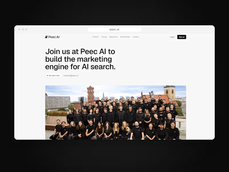
Peec AI is a Berlin AI-search analytics startup. On a 7+ month Framer retainer I design and build their marketing site as an embedded website team: careers page connected to Ashby, pricing with currency switching, product pages like Actions, a three-step lead qualification funnel, the CMS blog and changelog, and long-form report pages, plus ongoing maintenance and speed work. peec.ai
1
2
40
Message
26
Naz Hashem
pro
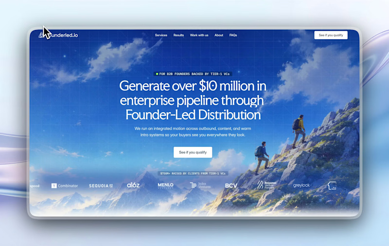
recent website revamp for Founderled (https://founderled.io). Founderled is the the trusted GTM partner behind 25+ founders who've raised over $750M from Tier-1 VCs like YC, Sequoia, a16z. cooking as usual @ clarity design studio (https://designwithclarity.co)https://cal.com/clarity-design-studio/discovery-call
11
26
392
Message
13
Alex Lazar
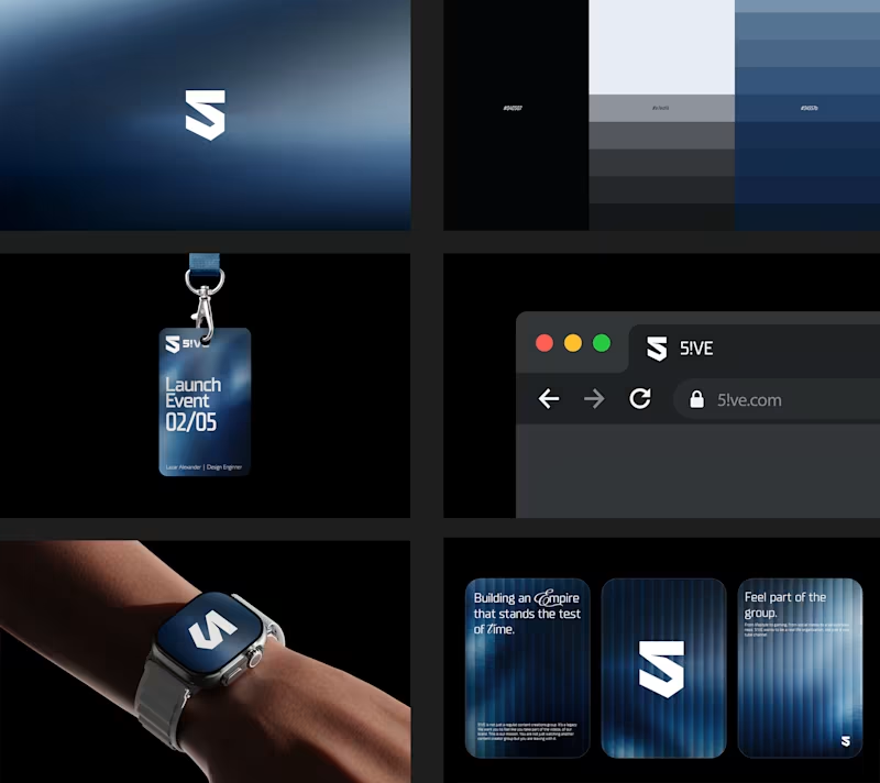
Branding Design for a AI Startup The client wanted a solution to its boring and non-convertible logo and we came with with a solution by creating a branding that converts and speaks to its clients.
7
13
177
Message
11
Emisho Victor
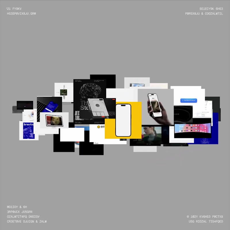
I recently built a new portfolio using Codex, and one of my favorite parts is the interactive spatial gallery mode I created. I wanted the website to feel alive and encourage people to get a little lost exploring the work. Best experienced on desktop: https://emishovictor.com P.S. I'm open to new product design opportunities! I'm also happy to share my résumé and private portfolio, which features more detailed case studies of my product design work.
3
11
200
Message
15
Muhammad Abdullah
pro
Meet Arvonn. A strategic branding agency for SaaS, fintech and tech companies. One idea at the centre, carried through strategy, identity, voice and systems. Gravity, by design. hi@arvonn.com (mailto:hi@arvonn.com) #brandingagency #brandstrategy #brandidentity
2
15
477
Message
10
Edward Sseruyiga
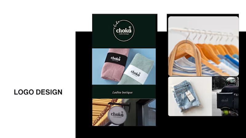
It’s been a minute since my last post here on Contra. While my main focus usually lives in photo editing and digital design, I was digging through the archive recently and thought it’d be fun to share a couple of branding projects from the past: Slide 1: Seart Visuals apparel & merchandise branding (1 year ago) Slide 2: Choku Ladies Boutique identity and mockups (2 years ago) Brand identity isn't my everyday lane, but tackling projects like these taught me a lot about visual consistency across different mediums. I’d love to hear your thoughts or see any feedback from fellow designers. Great to connect with the community again.
14
10
1.2K
Message
17
Mati Design
pro
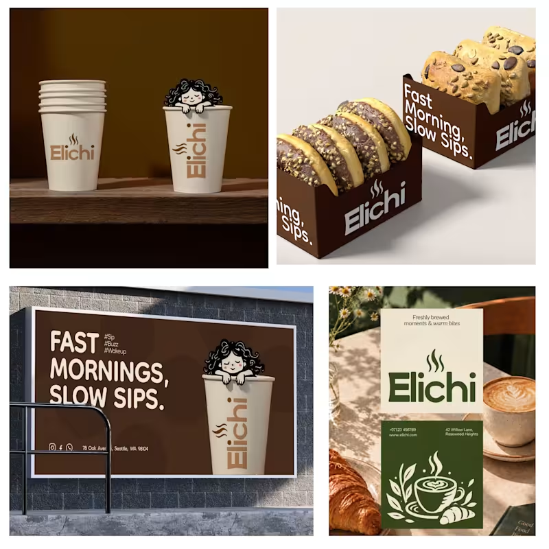
Giving Elichi Cafe Its Own Visual Voice. I developed a distinctive visual direction for Elichi Cafe, focusing on the character and personality behind the brand. Every design choice contributes to a unified identity that feels intentional and recognizable.
3
17
344
Message
21
faro soliman
pro
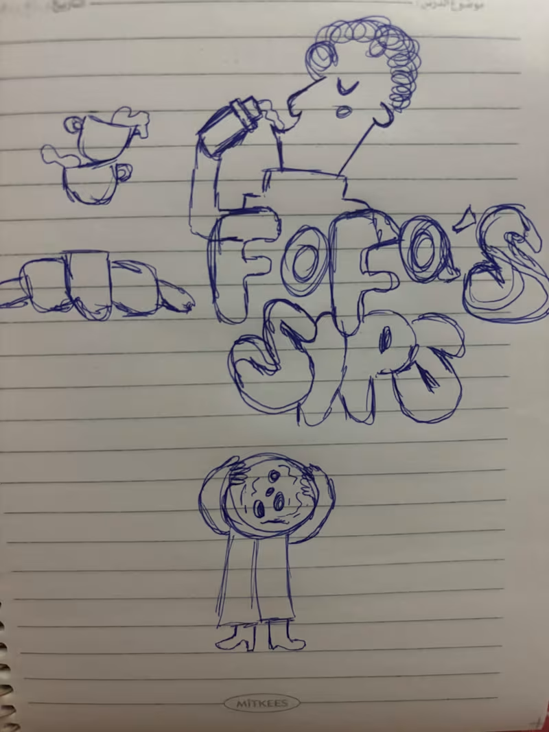
I turned one of my notebook doodles into a whole brand identity. And honestly this was way more fun than I expected I usually work on UI/UX and digital products so I wanted to take a step back from screens and explore something completely different: illustration-led branding. I took my original FOODAS sketch and built an entire visual world around it from the logo and mascot illustrations to the color palette packaging, cups, and menus The goal wasn't to make it look perfectly polished and predictable I wanted it to feel playful, a little weird, and still premium. Now I'm curious about one thing: Can playful, imperfect illustrations make a brand feel more premium or do you think premium branding needs to be more minimal? I have a feeling designers will disagree on this one
11
21
602
Message
29
Niks Pisarevs
max
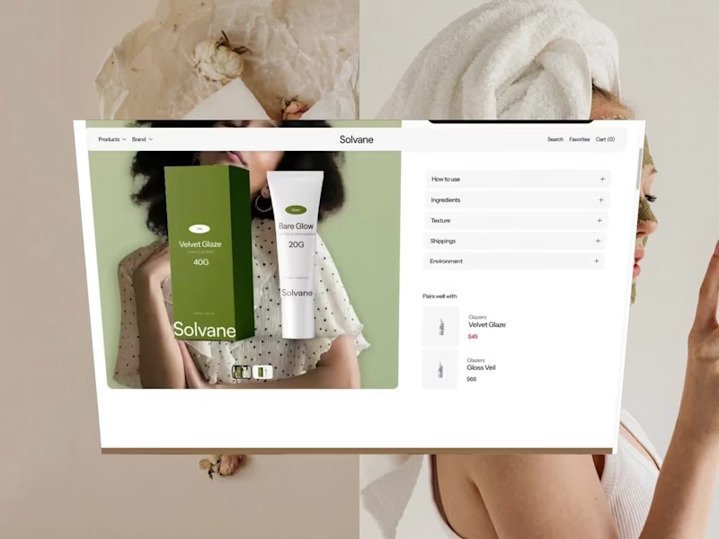
Solvane is a tranquil, editorial front store for a conscious skincare line, crafted using Framer with Framer Commerce and Shopify. Warm neutrals and large lifestyle photography allow the products to breathe. Beneath that is product listing pages with variants, an ever-present add to cart feature and full Shopify checkout – all without writing any code.
15
29
368
Message
10
Reyda Dönmez
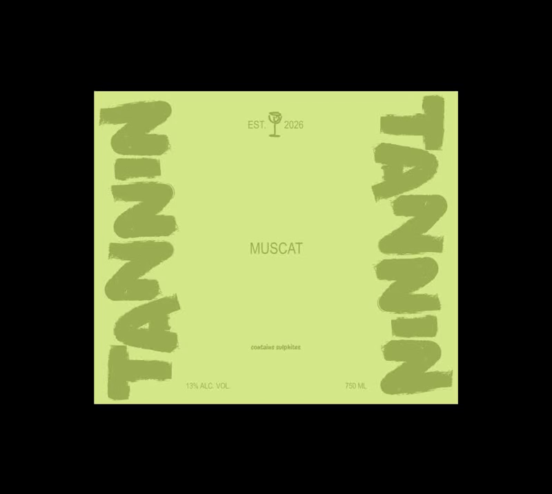
Wine labels with Figma motion. 🍷
1
10
159
Message
15
Neda Filiposka
pro
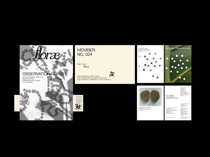
What if a botanical brand functioned as an archive rather than a catalogue? FLORAE is a speculative identity exploring the relationship between nature, observation, and time. Imagined as a living botanical archive, the brand documents the small, often overlooked changes through which growth reveals itself. Each specimen becomes a record. Each observation adds to a growing collection. Together, they form an evolving archive of botanical forms, patterns, and transformations. The visual identity draws from scientific documentation, editorial typography, organic textures, and a restrained botanical palette. Numbered observations, specimen records, and archival language establish a visual system that feels both analytical and alive, balancing the precision of documentation with the unpredictability of nature. Rather than presenting nature as something static to be collected, FLORAE treats it as something to be observed, interpreted, and continuously rediscovered.
5
15
356
Message
17
Sahil Roy
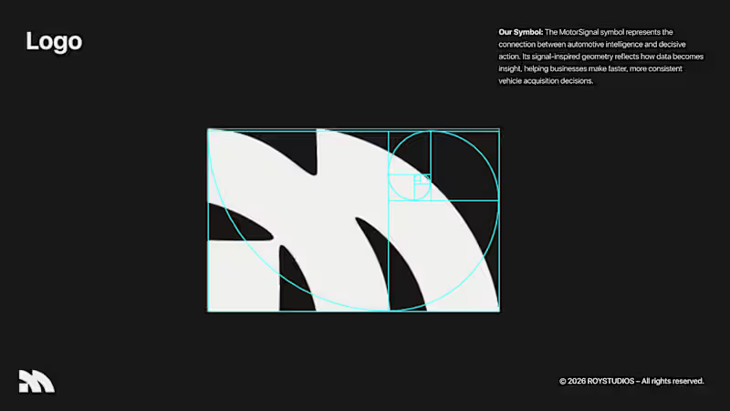
Hi Brand Designer and Inpirees, I just finished designing an AI automative B2B SaaS branding. This is a self-made project that I challenged myself to test the skills of my newly unlocked branding skills. 🤞 Motor Signal is an AI-powered vehicle quotation software that helps businesses to evaluate their user's motor vehicles easily and faster. This was a very niche industry that I chose to do a project on. I want you guys to be the judge for this project, and give me your wisdom on this project and how you guys would design this project if it were you. 🤏
3
17
256
Message
50
Juice Lab
pro
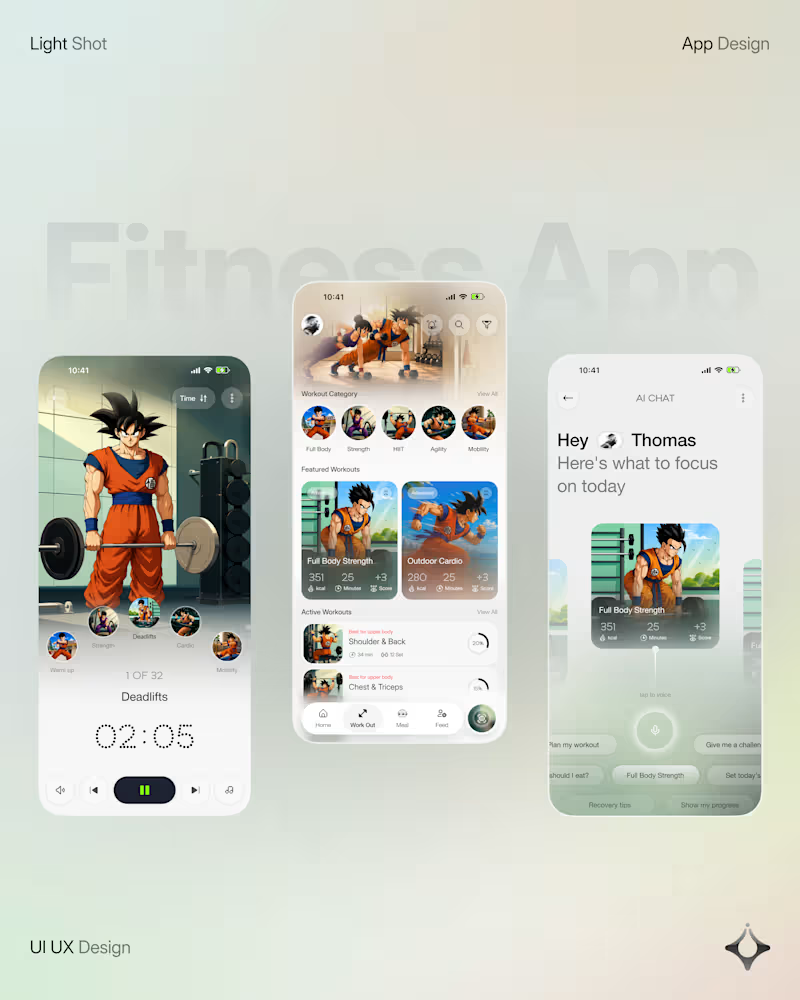
What if your fitness app felt like having a personal trainer in your pocket? Meet your new workout companion. A bold fitness app concept combining personalized workouts, AI coaching, and a seamless mobile experience to make every session count. Would you use this to level up your fitness journey?
41
50
1.1K
Message
14
Oguntade Oluwaseun
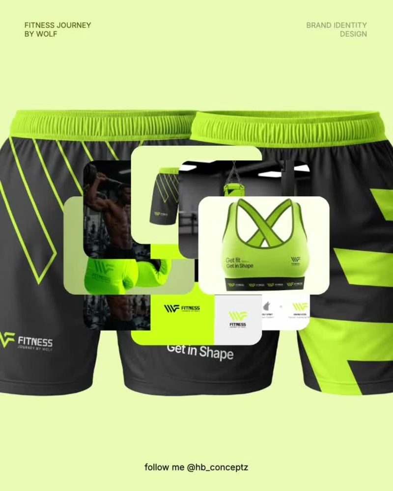
Built to move. Designed to roar. 🐺💚 Fitness Journey by Wolf — bold visuals for a brand that lives and breathes fitness. Got a brand that needs this energy? My DMs are open for new projects and collaborations. #FitnessBranding #BrandIdentity #PackagingDesign #GraphicDesign #BrandDesigner #CreativeDesign #DesignPortfolio
4
14
136