
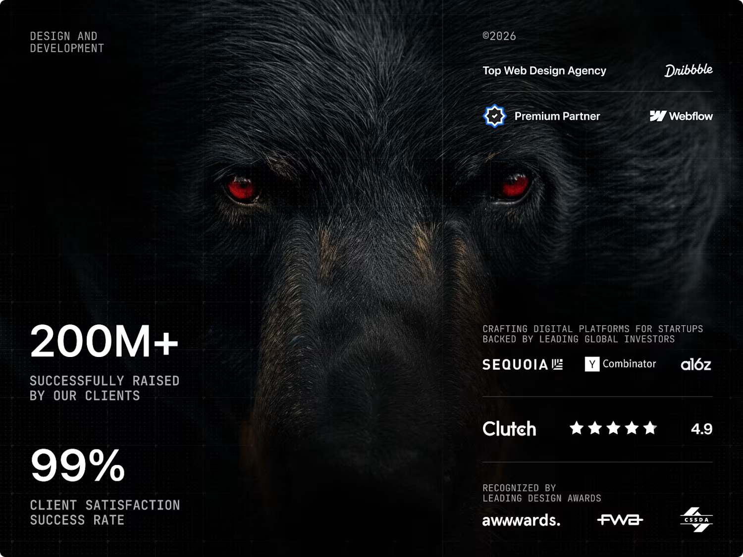
Bearplus Fullstack Agency
Award-winning agency specializing in design and development.
- 5.00
- Rating
- 16
- Followers
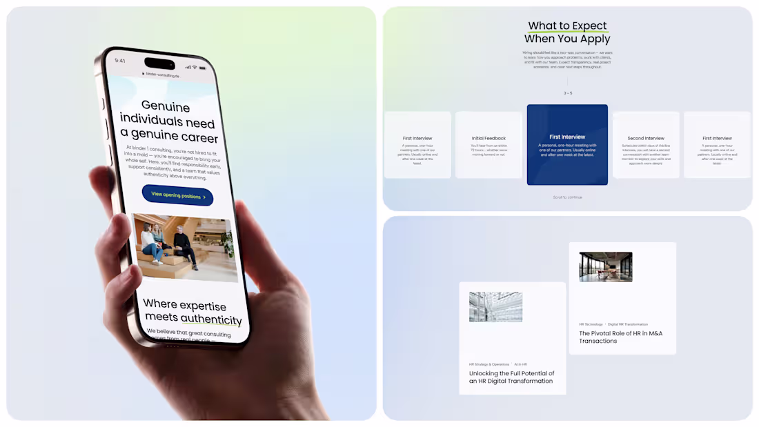
Designing the Career page for Binder Consulting
Career pages are often the most neglected part of a consultancy site, which is strange because they're where the best people first meet the brand.
We treated Binder's like its own small story. It opens with the line "Consulting That Challenges You. A Team That Supports You," which sets the tone immediately. From there: warm photography of the real team, quotes from current members on why they stay, a clear look at the career path on offer, honest benefits, and a fully transparent hiring process laid out stage by stage.
Nothing hidden, nothing oversold. The page makes one quiet point really well: consulting can be ambitious and human at the same time.
Open to new projects if you're building something in this space.
2
66
Rotimatic trade-in experience
Rotimatic asked us to design the page where existing owners swap their old machine for the new one. The challenge was making a flow feel as natural as demoing the product itself. We focused on tight visual hierarchy, brand-true colour and motion, and a layout that guides without nagging. The result is a trade-in journey that feels less like checkout and more like a quiet upgrade.
2
69
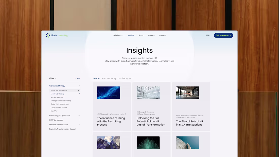
Rethinking the Insight page for Binder Consulting
A small but meaningful UX call on this build. Most consultancies split their content into three separate pages: articles here, success stories there, whitepapers somewhere else. We put all three on one page, controlled by one shared filter. And the filter applies live, the moment you tap a tag, no Apply button to chase. Sounds minor, but it changes how the page feels. Less like navigating a site, more like flipping through a well-organised library. Open to new projects if you're working on something in this space.
2
2
119
PlayStation Europe Data Dashboard, A Visual Concept
PlayStation Europe came to us about their internal data dashboard. We took it as a concept exploration, the kind of work where UX rigour and visual craft have to share the same file. Dense multi-layered data, made readable. A full system underneath: tokens, components, motion rules, dark and light. Internal tools rarely get this kind of attention. We think they should.
1
71
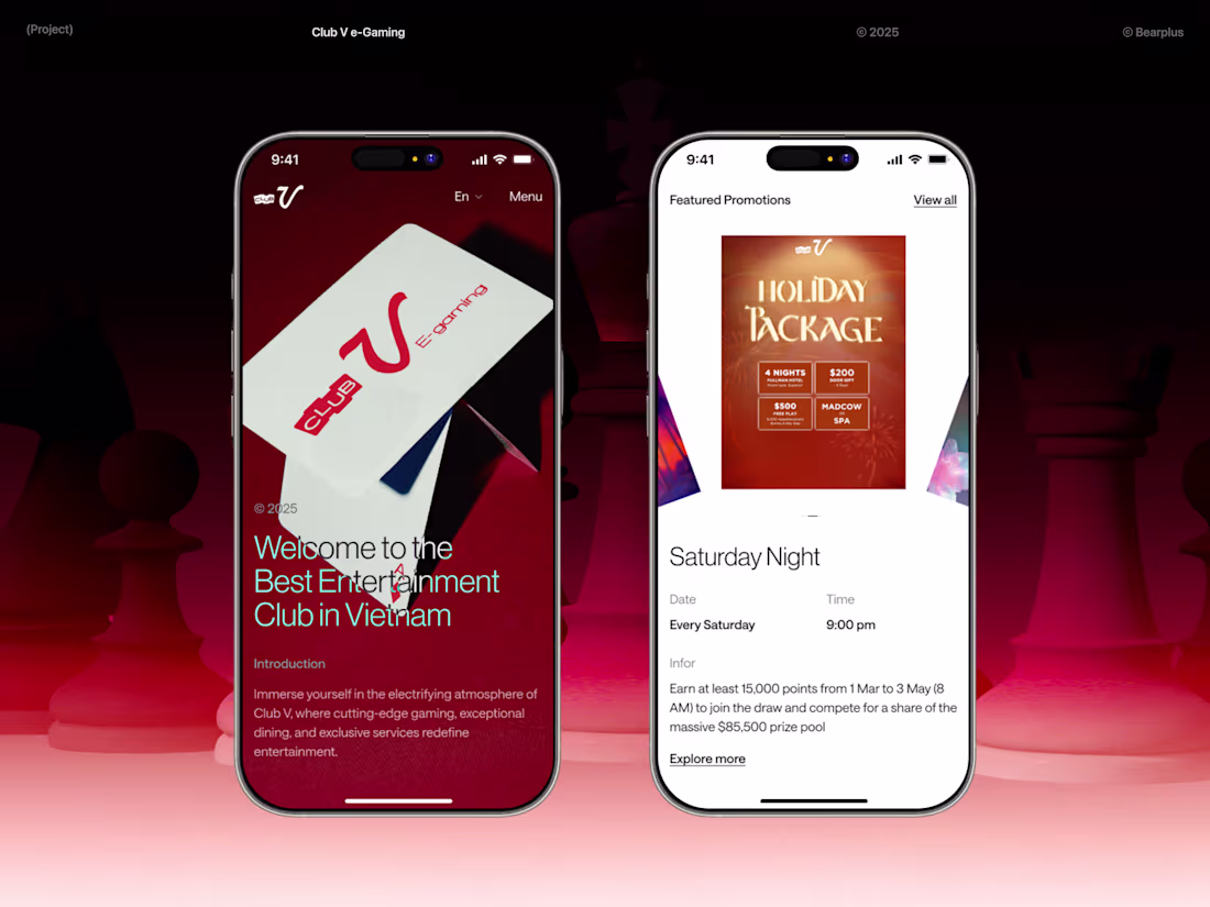
ClubV Work With Us Page, Design and Build
We designed and built the Work With Us page for ClubV, a premium e-gaming venue in Ho Chi Minh City. Most careers subpages get treated as filler. We treated this one as a brand surface. Core values, team photography, multilingual job flows, and a layout that holds up across English, Korean, Japanese and Chinese. Clean typography, considered spacing, and a structure that respects how people actually read job pages.
3
2
117
Binder Consulting Text Card
A text card from our work for Binder Consulting, a Munich firm working at the intersection of HR consulting, HR-IT, and AI products. The challenge was finding a voice that fits between two tired patterns: legacy consulting stiffness and AI startup loudness. We built a typographic system that signals depth without performing it, used as quiet anchors across the site. Small surface, a lot of brand thinking underneath.
1
65
How we visualised millions of dollar in jackpots for ClubV
ClubV is the leading egaming club in Saigon, packed with the latest slots, roulette and baccarat machines. They needed a website that matched the floor experience: high stakes, but quietly premium.
This screen pulls live jackpot data from their API and lays it out as a cluster of circles. One per win, sized by payout. Switch between 7 and 30 day views. It updates in real time.
The brief was simple. Make the numbers the hero. We did that by stripping everything else back.
Happy to chat about similar work for hospitality or gaming brands.
1
94
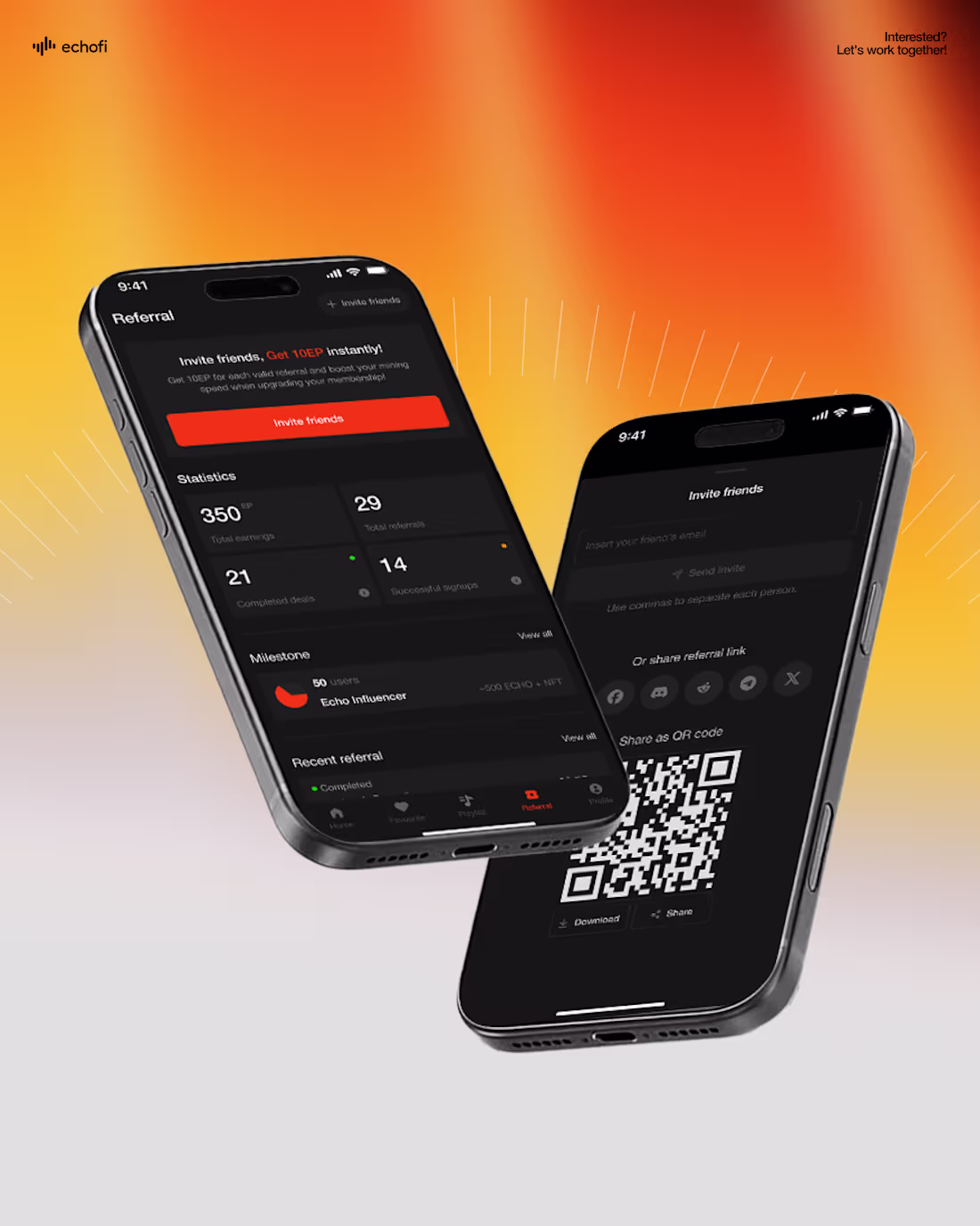
Refer-a-friend, how to make it convert
Just shipped the referral experience for Echofi, a Web3 music app where listening and inviting earns you tokens.
Referrals are usually an afterthought. A button, a link, a shrug. We treated it like a product on its own:
- Share sheet that gets out of the way
- Real-time dashboard showing pending vs confirmed earnings
- Tiered milestones to keep momentum after the first invite
- Plain language. No jargon. No fake urgency.
If you're building something where word of mouth matters, happy to chat. Booking a few projects for the next quarter.
1
112
Binder Consulting - About page that works
A great About page isn't just a design exercise, it's a trust exercise.
For Binder Consulting, we designed each section with intent: a clear intro that frames the company's purpose, a values section that communicates how they work, a founder quote that humanizes the brand, a "what drives us" narrative that reveals motivation, and a management team section that puts faces to the expertise.
Every word, every layout choice, was crafted to help visitors truly understand who Binder is and why it matters.
1
95
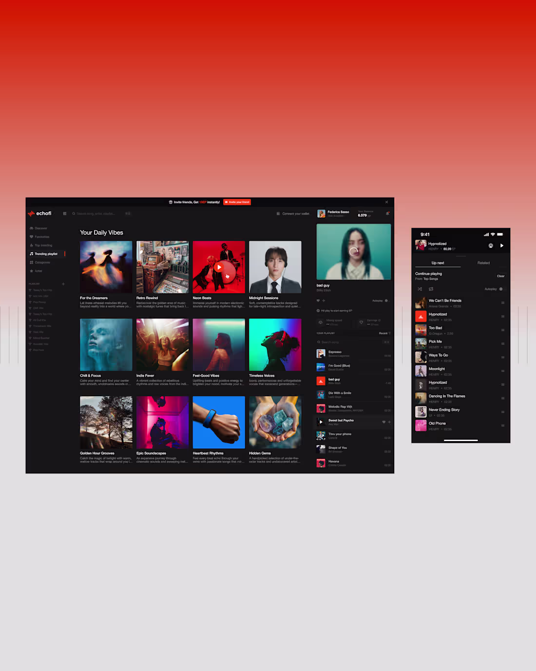
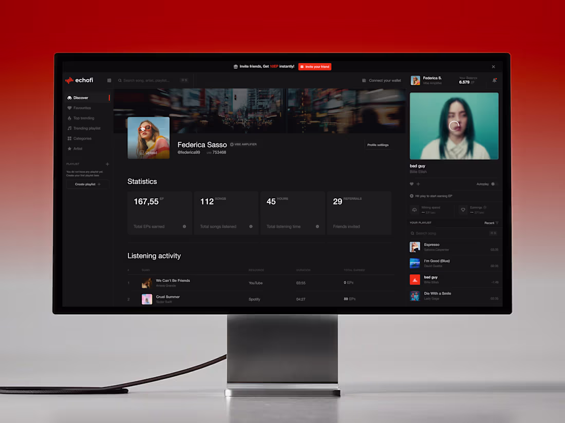
Echofi - User dashboard
The dashboard had to do the heavy lifting of a Web3 app while feeling as effortless as a music player.
We organized ECHO token earnings, listening stats, referrals, and staking into a sleek, modular layout, giving users full visibility without overwhelming them.
Every number, every action, every reward is right where it should be.
4
2
129
Echofi - Card carousel
A standard carousel wouldn't do Club V justice. So we designed a vertical fanning card system that turns browsing into a moment of discovery. Cards cascade with elegant showing, layering motion in a way that feels more like flipping through a luxury catalog than scrolling a website. Sexy, deliberate, and built to be remembered.
1
103
Binder Consulting website is launched!
Just launched: binder|consulting, a firm operating across HR strategy, technology, and transformation.
The real challenge wasn't visual. It was editorial. We spent the early phase restructuring content before a single pixel was designed, grouping services the way clients actually approach them and pruning what didn't need to be said upfront.
Good design for a consulting firm isn't about looking impressive. It's about making a complex offering feel navigable.
If your current site feels like it's working against you, happy to jump on a 20-minute call.
6
5
145
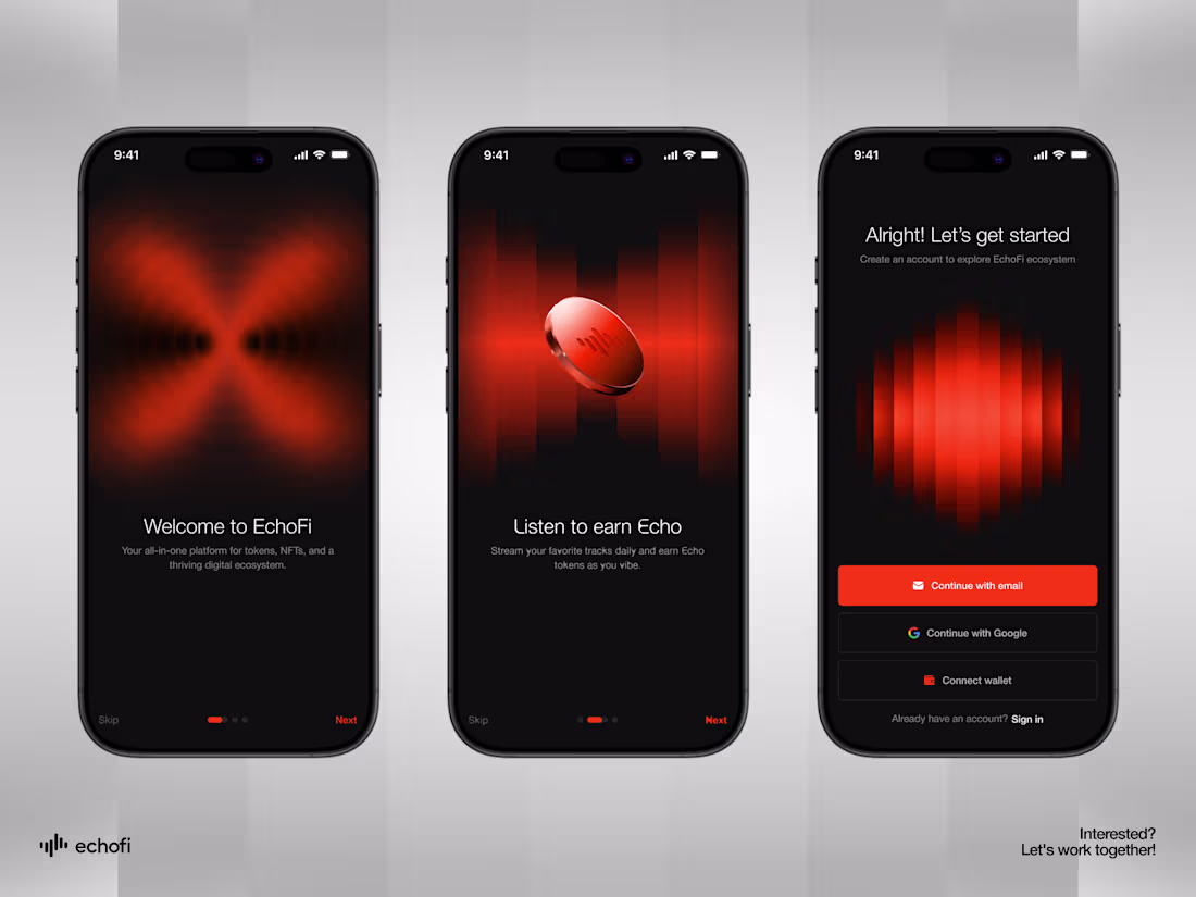
Echofi - Onboarding
No clutter. No friction. No unnecessary steps. Onboarding for Echofi is minimal by design, sleek in execution, and fully on-brand from first tap to final screen. Because the best onboarding is the one you barely notice.
2
2
164
ClubV - Mobile screens
On mobile, every section was crafted to fit neatly within one viewport, keeping the journey focused and frictionless.
Several sections feature adaptive designs, reworked from the ground up, so interactions feel native rather than ported.
We refined spacing, tap targets, and motion for thumb-first use. The outcome is a mobile build that performs with the same polish as desktop.
4
4
163
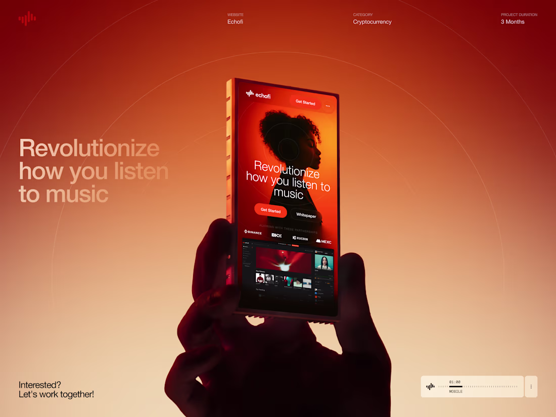
Echofi: Where Every Detail Earns Its Place
Echofi set out to revolutionize how people listen to music. And revolutions don't happen without precision. You can't reshape a daily habit if the small things feel clunky.
So we sweated every micro-interaction. Every tap, every transition, every moment of friction was refined until listening, and earning, felt as natural as pressing play.
4
2
159
Club V is Saigon's premier e-gaming destination, where competitive play meets premium hospitality.
We crafted a digital experience that mirrors the energy of the venue itself: bold, immersive, and unapologetically built for gamers.
From the first scroll, visitors step into a world designed to thrill.
To see more of our works, visit 🔗 https://bear.plus/works
2
184
Quietly thrilled to share this.
Bearplus was selected for Dribbble Select: Best Shots of the Year, and featured in the Dribbble Select: Web Design Agencies directory.
We believe beauty isn't decoration. It's the shortest path to being believed. Every pixel, every revision, every late-night "let's push it one more round" is really about earning trust in the seconds before anyone reads a word.
Thank you to the founders, product teams, and marketers who let us push the details further.
Links in comments 👇
21
36
563
We designed a dashboard that brings clarity 🔥 to this intersection of Web3 and music, giving users a clean interface to track their tokens, monitor music performance, and manage distribution at a glance 🙌
1
164
Echofi - Card Stack
0
153
Echofi - Mobile Screens
0
159
Echofi - Mobile Responsive
0
154
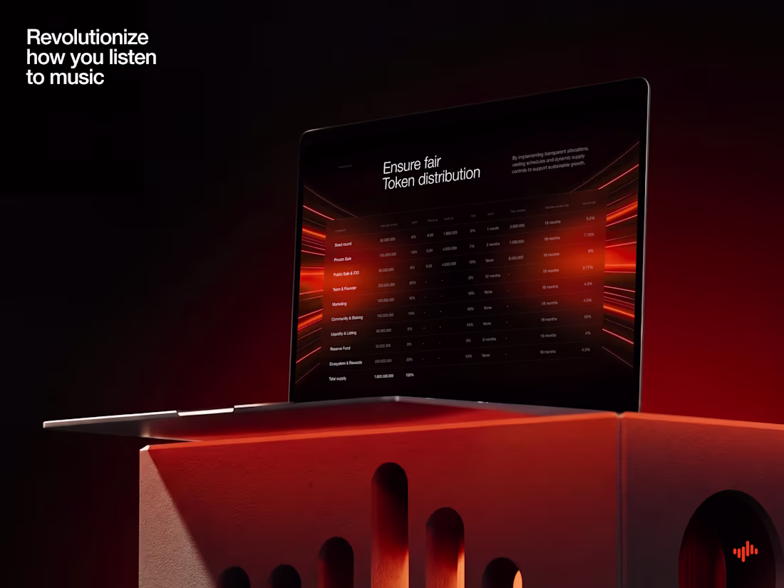
Echofi - Token Distribution
0
145
Echofi - Hero section
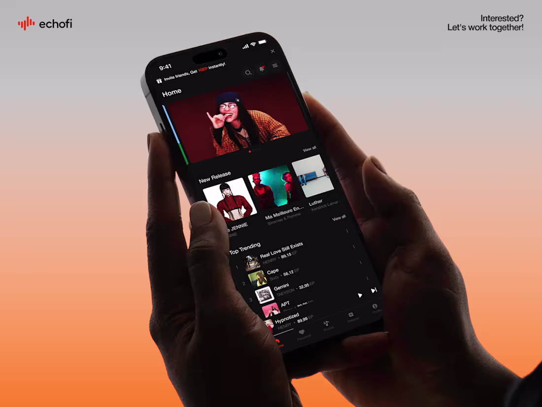
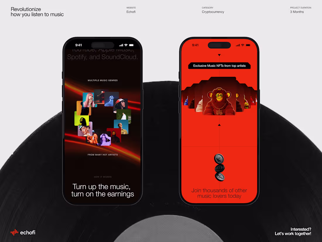
Echofi is a Web3 MusicFi platform that turns music listening into a token-earning experience. Users can sign up with email or a Web3 wallet, listen to music, interact with content, and earn ECHO tokens through daily activity, referrals, and staking. The ecosystem also includes music NFTs, transparent tokenomics, and a roadmap focused on mobile expansion, deeper blockchain integration, and community growth.
0
141
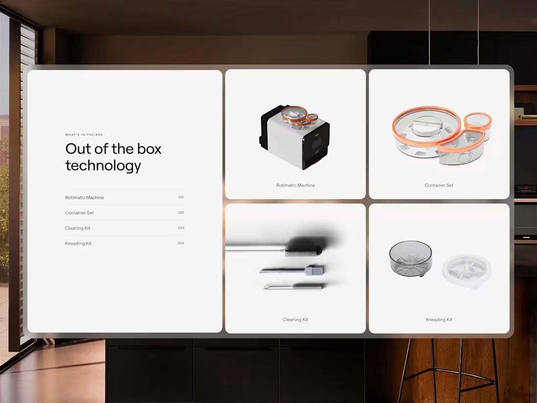
Rotimatic - 3D illustration of product and accessories
By integrating 3D product illustrations, Rotimatic website transforms the way customers discover and interact with its innovative roti maker. Instead of relying on static photos, the 3D experience brings the product to life—highlighting its design, components, and functionality in a way that feels intuitive and engaging. This not only builds confidence in a complex physical product but also creates an immersive digital journey that mirrors the in-store experience.
1
183
ROTIMATIC NEXT - Website 3D Visualization
For the launch of Rotimatic- the world’s first fully automated roti-making machine, Bearplus built a digital experience that blends 3D product visualization + interactive storytelling.
- 3D Illustrations & Motion: We showcased the machine in detail, demonstrating how each step works, so customers can easily understand the product’s value.
- Seamless User Journey: Clear storytelling of convenience and technology, making it intuitive for first-time visitors.
1
165
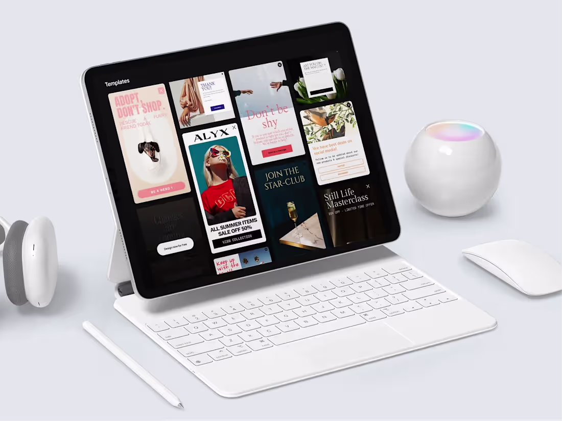
Bearpop- Mobile Homepage
Optimized for all shapes and sizes
We have dedicated ourselves to the rigorous process of fine-tuning every aspect, leaving no stone unturned to guarantee that interaction on our platform is both effortless and engaging. Our meticulous efforts extend to optimizing legibility, ensuring a smooth and enjoyable experience, regardless of the platform users choose to engage with.
0
134
Yikez - Turn talks into tasks - Mobile Design
Yikez seamlessly blends the casual intimacy of chat rooms with the efficiency of task management. Gather your friends and family in a dedicated chat room. Discuss, delegate, and decide on tasks together.
Bear Plus has been entrusted with the pivotal task of redesigning the UX/UI for Yikez's website. This redesign aims to enhance user engagement, streamline navigation, and reflect the company's forward-thinking ethos.
1
115
Smart TV App Design
Bearplus was commissioned to work on a new design for a new Smart TV hardware app interface.
Designing for television has become part of the UX design practices. When compared to computers and even mobile phones, designing UIs for TV is still a relatively new area.
Here are our three take-aways for UX of smart TV:
Size and color: most of us sit more or less 3 meters away from the screen. That means, fonts, images, icons and other elements must be significantly bigger whereas colors have better contrast for readability.
Focus state: Since Smart TV has no touch input or mouse cursor, it’s crucial to deliver a very straightforward design that makes it dead simple for navigation that relies entirely on directional pad (up, down, left, right). Users must understand clearly between focused and non-focused states.
1
0
117
Open Banking Excellence Website
0
119
Recruit First - Homepage Design
0
102
Roxtaw - A Venture Builder
0
94
Geniusminds - The future of Recruiting in the Age of Automation
0
84
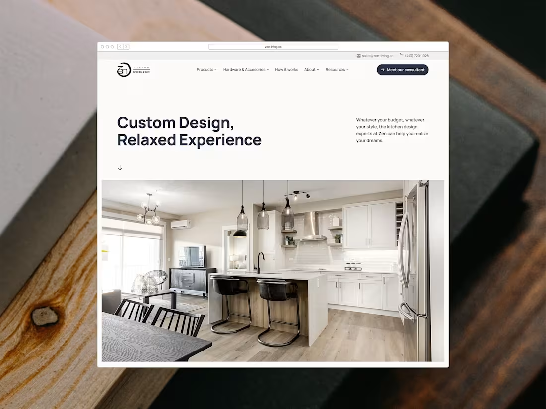
ZEN LIVING - A Modern Website for 50+ Years of Craftsmanship 🎗
We are excited to introduce the landing page of the website that we redesigned and developed for Zen Living, one of Canada's largest manufacturers and suppliers of cabinets.
With an inventory of over 500 distinctive products, Zen Living needed a website that not only showcases their impressive cabinet selection but also assists customers in their purchasing journey.
To ensure a seamless browsing experience, allowing customers to explore a wide range of offerings without confusion, we chose a clean, modern design with a neutral color palette. We categorized products based on customer preferences and adorned them with high-quality 3D images for easy exploration.
We strategically placed call-to-action buttons to enhance interactions and ultimately boost profitability.
1
0
96
Artbook - Highlight Products
A dynamic product showcase component featuring interactive hover animations and scrolling marquee text. This UI element reveals product details and information on hover, creating an engaging browsing experience for the Artbook Bookstore website.
Hover Animation: Products reveal images on cursor hover
Marquee Text: Scrolling text animation for dynamic content display
Product Integration: Clean showcase layout with book titles and author information
Modern Layout: Clean white background with typography focus
0
91
Artbook - Interaction Design
We’re excited to unveil the redesigned Artbook website, showcasing our expertise in crafting immersive digital experiences. Here are the highlights:
Interactive Design: Our seamless user experience features intuitive interactions, smooth transitions, and responsive animations, guiding users effortlessly through the site.
Clean Minimalism: Embracing a minimalist approach, we utilized ample white space, elegant typography, and a restrained color palette. This design enhances accessibility and highlights the Artbook's stunning visuals and content.
Brand Story Integration: We infused the website with Artbook’s artistic spirit. Every element reflects the brand’s dedication to art and literature, from curated collections to engaging editorial content.
0
87
Artbook - Homepage
We’re excited to unveil the redesigned Artbook website, showcasing our expertise in crafting immersive digital experiences. Here are the highlights:
Interactive Design: Our seamless user experience features intuitive interactions, smooth transitions, and responsive animations, guiding users effortlessly through the site.
Clean Minimalism: Embracing a minimalist approach, we utilized ample white space, elegant typography, and a restrained color palette. This design enhances accessibility and highlights the Artbook's stunning visuals and content.
Brand Story Integration: We infused the website with Artbook’s artistic spirit. Every element reflects the brand’s dedication to art and literature, from curated collections to engaging editorial content.
0
83
Artbook- Website Design
Artbook is a premier destination for art enthusiasts and book lovers alike, offering a curated selection of high-quality art books that celebrate creativity and visual storytelling.
Our mission is to provide a platform where art and literature intersect, allowing readers to explore the world of art through beautifully designed publications that inspire and captivate.
We’re excited to unveil the redesigned Artbook website, showcasing our expertise in crafting immersive digital experiences.
0
71
Silana - Product
Visualize products by motion graphics
Silana’s technology is powerful—but also complex. Our goal was to make it simple for customers, partners, and investors to understand what they do and why it matters. From the homepage to detailed explainer sections, we used clear, human-centered language to build trust and remove confusion.
To bring their innovation to life, we designed motion graphics that illustrate complex processes in a simple, engaging way. These dynamic visuals help audiences quickly grasp how Silana’s technology works and the value it creates.
0
87
Silana – Homepage
Silana is an Austrian deep-tech startup founded by three engineers with a bold mission: Automate sewing and bring garment manufacturing back to Europe and the U.S.
By tackling one of the last unsolved problems in manufacturing, Silana aims to create a more sustainable, resilient, and localized future for the fashion industry.
1
112
Silana - How it works
Design with purpose
We didn’t aim to impress with flashy visuals — we aimed to support a meaningful mission. Every design decision was intentional: a system that feels calm and modern, giving innovation room to speak for itself. The interface is technical enough to reflect the depth of their engineering, but approachable enough for anyone to understand.
Behind the scenes, we structured the design to be flexible — so it can grow with Silana as they evolve.
From layout to micro-interactions, everything was crafted to feel thoughtful, focused, and aligned with the way Silana works: precise, grounded, and forward-thinking.
We let the product shine — make sure the digital space supported that message with elegance and ease.
1
95
CaskX - Interactive Journey with the Rolling Barrel
In our efforts to create a truly immersive and engaging experience, we have developed an interactive 3D design element that takes the shape of a whisky barrel.
As you navigate through the site, this beautifully crafted barrel rolls down the page, following your scrolling motion with your mouse. This real-time interaction invites you to explore more, driving engagement and encouraging a sense of discovery as you unearth the investment opportunities within the platform.
This dynamic design element mirrors the journey of whisky maturation itself – moving, evolving, and revealing its worth over time. It's a playful yet sophisticated nod to the whisky industry and a reflection of owner’s commitment to making the investment process enjoyable as the spirits we deal with.
2
97
Simplifies Investments with User-Centric Design
Recognizing that investing can feel complex, we’ve streamlined the process with a clear, intuitive form that makes getting started easy and straightforward.
Our goal is to make your whisky investment experience as straightforward and enjoyable as possible. We've stripped away the complexities, resulting in a minimalist, easy-to-use form that guides users through each step of the investment process. From the moment you decide to invest, through to the final confirmation, every interaction is designed to be smooth and hassle-free.
It’s not just about design and usability, we ensure all essential information is easy to access and clearly presented. By removing jargon, you can understand exactly what’s happening at every step of the process.
2
98
Crafting an exclusive luxury experience with CaskX
CaskX, the X is more than just a letter - it embodies the heart of the brand philosophy and adds an element of intrigue to our user experience. The X symbolizes the secret, power and exclusiveness.
We've aimed to use this 'X' motif in various contexts to not only maintain visual consistency, but also to continuously tell the brand story in a nuanced and compelling manner.
So, when users interact with the website, know that each 'X' they encounter is more than just a design element. It's an embodiment of the CaskX experience - where secrets are unraveled, luxury is expected, exclusivity is the norm, and making powerful investments is a seamless process.
1
82
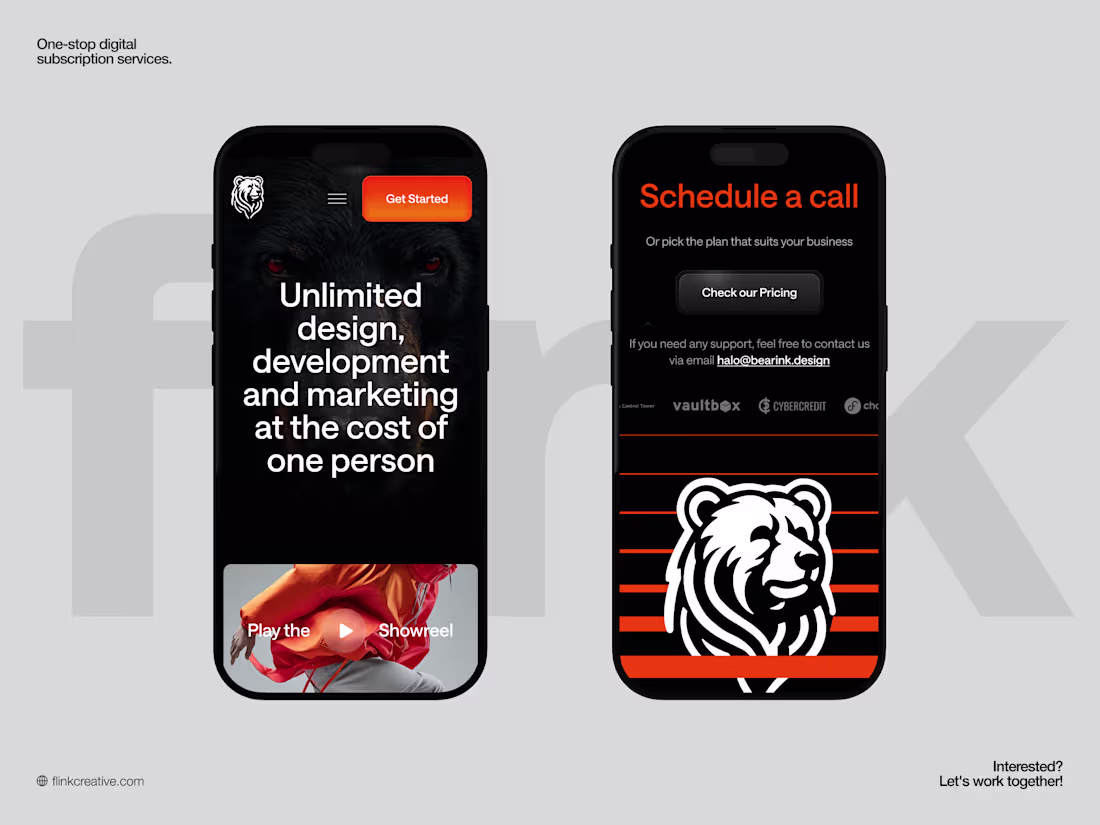
Flink Creative - Mobile Responsive
The mobile experience is crafted to feel premium yet effortless, with a bold hero, clear typography, and flow optimized for thumbs. Navigation tucks neatly into a compact menu, while primary CTAs stay highly visible, making it easy for busy founders to explore unlimited design, development, and marketing services on the go.
The layout keeps the signature branding and strong contrast intact, ensuring the visual identity remains instantly recognizable even on smaller screens.
2
86
Flink Creative - Footer Interaction
The footer turns a traditionally quiet area into a bold brand moment, using the iconic bear mark over dynamic orange stripes to leave a strong final impression. Instead of being purely informational, it acts as a visual anchor for the entire experience, balancing functional links and contact details with a playful, memorable piece of brand storytelling.
When users hover over the ‘Check our Pricing’ button, it glows in bright orange, reinforcing the primary call to action and adding a subtle sense of energy and urgency to the interaction, while hovering over the footer makes the bear subtly move with the cursor, turning the bottom of the page into a playful micro‑interaction that keeps the brand feeling alive and responsive.
2
77
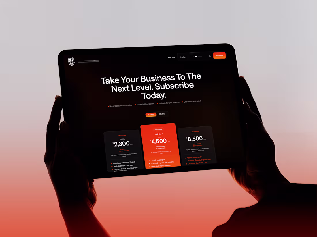
Flink Creative - Pricing
The pricing section is designed to help startups make confident decisions quickly by clearly presenting three subscription tiers side by side, each with its own highlight color and key benefits.
High-contrast cards, large numbers, and simple labels make costs and value easy to scan at a glance. Supporting details underneath each plan outline deliverables and expectations, while subtle microcopy about “no contracts” and “cancel anytime” reinforces flexibility and cost-efficiency for growing businesses.
0
74
Flink Creative - Full website
Flink Creative is a subscription-based creative partner that gives you a senior, dedicated product and marketing team in minutes, helping brands ship world-class design, development, and growth campaigns for one simple monthly fee.
Not a vendor. Not a contractor.
Instead, a partner plugs straight into your workflow. The fastest-moving companies are not the ones with the largest teams, but the ones with the most dependable execution. With Flink Creative, getting started is effortless: submit a request, collaborate directly with the team, and receive polished work, fast, consistent, every time.
0
65
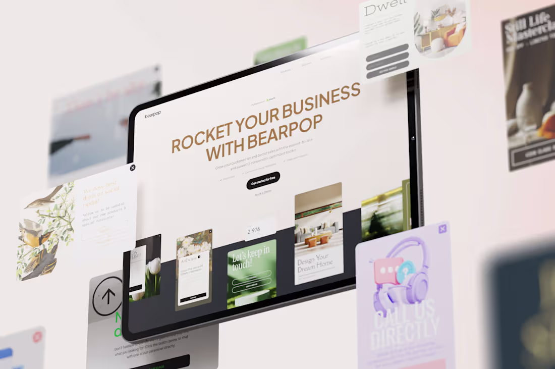
BEARPOP - It's all about Captivating Presentation ✨
Bearpop's website has been thoughtfully revamped to offer a seamless and user-friendly experience.
The team at Bearplus made sure the intuitive layout ensures effortless navigation, while the updated user interface adds a touch of modern elegance. Every interaction is a visual delight, making users' journey through Bearpop's website a refined and easy experience.
1
113
BEARPOP - A Revolutionized Experience of a Conversion-rate optimized Toolkit
Bearpop is a conversion rate optimization plugin for e-commerce store owners, supporting to grow their email list and increase sales.
Bearplus has transformed Bearpop entirely, from its UX/UI to full-stack development. Enjoy a seamless experience with a visually captivating interface that enhances any popup creation.
This design goes beyond looks; it introduces new tools, streamlines workflows, and integrates user feedback for a superior Bearpop experience.
0
106
Bearpop- Art Direction is the start of everything!
With a color palette mainly consists of soft pinks, muted greens, beige and brown, and neutral touches, we wish to evoke a sense of versatility and contemporary in the design.
Plus Jakarta Sans', a fresh take on geometric sans serif styles, offer great balance through its modern clean cut and pointy curves. Moreover, the typeface offer a wide range of sizes to perfectly fit the demand of this multi-faceted design.
0
97
BEARPOP - Aesthetics is the Finesse.
Here at Bearplus, we take pride in the aesthetics of every work we do. And Bearpop is no exception.
Our graphic design templates represent meticulously crafted canvases, where each template becomes a canvas narrating a distinct story. What sets Bearpop apart? Our product builder goes beyond aesthetics—it's a conversion powerhouse. Integrated data collection, leads management, and straightforward content guidance come together seamlessly. Ready to power your next pop-up, it's an all-in-one solution.
1
118
Mobile Design - Kanak Naturals Green Packaging
Discover the responsive mobile design of Kanak Naturals, ensuring a smooth and engaging user experience on any device. The mobile-optimized layout adapts seamlessly to different screen sizes, offering intuitive navigation and touch-friendly interactions.
Every element, from high-quality visuals to smooth animations, is designed to provide the same immersive
2
122
3D Product Interaction Design - Kanak Naturals Green Packaging
The Kanak project features 3D immersive animation with scrolling, creating an interactive and engaging experience for users to explore products & services visually and dynamically.
Features:
- Product Showcase: High-quality images and 3D models emphasize durability and innovative design.
- Interactive AR: View products in real-world settings via augmented reality.
- Ambassador-Led Navigation: Journey through the site guided by our female ambassador, emphasizing our sustainability mission.
🌟 FWA of the day
🌟 CSS Design Awards - Website Of The Day
1
106
Visual Storytelling - Kanak Naturals Green Packaging
Take a look at our latest UI design for Kanak Naturals, where smooth scrolling turns browsing into an engaging story.
As you navigate their website, you’ll find that each scroll smoothly reveals more about their eco-friendly packaging solutions. It’s a relaxed, intuitive way to discover how Kanak Naturals is making a difference with sustainability.
🌟 FWA of the day:
🌟 CSS Design Awards - Website Of The Day
1
113
Homepage Design - Kanak Naturals Green Packaging
The Kanak project features 3D immersive animation with scrolling, creating an interactive and engaging experience for users to explore products.
- 3D & 2D Integration: Explore products in a realistic setting using Astro Build for stunning visual fidelity. Interact with 3D models for a tactile, virtual experience.
- Color Palette: Earthy tones inspired by natural materials like bamboo and sugarcane
- Typography: Robust, clean fonts mirror practical yet sustainable packaging designs.
- High-quality images and 3D models emphasize durability and innovative design.
- Interactive AR: View products in real-world settings via augmented reality.
Ambassador
- Led Navigation: Journey through the site
🌟 FWA of the day
🌟 CSS Design Awards - Website Of The Day
1
107
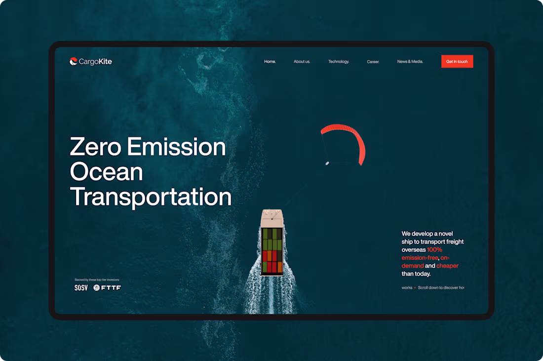
3D Interactivity - CargoKite Website Design
CargoKite sets a new standard in web design with its stunning 3D interactive features. The 3D elements create a dynamic and captivating environment that keeps users engaged and intrigued.
Our design features:
- Interactive 3D Models: Engaging and detailed 3D models of CargoKite's ships, providing users with a dynamic and immersive experience.
- Subtle Animations & Micro-Interactions: Thoughtfully crafted animations and interactions that enhance user engagement and provide a seamless navigation experience.
- Cross-Platform Seamlessness: Ensuring a flawless and consistent user experience across all devices and platforms.
🌟 Awwwards - Site of the day
🌟 FWA of the day
🌟 CSS Design Awards - Website Of The Day
1
101
We're thrilled to showcase our project for CargoKite – a revolutionary company redefining cargo transportation with its cutting-edge kite technology.
Our design features:
- Interactive 3D Models: Engaging and detailed 3D models of CargoKite's ships, providing users with a dynamic and immersive experience.
- Subtle Animations & Micro-Interactions: Thoughtfully crafted animations and interactions that enhance user engagement and provide a seamless navigation experience.
- Cross-Platform Seamlessness: Ensuring a flawless and consistent user experience across all devices and platforms.
🌟 Awwwards - Site of the day
🌟 FWA of the day
🌟 CSS Design Awards - Website Of The Day
1
86
Interactive Scrolling - CargoKite Website Design
The CargoKite website features an innovative interactive scrolling experience, bringing dynamic storytelling to users with each scroll revealing new layers of content.
Our design features:
- Interactive 3D Models: Engaging and detailed 3D models of CargoKite's ships, providing users with a dynamic and immersive experience.
- Subtle Animations & Micro-Interactions: Thoughtfully crafted animations and interactions that enhance user engagement and provide a seamless navigation experience.
- Cross-Platform Seamlessness: Ensuring a flawless and consistent user experience across all devices and platforms.
🌟 Awwwards - Site of the day
🌟 FWA of the day
🌟 CSS Design Awards - Website Of The Day
0
78
CargoKite - Revolutionizing Ocean Transport & Logistic
0
88