Contra - A professional network for the jobs and skills of the future
Discover
Sign Up
Post a job
Sign Up
Log In
Filters
Projects
People
Filters
Featured
Web developers
Content creators
Graphic designers
Product designers
AI developers
Motion designers
Social media marketers
Animators
Video editors
Projects we love
Projects we love
Standout projects making waves around the web
View more
Message
23
Anna Peredelskaia
pro
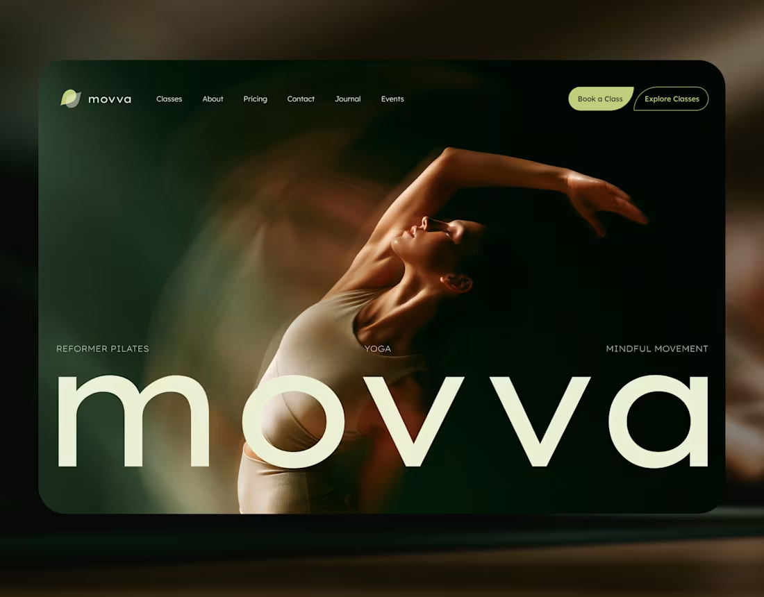
MOVVA — Yoga & Pilates Website Design and Webflow Development
1
23
262
Message
37
Maxim Zvarici
pro
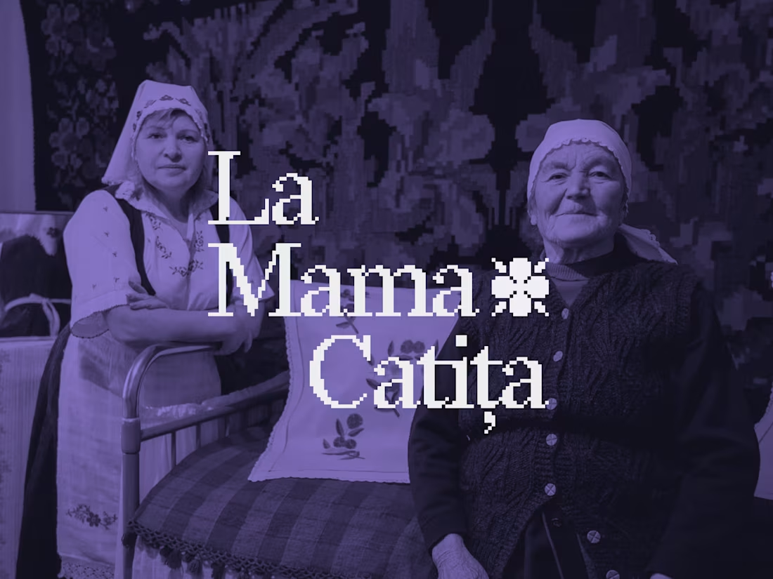
La Mama Catița Visual Identity Design
1
37
749
Message
23
Sasha Beglova
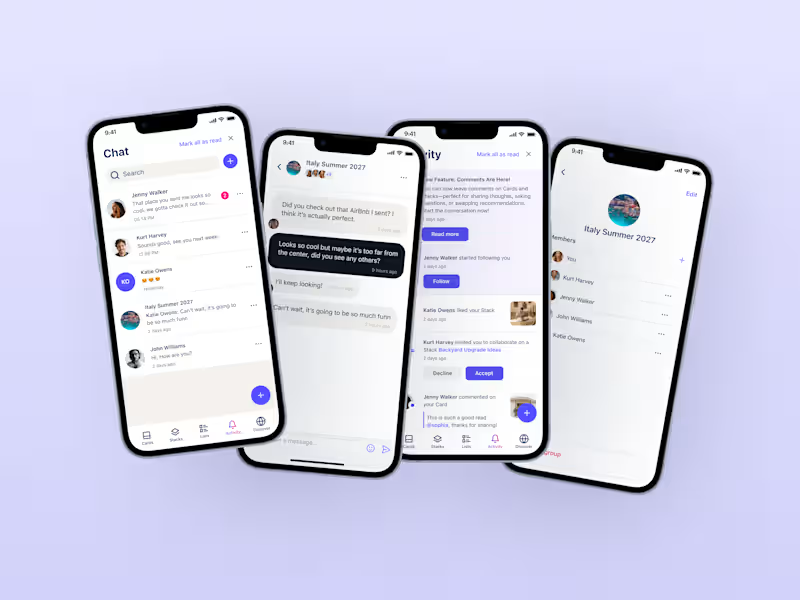
Stacklist | UI/UX & Graphic Design
23
506
Message
31
Flávia Jackeline
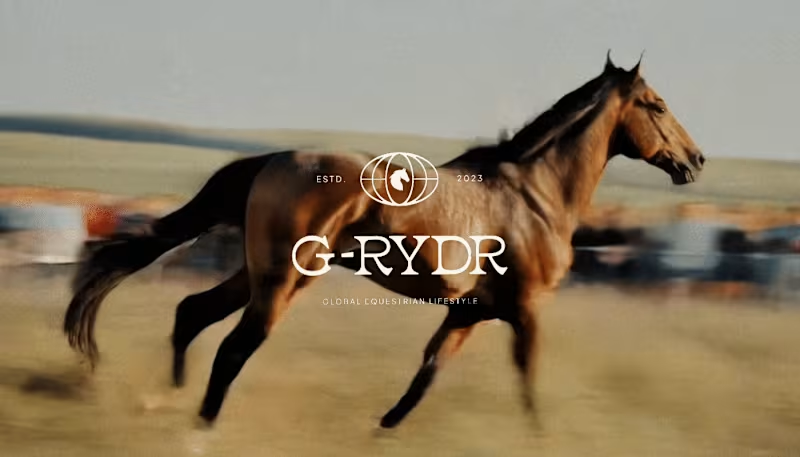
Visual Identity Design for G-RYDR — Equestrian Lifestyle
1
31
369
Web design projects using Framer
Framer
The best modern websites built on the leading web design tool, Framer
View more
Message
23
Kyle Panilan
max
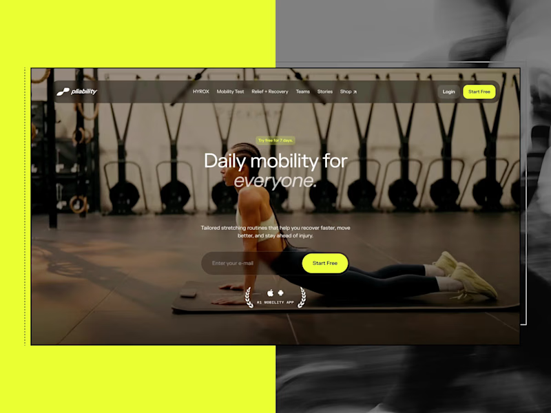
Framer Website for pliability: the #1 Mobility App in the World
1
23
712
Message
6
Domenico Griffo
pro
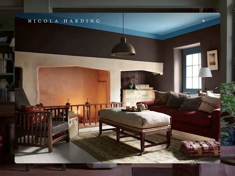
Nicola Harding & Co
6
142
Message
4
Rachel Cohen
pro
Starfish Studios Website Redesign
4
124
Message
14
Studio Ilker
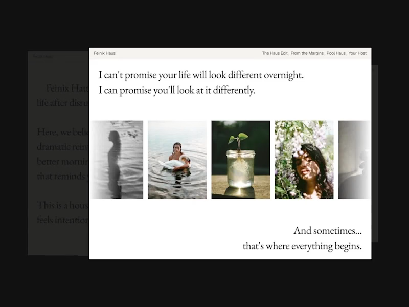
Feinix Haus Website
14
688
AI projects
AI
New projects from the best AI creators
View more
Message
12
Lisa Demchenko
max
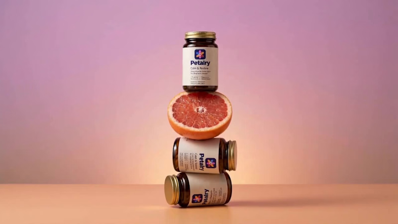
Petalry Brand Identity Development - Kittl exploration
12
372
Message
9
Alexandru Köllo
max
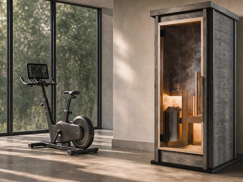
AI Product Visuals: Luxury Sauna Collection
9
153
Message
20
Darya Batyr ✦
max
Kotoba: Giving Voice AI a Human Visual Identity
20
324
Message
3
Viktor Gavrilovic
pro
MatchPro: Building soccer tournament schedules in seconds
3
113
Brand design projects
Brand design
Bold visual identities and branding systems created by top independent designers
View more
Message
10
Chantal Jemmott
pro
Label Redesign
10
200
Message
10
Olga & Joyd Branding ✦ Web Design
pro
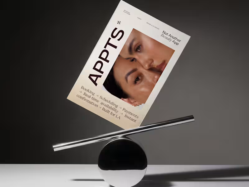
APPTS — Brand Identity & Mobile App Design
10
145
Message
8
Dane Kowachek
pro
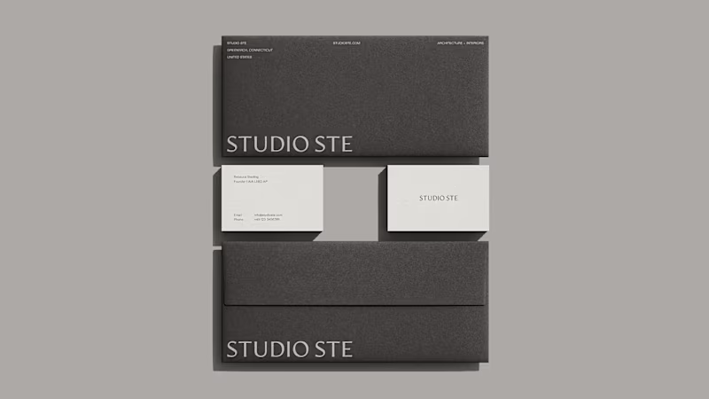
Brand Identity Development for Studio STE
8
92
Message
26
Daniel G Bright
max
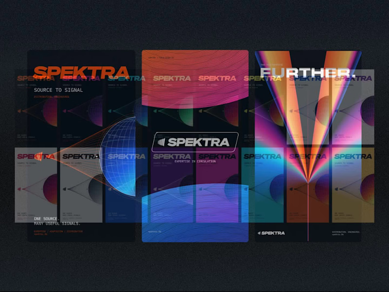
Spektra Visual Identity Development
26
459
Video editor projects
Video editing
Creative video edits made using today’s best editing tools
View more
Message
14
Jen Lai
pro
Gritzy | Social Media + OOH Animations
14
254
Message
12
Mykola Malyhin
pro
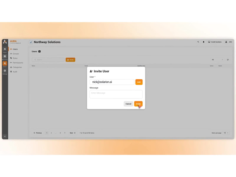
Aura | AI SaaS Explainer Video & Real UI Product Demo
12
113
Message
11
Bohdan Serdiuk
pro
Bolt New Slides V2 launch video
11
129
Message
11
Blahomyr Popok
max
Explainer video for PerformancePay - a motion design explainer
11
184
Standout projects
Standout projects
More projects we love that are making waves across the web
Message
6
Vuk .
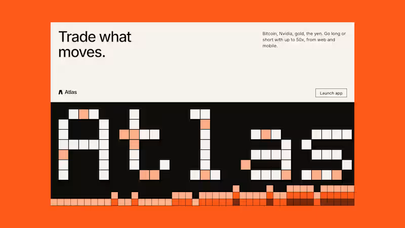
more from atlas - exploration
4
6
36
Message
4
Josh Bendall
pro
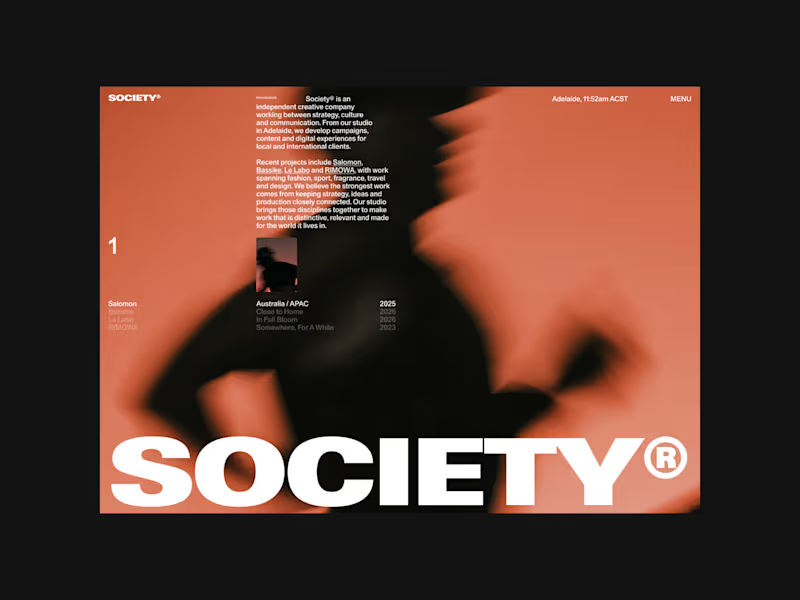
A first look at Society®. An independent creative studio specialising in strategy, creative direction, campaigns and digital experiences. Heres a look at the preloader and project showcase interaction on the homepage: an editorial approach to the traditional agency portfolio, with a simple preloader transitioning into a full-screen project showcase.
2
4
17
Message
4
samin panah
pro
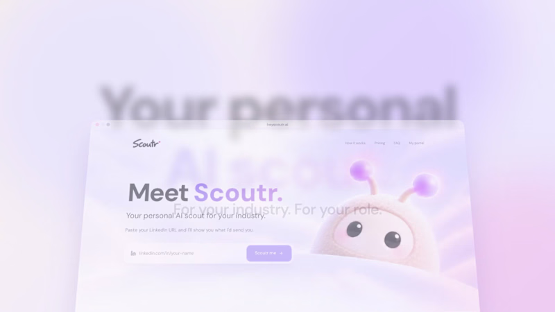
Just built Scoutr 🚀 Your personal AI scout that keeps you up to date with AI news, tools, and trends that actually matter to your role and industry. Simply connect your LinkedIn profile, and Scoutr figures out what's relevant to you. Here's a quick demo of how it works 👇 Check it out: https://heyscoutr.ai/
3
4
41
Message
6
Austyn McFadden
pro
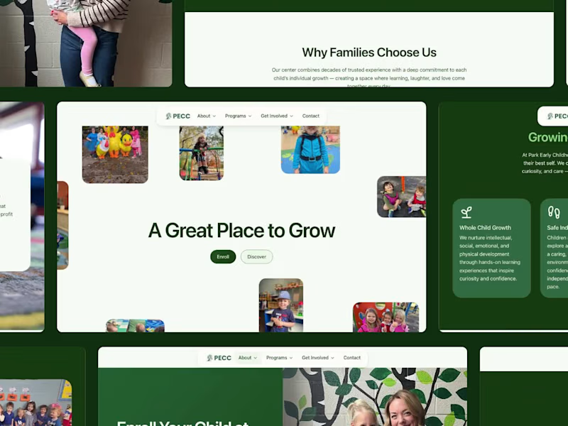
We designed and built a new website for Park Early Childhood Center in Lexington, KY. PECC has been caring for local families since 1979, and the new site lets parents feel that warmth before they ever walk in the door. Real photos of real kids. Clear paths to enroll, join the waitlist, or schedule a tour. Smooth interactions that make it fun to explore, on desktop and mobile. Live now at pecclex.org (http://pecclex.org) 🌱
3
6
97
Message
9
Anna Podrez
pro
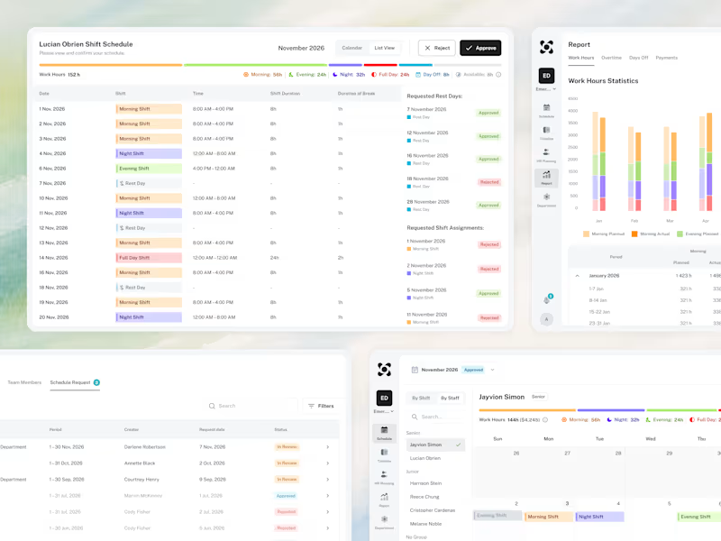
🧩 A look at how the whole system comes together as one connected experience.
4
9
90
Message
22
Aleksandar Coric
pro
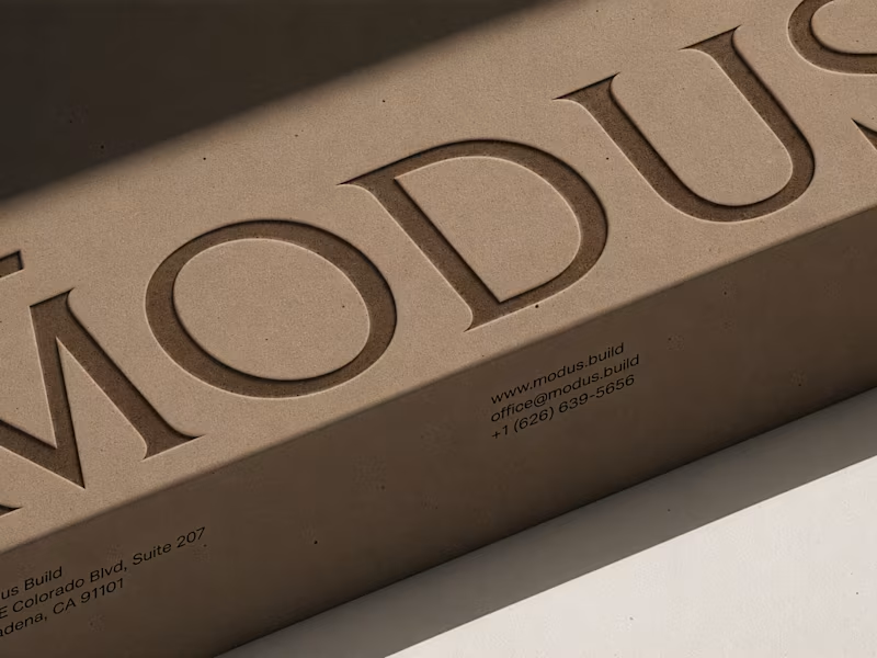
MODUS Build - Brand Identity & Web Design Coming from an architectural background, I approached MODUS Build with a particular appreciation for precision, proportion, and thoughtful design. The challenge was to create a distinctive identity that communicates these values without relying on conventional construction imagery. The concept was built around a simple typography idea: “The Measure of Good Building.” A small detail above the letter M represents a reference measure - a fixed length against which other dimensions can be measured. This subtle intervention gives the logo its meaning and connects it directly to the brand's philosophy. I carried this idea into a cohesive visual system, bringing together typography, graphic patterns, brand applications, and website design. For me, the most rewarding part was creating something visually refined yet purposeful, where even the smallest detail has a reason to exist, keeping the same principle as in architecture. #branding #logodesign #webdesign
16
22
264
Message
14
Austyn McFadden
pro
Vaughn is more than just a name to me. It was my grandpa’s last name. His brother Ed was the reason I fell in love with photography, which eventually led me to design. Neither of them are here anymore, but a little piece of both of them lives on through vaughn.agency
3
14
245
Message
12
Yaren Et
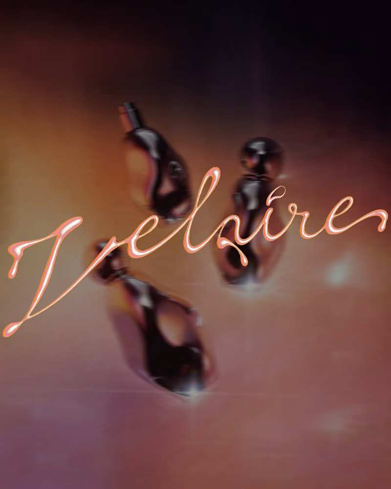
VELAIRE — Beauty & Fragrance Visual Identity A self-initiated identity exploring custom lettering, sensual art direction and a refined visual system across packaging, editorial and digital applications. Currently open to freelance and remote collaborations in branding, music, fashion and culture. Visual Identity · Art Direction · Logo Design · Campaign Design #VisualIdentity #ArtDirection #BrandDesign #LogoDesign #GraphicDesign
16
12
191
Message
17
Vladyslav Polishchuk
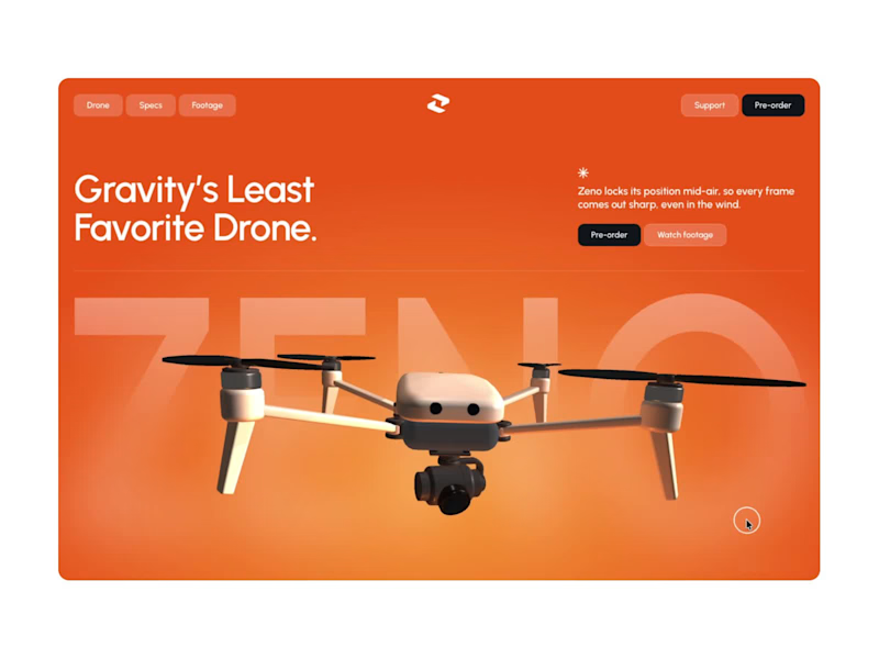
ZENO: 3D Landing Page for a Camera Drone I designed the layout and visual system in Figma, then built the interactive 3D hero in Spline together with Claude. I set the art direction, composition and mood. Claude worked directly inside Spline and helped assemble the drone scene, the materials and the interaction. I directed and refined every iteration.
6
17
255
Message
17
Raphael Sousa
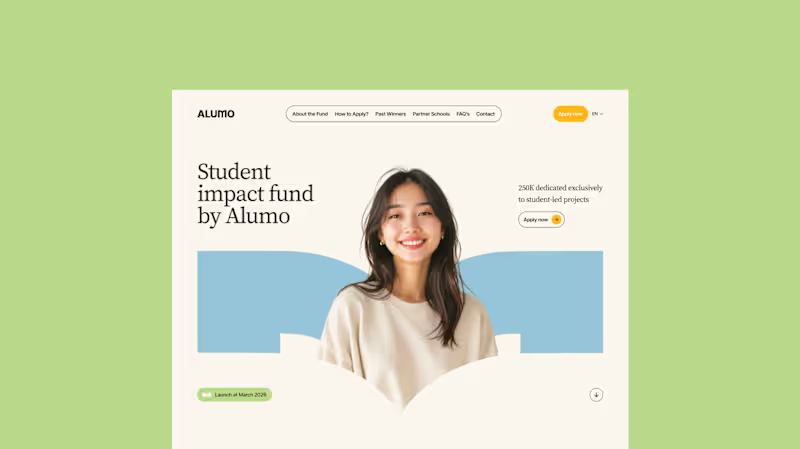
The Client: Alumo is a student impact fund that pools collective influence from influencers and partner schools to deliver a $250,000 annual grant program for student-led projects across Canada. The Issue: The fund needed a website that could communicate trust and purpose to two very different audiences — students applying for grants and partner schools or influencers considering joining — while also showcasing past winners and guiding applicants through the process clearly. The Solution: A multi-page website was designed with a warm, approachable visual identity using earthy tones, generous imagery, and clear information hierarchy. Each section — About, Past Winners, and How to Apply — was structured to reduce friction and build confidence, making it easy for students to understand eligibility and take action before the deadline.
13
17
262
Message
13
Vladyslav Holdysh
pro
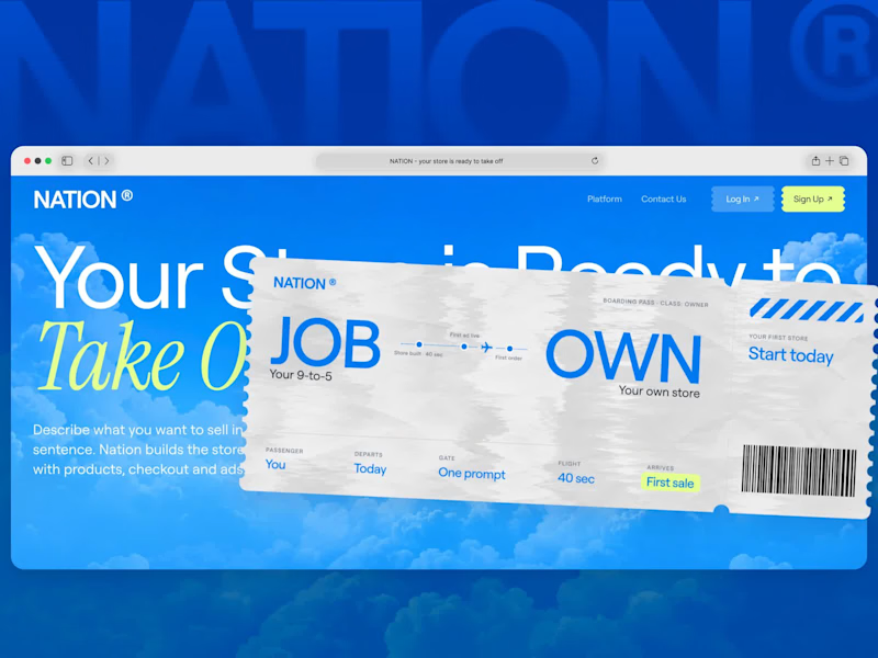
I designed and built this hero as a concept for Nation, an AI store builder for first-time sellers. You write one sentence, and Nation builds the store, runs the ads and ships the orders while you approve each step The brief asked for “a nation, not a SaaS.” A nation is somewhere you travel to, so the hero is a boarding pass for one trip: JOB → OWN, from your 9-to-5 to your own store. The ticket’s only highlight is “First sale,” which promises money without promising a number Before the ticket I tried a flag, a passport, a main street of shops and a shipping box. The box didn’t make it, but its airmail stripes ended up on the stub On the live page the two torn halves of the ticket snap together, the page builds around it, and hovering flips it to the back. Below that, one real seller’s story explains the product with the interface set into the sentence Live site: nation-site-xi.vercel.app (http://nation-site-xi.vercel.app)Concept work, not affiliated with Nation
6
13
259
Message
16
Aria Muhammad
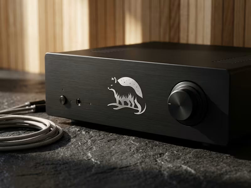
Engineering technical restraint for Nordic Sounds, a cinematic audio production studio. The identity pairs an Arctic Fox silhouette with a celestial starry dome, calibrated for micro scale legibility, laser engraving on bead blasted aluminum, and silver foil stamping on rigid paper boxes. Zero decorative fluff, pure functional clarity. Full case study on profile.
8
16
247
Message
9
lion create
pro
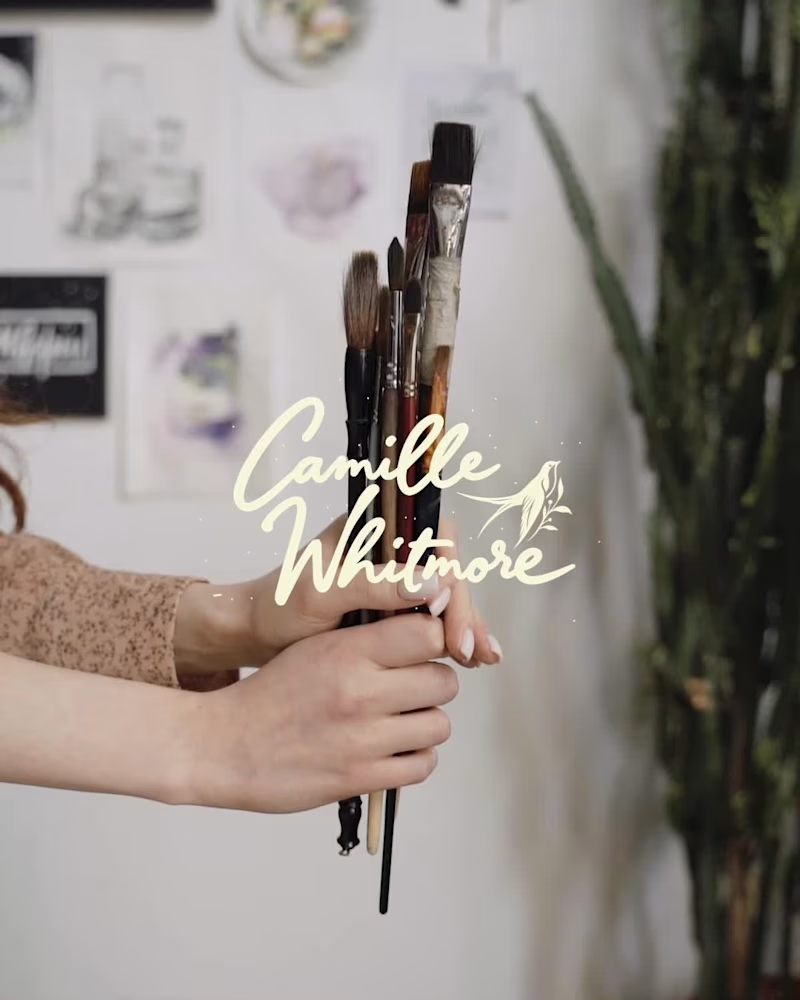
Camille Whitmore is a therapist for artists and creative minds. She works with Expressive Arts Therapy, an approach that uses the act of creating (painting, gesture, writing, sound) as a way into what emotion keeps hidden. For those who live by their sensitivity, art is not a hobby, it is a language. And through that language, Camille guides each person back to themselves. And why the swallow? Because the swallow is the bird that always returns. No matter how far it flies, it finds its way home. That is exactly what happens here: art takes you far, inward, toward what was hidden, and brings you back to yourself. The flight is the transformation. The return is the healing. #expressivearts #arttherapy #forartists #creativemind #creativeprocess #selfdiscovery #artheals #emotionalwellbeing #sensitivesoul #artistlife
5
9
114
Message
17
Austyn McFadden
pro
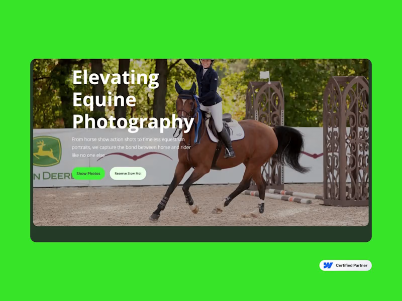
A new digital home for Winslow Photography. Based in Wilmington, Ohio, Winslow has been capturing the equestrian world since 2008, from major horse shows to the moments that make the bond between horse and rider so special. I had the opportunity to design and develop their new website in Webflow, while also helping with copywriting and art direction. The goal was simple: let their incredible photography lead, create a better experience for visitors, and build a website that feels as polished as the work they produce.
2
17
458
Message
21
acream
pro
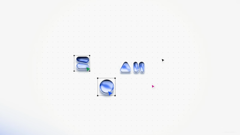
Visual Direction for Zoah(an a16z speedrun company) — 10-Day Motion Sprint Sound on Core Focus: ✦ Agent Builder: Direct canvas manipulation flow. ✦ Design is Code: Seamless transition between frame & code. ✦ Vector & Canvas Collabration Branching: Fluid spatial micro-interactions and with dynamic, multi-threaded branch animation. ✦ Custom Spatial Audio: Tactile sound design built from scratch to complement every pixel movement. From zero to a polished demo experience in 10 days. *For reference only, all final product details , official announcements and brand details remain subject to Zoah's official release. Designed & Animated by @acream_1
11
21
806
Message
11
Robert Kostrzewa
At first glance, this looked like a simple experiment. In reality, it turned out to be much more challenging than I expected. 👀 Another round of generative AI testing, this time focused on transforming a logo and placing it into various creative environments. Nano Banana performs surprisingly well for this kind of task and offers a strong level of control over the final output. The creative possibilities are huge, and at this point the main limitation is really imagination ✨ Even with prompts designed to preserve proportions and logo scale, the model did not always remain fully consistent. In some cases the geometry or size of the mark shifted slightly, so I used Generative Fill in Adobe Photoshop to clean up the final details. Interestingly, generating the assets was not the hardest part. Once I started adding music and building a more dynamic edit, it became clear how much work it takes to polish even a seemingly simple concept 🎬 Overall, I’m really happy with the result and will definitely keep exploring this direction. Visuals created in @Magnific Spaces, currently my favorite tool for this type of work. Editing and animation done in Adobe After Effects. #GenerativeAI (https://www.linkedin.com/search/results/all/?keywords=%23generativeai&origin=HASH_TAG_FROM_FEED) #AIDesign (https://www.linkedin.com/search/results/all/?keywords=%23aidesign&origin=HASH_TAG_FROM_FEED) #CreativeAI (https://www.linkedin.com/search/results/all/?keywords=%23creativeai&origin=HASH_TAG_FROM_FEED) #BrandDesign (https://www.linkedin.com/search/results/all/?keywords=%23branddesign&origin=HASH_TAG_FROM_FEED) #MotionDesign (https://www.linkedin.com/search/results/all/?keywords=%23motiondesign&origin=HASH_TAG_FROM_FEED) #NanoBanana (https://www.linkedin.com/search/results/all/?keywords=%23nanobanana&origin=HASH_TAG_FROM_FEED) #VisualDesign (https://www.linkedin.com/search/results/all/?keywords=%23visualdesign&origin=HASH_TAG_FROM_FEED) #AIWorkflow (https://www.linkedin.com/search/results/all/?keywords=%23aiworkflow&origin=HASH_TAG_FROM_FEED) #netflix (https://www.linkedin.com/search/results/all/?keywords=%23netflix&origin=HASH_TAG_FROM_FEED) #freepik (https://www.linkedin.com/search/results/all/?keywords=%23freepik&origin=HASH_TAG_FROM_FEED)
10
11
293