pro
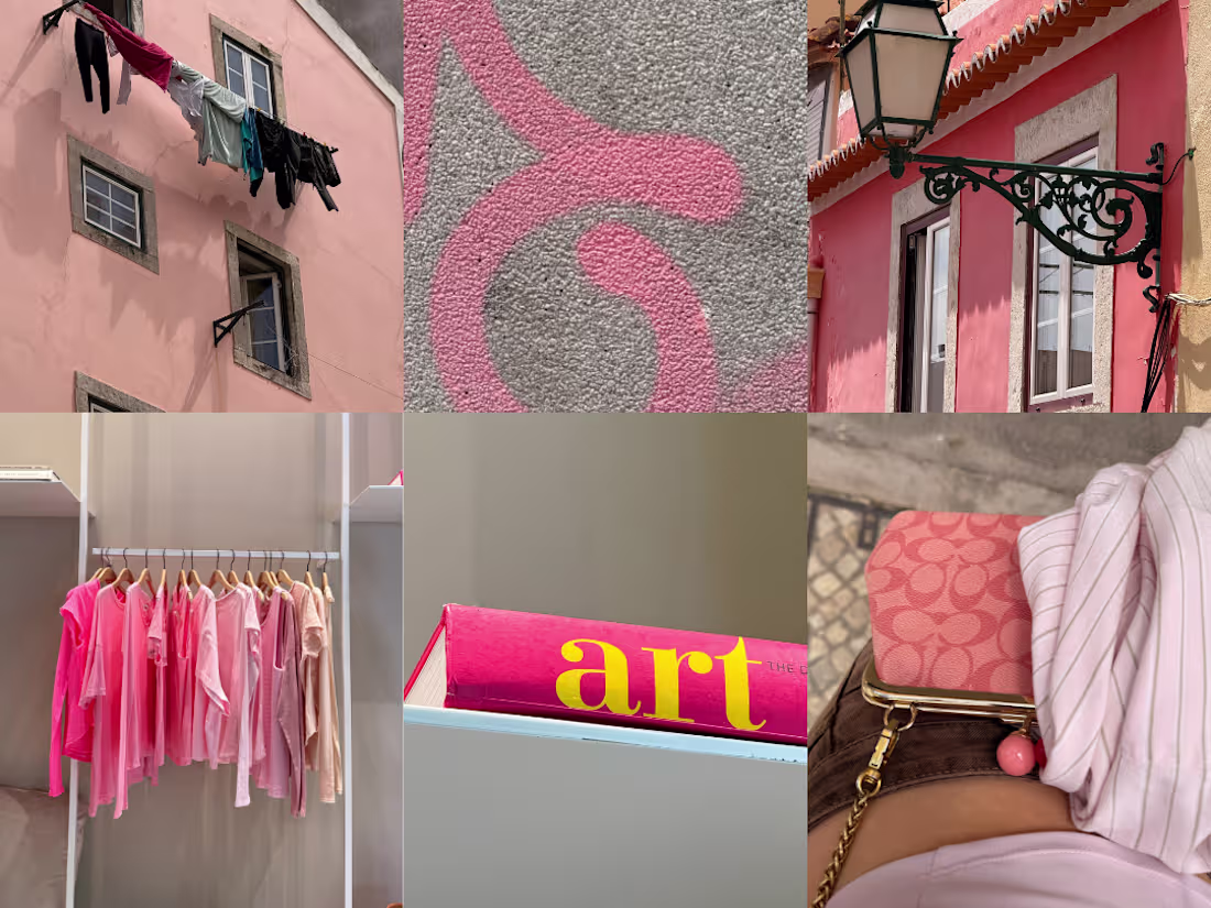
Color hunting in Lisbon w/ creative designers.
5
41
1.7K
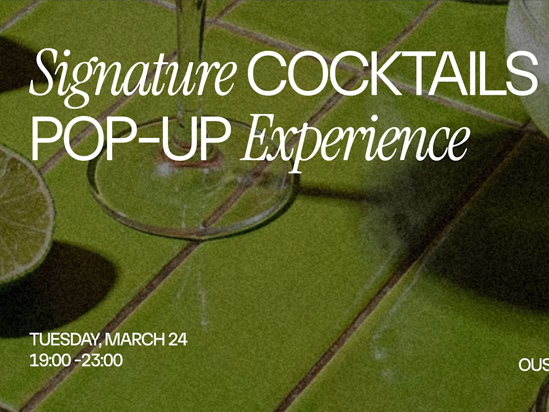
I designed a poster for a cocktail bar event using Kittl.
Which poster version do you prefer (1 or 2)?
10
55
3.8K
Love how this post I designed turned out!
Post (https://www.instagram.com/p/DVv9jIKjAoP/?img_index=1)
14
2.4K
Designing a poster using @Kittl
(SOUND ON)
4
26
3.1K
Memory Capsule (https://memory-capsule.figma.site)
It’s a space where memories are cherished and kept alive.
🏞️ Share why this moment is so special to you.
👀 Explore everyone’s memories and relive February together.
X post
(https://x.com/ritadigore/status/2028271314331476226?s=20)Figma Community Preview (https://www.figma.com/community/file/1610089455546982171/memory-capsule)
13
64
3.6K
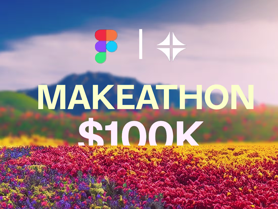
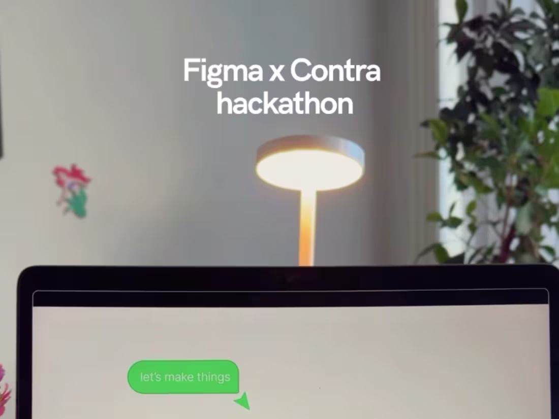
Designers, creators, builders @figma (https://www.instagram.com/figma/) x @contra (https://www.instagram.com/contra/) Makeathon 2.0 is live now!
There is a $100K cash prize 🤑
JOIN HERE (https://on.contra.com/gLpFPt)
12
45
4.8K
Who's joining?
40
134
13.3K
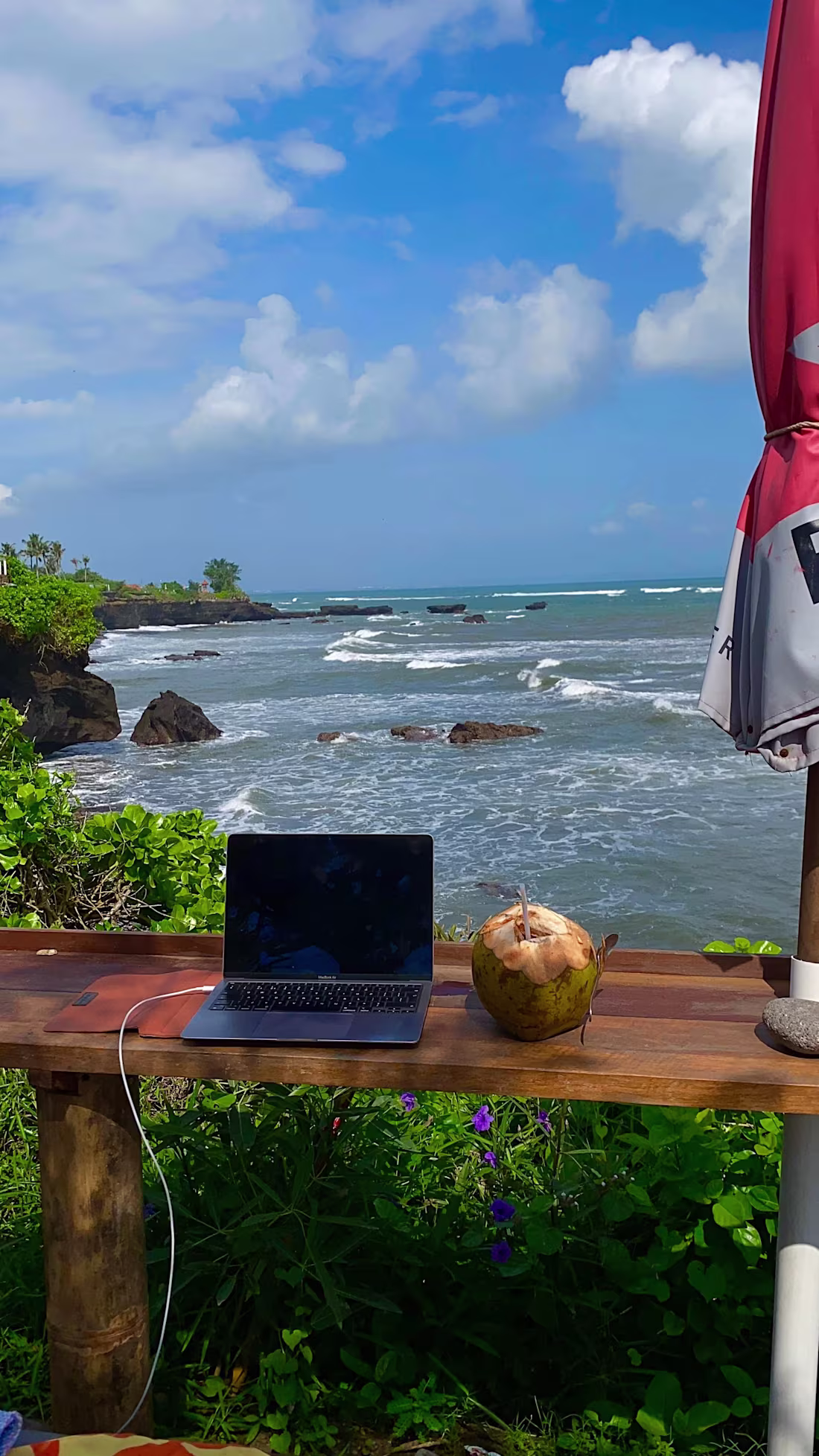
Coworking from Lisbon ☀️
Anyone else based here?
9
38
1.6K
Hearing this client testimonial makes me so grateful I took the risk and chose the path of being an independent creative 💛
[Audio On] 🎧
12
45
2.1K
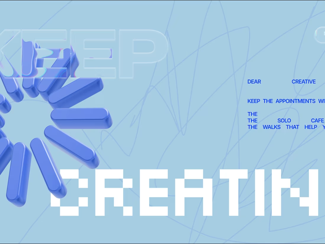
The process of designing the “Keep Creating” card with Spline Hana.
You can see that at the beginning, I was just experimenting with shapes. Honestly, I didn’t know where I was going. I only had the words “Keep Creating” in mind.
Then I remembered I had written a short paragraph a few months ago about my creative solo dates, where I don’t put too much pressure on myself. I do them just for the sake of getting that spark and enjoying the process of creating.
In the final card, I used 3D shapes, a liquid glass effect on the cursor and the word “Keep”. I used the system font and found it perfect for the word “Creating.”
I honestly love the final look.
Click to see the card here. (https://app.spline.design/community/file/004799e8-cf05-4576-b78f-a9ea3d56cec4)
29
99
3.5K

One of my favourite projects in 2025 was working with one of my good friends on her new brand identity, Made For More ☀️
An umbrella brand that holds her mentorships, nutrition coaching, podcast, social media presence, and more.
It was definitely more challenging. When you work with someone you know, your self-expectations are higher. But that also made it exciting.
Seeing this brand identity come together was genuinely special.
I’m still putting the full case study together for Contra, but here’s a sneak peek.
The project was built using Figma and Adobe Illustrator, with Canva used to organise and hand over all the assets so she can confidently use and scale them in the future.
This is the kind of work I want more of in 2026. Brands with soul. Brands that tell a story and shape culture.
49
149
3.4K
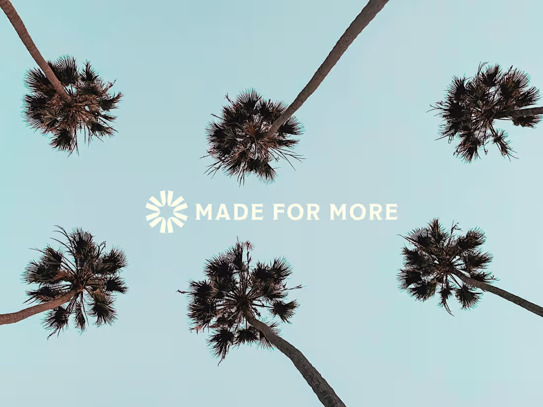
Finished the brand guidelines for the Made for More brand ☀️
The full case study is coming soon!
9
55
2.8K
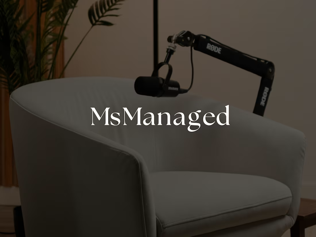
Visual identity design project for MsManaged
20
140
4.2K
![Cover image for MsManaged Podcast [Brand Identity & Logo Design]](https://media.contra.com/image/upload/q_auto,w_1100/zjhxn36am1xwkqopiiqu.avif)
MsManaged Podcast [Brand Identity & Logo Design]
6
99
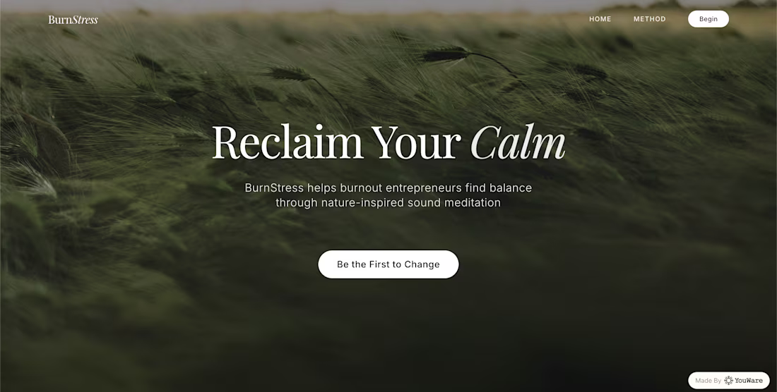
BurnStress is a wellness platform offering nature-inspired sound meditations for burned-out entrepreneurs.
The design is inspired by earthy, natural tones that feel grounding and calm.
The core functionality is a waitlist email collection, designed to build anticipation and create gentle tension for the user.
Link to BurnStress (https://burnstress-wellness.youware.app/)
22
85
3K
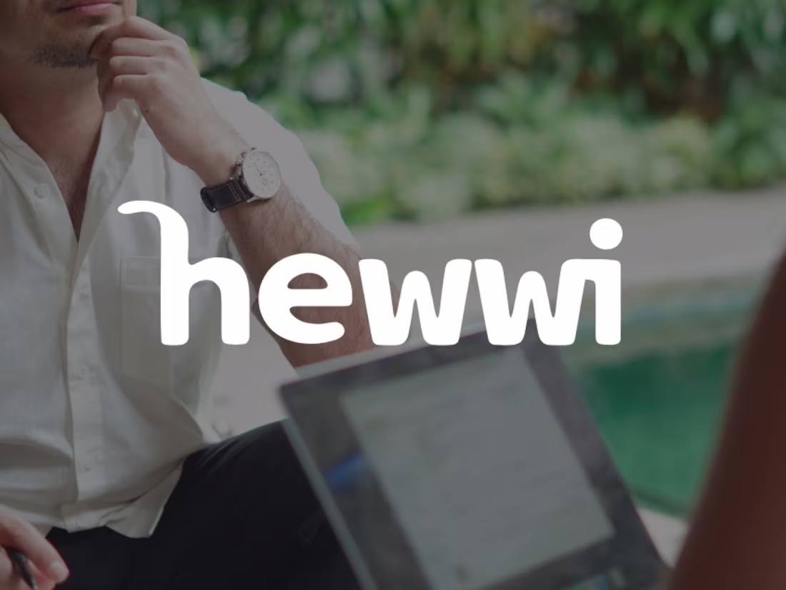
![Cover image for 📔 [Product Branding] Hewwi](https://media.contra.com/image/upload/q_auto,w_1100/ihygzsreyrzafaz6vnbx.avif)
📔 [Product Branding] Hewwi
24
379
Looking back, working on Hewwi project brought me the most joy ever.
Back in 2024, Zain (prev. @Canva Subscriptions Mgr) reached out to me to design the branding for Hewwi.
After designing the Hewwi brand identity, we focused on the journal design itself.
In the video attached, you'll see the Hewwi App, designed based on the visual identity.
The best reward was seeing @Ben Huffman meet Zain and seeing the journal itself IRL(see pic in the replies).
For this project, I used Adobe Illustrator, Figma, and Jitter to showcase the work.
All project links:
➡️ Brand Identity Case Study
(https://contra.com/p/6krUOQqb-brand-blueprint-or-visual-identity-for-hewwi?referralExperimentNid=DEFAULT_REFERRAL_PROGRAM&referrerUsername=margaretadigore)➡️ Journal Design (https://margaretadigore.contra.com/p/Qq6Xo2gQ-packaging-design-hewwi)
15
48
2.8K
Brand Blueprint | Visual Identity for Hewwi
27
865
Brand Design Partner
22
1.5K
I made this video to showcase the creative process behind this project (https://on.contra.com/rWnNDk) I submitted
🔗 video link (https://www.instagram.com/p/DI0zj8EzC0b/)
8
2.5K
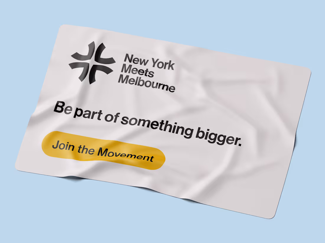
Brand Identity Design for YouTube Channel
114
1.5K
Another brand identity project I worked on earlier this year.
New York Meets Melbourne is a YouTube channel focused on interviewing local creatives.
The main concept behind this brand identity is community and collaboration among creatives.
If you want to see the creative process behind this project, click on this video (https://www.instagram.com/p/DI0zj8EzC0b/).
I used Jitter to create this motion bento graphic, as well as Figma and Adobe Illustrator for the design itself.
➡️ Full project here (https://contra.com/p/6rPAMsOr-brand-identity-design-for-you-tube-channel?referralExperimentNid=DEFAULT_REFERRAL_PROGRAM&referrerUsername=margaretadigore)
12
57
2.8K
I tried Builder.io for the first time, and we are a MATCH hehe.
I built Flowhaus (https://2ee3fede33774a30bcb4babbe509512a-main.projects.builder.my), a creator dashboard that helps you track your client project time and income.
A few interactive features I built inside it:
• The time tracker actually spins faster when you press start.
• You can add any project details and it automatically calculates your earnings per week and month.
• You can track your leads and client projects, duplicate them, and drag them across.
Honestly, as a brand designer, this is the first tool that actually feels easy.
I’ve been iterating along the way; the design page (figma style) is a lifesaver. No need to type a prompt for every tweak; you just change it quickly and keep moving.
69
212
5.2K
Contra UGC Video Campaign
12
473
$1.8K+ earned
1
9
325
$1K+ earned
Digital Nomad Life | Content Creation for Contra
73
3.9K
Contra Refer and Earn Contest Payment
9
202
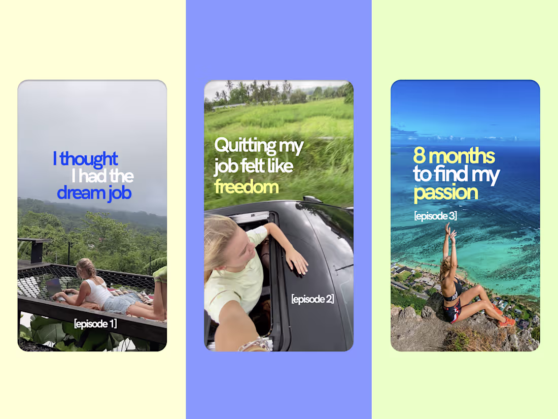
I created this video for a content creation contest, and it made it to the TOP 50 out of thousands
The topic is: What 2 weeks OFF social media taught me
At the end, you will see a branding I designed while being in Vietnam
See the contest entry (https://www.instagram.com/reel/DCHbEqnJV-z/)
30
2.5K
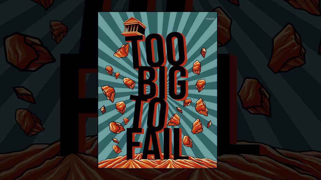
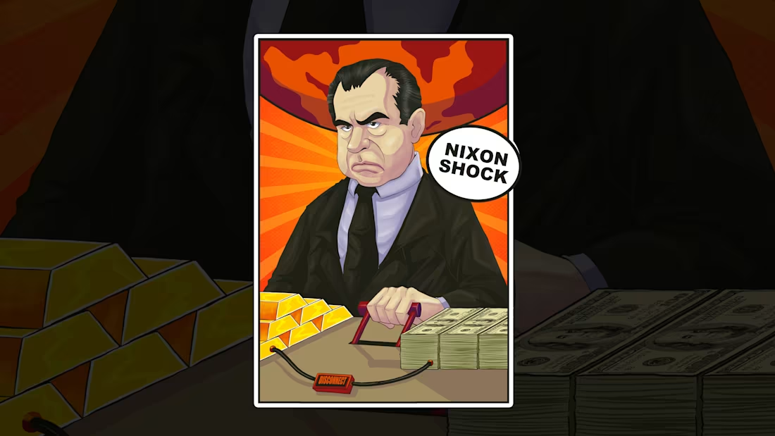
Historical Financial Illustrations
This illustration series looks at 3 key moments that changed the global financial system.
< 2008 – Global Financial Crisis & the Birth of “Too Big to Fail”
< 1971 – Nixon Ends Gold Convertibility (“Nixon Shock”)
< 2009 – Genesis Block of Bitcoin
Full project case study (https://contra.com/p/3lemX33e-historical-financial-illustrations-for-stokr?referralExperimentNid=DEFAULT_REFERRAL_PROGRAM&referrerUsername=ritadigore)
14
44
1.8K
Historical Financial Illustrations for STOKR
2
35
I built a new feature for Contra using Tempo Labs
Feature: Simple To - Do List inside Contra
I am proposing a built-in to-do list inside Contra, made specifically for freelancers and creators managing multiple projects at once.
This isn’t another generic task app. It lives inside the platform where the work already is. You can quickly add tasks for clients, content, deadlines, and personal admin in one clean space.
Why this should exist on Contra:
Because the first thing a freelancer needs is clarity on what to do next. If Contra already helps us find work, it should also help us get the work done.
Test out the feature on this link
(https://37a5656c-d2e1-414c-b2dd-972c46e76600.canvases.tempo.build/)Would you use this feature?
30
93
2.3K
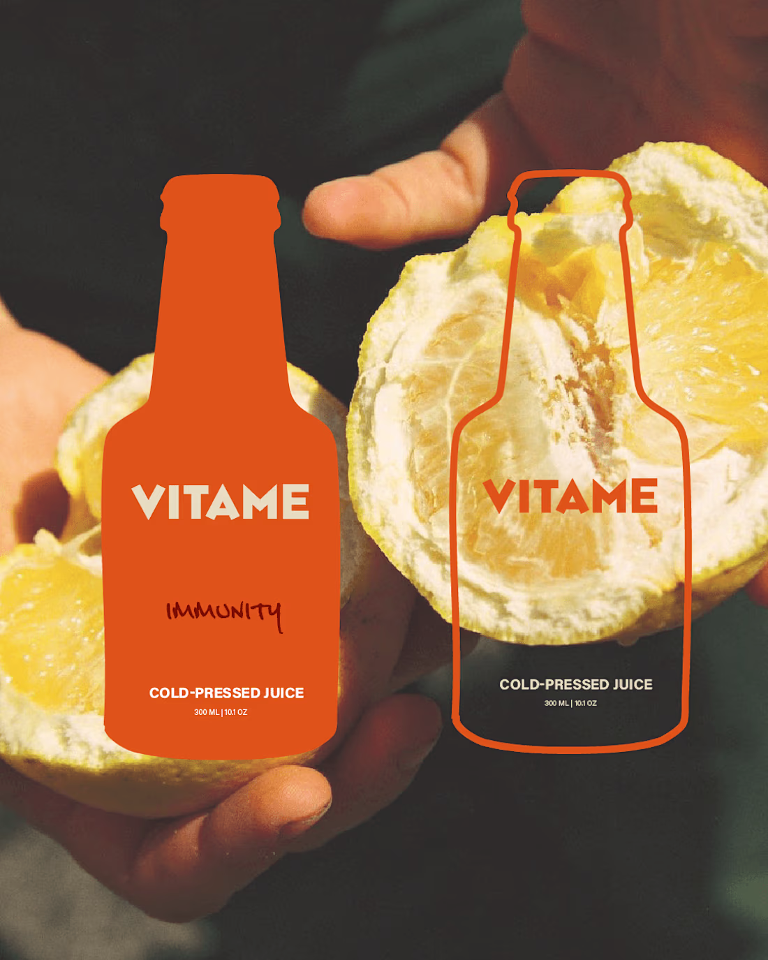
🍊 Vitame Branding
When I feel like creating something outside of client work, I take on passion projects and design just for fun.
Vitame is a cold-pressed juice brand that harnesses fresh, nutrient-rich ingredients to create energising juices for a healthy lifestyle.
54
131
3.8K
🍊 Vitame Branding
9
196
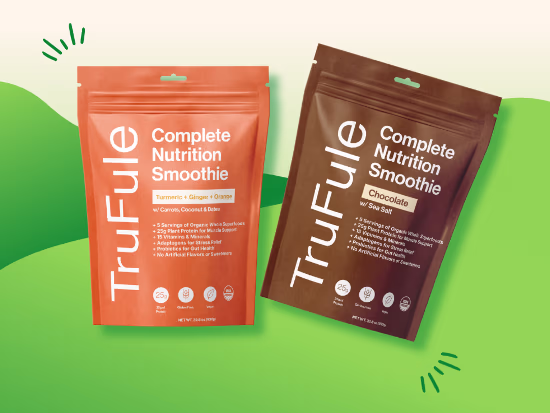
Bold Smoothie Powder Brand Identity
6
69
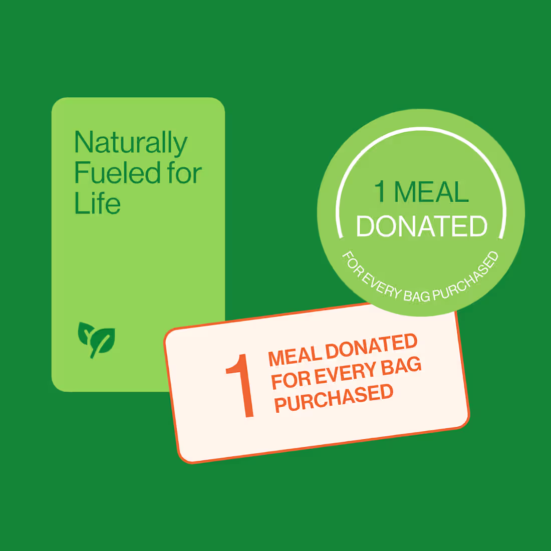
Bold Smoothie Powder Brand Identity
I crafted a vibrant new brand identity for a smoothie powder brand. The result is a bold, colorful visual system that captures freshness, flavor, and modern vitality.
Full case study (https://contra.com/p/NsNvBWMP-bold-smoothie-powder-brand-identity?referralExperimentNid=DEFAULT_REFERRAL_PROGRAM&referrerUsername=margaretadigore)
25
75
2.2K
I love Vietnamese food! When I visited Ho Chi Minh City (Saigon), I bought a disposable camera and spent the day taking photos around the city.
While doing that, I got so inspired that I decided to design my two favorite Vietnamese dishes.
Part 1: Banh Mi 🥖
When I think of Vietnamese street food, I always picture the iconic red plastic chairs, so I incorporated it into the packaging pattern. The red color represents the vibrancy of the flavors.
15
55
2K
Part 2: Pho 🍲
In Part 1 (https://on.contra.com/NzQpPC), I shared how I designed two of my favorite dishes while visiting Saigon.
Pho is my comfort food...warm, rich, and full of unforgettable flavor.
The logo animation represents the diagonal motion of the noodles. I also made a video (https://on.contra.com/pzpzKm)about how I got inspired to design these two dishes.
10
46
1.7K
![Cover image for 🍦 [Logo Design] Ice Cream Branding](https://media.contra.com/image/upload/q_auto,w_1100/qbxflormdga94bdrbu0s.avif)
🍦 [Logo Design] Ice Cream Branding
10
175
![Cover image for 📦 [Packaging Design] Companion Candles](https://media.contra.com/image/upload/q_auto,w_1100/k47mknsmlmdbdnnhqtlw.avif)
$570 earned
📦 [Packaging Design] Companion Candles
9
389
Figma x Contra UGC Video
0
44