Built with Jitter
Bold Smoothie Powder Brand Identity
Rita Digore
Verified
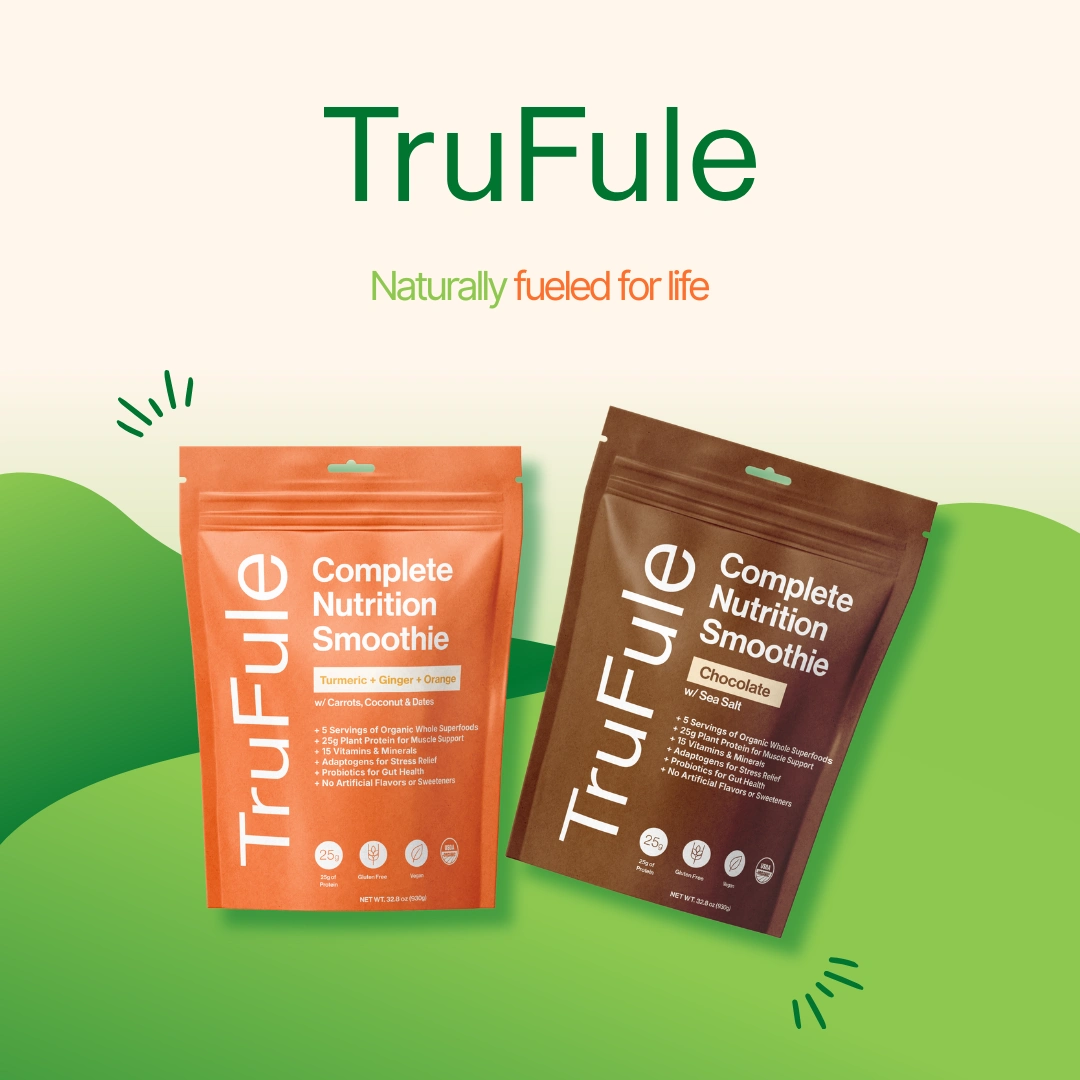
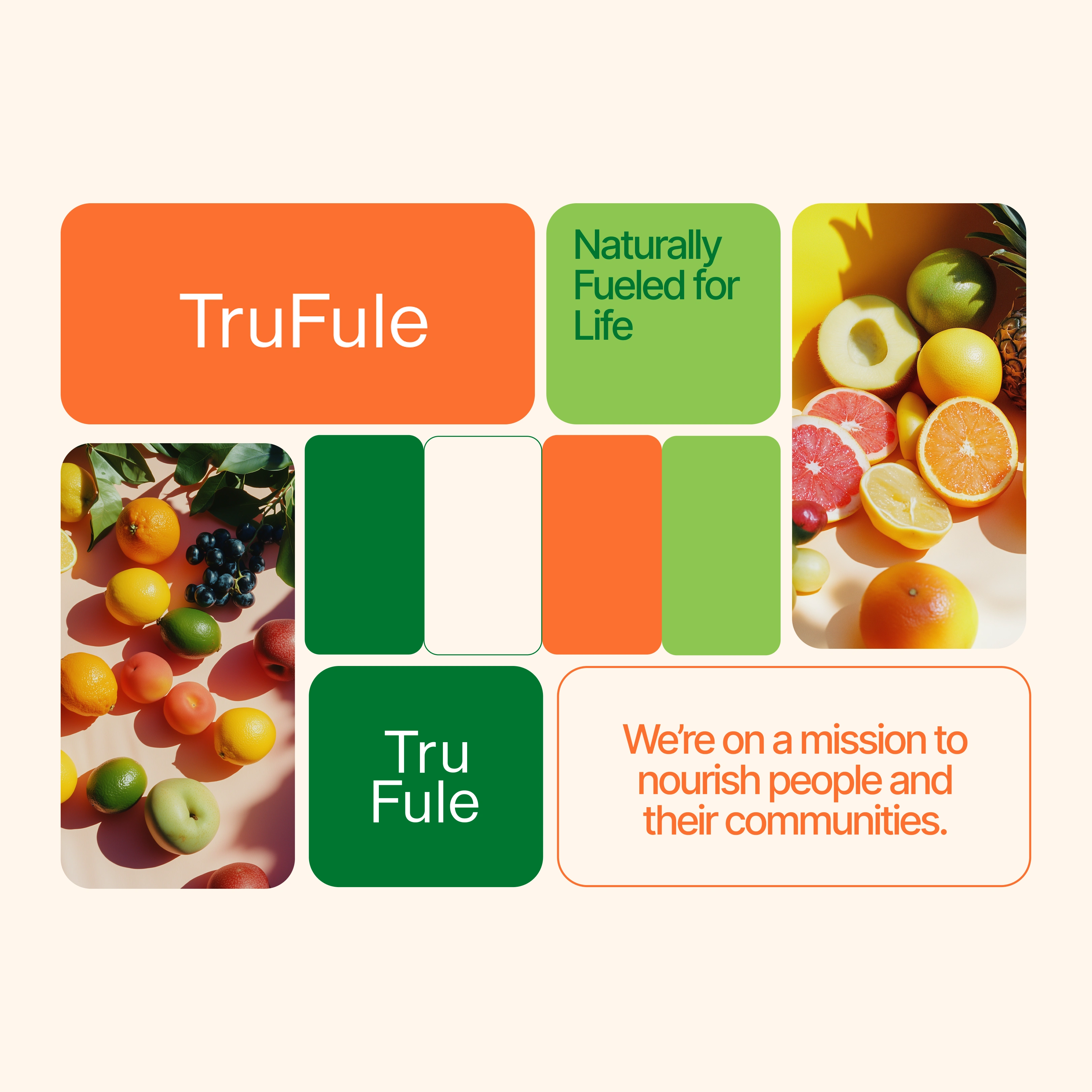

Case Study: TruFule Brand Identity
Problem:
TruFule’s old branding felt generic and failed to reflect the brand’s energetic, flavorful essence. It needed a look that would grab attention and communicate freshness in a crowded health market.
Solution:
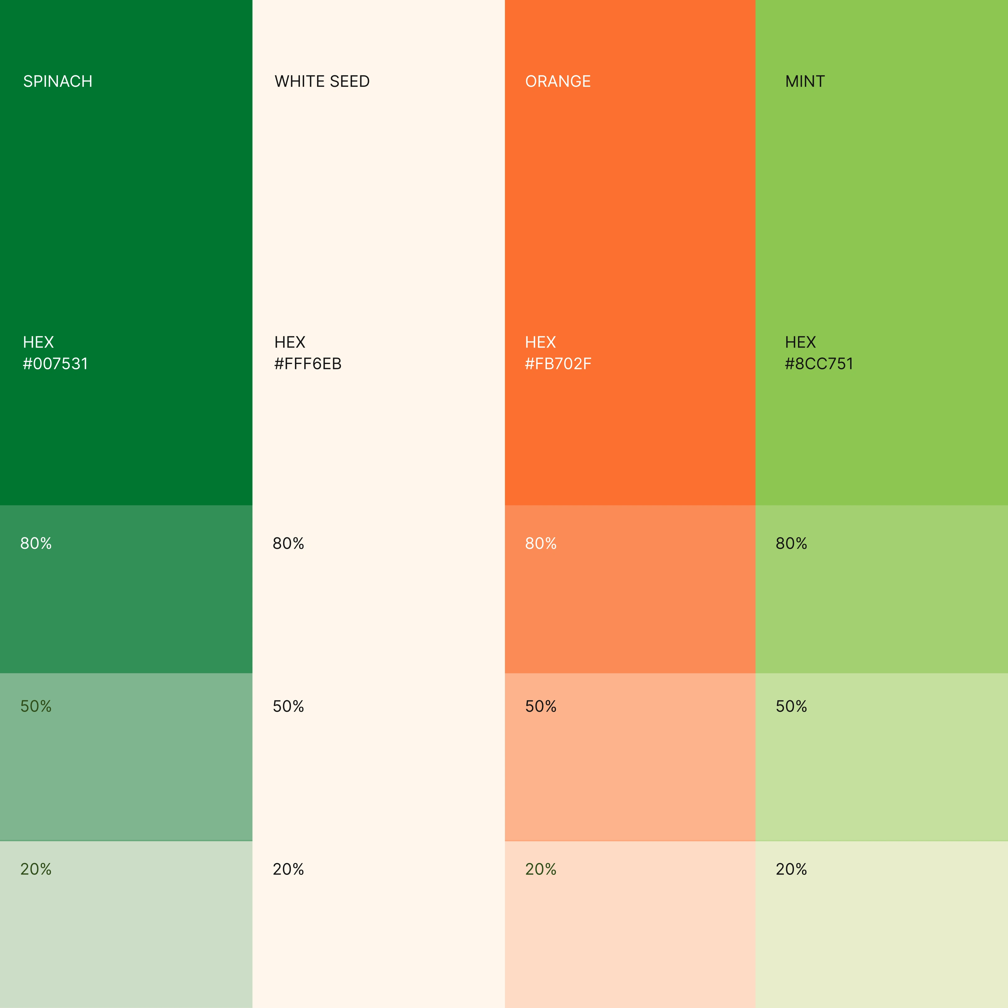
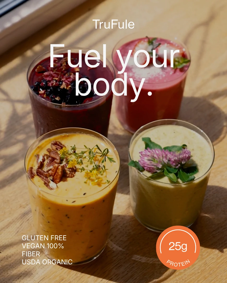
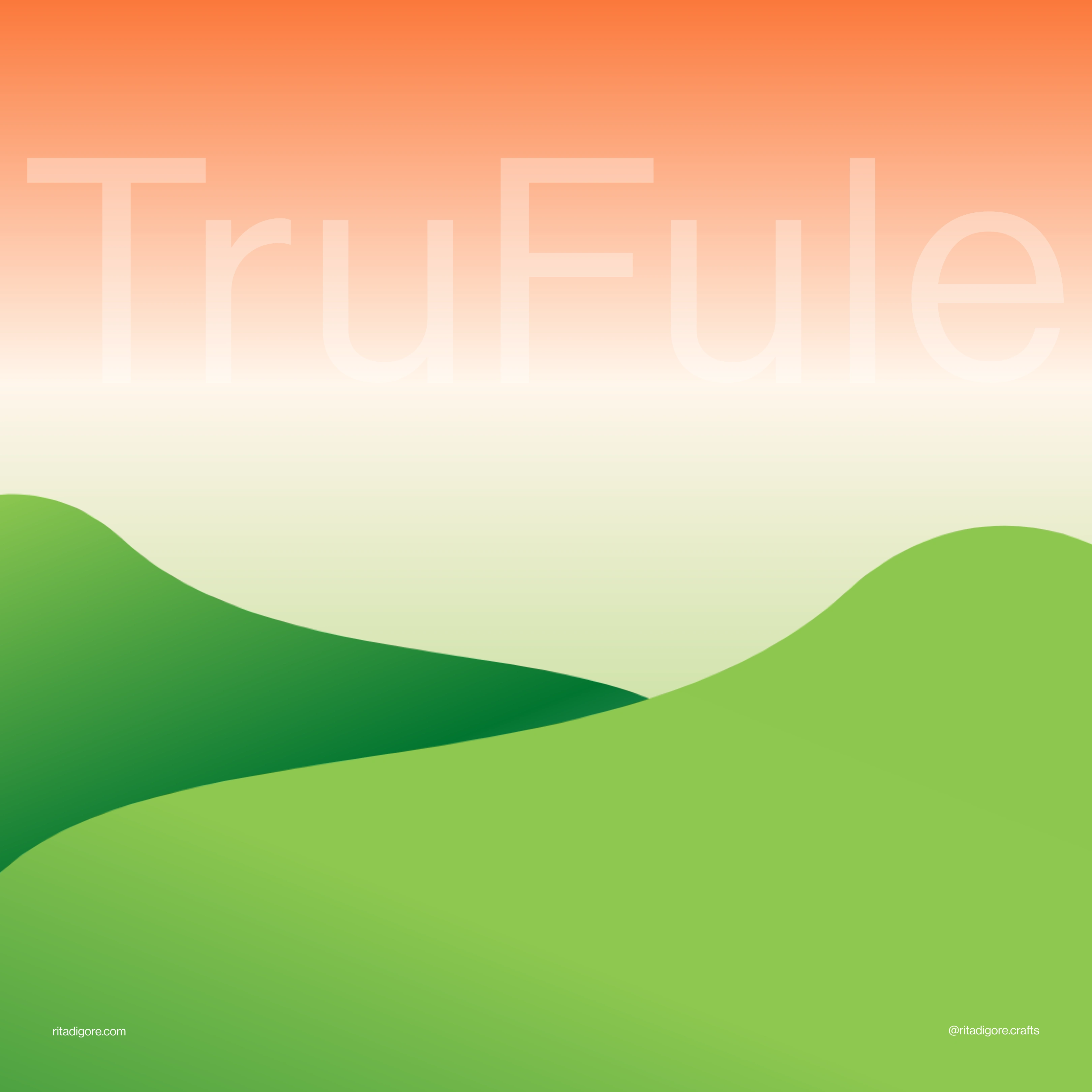
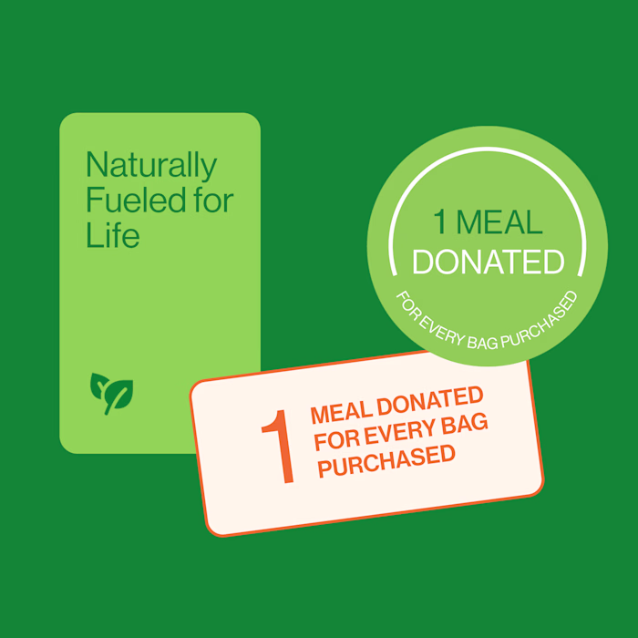
I created a bold, colorful visual identity that embodies TruFule’s vitality. The new design features vibrant color palettes, expressive typography, and packaging that energizes the shelf and connects with modern, health-conscious consumers.
Like this project
Posted Oct 19, 2025
Created a bold, colorful brand identity for a smoothie powder brand that bursts with energy and stands out on shelves with fresh, vibrant appeal.
Likes
6
Views
69
Timeline
Jun 11, 2025 - Sep 3, 2025
Clients
Stantt


![🍦 [Logo Design] Ice Cream Branding](https://media.contra.com/image/upload/c_fill,w_700/qbxflormdga94bdrbu0s.avif)