🍦 [Logo Design] Ice Cream Branding
Rita Digore
Verified
About
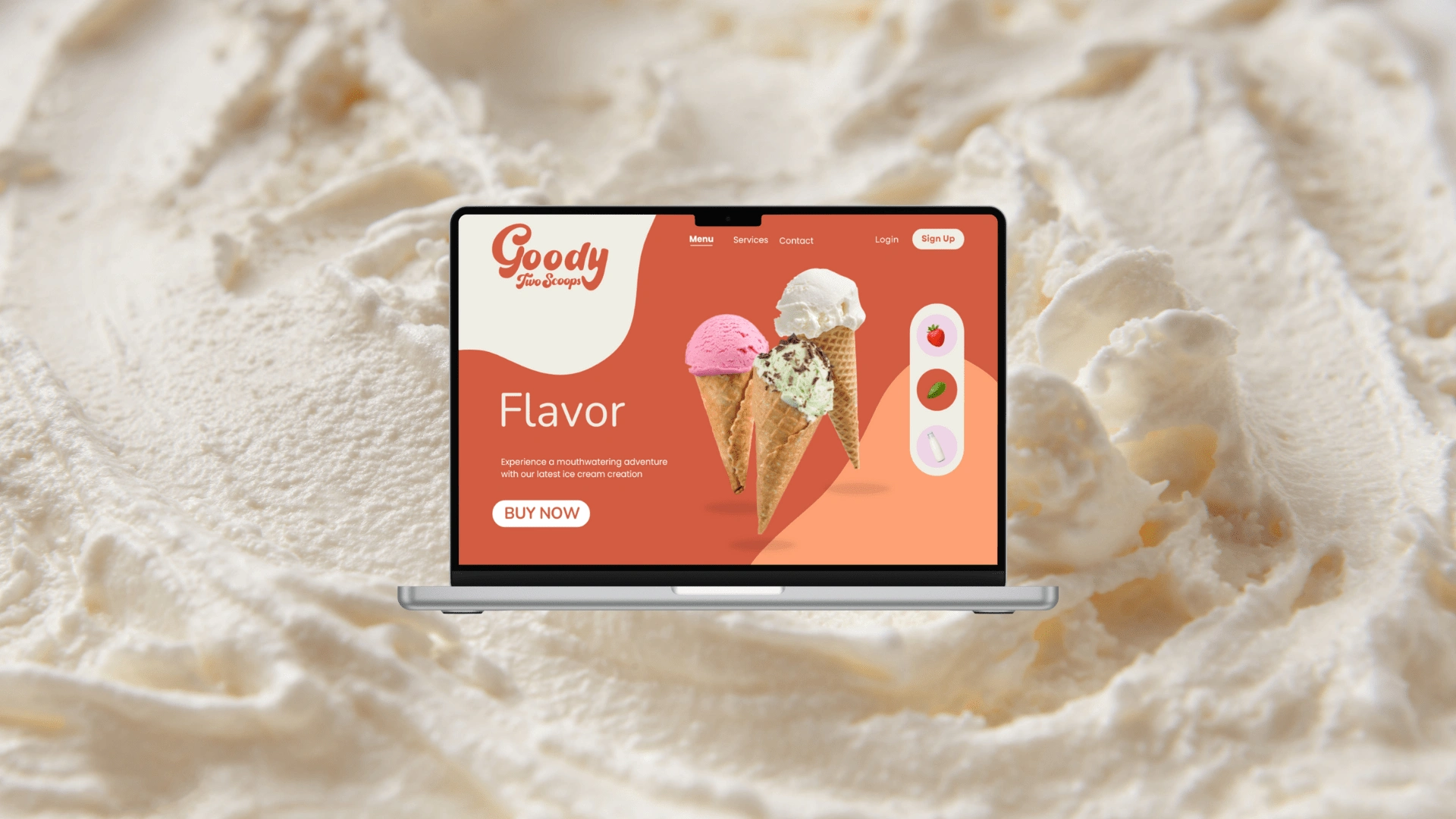
Goody Two Scoops is not just an ice cream brand; it’s a joyful indulgence that blends fun with wholesome goodness. Born from a passion for crafting delicious, innovative flavours, Goody Two Scoops emphasizes the use of natural ingredients and nutritional benefits.
The brand creates ice cream that delivers both satisfaction and well-being. Whether it’s antioxidant-rich rooibos tea or bold, creative flavour combinations, Goody Two Scoops offers a creamy, delightful experience that appeals to both children and adults.
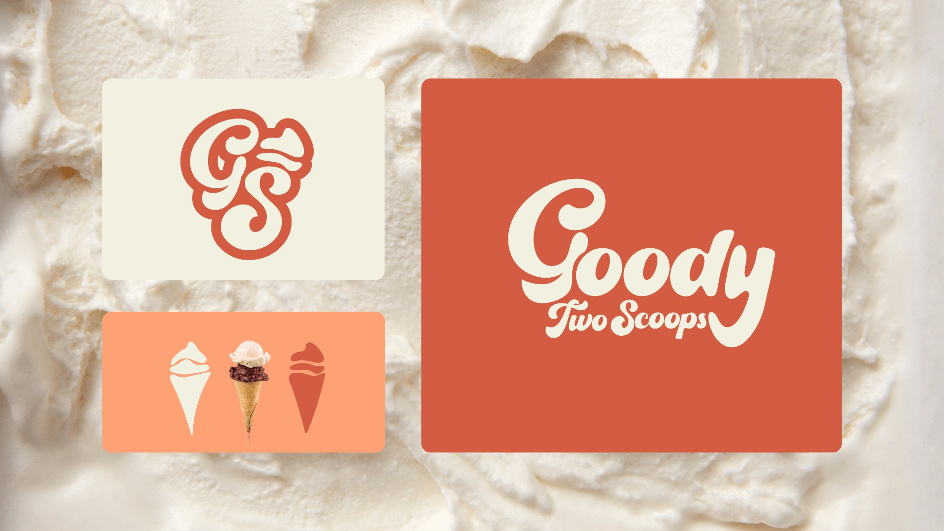
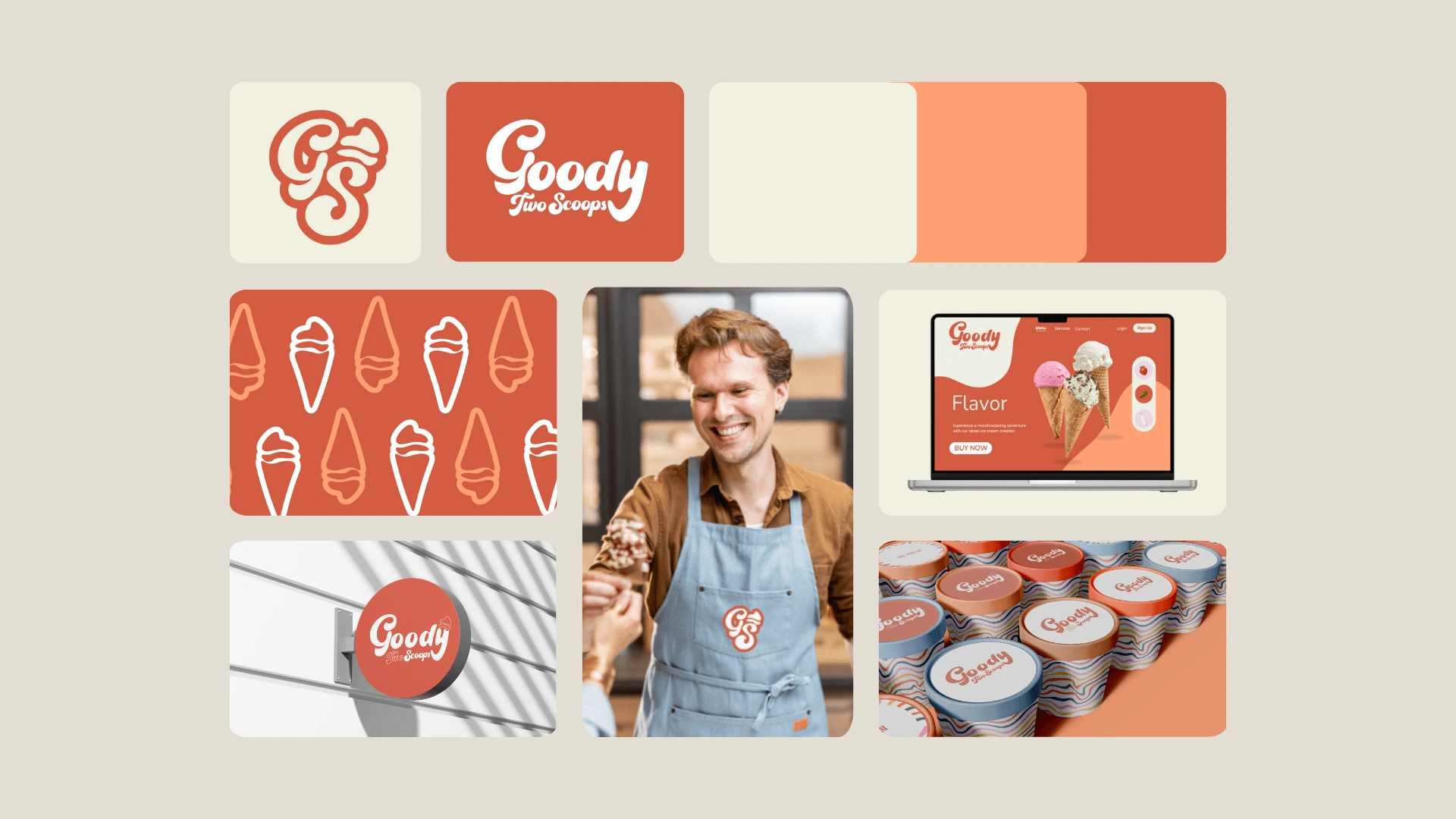
Primary Logo
The logo for Goody Two Scoops features a playful, custom design created using the Pen Tool in Illustrator, reflecting a hand-drawn aesthetic. The font used for the logo is Pacifica, which is characterized by its flowing, bold, and rounded script style, evoking a sense of fun, nostalgia, and approachability.
Secondary Logo
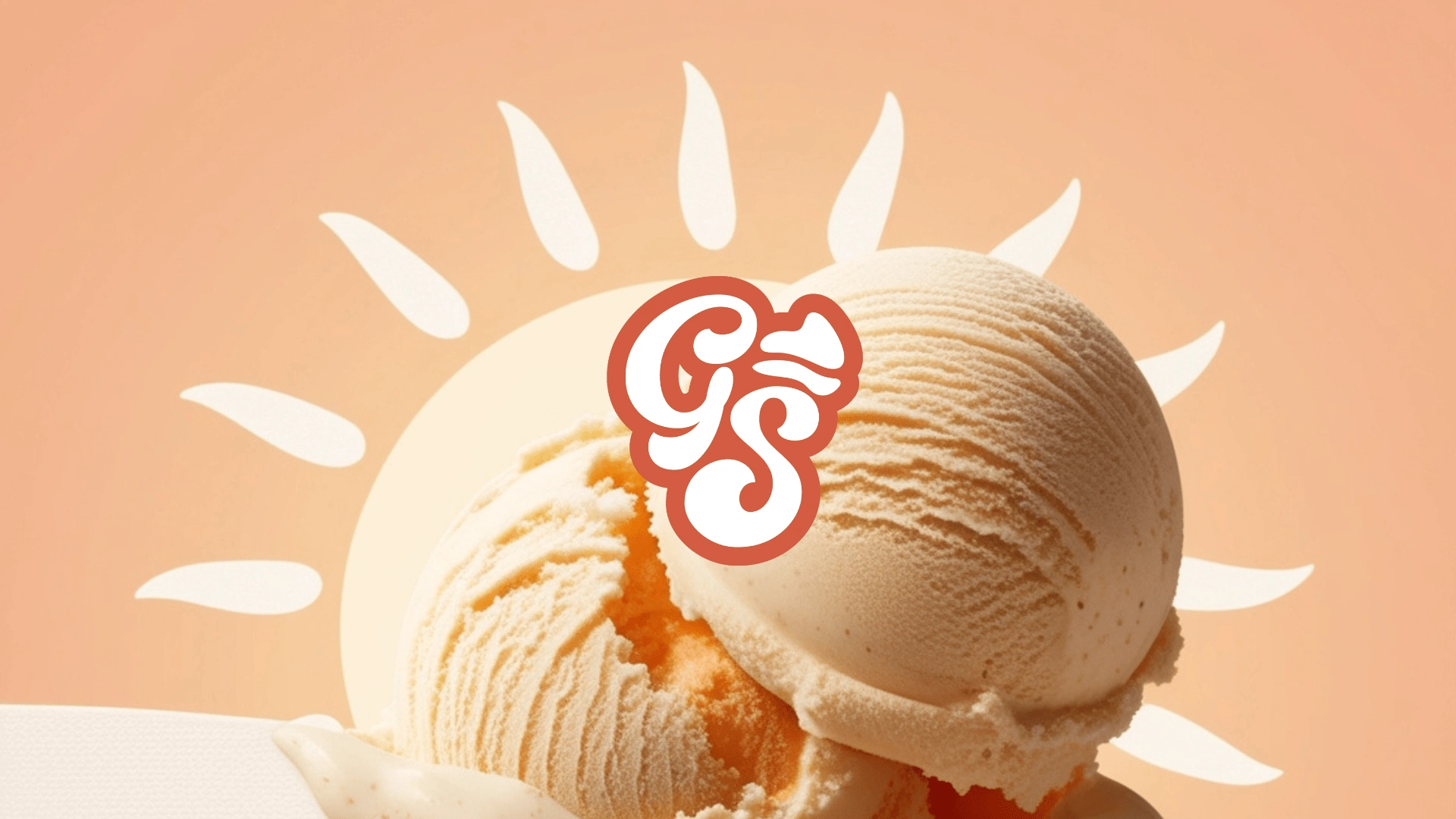
This logo design is a compact, stylish representation of the Goody Two Scoops brand, ideal for use as a social media profile image or a website favicon. The bold terracotta colour complements the playful, curvy typography of the "GS," which mirrors the rounded scoops of ice cream in the cone that signifies “Two”. The design is minimal yet effective, conveying the brand's fun and approachable vibe while remaining visually appealing and practical for digital use.
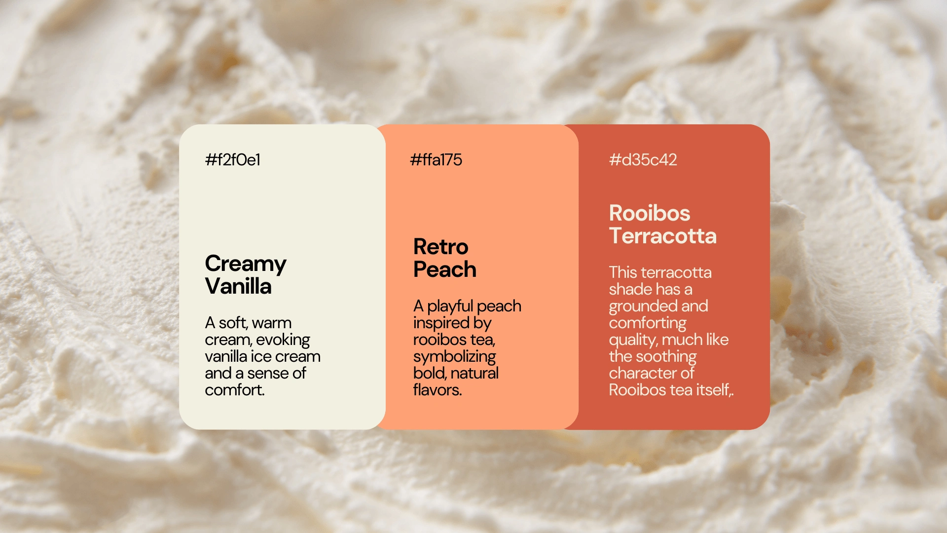
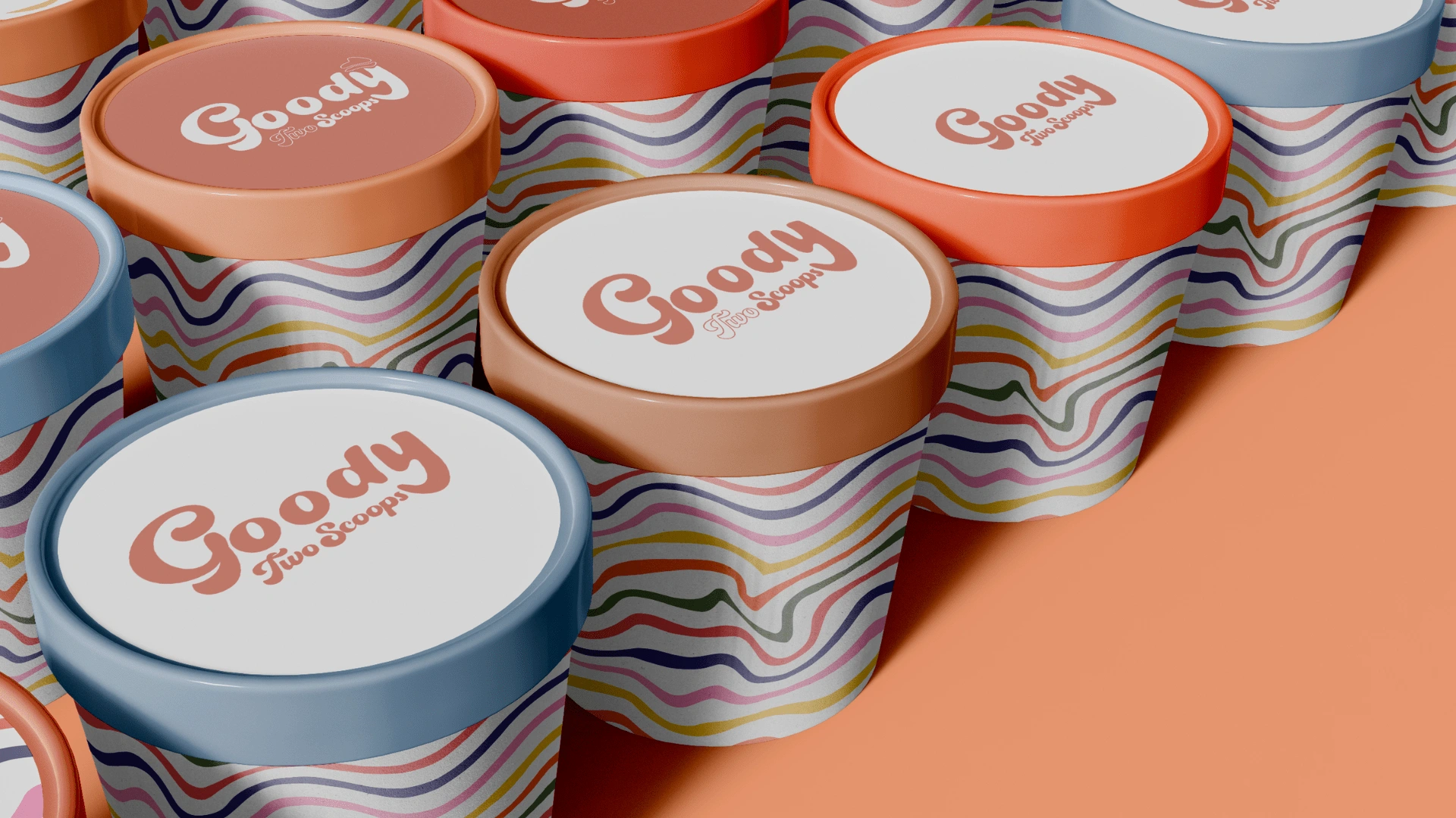
Colour Palette
Creamy Vanilla: A soft, warm cream that evokes vanilla ice cream and a sense of comfort.
Retro Peach: A playful peach inspired by rooibos tea, symbolizing bold, natural flavours.
Rooibos Terracotta: This terracotta shade has a grounded and comforting quality, much like the soothing character of Rooibos tea itself,.
Why this design and font?
Font & Shape Psychology
Pacifica is a smooth, rounded script font with a retro-inspired look. The curves of the letters feel dynamic and joyful, creating a sense of movement, much like the indulgent and enjoyable experience of eating ice cream.
Target Audience
This logo design, with its playful typography and smooth, rounded forms, is well-suited to Goody Two Scoops' target audience, likely families, children, and ice cream enthusiasts looking for a fun, nostalgic, and welcoming experience. The colour choice, combined with the hand-drawn quality of the logo, creates an approachable, down-to-earth feel, while the boldness of the design ensures it stands out in both physical and digital spaces.
Design Details
The "Goody" portion of the logo is the most prominent, set in large, flowing script that conveys the brand’s fun, playful personality. The large, swooping curves suggest generosity and fullness, perfect for a brand that wants to be associated with indulgent scoops of ice cream.
The "Two Scoops" text is integrated in a smaller, complementary script, with "Two" outlined to create visual contrast and "Scoops" in solid, bold white to stand out. The balance between the two parts of the name emphasizes the duality that the brand aims for.
Visual Elements
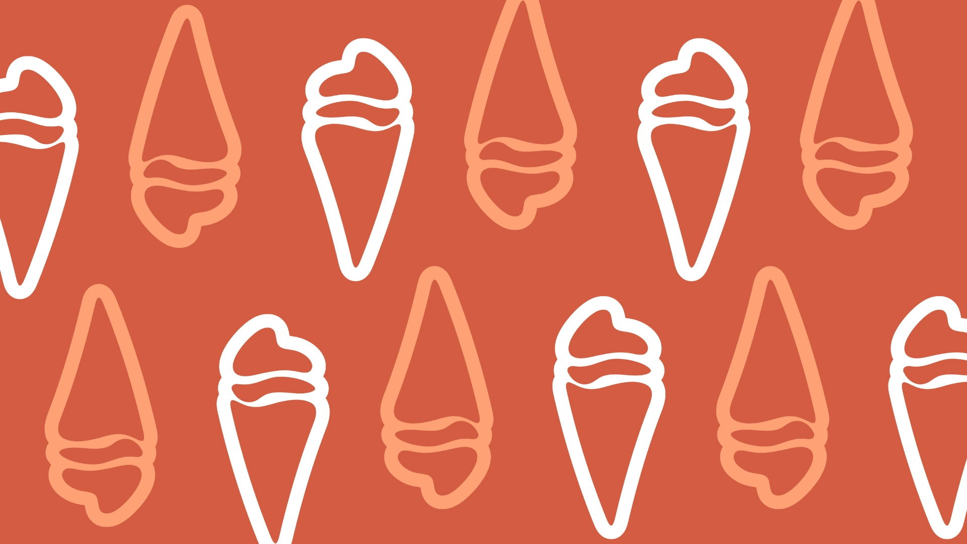
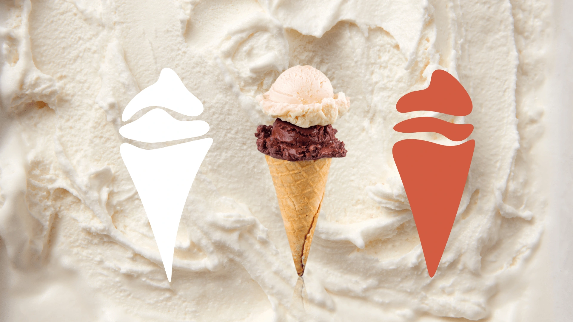
Above the "y" in "Goody," there is a visual element that resembles 2 scoops of ice cream, created as a custom illustration, further emphasizing the product and visually tying the brand to its core offering. The curved, flowing lines of the scoop integrate well with the round and friendly shapes of the text, making the logo feel cohesive and complete.
Like this project
Posted Feb 18, 2025
The final logo embodies joy and health, capturing Goody Two Scoops' playful spirit and wholesome essence.
Likes
10
Views
174
Timeline
Sep 13, 2024 - Oct 1, 2024
Clients
Red Umbrella

![📦 [Packaging Design] Companion Candles](https://media.contra.com/image/upload/c_fill,w_700/k47mknsmlmdbdnnhqtlw.avif)