Contra - A professional network for the jobs and skills of the futureDiscover

Standout projects

Standout projects

More projects we love that are making waves across the web
Cover image for Designing OVA: Translating Sound into
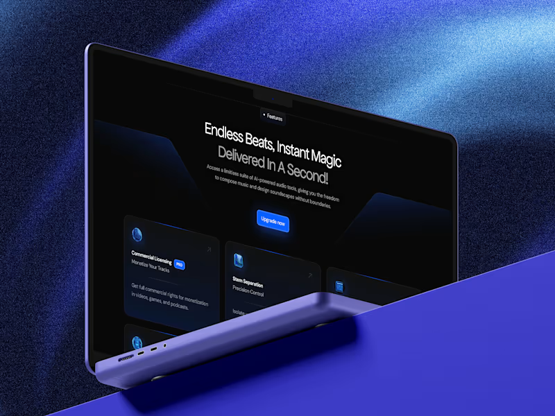
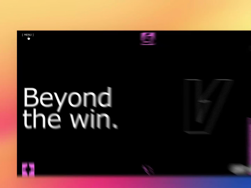
Designing OVA: Translating Sound into Motion Designing the visual identity and web experience for OVA was all about taking something completely invisible: sound, AI, and futuristic energy, to give it a bold, tangible visual form. The Idea & Inspiration It all started with one simple question: What does sound look like when it moves? I wanted to capture that magic spot where human emotion meets generative AI. Drawing inspiration from real-time audio visualizers and fluid dynamics, every gradient, wave, and curve in this system was built to mimic audio ripples moving through space. The Challenges and solutions: Making Static Graphics Feel Alive: Audio is pure motion, but static screens can easily feel flat. The trick was creating visual rhythm through fluid shapes and high-contrast gradients so the identity felt energetic without needing heavy video files that bog down site performance. Futuristic, But Still User-Friendly: AI branding can quickly slide into generic sci-fi tropes. To keep it grounded, I paired an electric blue and neon purple palette with clean, spacious UI, readable typography, and straightforward navigation. Putting the Tech Together: Embedding custom 1440px canvas layouts, interactive Spline 3D scenes, and responsive Framer builds into a seamless portfolio view took a lot of trial, error, and breakpoint tweaking but getting that full-width desktop feel was totally worth it. At its core, OVA is a minimal, modern showcase of what happens when design, music, and artificial intelligence hit the exact same frequency.
3
13
411
Cover image for Most sites tell you they're
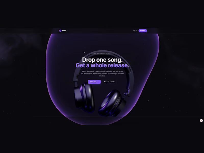
Most sites tell you they're premium. Almost none of them make you feel it. I spent the last stretch building thirteen concept sites chasing that difference, and the thing that kept proving itself is that the feeling comes from motion you control, not motion you watch. Four are real-time 3D in the browser. A crystalline brand hero turning under studio lighting, a perfume landing lit entirely by a real HDRI environment, a neural field of instanced particles for an AI product, an architectural monolith that reveals itself out of near-black. The other nine are scroll-scrubbed video, where you drag a whiskey pour or open a box or drive into a sunrise at whatever pace you want. The visitor is the animator, which is a very different thing from watching an autoplay loop. I design it, build it, and ship it myself, so there's no handoff where the feeling leaks out between the mockup and the browser. Two things I learned that I'd want someone else to know. If you light a translucent material without a real environment map, your scene renders black. Lighting is not polish you add at the end, it's a design decision you make first, before you have anything to look at. And if you want video to scrub frame for frame off scroll position with no stutter, re-encode it all keyframe. Every frame becomes a seek target. Most people fight that stutter in JavaScript when the fix lives in the encode. Who it actually serves is anyone selling on craft rather than spec. Fragrance, architecture, spirits, dev tools. The interaction buys a few more seconds of attention right where the headline and the call to action live, and those seconds are usually the whole game. All thirteen are live and interactive, and labeled as concepts because that's what they are. Still chewing on one thing. Where's the line where motion stops serving the brand and becomes the thing people remember instead of the brand? https://xkaii.studio/ui-ux-designs/
4
12
155