The network for creativity
Join 1.25M professional creatives like you
Connect with clients, get discovered, and run your business 100% commission-free
Creatives on Contra have earned over $150M and we are just getting started
Back to feedPost

One Logo a Day | Exploring Geometric Expression
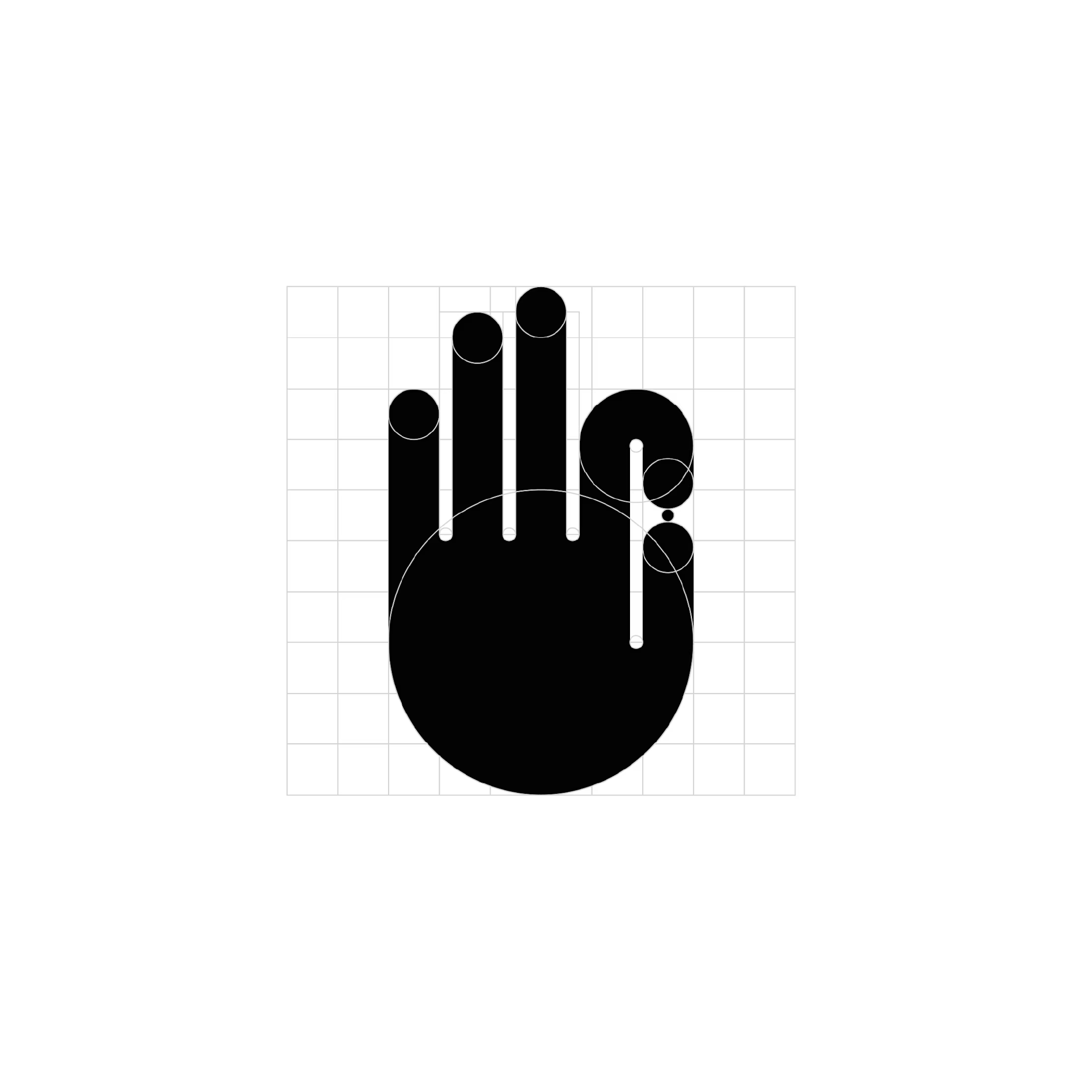
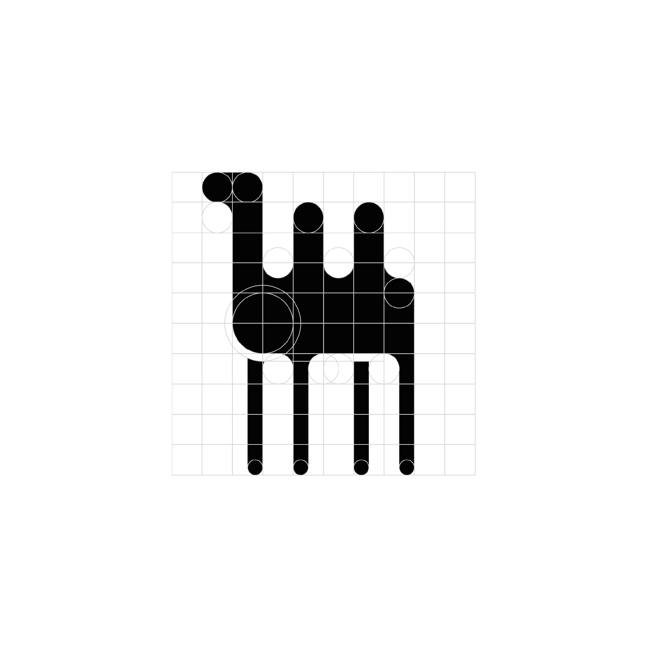
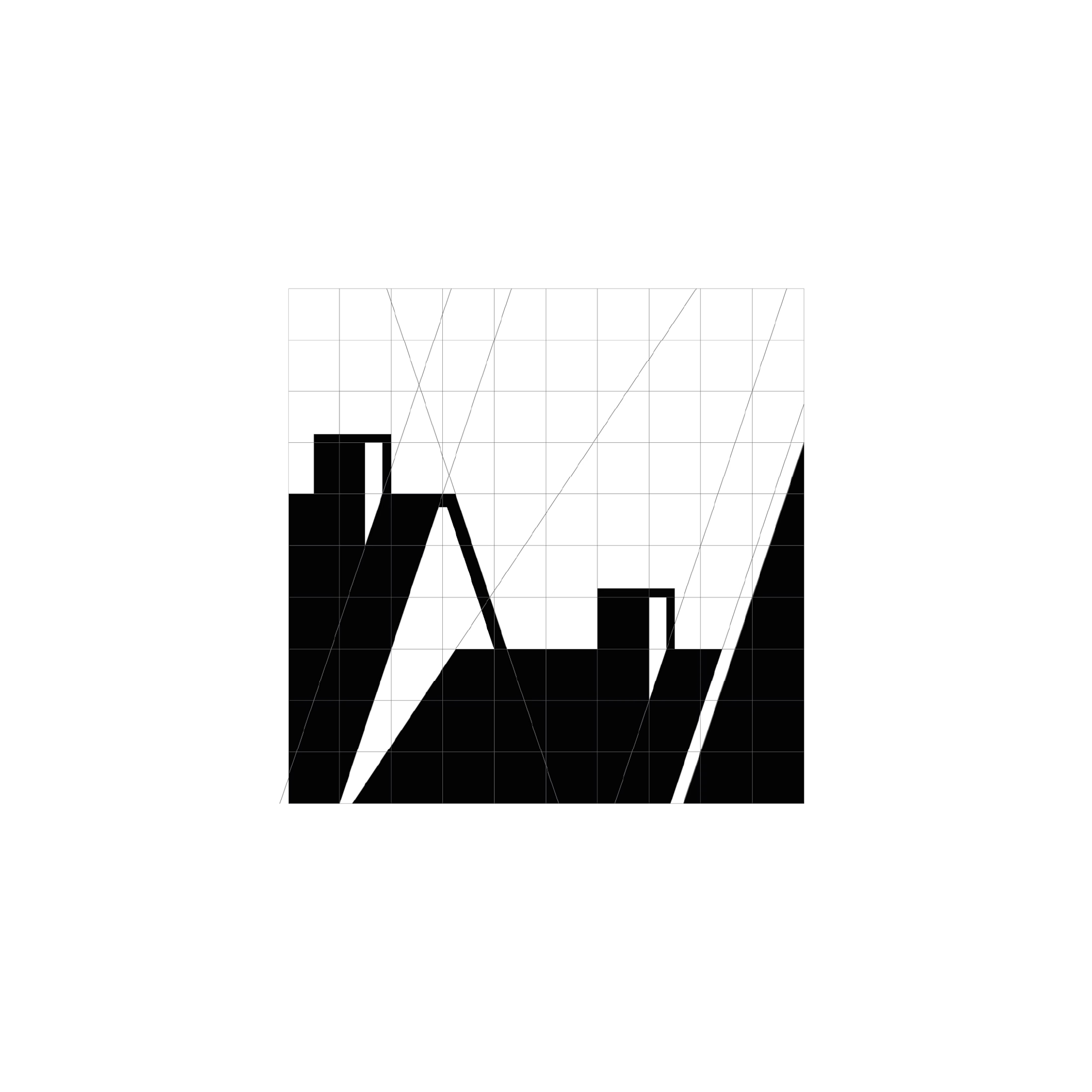
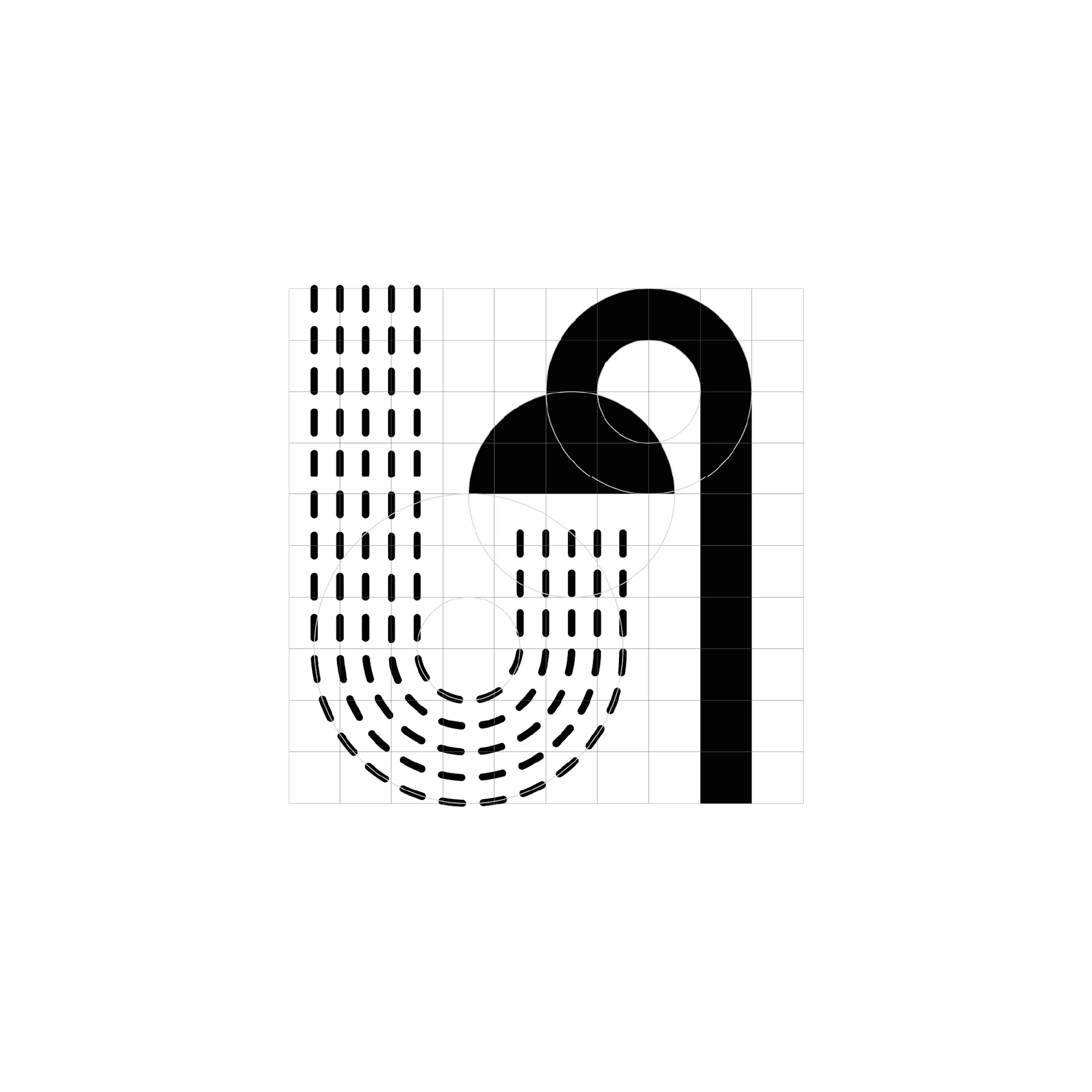
For one month, I challenged myself to design a logo every day. These four favourites share a distinct visual language: bold monochrome shapes, precise geometric construction, and playful use of negative space.
Circles, semicircles, and elongated verticals become the building blocks for expressive symbols. Rounded forms soften the heavy black silhouettes, while repetition creates rhythm and movement. Elsewhere, sharp diagonals and dramatic shifts in thickness introduce a more angular, architectural character.
The series explores the boundary between abstraction and recognition, suggesting familiar objects and gestures through a small number of carefully arranged shapes. Visible construction grids reveal the relationships behind each mark, showing how proportions, alignments, and curves hold the compositions together.
Working entirely in black and white places the focus on form. Each design becomes an exercise in creating personality and visual impact through silhouette, contrast, and space.

The network for creativity
Join 1.25M professional creatives like you
Connect with clients, get discovered, and run your business 100% commission-free
Creatives on Contra have earned over $150M and we are just getting started
Related posts

🍔 BITE BOX — Where Every Bite Brings a Smile! 🧡
A fun, fresh, and memorable logo concept designed for a modern fast-food brand. The smile icon represents happiness, while the bold typography creates a friendly and recognizable identity. 🍟✨
#LogoDesign #FoodBranding #GraphicDesign #BrandIdentity #LogoDesigner


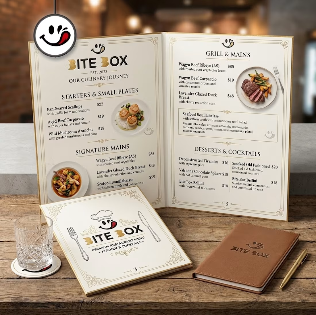
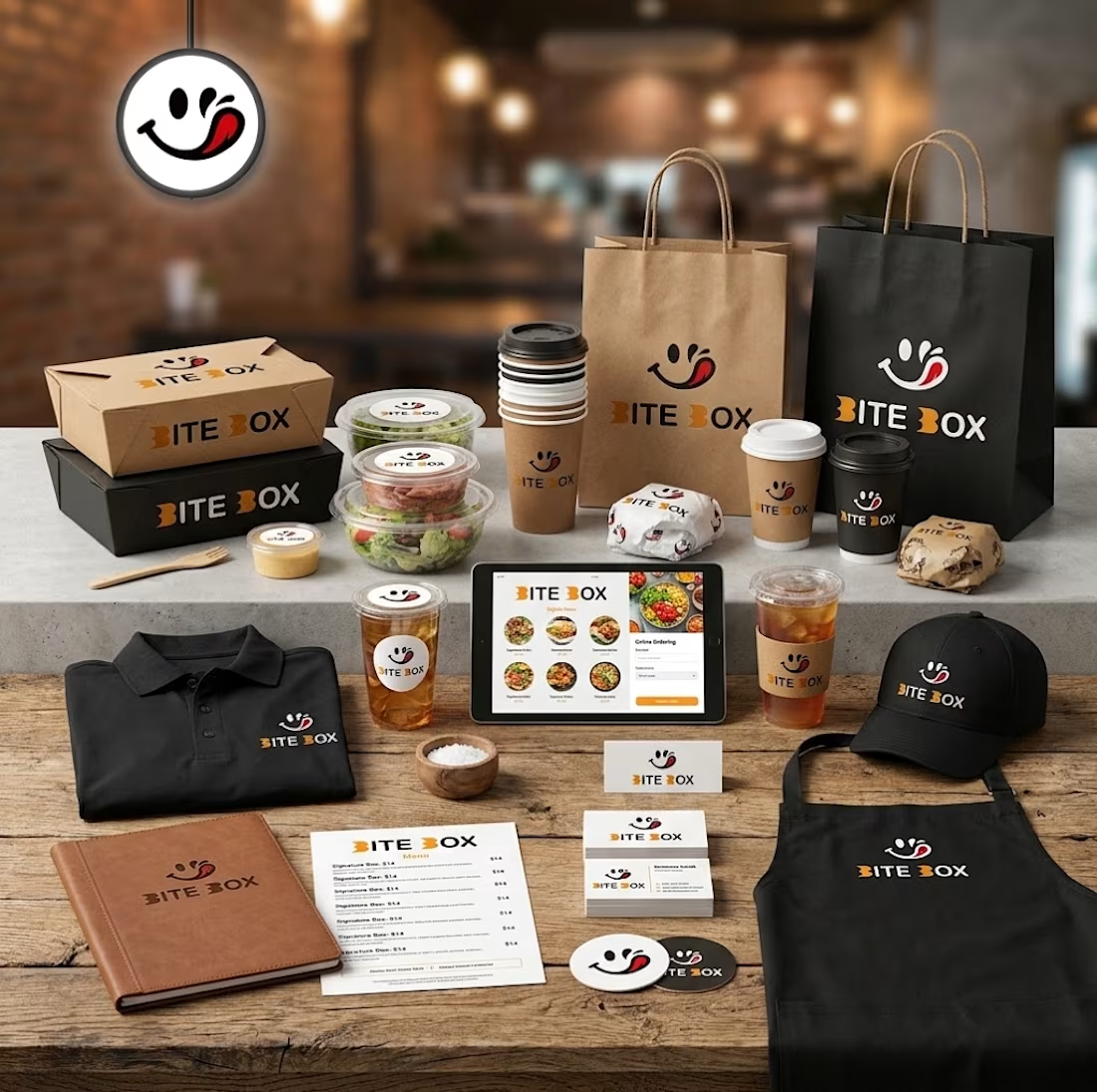
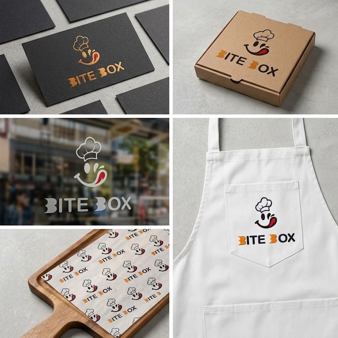


the little chef smile on the box is doing a lot of the work here

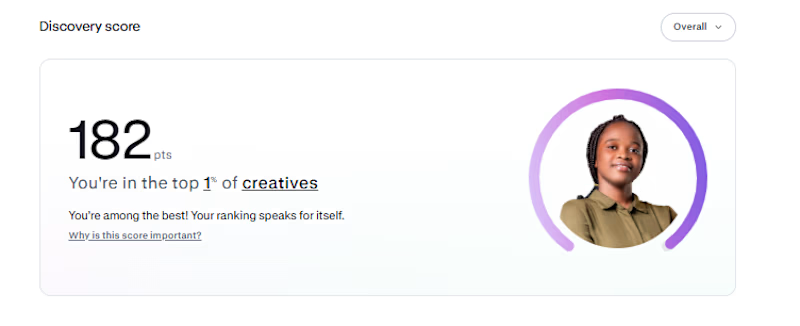
My Contra discovery score is now 182, putting me in the top 1% of creatives.
Funnily enough, I haven't gotten a job on Contra yet. 😂 I'm just here, posting my work, building my portfolio, and hoping the right clients find me
One thing I've learned is that you have to keep showing up, even when the results aren't coming yet.
Hopefully, something good comes out of it...

Congrats buddy
✨ Your Clothing Brand Deserves a Unique Identity! 👕🖤
A stylish, modern, and professional logo can make your clothing brand stand out. From elegant fashion labels to trendy streetwear brands, I create unique logo designs that reflect your brand’s personality.
💎 Clean & Modern Designs
👕 Perfect for Clothing Brands
✨ Professional & Memorable Identity
Ready to give your clothing brand a fresh new look? Let’s create something amazing!
📩 DM me to get started!
#ClothingLogo #FashionBranding #LogoDesign #ClothingBrand #GraphicDesigner
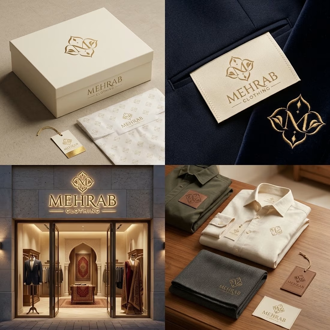

The elegant logo and refined typography work beautifully together.