The network for creativity
Join 1.25M professional creatives like you
Connect with clients, get discovered, and run your business 100% commission-free
Creatives on Contra have earned over $150M and we are just getting started
Back to feedPost

German Archaeologists Association | Connecting Heritage and Identity
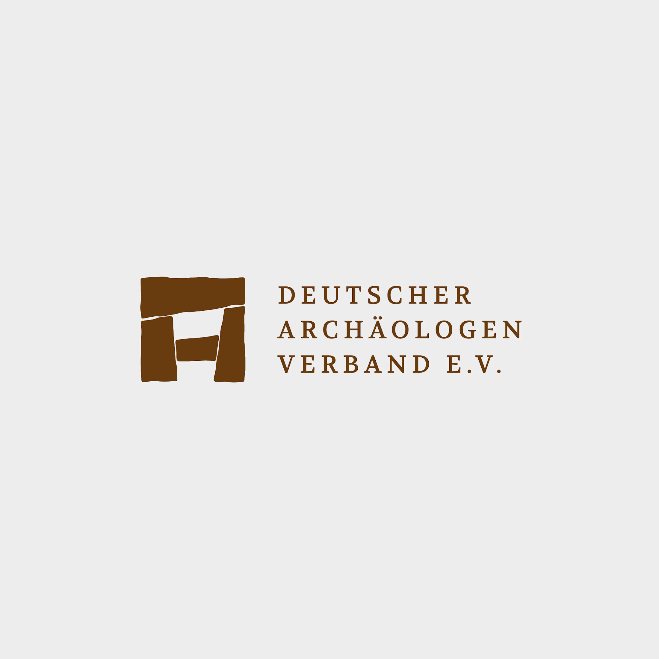
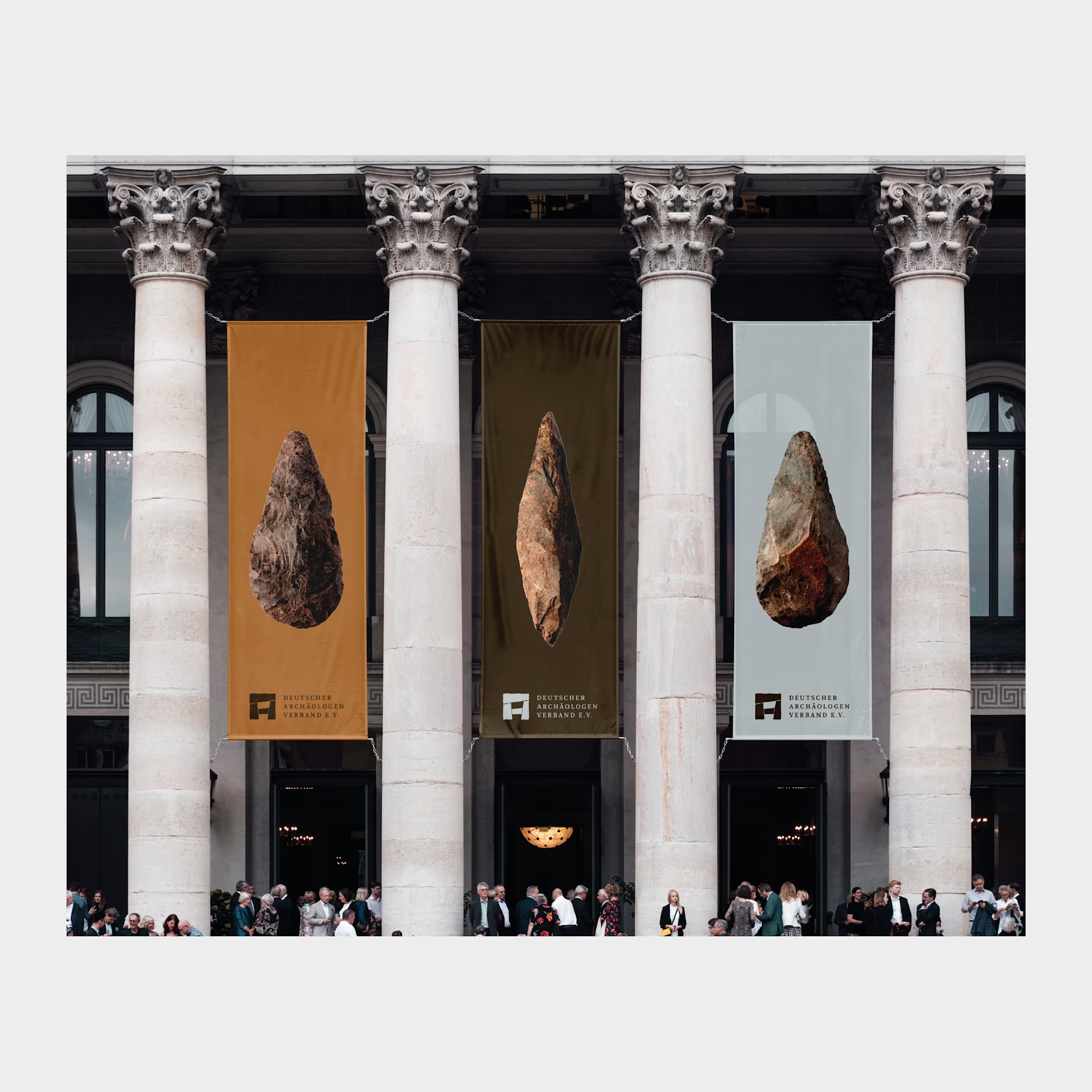
For the German Archaeologists Association, I redesigned the logo to translate the physical character of archaeology into a clear, contemporary visual identity.
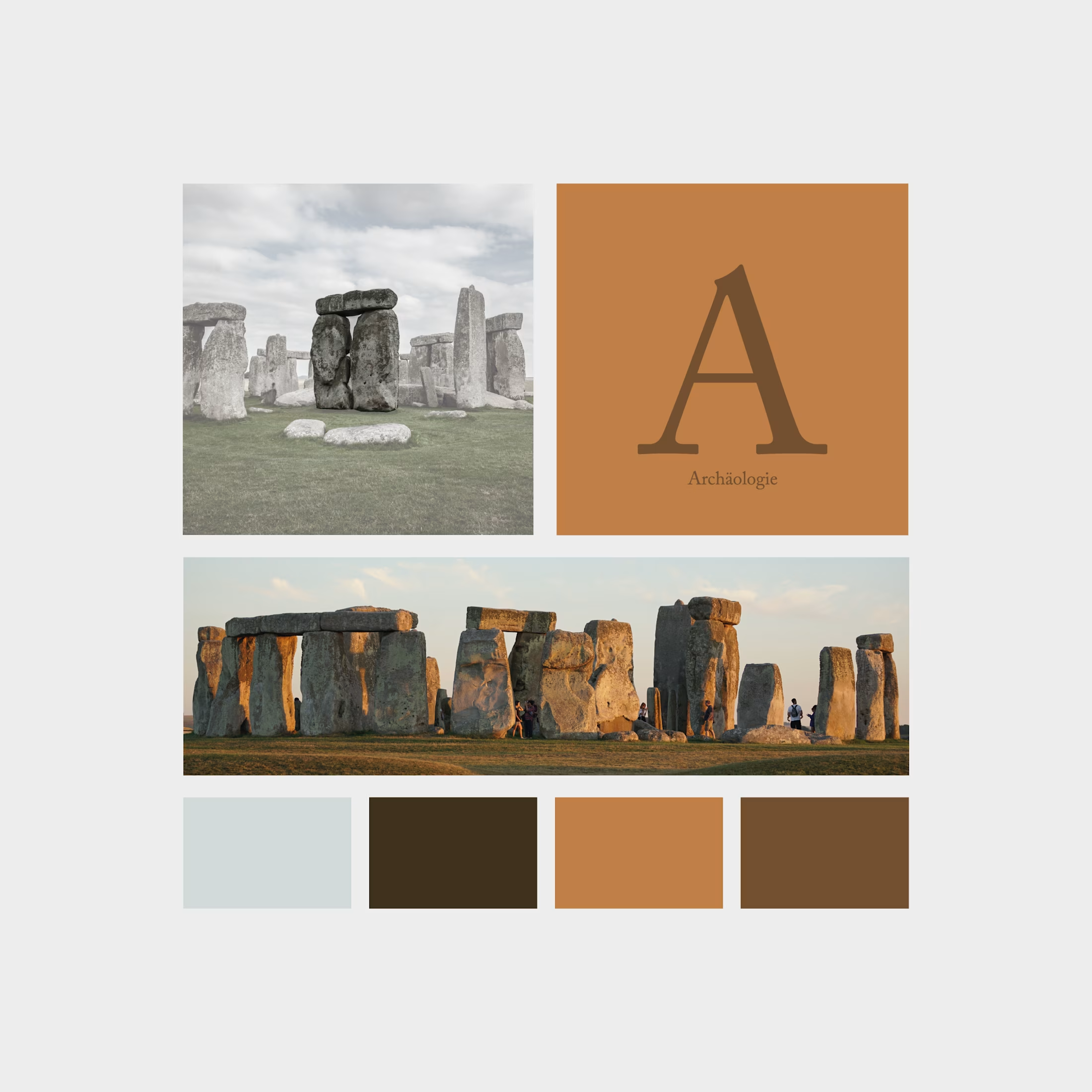
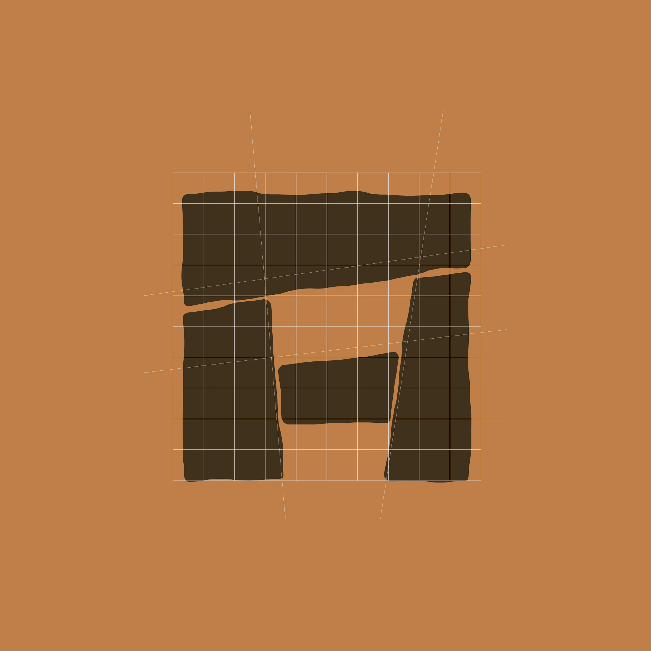
The symbol combines a Stonehenge-inspired structure with an abstract “A” for archaeology. Four stone-like shapes form a compact emblem, with subtly irregular edges that evoke weathered surfaces and ancient construction. Balanced proportions bring structure to these organic contours, connecting historical references with precise graphic design.
Uppercase serif typography adds a scholarly, authoritative character. Generous letter spacing and a structured three-line arrangement give the association’s name clarity and presence.
The palette draws on earth, stone, and excavation: warm ochre, deep brown, and cool mineral grey. The emblem also retains its distinctive character in simple black-and-white applications.
The result is an identity rooted in the material traces of the past, giving the association a confident contemporary presence.

The network for creativity
Join 1.25M professional creatives like you
Connect with clients, get discovered, and run your business 100% commission-free
Creatives on Contra have earned over $150M and we are just getting started
Related posts

🍔 BITE BOX — Where Every Bite Brings a Smile! 🧡
A fun, fresh, and memorable logo concept designed for a modern fast-food brand. The smile icon represents happiness, while the bold typography creates a friendly and recognizable identity. 🍟✨
#LogoDesign #FoodBranding #GraphicDesign #BrandIdentity #LogoDesigner


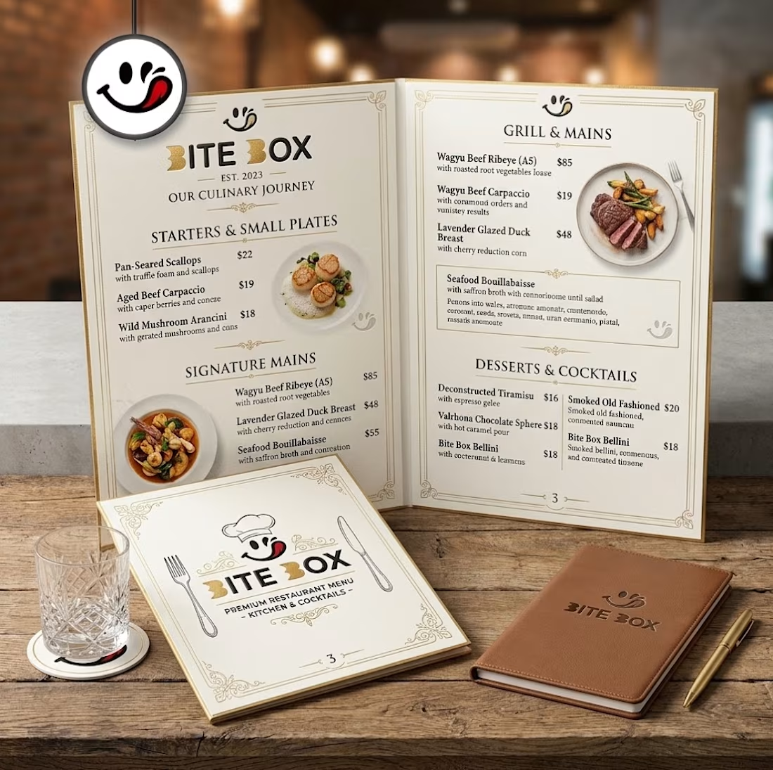
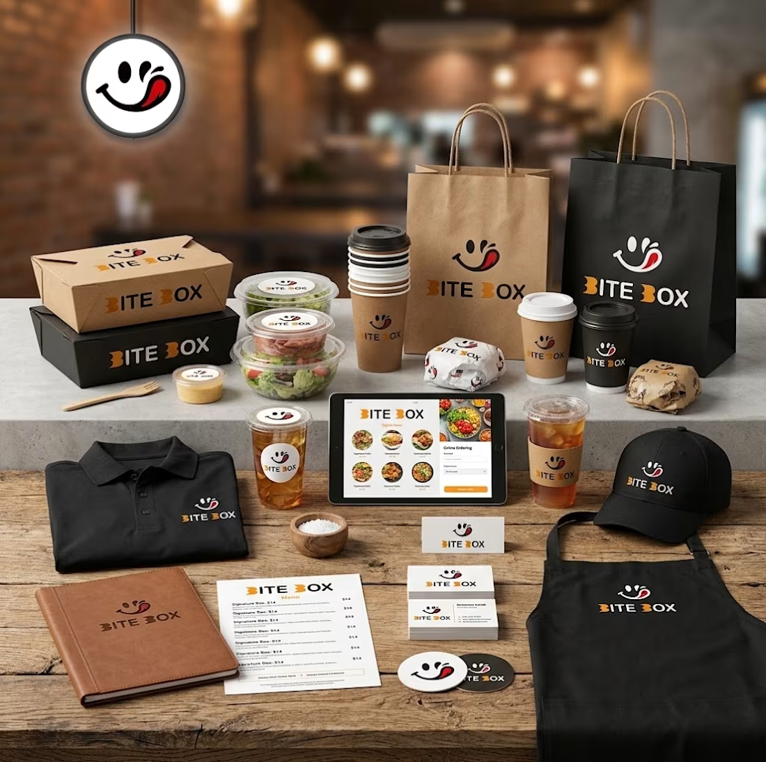
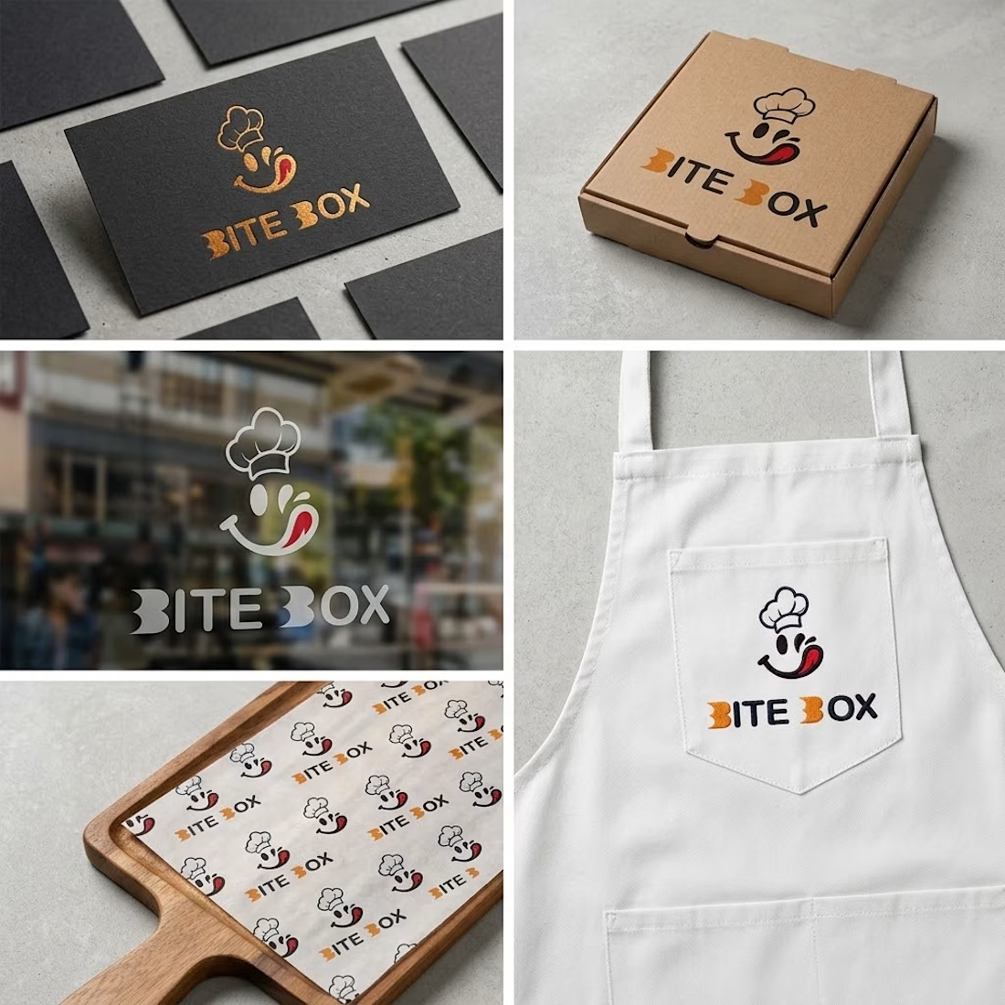
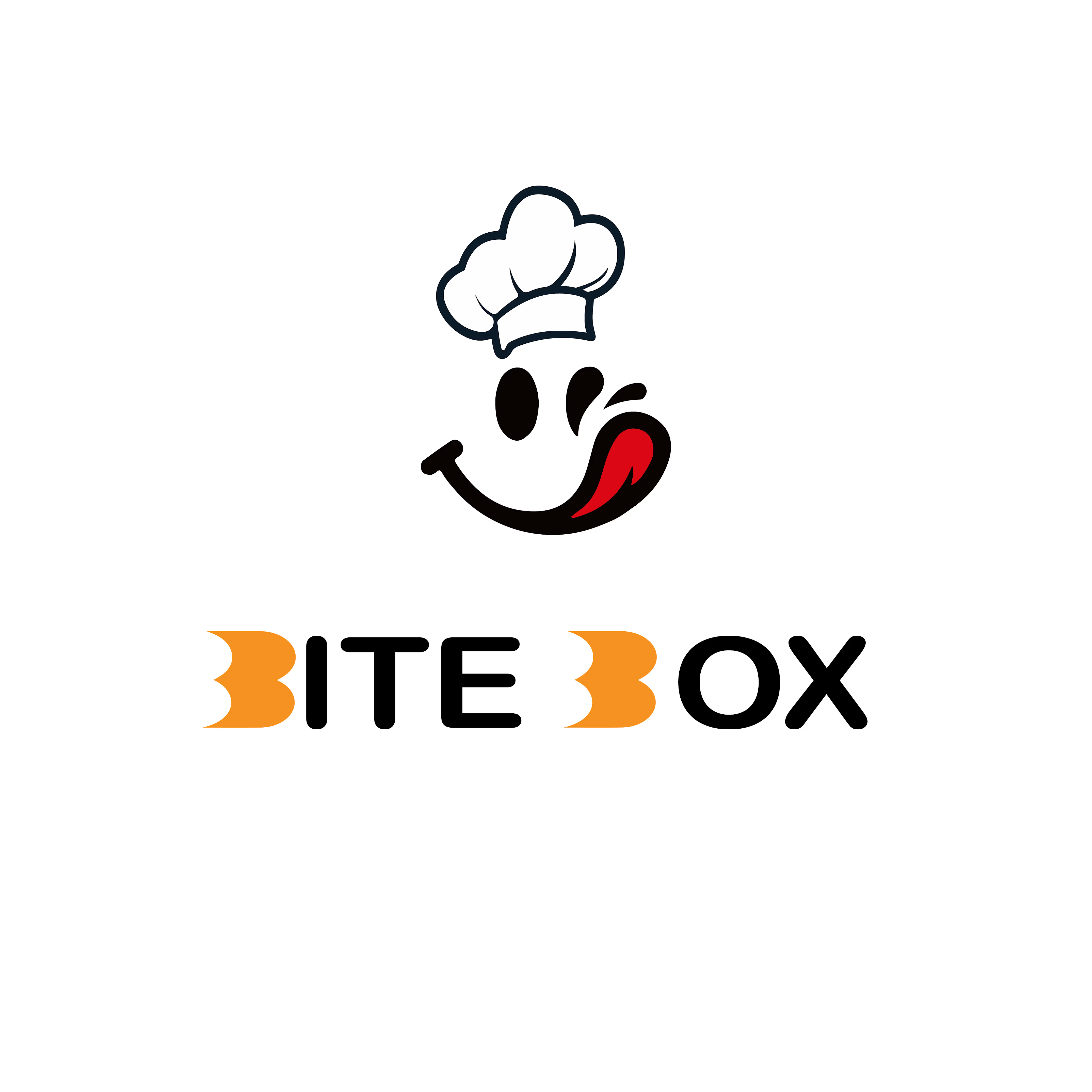


the little chef smile on the box is doing a lot of the work here

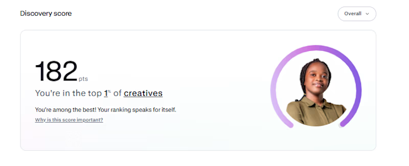
My Contra discovery score is now 182, putting me in the top 1% of creatives.
Funnily enough, I haven't gotten a job on Contra yet. 😂 I'm just here, posting my work, building my portfolio, and hoping the right clients find me
One thing I've learned is that you have to keep showing up, even when the results aren't coming yet.
Hopefully, something good comes out of it...

Congrats buddy

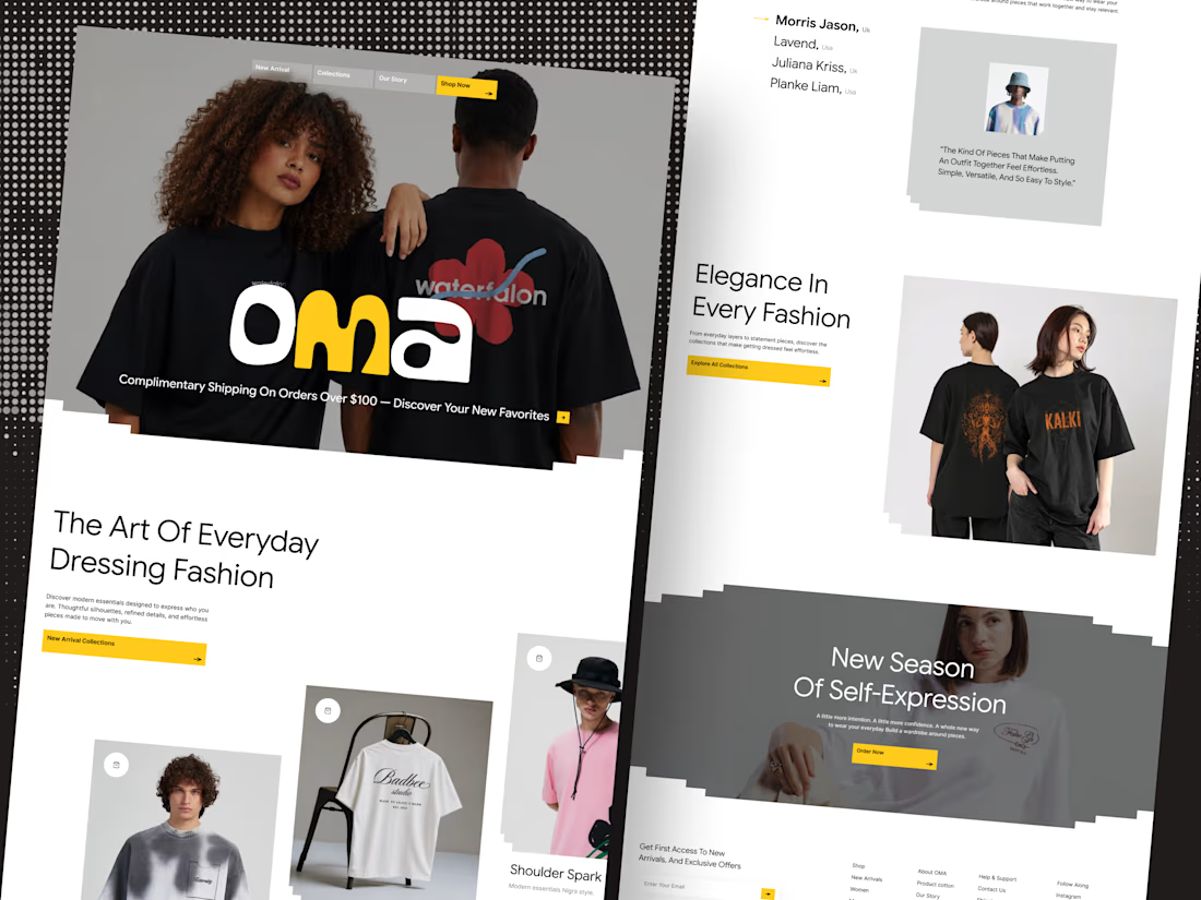
🛍️ Shopify based fashion E-commerce website Landing page
Your fashion brand deserves a storefront that sells style.
Introducing OMA — a modern fashion e-commerce website designed to make every collection stand out.From bold editorial visuals to a clean shopping experience, every detail is crafted to help fashion brands create a stronger first impression and turn browsing into buying.
✨ Premium fashion-focused design
🛒 Conversion-focused shopping experience
🎨 Modern, editorial art direction
📱 Designed for a seamless online shopping journey
Building a fashion brand? Let’s design a storefront your customers will love.
Available for Shopify store design projects and custom e-commerce website design.
💬 DM me to discuss your next project.



Nice work