Contra - A professional network for the jobs and skills of the future
Discover
Sign Up
Post a job
Sign Up
Log In
Filters
Projects
People
Filters
Featured
Web developers
Content creators
Graphic designers
Product designers
AI developers
Motion designers
Social media marketers
Animators
Video editors
Projects we love
Projects we love
Standout projects making waves around the web
View more
Message
13
Nadia Ariefdien
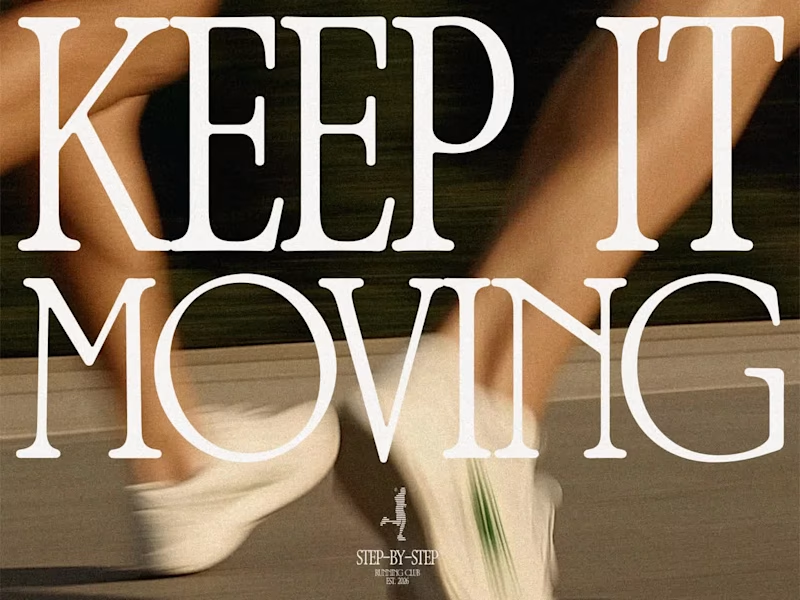
Step-by-Step Running Club – Branding & Merch Design
13
107
Message
18
Anita Autorino
max
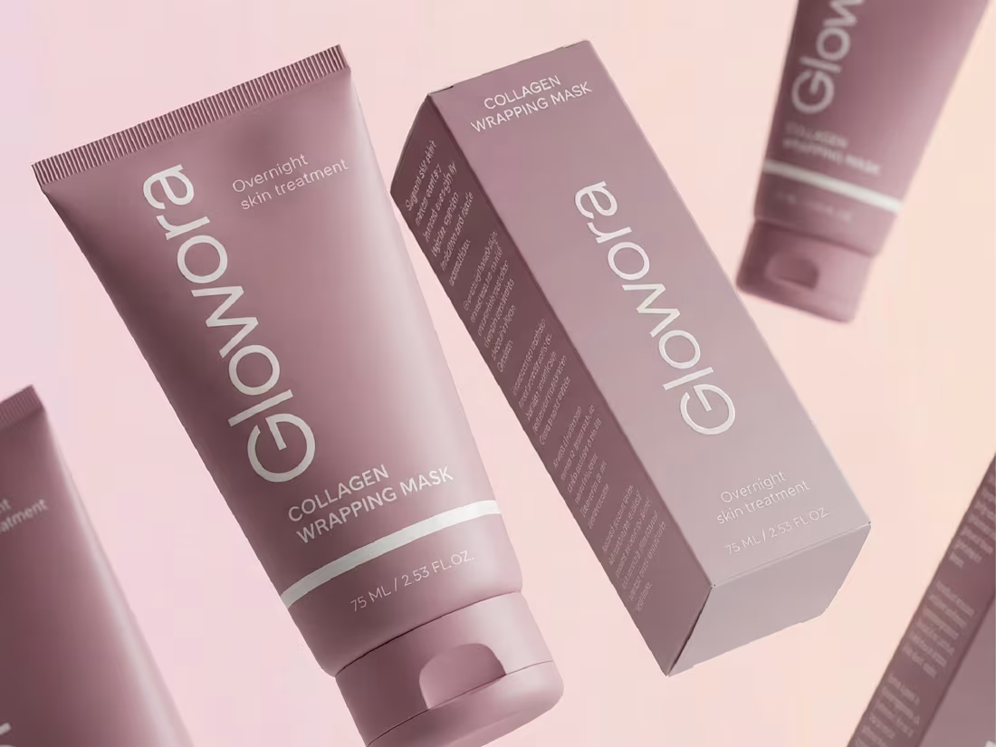
Glowora | Packaging Design for Skincare Brand
18
371
Message
18
Chantal Jemmott
pro
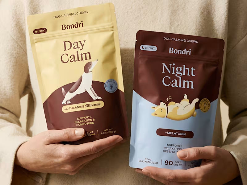
Packaging for Dog Calming Chews
18
306
Message
8
Jacquelyn Conn
pro
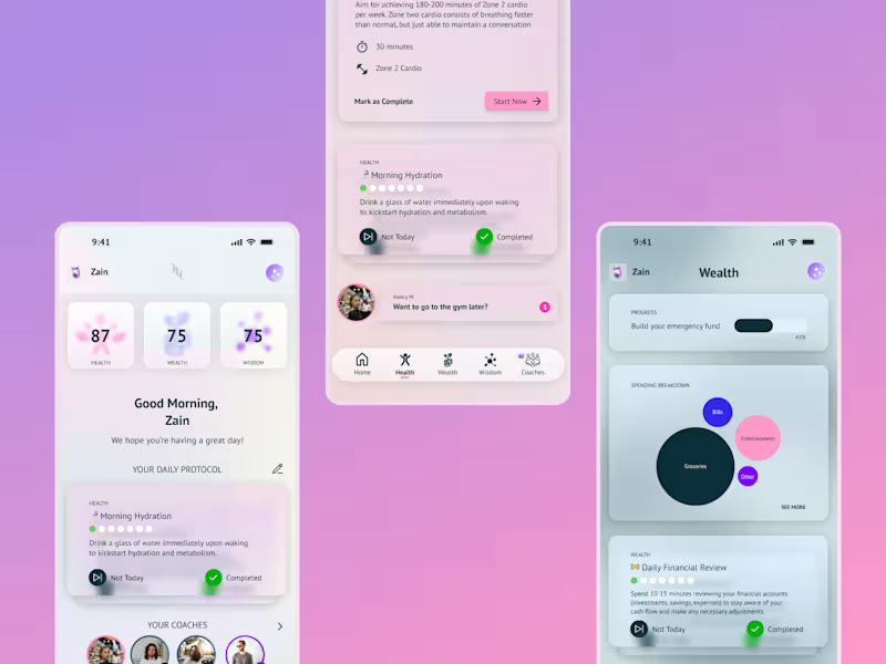
AI Lifestyle App Design for Hewwi
1
8
165
Web design projects using Framer
Framer
The best modern websites built on the leading web design tool, Framer
View more
Message
28
Sana M.
pro
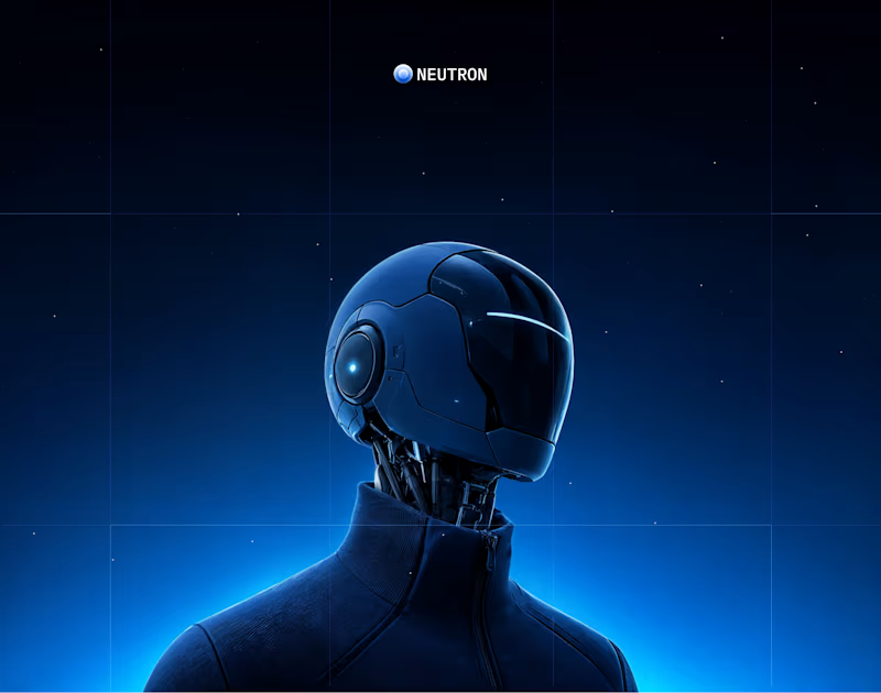
NEUTRON - BRANDING & WEBSITE
28
489
Framer is the leading tool for building websites, fast
Hire experts
Message
11
Chris Nijhof
max
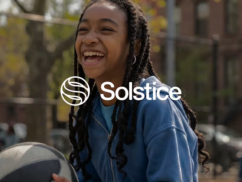
Solstice — Framer Website | $21M Series A
11
190
Message
5
Dan Lee
pro
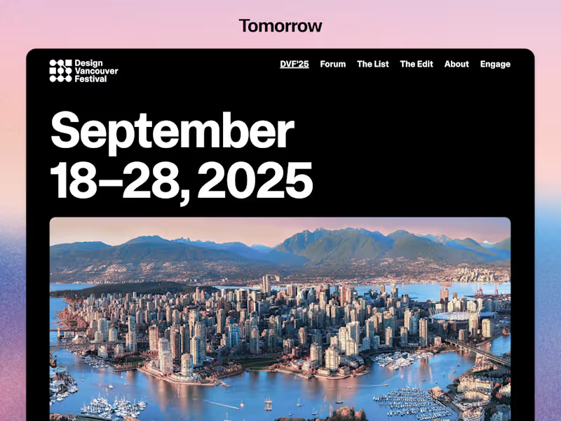
Figma to Framer - Design Vancouver Festival 2025
5
44
AI projects
AI
New projects from the best AI creators
View more
Message
11
Hayley Cantor
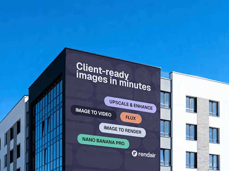
Rendair Brand System Design
11
174
Message
8
Snapra Studio
pro
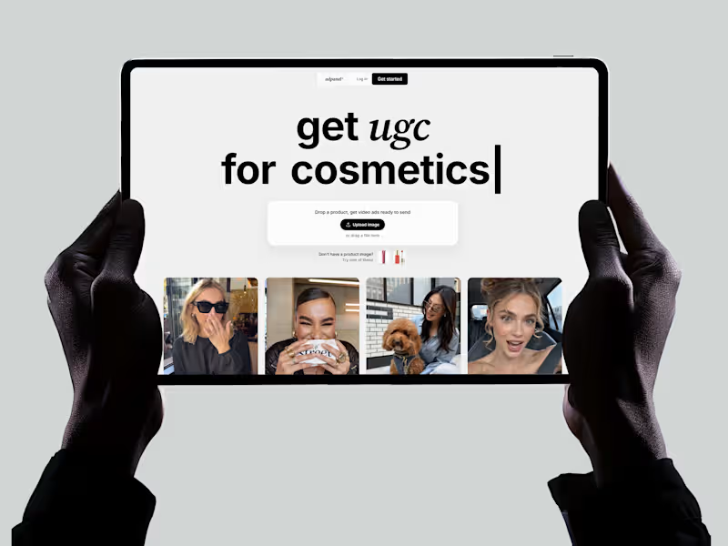
AdPanel: fixing activation for an AI UGC ad platform
8
139
Message
9
Jeihun Alizadeh
pro
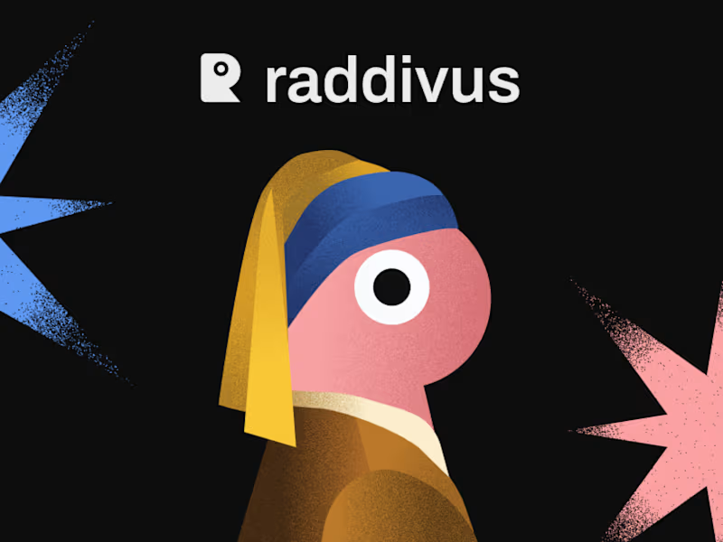
Raddivus — Bold Branding for an AI Ad Copilot
9
141
Message
15
Anna asol_design
pro
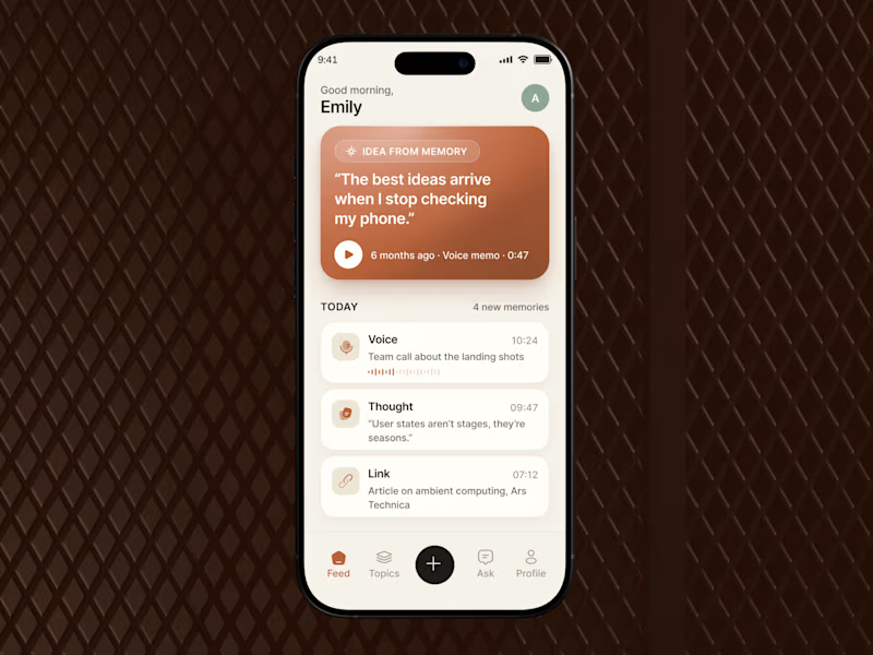
Mobile App Design | AI Voice Notes App | Smart Notes + AI App
15
94
Brand design projects
Brand design
Bold visual identities and branding systems created by top independent designers
View more
Message
10
Elsa Toussaint
max
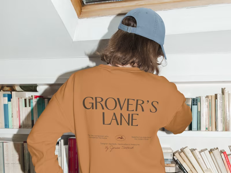
Brand Identity for Grover's Lane
10
140
Message
7
Elisa Cipriani
pro
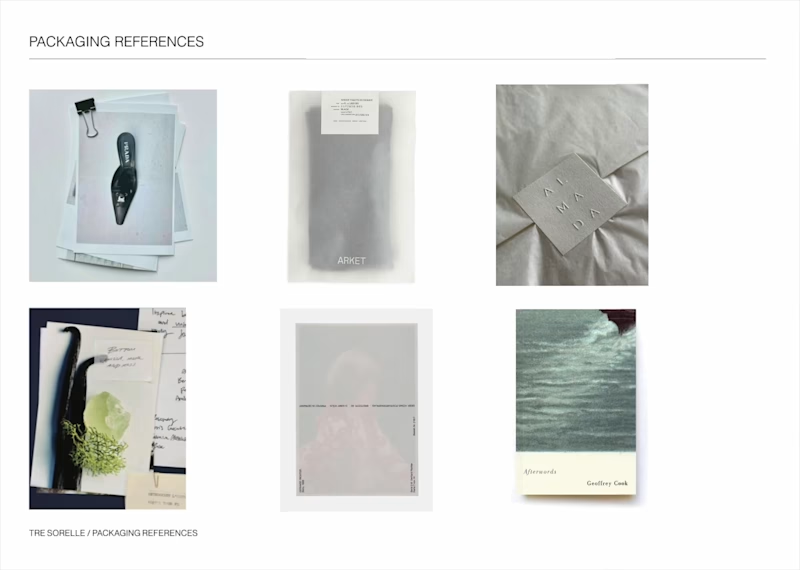
Brand Manual & Photoshoot Guidelines for Tre Sorelle
7
42
Message
7
Sydelle Creative
pro
Viafide - Brand Strategy, Naming & Visual Identity
7
66
Message
17
Elodie Fontaine
pro
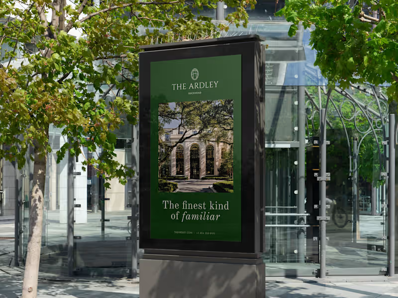
The Ardley — Brand Identity
1
17
239
Video editor projects
Video editing
Creative video edits made using today’s best editing tools
View more
Message
2
Mark Pavlyshyn
pro
Product Explainer Video for Health Care Mobile App
2
103
Message
1
Robin Holesinsky
pro
Launch Film for Reducto Redesign
1
65
Message
8
Justin Jones
pro
6ix Watchlist Feature Launch Video
8
214
Message
6
Val Guerra
pro
Product Launch Video for DKV Nova
6
189
Standout projects
Standout projects
More projects we love that are making waves across the web
Message
7
Miguel Angelo Batocki Da Silva
Belovetz is a clothing brand born from a simple truth: the bond between people and their pets deserves to be worn, not just felt. Rooted in soft Y2K nostalgia and vintage warmth, the brand brings together comfort, style, and companionship into a single wardrobe made for two. The identity of Belovetz was built around a soft, cozy aesthetic — warm pastel tones, rounded typography, and a visual language that feels like a favorite childhood sweater. Every detail, from the heart-shaped logo to the bandaid symbol woven into its DNA, speaks of care, affection, and the kind of love that never goes out of style. More than a fashion label, Belovetz is an invitation: to dress the same way you love — openly, comfortably, and together with the ones who matter most, four-legged or not.
1
7
53
Message
6
DESH Group
pro
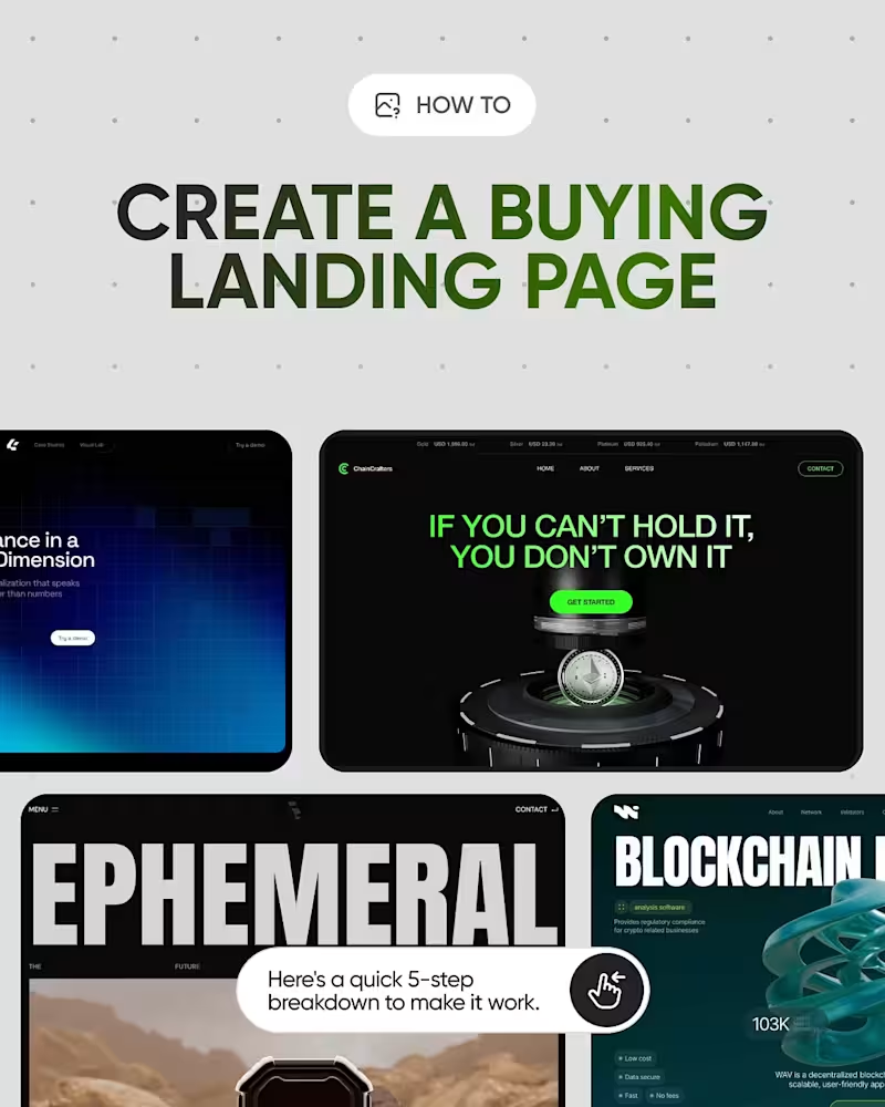
We created a visual guide on designing a buying-focused landing page, breaking down the key elements that help turn attention into action. From clear and bold headlines to strong visuals, value-focused sections, mobile navigation, and a focused CTA, each slide highlights a practical part of the buying journey. A simple framework for creating landing pages that communicate value and make the next step obvious.
1
6
69
Message
3
Enmanuel Jimenez Veloz
DPLNK is a design practice built around one simple idea: brands become stronger when everything connects. Strategy connects with identity. Identity connects with expression. Expression connects with people. The name reflects that principle — a visual system reduced to its essential link between idea and perception. No unnecessary layers. No decoration for the sake of it. Just purposeful design, built to make brands feel clear, distinctive, and connected. This is the kind of work I want to create more of. If you’re building a brand that deserves that level of intention, let’s talk.
3
3
46
Message
12
Kris Anfalova
pro
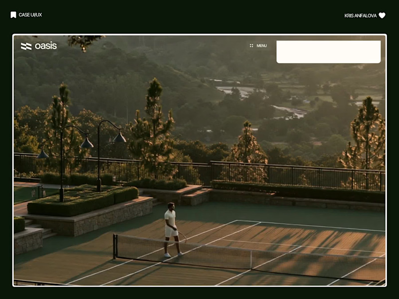
Oasis — Padel & Tennis Booking Platform Oasis is a court booking platform for padel and tennis clubs — members can select a court, check availability, and confirm payment in one streamlined flow. I designed the booking interface, built directly over real club photography. Rather than placing the booking form on a neutral background, I anchored it directly over a full-bleed, golden-hour photograph of the real court. Before a user even looks at a date picker, they’ve already felt the atmosphere — that emotional context does more for conversion than any copy could. The booking card itself stays intentionally minimal: court name, availability, surface type, date, duration, and price, in that order. No unnecessary steps between deciding and confirming. I used a distinct chartreuse accent — a departure from the green typically associated with sports apps — to carry through the primary CTA and a first-time-visitor promo card, giving the whole flow a bit of warmth and personality without slowing anything down. Creative: Midjourney Video: Flux Animation: jitter
6
12
99
Message
1
John Lam
pro
Brand design, Logo design, Web design, Product design for Education Platform - BetterCampus with 2M+ users
2
1
76
Message
8
Daniel Sun
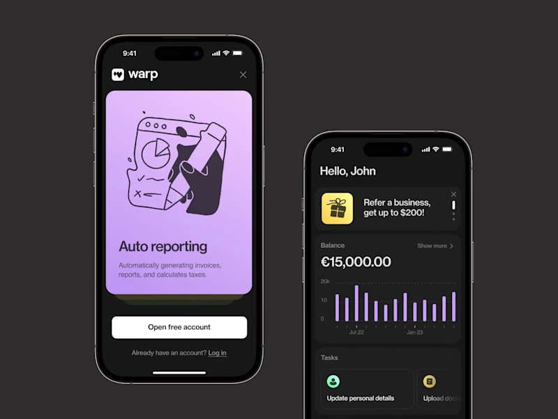
Team payroll platform: App design, Illustration, Animation I designed the user interface for an app that calculates payroll and monitors compliance with regulatory requirements. I kept the layout clean and simple so that users can quickly find the information they need and conveniently manage everything from their phone. I also made the illustrations friendly and used accent colors where appropriate, so that the interface would work in harmony with the playful illustrations.
4
8
360
Message
1
Tom Garcy
Oslo Tennisklubb (https://www.oslotk.no/) has been around for 125 years. From the beginning, we knew this had to be an evolution, not a revolution. The club's original symbol carried real emotional weight, so we preserved its essence and refined everything around it. At the same time, we had the creative freedom to build something bold enough to stand out – not just in tennis, but across the entire sports world. Oslo Tennisklubb is one of Norway's most prestigious clubs. But it's also open, human, and welcoming. A place where a Bentley owner and a 22-year-old discovering tennis for the first time share the same court – and both feel they belong. That tension became the foundation of the identity. Exclusive not by who it keeps out, but by the quality it keeps in. What started as a logo update became one of our most cherished studio projects. It required deep historical respect, and gave us room to go bold without losing sight of what matters: community, passion, and timeless quality. We're proud of what this team built together. Symbol Design: Helena Jiskrova (https://www.linkedin.com/in/h26jd/)Production: Loren Goodknight (https://www.linkedin.com/in/loren-goodknight-2383b710/)Strategy: Jakub Čvanda (https://www.linkedin.com/in/jakubcvandaprofile/)Graphic Designer: Jaydip Sakhiya (https://www.linkedin.com/in/jaydip-sakhiya-48159811a/)Web Designer: Vašek Šrámek (https://www.linkedin.com/in/vaseksramek/en/) & Tom Garcy (https://www.linkedin.com/in/tomgarcy/)Motion Designer: Dominik Budimir (https://www.linkedin.com/in/dominik-budimir-7317341b6/)Creative Director: Tom Garcy (https://www.linkedin.com/in/tomgarcy/)
1
1
24
Message
55
Klym Yevtushenko
pro
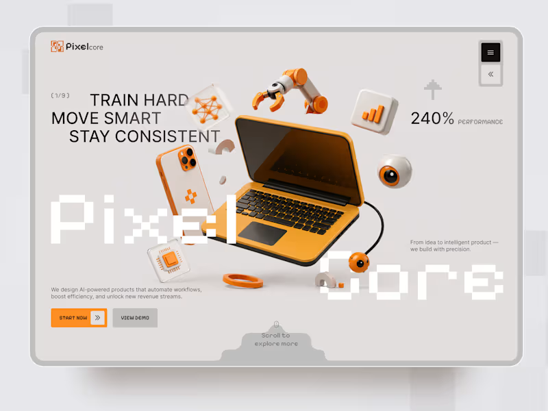
Pixelcore — AI & Technology Landing Page 🤖⚡ Pixelcore is a futuristic landing page concept for an AI-powered technology company focused on automation, data, integrations, and digital product development. The goal was to communicate innovation and technical expertise without falling into the typical dark, overly complex AI aesthetic. The visual direction combines a clean monochrome interface with bold orange accents, pixel-inspired typography, and playful 3D technology objects. Special attention was given to: • a dynamic hero composition built around 3D tech visuals and strong typography; • a distinctive orange accent system that guides attention toward key actions 🟠; • pixel-inspired typography that reinforces the digital and technological character of the brand; • 3D objects representing AI, automation, analytics, hardware, and connected technology; • clear CTAs that make the next step immediately visible; • service cards for AI Automation, Data Insights, Integrations, and Product Design; • trust elements and performance metrics that support the company’s positioning; • responsive mobile layouts that simplify the composition while keeping the same visual identity 📱; • a modular visual system that could easily scale across services, case studies, and additional landing pages. The result is a clean but expressive digital experience that makes an AI company feel innovative, approachable, and visually memorable — without sacrificing clarity or usability. Looking to create a distinctive website for your AI, SaaS, or technology product? Let’s turn complex technology into a digital experience people instantly understand ⚡
26
55
939
Message
30
Karan | Brands & Websites
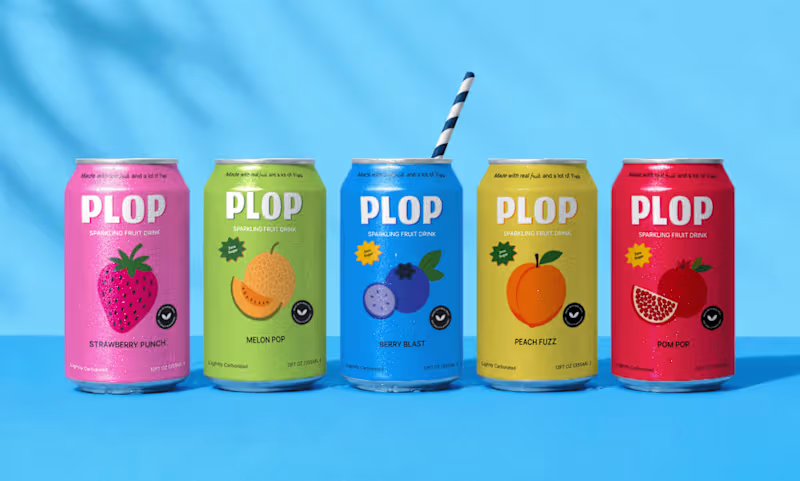
Another round of mockups exploring the world of fruity, fizzy, slightly ridiculous refreshment.
30
30
591
Message
10
Ste D'Elboux
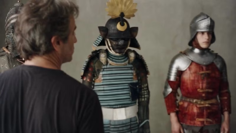
WHAT WE WEAR TO PROTECT What if historical armor left the museum and walked into a 1990s fashion editorial? For the #FLORAMuseum challenge, I used four original armor pieces from The Met as my creative brief — without changing the pieces themselves. I only changed the context: real models, fashion photography, a magazine cover and a VHS-style behind-the-scenes. 5,000 years of protection. One new context. Original references from The Met: https://www.metmuseum.org/art/collection/search/24008 https://www.metmuseum.org/art/collection/search/25640 https://www.metmuseum.org/art/collection/search/23205 https://www.metmuseum.org/art/collection/search/24671 Built with @floraai #FLORAMuseum
1
10
504
Message
14
Philipe Bastos
pro
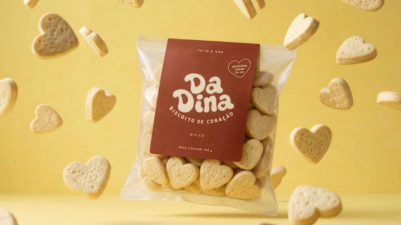
Da Dina is a Brazilian handmade cookie brand built around warmth, affection, and the feeling of a family recipe. The visual identity transforms that homemade character into a playful and contemporary brand system. A custom wordmark, warm color palette, and illustrated character give the brand a distinctive personality while keeping it approachable and nostalgic. The project expands across packaging, delivery materials, and product photography, creating a cohesive visual language around the heart-shaped cookies and the idea behind the brand: “Biscoito de Coração” cookies made from the heart.
7
14
213
Message
29
Arek Dvornechuck
pro
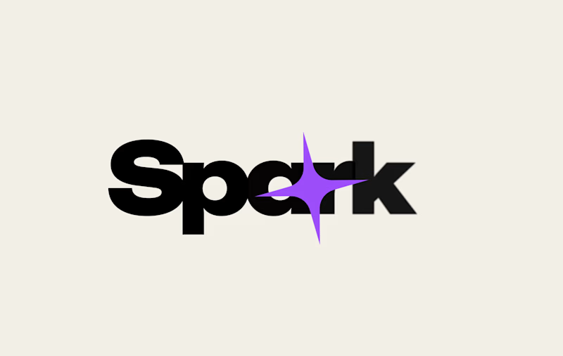
working on logo animation for Spark Studios
21
29
445
Message
18
Oleh Urazovskyi 🇺🇦
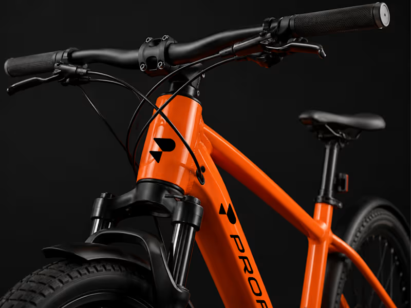
Profit Logo & Brand Identity A complete visual identity developed for Profit, a modern electric bike brand focused on performance, precision, and forward movement. The project includes a distinctive logo and symbol, a bold orange, black, and white color system, custom typography, and clear guidelines for consistent brand application. The identity was extended across digital and physical touchpoints, including social media, business cards, and product branding. The visual language combines strong geometric forms, high-contrast layouts, and dynamic product imagery to create a confident, technical, and contemporary presence that reflects the brand’s focus on modern cycling.
4
18
339
Message
19
Serhii Yurkovskyi
pro
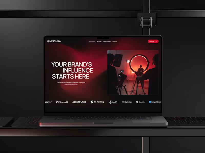
Mischka already had a bold identity. The website had to live up to it. MISCHKA is an award-winning, performance-first influencer marketing agency working with cybersecurity and technology brands. The team came with a clear point of view, so this was never simply about giving them a more polished online presence. It was about building a website that could carry the same confidence and energy as the agency itself. The project went far beyond technical implementation. We spent a lot of time on the site structure and UX, as well as developing the visual language for the interface. The gradients, in particular, became one of the most recognizable parts of its digital identity. They aren’t just there for atmosphere - they connect sections, frame key content, and give the whole experience its rhythm. Behind the visuals, we built a client-friendly CMS around the way the team publishes its work. MISCHKA can add and update case studies and insights without rebuilding pages or relying on a developer for every change. My role covered Webflow development, responsive behavior, interactions, and CMS architecture. I was also directly involved in shaping the UX structure and wireframes, and created a number of visual elements used throughout the interface - including custom graphics, gradient treatments, and other identity-led details. The result is a website that feels unmistakably MISCHKA on the surface while remaining practical and scalable behind it. It’s also one of those projects I still enjoy opening in a new tab, just to watch the whole experience move. A lot of care went into every part of it, and I think that comes through. After launch, the team shared their experience in a verified Clutch review: “They really know Webflow inside out.” A live result I’m proud of and a happy client at the end of it - that’s exactly how I want a project to close. Thank you, Yuliya Gorenko, for your trust and for the opportunity to work on this project. I really enjoyed the collaboration and am proud of what we created together! Explore the project: Live website: https://www.mischka.agency/ (https://www.mischka.agency/)Client review: https://clutch.co/go-to-review/82f12ed1-54c6-4072-ad3e-ca176f90de66/466955 (https://clutch.co/go-to-review/82f12ed1-54c6-4072-ad3e-ca176f90de66/466955)If your company has a strong brand but its website still feels like the weaker version of it, send me the link. I’d love to hear what needs to change!
17
19
267
Message
20
Ste D'Elboux
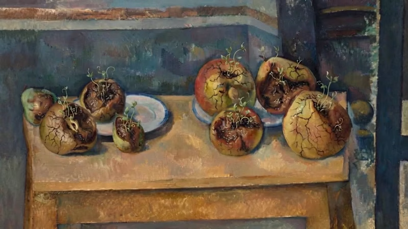
What if a "still life" wasn't dead at all? 🍎🌱 For the #FLORAMuseum challenge, I reimagined an open-access work from @metmuseum without changing its composition, lighting, or adding anything to the scene. I simply let time move forward. The fruit decays, seeds begin to sprout, and a “dead” still life slowly becomes a living cycle again. Built and iterated in FLORA, using the original artwork as the visual anchor. Nature is never truly still. And never truly dead. 🌱
4
20
1.4K
Message
13
Yurii Tarasov
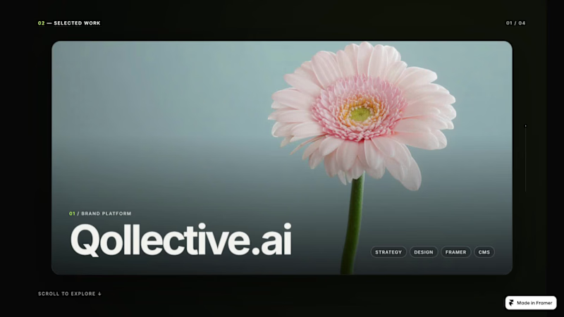
Selected Work, reimagined as a scroll-driven project stack. Built in Framer with a custom Code Component — smooth depth, layered transitions and continuous motion. Live site: https://yuriitarasov.framer.website/
10
13
265
Explore projects