Freelance Brand Designers in Rio de Janeiro
Sign Up
Post a job
Sign Up
Log In
Filters
2
Projects
People
Adelaida ✦ BYAD Studio
pro
Rio de Janeiro - State of Rio de Janeiro, Brazil
Empowering Your Brand's Voice Through Design 💫
$25k+
Earned
34x
Hired
4.8
Rating
566
Followers
Follow
Message
Empowering Your Brand's Voice Through Design 💫
15
Borne Branding
15
400
9
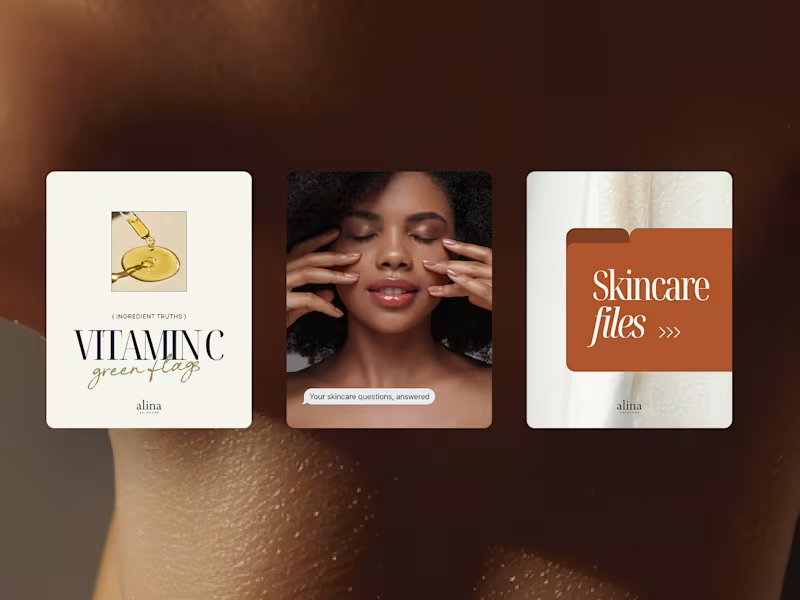
Alina Skincare Social Content
9
152
23
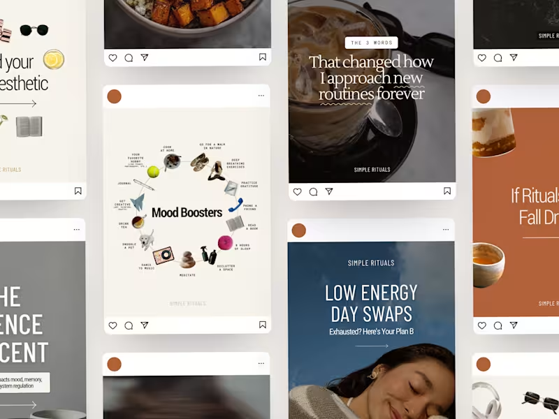
Simple Rituals Social Content
23
373
3
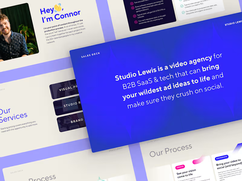
Studio Lewis Sales Deck
3
131
Brand Designer
(15)
Follow
Message
STEPHANIE TETIIZ
Rio de Janeiro, Brazil
Impactful illustration and brand design rooted in craft ✨
$5k+
Earned
2x
Hired
76
Followers
Follow
Message
Impactful illustration and brand design rooted in craft ✨
2
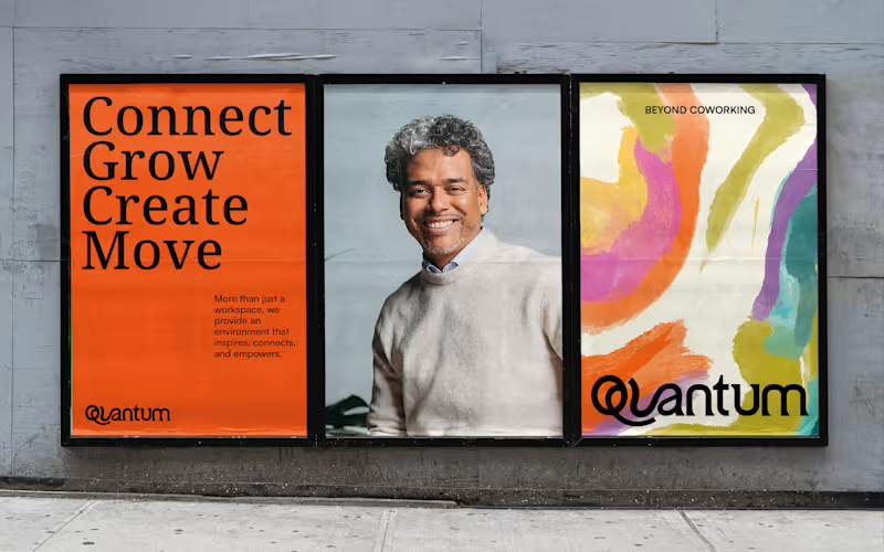
Visual identity - Quantum Workspaces
2
13
14
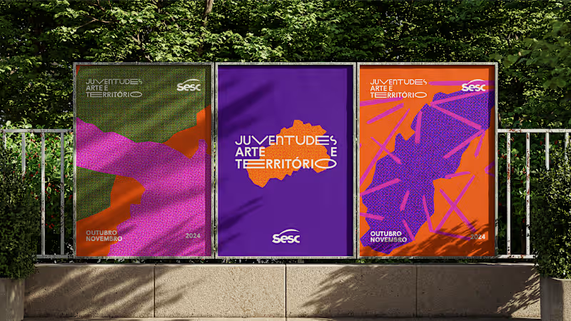
Sesc - Juventudes, Arte e Território
14
81
2
Mulheres nas Artes - Identity
2
22
16
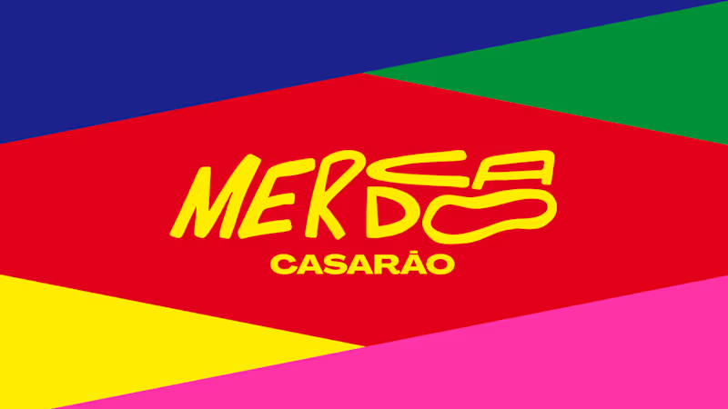
MERCADO CASARÃO - identity
16
117
Brand Designer
(7)
Follow
Message
Marcus Dutra
pro
Rio de Janeiro, Brazil
Designer Director at Mainnet Design
$50k+
Earned
23x
Hired
4.8
Rating
227
Followers
Top
expert
+4
Follow
Message
Designer Director at Mainnet Design
27
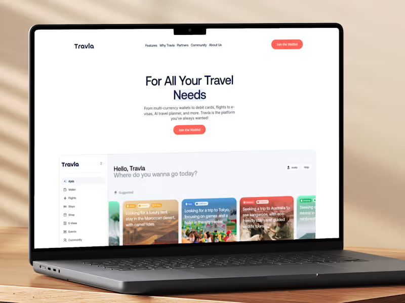
Travla - Travel App
27
353
3
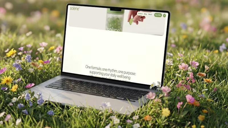
Solene - E-Commerce & Branding
3
88
2
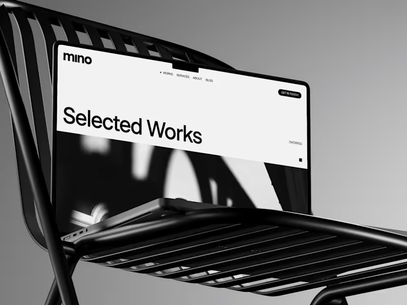
Mino® - Real Estate Agency
2
65
1
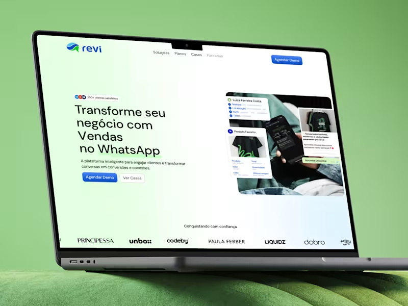
Revi - WhatsApp SaaS
1
65
Brand Designer
(7)
Follow
Message
Mauricio Pontual
pro
Rio de Janeiro, Brazil
Senior Art Director | AI Campaigns, Branding & Films
33
Followers
Follow
Message
Senior Art Director | AI Campaigns, Branding & Films
0
Another Contra feature! ✨ So happy to see BEYOND CAPSULE hand-picked by the Contra team. This self-initiated project brought together brand identity, packaging, 3D and editorial art direction around one idea: making the product easier to understand through information, color and detail. Thank you, Contra, for featuring my work again, and everyone who has taken a look and supported the project. It means a lot! Explore the full project and film: https://contra.com/community/QT8Yx218-beyond-capsule-brand-identity-packaging
0
62
39
BEYOND CAPSULE — Brand Identity, Packaging & Art Direction Know what is inside. An independent identity for a fictional US-market supplement line, developed from the information on the label outward. The starting point was a nutraceutical brand with a futuristic aesthetic. The challenge was to explain its composition and formats without making that aesthetic stand in for evidence of results. 01 / Collection and detail. The line presents ashwagandha root powder in two formats: capsules and powder. Format, ingredient and quantity lead the reading order. Yellow-green identifies capsules; lavender identifies powder. The palette carries through the label bands, lids, colored capsule halves and scoop. Names and numerical codes support recognition alongside color. 02 / From 3D to packaging. The jars and accessories were built in Blender around that identification system. One half of each capsule is colored, while the other is transparent. The label hierarchy moves from the front panel into Supplement Facts, suggested use and supporting information. The second board pairs original 3D renders with the flat label artwork so the packaging can be read as a designed object, not only as a campaign image. 03 / Editorial and applications. The same structure extends to a digital entry screen and A5 product sheets. The studio campaign explores the collection through low angles, top views, macro textures and a capsule held between fingers. Product references guide the AI-assisted images, with selection focused on consistency of color, packaging and scale. The accompanying 20-second film animates the selected stills and typography, with an original instrumental soundtrack. Creative direction, visual identity, packaging, 3D and art direction: Mauricio Pontual / MP House Studio. Tools: Blender and Higgsfield. Motion assembled in Higgsedit. Self-initiated concept; not commissioned. Fictional brand and product specifications. AI-assisted editorial imagery based on original 3D packaging. No product efficacy or market results are claimed.
24
39
1.6K
25
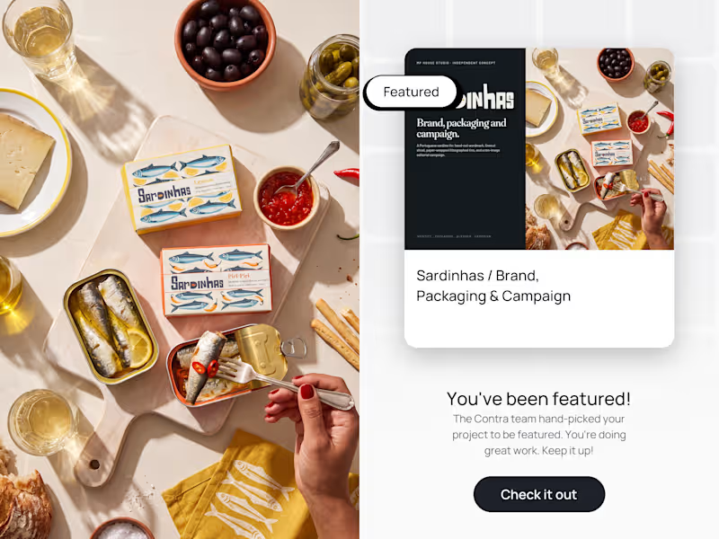
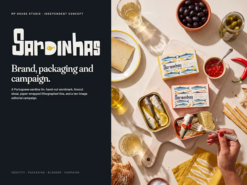
Sardinhas was hand-picked by the Contra team to be featured. An independent brand concept for a Portuguese sardine tin, built end to end: identity, illustration, packaging, 3D and a ten-image editorial campaign. Hand-cut wordmark, linocut shoal, paper-wrapped lithographed tins rendered in Blender, and a campaign shot on one table under one sun. Creative direction, brand identity, packaging and AI-assisted visual development by Mauricio Pontual / MP House Studio. Independent concept, not commissioned. Full project: https://on.contra.com/p78dgN
13
25
588
28
Sardinhas / Brand, Packaging & Campaign Sardinhas is Portuguese for sardines. Nothing more, nothing less. An independent brand concept for a Portuguese sardine tin, built end to end: identity, illustration, packaging, 3D and a ten-image editorial campaign. Four boards trace the work. 01 / Identity and illustration. The wordmark is hand-cut lettering with a sardine living inside the D. One rule runs through the whole system: the letters stay charcoal, and only the fish in the D takes the colour of each flavour. The illustration is a three-ink linocut shoal, sea blue and charcoal on cream paper, with a third ink that changes with the flavour: lemon, olive, tomato, piri-piri. Style explored in Midjourney V8, locked with a master image and derived across the four flavours. 02 / Packaging. Two skins. Outside, a printed paper wrap with folded ends, the way Portuguese conservas have been sold for a century. Inside, a lithographed tin with the same shoal on the lid and the body in the flavour ink. Four flavours: Lemon, Olive Oil, Tomato, Piri-Piri. All texts, nutrition and barcode in English. Every tin and wrap was built and rendered in Blender, textures generated from the vector artwork at 20 px per mm. 03 / Campaign. One table, one sun. Cream plaster, hard late-afternoon light, the same hand in every frame. The colour never comes from the ground: it comes from the tin, the printed linen napkin and the food. Full petiscos tables, the tin opened at the centre, a shop interior, a printed paper bag, four napkins for four flavours. Photographs generated with Nano Banana Pro through Higgsfield at 4K, always with the Blender renders as product reference. Tools: Midjourney V8 for the illustration language, Blender 5.2 for packaging and renders, Nano Banana Pro via Higgsfield for the campaign, Claude Code as the direction hub for the whole project. Creative direction, brand identity, packaging and AI-assisted visual development by Mauricio Pontual / MP House Studio. Independent concept, not commissioned. #BrandIdentity #PackagingDesign #ArtDirection #Illustration #Blender #GenerativeAI #FoodPhotography #Sardines
26
28
793
Brand Designer
(7)
Follow
Message
Candela Albertini
pro
Rio de Janeiro, Brazil
Visual Designer with expertise in UI Design
New to Contra
Follow
Message
Visual Designer with expertise in UI Design
2
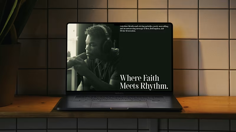
Lani Rose — Web Design Lani Rose is an independent R&B artist. The concept behind this design draws from a deep, earthy green palette — evoking spirituality, soul, and a grounded connection to self. The retro undertones pay homage to the roots of R&B while keeping the overall feel modern and intentional. The layout is minimal and airy, with a strong sense of balance and whitespace that lets the music and visuals breathe. The hero section puts his best tracks and covers front and center, leading listeners directly to where they can stream and connect with his work.
3
2
114
0
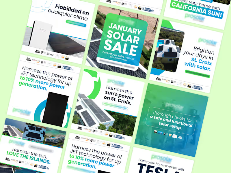
Social Media Design Projects
0
8
0
AXIS LIGHTMENT EQUIPMENT
0
6
0
Brochure / Presentation Project
0
8
Brand Designer
(3)
Follow
Message
Vladmir Oliveira
Rio de Janeiro, Brazil
Web Designer, UI Design & Brand Identity Designer.
23
Followers
Follow
Message
Web Designer, UI Design & Brand Identity Designer.
7
Hot Birds is a brand identity study developed for a contemporary fast casual restaurant focused on hot chicken and bold flavors. The project explores the creation of a strong and recognizable visual system that reflects intensity, quality and personality. Inspired by the culture of Nashville hot chicken and the warmth of Southern hospitality, the brand combines a vibrant color palette, bold typography and a playful yet confident visual language. The intention was to build a brand that feels approachable while still standing out in a highly competitive food market. From logo design to real world applications, the identity was designed to be flexible and impactful across multiple touchpoints including packaging, social media and physical environments, ensuring consistency and memorability.
3
7
155
1
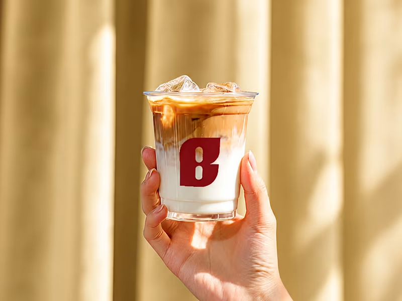
BrewPort is a specialty coffee shop brand concept built around the culture of modern nomads, remote workers, and people who treat every seat like a headquarters. This project covers the full brand identity system, from logo design and color palette to typography, tone of voice, and merch copy. About this project This is a fictional project developed for portfolio purposes. The logo and visual identity were originally created for a real client - who, let's say, decided not to pay. Rather than letting the work disappear into a drawer, I reframed it as a full brand study case, built out the identity system, and turned it into something worth showing. If life gives you an unpaid invoice, make a case study.
1
1
94
4
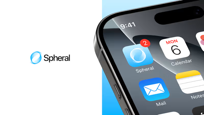
Conceptual identity and interface project for Spheral, an app focused on centralized organization and communication. The design explores organic shapes, depth, and motion to convey fluidity and continuity across interactions. The name Spheral derives from the concept of a sphere, representing a cohesive, immersive system that moves around the user.
5
4
197
2
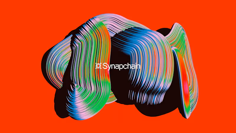
I designed the brand identity for Synapchain, a data intelligence platform bridging the gap between blockchain complexity and human clarity. The visual system needed to feel both technical and alive. The result: an identity built around fluid 3D forms , and a modular logo mark that reflects the interconnected nature of decentralized networks. Every touchpoint was crafted to make Web3 feel approachable without losing its edge. This is what I love about branding: turning abstract ideas into systems people actually want to engage with. Background by: Rik Oostenbroek (store.rikoostenbroek.com (http://store.rikoostenbroek.com)) all credits. Open to new projects and opportunities.
2
151
Brand Designer
(14)
Follow
Message
Barbara Abbes
pro
Rio de Janeiro, Brazil
Graphic designer passionate about creating engaging work.
Follow
Message
Graphic designer passionate about creating engaging work.
0
Brand Identity for Nous-Music
0
12
0
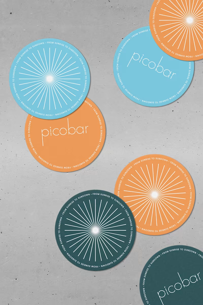
Picobar Brand Refresh
0
8
1
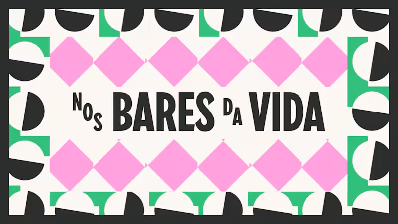
Nos Bares da Vida
1
6
0
On-screen graphics for Os Hassums
0
8
Brand Designer
(7)
Follow
Message
Sibelius Claussen
Rio de Janeiro, Brazil
Creative Director & Product Designer | Brand Systems + SaaS
Follow
Message
Creative Director & Product Designer | Brand Systems + SaaS
1
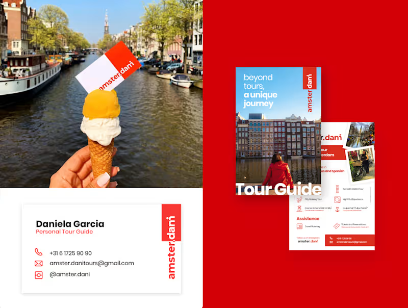
Dani approached me with a playful challenge: create a brand that felt unmistakably like Amsterdam while turning her nickname into the joke “Amster.dani.” Over a three‑week sprint using my own methodology, I designed the entire brand ecosystem, from concept and tone of voice to logo, symbol set, and key digital touchpoints. At the center is a wordmark that can be read as both “amster.dani” and “amsterdam,” merging the city’s name with her story to signal a more intimate, local‑guided experience. Around it, I built a visual language that connects the city’s essence with Dani’s view as a resident, using clear typography, bold color blocks, and flexible icons for tour categories, so every interaction feels like “not just a tour, a unique journey.”
2
1
138
3
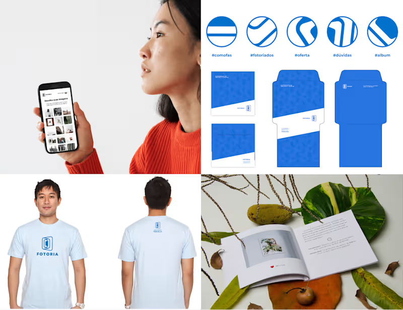
I founded Fotoria as a startup to help creators turn their Instagram feeds into tangible memories, designing both the physical photo book and the digital experience end‑to‑end. I led the project from user research to service design, defining how photos would be selected, laid out, and delivered so that the process felt seamless for non‑technical users. Using Figma and Illustrator, I created the visual identity and the book layout system, then built an InDesign template that could generate entire albums automatically from Instagram data. A custom PDF‑conversion flow coded in React transformed user selections into print‑ready files, and the final experience ended with a curated package arriving at the user’s home as a finished book, connecting their digital stories with a physical object they could keep and gift. #book #branding
2
3
144
1
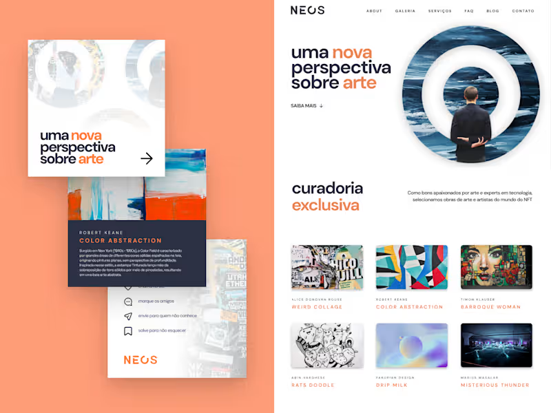
I led the NEOS NFT project for André Maso, overseeing the development of a new brand ecosystem and website to better connect a community of artists and investors. During this three‑month collaboration, I guided the branding implementation on the site, respected an existing logo created by another designer, and introduced strategic adjustments and new visual elements to strengthen the identity. Working primarily in Figma and WordPress with custom CSS/HTML, I focused on translating the brand into a clear, engaging digital experience that showcased each artist’s work and presence. The result was a more organized and expressive brand structure, supported by a visual language that highlights individual artists while reinforcing a shared sense of belonging, recognition, and appreciation within the NEOS community. #branding
1
115
1
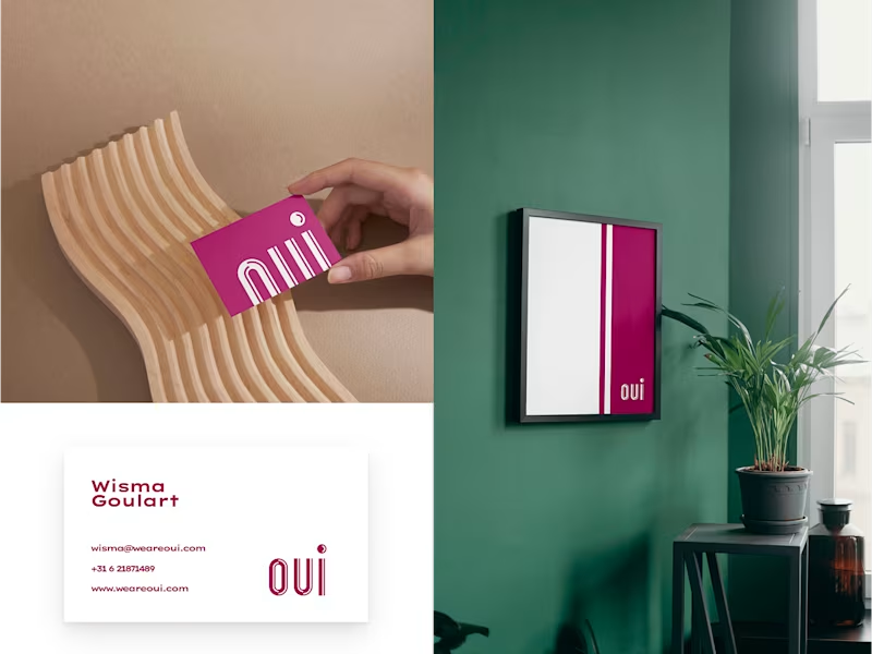
I created the entire brand ecosystem using my own methodology, leading a three‑week sprint with Wisma Goulart, a female‑led European design agency, to build a visual identity with more vitality while staying true to the director’s vision. I worked entirely in Figma, using a presentation structure I developed to guide the team through research, exploration, and final directions, and relied on third‑party tools to prepare assets for different devices. A key outcome was the “OUI” logo: a clean wordmark with subtle cuts that symbolize a new era for the agency, paired with a circular symbol that embeds a discreet smile to convey positivity and approachability. This direction gave Wisma Goulart a cohesive visual foundation and logo system that strengthens their positioning as an optimistic, welcoming studio in the European market.
1
135
Brand Designer
(4)
Follow
Message
Explore people