The network for creativity
Join 1.25M professional creatives like you
Connect with clients, get discovered, and run your business 100% commission-free
Creatives on Contra have earned over $150M and we are just getting started
Back to feedPost
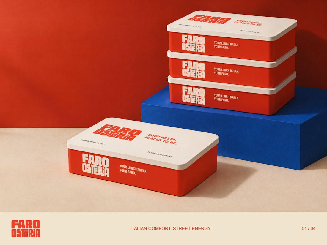
FARO OSTERIA — Italian comfort. Street energy.
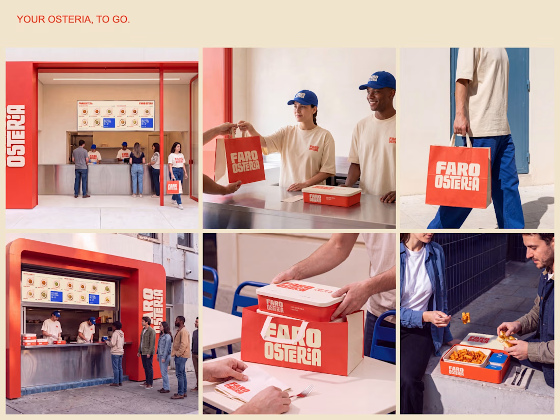
A brand and takeaway concept built around the entire meal: bold packaging, a clear digital menu and a street presence that carries the same identity from counter to customer.
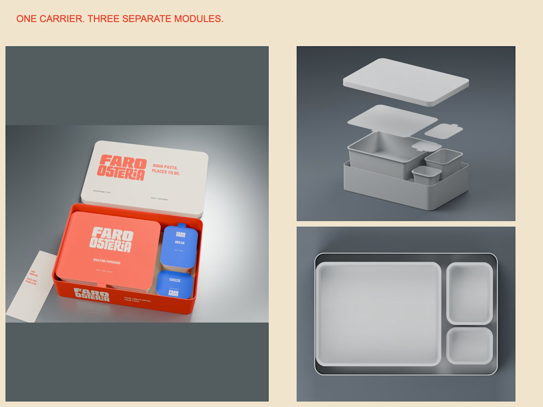
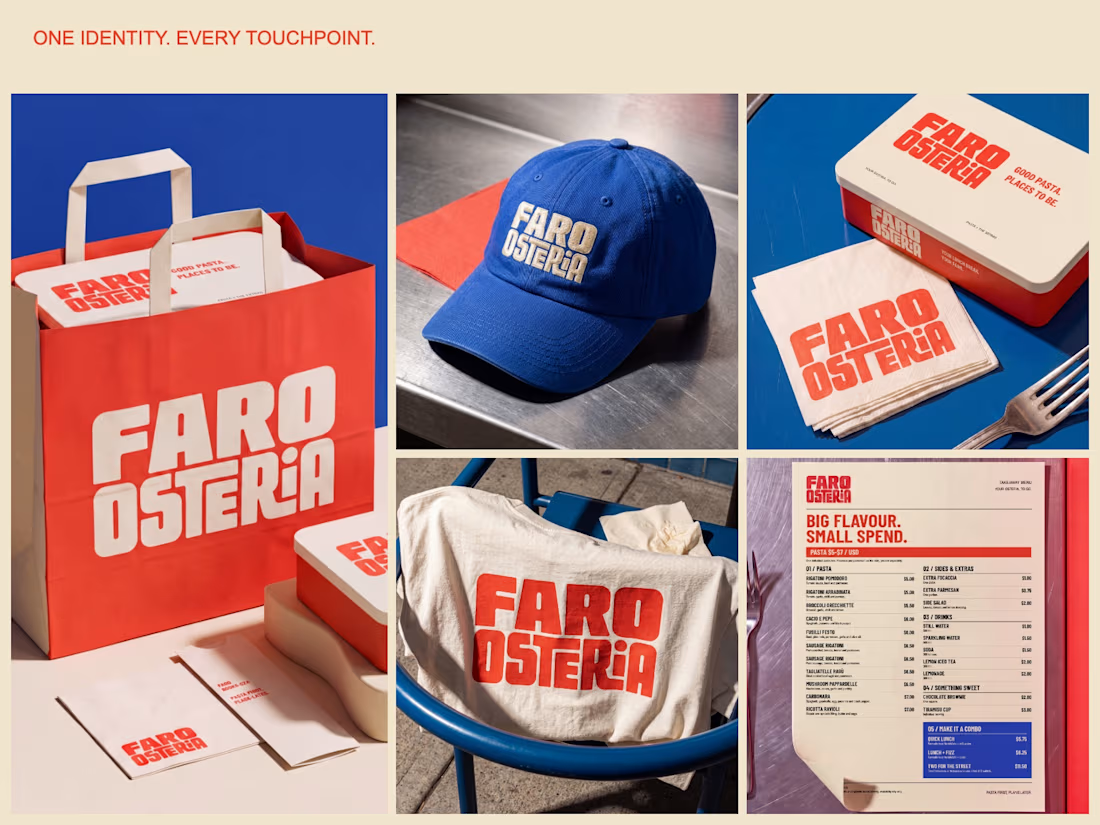
The packaging study uses one carrier with separate pasta, bread and cheese modules. The visual system extends through a $5–$7 pasta menu, uniforms, bags and editorial campaign imagery.
Creative Direction — Mauricio Pontual.
Concept study. Packaging modelled in Blender; campaign imagery developed with AI-assisted tools and art direction.
Explore the complete project:
https://www.behance.net/gallery/255879863/Faro-Osteria-Food-Branding-Packaging-Design



this looks fantastic!

Thank you so much, Nicolette! Really glad you liked it!

the red pasta boxes are my favourite. how long did the blender modelling take?
Thanks, Ajibola! The red pasta boxes are my favorites too. The Blender modeling was done autonomously and took less than 4 minutes.

That one red carrier with separate pasta, bread, and cheese trays is the smart part. The same blocky wordmark then sits cleanly on the bag, cap, and uniform, so the street look actually matches the box.
Thank you so much, Rohan! Really appreciate it

Amazing🙌
Thank you so much, Nilkanth!

The red and blue palette against that warm photography is doing a lot of work here. Love how the identity carries through from the carrier bags to the caps to the store signage without feeling forced. The modular packaging idea with separate compartments is genuinely clever for a takeaway concept.
Thank you so much, Tabish!

Great work
Thank you! Really appreciate it.

nice branding..🔥
Thanks, Sahil! Glad you liked the branding.
The network for creativity
Join 1.25M professional creatives like you
Connect with clients, get discovered, and run your business 100% commission-free
Creatives on Contra have earned over $150M and we are just getting started





Related posts

Nike × Champions League Ball Concept
An independent concept exploring what a Champions League ball could look like through Nike’s visual language.
The idea starts with a star containing a Swoosh in the negative space, then extends into a complete ball system using Nike’s existing panel construction.
Designed and animated with Spline, After Effects, and a custom 3D ball tool built for the project.
Unofficial concept. Not affiliated with Nike or UEFA.


This is very well thought of and creative

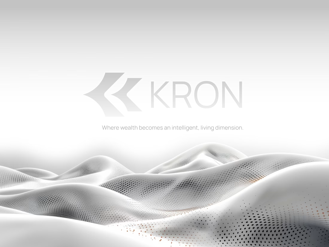
Does a fintech brand actually need to look like fintech?
We don’t think it does.
For KRON, we wanted to move away from the visual language you’d normally associate with finance.
No banking blue.
No obvious financial symbols.
No trying to scream “AI.”
Instead, we started with one idea:
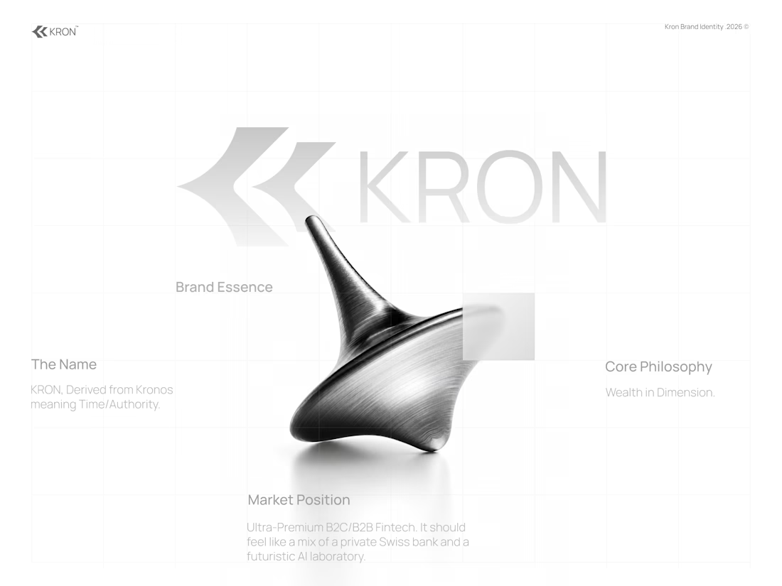
What if wealth had depth?
That led us toward a much more spatial identity built around form, movement, architecture, and dimension.
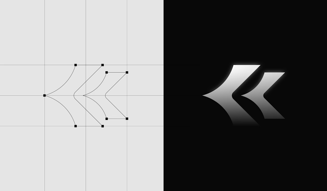
Even the K started becoming less of a letter and more of a structure we could build around.
Still exploring how far this system can go.
Would you know this was a fintech brand without being told?
And more importantly, does it need to?
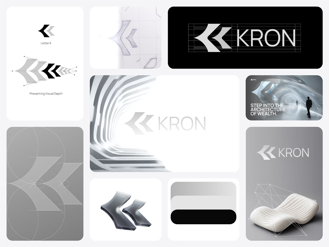

Honestly this branding kit feels luxury specially with high contrast and soft colors good job 🎉🎉❤️❤️


When reviewing a studio portfolio, look past the final screenshots. Ask what the problem was and what changed between first concept and shipped version. The work shows what they can present. The process shows what they can solve.
Hey bro the colors you use is amazing Congrats 🔥🔥🎉🎉