The network for creativity
Join 1.25M professional creatives like you
Connect with clients, get discovered, and run your business 100% commission-free
Creatives on Contra have earned over $150M and we are just getting started
Back to feedPost

Hot Birds is a brand identity study developed for a contemporary fast casual restaurant focused on hot chicken and bold flavors. The project explores the creation of a strong and recognizable visual system that reflects intensity, quality and personality.
Inspired by the culture of Nashville hot chicken and the warmth of Southern hospitality, the brand combines a vibrant color palette, bold typography and a playful yet confident visual language. The intention was to build a brand that feels approachable while still standing out in a highly competitive food market.
From logo design to real world applications, the identity was designed to be flexible and impactful across multiple touchpoints including packaging, social media and physical environments, ensuring consistency and memorability.


love the aesthetic, cool designs

This is so fun! Love it 🤩
The network for creativity
Join 1.25M professional creatives like you
Connect with clients, get discovered, and run your business 100% commission-free
Creatives on Contra have earned over $150M and we are just getting started



Related posts

Amazing!

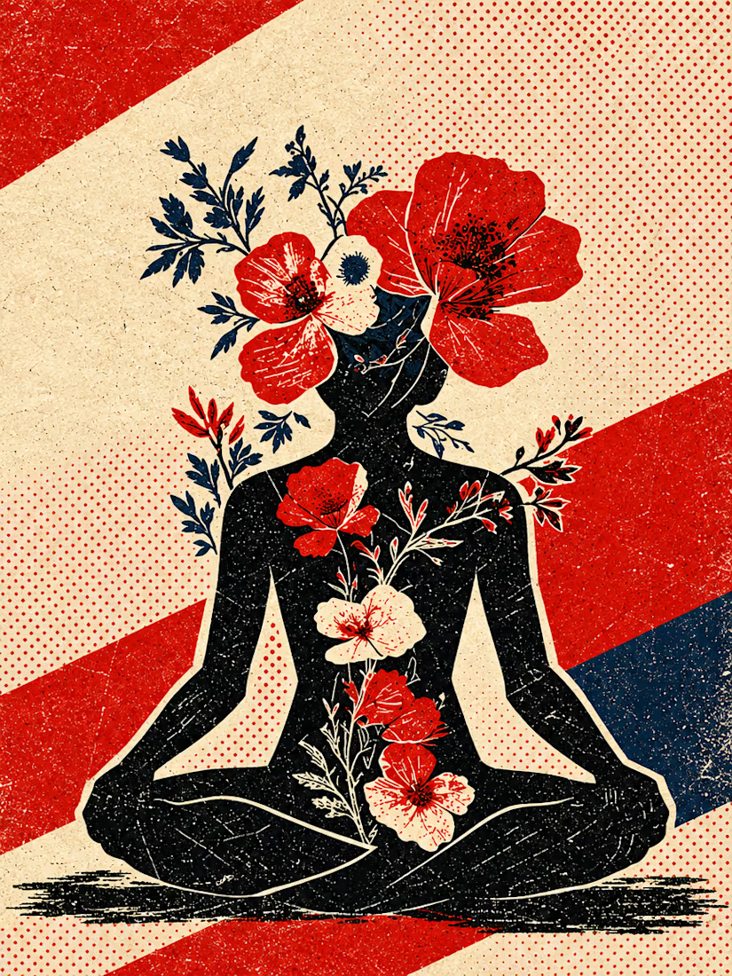
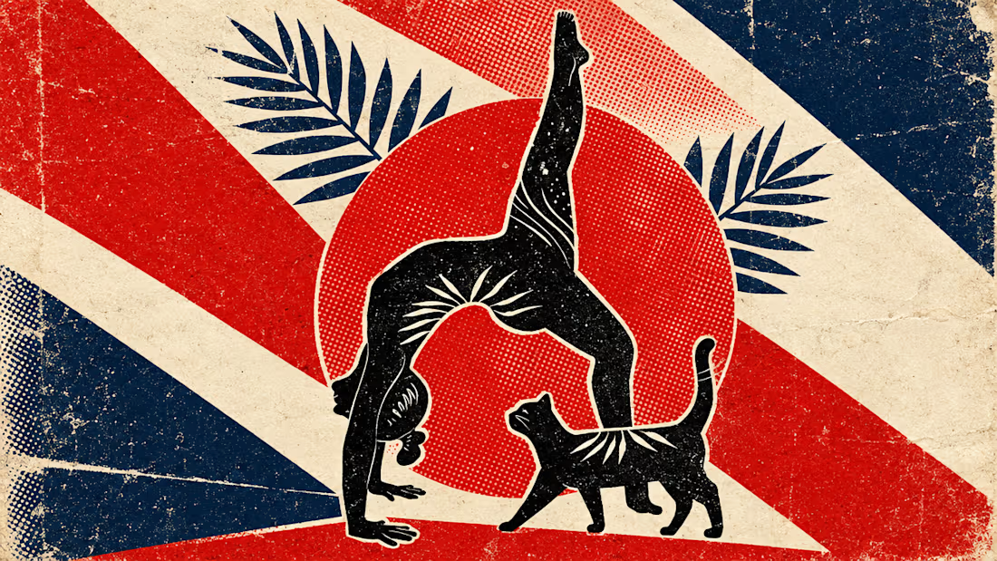
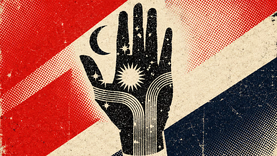
What happens when propaganda designed to erase the self gets pointed at the self instead?
Soviet propaganda spent 70 years trying to erase the individual soul in favour of the collective machine. I pointed that exact visual language at the thing it was built to suppress.
I kept...


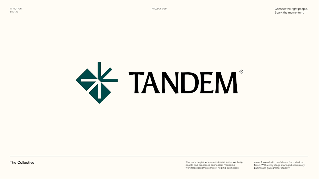
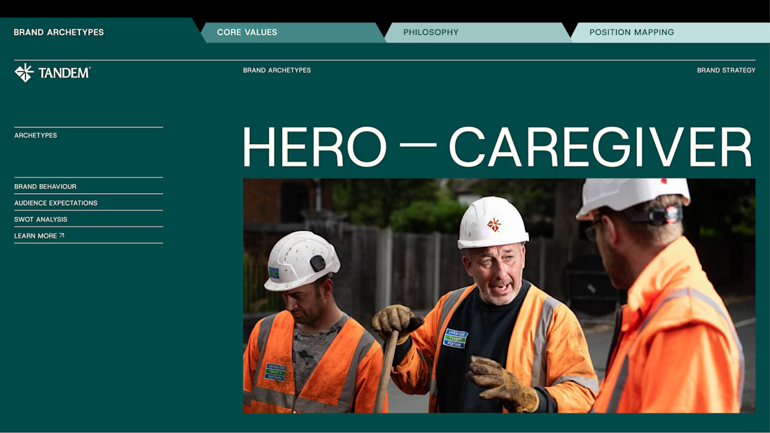
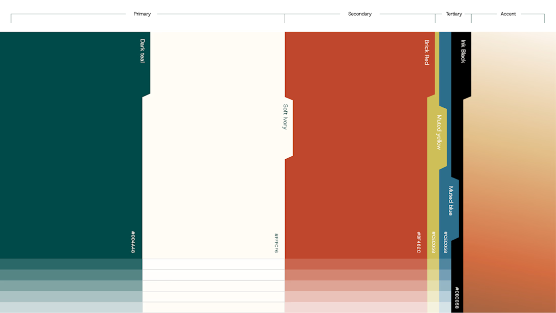
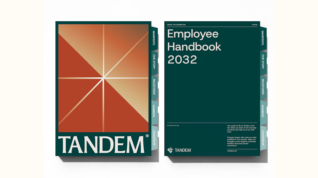
Wrapping up another brand identity project for a workforce management company.
We're currently putting together the full case study, but here's an early look at some of the visuals. Really pleased with how this one has come together!
We explored several distinct creative directions before arriving at the final identity. And there's plenty of interesting work that didn't make the cut.
While we prepare the full case study, I'm thinking of sharing some of those rejected directions and the thinking behind them.
Would you be interested in seeing what didn't make it?




Good branding isn’t just about how a logo looks. It’s about what it represents.
Sharing one of our recent projects: NEXU, a fintech brand identity built around connection, trust, and opportunity.
The idea was to create a visual identity that makes finance feel more human and approachable. The symbol brings together the gesture of reaching out and the strength of a bridge, representing the connection between people, capital, and opportunity.
From the logo concept to the broader visual identity, every detail was designed to communicate confidence, clarity, and progress.
It’s always rewarding to see how a simple visual idea can tell a much bigger story.
Would love to hear what you think!
Check it out
#BrandIdentity #LogoDesign #Fintech #BrandDesign #ContraCommunity

Fantastic work


