The network for creativity
Join 1.25M professional creatives like you
Connect with clients, get discovered, and run your business 100% commission-free
Creatives on Contra have earned over $150M and we are just getting started
Back to feedPost
FARO OSTERIA just got featured on Contra! ✨
Really happy to see this one selected by the Contra team. I loved building the world around it, from the red pasta boxes and blue caps to the menu and street campaign.
Thank you, Contra, and everyone who has taken a look and supported the work.
Explore the project:
https://contra.com/community/eVKgBdEl-faro-osteria-italian-comfort-street
Independent concept. Creative direction, branding, packaging and AI assisted imagery by Mauricio Pontual / MP House Studio.

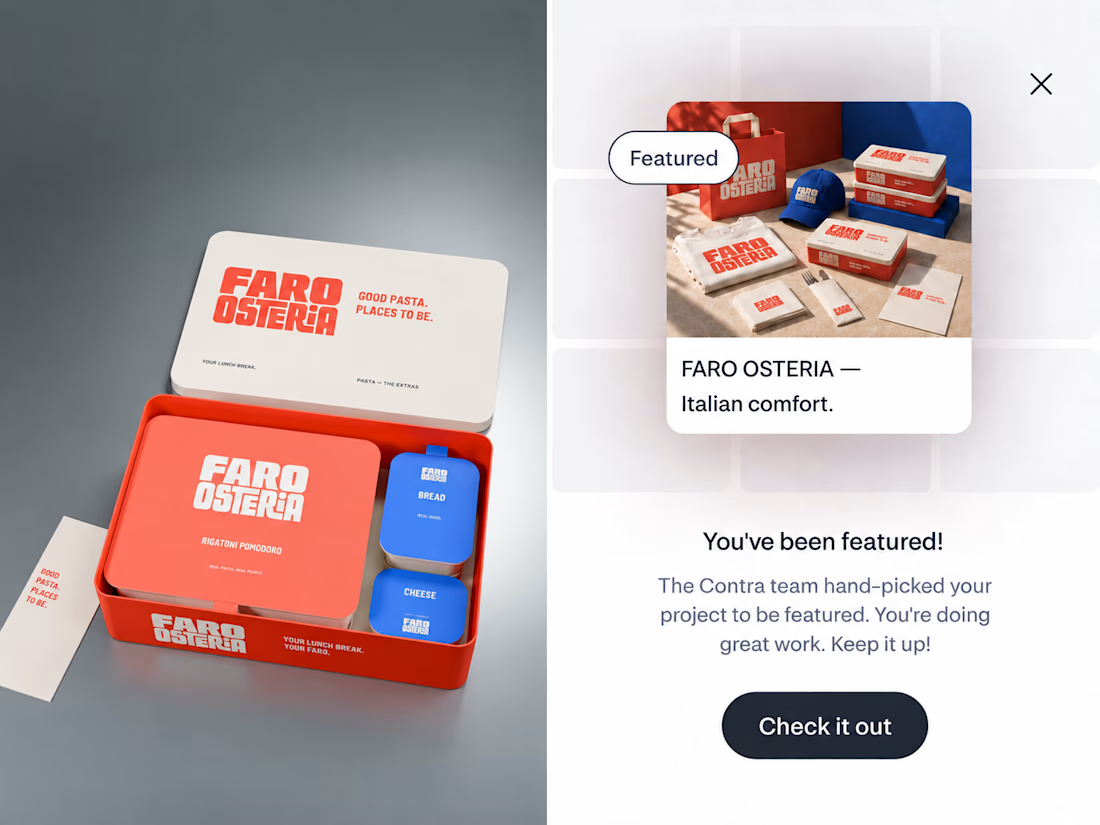

The red-and-blue packaging system feels wonderfully confident, and the tiny “featured” moment makes the presentation feel like part of the brand world. Great balance of restaurant warmth and editorial polish.

Thank you so much, Rohan!

Thanks, Sahil! Appreciate it.

Que buen proyecto
Muchas gracias, Jose! Me alegra que te haya gustado.
The network for creativity
Join 1.25M professional creatives like you
Connect with clients, get discovered, and run your business 100% commission-free
Creatives on Contra have earned over $150M and we are just getting started
Related posts


Celvana brand identity & packaging for a red light therapy brand launching in the US.
The category is crowded with identical, unbranded panels. Celvana sells precision, so the brand had to look like medical equipment you can trust: clinical, exact and professional.
Brand identity case study
Packaging case study

This is high end branding

Nothing rots in salt.
So I put a skincare brand in a salt flat and let it crystallize. Name, mark, palette, campaign, packaging. One idea, zero moodboards.
HALITE. Case study live soon.
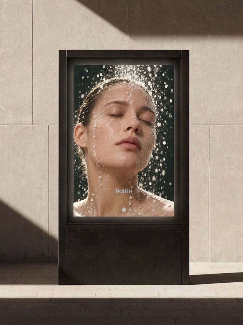
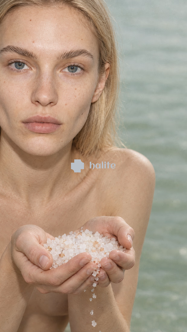
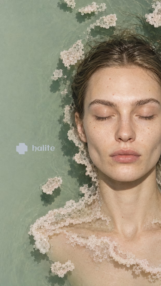
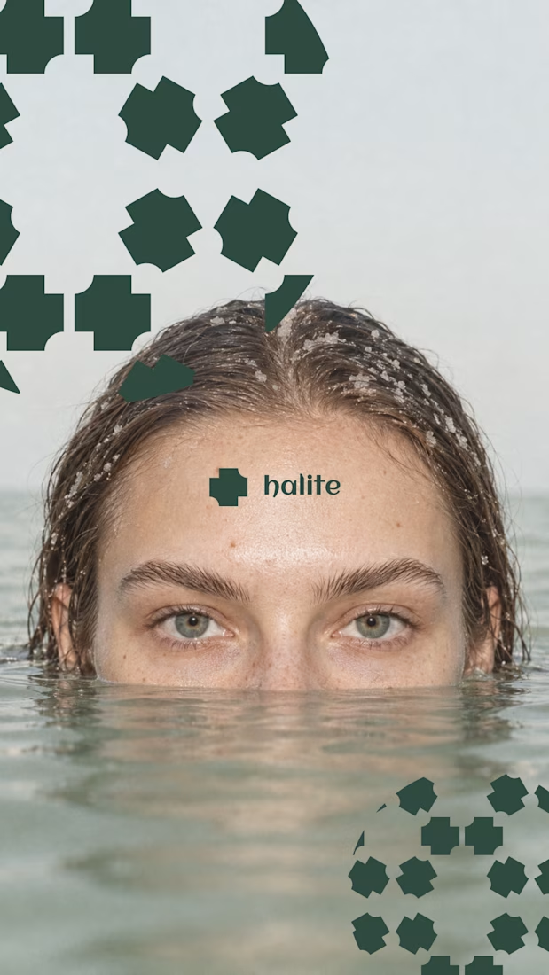

Salt as the core idea is clever. It says preservation, purity and texture in one move, which is exactly what skincare is trying to say. Curious how the crystal motif holds up at small sizes, like a cap or a sachet. Looking forward to the full case.


A little throwback to one of our favorite collaborations with Lion Pose! 🧡
We worked with the founders to bring their vision to life through core brand identity, logo, and packaging design, creating a bold, playful visual language that feels fresh in the skincare space.
So lovely to see Lion Pose grow from its early days to the shelves of Sephora, with our packaging work recognized at the 2024 Dieline Awards!


Nice work


