The network for creativity
Join 1.25M professional creatives like you
Connect with clients, get discovered, and run your business 100% commission-free
Creatives on Contra have earned over $150M and we are just getting started
Back to feedPost
BEYOND CAPSULE — Brand Identity, Packaging & Art Direction
Know what is inside.
An independent identity for a fictional US-market supplement line, developed from the information on the label outward.
The starting point was a nutraceutical brand with a futuristic aesthetic. The challenge was to explain its composition and formats without making that aesthetic stand in for evidence of results.
01 / Collection and detail.
The line presents ashwagandha root powder in two formats: capsules and powder. Format, ingredient and quantity lead the reading order. Yellow-green identifies capsules; lavender identifies powder. The palette carries through the label bands, lids, colored capsule halves and scoop. Names and numerical codes support recognition alongside color.
02 / From 3D to packaging.
The jars and accessories were built in Blender around that identification system. One half of each capsule is colored, while the other is transparent. The label hierarchy moves from the front panel into Supplement Facts, suggested use and supporting information. The second board pairs original 3D renders with the flat label artwork so the packaging can be read as a designed object, not only as a campaign image.
03 / Editorial and applications.
The same structure extends to a digital entry screen and A5 product sheets. The studio campaign explores the collection through low angles, top views, macro textures and a capsule held between fingers. Product references guide the AI-assisted images, with selection focused on consistency of color, packaging and scale. The accompanying 20-second film animates the selected stills and typography, with an original instrumental soundtrack.
Creative direction, visual identity, packaging, 3D and art direction: Mauricio Pontual / MP House Studio.
Tools: Blender and Higgsfield. Motion assembled in Higgsedit.
Self-initiated concept; not commissioned. Fictional brand and product specifications. AI-assisted editorial imagery based on original 3D packaging. No product efficacy or market results are claimed.


The restraint in the packaging system really works—the label hierarchy keeps the product line clear while the lavender/lime palette gives it a distinctive shelf presence. Nice balance of utility and art direction.

Thank you, Rohan! I really appreciate it.

This is incredibly well thought out the way the identity, packaging system, 3D, and editorial direction all connect feels really cohesive. I especially like how the visual language stays futuristic without losing clarity or credibility. Beautiful work 👏
Really kind of you, Gabriela. Thank you for taking the time to say that.

Thanks, TRUEFRAME. Happy you liked the labels.

Thank you, Nirooz. That’s very kind of you to say. Glad you liked the palette and packaging.

yellow and green label is amazing!!👍
Thank you, Tvaron. Happy you liked that combination!

Incredible work
Thank you, Rahman. Really glad you think so.

Thanks, Juice. Glad it came through.

Thanks, Alaa. Really appreciate it.

Love the colors!
Thanks, Martina. So glad you liked the palette!

The lavender and yellow-green combo is such an unexpected pairing for a supplement brand, most of this category defaults to clinical white or sterile blue. Was that contrast a deliberate move to stand out on shelf, or did it come from the futuristic direction you mentioned?
Yes, it was deliberate. I wanted it to feel futuristic, but still warm and ownable.

CLEAN!
Thanks, Blessing. Glad you liked it!

Wow! So beautiful and professional work!👌
Thank you, Md Abdur Rouf. Happy you liked it!

Awesome 🔥
Thanks, Nazmul. Appreciate it!

Thanks, Sahil. Much appreciated.

Sick work 😍
Appreciate it, Ravi. Glad you liked it!

this is great
Thanks, Adeniran. Glad you liked it!

I love how you pair the colors
Thank you, Esther. Happy you liked the color pairing!


That label system is sharp.
Thanks, Milan!


colour coding capsules and powder so you can tell them apart at a glance.. smart
Thank you, Kazi!

The half colored, half transparent capsule carrying the same color code as the label and scoop is the detail that makes this read as a system instead of a campaign image.
Thanks, Rafee. I really appreciate!

Outstanding
Thank you, Faysal. Much appreciated!

This brand identity is stunning. The color palette combined with the precise typography gives the packaging a highly premium, modern feel.
Thank you, Agadon! I’m glad the identity and typography felt that way to you.


Nice one,Mauricio
Nice of you, Sodiq. Thank you.

Starting from the label and building outward is a really smart constraint. The capsule color system as a navigation tool across formats is clever, and the 3D packaging feels premium without being overdone.
Thank you, Tabish!

WOW
Thank you, Gargi! Glad you liked it!

Exceptional work, Mauricio! The balance between futuristic AI-assisted visuals and strict, clean Supplement Facts layout hierarchy is brilliant. The color system for the multi-SKU line looks incredibly premium. Fantastic packaging logic!
The network for creativity
Join 1.25M professional creatives like you
Connect with clients, get discovered, and run your business 100% commission-free
Creatives on Contra have earned over $150M and we are just getting started

Challenges
View all


Related posts



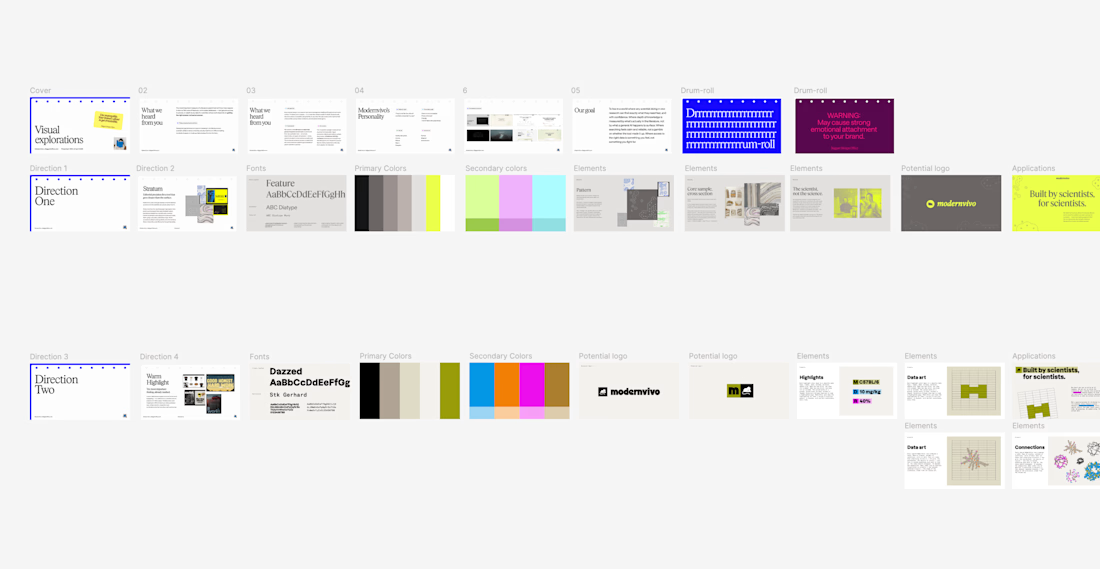
after presenting more brand directions than I can count, one thing I’ve learned: I never jump straight into showing the visuals.
first I want to establish what we're actually trying to solve.
what we heard from the client. what they want to be known for. where they sit in the market. what needs to feel different.
then the big idea, and how it translates into type, colour, imagery and graphic elements.
only then the designs.
context changes how you judge the work.

Same data, two different ways to experience it 🤔
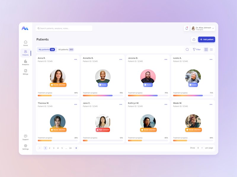
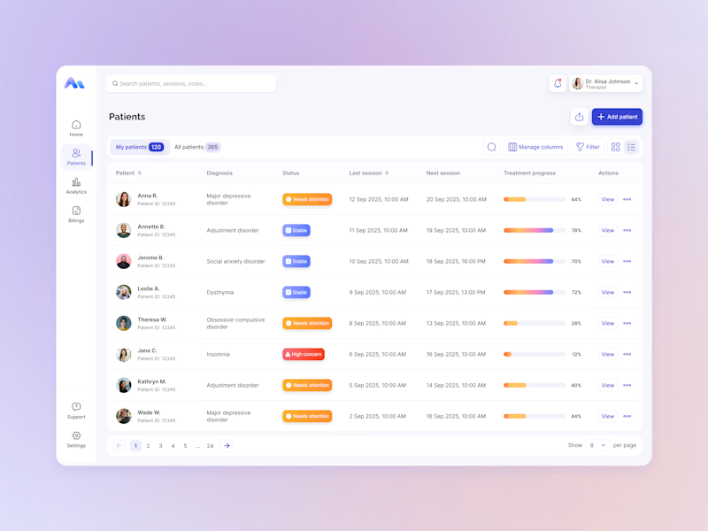
I explored two patient list layouts for a mental health platform: a card view and a table view.
Cards feel more visual and personal, but space is limited and adding more information can quickly make them crowded. For complex enterprise products, I often find tables more practical — they’re easier to scan, compare, sort, and can support more columns when users need greater visibility.
For this kind of workflow, I’m leaning toward the table view. Which would you choose — cards or table?

11 voted
55%
9 voted
45%
20 votes
Closed

For a mental-health patient list the choice isn't really card vs table — it's scan-speed vs context. The card wins the first meeting because the photo and name set the clinician's mental model before they touch the row, but the table is what holds up under the daily rhythm of...