Borne Branding

Adelaida Garcia Lares
Verified


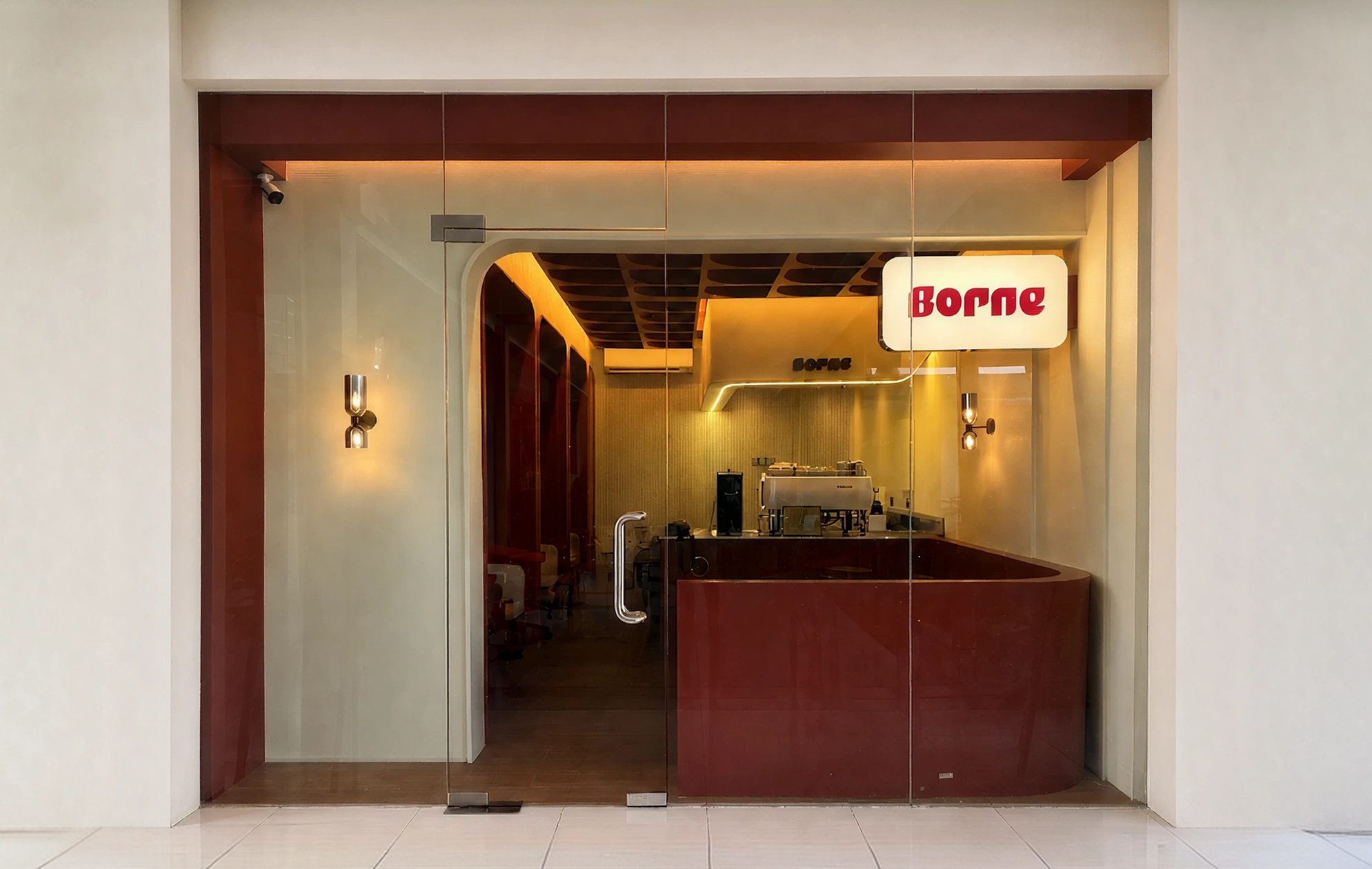
Borne is an independent café brand opening its doors in Davao City, Philippines — a space built around the idea of forward momentum and belonging.
The name itself carries a double meaning: being supported and brought to a better place, and enduring something for someone else — a quiet homage to the founder's mother, who brought the family to the UK at sixteen and gave them a better start. Every part of the brand, from the wordmark to the interior, was built to carry that meaning forward.
✨ Client's desire
The client came in with an existing logo and interior already in motion, but felt the identity wasn't landing. The mark read as soft, rounded, and closer to a natural or wellness product than the bold, premium, elevated café they were building — and without a fuller brand ecosystem around it, it felt flat on its own. The goal was to refine the logo into something sharper and more confident, then build the complete visual system needed to launch: brand guidelines, packaging, menu, social templates, and merch — all in time for a soft launch aimed at the first week of July.
🎯 Target Audience
Borne speaks to a Gen-Z and young, unisex crowd looking for something that sits between minimalist and maximalist — premium but everyday, expressive but not precious. The brand draws on café culture across the UK, Australia, Japan, and the Mediterranean, translated for a local Davao audience that wants a space (and a habit) that feels like it belongs in their daily life, not just a one-off destination.
The designed assets were intended for use in:
Pre-launch social media teasers and the soft launch campaign
In-store collateral (menus, signage, packaging) for day-to-day café operations
Merch and loyalty touchpoints for building a regular customer base
LOGO & BRAND IDENTITY
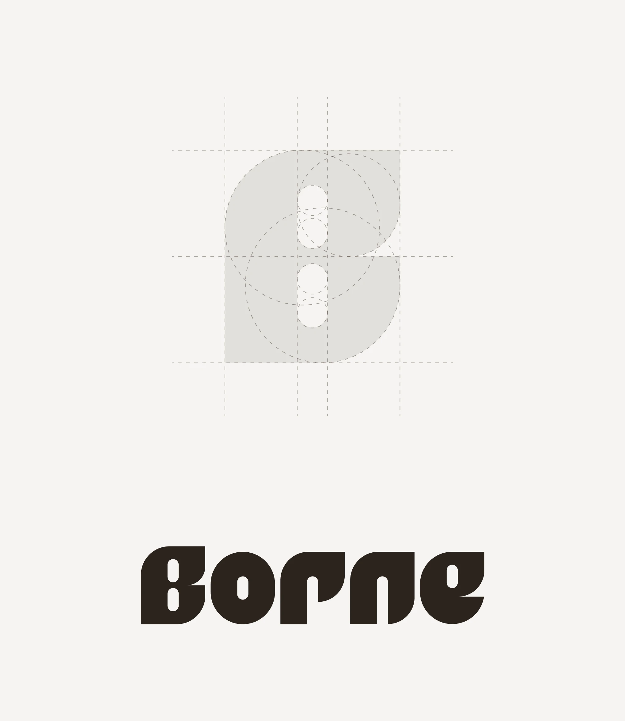
Logos
The core of the project was refining the existing wordmark into a bolder, more geometric system. Early rounds tested an abstract bee symbol and custom cutouts on individual letters, but feedback made it clear the customization needed to be consistent across every letter, not just one or two, to avoid an unbalanced logotype. The direction shifted toward a geometric base with subtle, uniform terminations — closer in spirit to references like Chora — trading soft, organic curves for sharper, structured detail while keeping a hint of warmth.
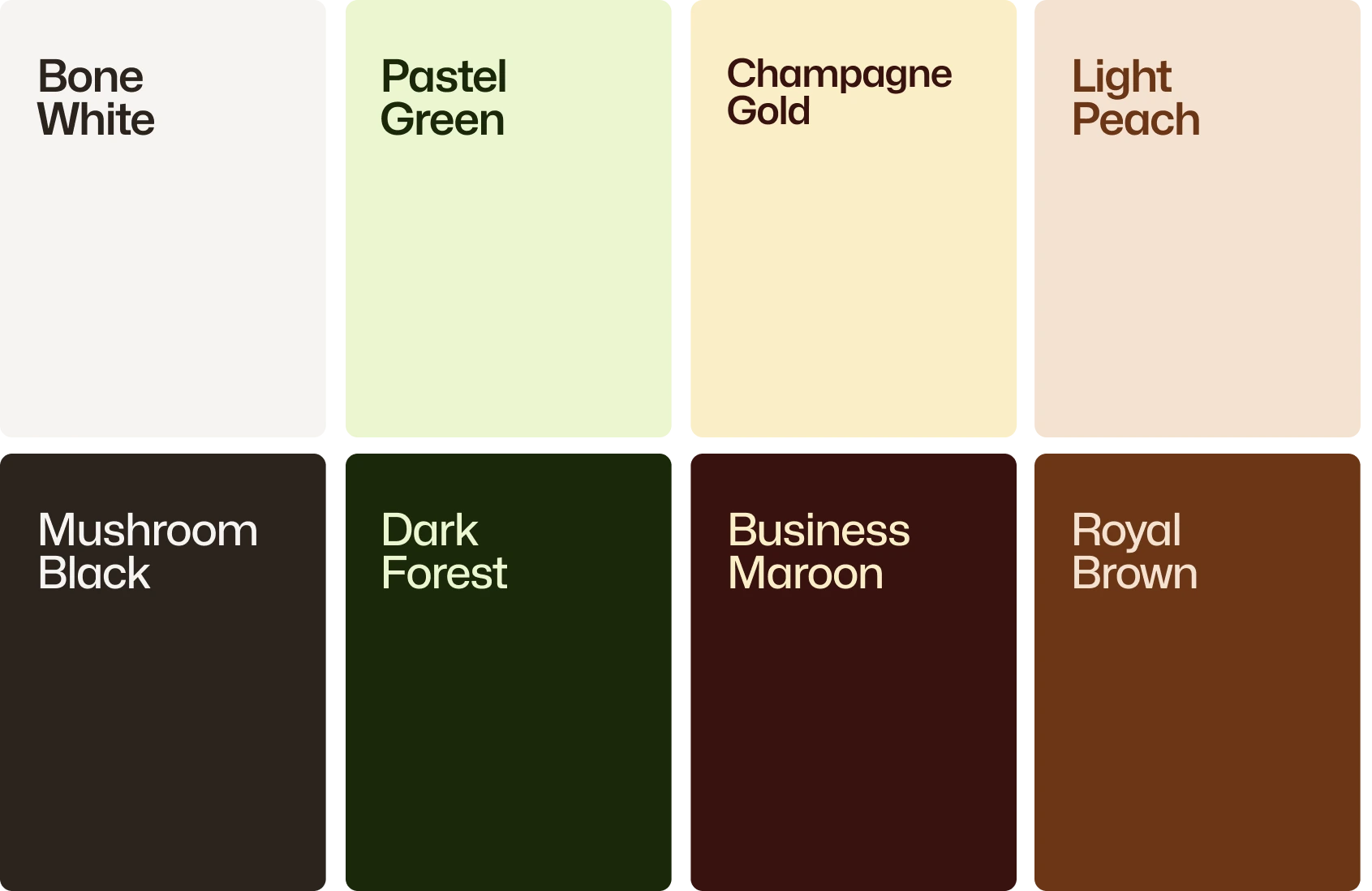
Color Palette
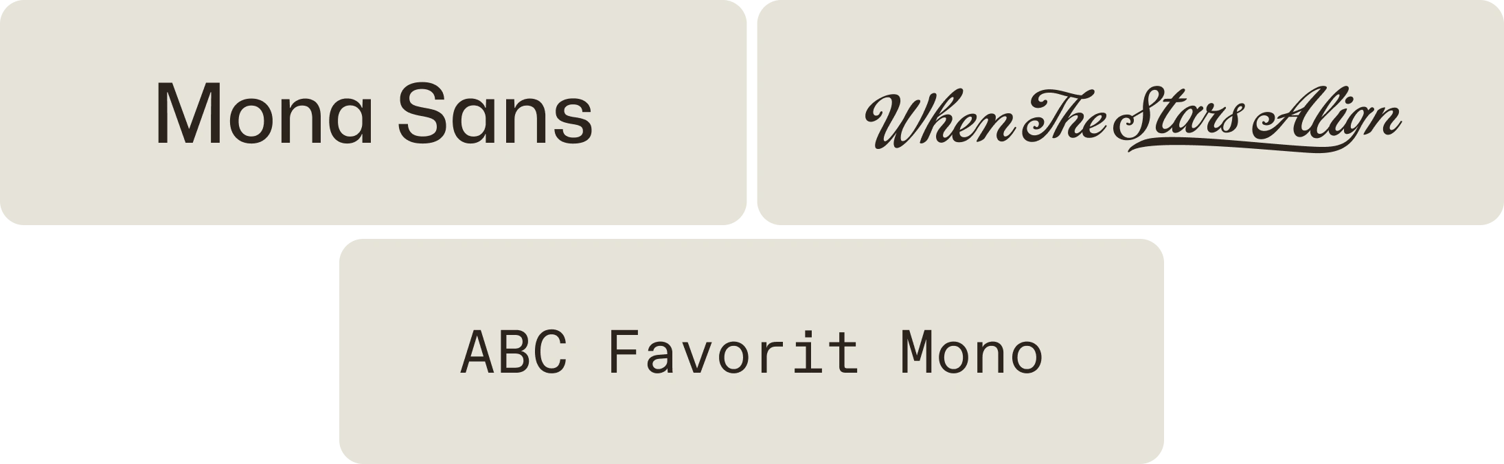
Fonts
The resulting identity leans into bold, typography-led design with saturated, non-pastel colors and strong tonal contrasts, built on the client's own olive green, sienna, and rust palette. It deliberately avoids the visual clichés of café branding — no coffee beans, steam, hand-drawn illustration, or Scandinavian minimalism — landing instead on something premium, confident, and distinct.
PACKAGING & MENU
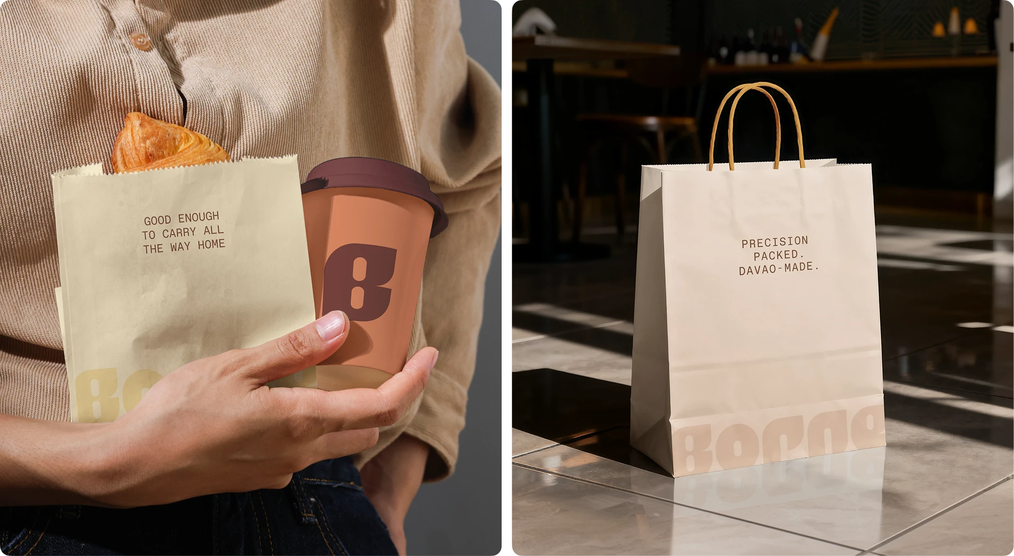
Take-out bags and cup
Packaging and menu design translated the new identity into the physical touchpoints customers would interact with first: takeout bags, cups, and in-store menus, each carrying the brand's color system and typography into everyday use. Packaging was prioritized ahead of the café's launch photography, since it needed to be ready in time for the brand's first real-world visuals.
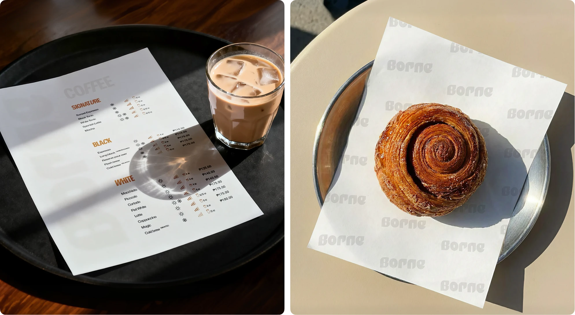
Menu - Papper wrap
MERCH
The identity extended into merch and everyday collateral — including cups, tote bags, aprons, and loyalty cards — carrying the same custom typography and color system so the brand feels consistent everywhere a customer encounters it, in-store or out.
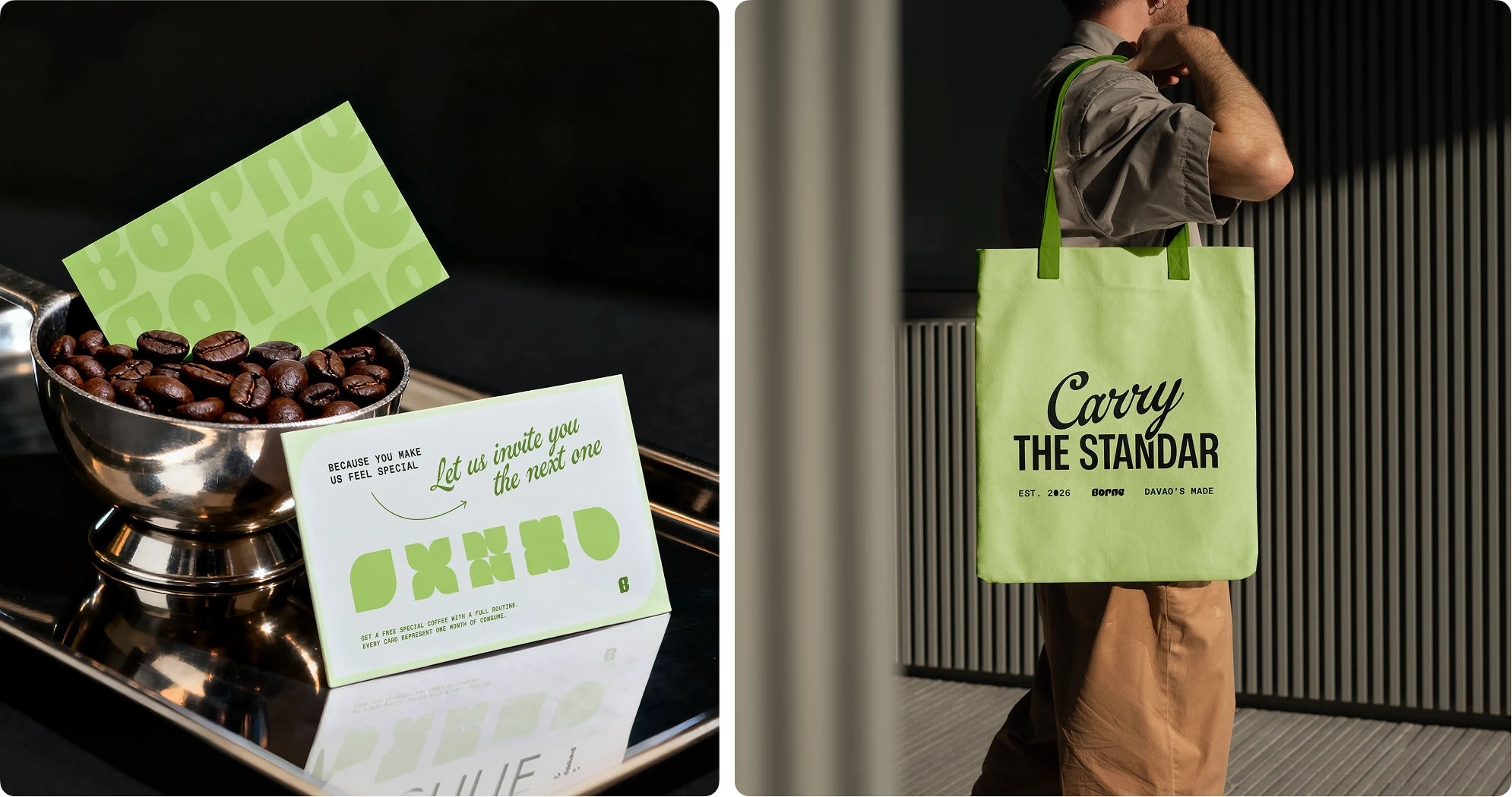
Fidelity card - Tote bag
Like this project
Posted Aug 5, 2026
Full brand identity and launch collateral for an independent café opening in Davao City, Philippines.
Likes
20
Views
651
Timeline
May 5, 2026 - Jun 18, 2026
Clients
Borne