
Wabi is a real estate app for owners, advisors and users for searching Properties for sale and rent, in addition to offering stading accommodation options for a certain date.
Its objective is to become the leading platform in sales, rental and holiday accommodation, which offers growth opportunity to those advisors to provide their services for the platform and manage their payments.
✨ Client's desire
We want the style of our brand to be creative, professional and minimalist, reflecting a modern app that stands out in the real estate market. We aspire that Wabi feels unique and distinctive, but also accessible and visually attractive, so that users feel motivated to interact and explore the app continuously.
🔑 Visual Keywords
Modern
Adult
Accesible
Geometric
Abstract
Visual Identity
To inspire modernity and freshness, yellow and blue was chosen, colors that represent technology, energy, warmth and stability. These concepts are strongly associated with the brand's values.
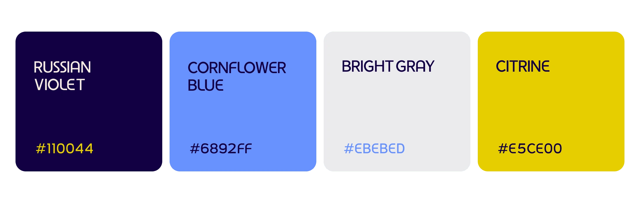
Color Palette
A Geometric Sans source was chosen to strengthen this modern and professional style, in turn connecting with a more gentle image thanks to its curved endings.

Typography
For the logo, it was decided to leave the text in lowercase to take advantage of the curved endings and show a more young and fresher side. The map pin is a characteristic element of this market, so to give a more unique touch, it was made based on the "a" of the logo, creating a spiral that leads to the center of the figure. This represents the path that the user travels until their objective/core, associated with the physical and psychological process of finding a new home.
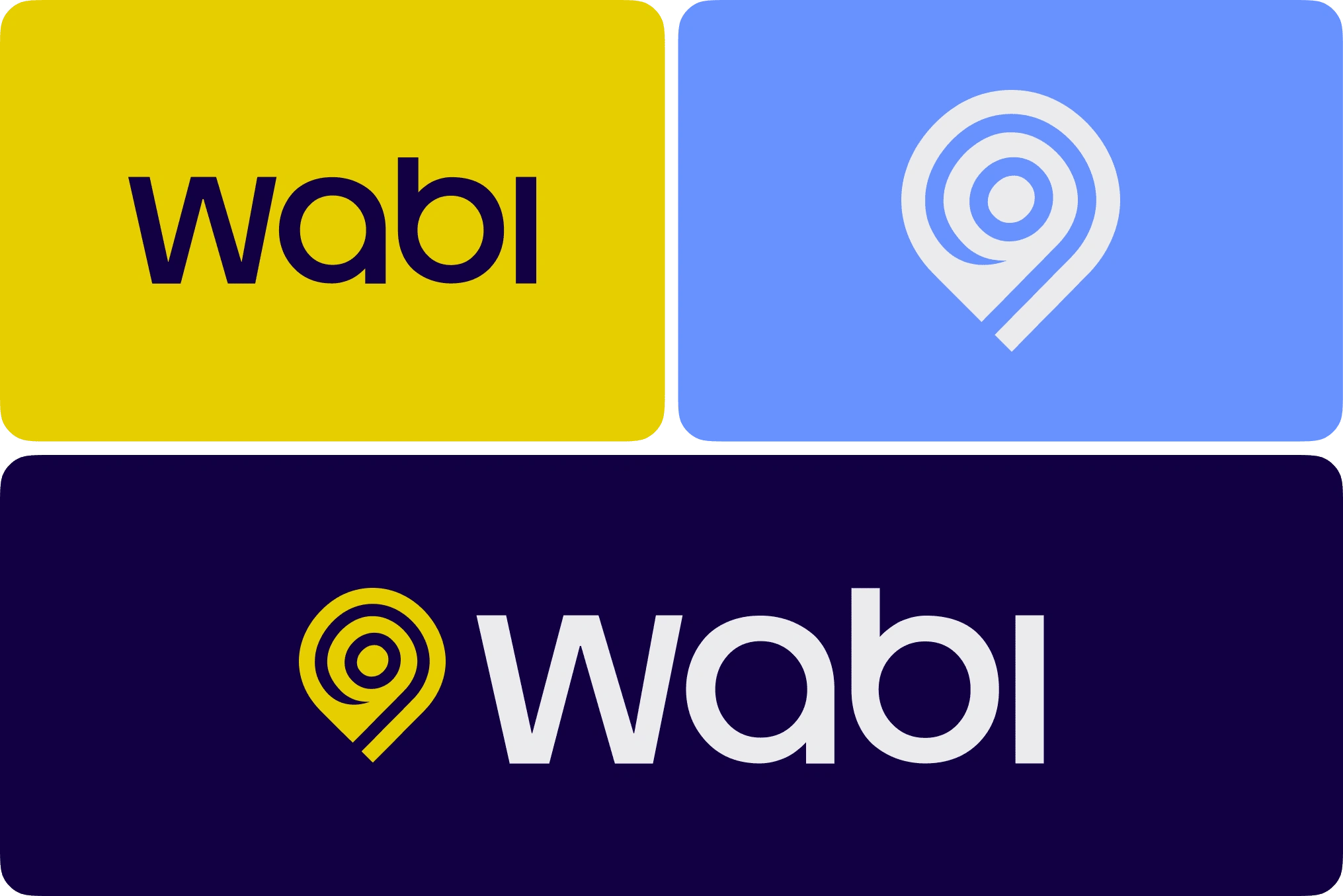
Logo Variations
Applications
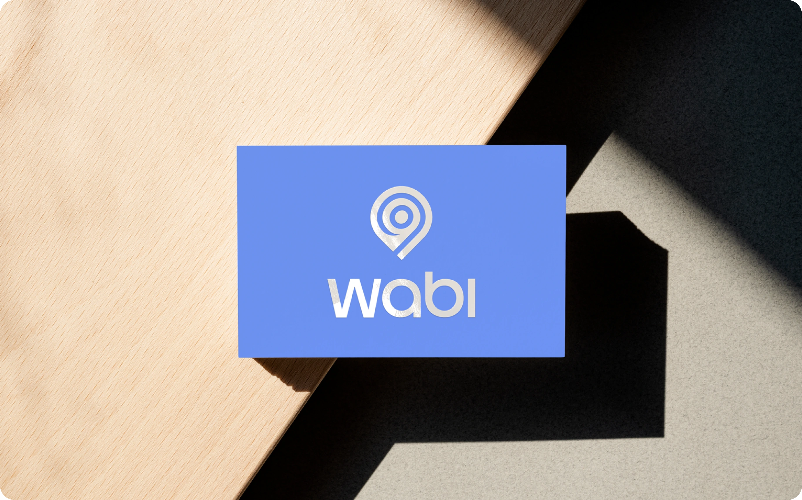
Business Card
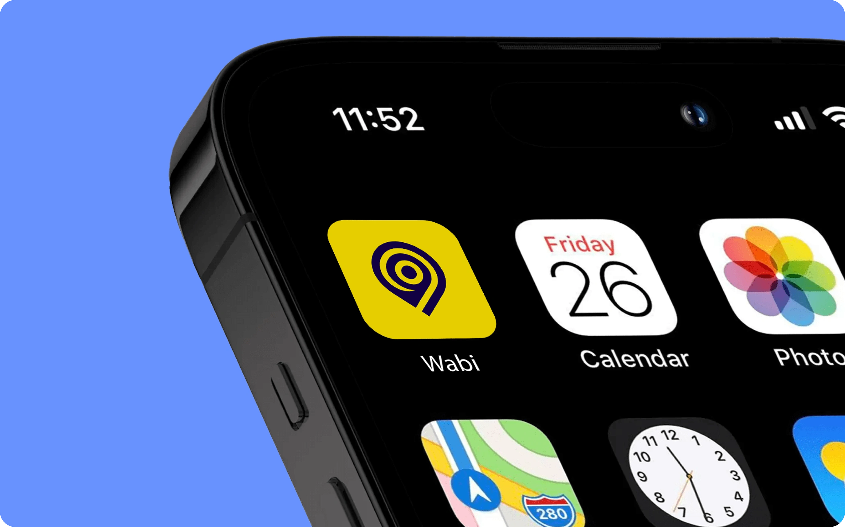
App Icon
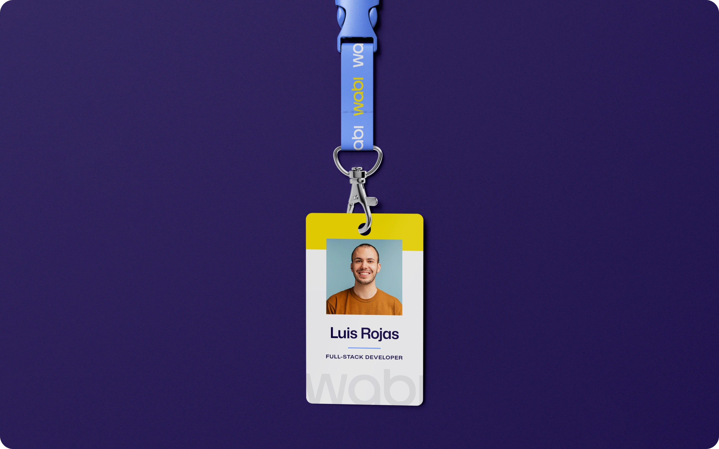
ID Card
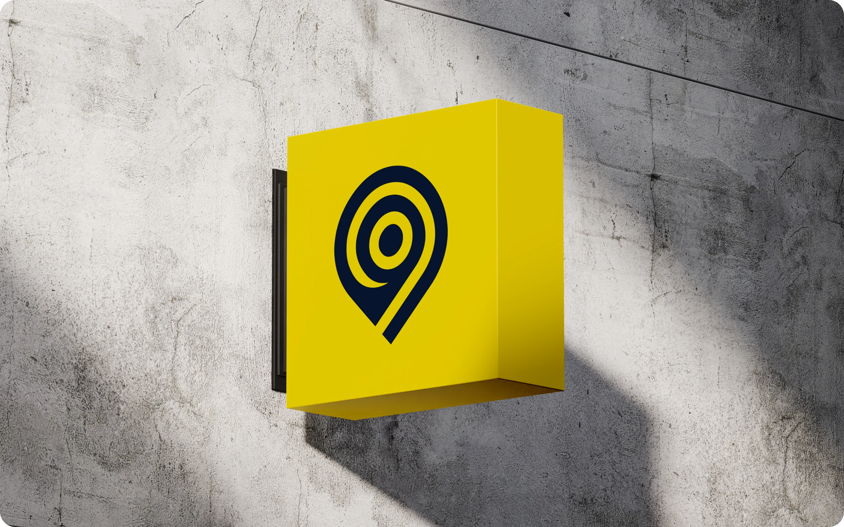
Outdoor Sign
26 likes · 668 views · Feb 21, 2025
Eye-catching Logo Design for a B2B app that connects agents and users in real estate negotiations in Venezuela.
Timeline
Dec 9, 2024 - Dec 16, 2024

