S&S TECNIPETROL
Adelaida
S&S TECNIPETROL, C.A. is a company that offers equipment, parts and supplies in the oil and industrial sector.
The company was created with a mission to forge strategic partnerships with leading manufacturers of equipment, components and supplies on a global scale. This allows us to offer the highest quality products to our customers worldwide.
✨ Client's desire
Develop a dynamic brand identity that inspires evolution and professionalism in the industrial sector.
🔑 Visual Keywords
Modern
Adult
Sophisticated and Luxurious
Geometric
Abstract
Visual Identity
The bases of this include a color palette composed by primary colors, this time far from the common use in visual identities of companies related to the national public sector. This time a more sober and not so saturated perspective of these colors was sought, so that when used together, it generates a pleasant and mature contrast.

Color Palette
A wide San Serif font was chosen for the logo, seeking to give a wider and simpler air, without moving away from the modern aesthetic thanks to its curved finishes.

Family Font
For the creation of the Logo, we sought to take advantage of characteristic elements of the previous Visual Identity, to create consistency and in turn, give a more modern and functional style.
Through the union of 1/4 of a circle, a figure was created that represents the two "S" of the name. Enclosed in a circle, an image alluding to the world (an element used in the previous logo) is shown and denotes movement and fluidity.
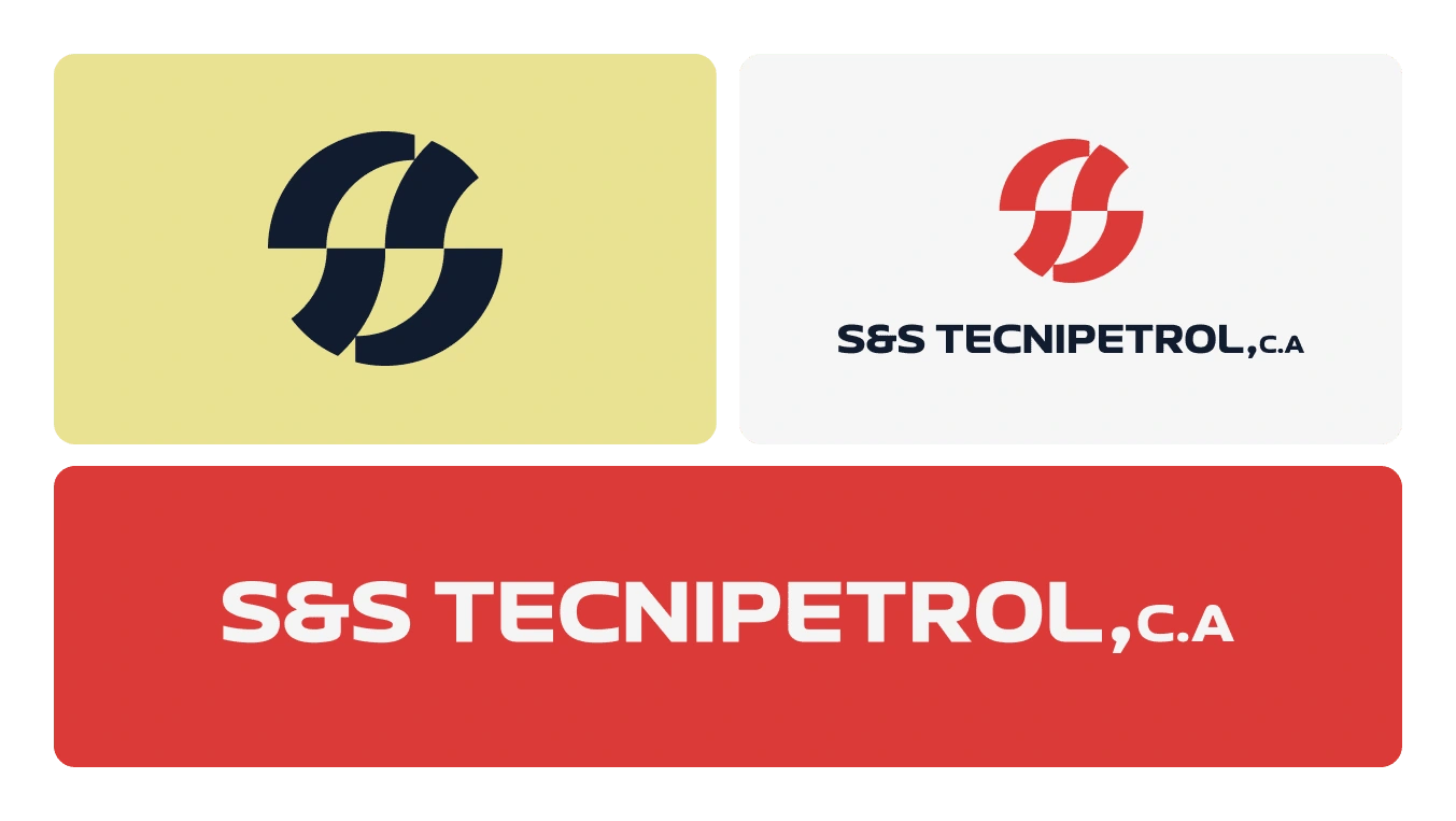
Logo System
Applications
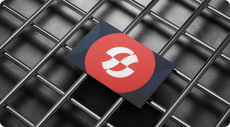
Business Card
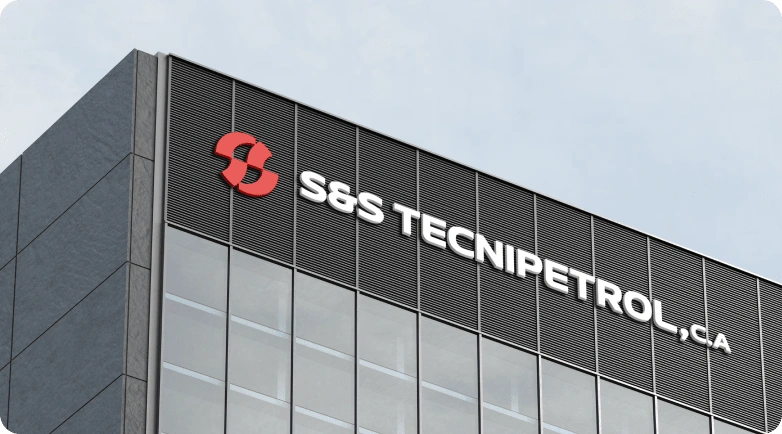
Corporeal Letters
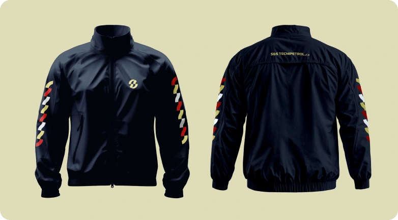
Windbreaker
Like this project
Posted Aug 8, 2024
Visual Identity for a Company focused on strategic partnerships with leading manufacturers of equipment, components and supplies