✨ INTO THE STUDIO ✨
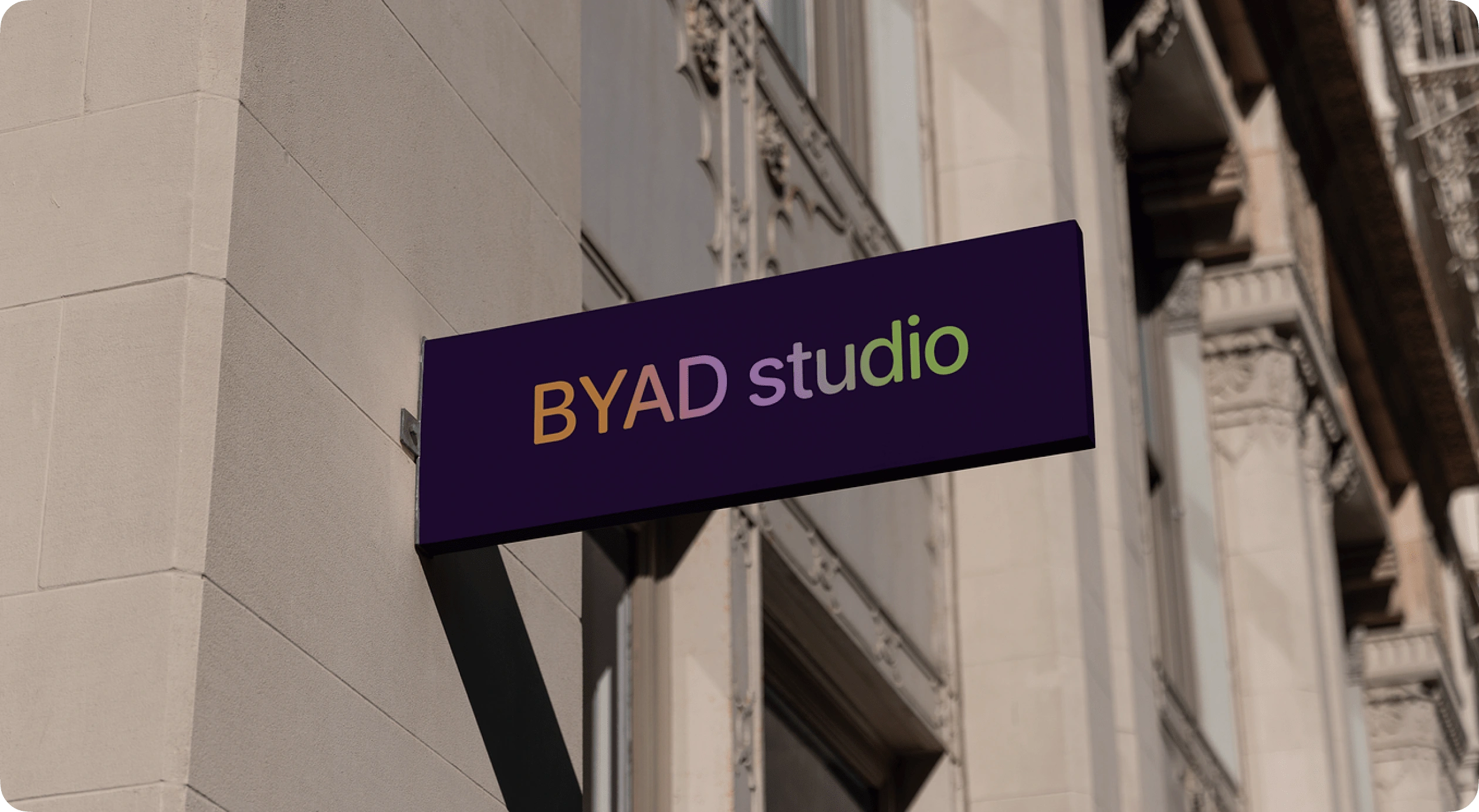
BYAD Studio is the result of my experience and passion for my career.
I have been a designer since I was 18 years old and in my career, I have worked with several companies and brands as a freelancer, interacting with different types of businesses and market strategies. As time went by, I found myself faced with the decision of whether to continue working as a small part of an entity, or to start creating something of my own that would allow me to get out of my comfort zone and invest in myself as a professional.
✨ Concept and Ideation
BYAD is a play on words that means "By Ade" (that's my diminutive). The goal of the naming was to have as a result something short and memorable, that can visually represent my essence and vision as a service provider.
The color palette manages to express modernity, fun and eccentricity. The color system developed allows for a wide range of use to adapt to the different resources and formats created for the brand.
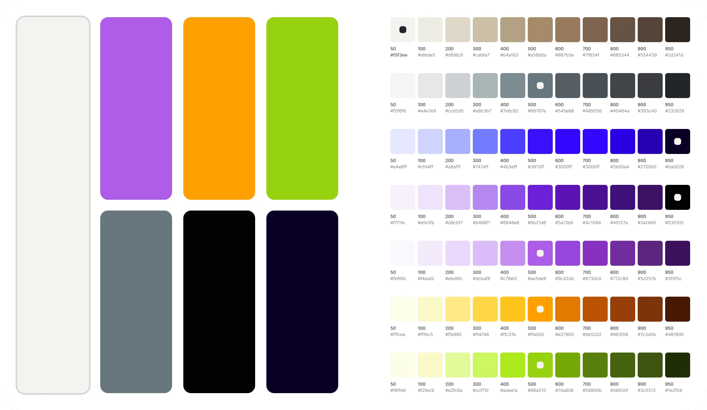
Color System
The logo consists of two perspectives, literal and abstract. For the literal side, Open Runde was chosen, connecting with a more modern and functional style; For the abstract, Arnaiz was used, a display typeface that was modified to soften and connect the letters, forming a single figure and showing the most irreverent and disruptive side of identity. As a last proposal, there is a variation of the logo that connects both perspectives, to convey balance and harmony in both styles.

Logo Variations
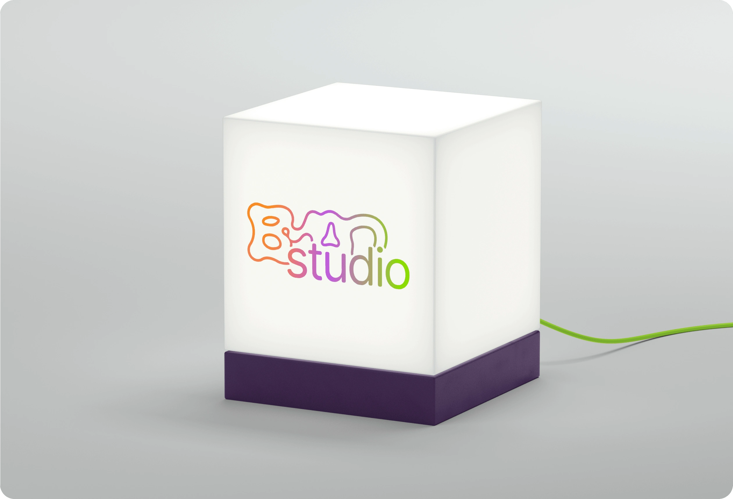
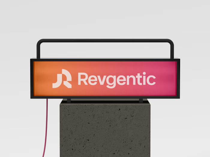
Logo in lightbox
💡Visual Strategy
From the union between feminine and masculine energy, the different elements that make up the graphic line seek to connect with a wide audience from a modern, minimalist and versatile perspective depending on the context and purpose.
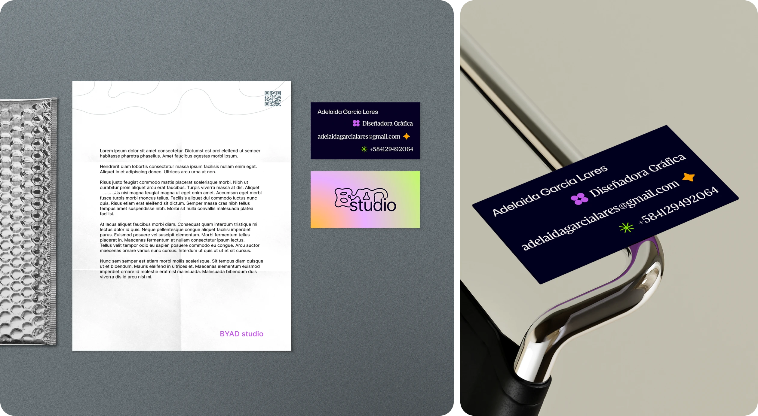
Stationery
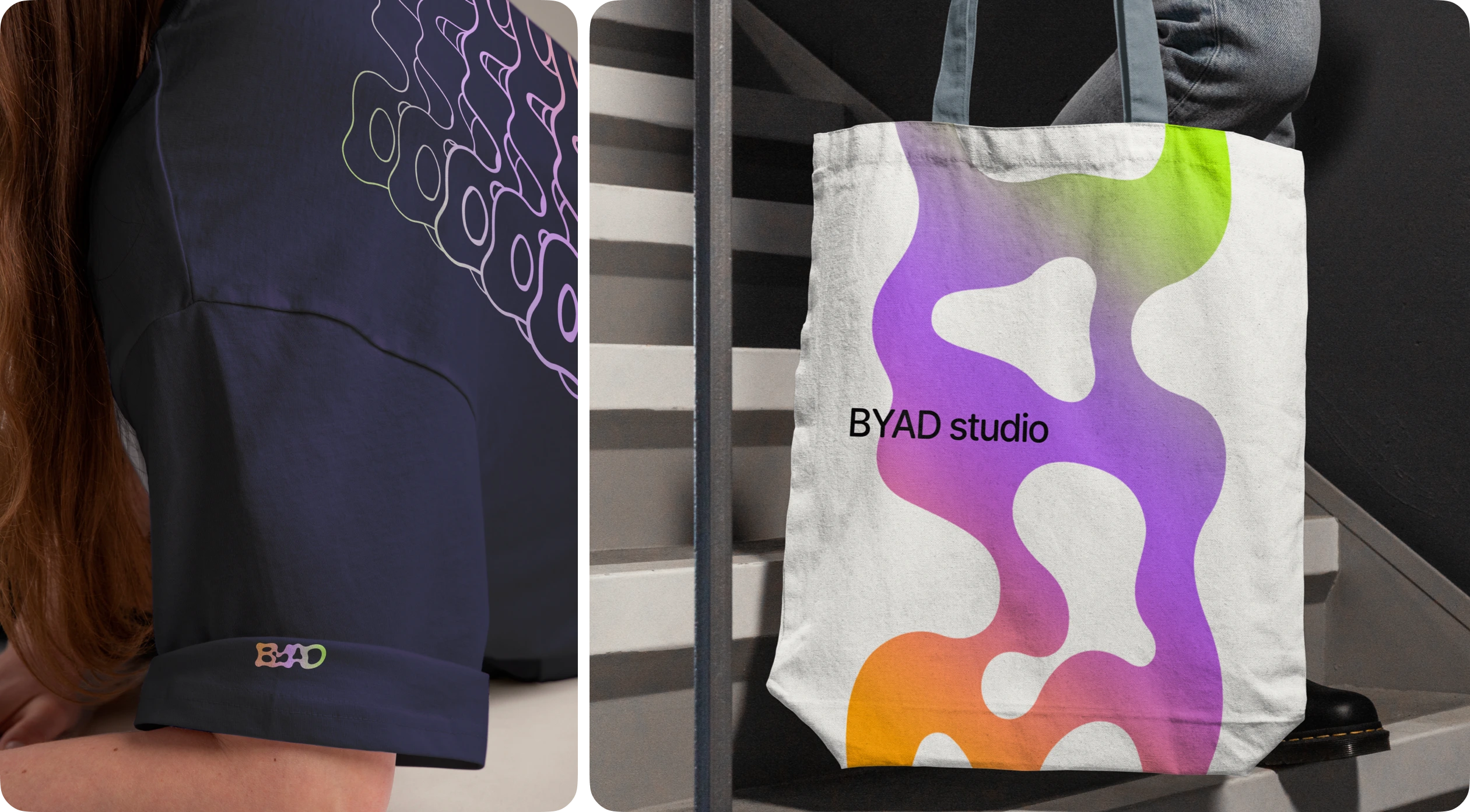
Mechandise
Among the most outstanding elements is the use of gradients, rounded rectangles, geometric and changing shapes, flat and clean backgrounds, as well as hand drawn shapes, contrasting and realistic mockups, and complementary typographies (BT Brainstorm) for advertising and dissemination pieces.

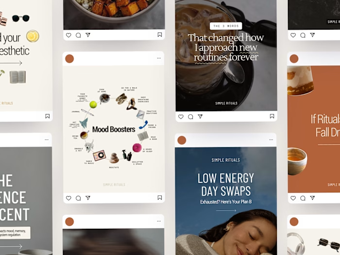
Instagram Post
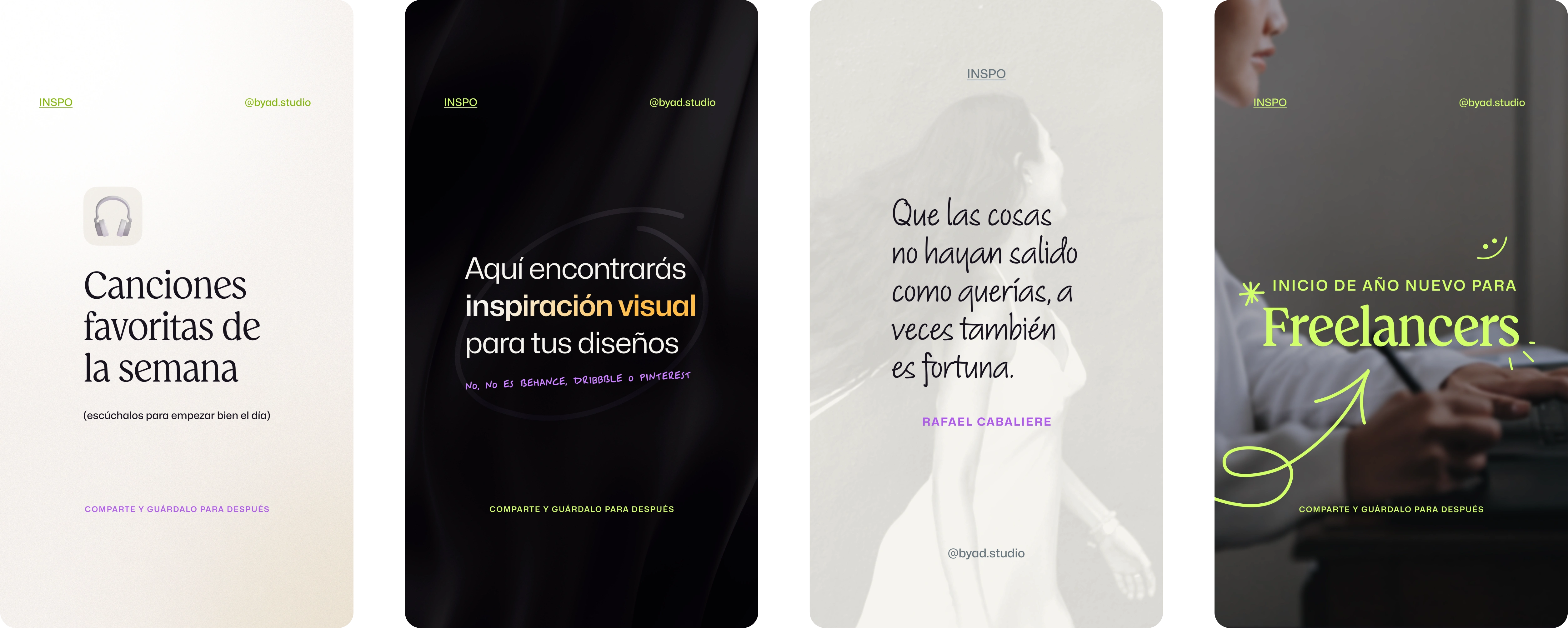
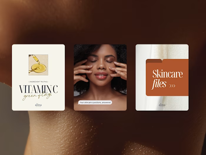
Reel covers and Stories
The content strategy is a balance between trend research and creative copywriting, and my passion for productivity, mental health, design, and creativity. If you'd want to see more about the content I post, you're welcome to follow me on Instagram.
Like this project
Posted Mar 11, 2024
Strategy and visual details of BYAD Studio, my personal brand specialized on Graphic and Interface Design services.

