Minutiae Content Co.
Minutiae Content Co. is a writing and strategy firm by Amanda Lien, specializing in authentic thought leadership and marketing content for B2B and tech founders, entrepreneurs, and small businesses.
The brand is projected in offer personalized and representative strategy services to clients who want assistance in improving their presence and credibility in the digital environment, generating impact and converting clients.
✨ Client's desire
The brand stands out for being accessible and authentic, developing tailor-made content for the target audience of each client, and without neglecting the personal touch of Amanda. Through her experience and knowledge, she offers support and strategic tools to increase the recognition and loyalty of start-ups, entrepeneurs, small businesses and more.
The color palette connect dynamism and confidence through the adult and sophisticated personality, with vibrant colors that inspire modernity, creativity and a fun touch.

Color Palette
In the choice of colors, a duo was decided between a Sans and a Serif typeface, a classic but effective combination to inspire elegance and style, without falling into rigidity and the old classic. In this way, we can connect with a current audience that recognizes the importance of the fundamental foundations of the business world, applying the new strategies of the current market.

Typography
💡Visual Strategy
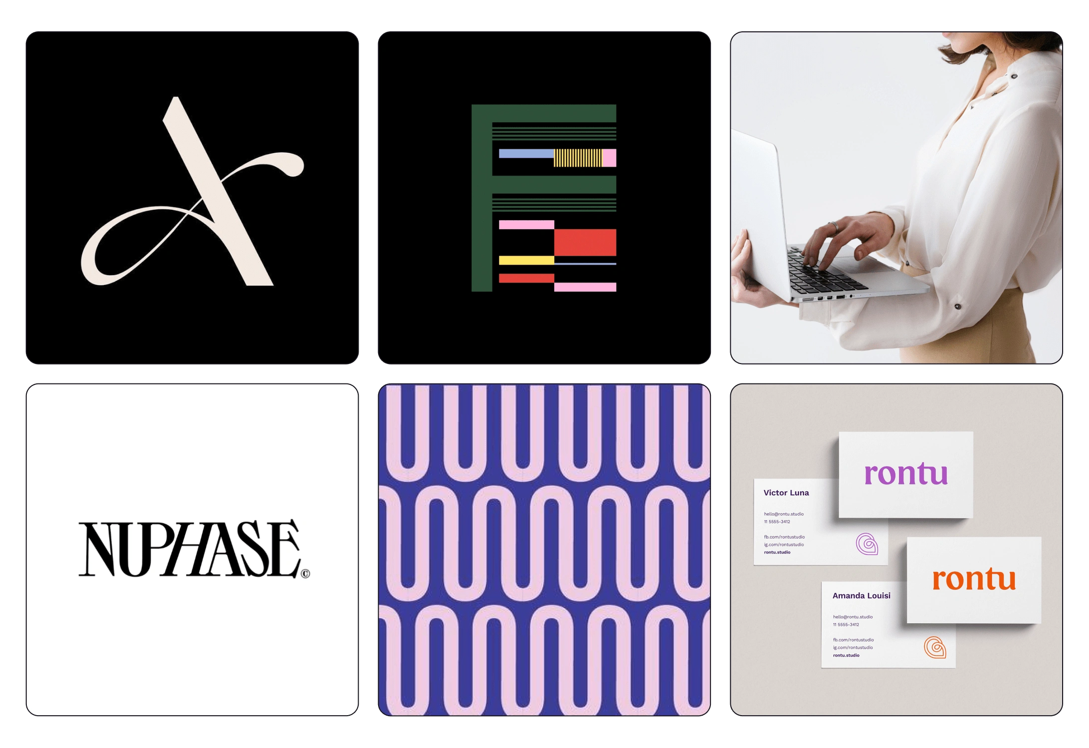
Moodboard
The moodboard we can see visual features that are mentioned on the page:
1. The use of Serif and Sans typefaces
2. Black & White Base Backgrounds
3. Optical Art & Flat PatternsMoodboard
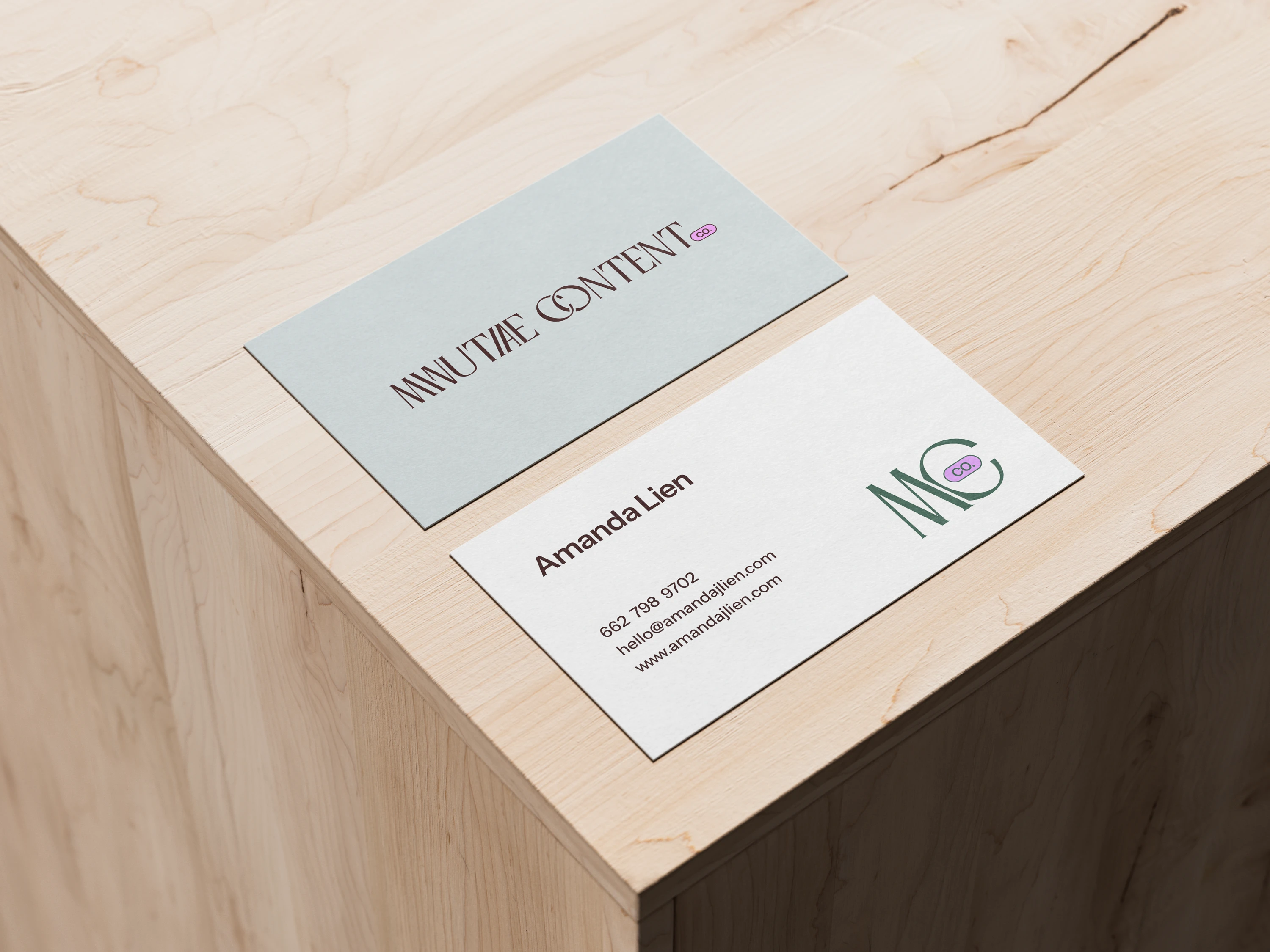
Business Card
Through this Sans and Serif typefaces, we evoke a modern presence with character. This union with the Serif typeface for the main name, and a San Serif for the "Co.", is inspired by the NeoBrutalism aesthetic, a design style characteristic for its bold flat colors and lots of flat geometry.
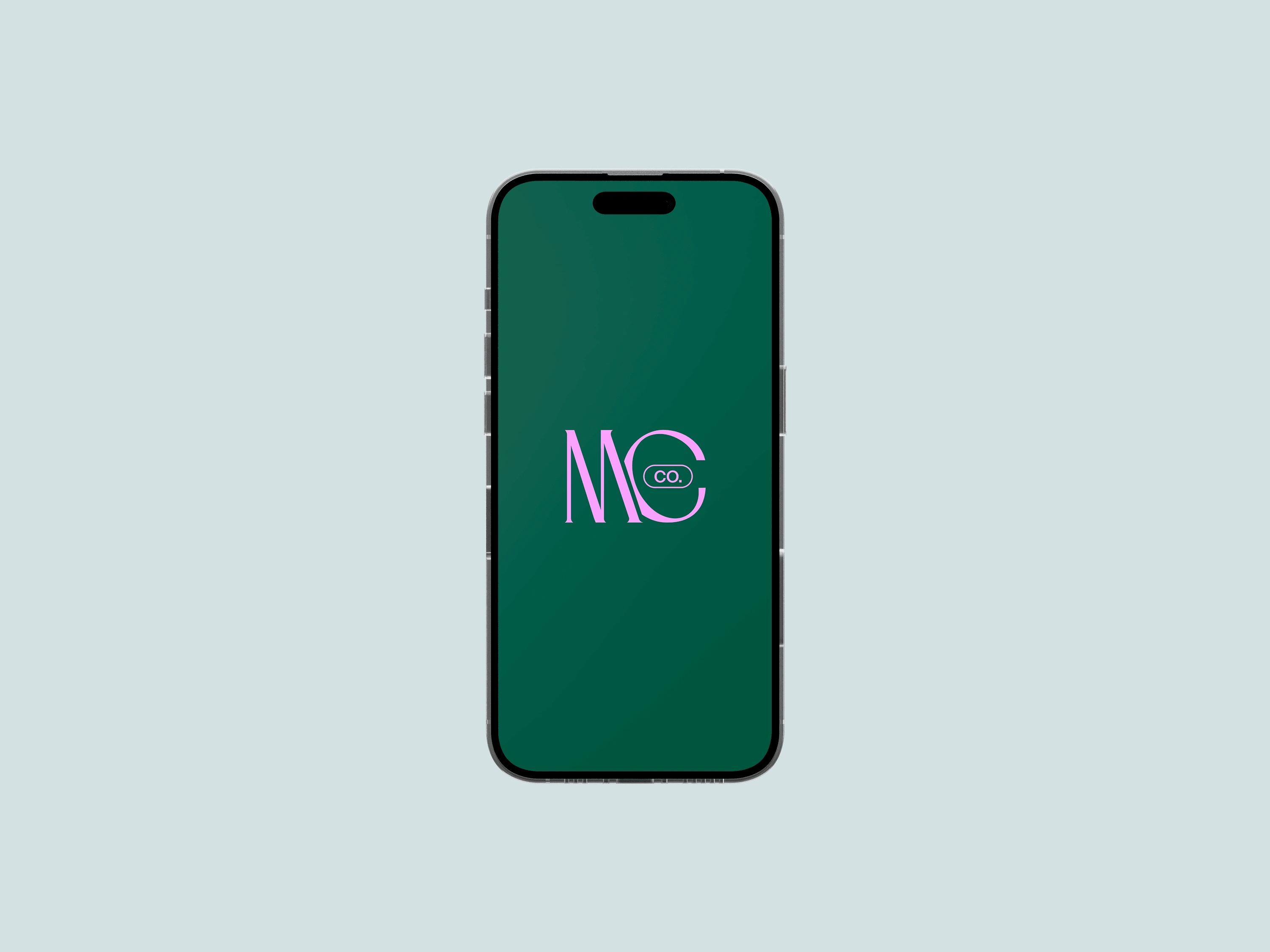
Submark Wallpaper
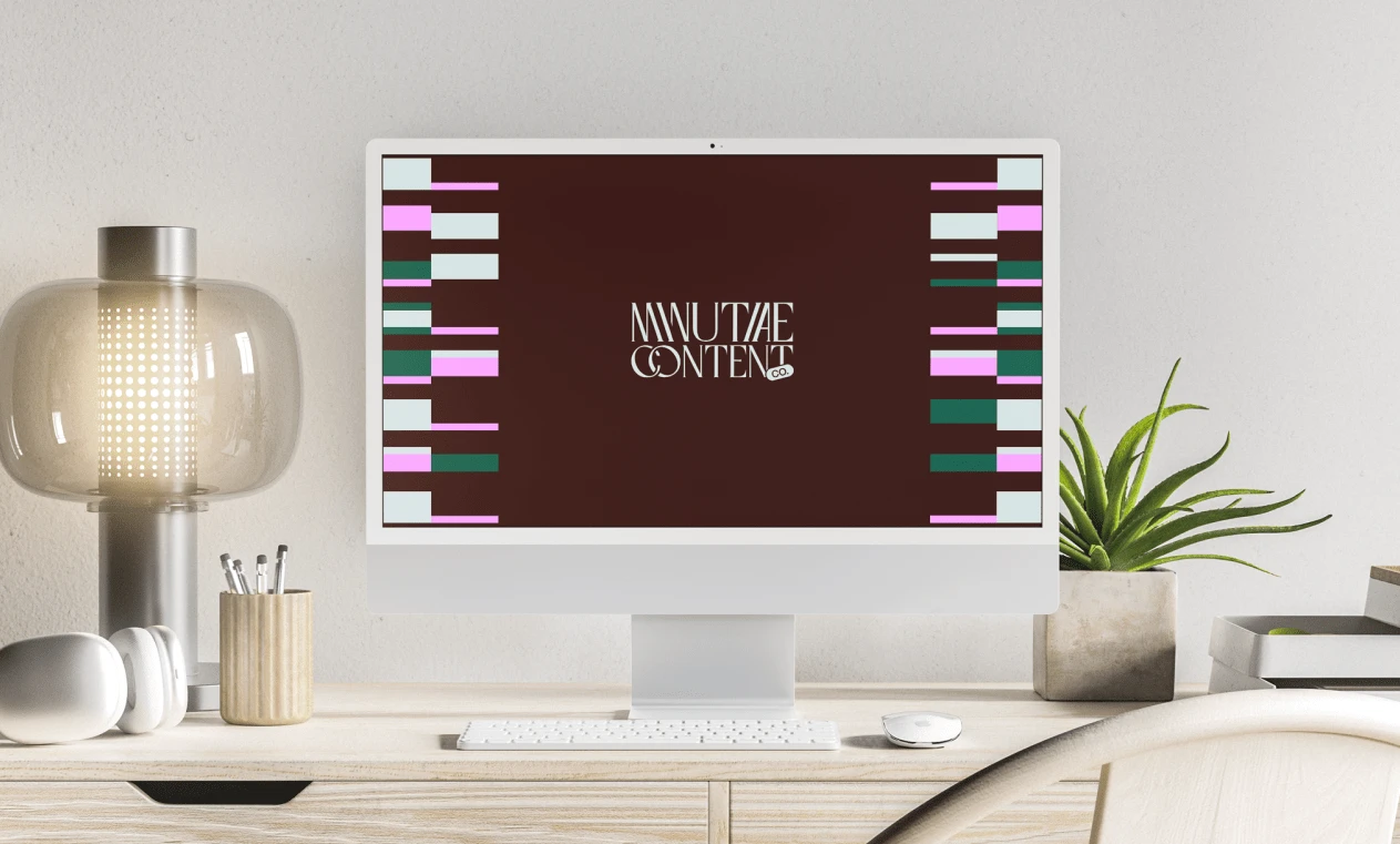
Desktop Wallpaper
The first visual appeal is playing typography by tilting some letters and superimposing letters, which gives it a lot of style and ease of reading. The detail of the "Co." sloping above Content gives it a touch of informality and movement. In its various variations, the "Co." includes fill alone, outline only, and fill and outline.
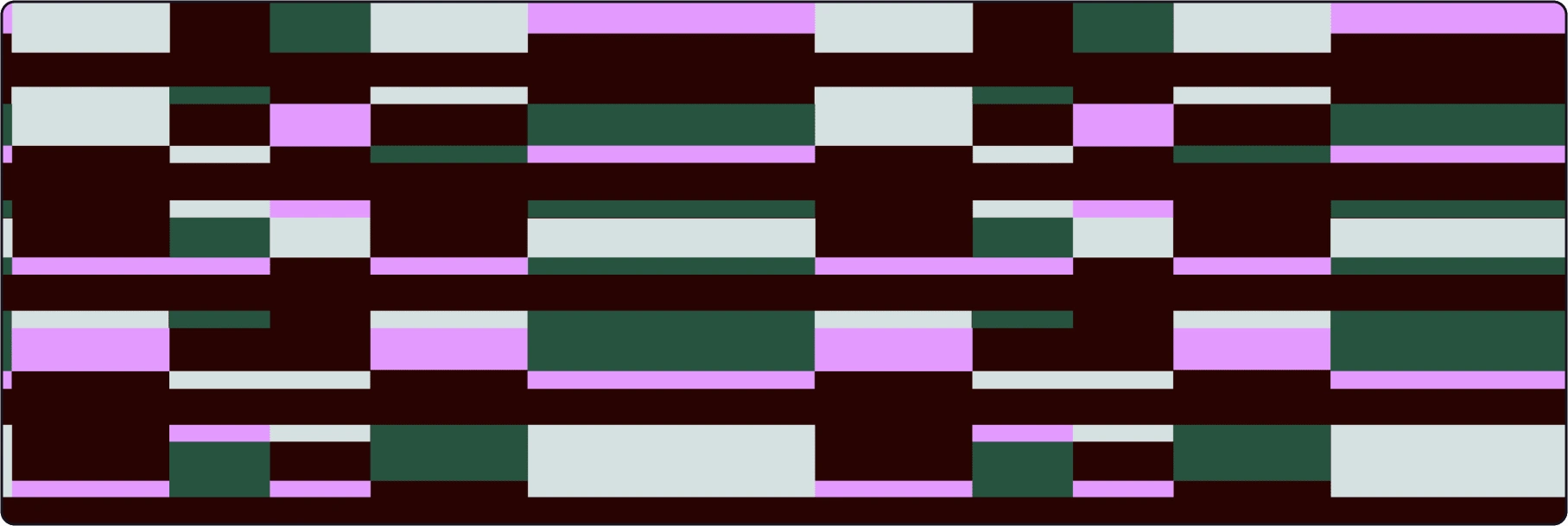
Pattern
For a visual complement, flat patterns and optical art, which together with the color palette, allow us to capture the viewer's attention without saturating it.
These three features allows to connect with customers in an accessible and authentic way.
Like this project
What the client had to say
Adelaida was professional and communicative – she took an incredibly collaborative approach to our project and was receptive to my feedback, turning my ideas and requests into engaging, unique assets that I absolutely love!
Amanda Lien
Feb 14, 2024, Client
Posted Feb 18, 2024
Logo design for a writing and strategy firm specializing in authentic thought leadership and marketing content.
Likes
6
Views
202
Timeline
Feb 5, 2024 - Feb 14, 2024

