Camino Irregular
Adelaida
Camino Irregular offers functional and assertive strategies, promoting assertive inclusivity in learning and cognitive development in aspects focused on people with learning conditions and disabilities.
Through its articles, the brand shares information and tools focused on neurodivergence and learning conditions, through articles, workshops and digital resources.
✨ Client's desire
The term neurodivergent was conceived in the autistic community to refer to people whose neurology is atypical.
The brand seeks to be a support and companion in the understanding and learning of new techniques that improve the quality of life of an audience that has special conditions such as:
ADHD
Autism
Dyslexia
Asperger
Down Syndrome
Through pink and green tones used in the color palette, the brand is close and empathetic with an audience varied in gender and age, which allows the accessibility and consistency of the information to be maintained.
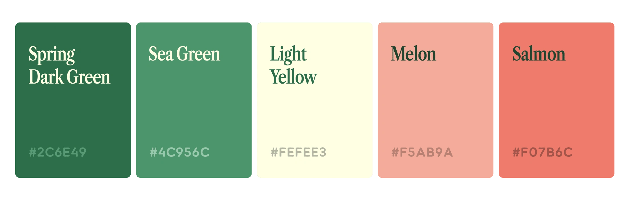
Color Palette
Along with this, the typographic choice denotes modernity and a friendly personality with the use of serif and sans serif fonts. In this sense, LT Saeda is mainly used in the logo due to its characteristic contrast of circular edges and rounded corners, which allows it to be fun and accessible to the public. And as a complement, Libre Caslon Condesed was chosen to be applied in titles and CTAs present in the different pieces of the graphic line (social media post, publicity, website, etc).
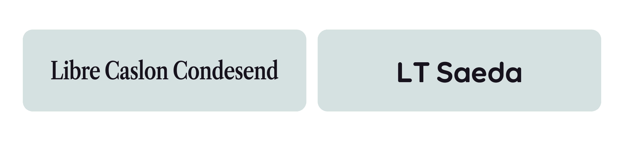
Typography
💡Visual Strategy
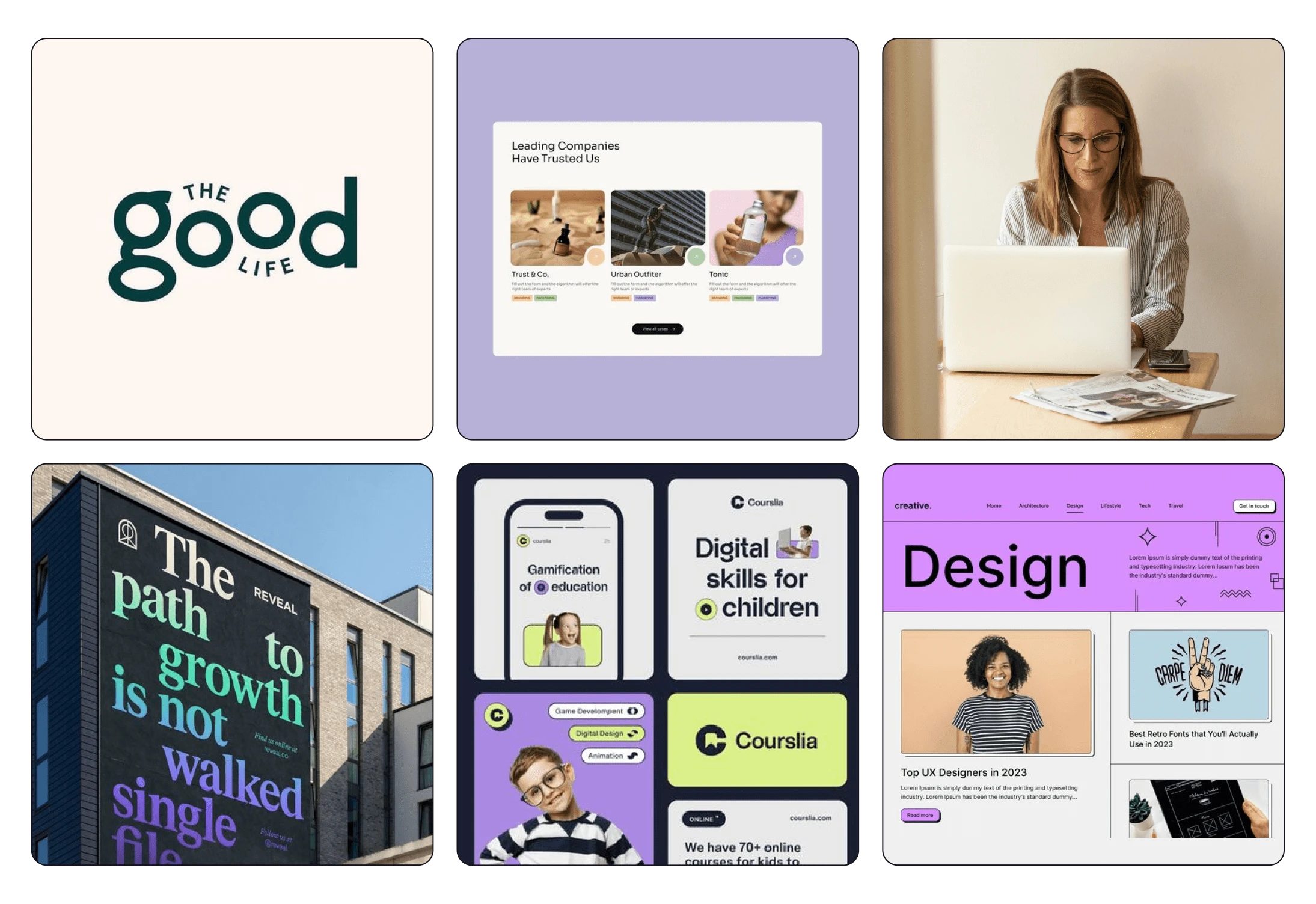
Moodboard
The moodboard we can see visual features that are mentioned on the page:
1. The use of Serif and Sans typefaces
2. Flat and colourful Backgrounds
3. Neo Brutalism
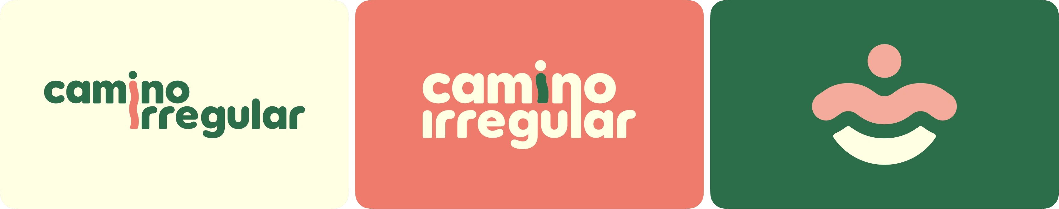
Logo Variations
The concept behind the logo is balance where the main character flows with their emotions and way of interacting, and is expressed through the undulating torso of the "i". The submark shows the center and flow, and the individual being held and guarded.
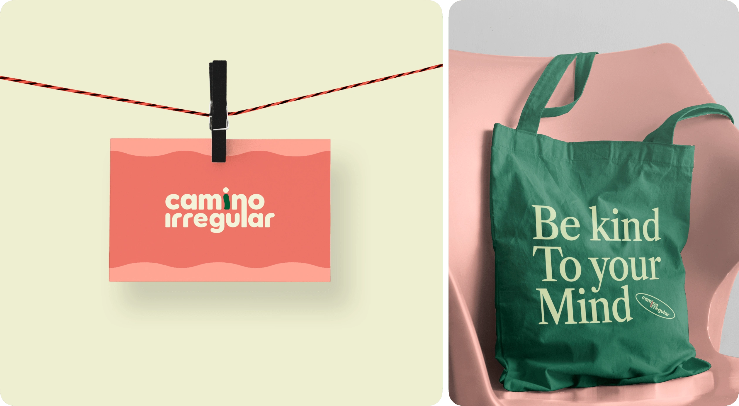
Business Card/Tote bag
The graphic line exposes the fun, simple and dynamic side of the brand through its color combinations that seek to captivate the public with their undulating and scribble figures, emphasizing relevant information that retains attention. Flat backgrounds are mostly used, and paper textures and gradients are experimented with to complement other pieces and give a little more variety to the pieces, without generating noise and strangeness.
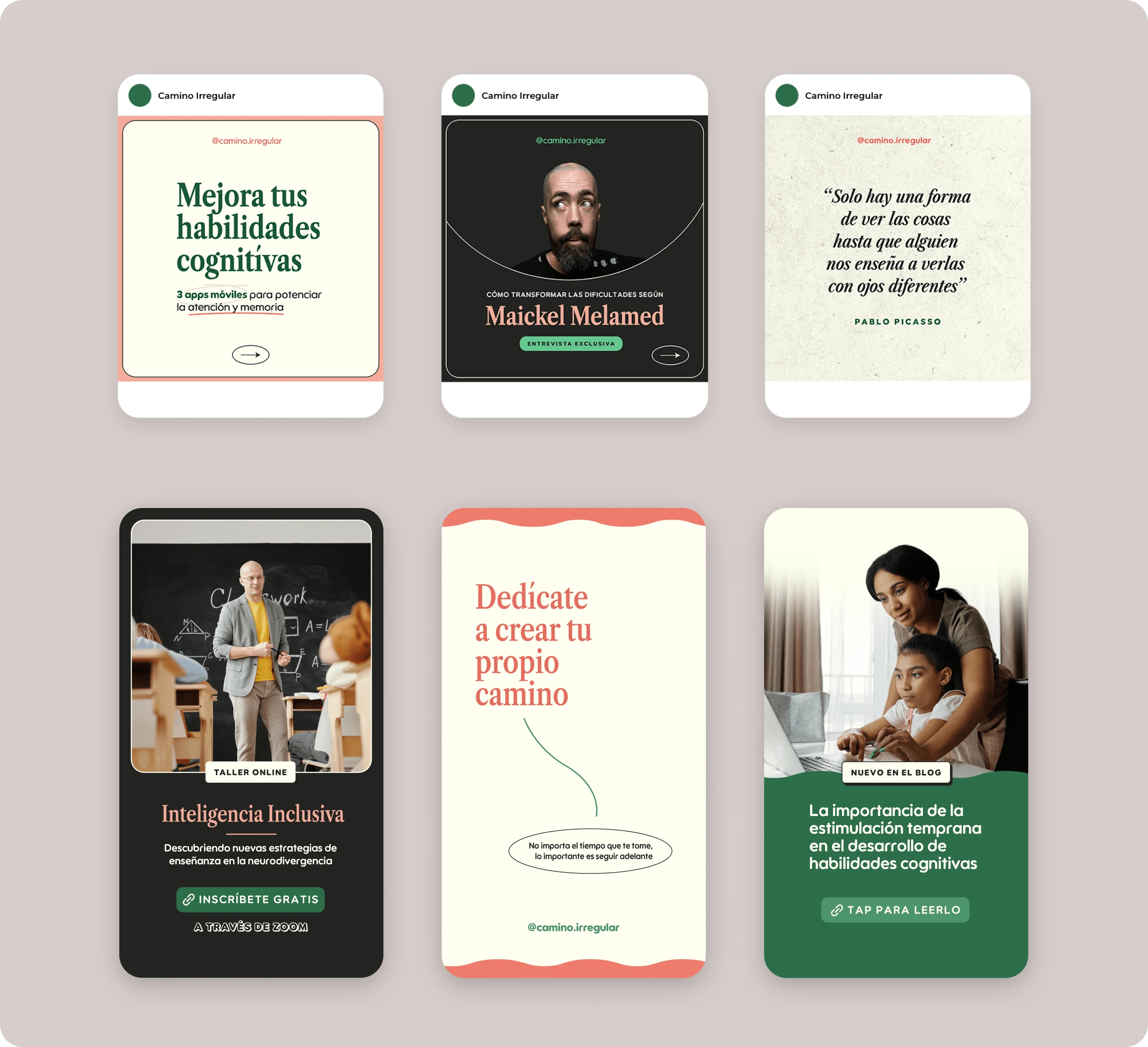
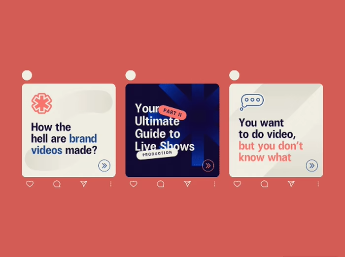
Social Media Content
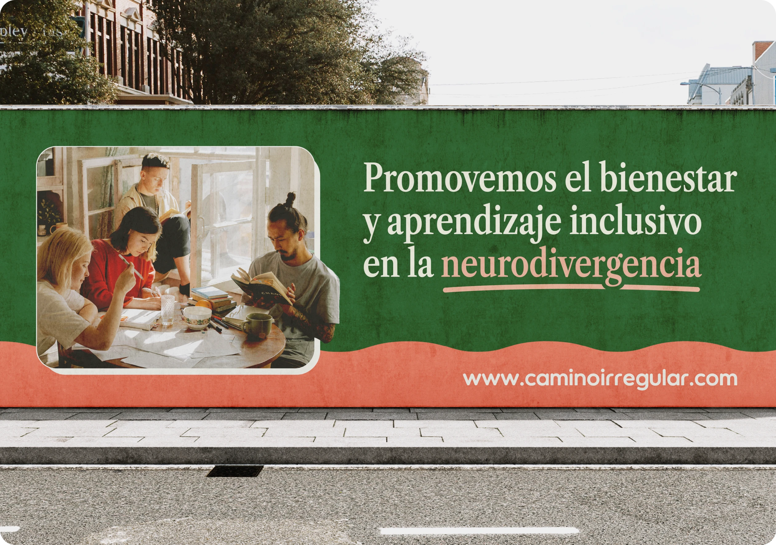
Outdoor Advertising
Through these elements, we are able to connect with young and adult users who are interested in improving learning and productivity, either their own or those of their loved ones.
Like this project
Posted Apr 3, 2024
Visual Identity for brand that offers functional and assertive strategies in learning and cognitive development