Brite Harvest
Brite Harvest is a fast-growing company specializing in the sourcing, production, and distribution of high-quality açai products for both B2B and B2C markets.
Known for It's commitment to sustainability and health-conscious products, the brand offers a diverse range of açai-based products including frozen açai & other exotic superfood purees and ready-to-eat bowls. Their products are crafted using premium açai berries sourced from Amazonian açai palm trees in Brazil, ensuring their natural flavor and nutritional value.
✨ Client's desire
Develop a brand identity drawing inspiration from the bright color and organic natire of açai and the Amazon Rainforest.
🎯 Target Audience
From young Children to ederly.
From 0 - +60 years.
Men and Women.
Visual Identity
The bases of this include a color palette composed mainly of purple and pink tones, resembling the main product and its delicious flavor, adding green as a complement that gives impact to the different elements of the graphic line, together with the rest of the colors thanks to its pleasant contrast.

Color Palette
The use of Display typefaces connects with the modern and fun side of the brand, due to its innovative way of producing and offering its products. In this sense, SG Mikura appears as the main typography for the Logo, and Sora as a complement for the graphic line.

Primary and Secondary font
Among the different characteristics of the logo, such as its simplicity and bold aesthetics, the flower represents the nature of the Amazon (where the açai comes from) and the elements inside the flower that simulate the interior of the açai with the seed in the center.
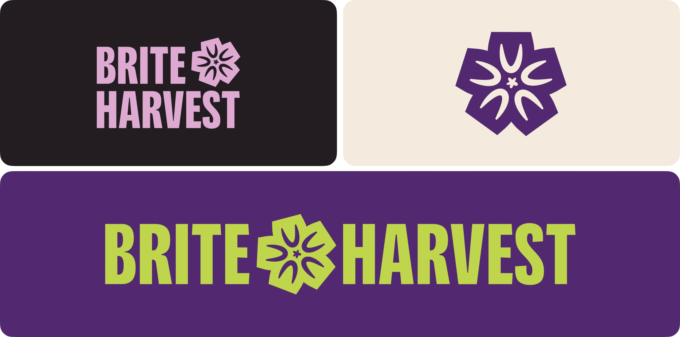
Logo Variations
Graphic Line
PACKAGING

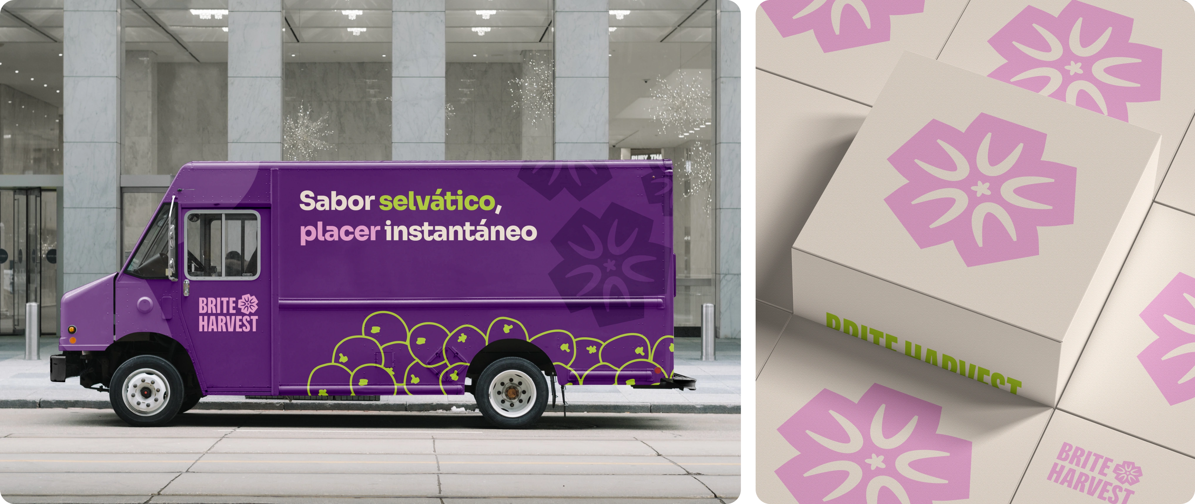
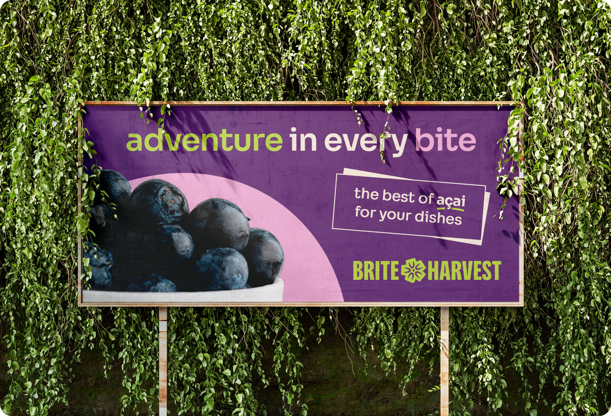
ADVERTISING
WEBSITE

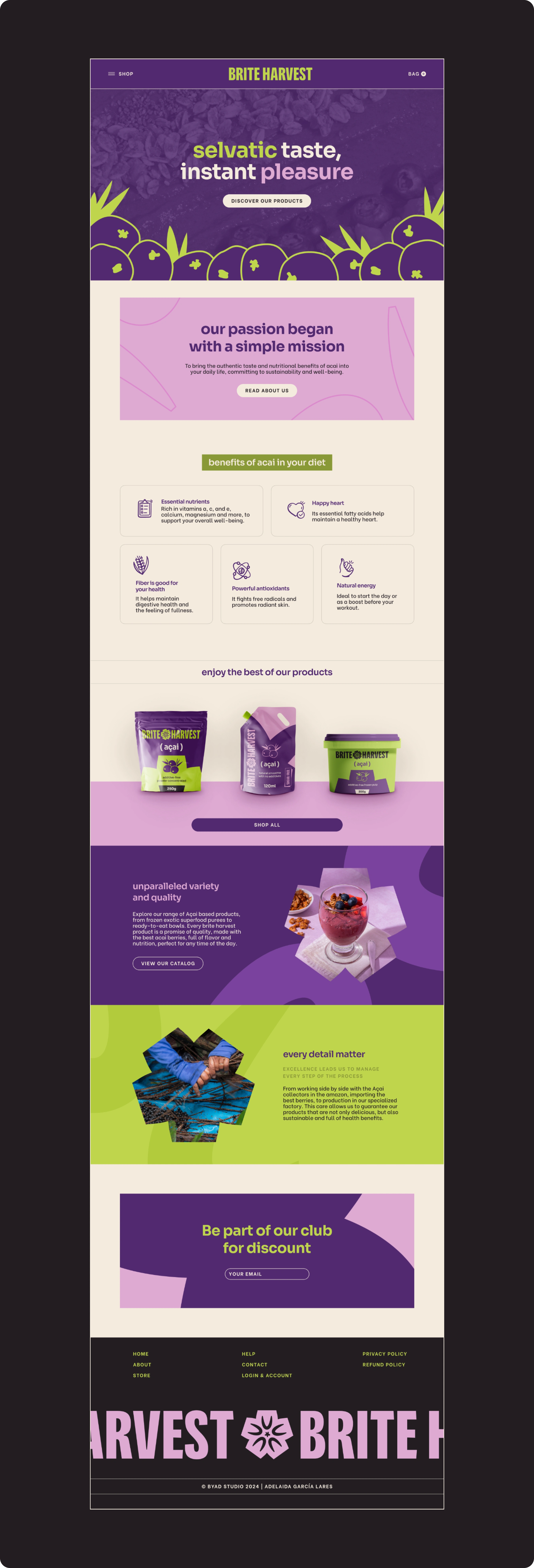
This project is proposed as part of the dynamic of Brand Brief & Brite Harvest on its instagram account. You can see more information about the project in the post below 👇
Like this project
Posted May 11, 2024
Visual Identity & Web Design for a brand that offers a diverse range of açai-based products, ensuring their natural flavor and nutritional value

