Experiencias Aleph
Experiencias Aleph (Aleph Experiences) is a center specialized in therapies focused on the transformation and development of human potential, through traditional and alternative medicine.
✨ Client's desire
The client wanted to develop the visual concept based on the letter Aleph, symbolizing the beginning, the birth of everything, and a butterfly, representing transformation and metamorphosis.

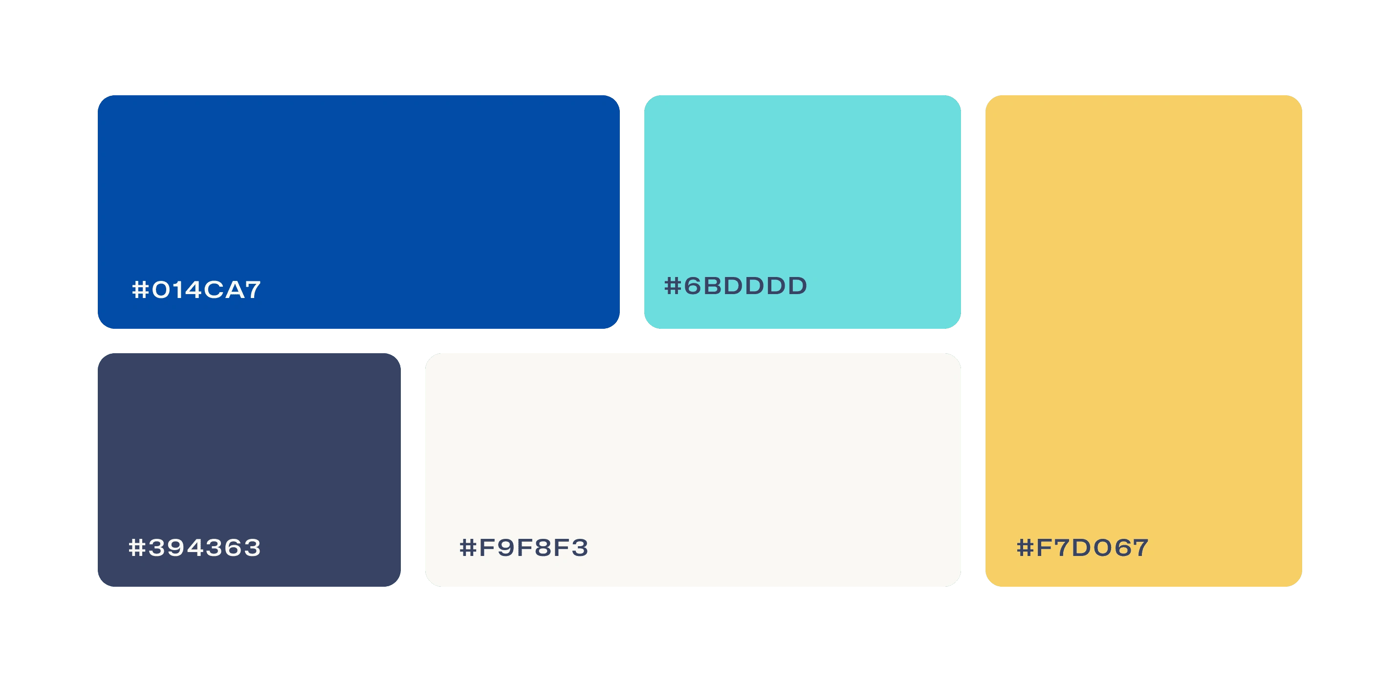
Color Palette
The color palette based on the specific preferences of the Client, seeks to inspire:
Wisdom
Science
Learning
Commitment
Transformation
Welfare
💡Visual Strategy
The brand seeks to reflect on the transformation and development of human potential, through the integration of conventional and complementary therapies that promote health and well-being in customers between 30 and 60 years old.
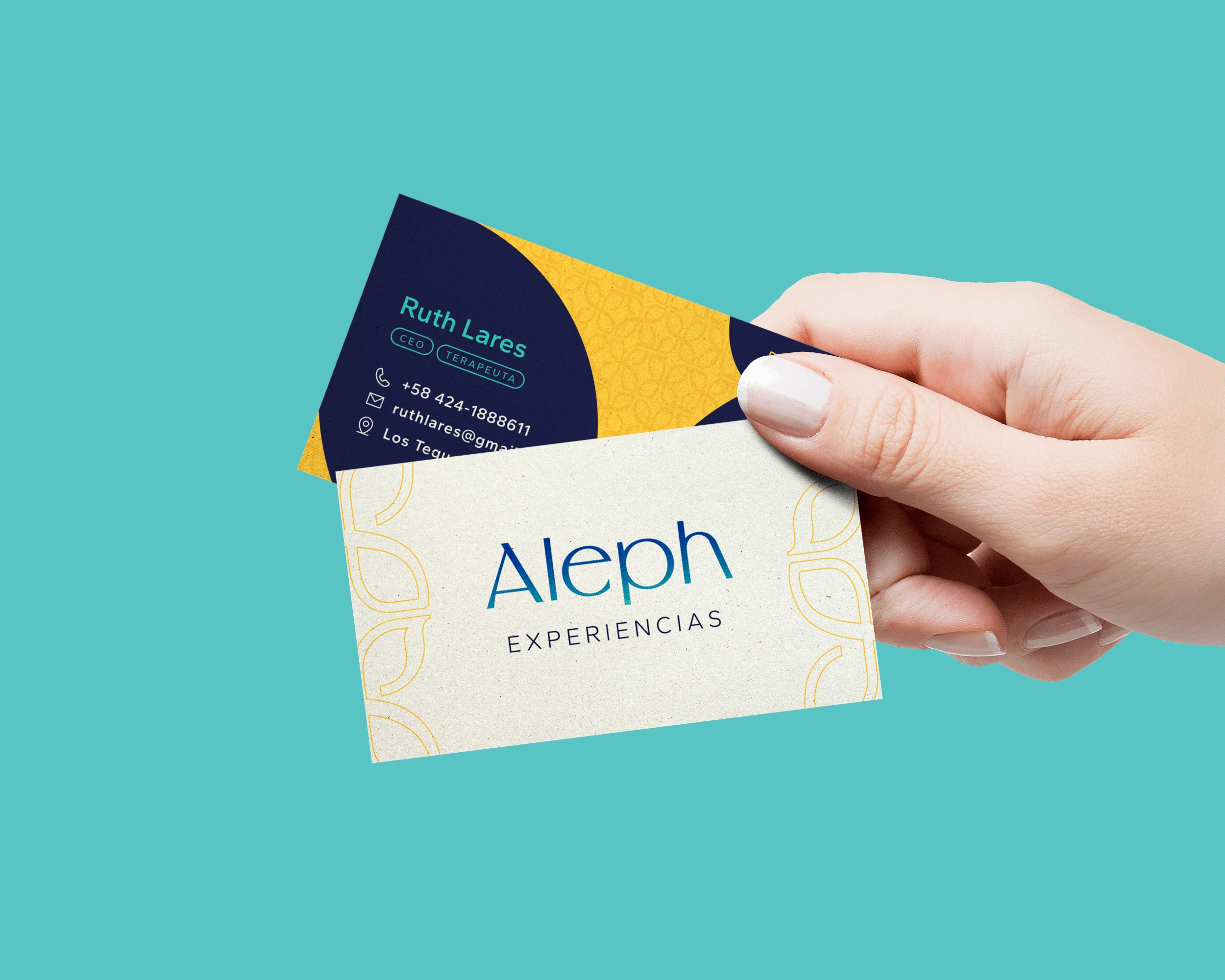
Business Card
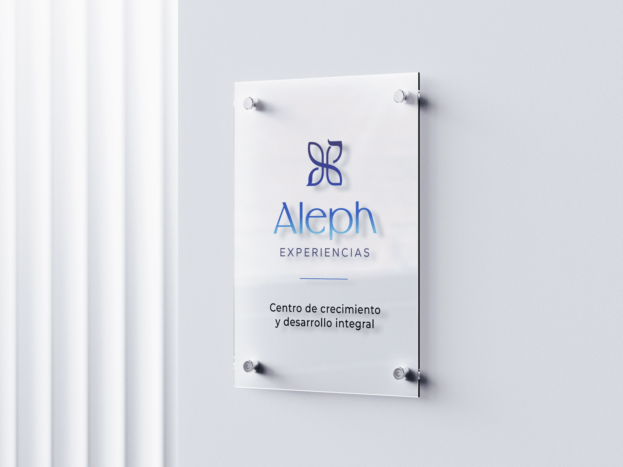
Glass Sign
The pattern of the imagotype seeks to give consistency and a more organic aesthetic, without being the protagonist on the canvas.
The uses soft and rigid geometric figures that inspire ambiguity in the public of any genre, with flat colors that express simplicity and sophistication.

Graphic Line
👀 Thoughts and perspective
The concept behind the imagotype fully reflects the philosophy and mission of the brand as an individual and for its target audience. I believe that how this is presented in Its representative colors demonstrates its modern and confident side in a more adult audience that seeks stability and confidence.
Like this project
Posted Jul 31, 2023
Logo, Stationery and Social Media Design for a center specialized in improve health through traditional and alternative therapies

