Studio Lewis
Studio Lewis is a in-house production studio specialized in provides storytelling strategies and resources for companies, creating memorable videos that make them stand out in their market.
It's vision is collaborate to tell more human stories in order to connect with the audiences on a deeper level. Instead of just products screens and talking head videos, their services and attention to details help to transform this approach.
✨ Client's desire
Design a Social Media Graphic Line on Canva, that enhace and allows its content to be more friendly and dynamic to its public/community.
🎯 Target Audience
Founders
B2B & SAAS
StartUps
Marketing and Product Leaders
Software Companies
GRAPHIC LINE
The original color palette of the Visual Identity was transformed, creating a complementary palette with more saturated and modern tones, which seek to emphasize the most creative and professional side of the brand.

For this, a shade of blue was taken more towards the range of purple for blues and gray, and Salmon as a derivative of Old Rose. These colors are used throughout the hierarchy of information and personalization of publications.
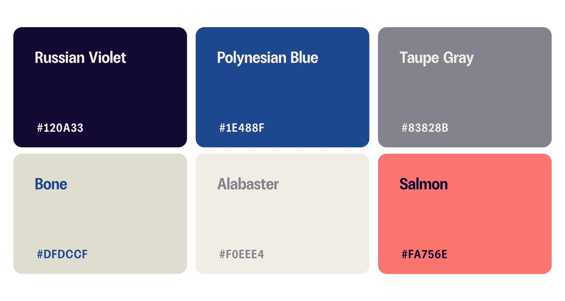
Color Palette

Selected Font
The typographic selection was ZT Talk, a Sans display font that, thanks to its typefaces, is adaptable to the hierarchy of text and create effective content that captivates the reader, lightening the information so that the message is clearer.
TEMPLATES
Among the main features of the templates, we find the use of rounded shapes, gradient shapes with transparency, gradient dot patterns, vector illustrations with outline and background, animated and static outline arrows.
These are assigned to the different layers that make up the template: background, content, and add-ons/decorations.

Carrousel Template
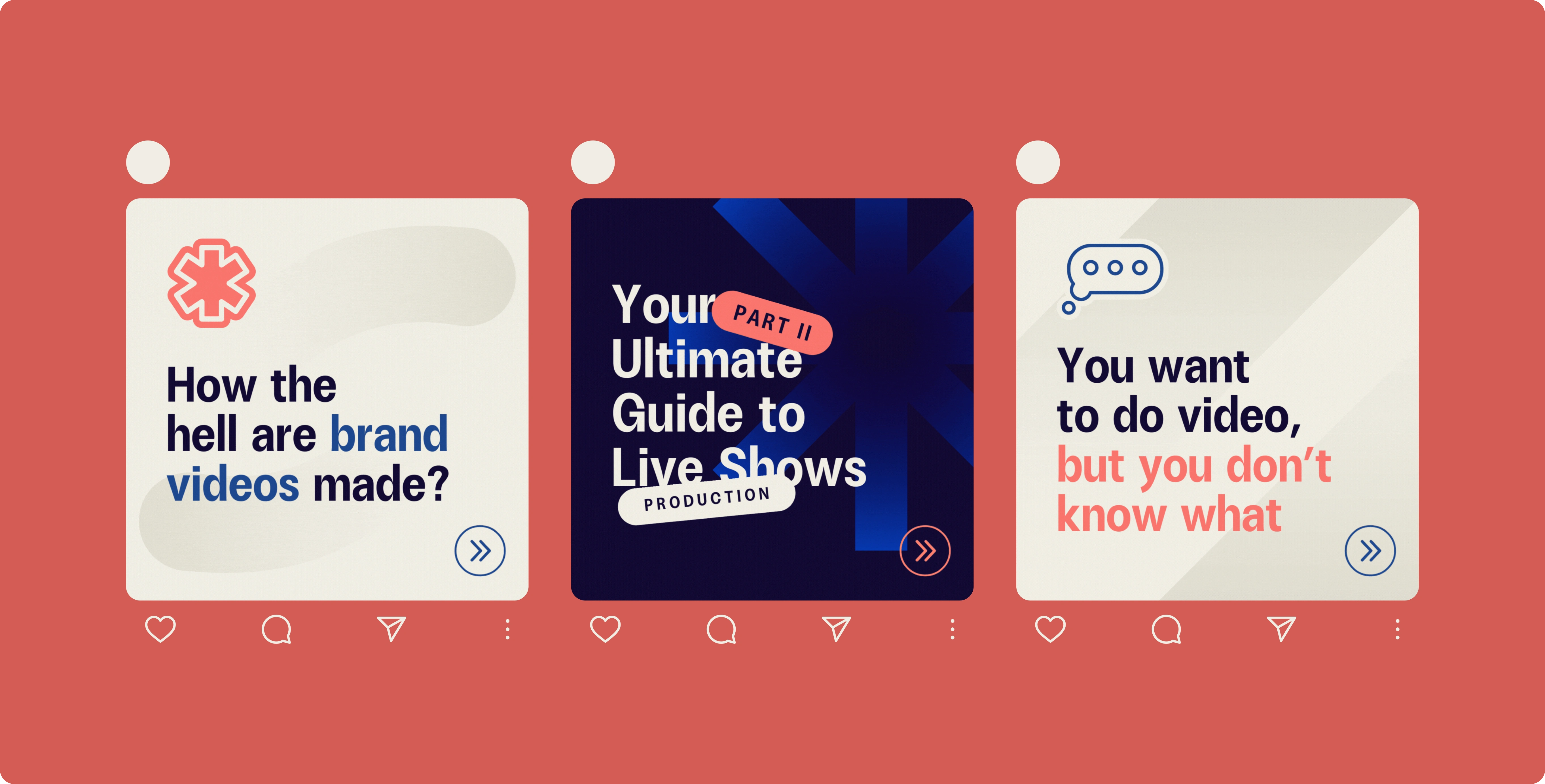
Templates Covers
The crucial part of this process was the interpretation and redistribution of the diagrams. As part of the sales strategy and planning of each project, the brand develops a flowchart that explains the executable step by step of the work that will be done, that is: the video they will produce.
Thanks to the visual elements chosen, each part of the processes can be laid out and sectioned in a more harmonious and light way to make the information to the public more digestible.
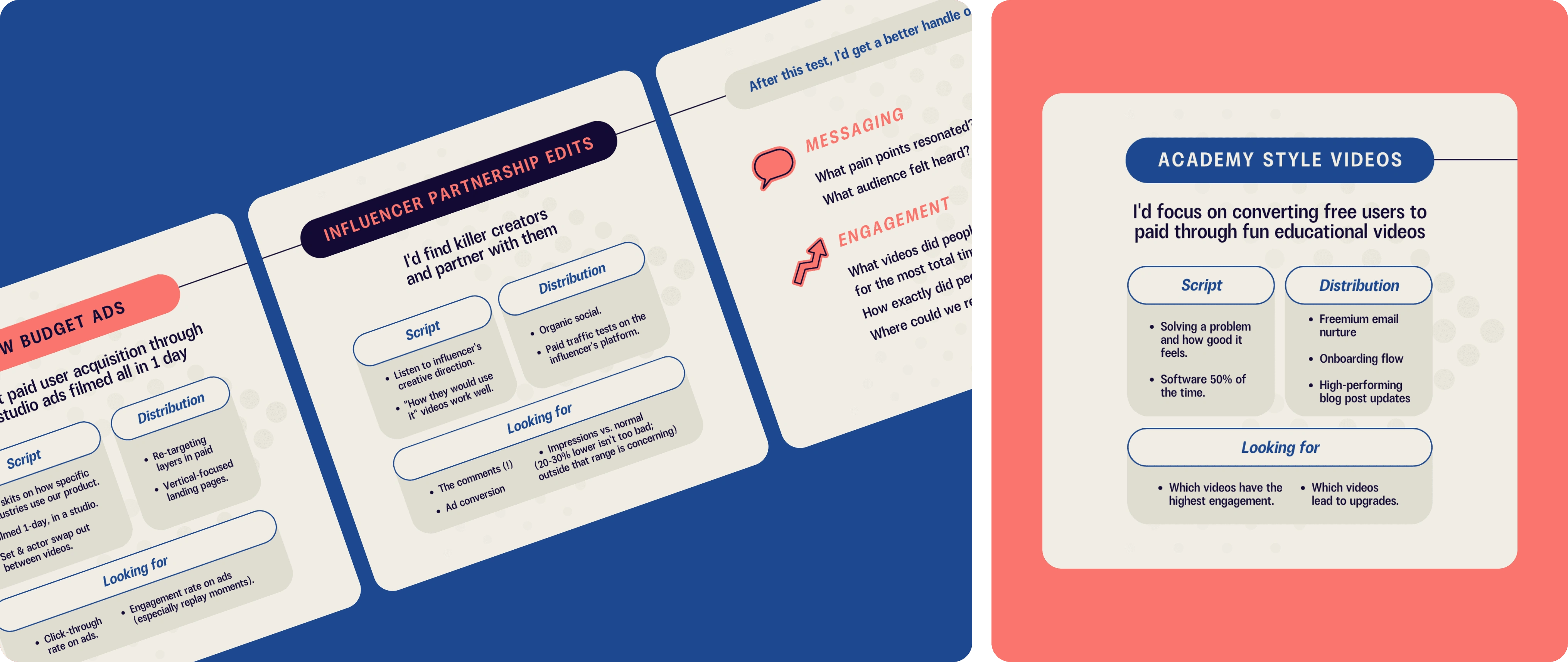
To maintain coherence and clarity, resources were created that document how the Graphic Line is composed and the strong point of the content: the diagrams. It consists of two documents:
Social Media Kit: Description and presentation of all the details and elements that make up the Graphic Line, with resources available to duplicate and use in the templates.
Diagram Library: Description and presentation of all the details and elements that make up the creation of Diagrams and other research methods, adapted to the level of complexity of the information, with resources available to duplicate and use in the templates.
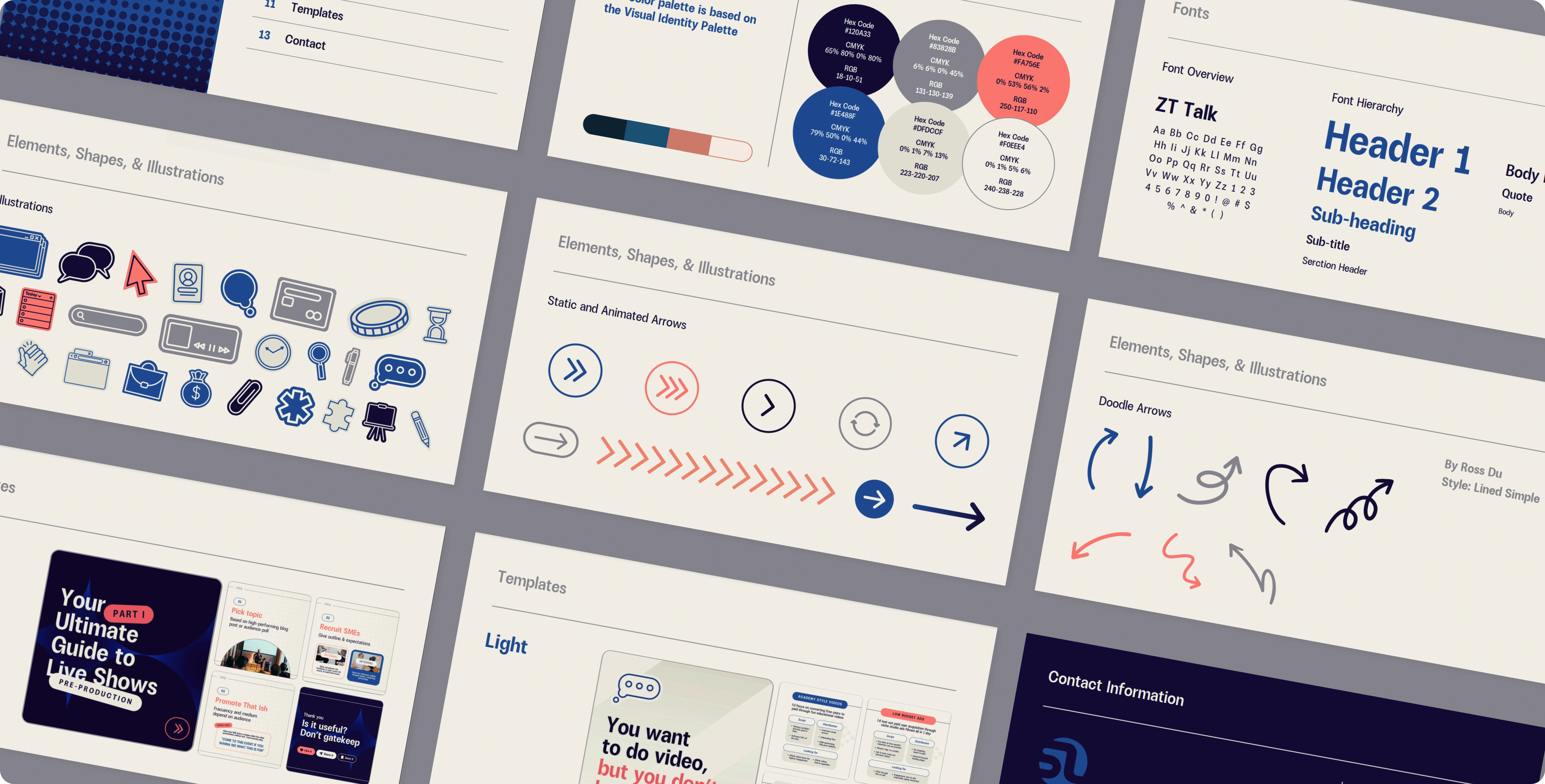
Social Media Kit
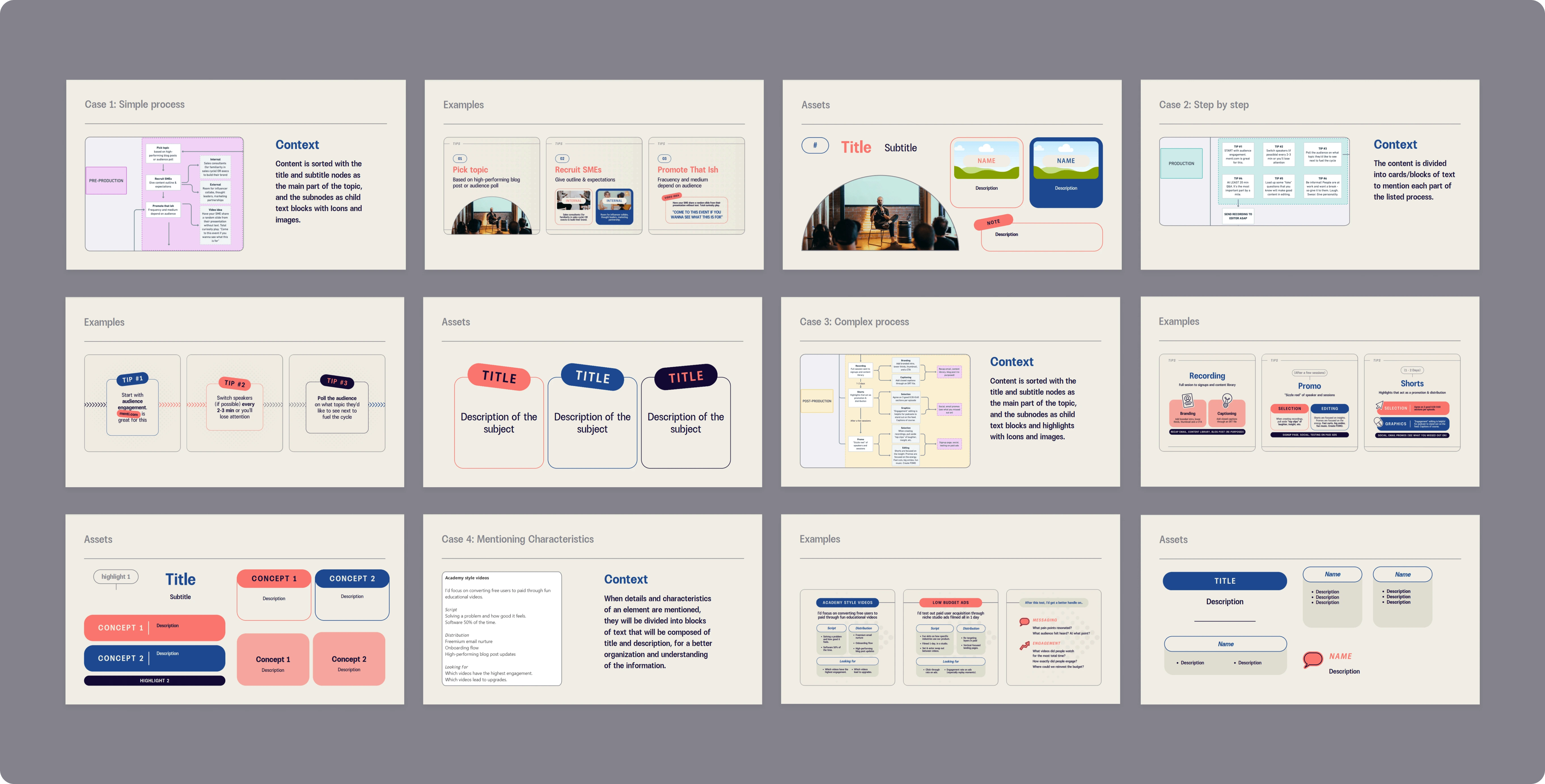
Diagram Library
Like this project
What the client had to say
Great communicator. Great attention to detail. And makes BEAUTIFUL designs. I'd absolutely consider hiring Adelaida again in a heartbeat.
Connor Lewis, Studio Lewis
Jun 17, 2024, Client
Posted Jun 19, 2024
LinkedIn Templates for in-house production studio specialized in provides storytelling strategies and resources for companies
Likes
82
Views
1.8K
Timeline
May 29, 2024 - Jun 17, 2024
Clients
Studio Lewis

