
Brand Identity Designer for scaling startups
- 5.0
- Rating
- 27
- Followers
Brand Identity Designer for scaling startups
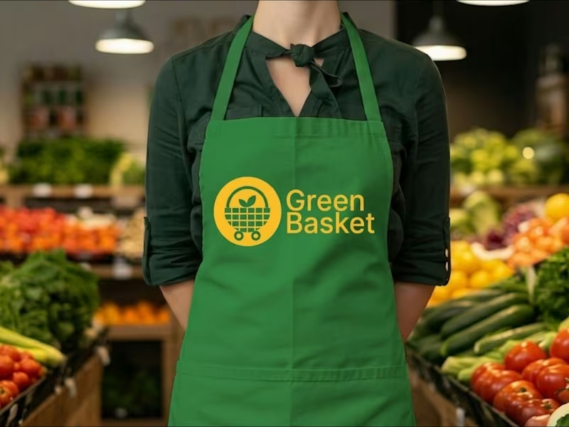
GreenBasket brand identity for a grocery delivery service
Most grocery delivery brands sell speed. GreenBasket sells trust.
The category is crowded with the same promise; fast, fresh, convenient. So the strategic move wasn't to shout it louder. It was to anchor the brand somewhere competitors can't easily copy: the supply chain itself.
GreenBasket sources directly from local farmers. That single fact does the work of three positioning statements, it explains the freshness, justifies the trust, and gives customers a reason to care beyond convenience.
From there the identity followed the logic: simple, warm, and unfussy. A brand that feels like a dependable weekly habit rather than a one-off transaction.
Vision: to become the everyday default for fresh grocery delivery.
Mission: carefully sourced groceries delivered with speed and consistency connecting people to quality food while supporting the farmers behind it.
Grocery shopping is a chore. The job of the brand was to make it feel like one less thing to think about.
1
330


Reducing perception risk through strategic brand design.
- 5.0
- Rating
- 4
- Followers
Reducing perception risk through strategic brand design.



Expert Product & Brand Identity Designer


Brand Designer | Visual Identity & Logo Design
Brand Designer | Visual Identity & Logo Design
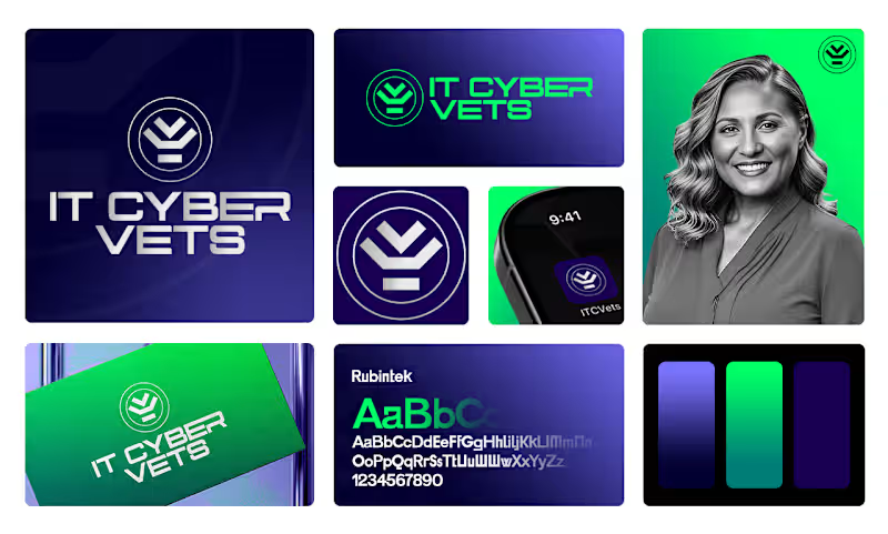

Brand Identity & Logo Designer | Social Media post Design
- 8
- Followers
Brand Identity & Logo Designer | Social Media post Design
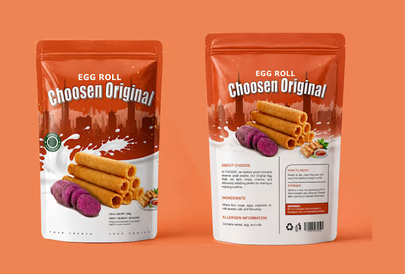
I turned a simple snack into a craving. Choosen Original Egg Roll.
People don't buy snacks with their eyes closed. They buy with craving.
For Choosen Original Egg Roll, the brief was clear — make it look crispy, crunchy, delicious and unforgettable on the shelf. So I built a story around the crunch itself.
The top half is bold city energy with deep orange that pops on any supermarket shelf. The bottom half is pure indulgence, a splash of milk for creaminess and freshness, stacked golden egg rolls that look so crispy you can almost hear them, and the sliced purple yam that tells you instantly this is not your regular flavor, this is original.
I added small details that sell, the Original Foods Industry seal for trust, the small serving shot with dip for appetite, and the tagline at the bottom, YOUR CRUNCH. YOUR CHOICE. It is personal. It makes the buyer feel like this snack was made for their moment.
This is packaging design that does not just sit, it sells.
If you have a food product, snack, or consumer brand that needs to stand out and get picked up, let's create your bestseller packaging.
DM me "CRUNCH" to get your own product packaging that converts.
#PackagingDesign #FoodPackaging #SnackPackaging #EggRollDesign #ProductPackaging #PouchDesign #ChoosenOriginal #FoodBranding #PackagingDesigner #GraphicDesigner #BrandDesigner #DesignThatSells
1
169

I don't design thumbnails. I design scroll-stoppers.
This thumbnail was built to do one thing make someone stop and click.
The topic is heavy, debt, economy, Wall Street, so the visual had to hit instantly. I used the red "THEY LIE" blindfold to create controversy and emotion. The blood-red rising arrow shattering the chart creates urgency. The bold text "THE ILLUSION IS DEAD." is the payoff. And the yellow "100% DEBT-TO-GDP" warning sticker is the hook that makes it feel like breaking news.
Every element is intentional. The red glow behind the subject for tension. The Wall Street sign and bank building for context. High contrast, big typography, and a story that is told in 1 second.
This is YouTube thumbnail psychology. Emotion plus proof plus curiosity equals clicks.
If you need YouTube thumbnails, podcast covers, or finance commentary graphics that actually get clicks and not just look good, let's work. I design for retention.
DM me "THUMBNAIL" to get high CTR thumbnails for your channel.
#ThumbnailDesign #YouTubeThumbnail #HighCTR #FinanceThumbnail #ClickbaitDesign #YouTubeDesigner #ThumbnailDesigner #PoliticalThumbnail #PodcastCover #SocialMediaDesign #GraphicDesigner #DesignThatConverts
1
205
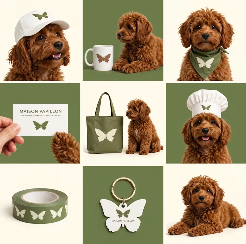
She didn't just want a logo. She wanted a feeling. Maison Papillon.
Papillon means butterfly in French. And that is exactly what this brand is about transformation.
When the client came to me for Maison Papillon Cafe Bakery Texas, she wanted more than a cafe. She wanted a place in Texas that feels like Paris in the morning, warm, soft, pet-friendly, where everyone belongs.
Not just any butterfly. A sage green butterfly with delicate gold veins. Calm but elegant. Natural but premium. The kind of mark that feels at home on a coffee mug, on a tote bag, on a bakery box, and even on a dog bandana.
I built a whole identity system around it. A primary serif wordmark for timeless elegance. A circular badge for packaging that feels like a seal of quality. And a complete pet-friendly extension because at Maison Papillon, even the dogs are family. The cap, the mug, the business card, the keychain, every touchpoint whispers the same story you are welcome here, come stay a while.
This is what brand identity should do. It should not just be seen. It should be felt.
If you want a brand that tells a story and lives beyond the logo, let's build your Maison.
DM me "PAPILLON" to get your own timeless brand identity and mockup set. Open for branding projects worldwide.
#BrandIdentity #LogoStorytelling #CafeBranding #BakeryBranding #MaisonPapillon #ButterflyLogo #PetFriendlyBrand #VisualIdentity #BrandDesigner #LogoDesign #TexasBakery #TimelessLogo
0
99
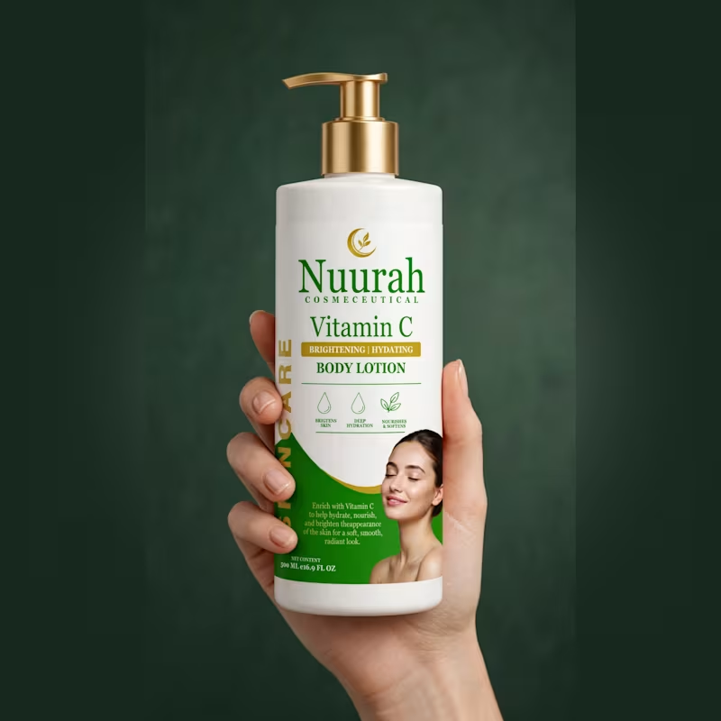
Every bottle tells a story. This one tells the story of GLOW.
This is not just a body lotion label. This is confidence in a bottle.
When the client came to me with Nuurah Cosmeceutical, she didn't just want a label. She wanted a feeling. That feeling you get when your skin is soft, hydrated, and glowing from within. That quiet luxury of knowing you look radiant.
The deep green speaks of nature, purity and healing. The touch of gold speaks of luxury, of a woman who values herself. The name Nuurah, light itself, became the hero. Big, bold, unapologetic. Because skincare should not hide. The woman on the front is not just a model, she is every woman closing her eyes and feeling beautiful in her own skin.
On the back, I kept the promise simple. Brightens. Hydrates. Nourishes. No confusion, just results.
This is design that sells emotion before it sells a product.
If you have a skincare or cosmetic brand that needs to tell a powerful story and not just sit on the shelf, let's make your product unforgettable.
DM me the word GLOW and let's create your bestseller brand story.
1
135

Brand Designer / Art Director
Brand Designer / Art Director


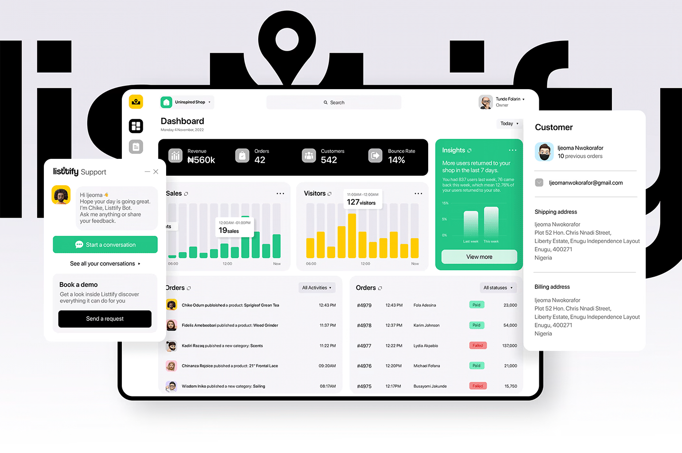

Expert Brand Designer focused on scalable identity systems.
- 9
- Followers
Expert Brand Designer focused on scalable identity systems.


User-Centric UI/UX & Vector Illustration Expert


