Wigwe University — A Redesign Case Study
Luther Ejoh
W i g w e U n v e r s i t y
A Case Study for The Redesign
Section 1: Analysis & Objective
Section 2: Design Process
Section 3: What now?
Appendix: Mock-up Designs
ANALYSIS AND OBJECTIVE
Analysis:
The current website design is outdated and not mobile-friendly
Poor spacing between texts and other elements
Minimal interactive designs and animations
Navigation is hidden. Users are left having to discover the interactions of the website instead of the website communicating the use of an interaction
Objectives:
Improve the website to be modern, responsive and user-friendly
Design with the end-users and business goals in the front and centre
Improve discoverability and reduce cognitive load on users
Create interactive designs and animations for the engagement and to ensure users read through and interact with everything
1. TOP NAVIGATION

Primary Button:
Because Admission is the end-point of the website, the Admission is made a Primary button, similar to how websites highlight the Download or Purchase button.
Additionally, Admission and Tuition & Fees should be made a single page. This reduces the number of pages users have to visit.
Resizing of Items:
For a lesser cognitive load, the font size of the links is reduced to 16 and the dropdown arrows are removed.
The dropdowns inform users what they can find in that page. This can still be displayed if users hover over it.
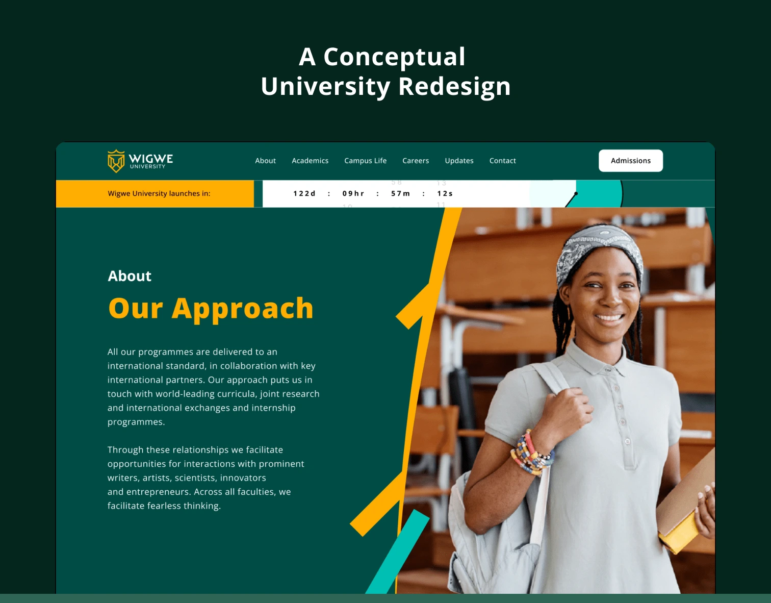
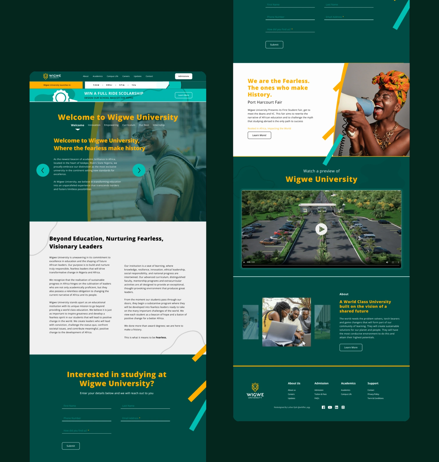
2. LAUNCH COUNTDOWN
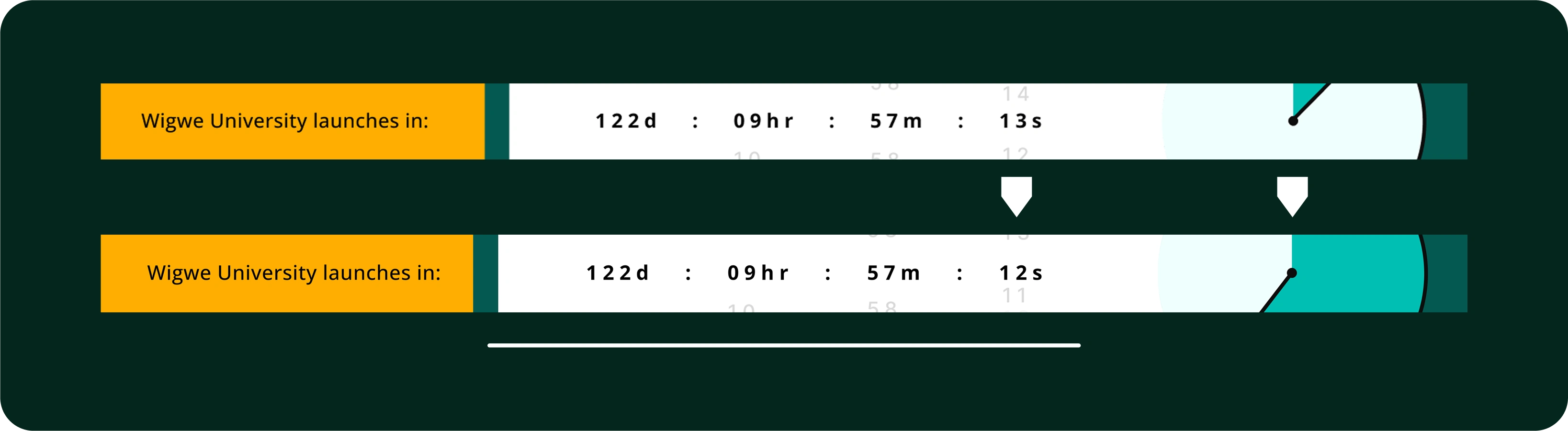
The Launch Countdown:
I made the numbers slide downwards like that of a doomsday clock with the goal of intensifying the countdown.
I also turned the Days, Hours, and Seconds into d, hr, and s for simplicity.
Stopwatch:
To give users a wider perspective of the countdown. A stopwatch, which eases from 0 to the current time, must be added.
The timer alone cannot tell the full scope of its progress from start.
3. WELCOME
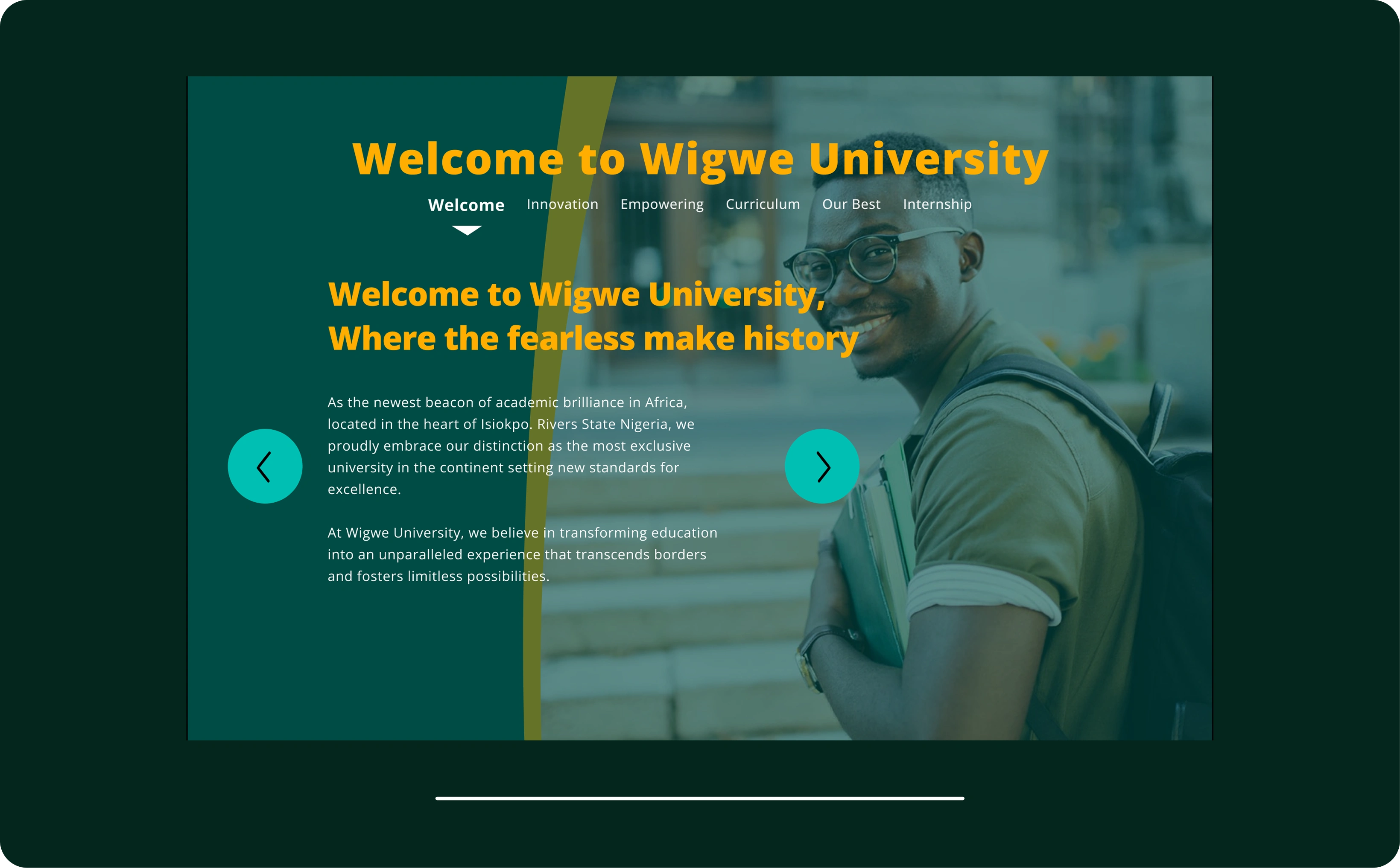
The Slide:
To make the slides more informative, key words of the topic of a slide can be added.
Interactive design such as this let users engage with and understand the website better instead of the website displaying itself.
Responsiveness & Simplicity:
For responsiveness and greater emphasis on the text, the images are made backgrounds, and the arrows are given a fill.
This satisfies the Rule of Thirds of design. For animation, texts slide and fade in from the centre. And greeting visitors with a smile creates positivity.
4. REACH OUT & ROOTED IN AFRICA
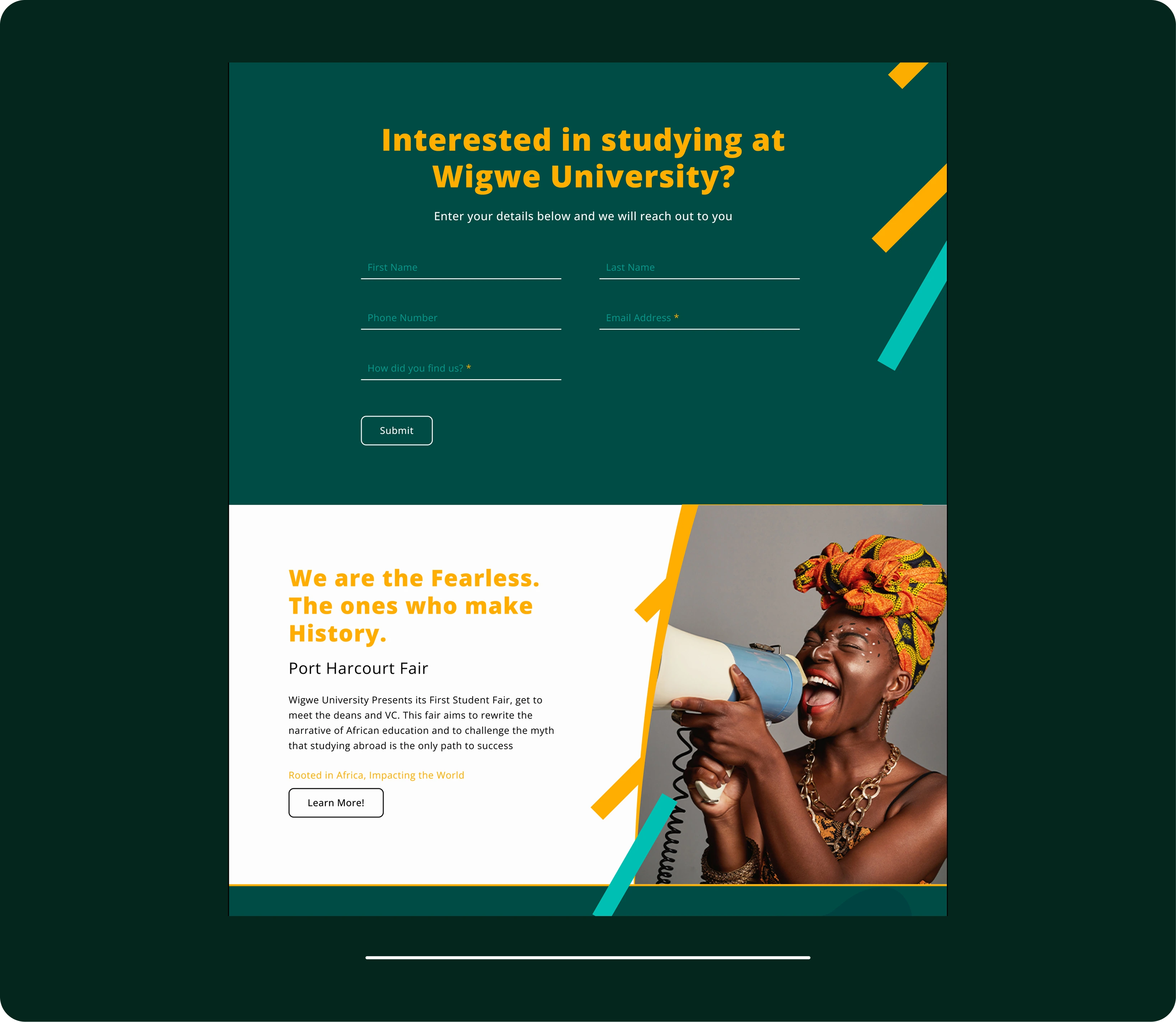
Reach Out Improvement:
I brought down the placeholder texts and changed the colours to match with neighbouring colours.
Rooted in Africa:
Replaced the link with a button for design better communication of interactions, which reduces cognitive load and increases discoverability. Adjusted the typography and increased the size of the image on the right.
For animation, each element fades in and slides up in Reach Out. And each text slides up and fades in, the image slides in from right, and the items do too but slower in Rooted in Africa.
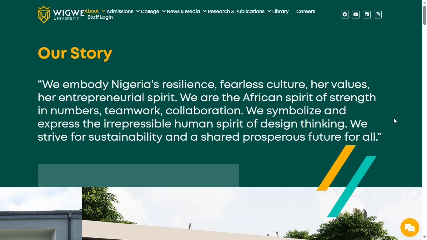
5. VIDEO & OUR STORY
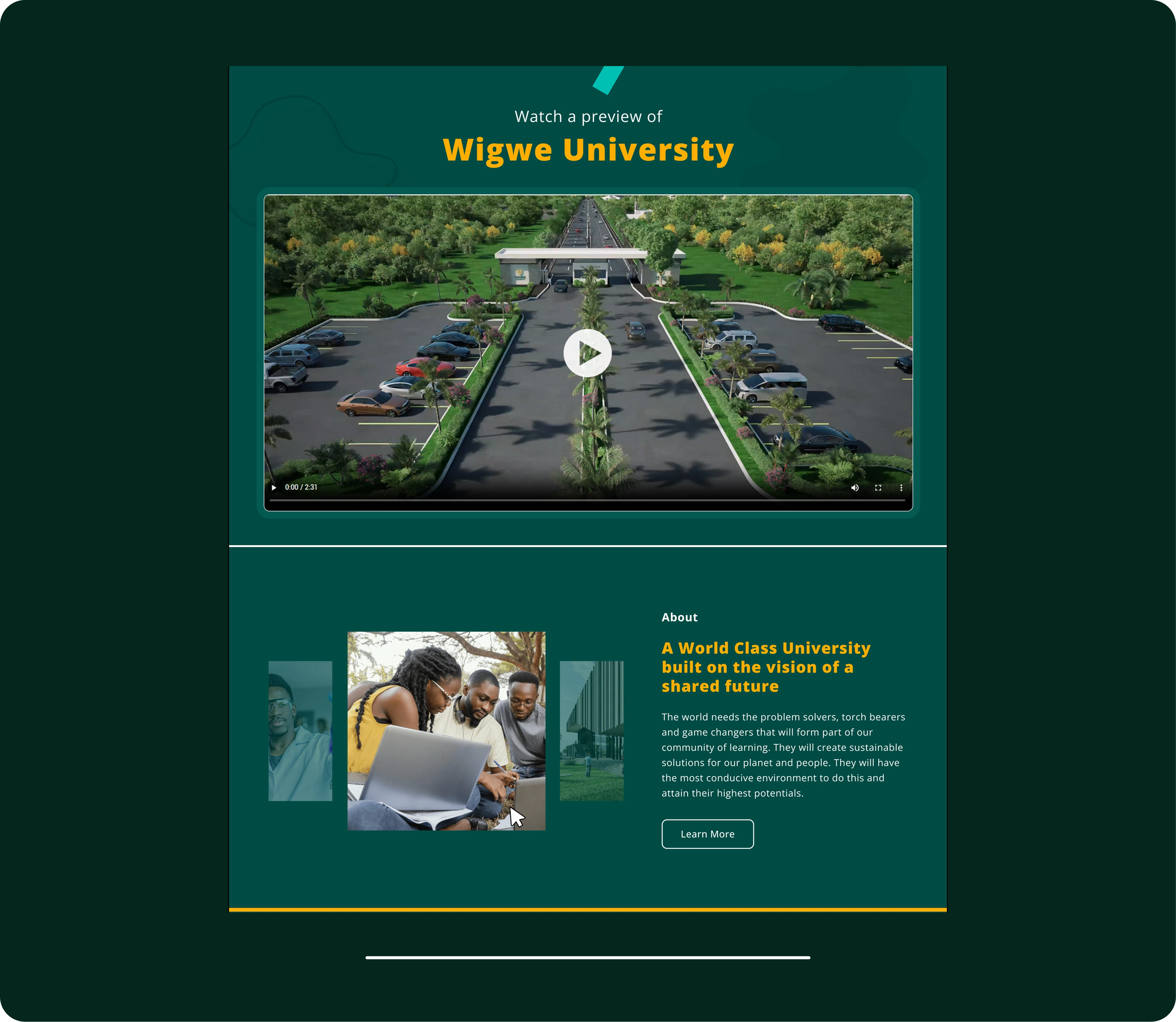
Video Preview:
A header that informs users of what to expect in the video. This directs users to watch to learn, instead of it being an untitled video.
Our Story:
Incorporated improvements to the typography and centred the images for users to recognise it is interactive.
The original looks static. To further inform users that it is interactive, the images increase in size when hovered on, including the centred one.
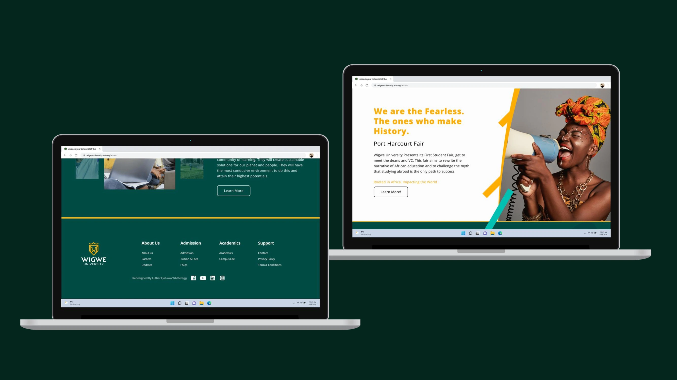
6. FOOTER
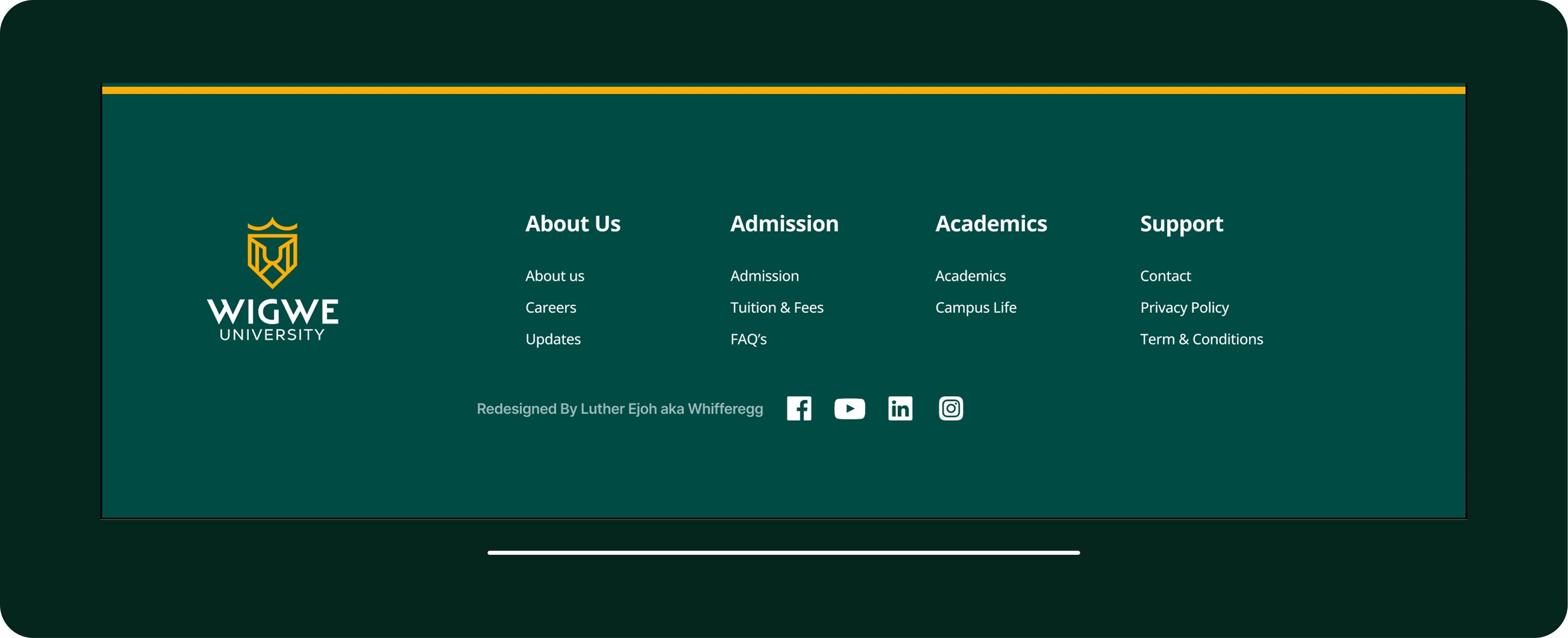
Organisation of Links:
Arranging the links into groups will help users better understand which link is related to which. And the social media handles are at the centre bottom. The watermark with my name is not a part of the design.
Logos placed at the left side are better seen than the centre.
INTENTIONS & DECISIONS
The objective of the redesign is to enhance the user experience by implementing a simpler visual design that guides visitors' attention to the right information, reducing cognitive load and increasing discoverability. This will ensure visitors successfully read through everything.
While working with the established style and layout of Wigwe University, I adhered to improving on what already exists, such as the size and spacing of elements and responsiveness.
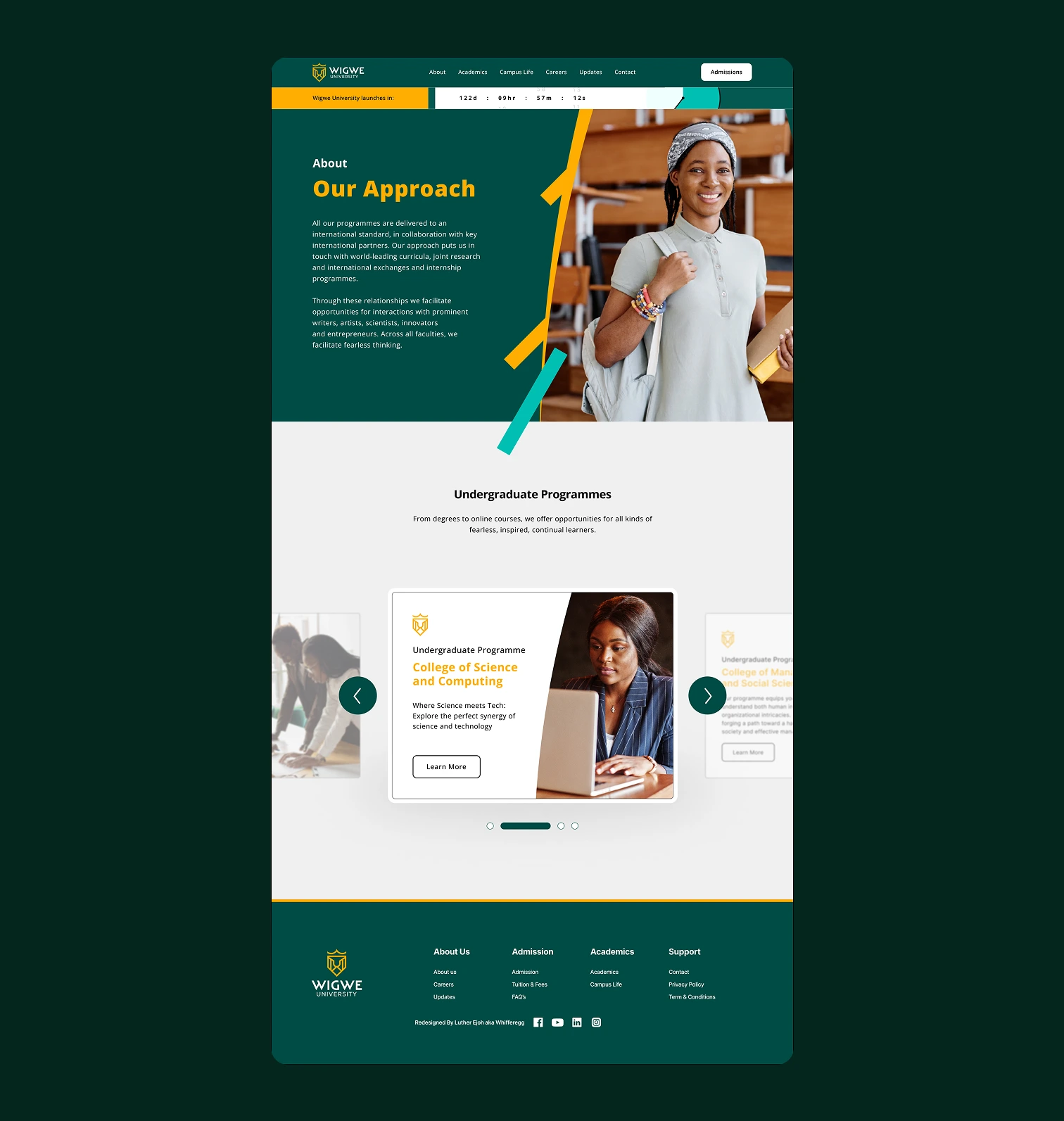
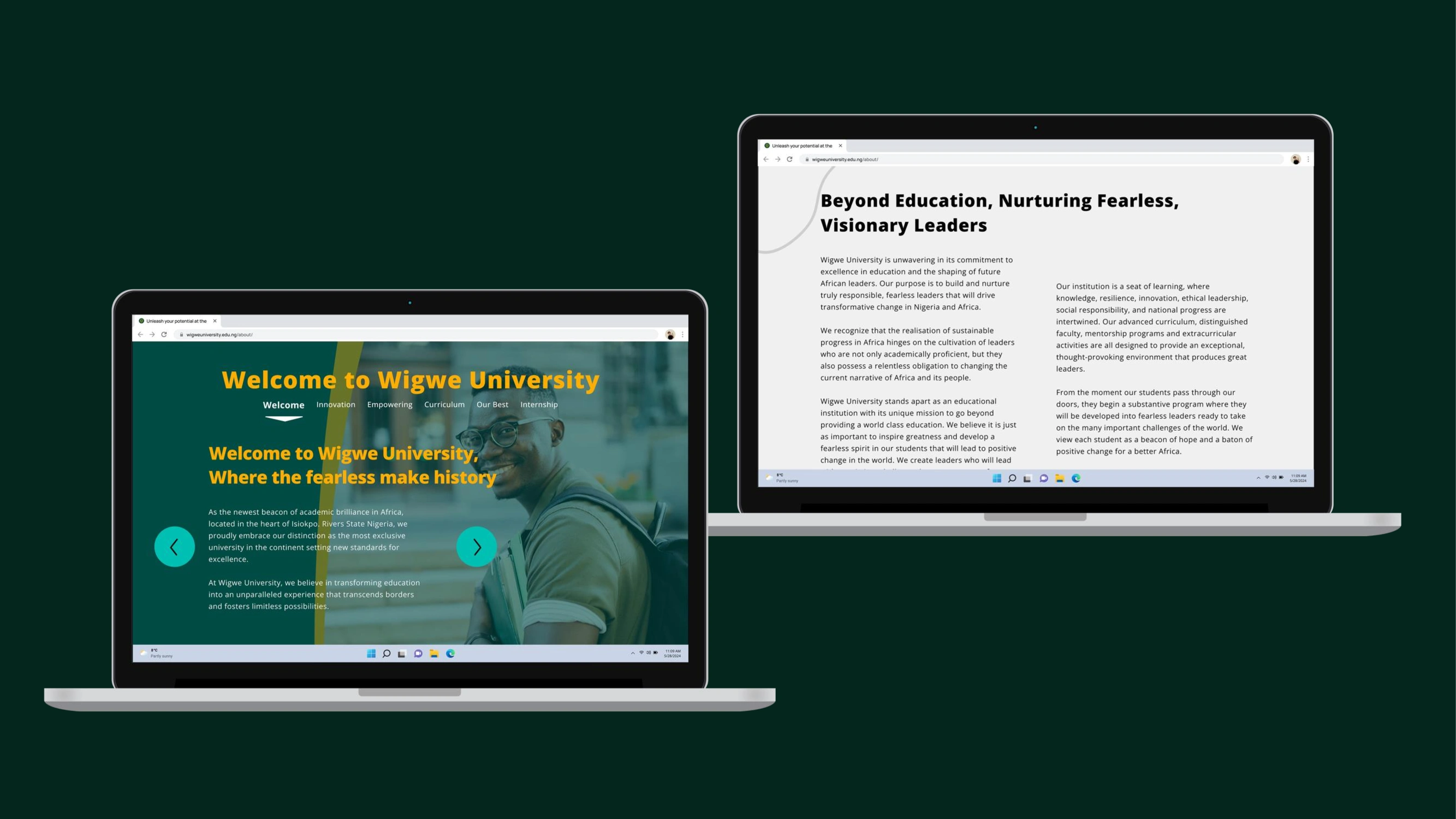
ORIGINAL DESIGN
FINAL DESIGN
Home Page
About us Page
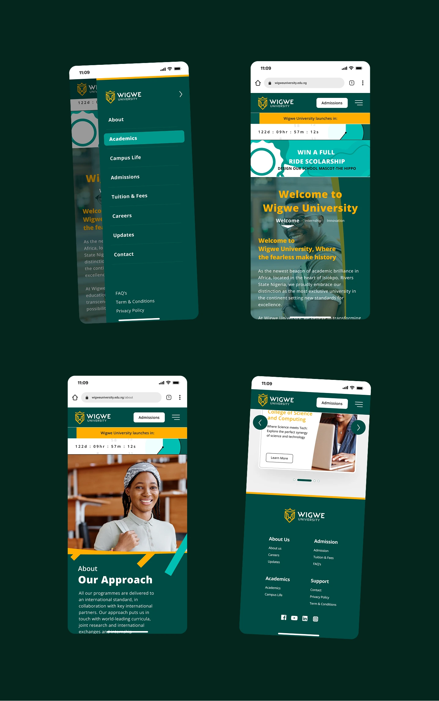
MOBILE MOCKUP
For Mobile and Tablets
Responsive and Light
Comprehensive and Spaced
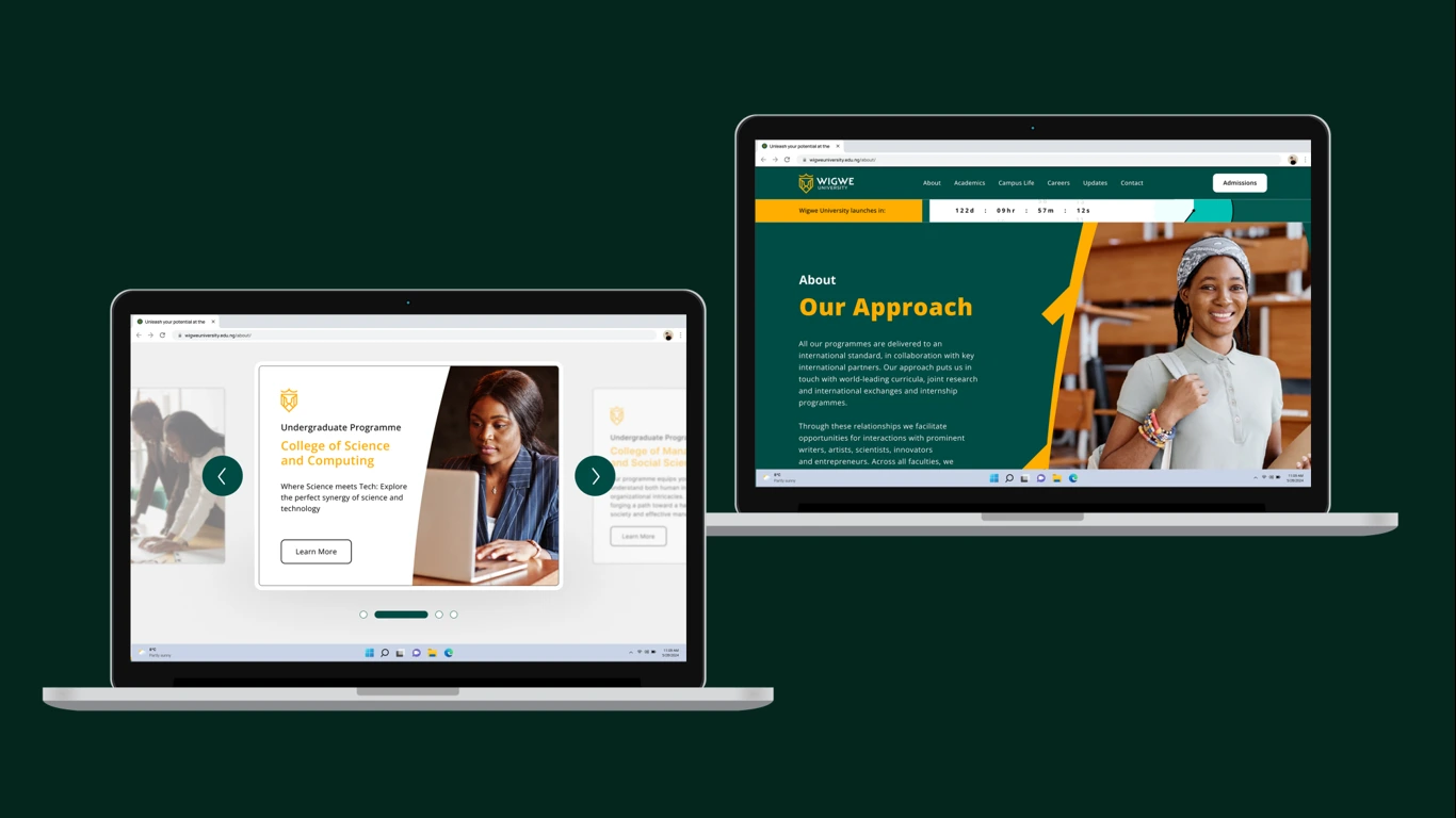
LAPTOP MOCKUP
For Desktops and Laptops
Responsive and Light
Comprehensive and Interactive
THANK YOU
And much appreciation for reading through. I'm excited to collaborate and create something great with you! I'd love to stay in touch! 📜 Instagram and X(twitter) @whiffer_egg
.
Like this project
Posted Aug 19, 2025
A website redesign with the aim to improve the user experience, such as better layouts, interaction, and spacing. It's best for a website to be user-centric.
Likes
2
Views
6
Timeline
May 24, 2024 - Jun 10, 2024