Akim - Brand Identity

Godknows Ukari
Cross-border payments in Africa move at the speed of the businesses sending them. The infrastructure underneath does not.
When a transaction fails between Lagos and Accra, nobody knows exactly where it broke. The neobank blames the corridor. The corridor blames compliance. The founder gets the churn event.
Akim is the settlement and clearance layer built for that gap not the app, not the wallet, but the rail underneath all of it. This case study documents the complete brand identity system: from the strategic foundation and naming rationale through to the full visual identity, design system, and key application surfaces.
__________
Category: Brand Identity
Industry: Fintech Infrastructure
Scope: Strategy, Identity, System
Type Spec — Case Study
Designer: Godknows Ukari
Year: 2026
Market: African Corridors, B2B
01 — Market Context
The Problem
Africa's cross-border payment market has a visibility problem. Volume is significant and growing remittances, trade flows, platform payouts, diaspora transfers. The infrastructure carrying those payments is not growing at the same rate.
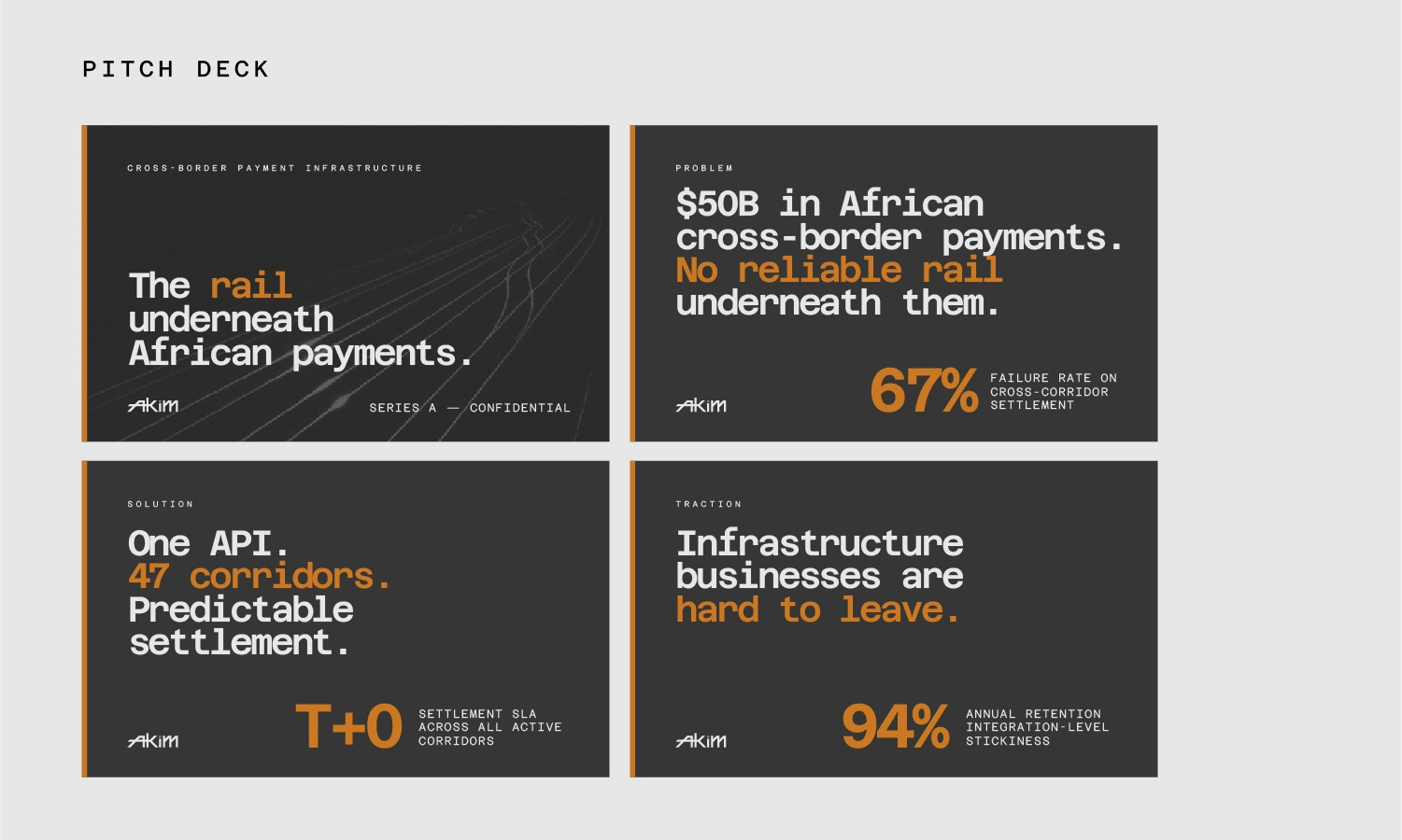
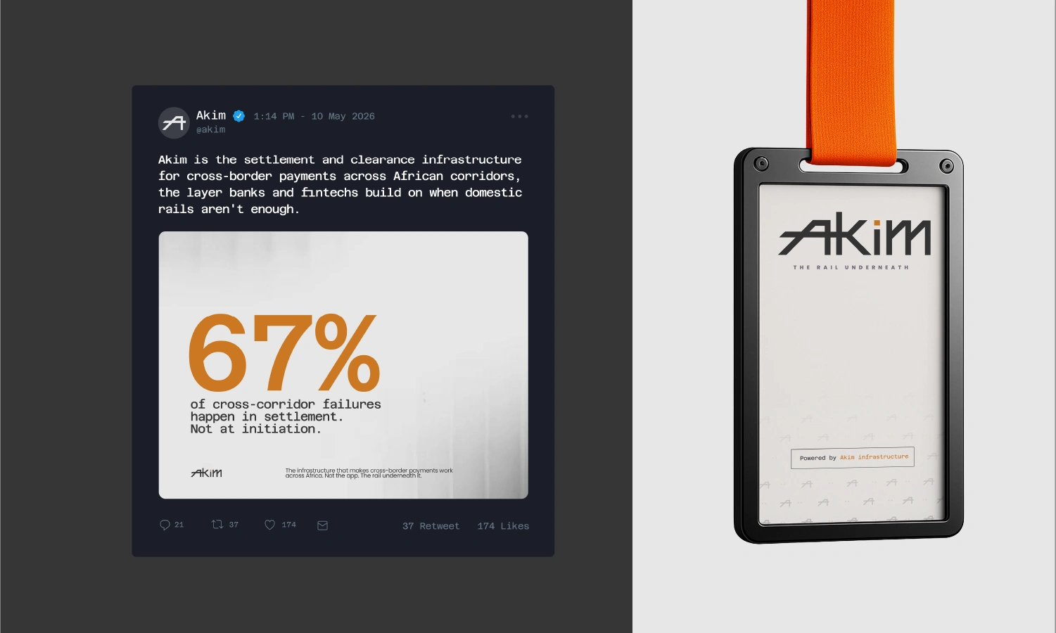
The failure point is not initiation. It is settlement. 67% of cross-corridor failures happen after a transaction has been accepted in the clearance and settlement layer that most founders never see and most vendors never discuss. The transaction appears to process. Then it reverses. Then nobody knows why.
The problem isn't that cross-border payments don't exist in Africa.
It's that they work fine until your most important transaction.
The competitive landscape is crowded at the consumer layer and underdeveloped at the infrastructure layer. Flutterwave and Cellulant have moved progressively toward consumer and merchant-facing products. SWIFT and legacy correspondent banking infrastructure carry institutional trust but were designed for a different era. A modern, developer-native, compliance-first settlement rail built specifically for African corridors is the gap Akim is built into.
The brand had to speak to three buyer types simultaneously: developers evaluating an API, enterprise finance leads assessing a vendor, and banking partners requiring compliance credibility. Each group has a different trust register. The identity system had to work across all three without diluting for any of them.
02 — Brand Strategy
Strategy
The positioning work started with one question: who does this brand need to be indispensable to? Not end users. Not regulators. Not investors, at least not first. The fintech founder who needs cross-border settlement to work in production, tomorrow, consistently. That is the primary buyer. Everything else follows from that.
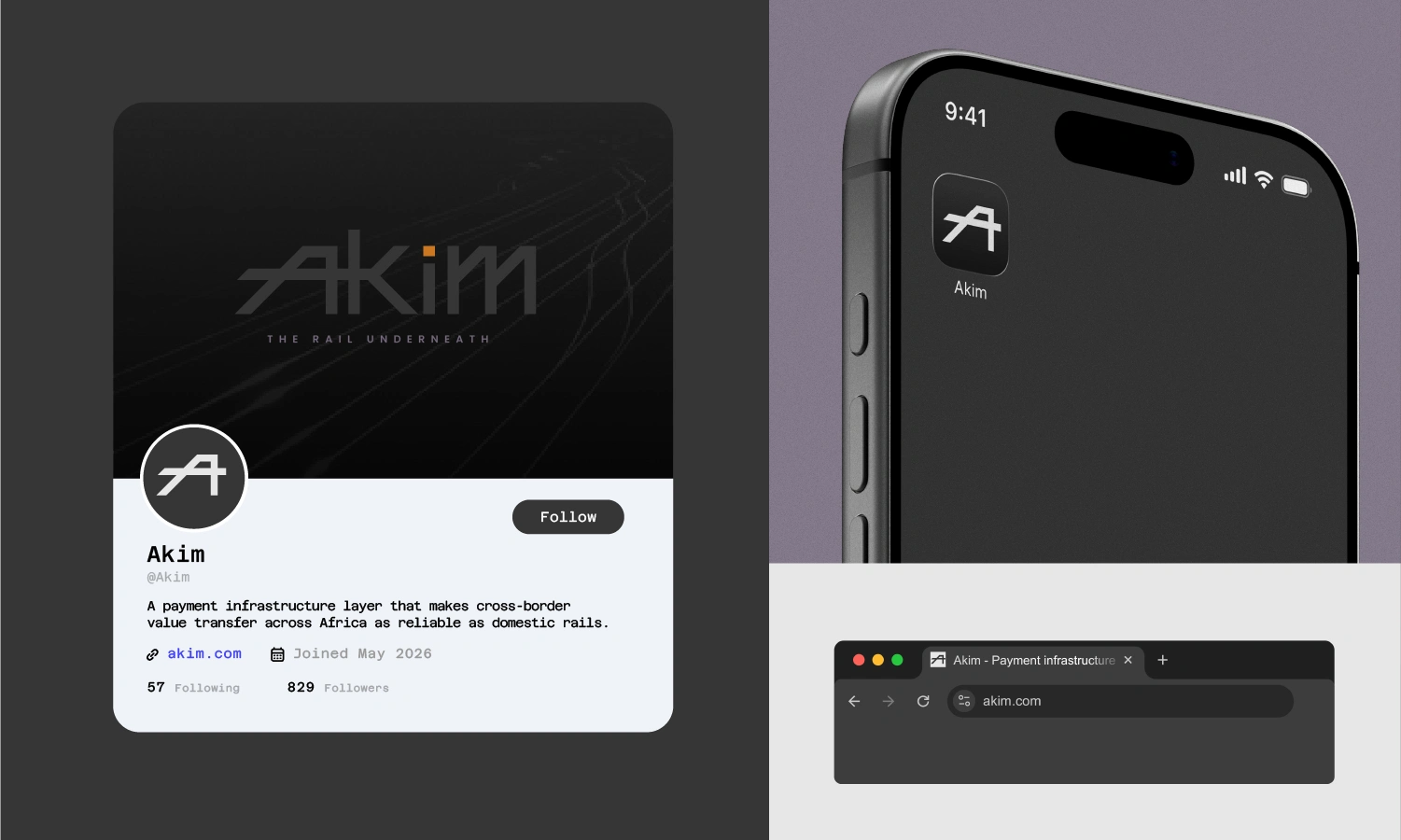
Akim is the payment infrastructure layer that makes cross-border value transfer across Africa as reliable as domestic rails built for the banks, fintechs, and platforms that can't afford the transaction to fail.
The positioning decision, infrastructure over product was deliberate and costly in the short term. Infrastructure businesses have a slower growth curve. They do not trend. They do not go viral. What they do is become impossible to replace once integrated. When a neobank wires your settlement logic into their core flow, the conversation stops being about price. It becomes about trust, uptime, and whether you pick up the phone when something breaks at 11pm on a Friday.
03 — Naming
Why Akim
Naming an infrastructure company is a specific kind of hard. The three traps that claimed most candidates in this category: the African word used decoratively, the generic tech compound, and the forced acronym. Every name that fell into one of those categories was eliminated immediately not because of aesthetics, but because of strategic failure.
Good infrastructure naming does one of two things: it is completely abstract and ownable Stripe, Visa, Swift or it implies function with precision Clearbank, Railsr, Column. The middle ground is where names go to die.
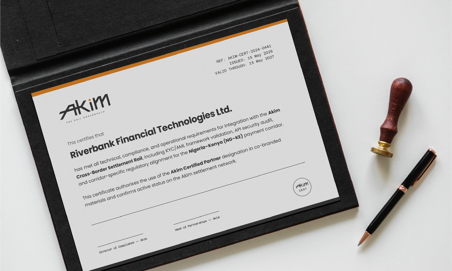
Akim passed every test an infrastructure name needs to pass. It works as an API namespace. It is pronounceable across the four primary language groups of the corridors it serves. It renders at favicon size without losing legibility. It sits on a compliance certificate next to a central bank logo without either borrowing authority it has not earned or shrinking from the comparison.
The name is rooted in Arabic and Hausa hakim, meaning authority and governance. But the brand does not lean on that etymology as a crutch. Akim earns its meaning through what it does, not what the dictionary says it means.
Four letters. Hard consonants. Globally pronounceable. Those are functional requirements, not aesthetic ones. The name had to work when a developer says it in a standup, when a compliance officer types it in a report reference, and when a founder reads it at the top of an API error log at 2am.
04 — Visual Identity
The Design
Metaphor
The brief called for a brand that looked like infrastructure not like payments. Infrastructure has a visual language. It is precise, load-bearing, and invisible to most people. The object that drove every visual decision was a railway switch: it controls where things go, it is catastrophically important when it fails, and nobody thinks about it unless it does.
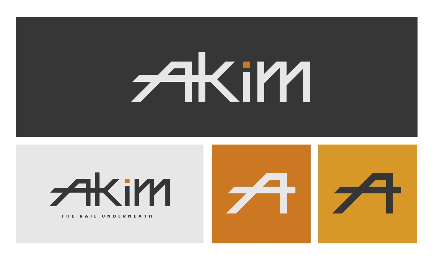
That object informed the letterform decisions directly. The diagonal left leg of the A derives from the switching angle of a rail junction. The structural crossbar of the K carries the geometry of parallel rails in cross-section. The double post of the M holds the visual weight of load-bearing infrastructure. The geometry is not decorative it is derived from the same engineering logic as the object the brand represents.
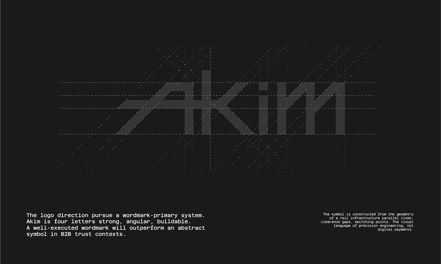
The wordmark-primary system was chosen over a symbol for a specific reason: in B2B infrastructure sales contexts, a strong wordmark outperforms an abstract mark because it carries the name into every touchpoint without translation. Akim is four letters. The name is the mark. A symbol would be redundant.
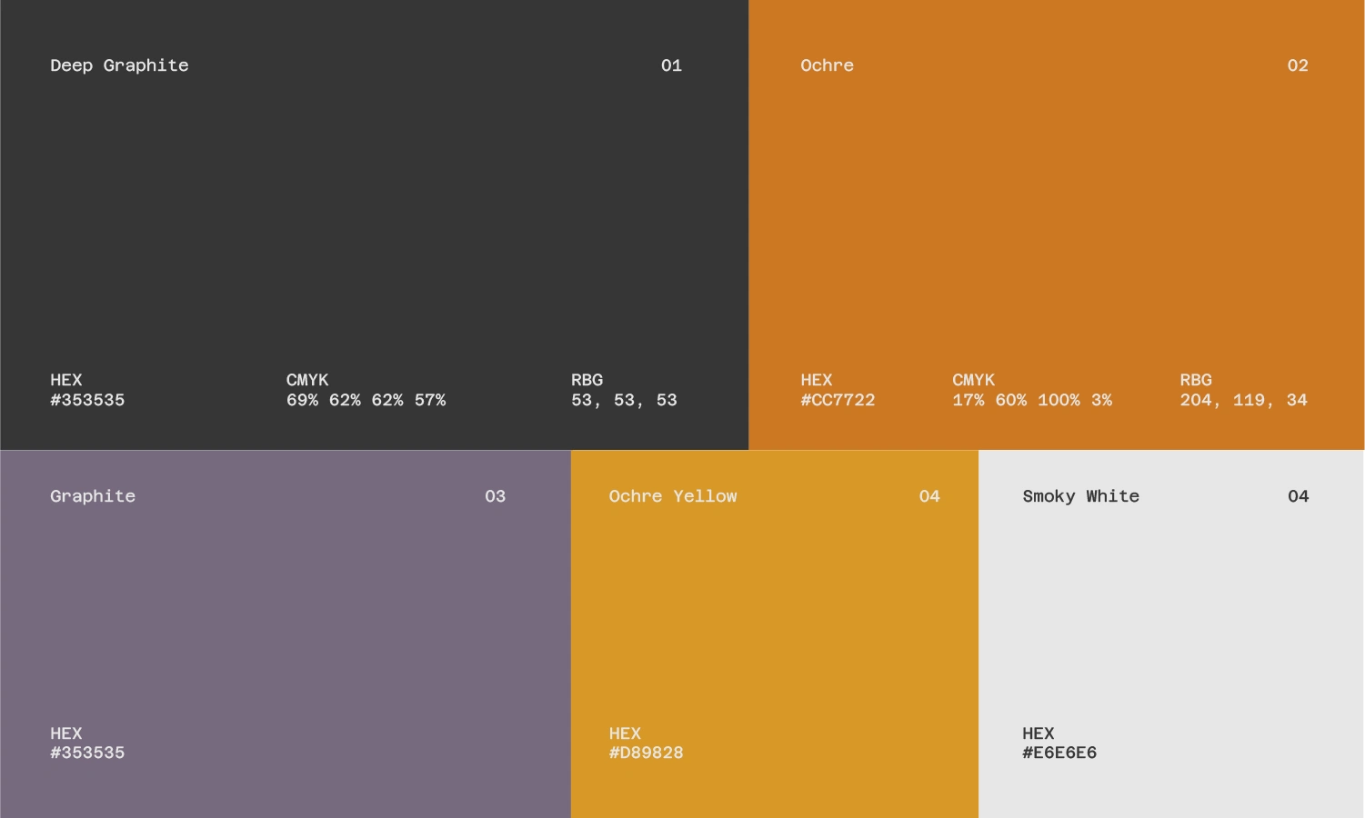
Blue was not considered. It is the default fintech colour for a reason and that reason is also why it is meaningless now. The palette is built around Deep Graphite (#353535) as the primary the colour of rail infrastructure, precision engineering, and permanence. Not pure black, which reads as fashion. Graphite, which reads as built to last.
Ochre (#CC7722) is the accent warm, grounded, and earned rather than decorative. It does not announce African identity. It signals it through association: the colour of laterite soil, of harmattan dust, of the ground these corridors run across. The supporting palette a muted purple-graphite, a lighter ochre-yellow, and a warm off-white extends the system without diluting the primary tension between graphite and ochre.
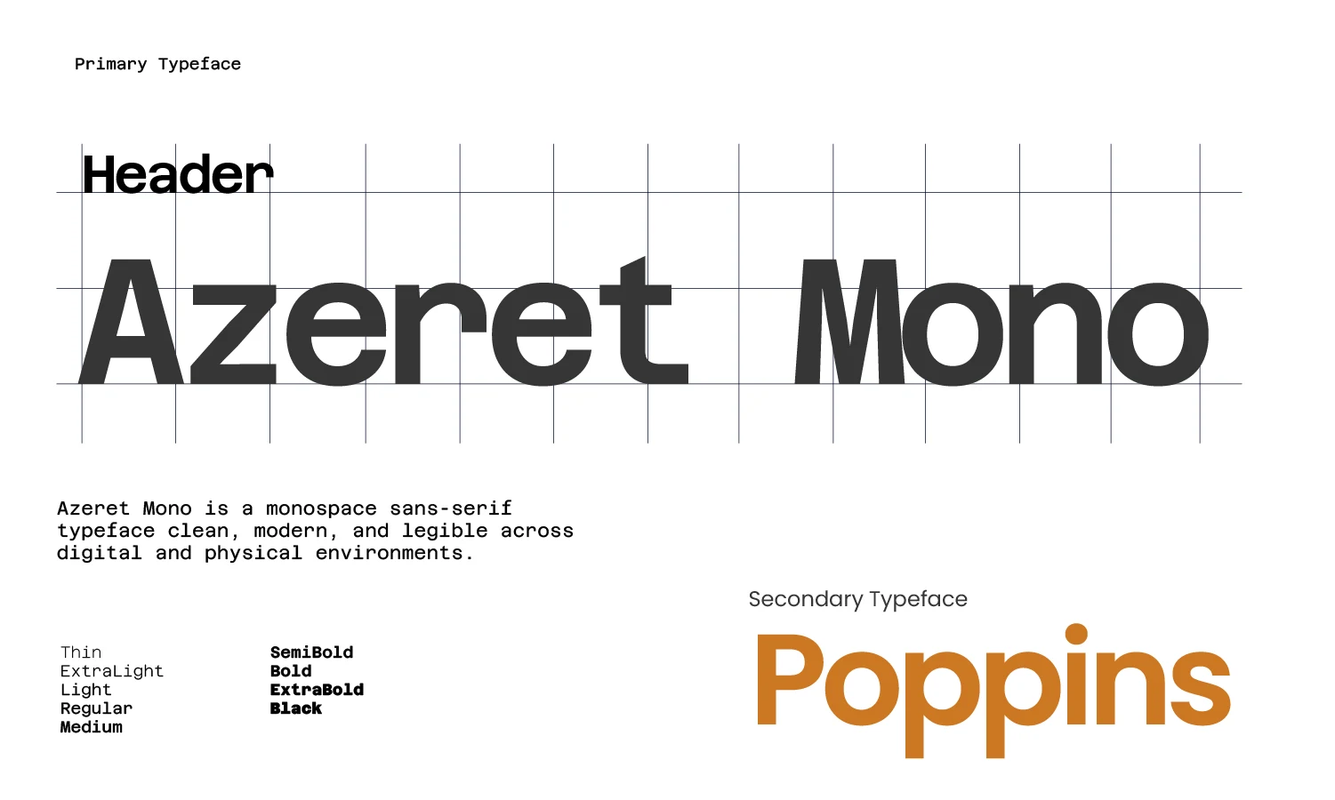
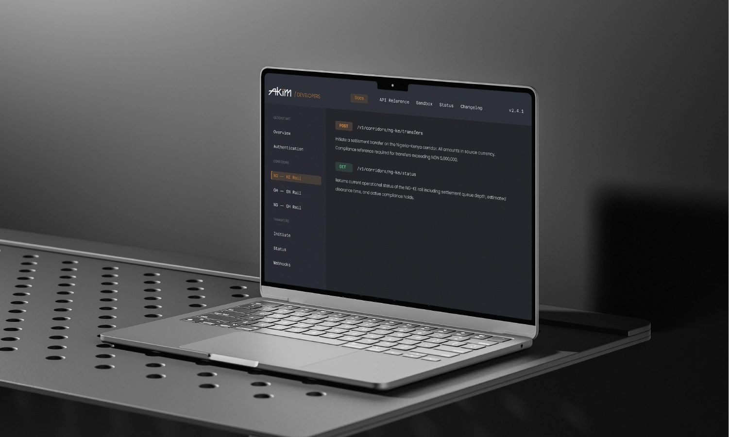
Azeret Mono as the primary typeface. The choice was functional before it was aesthetic: Akim lives in API documentation and compliance documents simultaneously. A monospace typeface bridges those two contexts developer-native by design, institutional by weight. At display scale, Azeret Mono carries the wordmark's geometric precision into headline copy. At body scale, it reads as technical authority rather than decorative choice.
Poppins as the secondary warmer, more accessible, used for supporting copy and UI contexts where the primary mono would create too much friction. The pairing holds the tension the brand needs: precise and human, technical and approachable.
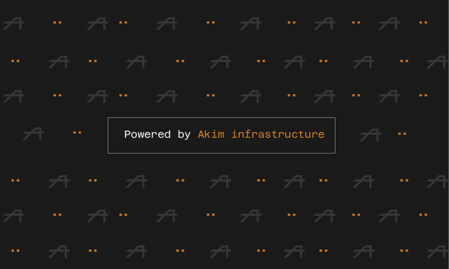
The pattern system is built from the A mark the icon form of the wordmark tiled at low opacity across dark backgrounds. The pattern reads as infrastructure at scale: repetitive, systematic, load-bearing. It appears on co-branded surfaces, conference materials, and backgrounds where the brand needs presence without competing with primary content.
05 — Brand System
The System
A logo on a white background is not a brand system. A brand system is the set of rules that governs how the identity behaves across every context it will encounter including the contexts nobody anticipates at the start of the project.
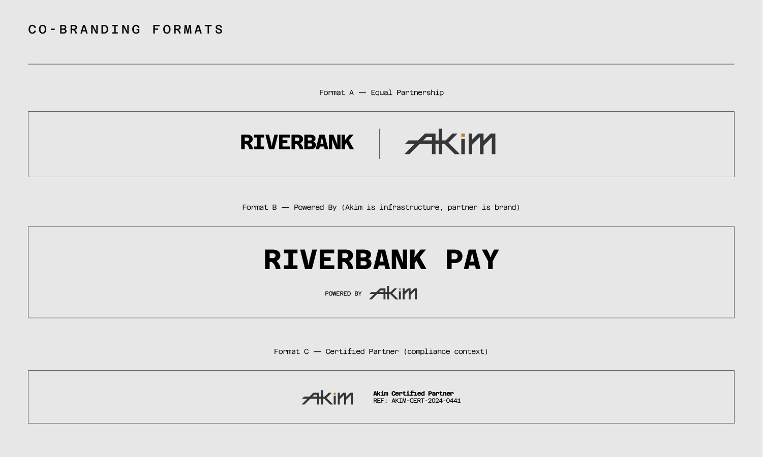
For Akim, the system rules were written before the applications were designed. The most important rules are not aesthetic. They are functional: the ochre dot appears once per lockup, in one place, in one form. The tagline deploys horizontally only. The logo never appears on busy backgrounds without a clear zone. Co-branded lockups maintain optical equivalence regardless of partner brand scale.
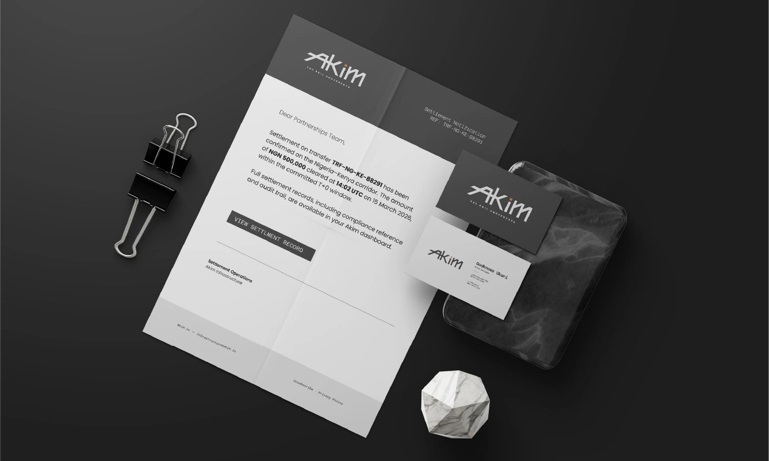
The voice system carries the same discipline. Every error state includes a reference ID, a human-readable reason, and an expected resolution time. Every piece of copy passes one test: does it tell you something specific, or does it perform credibility without delivering it?
06 — Applications
The Brand
In Production
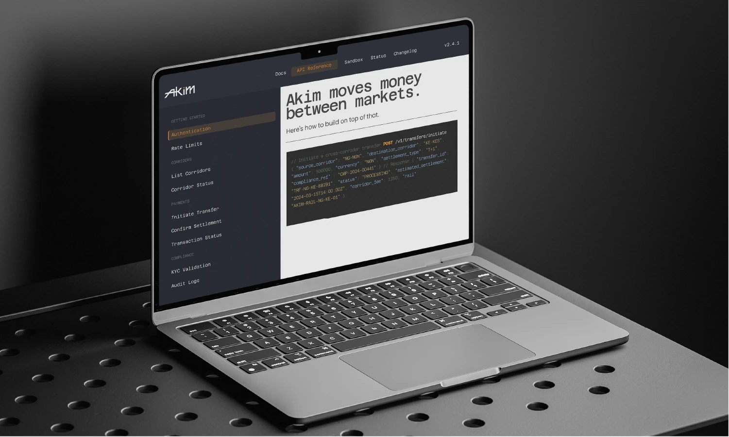
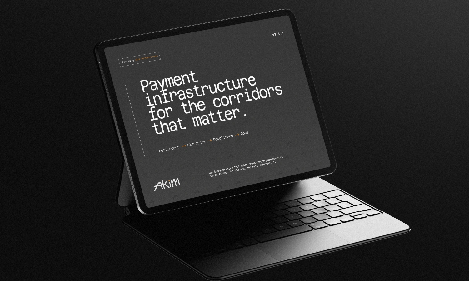
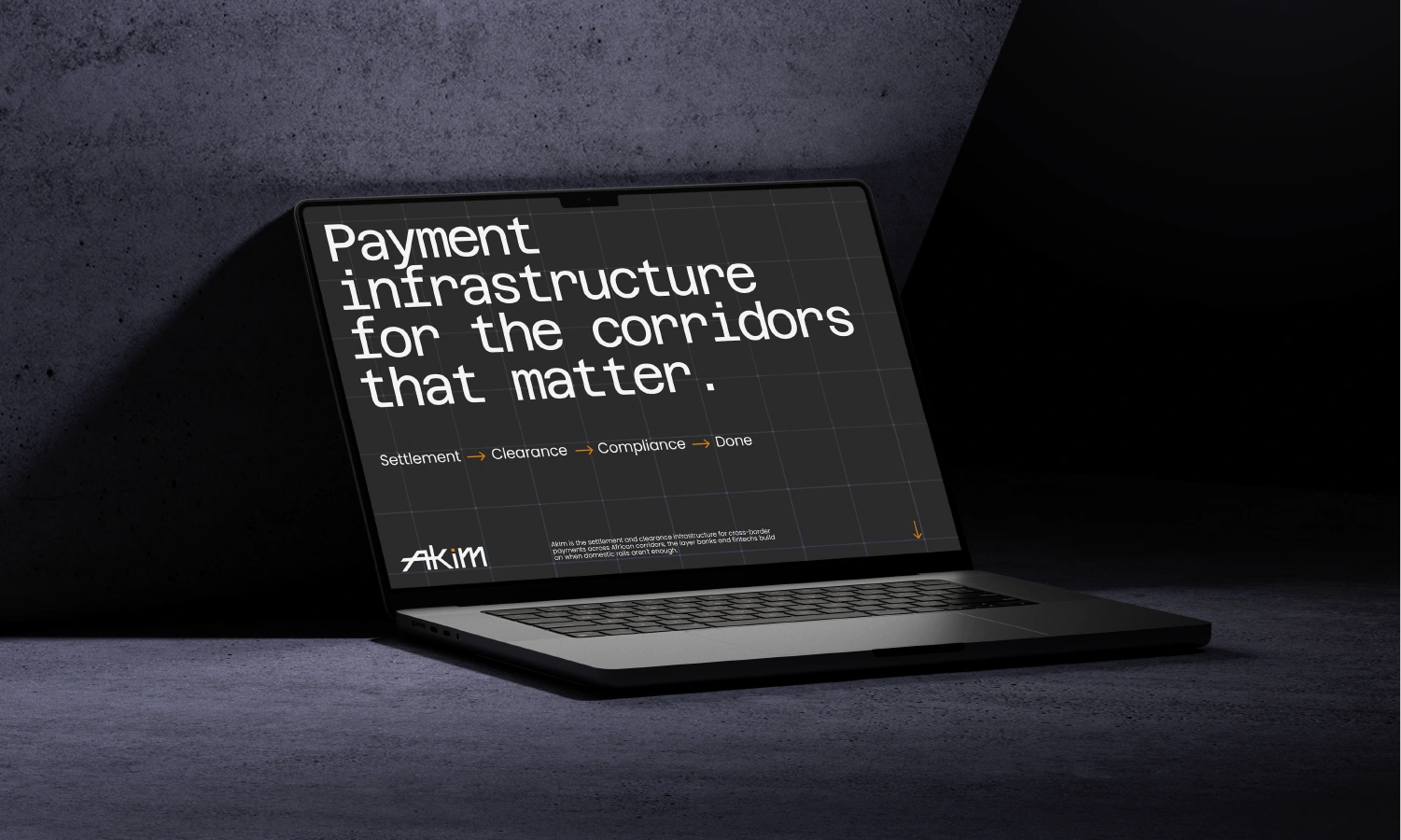
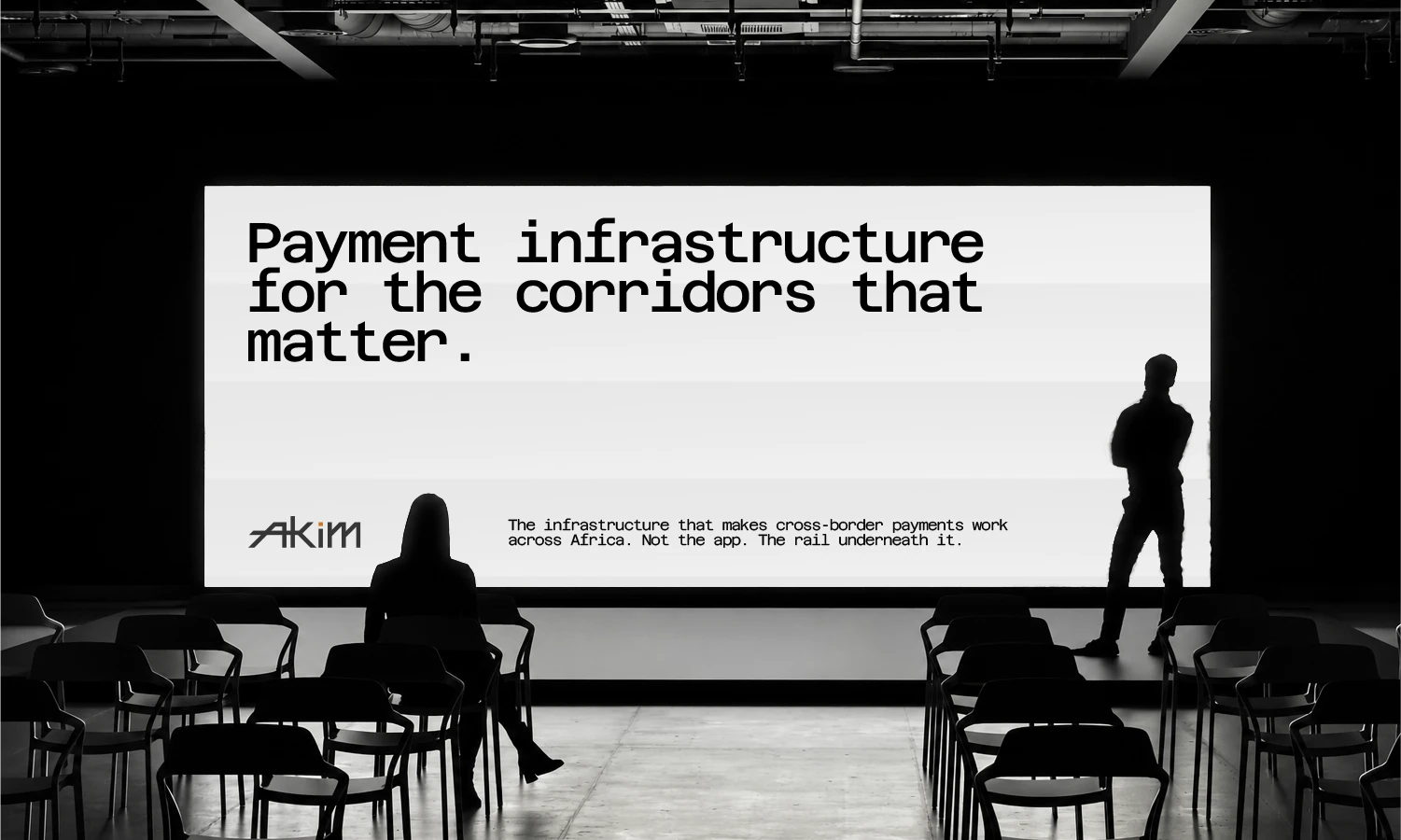
A brand identity is only as strong as the surfaces it survives. Akim was designed for the places it would actually live not the places that photograph well for a portfolio. The compliance certificate and the developer portal are more important applications than the tote bag. They were designed first and designed better.
Like this project
Posted Sep 5, 2026
Brand identity from strategy to system for fintech company operating in African and diaspora markets. If you're building payment infrastructure, a neobank, or a financial product for emerging markets and need a brand that holds up in a compliance document and a developer console, let's talk.
Likes
0
Views
2