Raices Bank - Brand Identity by Godknows UkariRaices Bank - Brand Identity by Godknows Ukari

Raices Bank - Brand Identity

Godknows Ukari

Godknows Ukari

EN
Overview
Raíces Bank is a Miami-based neobank built for Latin American immigrants people who arrived in the U.S. with ambition, resilience, and financial histories that traditional banks routinely ignore. The brand needed to speak to a community that has been underserved, not undersized. With over 2.5 million Latin American immigrants in South Florida alone, the opportunity was massive. The identity needed to match it.
ES
Descripción General
Raíces Bank es un neobank con sede en Miami creado para inmigrantes latinoamericanos personas que llegaron a los Estados Unidos con ambición, resiliencia e historiales financieros que los bancos tradicionales ignoran de manera sistemática. La marca necesitaba hablarle a una comunidad que ha sido desatendida, no subestimada. Con más de 2.5 millones de inmigrantes latinoamericanos solo en el sur de Florida, la oportunidad era enorme. La identidad tenía que estar a su altura.
The Strategy
The name "Raíces" (Spanish for "Roots") is the cornerstone of the brand's strategic messaging. It is a powerful, evocative term that immediately connects with the target audience on multiple levels:
• Cultural Heritage: It signifies a connection to one's origins, family, and cultural background, which are deeply cherished by immigrants.
• Stability and Foundation: Roots provide stability and a foundation for growth, metaphorically representing financial security and the establishment of a new life.
• Growth and Future: Just as roots enable a plant to grow, Raíces Bank aims to provide the financial foundation for its customers to grow and thrive in the United States.
Visual Identity
A Symbol of Growth and Connection The visual identity of Raíces Bank is designed to be modern, approachable, and deeply symbolic.
Logo Design
The logo features a stylized "R" that ingeniously incorporates organic, leaf-like elements. This design is not merely aesthetic; it carries significant meaning:
• The "R" for Raíces: A clear and direct representation of the bank's name.
• Leaf/Root Elements: These symbolize growth, nature, and the concept of roots. They suggest nurturing and the potential for flourishing, aligning with the immigrant's journey of building a new life.
• Fluidity and Connection: The interconnectedness of the elements within the logo conveys a sense of community, support, and the seamless integration of one's past with their future.
Color Palette
The primary color palette revolves around shades of green, complemented by accents of gold/yellow and dark blue/purple. This selection is highly intentional:
• Greens (Deep Green, Mint Green): Green is universally associated with growth, nature, prosperity, and financial stability. In many cultures, it also signifies hope and new beginnings. The varying shades add depth and modernity.
• Gold: This accent color represents optimism, warmth, and value. It can also subtly hint at prosperity and success, aspirations common among the target demographic.
• Dark Blue: These colors often convey trust, reliability, and sophistication, reinforcing the bank's credibility as a financial institution.
Typography
The typography is clean, modern, and highly legible, ensuring accessibility and a professional appearance across all platforms. It balances contemporary aesthetics with a friendly, inviting feel.
Messaging and Tone
The messaging strategy for Raíces Bank is built on empathy, understanding, and a bilingual approach that directly addresses the target audience in their preferred language.
• Bilingual Communication: The presence of both English and Spanish (e.g., "Your roots travels with you. So does your money." and "Tu raices te trajeron aqui. Nonotros te ayudamos a quedrate.") is crucial. It demonstrates respect for the cultural identity of Latin American immigrants and ensures clear communication, breaking down language barriers that often exist in financial services.
• Empathetic Slogans: Phrases like "Your roots travel with you. So does your money." and "Tu raices te trajeron aqui. Nonotros te ayudamos a quedrate." (Your roots brought you here. We help you stay/settle) are designed to resonate deeply. They acknowledge the immigrant's journey, the challenges of relocation, and offer a promise of support and stability.
• Keywords: ROOTED & RISING: These two words encapsulate the bank's promise. "ROOTED" speaks to heritage, stability, and a strong foundation, while "RISING" signifies growth, progress, and achieving aspirations in the new land.
Brand Touchpoints
The brand identity is consistently applied across various touchpoints, ensuring a cohesive and impactful experience:
• Mobile Application: The app interface is clean, intuitive, and incorporates the brand's colors and logo, providing a seamless digital banking experience.
• Banners and Marketing Materials: These effectively utilize the bilingual messaging and strong visual identity to capture attention and convey the bank's mission.
• Business Cards: Professional and consistent with the overall brand, reinforcing credibility and attention to detail.
The strategic branding of Raíces Bank is a holistic and empathetic approach to financial services for Latin American immigrants in the U.S. By deeply understanding their journey, cultural values, and aspirations, the brand has created an identity that is not only visually appealing but also profoundly meaningful and supportive. It stands as a testament to thoughtful design that goes beyond aesthetics to build genuine connection and trust.
Like this project

Posted May 9, 2026

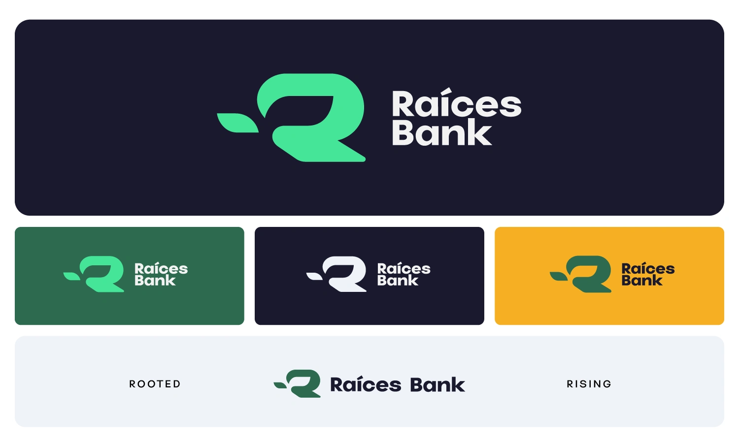
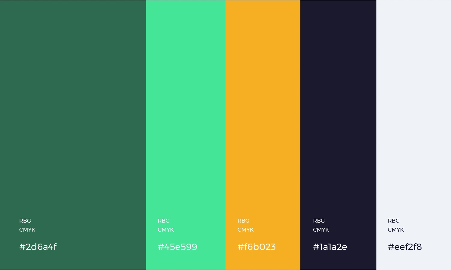
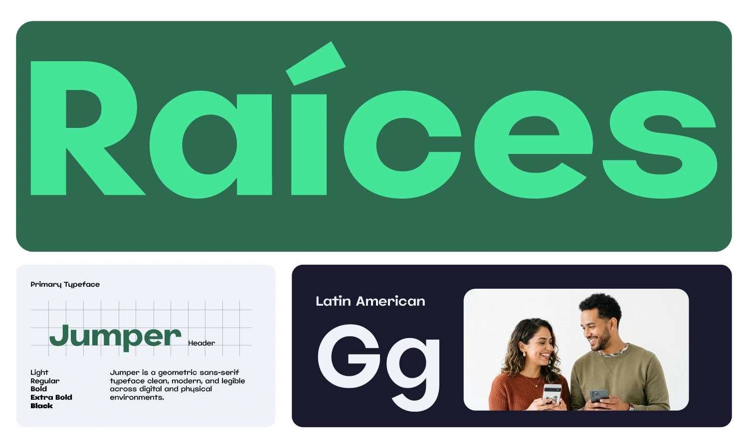
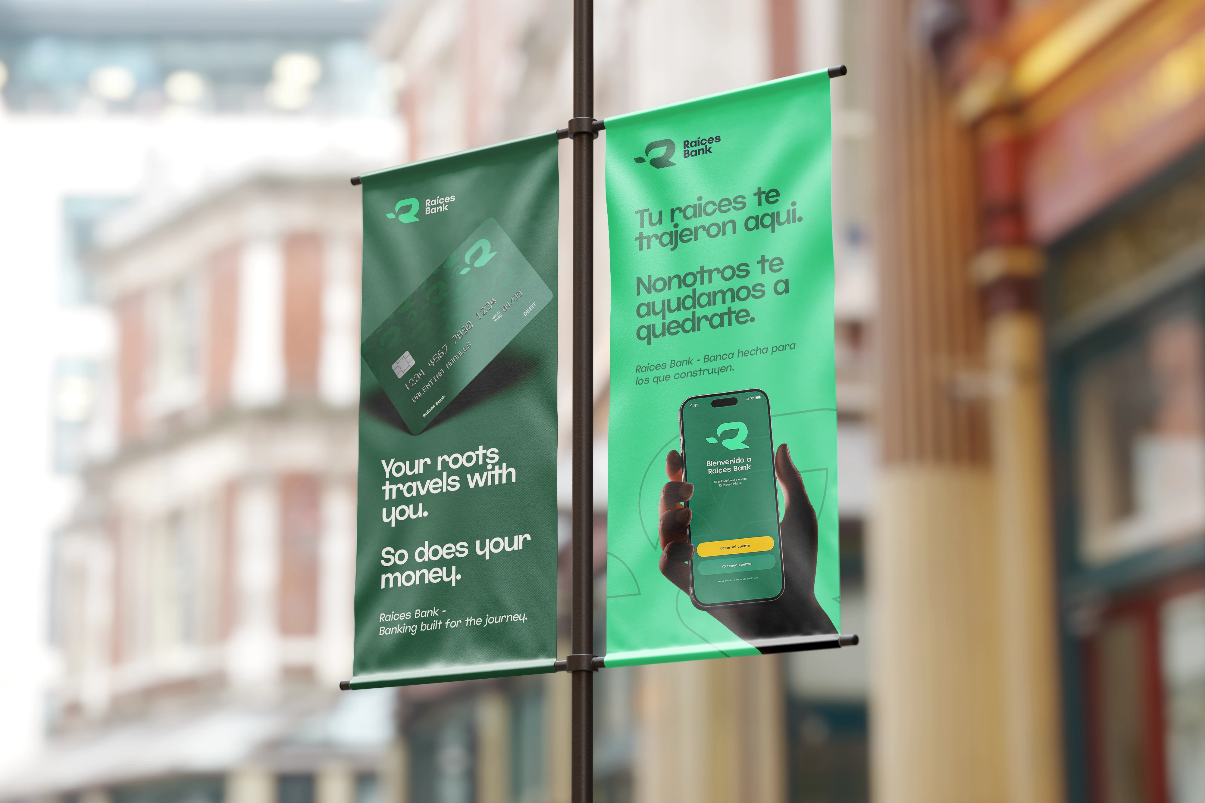
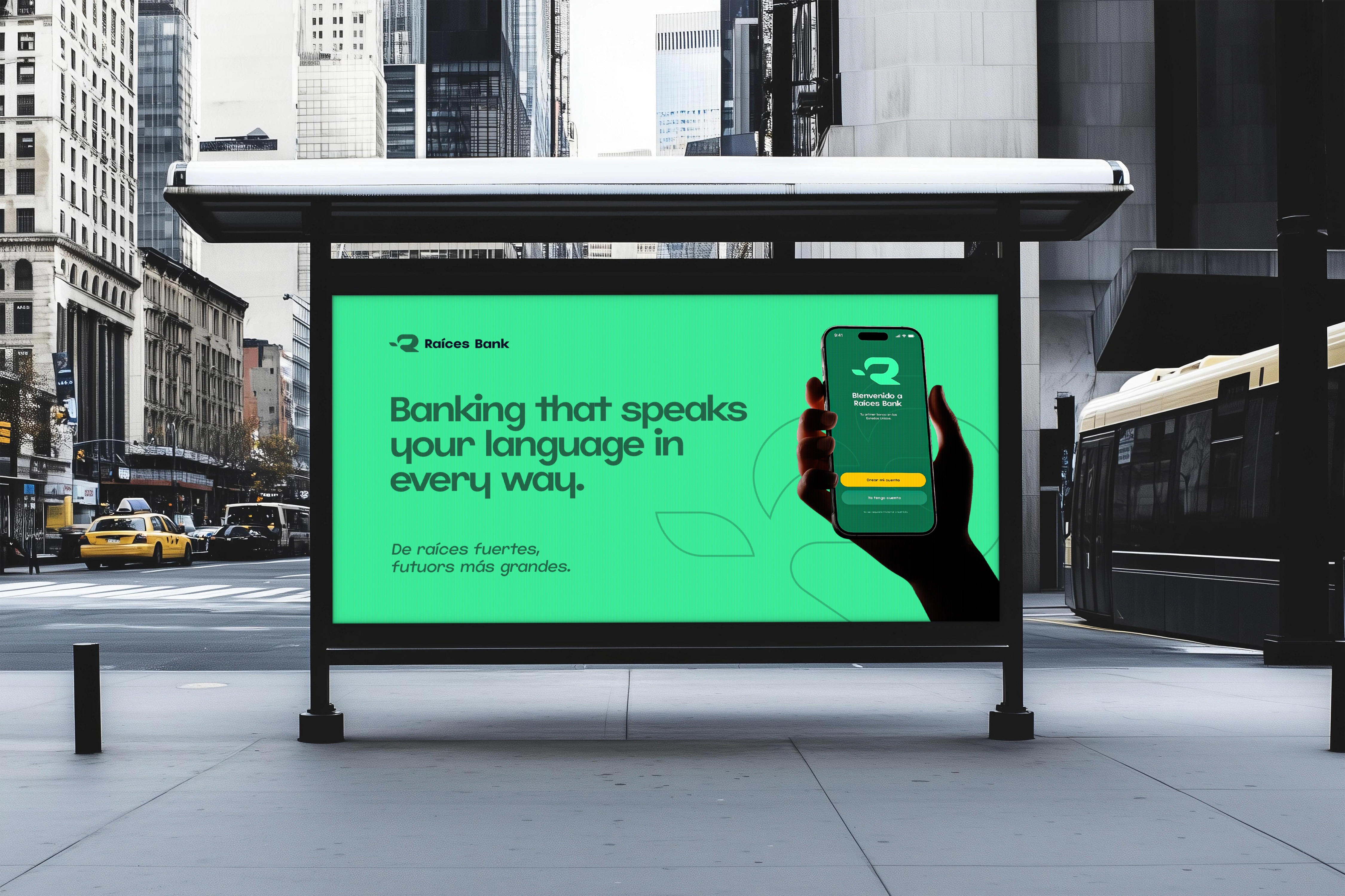
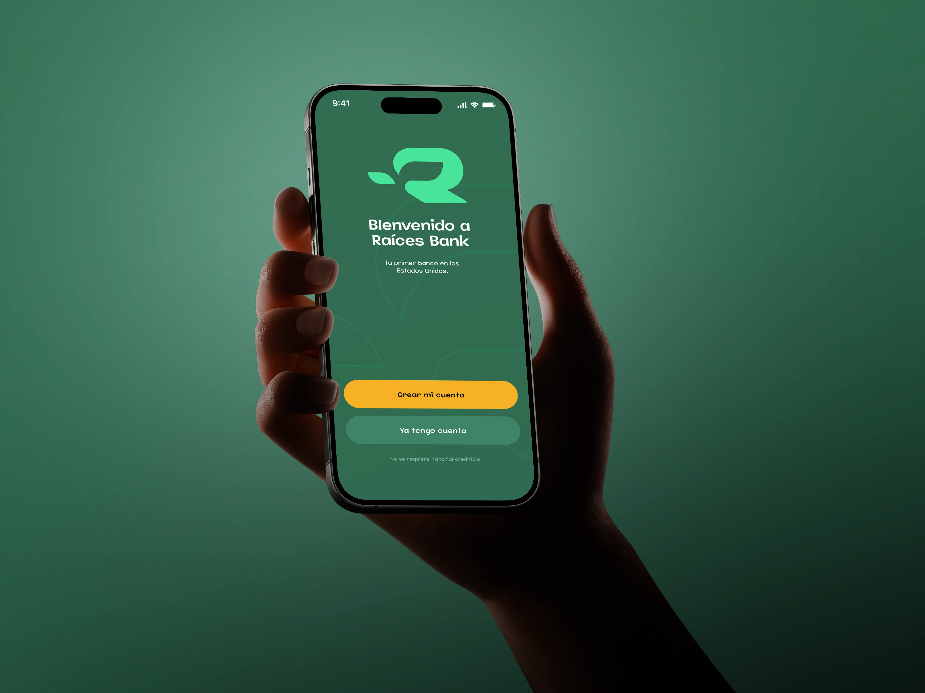
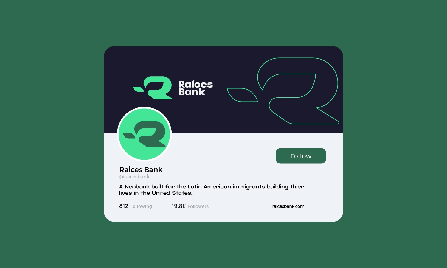
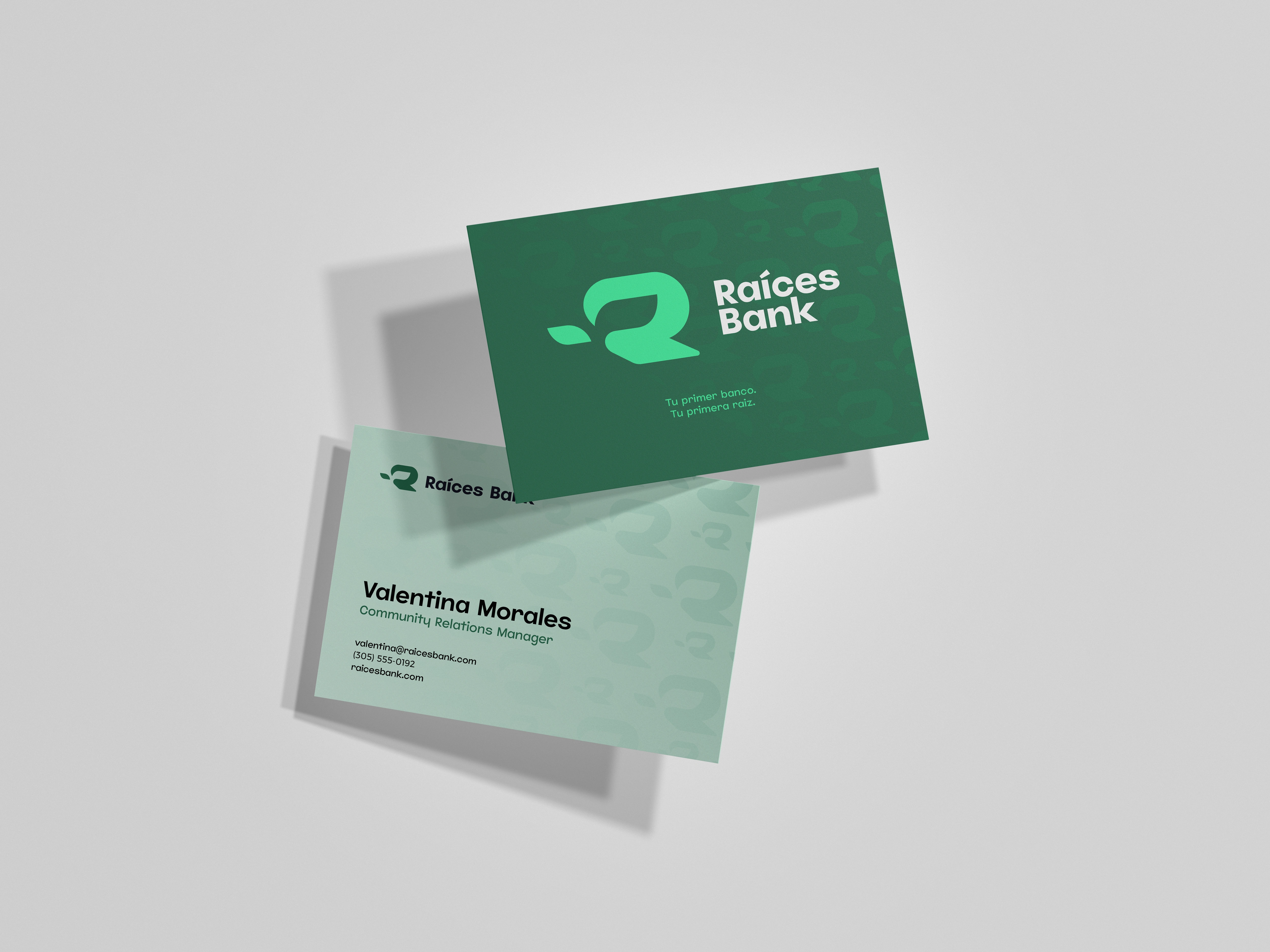
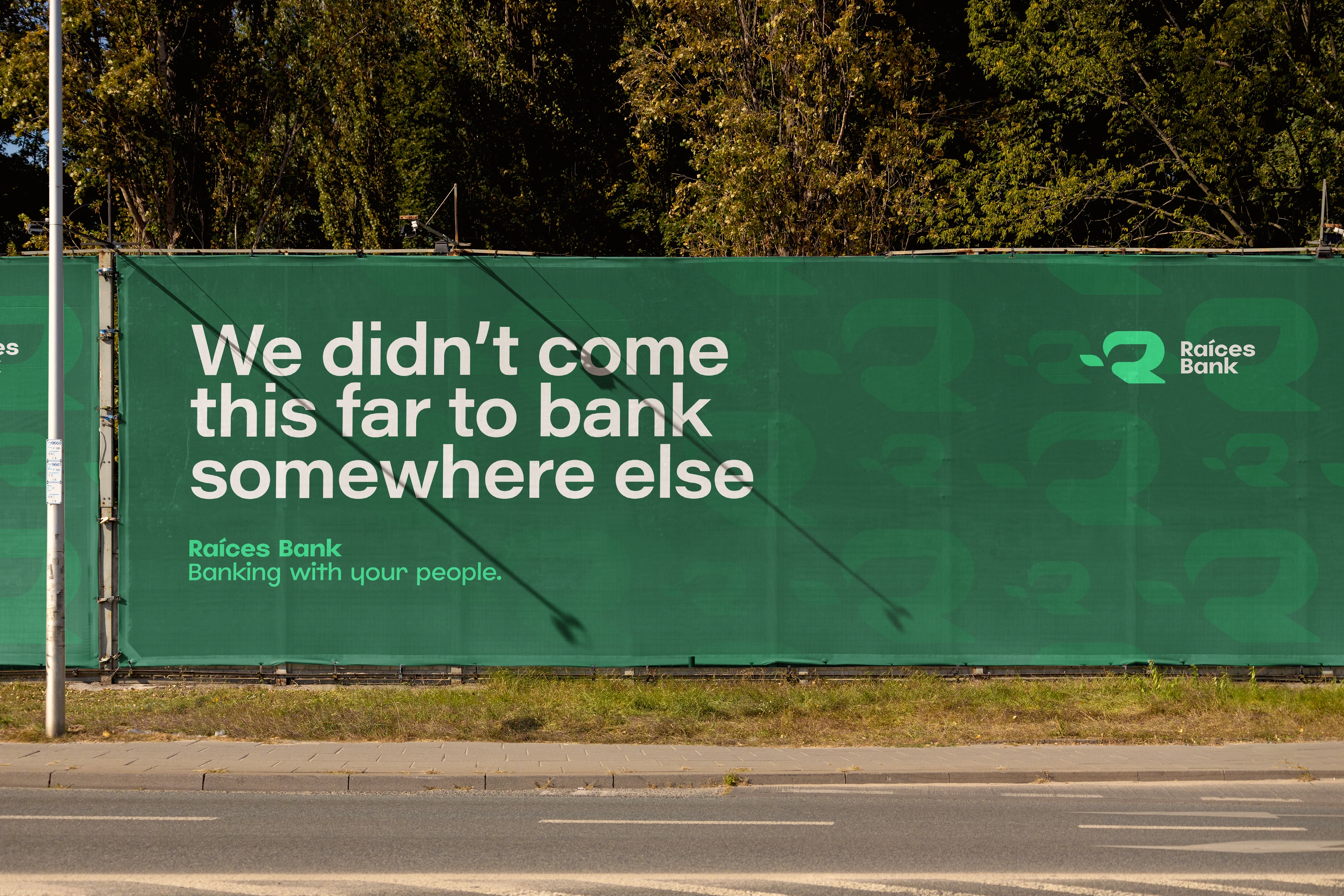
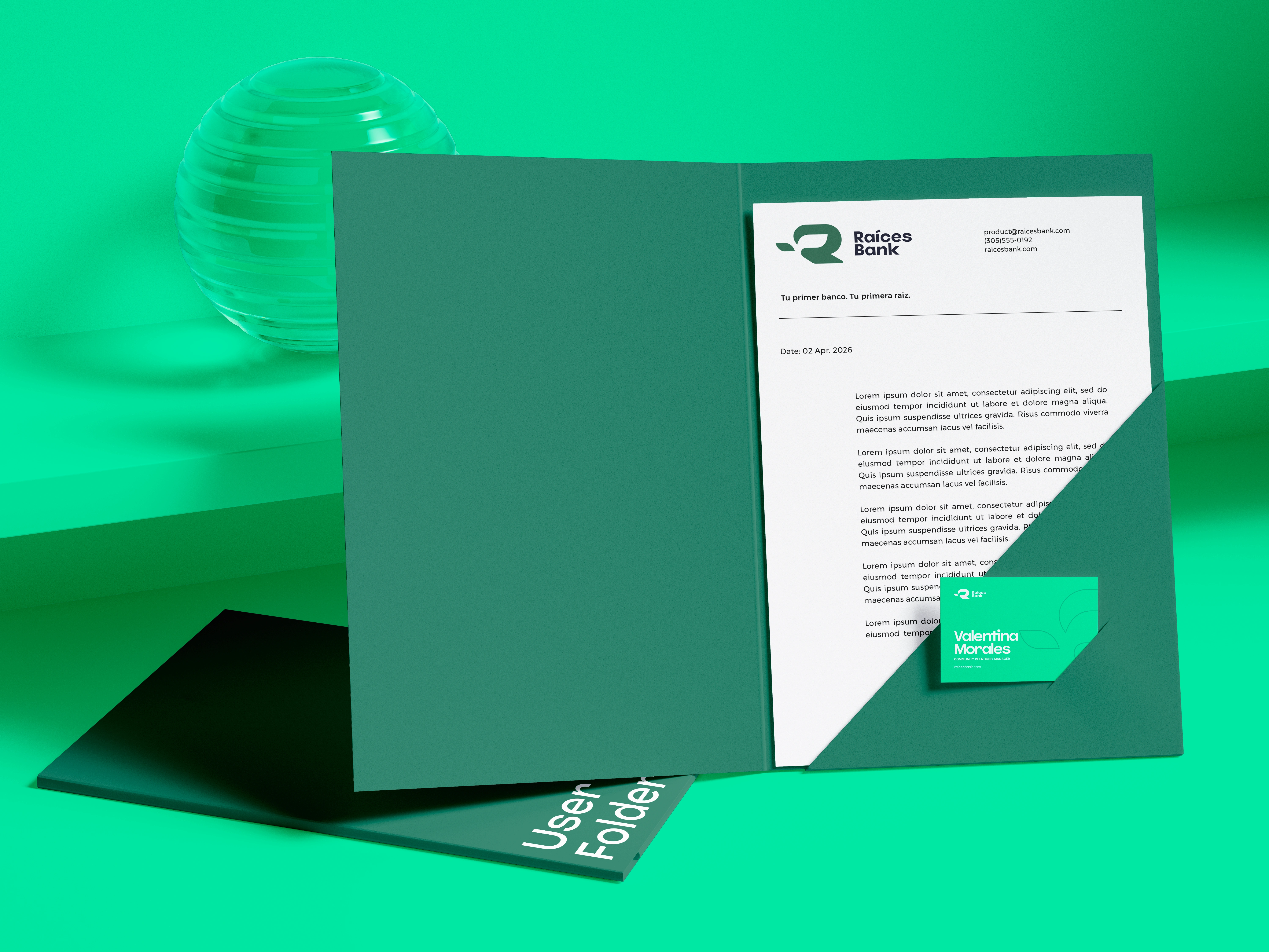
Raíces Bank is a neobank built for Latin American immigrants navigating financial life in the U.S. The brand needed to feel like a warm handshake familiar enough to earn trust, polished enough to compete with legacy institutions. The identity is anchored in the idea of rootedness with momentum. Earthy terracotta and warm neutrals evoke home and heritage, while the typography and mark carry the clean confidence of a modern financial product. Nothing about this brand shouts "immigrant bank" it simply speaks the right language, visually and culturally. The OOH campaign, Rooted. Rising., extends the identity into the streets of Miami the billboards, transit ads, and murals that meet the community where they actually live. English and Spanish coexist naturally, because that's how this audience actually thinks. This is what it looks like when brand strategy meets cultural fluency.