Personal Brand Identity design for Margot Ashford

Samuel Orheria


Overview
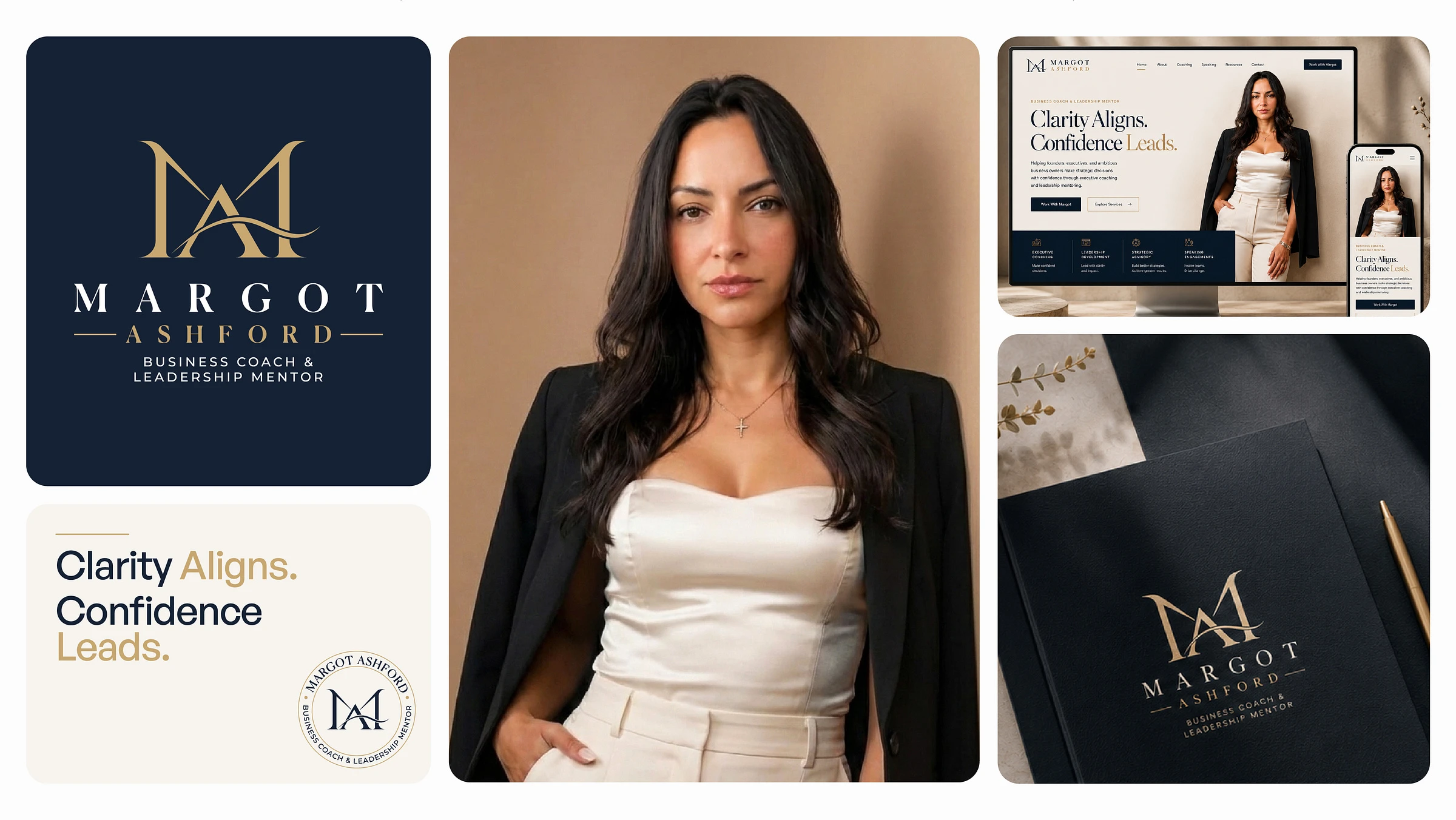
Margot Ashford is a Business Coach and Leadership Mentor dedicated to helping founders, executives, and ambitious professionals gain clarity, strengthen their leadership, and make confident decisions.
The objective was to create a premium personal brand identity that reflects trust, authority, and sophistication while maintaining a warm and approachable presence. Every element was designed to communicate confidence through simplicity, resulting in a timeless visual system that feels equally at home across digital and print experiences.
The Objective
The goal was to develop a visual identity that positions Margot Ashford as a trusted leadership expert while differentiating the brand from the common visual language found throughout the coaching industry.
Rather than relying on predictable symbols and motivational aesthetics, the identity focuses on refinement, clarity, and enduring elegance to establish immediate credibility with founders, executives, and decision-makers.
The Challenge
The coaching industry is saturated with brands that rely on generic visuals such as arrows, mountains, abstract growth icons, and corporate blue palettes. While these symbols communicate ambition, they rarely create a memorable identity.
The challenge was to build a brand that feels intelligent, premium, and authentic—one that communicates confidence before a conversation even begins.
Creative Direction
The visual language draws inspiration from modern editorial design and luxury branding, combining disciplined typography, architectural layouts, generous whitespace, and restrained colour usage.
Inspired by studios such as Pentagram, COLLINS, Porto Rocha, and Mucho, the design embraces simplicity as a strategy rather than decoration.
The result is a visual identity that feels calm, sophisticated, and built to last.
Logo Concept — Convergence
At the heart of the identity is a custom monogram built around the concept of Convergence.
The letterforms M and A merge into a single architectural symbol, representing the point where vision meets action.
Rather than functioning as a traditional monogram, the mark communicates alignment, clarity, and confident leadership through a single continuous form.
The flowing connection symbolizes meaningful transformation—bringing ideas, decisions, and purpose together into one cohesive direction.
Design Principles
Every design decision was guided by four core principles.
Clarity
Clear communication through disciplined layouts, thoughtful hierarchy, and intentional whitespace.
Confidence
Strong typography, balanced proportions, and timeless forms that inspire trust.
Elegance
Refined details that communicate sophistication without unnecessary decoration.
Consistency
A flexible visual system designed to perform seamlessly across every brand touchpoint.
Logo System
The identity includes a complete logo family designed for flexibility and consistency.
Primary Logo
Horizontal Wordmark
Brand Mark
Icon
Circular Seal
Each variation maintains visual harmony while adapting to different applications across digital, print, and social platforms.
Colour Palette
A restrained three-colour palette reinforces the brand's premium positioning.
Midnight Navy (#152235)
A colour associated with confidence, intelligence, professionalism, and trust.
Champagne Gold (#C8A770)
Introduces warmth, refinement, and understated luxury without overpowering the identity.
Warm Ivory (#F7F4EF)
Provides an elegant neutral foundation that allows typography and photography to become the primary focus.
Together, these colours create a timeless visual language suitable for both digital and printed experiences.
Typography
Typography plays a central role in defining the brand's personality.
Noe Display
Used for headlines and hero messaging.
Its editorial character introduces elegance, confidence, and visual distinction.
General Sans
Chosen for body copy and interface design.
Its clean, contemporary appearance ensures exceptional readability while complementing the expressive nature of Noe Display.
Together, the pairing balances luxury with functionality.
Visual Identity
The identity extends beyond the logo to create a cohesive visual language.
Large editorial typography, structured grid systems, balanced compositions, and generous whitespace work together to create an experience that feels calm, premium, and intentionally crafted.
Every visual decision reinforces the brand's commitment to clarity and confident leadership.
Brand Applications
The visual identity was designed to scale consistently across multiple touchpoints, including:
Responsive Website
Personal Brand Website
Business Stationery
Presentation Templates
Social Media Assets
Brand Collateral
Digital Marketing Materials
The system remains flexible while preserving a consistent visual experience across every interaction.
The Outcome
The final identity positions Margot Ashford as a premium leadership brand built on trust, clarity, and thoughtful design.
By combining a distinctive monogram, a restrained colour palette, elegant typography, and an editorial design system, the brand establishes a strong visual presence that feels both approachable and authoritative.
The result is a timeless identity that supports meaningful connections, strengthens credibility, and creates a memorable first impression.
Services
Brand Identity Design
Logo Design
Visual Identity System
Art Direction
Website UI Concept
Brand Applications
Deliverables
Primary Logo
Logo Variations
Brand Mark
Colour Palette
Typography System
Visual Identity
Website Concept
Brand Stationery
Social Media Assets
Brand Guidelines
Tools
Adobe Illustrator
Adobe Photoshop
Figma
Final Reflection
Great branding is more than creating a beautiful logo—it's about designing a visual system that communicates trust, creates recognition, and supports every interaction a brand has with its audience. For Margot Ashford, the focus was to craft an identity that feels timeless, confident, and unmistakably premium.
Like this project
Posted Jul 15, 2026
Developed a premium, timeless brand identity for Margot Ashford, a leadership coach.