Elias Ashcombe Brand Identity Design and website design

Samuel Orheria


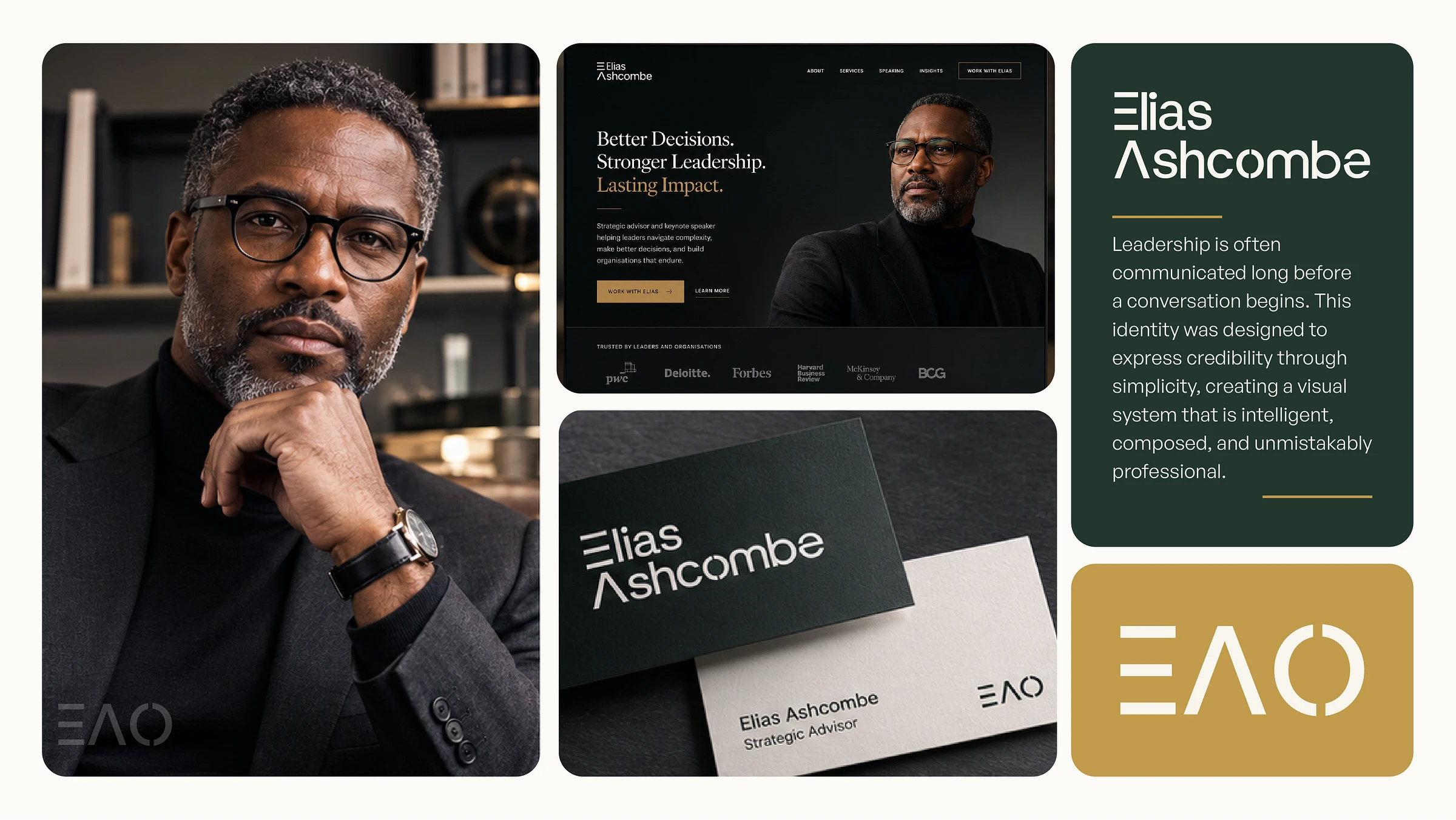
Leadership is often communicated long before a conversation begins. The way a brand looks, feels, and presents itself shapes perception before a single word is spoken.
Elias Ashcombe is a leadership strategist and executive advisor whose identity was designed to reflect clarity, credibility, and quiet confidence. Rather than relying on visual trends, the brand embraces restraint—using typography, composition, and thoughtful detail to communicate authority with lasting impact.
The result is a timeless visual identity built for modern leadership.
The Challenge
Many leadership brands lean heavily on generic corporate aesthetics or overly personal imagery, making it difficult to establish a distinctive presence. The challenge was to create an identity that felt intelligent, refined, and approachable while maintaining the confidence expected from an executive advisor.
The system needed to perform consistently across digital platforms, printed materials, presentations, and speaking engagements without losing its character.
Brand Strategy
The identity is built around three guiding principles.
Clarity Every element is intentional, reducing visual noise to allow the message to lead.
Confidence The design communicates authority through proportion, typography, and composition rather than decoration.
Timelessness The system avoids short-lived trends in favor of enduring design principles that remain relevant over time.
These principles informed every decision throughout the identity.
Logo Design
At the heart of the identity is a bespoke wordmark derived from General Sans and refined through optical adjustments.
Rather than creating unnecessary complexity, the logo introduces subtle customizations that give the identity a distinctive voice while preserving excellent readability. The custom E, open A, and split O establish recognizable details that become stronger with repeated exposure.
A compact symbol created from the custom letterforms extends the identity across smaller touchpoints while maintaining consistency with the primary wordmark.
Typography
Typography plays a central role in expressing the brand's personality.
Tiempos Headline brings warmth, authority, and editorial sophistication to headlines, while General Sans provides clarity and balance throughout supporting content. Together, they create a hierarchy that feels both intelligent and contemporary.
The relationship between serif and sans-serif introduces rhythm without overwhelming the identity.
Visual Language
The visual system embraces generous spacing, restrained color, and clean composition.
Rather than competing for attention, every component works together to create a sense of confidence and calm. Photography focuses on authenticity and executive presence, while subtle graphic details reinforce the precision of the overall system.
The identity is designed to feel equally at home in boardrooms, keynote stages, publications, and digital experiences.
Digital Experience
The responsive website extends the identity into an intuitive digital experience designed for clarity and ease of use.
Large editorial typography, balanced layouts, purposeful whitespace, and accessible navigation create an interface that feels premium without becoming distracting. Every interaction is guided by simplicity, allowing visitors to focus on the content rather than the interface itself.
The responsive system ensures a consistent experience across desktop and mobile devices.
Brand Applications
The identity system has been designed to scale seamlessly across a wide range of applications, including:
Responsive Website
Business Cards
Personal Stationery
Presentation Templates
Social Media Assets
Brand Icon System
Editorial Publications
Book Covers
Signage
Premium Print Collateral
Each application reinforces the same visual language while adapting naturally to its context.
Design Principles
The identity is intentionally understated.
Rather than relying on decorative effects, it builds recognition through consistency, proportion, typography, and craftsmanship. Every element serves a purpose, creating a brand that feels established, trustworthy, and enduring.
The result is a visual system that communicates professionalism without sacrificing personality.
Outcome
Elias Ashcombe demonstrates how thoughtful restraint can become a defining strength in personal branding.
Through bespoke typography, editorial composition, and a disciplined visual language, the identity expresses strategic leadership with confidence and clarity. It is a brand designed not simply to attract attention, but to earn trust over time.
Services
Brand Strategy Direction
Personal Brand Identity
Logo Design
Bespoke Wordmark Design
Visual Identity System
Typography System
Color Direction
Brand Applications
UI/UX Design
Responsive Website Design
Art Direction
Creative Direction
Tools
Adobe Illustrator
Adobe Photoshop
Figma
Like this project
Posted Jul 19, 2026
Developed a timeless brand identity for leadership strategist Elias Ashcombe.