
Sofiullahi Bolakale
Brand Identity & Logo Designer | Social Media post Design
New to Contra
Sofiullahi is ready for their next project!


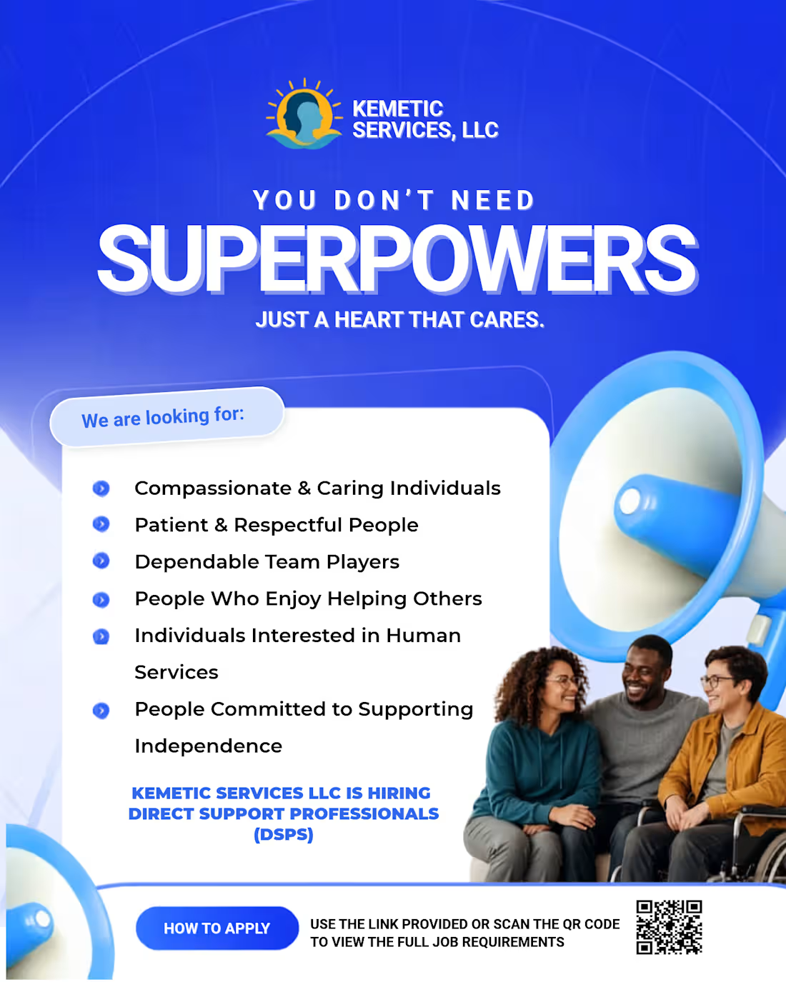
Everyone scrolls past hiring flyers.
But this one made people stop.
When KEMETIC SERVICES, LLC came to me, they didn't just want a flyer that says, "we're hiring." They wanted one that makes people FEEL why this job matters.
So I didn't design a job ad. I designed a human moment.
MAKE SOMEONE FEEL SEEN.
Three words. But for a Direct Support Professional, that's the whole job. It's patience when no one else has it. It's making everyday moments meaningful.
I built this around that feeling bold emotional typography, trust-building blue, urgent orange for action, and real people, real connection.
Because cheap flyers attract people looking for a paycheck.
Powerful flyers attract people looking for a purpose.
And that's why this campaign doesn't just get likes. It gets applications.
Want your design to do the same?
DM me "FEEL SEEN" and I'll build your next hiring magnet.
1
2
189
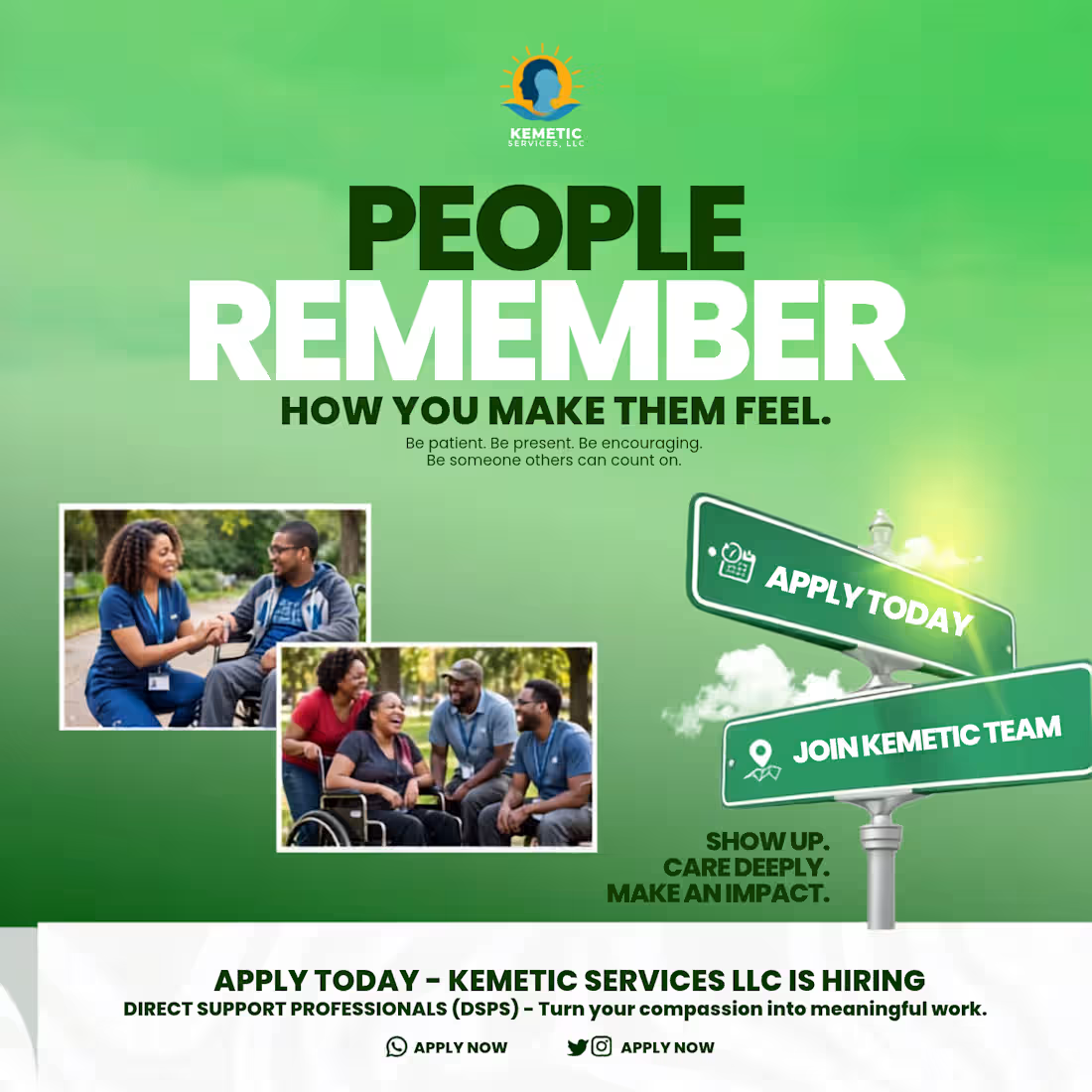
People may forget what you said, but they never forget how you made them feel.
For this KEMETIC SERVICES LLC recruitment design, I didn't want to design just another hiring flyer. I wanted to design a feeling.
The headline PEOPLE REMEMBER HOW YOU MAKE THEM FEEL is the whole story of what a Direct Support Professional does. It is not just a job, it is patience, presence, encouragement. It is being someone others can count on.
I used a calm green gradient to communicate trust and care, paired with real moments of connection the hand-holding, the laughter in the park. Those photos are not stock, they are emotion. On the right, the road sign pointing to APPLY TODAY and JOIN KEMETIC TEAM turns the career decision into a journey. And the closing words SHOW UP. CARE DEEPLY. MAKE AN IMPACT. seals the purpose.
This is the kind of recruitment design that attracts people with heart, not just people looking for a paycheck.
If you need hiring visuals, healthcare recruitment, or human-centered social media designs that connect emotionally and convert, I can create that for your brand.
DM me "FEEL" to get your own emotional converting recruitment design.
2
140
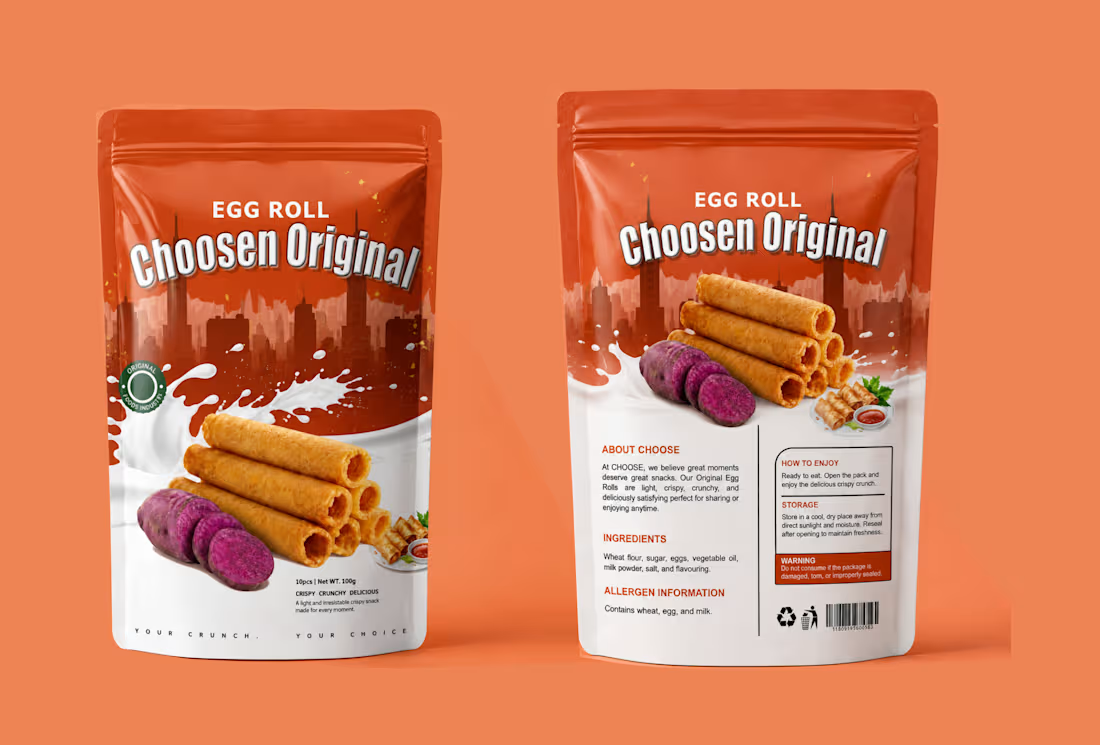
I turned a simple snack into a craving. Choosen Original Egg Roll.
People don't buy snacks with their eyes closed. They buy with craving.
For Choosen Original Egg Roll, the brief was clear — make it look crispy, crunchy, delicious and unforgettable on the shelf. So I built a story around the crunch itself.
The top half is bold city energy with deep orange that pops on any supermarket shelf. The bottom half is pure indulgence, a splash of milk for creaminess and freshness, stacked golden egg rolls that look so crispy you can almost hear them, and the sliced purple yam that tells you instantly this is not your regular flavor, this is original.
I added small details that sell, the Original Foods Industry seal for trust, the small serving shot with dip for appetite, and the tagline at the bottom, YOUR CRUNCH. YOUR CHOICE. It is personal. It makes the buyer feel like this snack was made for their moment.
This is packaging design that does not just sit, it sells.
If you have a food product, snack, or consumer brand that needs to stand out and get picked up, let's create your bestseller packaging.
DM me "CRUNCH" to get your own product packaging that converts.
#PackagingDesign #FoodPackaging #SnackPackaging #EggRollDesign #ProductPackaging #PouchDesign #ChoosenOriginal #FoodBranding #PackagingDesigner #GraphicDesigner #BrandDesigner #DesignThatSells
1
113
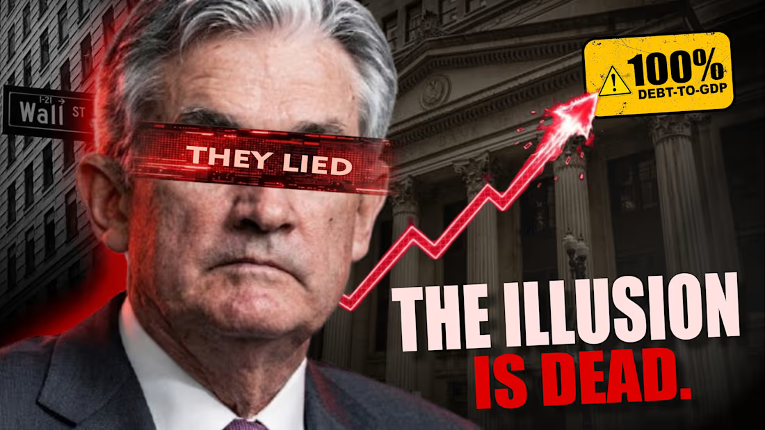
I don't design thumbnails. I design scroll-stoppers.
This thumbnail was built to do one thing make someone stop and click.
The topic is heavy, debt, economy, Wall Street, so the visual had to hit instantly. I used the red "THEY LIE" blindfold to create controversy and emotion. The blood-red rising arrow shattering the chart creates urgency. The bold text "THE ILLUSION IS DEAD." is the payoff. And the yellow "100% DEBT-TO-GDP" warning sticker is the hook that makes it feel like breaking news.
Every element is intentional. The red glow behind the subject for tension. The Wall Street sign and bank building for context. High contrast, big typography, and a story that is told in 1 second.
This is YouTube thumbnail psychology. Emotion plus proof plus curiosity equals clicks.
If you need YouTube thumbnails, podcast covers, or finance commentary graphics that actually get clicks and not just look good, let's work. I design for retention.
DM me "THUMBNAIL" to get high CTR thumbnails for your channel.
#ThumbnailDesign #YouTubeThumbnail #HighCTR #FinanceThumbnail #ClickbaitDesign #YouTubeDesigner #ThumbnailDesigner #PoliticalThumbnail #PodcastCover #SocialMediaDesign #GraphicDesigner #DesignThatConverts
1
171