


Remedy: Care & Cure 💊
A brand is never just a logo. It’s a promise.
In healthcare, the most important thing is trust.
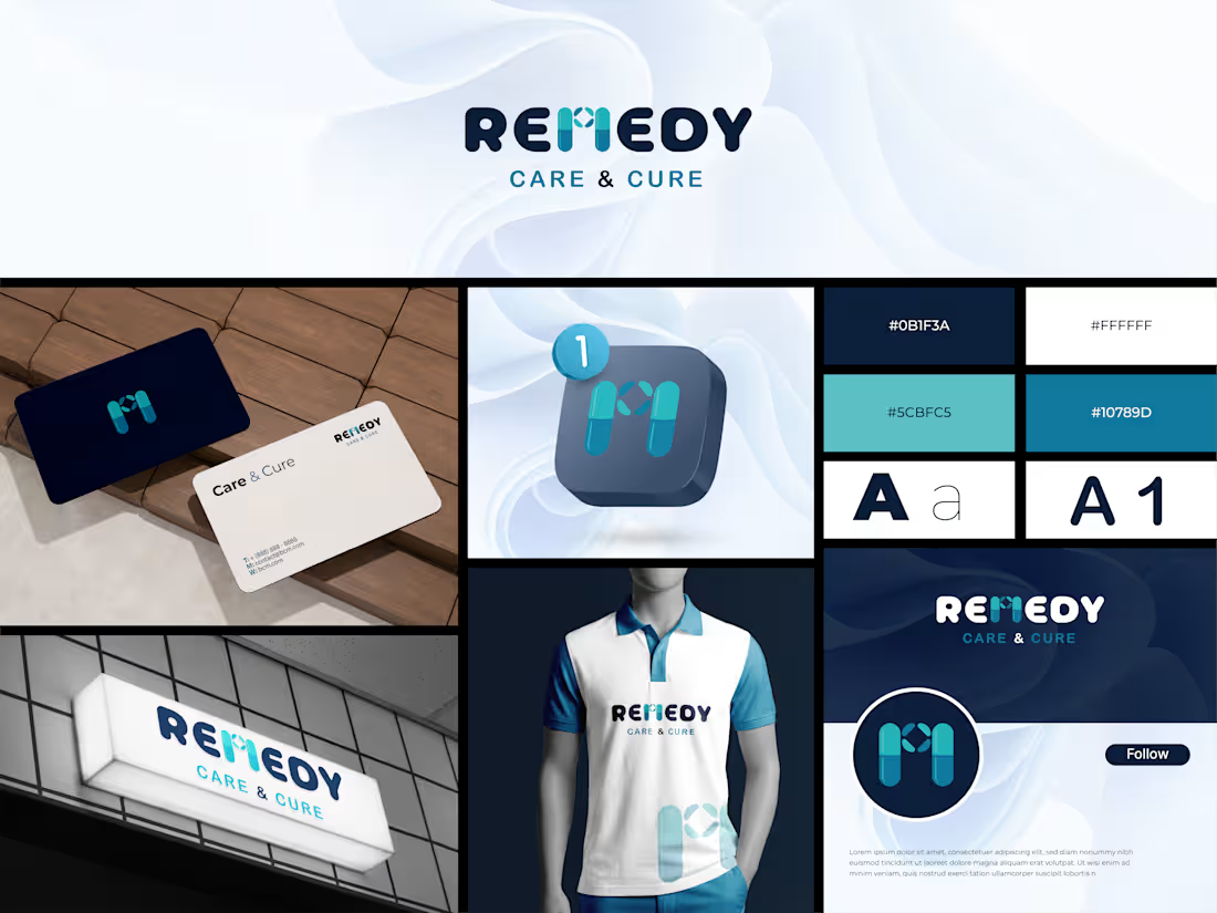
So for Remedy, I built the letter “M” from two capsules, with a small cross at the center.
Two capsules = Care and Cure.
The cross in the middle = a symbol of healing.
Navy blue brings trust.
Teal and aqua bring freshness and hope.
Soft, rounded shapes bring a friendly feel.
From business cards to signage, from app icon to uniform, every touchpoint says the same thing:
“I’m here to keep you healthy.”
❓ Quick Q&A
Q1: What concept is used in the logo?
A: The letter “M” is formed from two capsules, with a healthcare cross at the center. It reflects a pharmacy identity while staying a memorable monogram.
Q2: Why this color palette?
A: Deep navy (
#0B1F3A) conveys professionalism and trust. Teal (
#5CBFC5) and blue (
#10789D) bring a calm, fresh, healing feel. A perfect fit for a healthcare brand.
Q3: Where can this logo be used?
A: Pharmacies, clinics, health apps, medical stores, and wellness brands. The icon stays clear even at small sizes, like app icons and social profile pictures.
📩 Need a unique logo for your brand?
Send me a message, let’s bring your idea to life!
👉 Best Design: www.fiverr.com/sellers/rifatislam149/edit
(http://www.fiverr.com/sellers/rifatislam149/edit)👉 Portfolio: https://dribbble.com/artoryxrifat
#LogoDesign #BrandIdentity #HealthcareBranding #PharmacyLogo #LogoDesigner #BrandDesigner #VisualIdentity #MedicalLogo #BrandingDesign #Behance
1
5
Have you ever felt like traditional banking simply can’t keep up with your fast-moving digital lifestyle?
We’ve all experienced it, navigating complicated banking apps, outdated interfaces, and disconnected financial systems that make managing money more difficult than it should be.
But what if your financial platform could move as fast as your ambitions?
Introducing KORVA — a next-generation FinTech experience designed to redefine the way people interact with money.
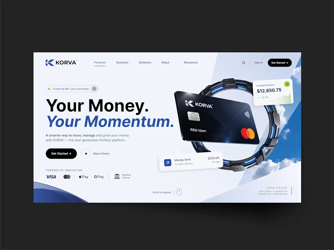
Clean, minimalist editorial aesthetics for a seamless user experience.
Real-time financial insights with intuitive balance tracking.
Seamless multi-device connectivity for effortless access.
Advanced security combined with a sophisticated luxury visual identity.
Why should managing your finances feel complicated when technology can make it effortless?
Every detail of KORVA has been thoughtfully designed, from its deep navy palette and refined typography to its futuristic interface and carefully structured financial dashboard.
The goal is simple: combine innovation, simplicity, and elegance to create a digital banking experience that feels as powerful as it looks.
The future of finance isn't just about moving money. It's about moving forward.
What do you think about this direction for the future of digital banking?
Share your thoughts in the comments below! 👇💼✨
1
34
FOOLAVO TAVERN — Where Flavor Meets Connection 🌿🍅
What truly turns a simple meal into an unforgettable memory? 🤔
Is it just the taste on the plate?
Or is it the laughter shared around the table? 🍷
At Foolavo Tavern, it’s always both.
The Story Behind the Design 📖
Every iconic brand starts with a vision.
A vision to bring people together.
When designing the identity for Foolavo Tavern, the goal was clear:
Blend the warmth of tradition with the energy of a modern gathering space.
We wanted to capture two core human desires:
Flavor — Rich, crafted, and memorable.
Gathering — Warm, welcoming, and alive.
Visual Identity & Elements 🎨
1. The Monogram (F + T) 📐
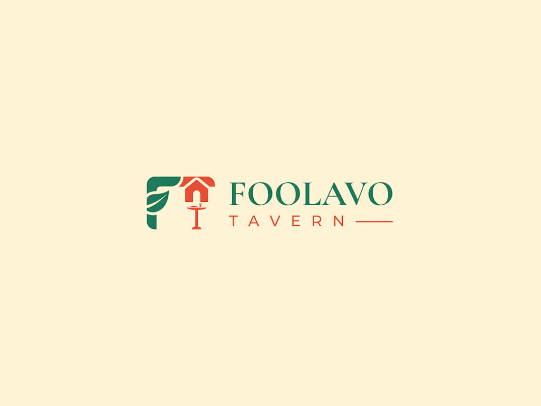
Integrated custom letterforms combining 'F' and 'T'.
Clean, geometric lines for instant recognition.
Seamlessly blending modern tavern vibes with classic heritage.
2. Color Palette & Emotion 🌿🍅
Fresh Green (#247A5A): Represents fresh ingredients, life, and organic harmony.
Tomato Red (#E94F37): Triggers appetite, energy, passion, and warmth.
3. Typography Pairing ✍️
Cormorant Garamond: Classic, refined serif bringing editorial elegance.
Montserrat: Clean, functional sans-serif for optimal modern legibility.
Design Concept Breakdown 💡
Letter F + Letter T + Leaf & Gathering Symbol = FOOLAVO TAVERN 🌿✨
How does this warm & earthy color combination make you feel? 🤔
Does it give you that cozy, weekend-gathering mood? 💭
Drop your thoughts in the comments below! 👇
Brand Identity Design by: MD Rifat Islam
Logo & Brand Design Specialist
📩 Available for new design projects & inquiries:
Email: rifat.kca2022@gmail.com
(mailto:rifat.kca2022@gmail.com)WhatsApp: +880 1857-134885
👉 Best Design: https://lnkd.in/g89uE9FM
(https://lnkd.in/g89uE9FM)👉 Portfolio: https://lnkd.in/gvscVsX6
(https://lnkd.in/gvscVsX6)#BrandIdentity (https://www.linkedin.com/search/results/all/?keywords=%23brandidentity&origin=HASH_TAG_FROM_FEED) #LogoDesign (https://www.linkedin.com/search/results/all/?keywords=%23logodesign&origin=HASH_TAG_FROM_FEED) #VisualIdentity (https://www.linkedin.com/search/results/all/?keywords=%23visualidentity&origin=HASH_TAG_FROM_FEED) #Branding (https://www.linkedin.com/search/results/all/?keywords=%23branding&origin=HASH_TAG_FROM_FEED) #FoolavoTavern (https://www.linkedin.com/search/results/all/?keywords=%23foolavotavern&origin=HASH_TAG_FROM_FEED) #GraphicDesign (https://www.linkedin.com/search/results/all/?keywords=%23graphicdesign&origin=HASH_TAG_FROM_FEED) #BrandDesigner (https://www.linkedin.com/search/results/all/?keywords=%23branddesigner&origin=HASH_TAG_FROM_FEED) #Typography (https://www.linkedin.com/search/results/all/?keywords=%23typography&origin=HASH_TAG_FROM_FEED) #LogoInspiration (https://www.linkedin.com/search/results/all/?keywords=%23logoinspiration&origin=HASH_TAG_FROM_FEED) #Behance (https://www.linkedin.com/search/results/all/?keywords=%23behance&origin=HASH_TAG_FROM_FEED) #Dribbble (https://www.linkedin.com/search/results/all/?keywords=%23dribbble&origin=HASH_TAG_FROM_FEED) #IdentityDesign (https://www.linkedin.com/search/results/all/?keywords=%23identitydesign&origin=HASH_TAG_FROM_FEED)
1
21
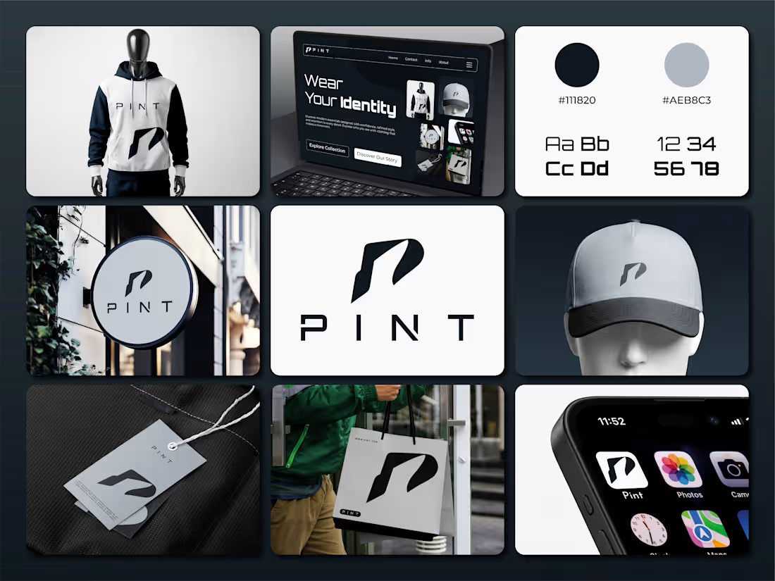
PINT® — A Mark of Modern Identity.
What if a simple letter could become the face of an entire brand?
That was the idea behind PINT.
I wanted to create more than just a fashion logo. I wanted a mark that feels bold, modern, and instantly recognizable, something that works just as naturally on a hoodie as it does on a shopping bag, a cap, or a digital screen.
✳ The idea behind the mark
The symbol is inspired by the letter “P,” shaped into a sharp, forward-moving form. Its clean geometry and distinctive silhouette give the brand a confident personality without making it feel overdesigned.
Less detail. More character.
◼ The visual direction
Deep black meets cool grey, creating a clean, understated look that lets the identity speak for itself. The typography adds a futuristic edge, while the minimal layouts keep everything balanced and timeless.
From apparel and packaging to storefronts and digital touchpoints, every element follows one consistent idea: make the brand recognizable wherever it appears.
Because a fashion brand isn't defined by what it wears alone.
It's defined by how people remember it.
✦ One symbol. One identity. One clear direction.
This is PINT — a fashion identity built around simplicity, confidence, and individuality.
What do you think of the direction? Does the mark capture the personality of a modern fashion brand?
👉 Best Design: www.fiverr.com/sellers/rifatislam149/edit
(http://www.fiverr.com/sellers/rifatislam149/edit)👉 Portfolio: https://dribbble.com/artoryxrifat
#PINT #PINTBrand #FashionBranding #LogoDesign #BrandIdentity #VisualIdentity #BrandGuidelines #FashionLogo #ClothingBrand #BrandDesign #MinimalistLogo #ModernLogo #CreativeLogo #LogoInspiration #GraphicDesign #BrandStrategy #BrandIdentityDesign #Typography #LogoConcept #FashionDesign #StreetwearBrand #LuxuryBranding #PackagingDesign #BrandPresentation #DesignPortfolio #AdobeIllustrator #CreativeDirection #IdentityDesign #BrandingInspiration #ArtoryxRifat
1
30