The network for creativity
Join 1.25M professional creatives like you
Connect with clients, get discovered, and run your business 100% commission-free
Creatives on Contra have earned over $150M and we are just getting started
Back to feedPost

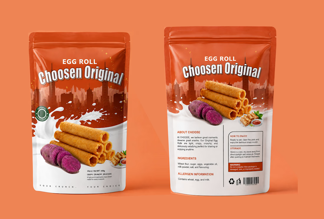
I turned a simple snack into a craving. Choosen Original Egg Roll.
People don't buy snacks with their eyes closed. They buy with craving.
For Choosen Original Egg Roll, the brief was clear — make it look crispy, crunchy, delicious and unforgettable on the shelf. So I built a story around the crunch itself.
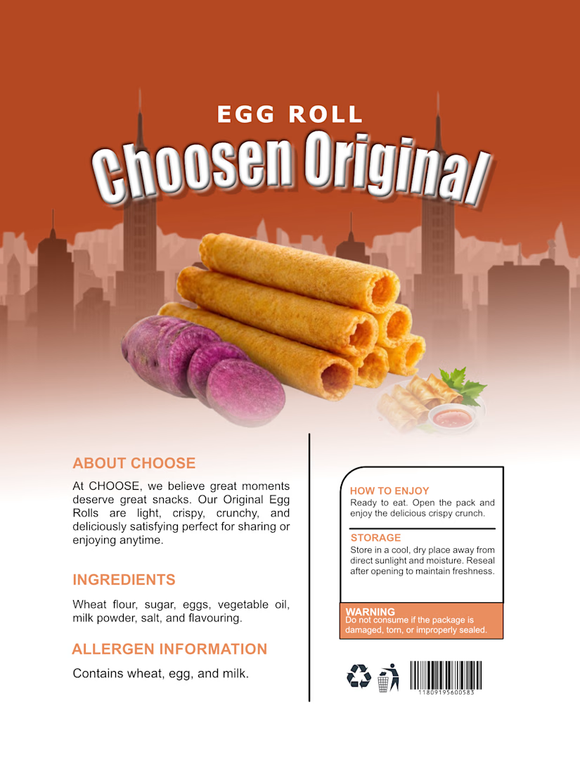
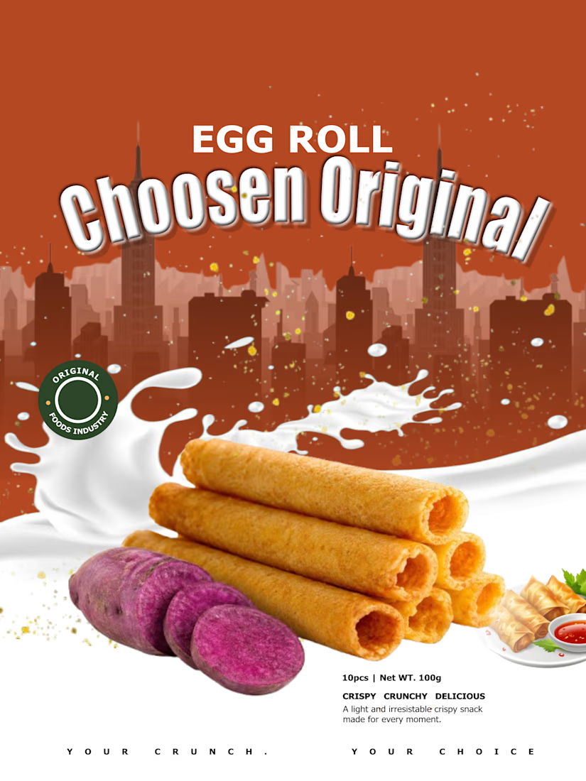
The top half is bold city energy with deep orange that pops on any supermarket shelf. The bottom half is pure indulgence, a splash of milk for creaminess and freshness, stacked golden egg rolls that look so crispy you can almost hear them, and the sliced purple yam that tells you instantly this is not your regular flavor, this is original.
I added small details that sell, the Original Foods Industry seal for trust, the small serving shot with dip for appetite, and the tagline at the bottom, YOUR CRUNCH. YOUR CHOICE. It is personal. It makes the buyer feel like this snack was made for their moment.
This is packaging design that does not just sit, it sells.
If you have a food product, snack, or consumer brand that needs to stand out and get picked up, let's create your bestseller packaging.
DM me "CRUNCH" to get your own product packaging that converts.
#PackagingDesign #FoodPackaging #SnackPackaging #EggRollDesign #ProductPackaging #PouchDesign #ChoosenOriginal #FoodBranding #PackagingDesigner #GraphicDesigner #BrandDesigner #DesignThatSells


The network for creativity
Join 1.25M professional creatives like you
Connect with clients, get discovered, and run your business 100% commission-free
Creatives on Contra have earned over $150M and we are just getting started





Related posts

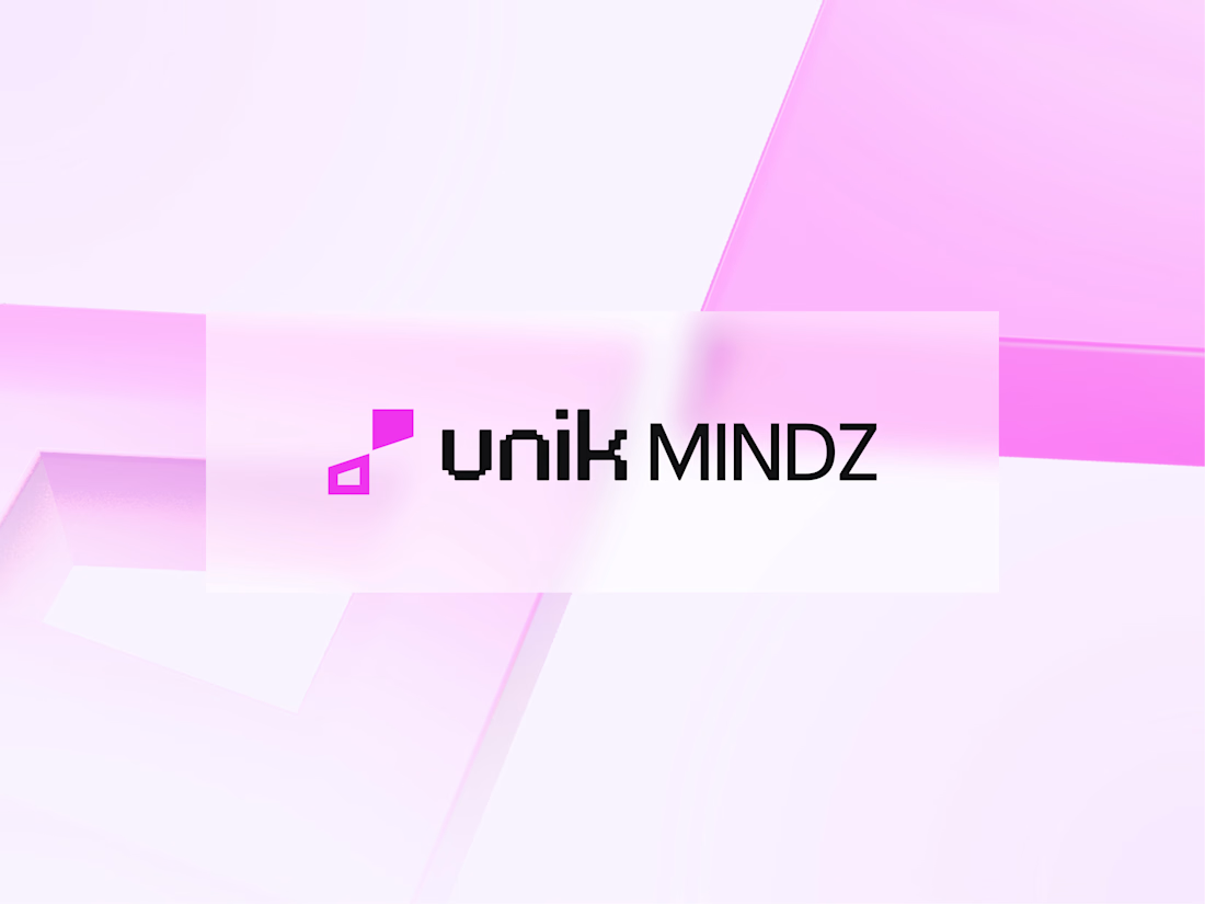
I'm excited to share the full case study from our collaboration on the Unik Mindz logo design and branding, completed in August 2026.
Unik Mindz is a creative design studio born from the legacy of the Unik family brand. Founded on the belief that every idea begins with a unique mind, the studio needed an identity that could carry that message and become the face of the brand.
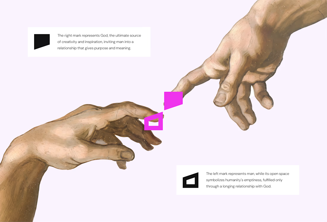
The logo draws inspiration from Michelangelo’s The Creation of Adam, focusing on the idea of connection. It captures the moment two minds meet to create something greater, reflecting the brand’s conviction that meaningful creativity starts with connection.
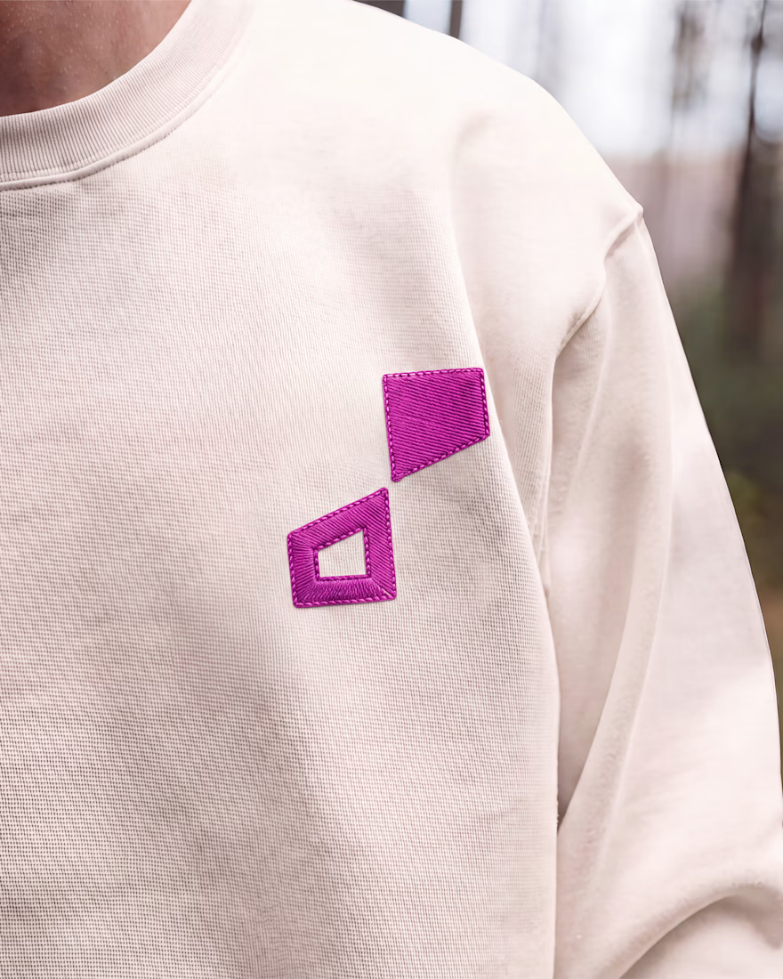
We wrapped the project with a clear system and guide for how the brand assets should be used going forward.
Want to work with us? Send a DM or email to info@donatus.agency

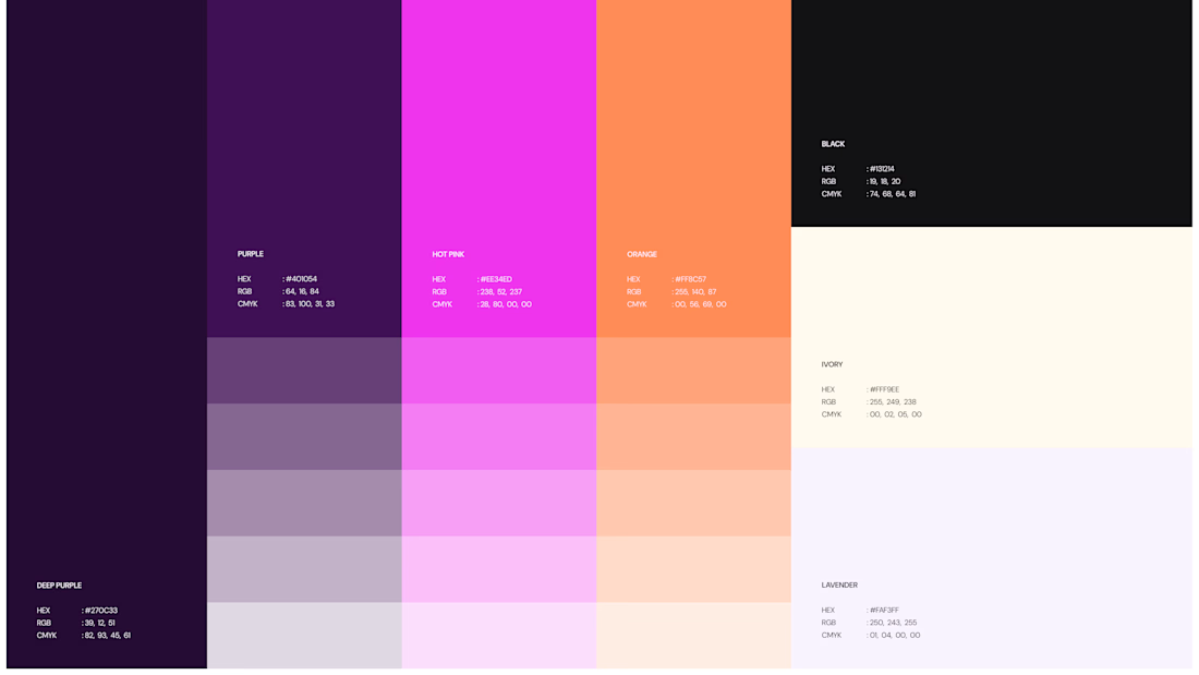

Honestly I never see something like this before I love the uniqueness of the design and it's vibrant color palette great job 🎉🎉

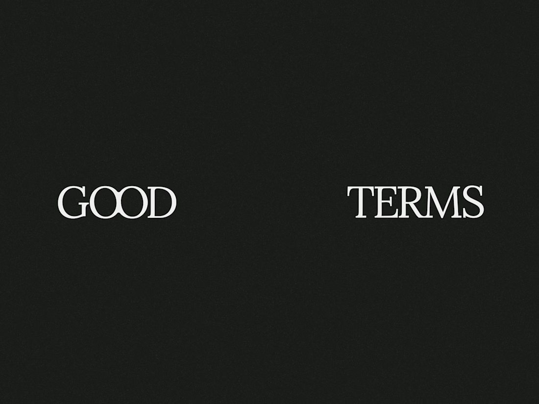
Good Terms -- Logo Design


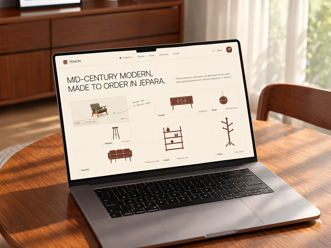
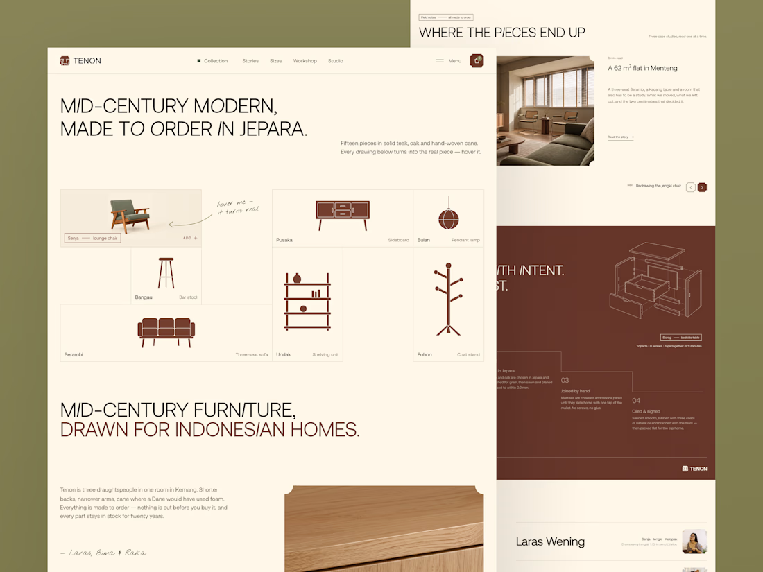
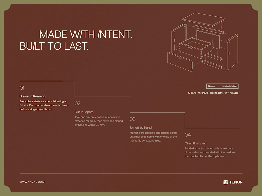
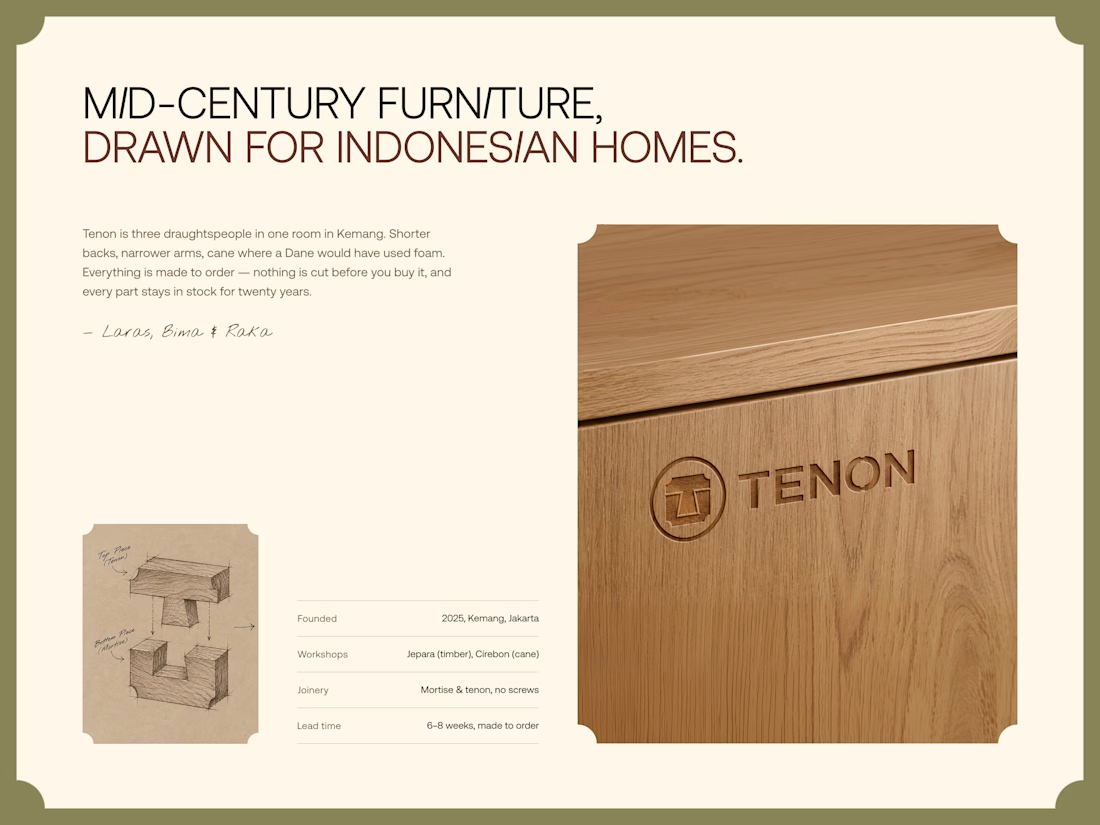
Tenon is Furniture Website Design
Exploring a digital experience for an Indonesian furniture brand inspired by mid-century modern design.
The website brings together product discovery, storytelling, and visual direction to make the digital experience feel as considered as the furniture itself.
Made to order. Made to last.

Love the color choice used