The network for creativity
Join 1.25M professional creatives like you
Connect with clients, get discovered, and run your business 100% commission-free
Creatives on Contra have earned over $150M and we are just getting started
Back to feedPost
Taste Test
Two warm ups today, both might become full case studies:
Parlata: an audio-postcard service that records and archives local dialects. Every recording becomes a small printed card with a QR link.
MODULO: an Industrial IoT brand. Olive, navy, one wobbly blob.
One is warm and human. One is technical and playful. Which would you want to see go all the way?
22 votes
Ends in 1d

love the designs and brandings

Both look solid, but MODULO!

Parlata all the way.... Damn my eyes hurt 😂

Creative work!

Love it

Parlata is great


Nice work👏🔥

😍
The network for creativity
Join 1.25M professional creatives like you
Connect with clients, get discovered, and run your business 100% commission-free
Creatives on Contra have earned over $150M and we are just getting started



Related posts

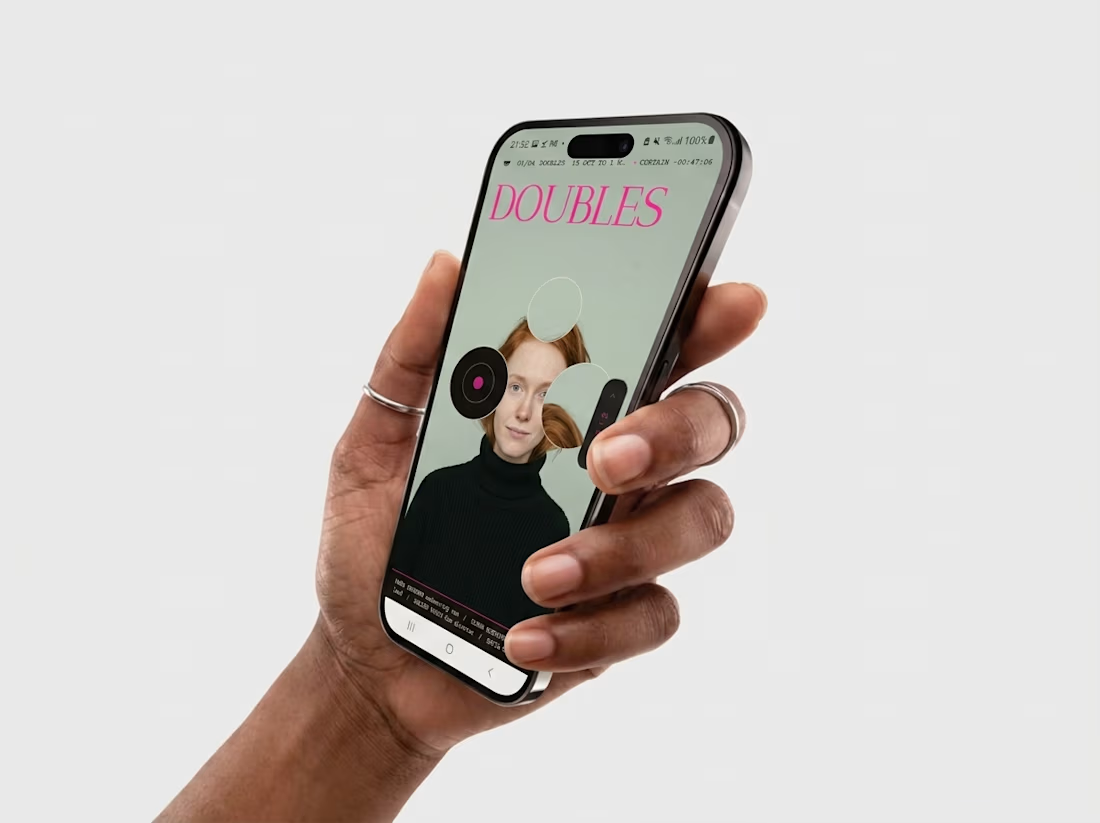
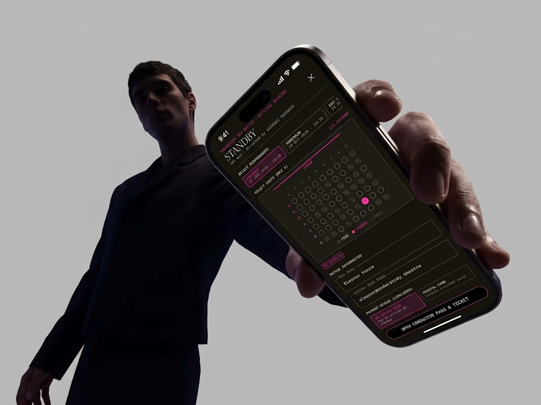
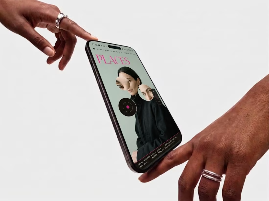
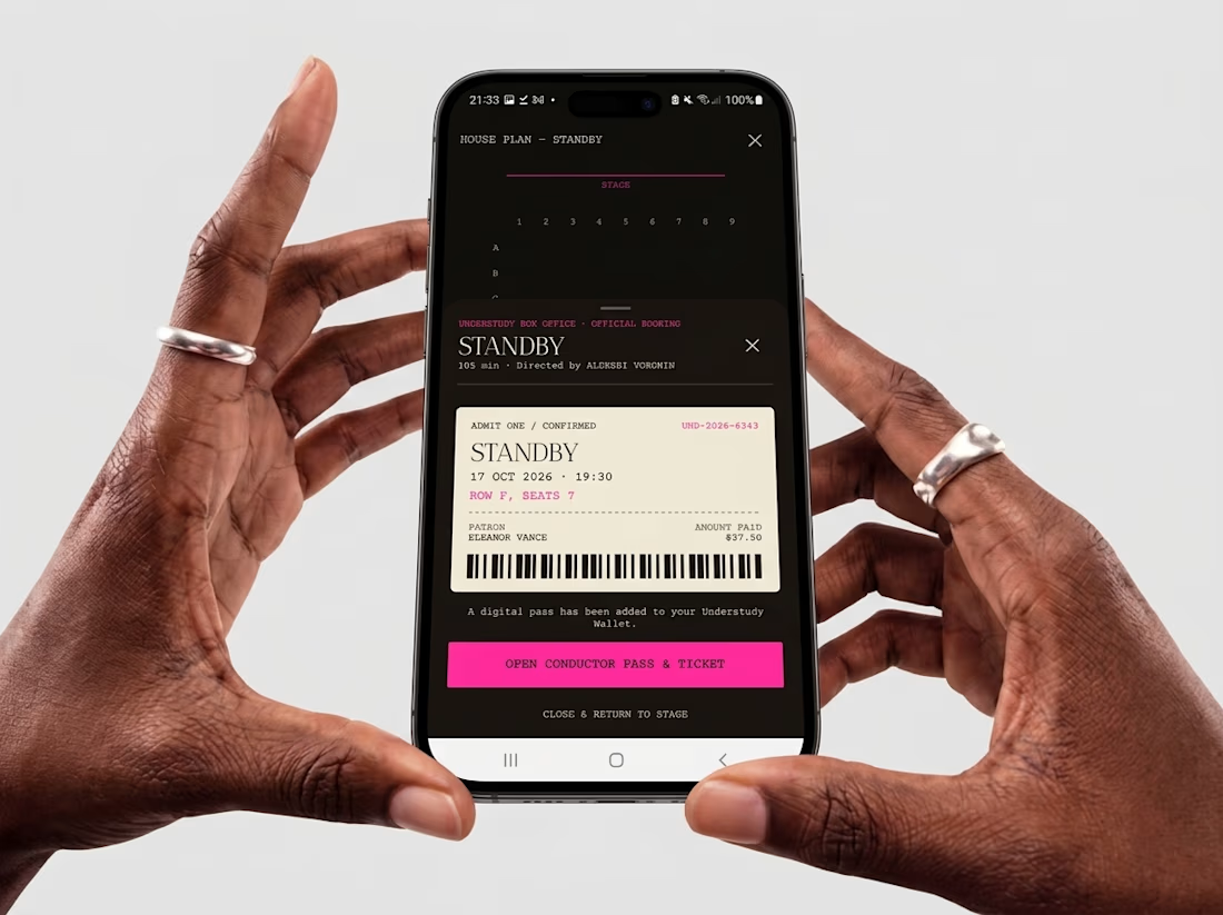
Friday app: Understudy
What if an app’s menu was a hole in a face?
UNDERSTUDY turns one circle into the interface: eyes open shows, voids open seat plans, and a typewriter clock counts down to curtain.


Can two different typographic directions change how you perceive the same skincare brand? 👀
For Elanor, a skincare brand I’ve worked on, I’m putting two wordmark directions head to head.
A. Script Combo brings more personality and a distinctive, expressive touch.
B. Contemporary feels cleaner, more restrained, and modern.
Now I want your honest opinion: A or B? Which direction feels right for Elanor, and why?
26 voted
58%
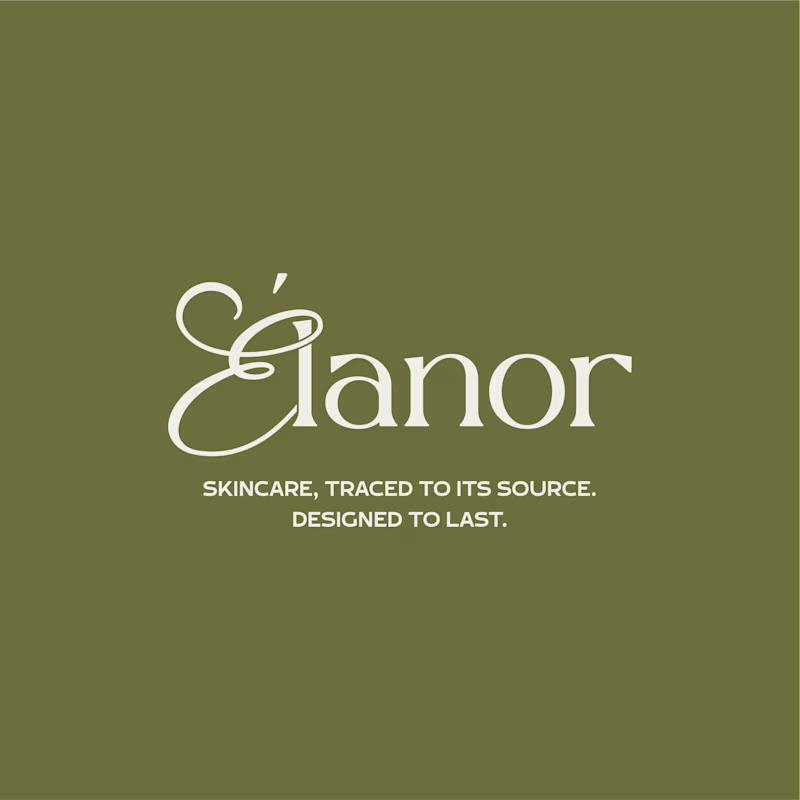
19 voted
42%
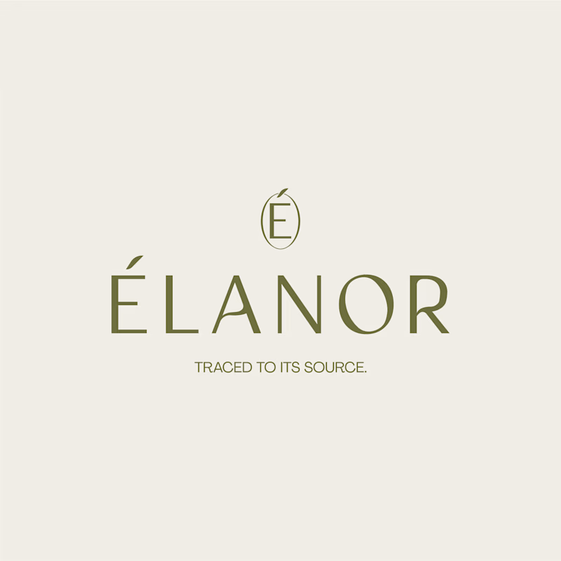
45 votes
Closed

Absolutely! Typography changes everything. For Élanor, I love the contemporary direction - it feels elegant, clean and very premium for a skincare brand like this. The É icon on top is a beautiful touch! Script has personality but contemporary feels more timeless for skincare. Great exploration!


Turned my real desk into a tiny clay diorama ☕️
Made with FLUX 3 Klein running locally, using 10 photos of my actual setup as references: the pegboard wall, headphones, mug, shelves...
Which one do you like more, A or B?
21 voted
58%
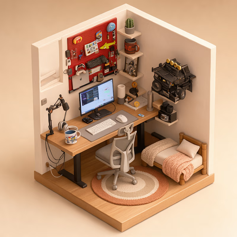
15 voted
42%
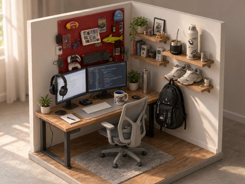
36 votes
Closed
Did small pano animation too