The network for creativity
Join 1.25M professional creatives like you
Connect with clients, get discovered, and run your business 100% commission-free
Creatives on Contra have earned over $150M and we are just getting started
Back to feedPost
A little more about the inspiration behind Tindara.
I wanted the identity to have a connection to Tindari, Sicily. The Madonna di Tindari statue was the starting point for the symbol, while Sicilian decorative patterns inspired the graphics around it.
For the colors, I chose mustard yellow, deep green, and burgundy, balanced with cream. I wanted to bring some of that warmth and richness into the packaging, while keeping the different elements comfortable together.
For me, these references are what give the project its character and sense of place.

Love this!

Thank you, Bella!

Deep cultural roots make this brand identiti so compelling
That's true. There's a little piece of history in everything!

Great work
Thank you!
The network for creativity
Join 1.25M professional creatives like you
Connect with clients, get discovered, and run your business 100% commission-free
Creatives on Contra have earned over $150M and we are just getting started



Related posts




#Brandidentity
Belted had an outdated logo and brand identity. The objective was a complete redesign, creating a strategic, modern logo design, aligning the colors with their business, and developing a complete brand identity alongside comprehensive brand guidelines.
#gaphicdesign #branding #brandidentity #logodesign #rebranding


The orange B against the blurred truck gets the logistics angle across without a literal truck icon. How does the lock-up hold on a light background, where there's no motion in the image to carry that energy?

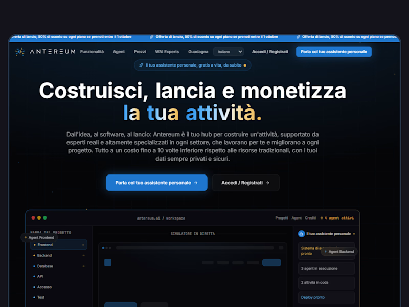
Webiste redesign for Saas company


2 voted
4%
44 voted
96%
46 votes
Closed