Websites, Stores & Funnels| Framer, Shopify,Kajabi,Wordpress


Websites, Stores & Funnels| Framer, Shopify,Kajabi,Wordpress


Framer Pro Expert & No-Code Dev | UX/UI & Product Designer

Framer Pro Expert & No-Code Dev | UX/UI & Product Designer


Product & Visual Designer · Brand Identity · UI/UX
- 2x
- Hired
- 5.0
- Rating
- 68
- Followers
Product & Visual Designer · Brand Identity · UI/UX
Project title
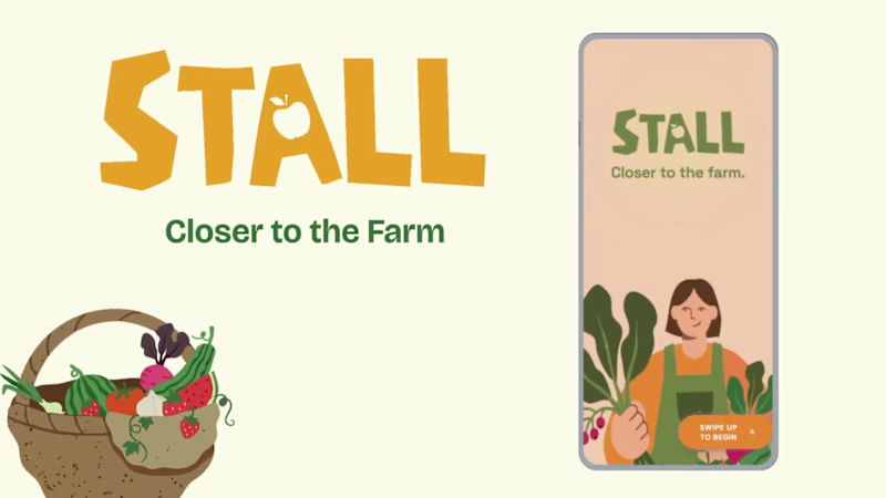
STALL — Your farmers market, alive.
A swipe-to-shop farmers market companion that connects local vendors with regulars before Saturday ever arrives.
The problem
Every Saturday, the same thing happens.
You show up to the farmers market at 10am. The ramp vendor you wanted is sold out by 9. You forgot cash. You walk past a honey stall three times because you can't remember if you already bought some. And that new mushroom farm you heard about? Gone before you spotted them.
On the vendor side, it's just as frustrating. Small farmers wake up at 4am, load the truck, drive an hour, and have no lightweight way to tell their regulars — the people who actually want what they grow — "I have asparagus this Saturday. Come find me."
STALL fixes both sides of that problem.
What STALL does
STALL is a two-sided farmers market app built around one weekly ritual: Saturday morning.
For shoppers:
Follow vendors at your local market
Swipe through a weekly produce deck — right to add to your list, left to skip — exactly like Bumble, but for ramps and sourdough
Get a Friday evening digest: what your vendors have this week, your auto-built shopping list, and where each stall is on the map
Pre-reserve high-demand seasonal items before you leave the house
Discover first-of-season arrivals with a "what's new this week" spotlight
For vendors:
Post a weekly inventory update in 3 taps — what you're bringing, quantities, price
Reach your regulars directly before market day
Manage pre-reservations without a complicated system
The app celebrates the seasonal nature of farmers markets — ramps in April, strawberries in June, squash in October. Every week feels like something worth showing up for.
How I built this with Google Stitch
STALL was designed and prototyped entirely using Google Stitch as the primary build tool, with Figma used only for initial wireframing.
The workflow:
Day 1 — Brand and wireframes
I started by defining the brand: the name, palette (Pumpkin Spice Forest — a warm amber, fern green, mauve, and cream system), and illustration direction. I wireframed the three core flows — swipe deck, Friday digest, and vendor post — before touching Stitch.
Day 2 — Into Stitch
I imported my Figma file directly into Stitch using the .fig import feature. From there I used streaming generation to build each screen live on the canvas — watching the splash screen, onboarding flow, and homepage assemble in real time was genuinely remarkable. The HTML-native canvas meant every animation I added — card tilt on swipe, drawer slide-up, bento tile stagger — rendered exactly as it would in production.
Key Stitch prompts used:
"Add a swipe gesture to the produce card stack — right swipe shows a green Added overlay with 5° card tilt, left swipe shows a mauve Skipped overlay with -5° tilt"
"Make the shopping list items stream in one by one with 120ms stagger on page load"
"Add a bottom drawer that slides up from the vendor card with spring easing — show the farm bio, full inventory list, and two action buttons"
"Build the Friday digest screen — vendor items animate in sequentially, the seasonal spotlight card pulses gently"
"Export web assets and deploy to Netlify"
In-place edits I used:
Swapped the swipe overlay color from red to mauve to match brand
Adjusted the bento grid gap from 8px to 6px after seeing it render on canvas
Changed the CTA button from outlined to filled after in-place visual comparison
Rewrote the seasonal spotlight copy directly on the canvas without regenerating
What Stitch made possible that nothing else could:
The swipe gesture interaction, the drawer spring animation, and the staggered list streaming — all three of these would have taken days to hand-code. In Stitch, they were prompt-driven and live on the canvas within minutes. The gap between "designed" and "interactive prototype" collapsed entirely.
Screens delivered
Splash screen — farmer illustration, full-bleed cream background
Onboarding screen 1 — market basket illustration, "Your market, every Saturday"
Onboarding screen 2 — swipe mechanic explainer with card UI
Onboarding screen 3 — Friday digest bento preview
Homepage — bento grid with market header, seasonal spotlight, list, map preview, swipe deck, streak tracker
Swipe deck — card front, vendor expand drawer, swipe right (added), swipe left (skipped)
Friday digest — streaming vendor list, seasonal spotlight, auto-built shopping list
Market day map — vendor stall grid, spot numbers, live confirmation states
Vendor post flow — 3-tap inventory update screen
Design decisions worth noting
The swipe mechanic — Borrowing the Bumble swipe pattern for produce discovery was the conceptual breakthrough. It transforms a passive browse into an active, satisfying decision. Every right swipe builds your list. Every left swipe still shows you where the vendor is on the market map — skipping is never permanent.
The Friday digest as the hero feature — Most apps make you come to them. The Friday evening push notification with a personalised market brief is the one moment where STALL comes to you. It changes Saturday morning from reactive to intentional.
Bento homepage — Instead of a scrolling feed, the homepage gives you everything at a glance: your market, your list, the seasonal moment, your vendors. Seven tiles, seven pieces of information, zero scrolling.
The color system — Pumpkin (#E8872A), Fern (#728040), Mauve (#B07090), Cream (#FDFAF6), and Moss (#4A5228). Every color has one job. Pumpkin is interactive. Fern is seasonal and confirmed. Mauve is reserved and streaks. Cream is every surface. Nothing competes.
What I learned
Stitch genuinely changes the prototyping workflow. The moment I stopped thinking of it as a design tool and started thinking of it as a build tool — one where the canvas is the product, not a picture of the product — everything accelerated. The in-place edit feature is the one I'll keep coming back to: being able to change a color, rewrite copy, or swap a component without regenerating the whole screen is the difference between iteration and rework.
STALL started as a hackathon idea. After building it in Stitch, it feels like something real.
Live Prototype: https://stitch.withgoogle.com/preview/8229547464152593644?node-id=e53124995cda49808685283be978dc8c
50
44
1K



Design System for iOS, Web, Mobile + Promo videos
Portfolio website design
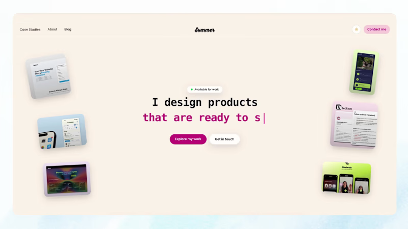
I designed and built my own portfolio in Next.js, React, and Tailwind so the site itself shows how I work, not just the case studies inside it.
It is an interactive site with case studies, about, and blog. Visitors can move through shipped product work, including PetCard, where I helped ship a real product using AI as a design collaborator. The goal was a clean, conversion-minded site that feels simple and makes the work easy to understand.
Live site: summerchang.co (http://summerchang.co)
2
65
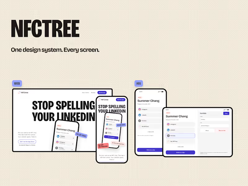
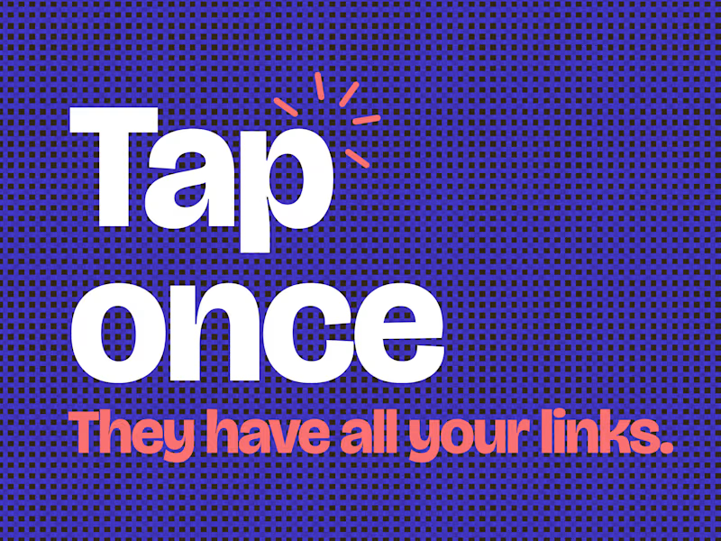
You met someone great.
Now you're spelling your LinkedIn.
Put your card on a NFC chip.
They tap. All your social links open in one place.
NFCtree. Free on the App.
1
88
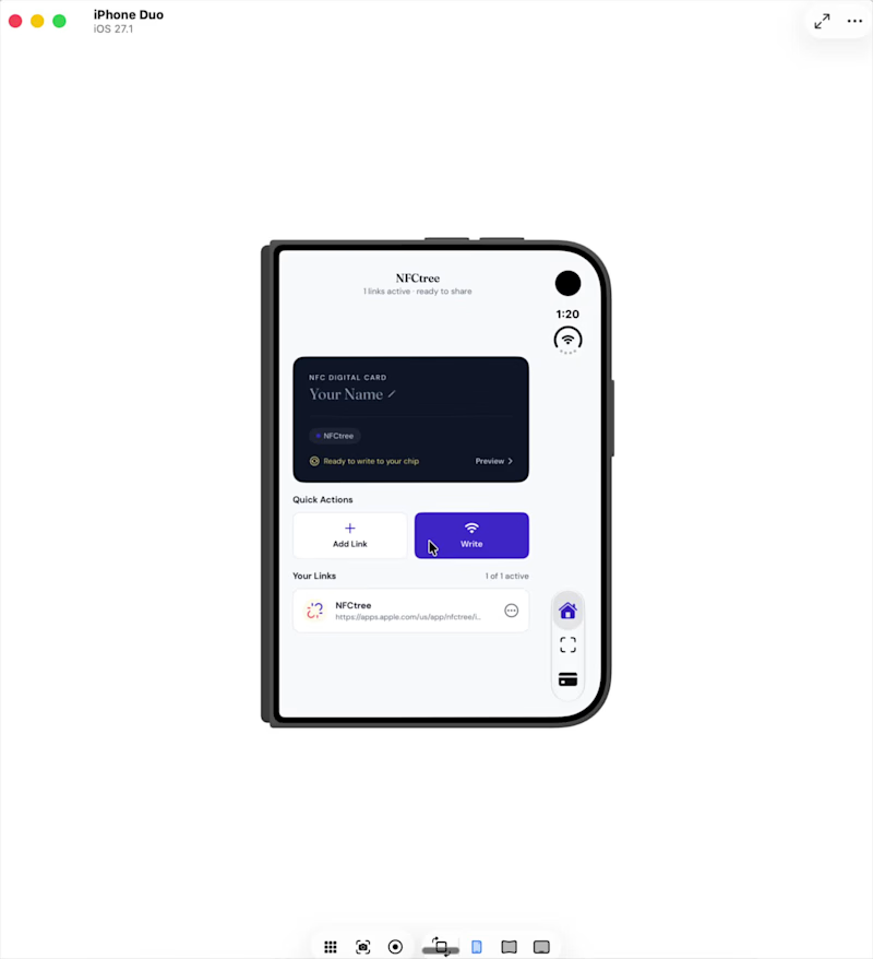
I vibe coded NFCtree all the way to the App Store.
No Figma. No design input. ⠀
It's my best performing app.
⠀
NFCtree started in code (Xcode Intelligence).
Live since June 2026.
⠀
Then the iPhone Duo came out.
New screens.
The app had to fit.
⠀
Getting design into code is easy now.
Getting what the code learned back into design is the hard part.
⠀
So this is my loop:
1. Claude Code reads the app and pulls out the design system.
2. Paper for visual inspiration. Layouts and functionality.
3. Storyboard to organize the tokens.
4. Figma to refine the system.
5. Claude Code takes it back into Xcode.
6. Run the loop again. ⠀
One canvas or a loop. Which is working for you?
2
144

Digital Experiences | Web, Apps & Automation for Businesses.
- 29
- Followers
Digital Experiences | Web, Apps & Automation for Businesses.
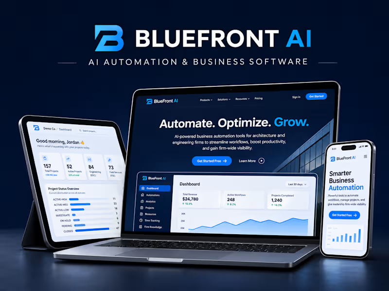
Sometimes I just like creating things without overthinking them.
This was a little creative experiment with visuals, motion and digital experiences - exploring different ways to bring ideas to life.
My work revolves around web, apps and AI-powered solutions, with a strong focus on making things both functional and visually engaging.
Always open to interesting ideas and collaborations.
2
242

Dropping a fresh look at my latest design & dev build for MoonshotTech (https://www.techwithmoonshot.com/).
For this build, the focus was simple: blend slick dark-mode aesthetics with smooth motion to make the brand feel truly future-ready.
Available for high-impact web design & dev projects.🚀
1
226
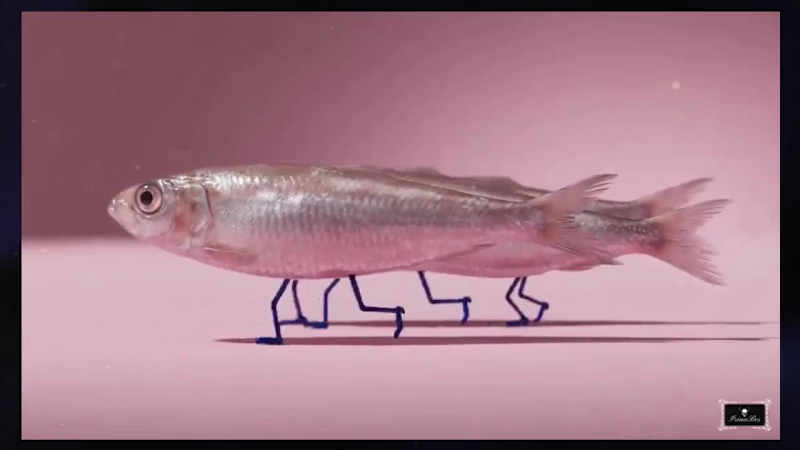
Making pixels dance is easy. Making them sell a vision is the real work.
Most people think fish can’t walk and horses don’t run through fire. But when you marry unhinged AI imagination with precision motion design, rules stop existing.
Did the motion hit or was it too fast? Be honest in the comments.🐟
5
7
380

Web & Brand Designer | SaaS, Shopify & Framer Specialist
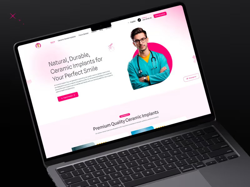
Dental Landing Page Design
Welcome to The Ceramic Implant Guy – Your Trusted Partner for a Healthy, Beautiful Smile!
At The Ceramic Implant Guy, we are dedicated to delivering exceptional dental care in a comfortable and modern setting. Our skilled team of dental professionals offers a wide range of services, from routine cleanings and preventive care to advanced cosmetic and restorative treatments. Using state-of-the-art technology and personalized care, we ensure every patient receives the highest standard of treatment tailored to their unique needs. Whether you're due for a check-up, seeking a brighter smile, or needing expert dental solutions, we’re here to help. Schedule your appointment today and experience compassionate, high-quality dentistry that puts your oral health first!
2
3
214
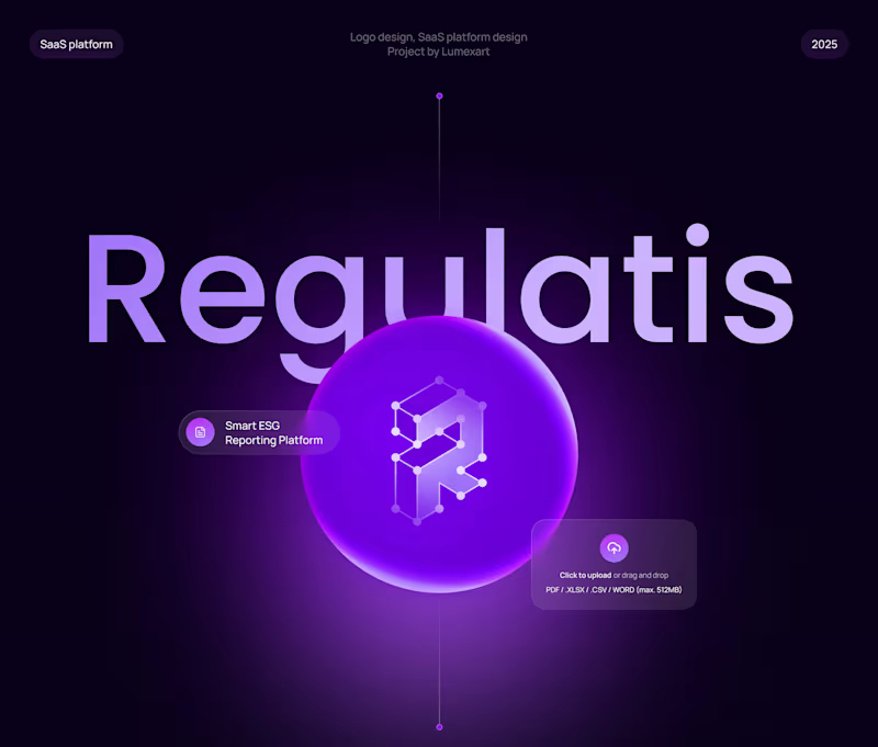
SaaS UI/UX Designer for B2B ESG Compliance & Data Management Platform
SaaS design, SaaS UI/UX, B2B SaaS platform, SaaS dashboard design, SaaS workflow automation, SaaS product UI, enterprise SaaS UX, SaaS reporting software, SaaS data visualization, ESG SaaS platform, sustainability SaaS tools, SaaS compliance dashboard, SaaS product experience, B2B product design, SaaS onboarding flow, SaaS application design, SaaS automation solutions, SaaS product dashboards, enterprise SaaS UX, SaaS data management, SaaS analytics dashboard, SaaS workflow design, SaaS usability testing.
3
13
351

Ørth App - Full Branding, UI/UX, Web & App Design, 70+ App Screens
Ørth - The app where you match with like-minded travel buddies, who share your adventurous spirit, interests, and dream destinations. One great project that involved the creation of a wide range of deliverables on several key points: From establishing the initial branding and logo design, to taking it further with the animation, web design & app-store visuals, and a complete app design including 70+ app screens developed for the brand.
2
5
216

Modern Clothing Store Design
A clean and modern clothing store design created to highlight apparel collections with a stylish and professional look. The layout focuses on simplicity, smooth navigation, and a visually engaging user experience. Built on Shopify, the store is fully responsive, easy to manage, and optimized for seamless shopping across all devices. The design reflects a contemporary brand identity while supporting performance and conversions.
4
240

Senior UI/UX Visual Designer | Figma Expert | Ex-Apple,Adobe
- 5.0
- Rating
Senior UI/UX Visual Designer | Figma Expert | Ex-Apple,Adobe
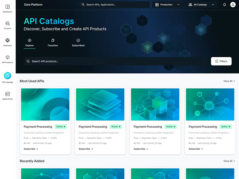
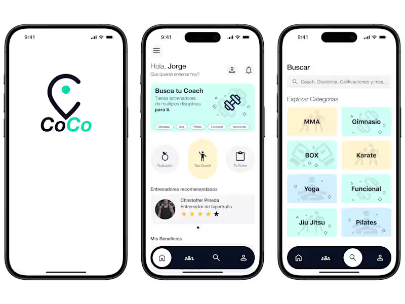


15+ yrs of experience in UX/UI development for UI/Mobile.