Redesigning a B2B E-commerce Platform for Clarity and Conversion
Anush | Foundrline
Verified
Gemini Computers — Redesigning a B2B E-commerce Platform for Clarity, Scale, and Conversion
Client: Gemini Computers
Industry: IT Solutions
Role: UI/UX Designer, Web Designer, Web Developer
Project Type: Website Redesign • Information Architecture Refresh
Why This Project Matters
Gemini Computers operates in a category where purchase decisions are high-consideration, system-based, and trust-driven.
Their homepage needed to do more than list inventory — it needed to help business buyers understand options, compare setups, and move forward with confidence.
This project was not about visual polish.
It was about restructuring a legacy storefront into a decision-support platform that reflects how B2B customers actually evaluate and buy hardware.
The Core Problem
Gemini already had:
A large and diverse product catalog
Established business credibility and long-term customers
Traffic coming from buyers with clear intent
What the existing site lacked was:
A clear hierarchy to guide first-time and returning users
A structured path from discovery → evaluation → purchase
Support for system-level buying (bundles, setups, business pricing)
Users weren’t failing to convert because of price or product quality.
They were failing because the experience required interpretation before action.
The real risk wasn’t demand — it was decision friction.
Summary
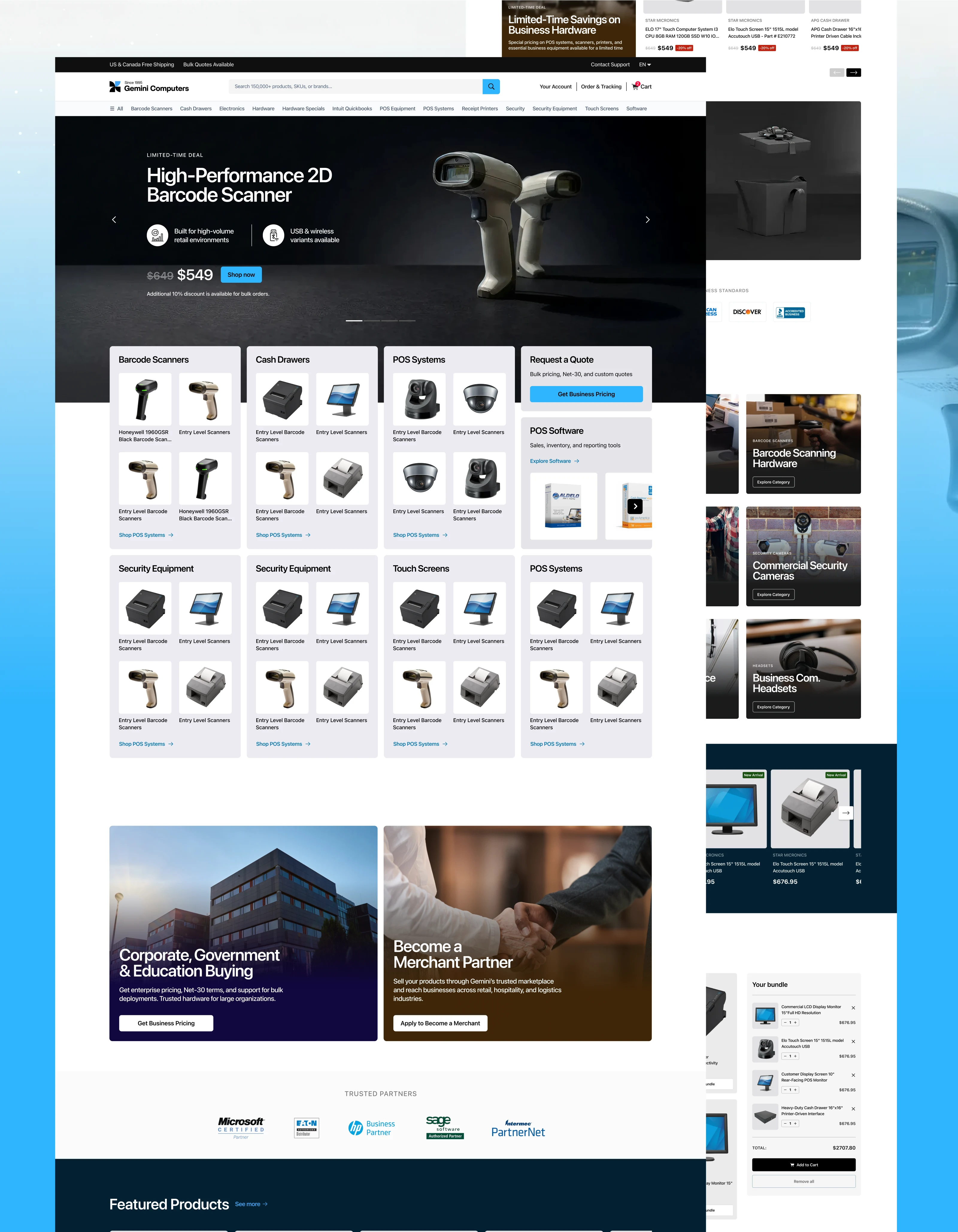
The redesigned Gemini Computers homepage marks a deliberate shift from a legacy, inventory-led layout to a conversion-oriented e-commerce experience structured around real B2B buying behavior.
The new system introduces clear hierarchy, simplified navigation, and intent-aligned CTAs to reduce cognitive load and guide users through decision-making with confidence. Product discovery is now organized, scalable, and reinforced through trust signals, bundles, and educational cues—repositioning Gemini from a transactional hardware vendor to a reliable operational partner for businesses.
By combining functional clarity at the level of mature marketplaces with a restrained, professional visual language, the homepage is now production-ready and extensible across categories. It establishes a strong foundation for scaling traffic, improving average order value, and supporting enterprise purchasing—making a clear case for continued investment in this direction.
Below is a sharpened, senior-level rewrite that elevates this from a feature comparison into a strategic case study narrative. It is written to help stakeholders understand why the changes matter commercially, not just what changed visually.
1. User Journey Transformation
From fragmented entry → to guided decision-making
Previous State
The original homepage attempted to surface everything at once—banners, sidebars, promotions, and dense link clusters competing for attention. As a result:
There was no clear entry point for first-time or returning users
Users were forced to decode the interface before taking action
The core value proposition (“What does Gemini help me buy, and for whom?”) was obscured by legacy UI patterns
This created hesitation at the very top of the funnel.
Redesigned Approach
The new homepage introduces a clear narrative hierarchy that mirrors how B2B buyers orient themselves:
What Gemini offers — business-grade hardware and systems
Who it serves — retail, hospitality, logistics, enterprise
How to engage — categories, bundles, pricing paths, and guidance
Attention is intentionally sequenced: Hero → discovery → deals → bundles → trust → resources
Strategic Impact
Users understand where they are and what to do within seconds
Entry friction is reduced, leading to faster engagement
The homepage now functions as a guided funnel, not a bulletin board
2. UX & Information Design Improvements
From cognitive overload → to confident scanning
Previous State
Over-reliance on side navigation, stacked banners, and dense copy
Weak typographic hierarchy—headings, links, and CTAs competed equally
A legacy “everything visible” philosophy that overwhelms modern users
This increased cognitive load and discouraged exploration.
Redesigned Approach
The new UX system prioritizes clarity through restraint:
Modular sections with consistent spacing and visual rhythm
A clear typographic ladder: Section titles → card headers → supporting text → CTAs
Progressive disclosure replaces clutter:
Category gateways
Curated product groups
Focused bundle entry points
Strategic Impact
Users scan confidently instead of reading defensively
Decisions are made incrementally, not all at once
The experience aligns with Airbnb-style disciplined minimalism—every element earns its place
3. Conversion Strategy Refinement
From aggressive selling → to intent-aligned progression
Previous State
CTAs were inconsistent and unprioritized
Trust indicators existed but were visually fragmented and outdated
Promotional urgency often appeared before confidence was established
This created friction for B2B buyers who require reassurance, not pressure.
Redesigned Approach
Conversion design is now intent-aware:
CTAs are matched to user mindset:
Explore Category → early discovery
Get Business Pricing → enterprise intent
Add to Bundle → system-level purchasing
Trust signals are consolidated into clean, modern reassurance layers:
Secure payments
Accreditations
Longevity and operational credibility
Pricing, discounts, and “New Arrival” markers are clearer and calmer—informative, not promotional.
Strategic Impact
Users are never pushed prematurely
Confidence is built before commitment
Conversion improves by reducing friction rather than increasing pressure, a core Amazon principle
4. E-commerce Flow & Merchandising Evolution
From flat listings → to system-aware buying
Previous State
Products were presented uniformly, with no prioritization
Categories, deals, and SKUs were intermixed
The site failed to support system-based purchasing, which is how POS and hardware are actually bought
This limited both conversion and average order value.
Redesigned Approach
Product discovery is now layered and purposeful:
Visual category gateways for broad orientation
Featured and deal-driven sections for momentum
“Newly Added” modules to signal freshness and relevance
Critically, the introduction of bundle builders aligns the site with real-world buying behavior:
Retail checkout setups
Restaurant counter systems
Warehouse and logistics environments
Educational buyer guides further support self-directed research.
Strategic Impact
Users can browse broadly or dive deep without disorientation
Bundles increase AOV while reducing pre-sales support load
The platform now supports both transactional buyers and consultative buyers, which is essential in B2B commerce
Overall Strategic Outcome
This redesign shifts Gemini from a legacy, inventory-driven storefront to a decision-support platform for business buyers.
The homepage now:
Guides rather than overwhelms
Educates without friction
Converts through clarity, not urgency
It establishes a scalable foundation for growth—across categories, traffic volume, and enterprise purchasing—making the design direction both commercially sound and strategically defensible.
Let’s Build What’s Next — Together.
If you’re looking to design or develop a product, website, or platform that connects deeply and performs flawlessly —
👉 Visit my website or Book a call here to start the conversation.
Like this project
What the client had to say
Excellent design. I would highly recommend.
Natanel Rozic
Jan 2, 2026, Client
Posted Dec 30, 2025
A strategic homepage redesign that transformed a legacy hardware storefront into a decision-driven B2B commerce experience built for scale, trust, & conversion.
Likes
0
Views
14
Timeline
Dec 17, 2025 - Jan 2, 2026
Clients
Gemini Computers