Volocars — A Revitalized Museum Experience Across Attractions
Anush | Foundrline
Verified
Volo Museum — UX Strategy, Information Architecture & Immersive Website Redesign
Client: Volo Museum, Illinois (Volocars.com)
Industry: Family Entertainment • Automotive Museum • Themed Attractions
Role: UX Strategist, UI Designer
Snapshot
Transformed a fragmented museum website ecosystem into a more immersive, scalable, and user-friendly digital destination experience.
Client
Volo Museum
Industry
Museums, Attractions & Family Entertainment
Audience
Families, tourists, museum visitors, history enthusiasts, event attendees, and attraction-focused audiences
Scope
UX Strategy
Information Architecture
UI/UX Design
Responsive Experience Design
Landing Page Redesigns
Scalable Design Systems
Attraction Storytelling Optimization
Mobile Usability Improvements
Project Scope
Redesign of 3 flagship long-form landing pages
Redesign of 14 supporting standard pages
UX restructuring and information architecture improvements
Responsive UI system creation
Component-based scalable page systems
Challenge
Transform a fragmented and outdated website ecosystem into a cohesive, immersive, and scalable museum platform that improved attraction discovery, visitor usability, and storytelling engagement.
Outcome
Created a more modern and structured digital experience that improved navigation clarity, attraction storytelling, mobile usability, and long-term scalability across the museum ecosystem.
The Challenge
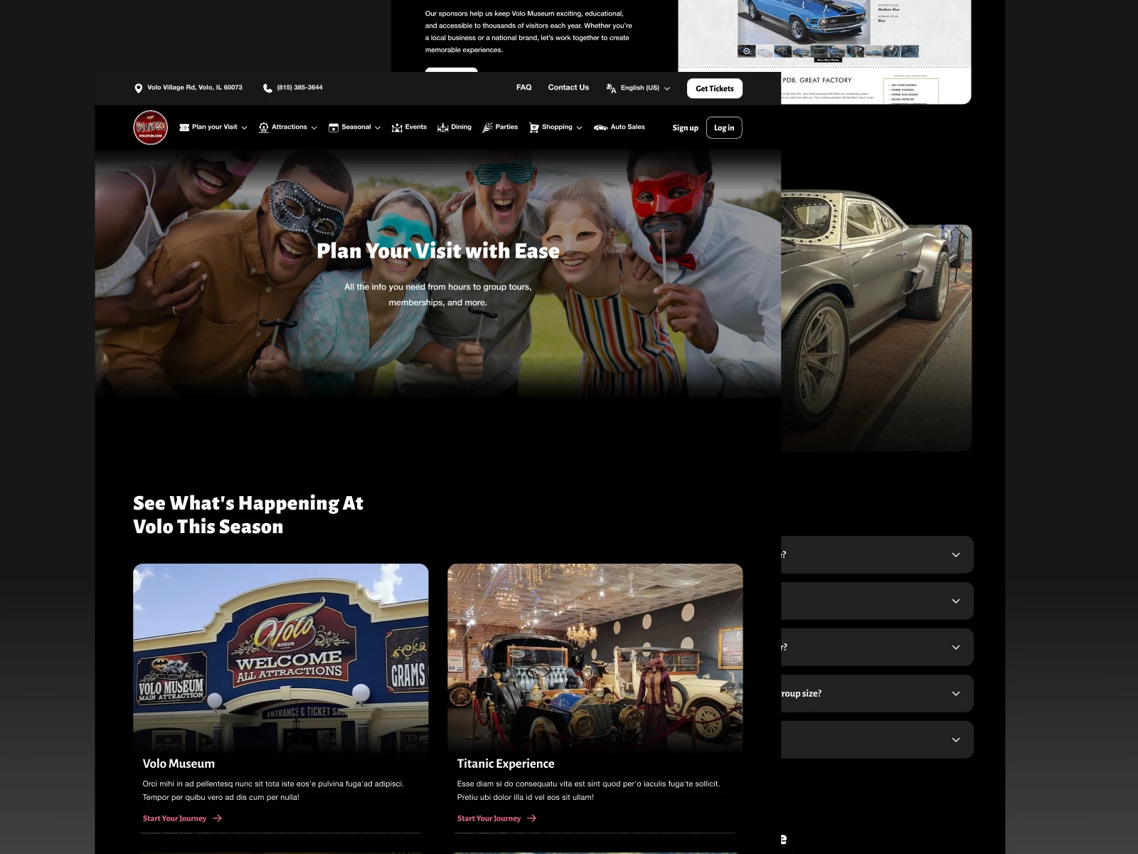
The Volo Museum experience is naturally immersive in the real world.
The digital experience wasn’t.
Over time, the website ecosystem had expanded organically across attractions, exhibits, informational pages, and visitor experiences.
Which introduced several UX and structural problems:
Fragmented attraction pages
Inconsistent layouts
Weak content hierarchy
Poor mobile readability
Difficult navigation flows
Limited emotional storytelling online
The challenge wasn’t simply refreshing visuals.
It was redesigning how users discover, explore, and emotionally engage with the museum digitally.
The experience needed to balance:
Entertainment and immersion
Information clarity
Family-friendly usability
Nostalgia-driven storytelling
Conversion-oriented navigation
This required more than page redesigns.
It required restructuring the experience architecture of the platform itself.
Where Things Were Breaking
Several structural and UX issues were limiting the effectiveness of the website.
1. Attraction Experiences Were Fragmented
Major attractions were spread across multiple disconnected pages with duplicated information and inconsistent structures.
This made it harder for visitors to:
Understand attractions fully
Navigate experiences naturally
Discover related content
Maintain engagement throughout browsing
The experience lacked cohesion.
2. Weak Information Hierarchy Reduced Clarity
Many pages were content-heavy but lacked prioritization.
Important information often became buried within dense layouts and long text sections.
This increased cognitive overload and reduced scanability.
Especially on mobile devices.
3. Visual Systems Were Inconsistent
Different pages followed different:
Layout structures
Spacing systems
CTA patterns
Typography hierarchy
Content organization approaches
Which created an inconsistent browsing experience across the platform.
4. Mobile Readability Created Friction
Large content blocks and outdated layout structures created usability problems on smaller screens.
The experience wasn’t aligned with modern mobile browsing behavior.
5. Attraction Storytelling Was Underdeveloped
Many attractions had strong real-world experiences but weaker digital presentation online.
The emotional engagement and immersion visitors experienced physically wasn’t translating through the website.

Strategic Reframing
The redesign centered around one key shift:
Move from:
a collection of informational museum pages
to
an immersive digital destination experience.
That changed how the entire platform was approached.
The objective became:
Consolidate fragmented experiences
Improve usability and clarity
Strengthen attraction storytelling
Modernize the visual system
Improve mobile behavior
Build scalable UX systems for future growth
Not just cleaner visuals.
A more intentional visitor journey.
Information Architecture Strategy
One of the biggest improvements involved restructuring the platform architecture itself.
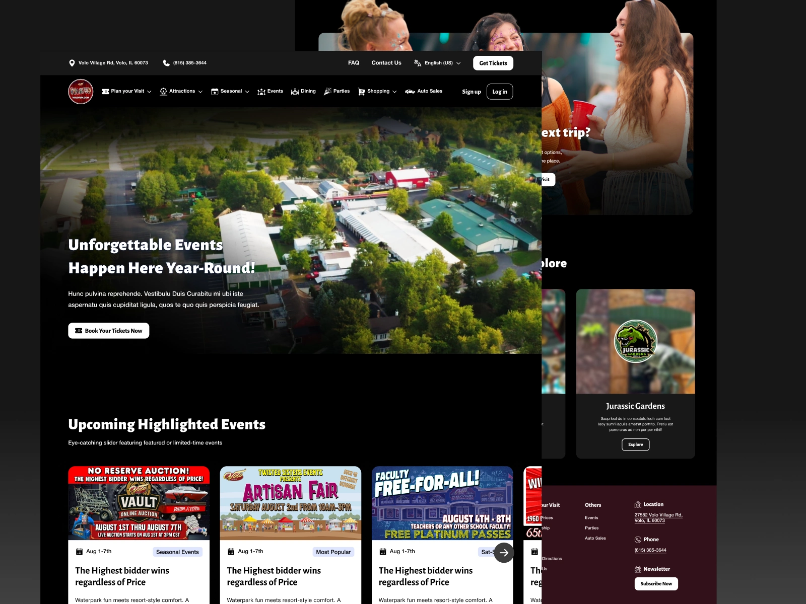
Attraction Consolidation
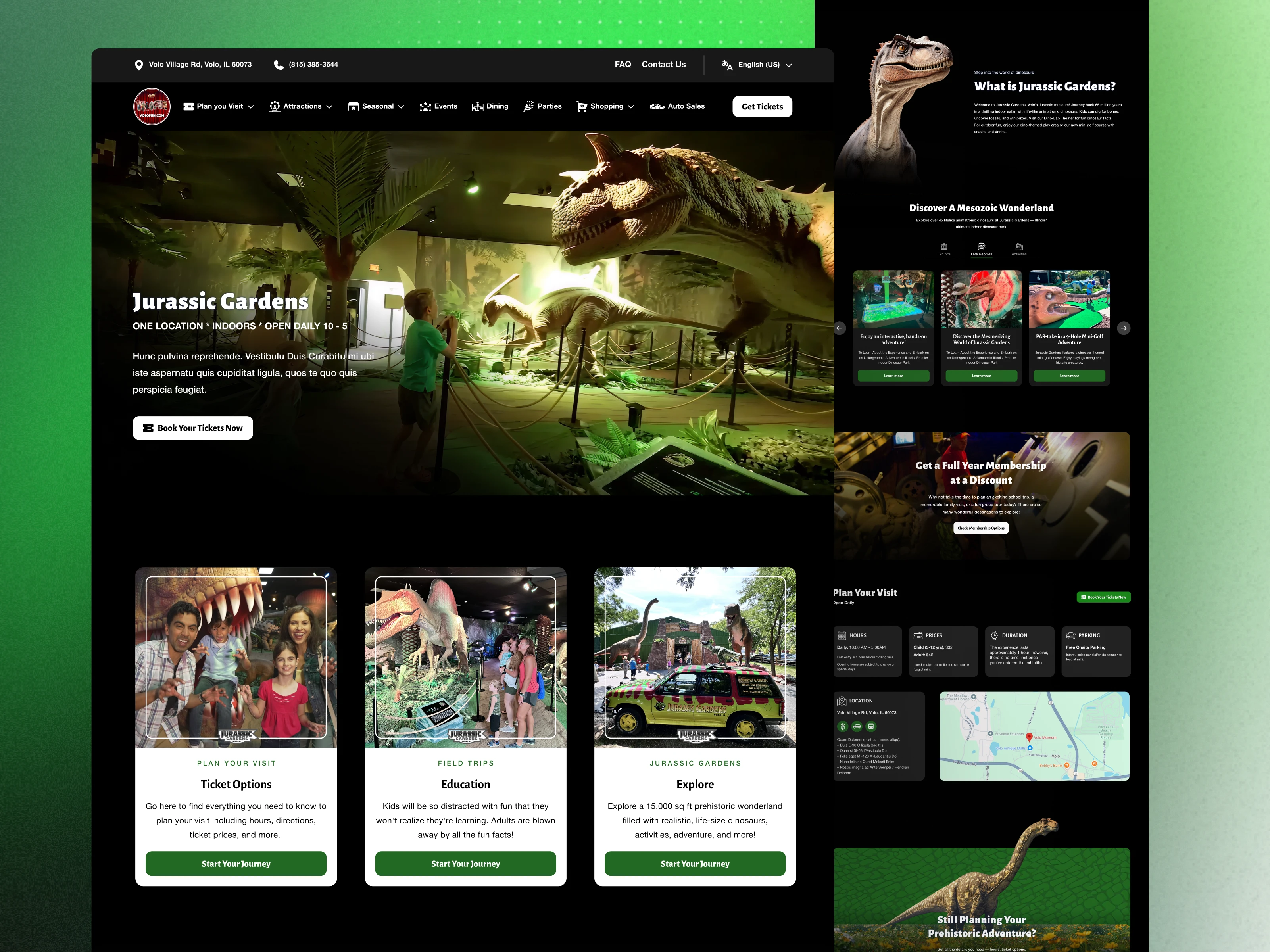
Jurassic Gardens
Content from four fragmented pages was consolidated into one cohesive and immersive attraction experience.
This improved:
Narrative flow
Visitor orientation
Scroll experience
CTA visibility
Content discoverability
Titanic Experience
Multiple disconnected informational pages were unified into a more emotionally paced and narrative-driven attraction structure.
The redesign focused on balancing:
Historical storytelling
Exhibit clarity
Entertainment value
while improving readability and reducing clutter.
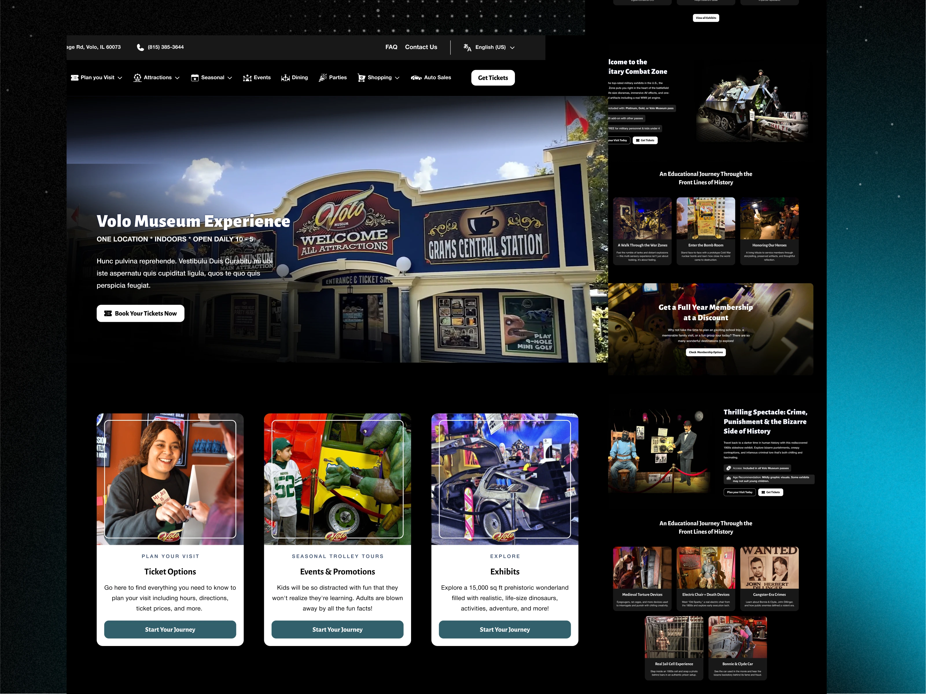
Main Volo Museum Experience
Museum-wide attraction information was reorganized into a clearer ecosystem structure that improved:
Attraction discoverability
Navigation clarity
Category organization
Visitor orientation
The goal was helping users understand the museum experience more holistically.
The Shift In Approach
1. Designed Around Experiences, Not Static Information
Pages were restructured around attraction immersion and visitor engagement rather than static informational blocks.
The layouts prioritized:
Storytelling flow
Emotional pacing
Visual engagement
Visitor exploration
This helped attractions feel more experiential digitally.
2. Introduced Scalable Modular UI Systems
Instead of designing isolated pages individually, the project introduced reusable UI systems across the ecosystem.
Reusable systems included:
Hero modules
Attraction sections
CTA blocks
Content grids
Event layouts
Membership structures
Shared navigation systems
This improved:
Consistency
Scalability
Maintainability
Future flexibility
3. Improved Visual Hierarchy and Readability
The redesign focused heavily on improving:
Typography hierarchy
Content segmentation
Spacing systems
Contrast and readability
CTA visibility
The goal was making pages easier to scan without losing richness or storytelling depth.
4. Applied Responsive-First UX Thinking
Responsive usability became a major priority throughout the redesign process.
Including improvements such as:
Mobile-first layout optimization
Cleaner scrolling behavior
Simplified navigation interactions
Larger touch targets
Better readability ratios
Optimized image hierarchy
The experience was redesigned around real-world browsing behavior across devices.
5. Balanced Nostalgia with Modern Usability
One of the key design challenges was modernizing the experience without losing the museum’s personality and nostalgic character.
The visual direction intentionally combined:
Cinematic attraction storytelling
Modern UX principles
Family-friendly accessibility
Nostalgia-driven emotional engagement
This helped preserve the uniqueness of the museum while improving usability significantly.
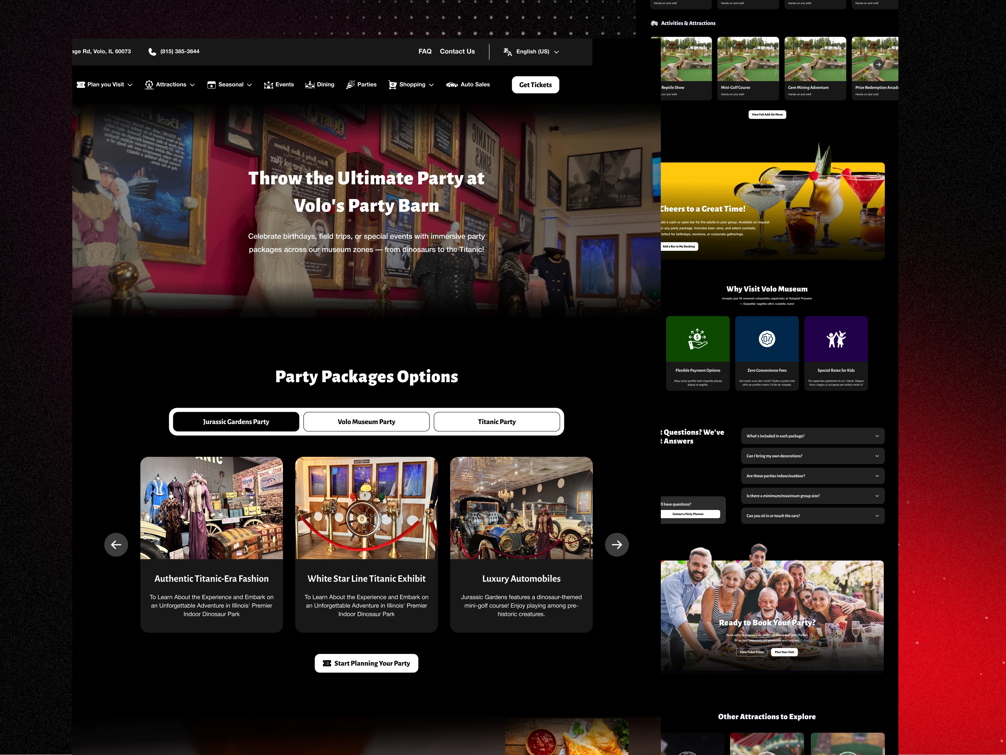
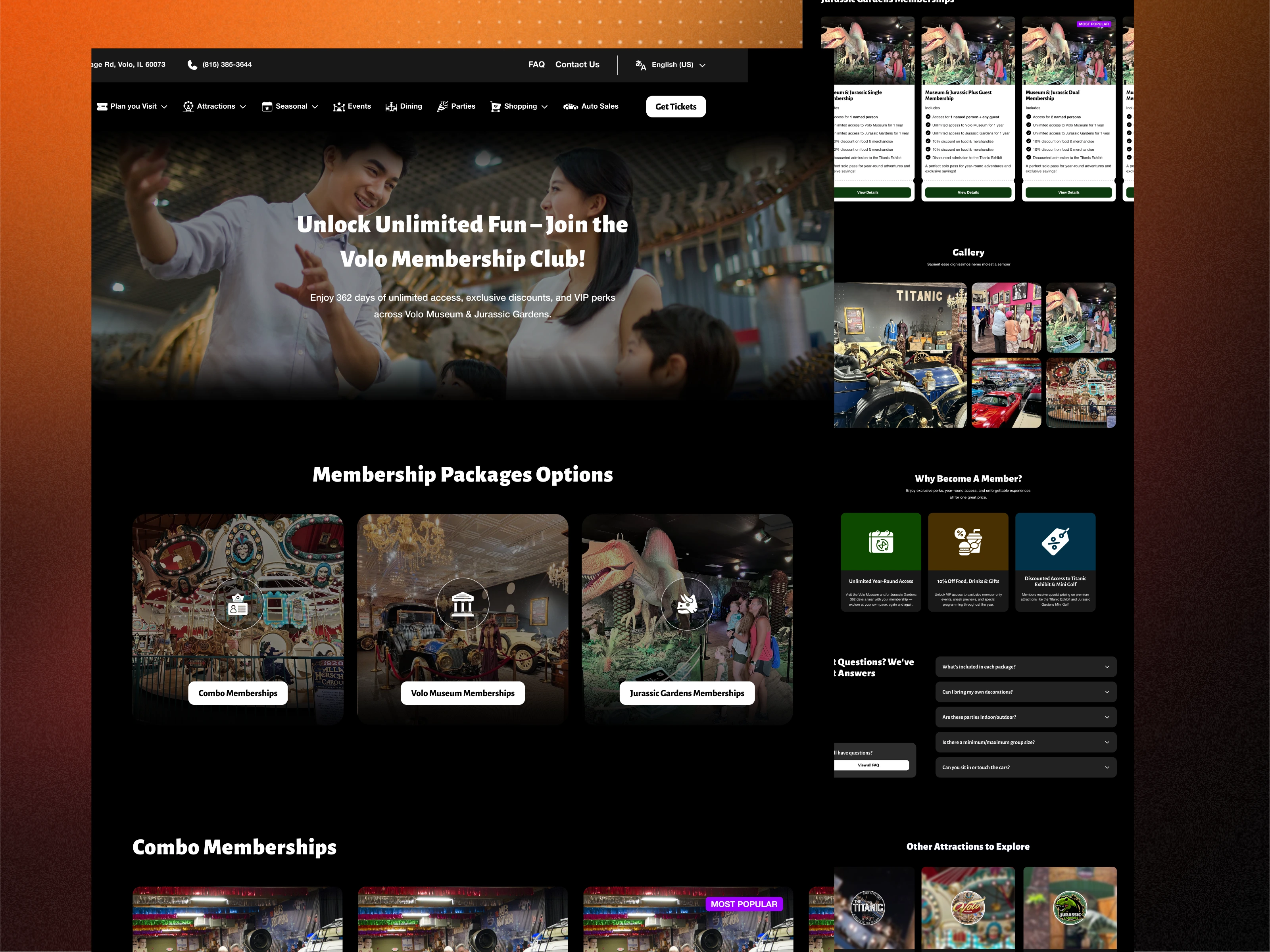
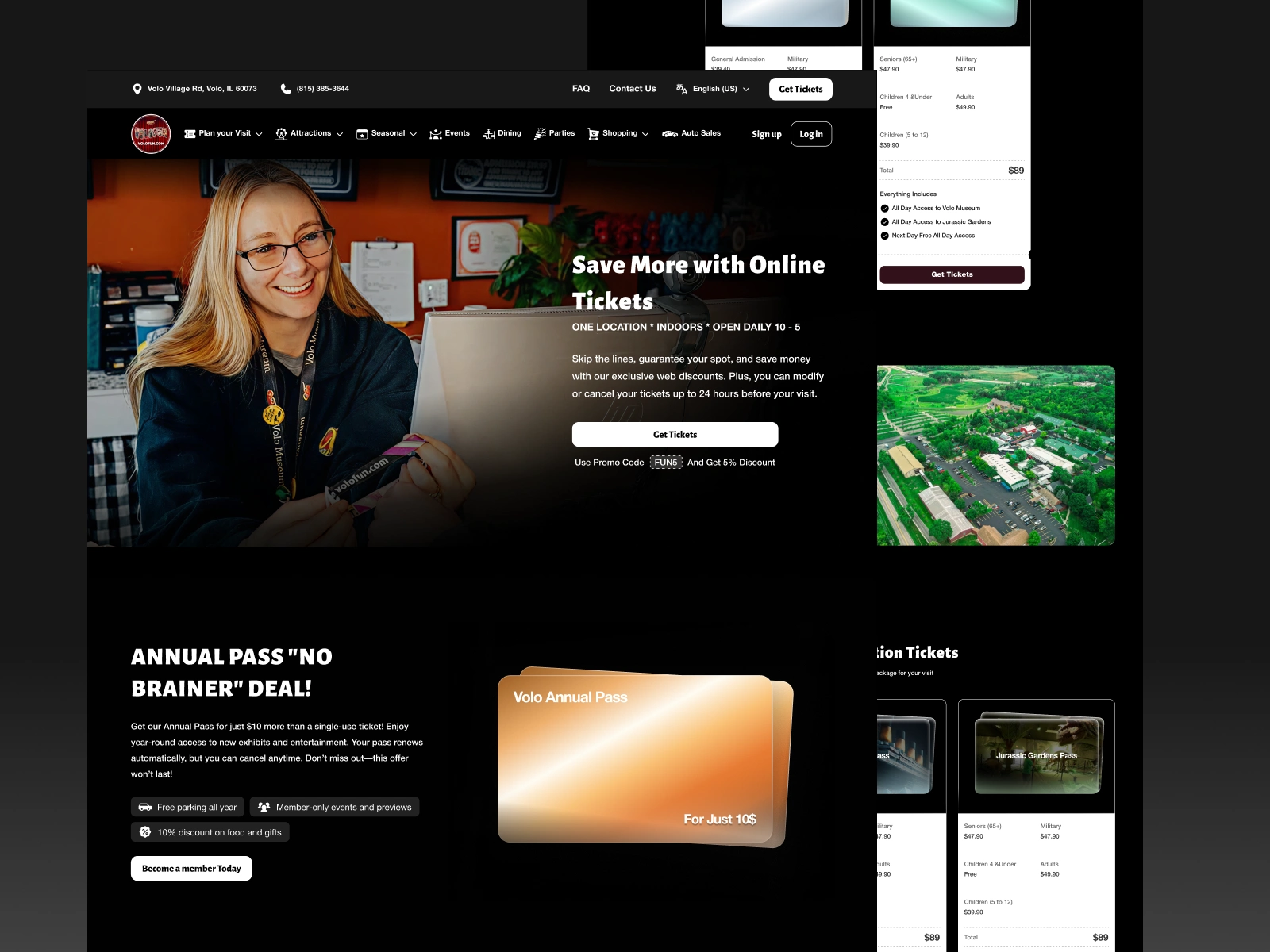
Landing Page Redesigns
Jurassic Gardens
Objectives
Create excitement and immersion
Improve attraction sequencing
Simplify information flow
Increase family engagement
UX Improvements
Large immersive hero sections
Attraction-based storytelling flow
Cleaner CTA positioning
Simplified hierarchy
Improved mobile scanability
Titanic Experience
Objectives
Create emotional pacing
Improve exhibit clarity
Balance history and entertainment
UX Improvements
Timeline-inspired page structure
Better exhibit segmentation
Cleaner hierarchy
Reduced content clutter
Improved readability
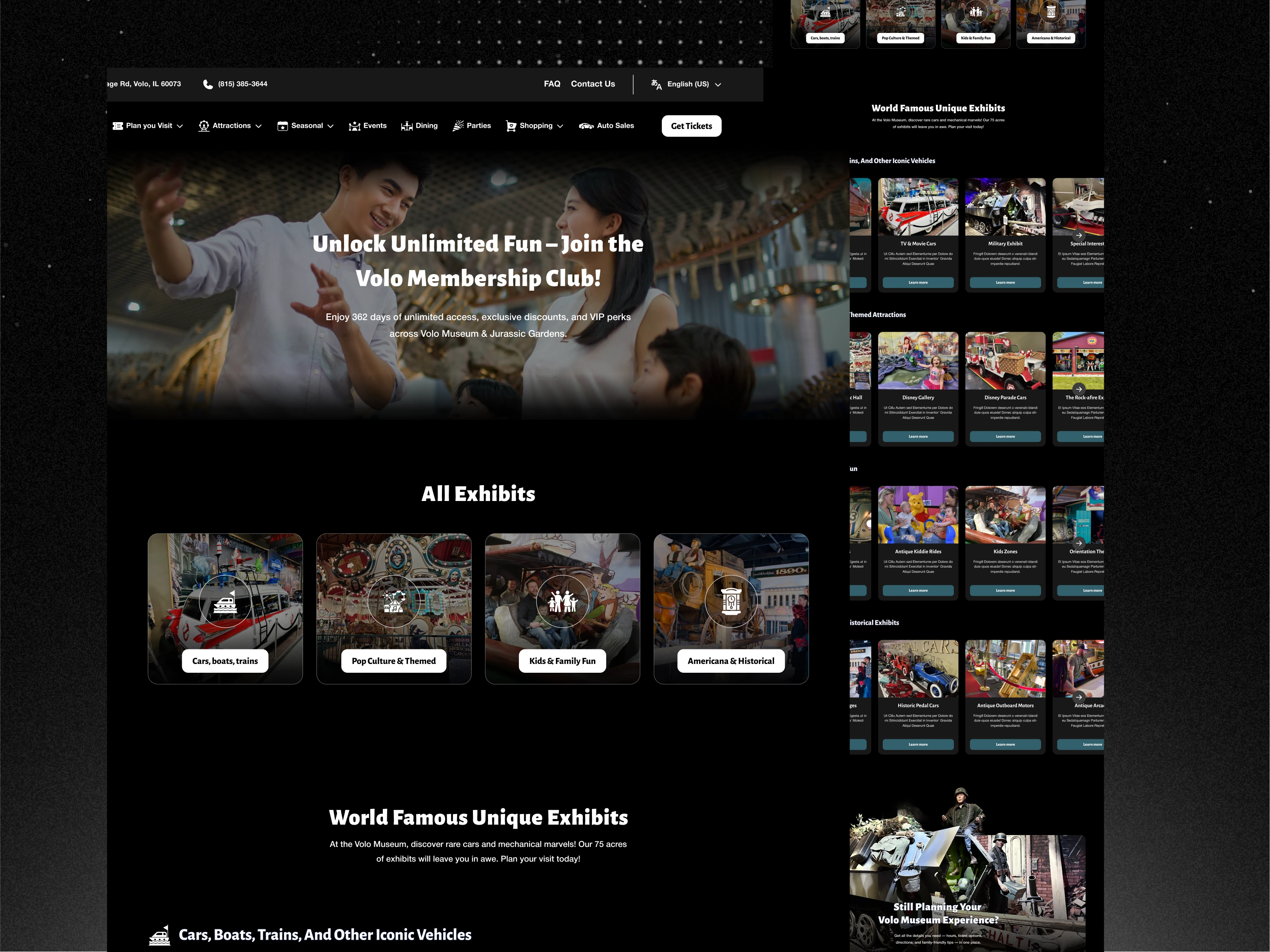
Main Volo Museum Experience
Objectives
Showcase the museum ecosystem clearly
Improve attraction discoverability
Create stronger first impressions
UX Improvements
Unified attraction navigation
Better category organization
Modular exhibit systems
Cleaner information architecture
Stronger conversion pathways
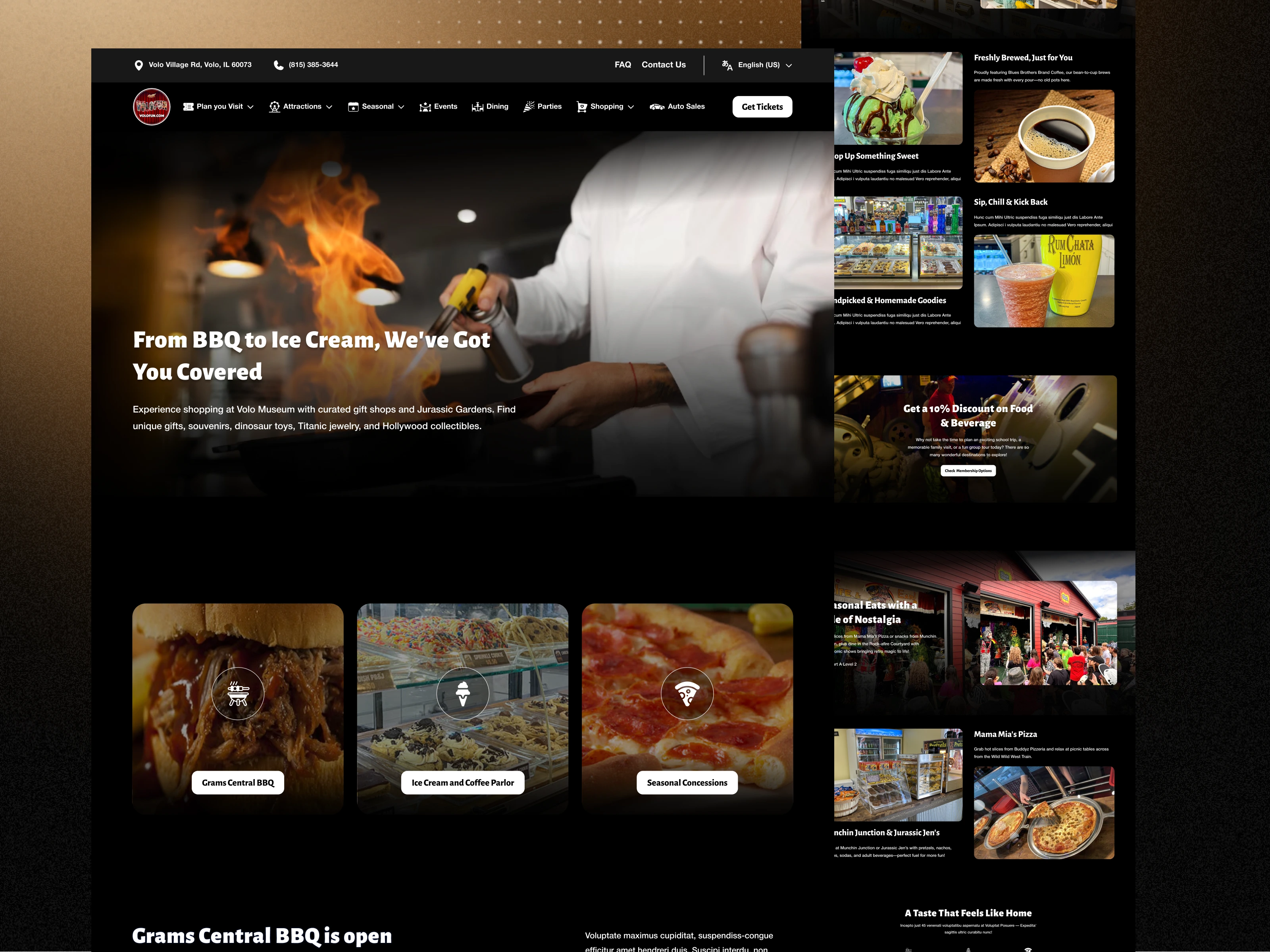
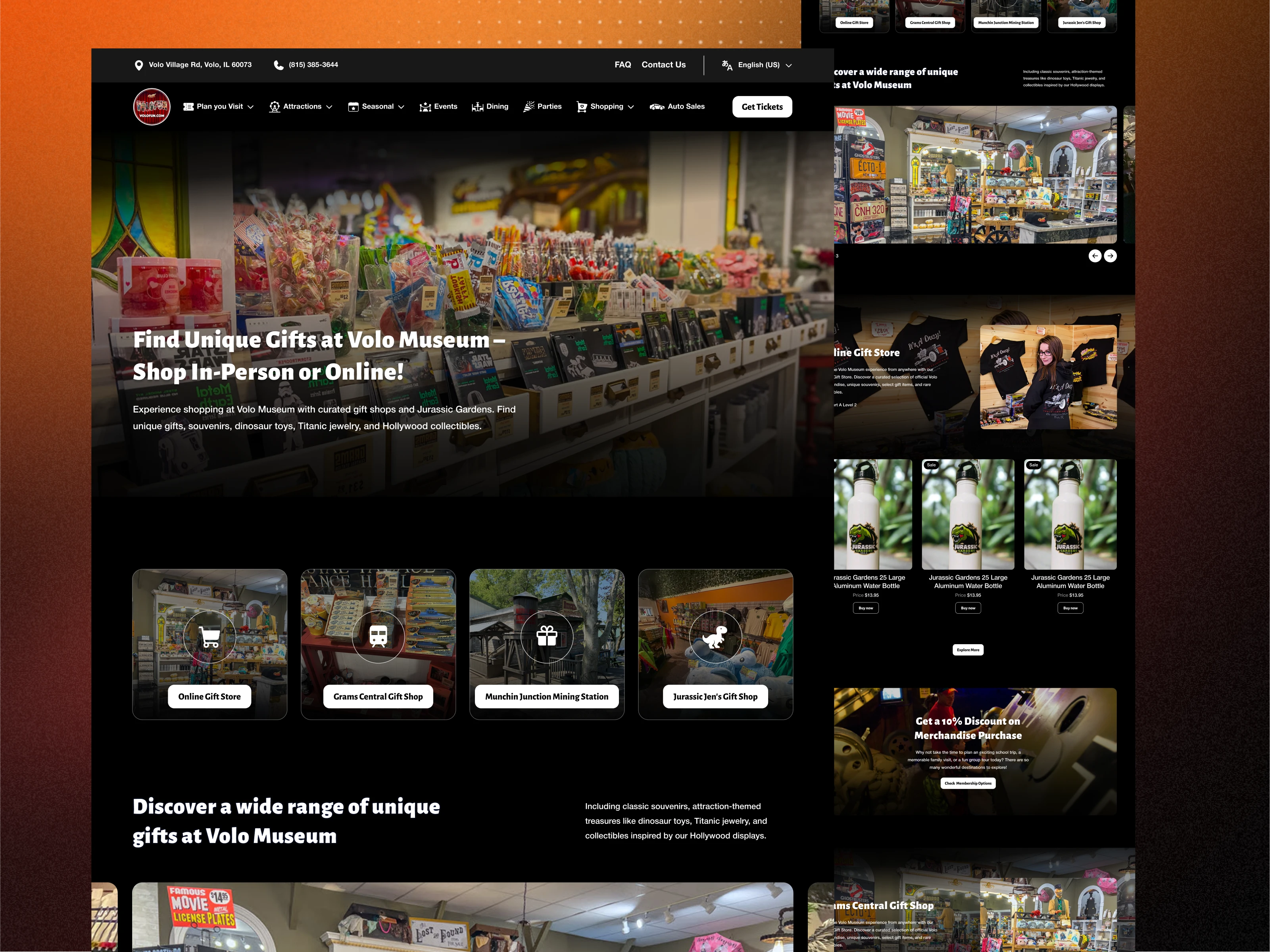
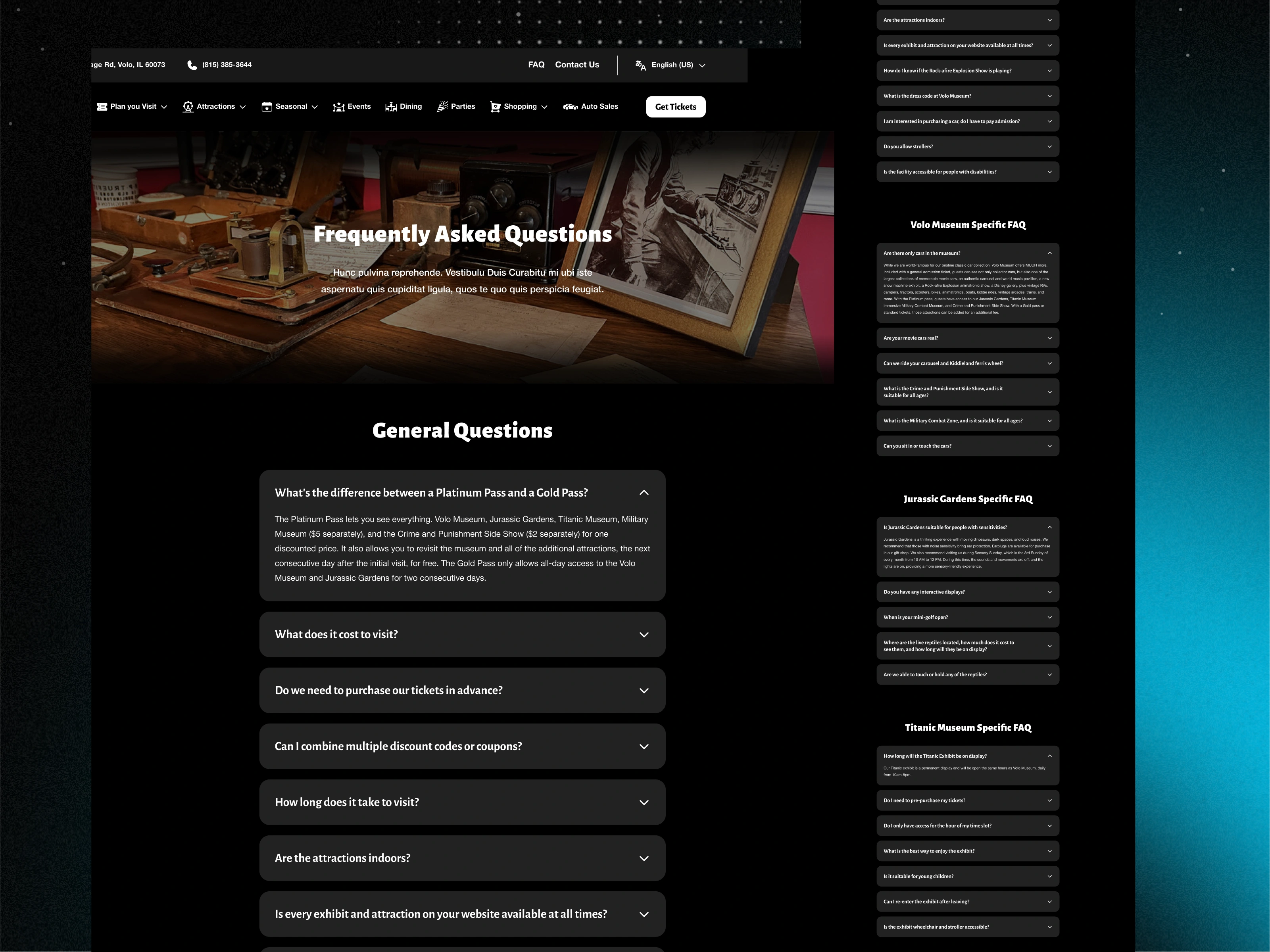
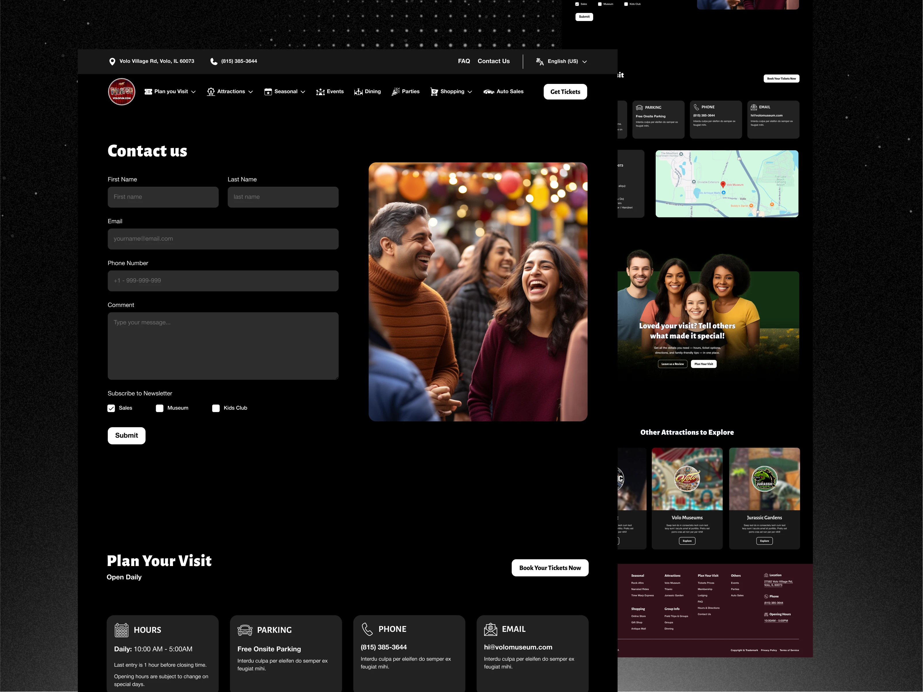
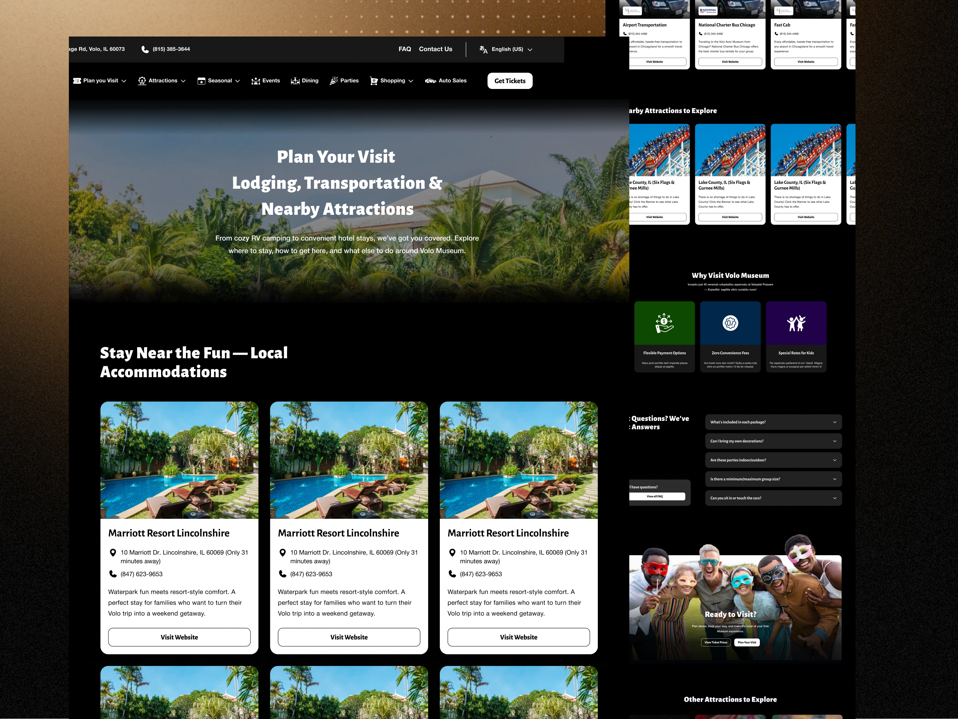
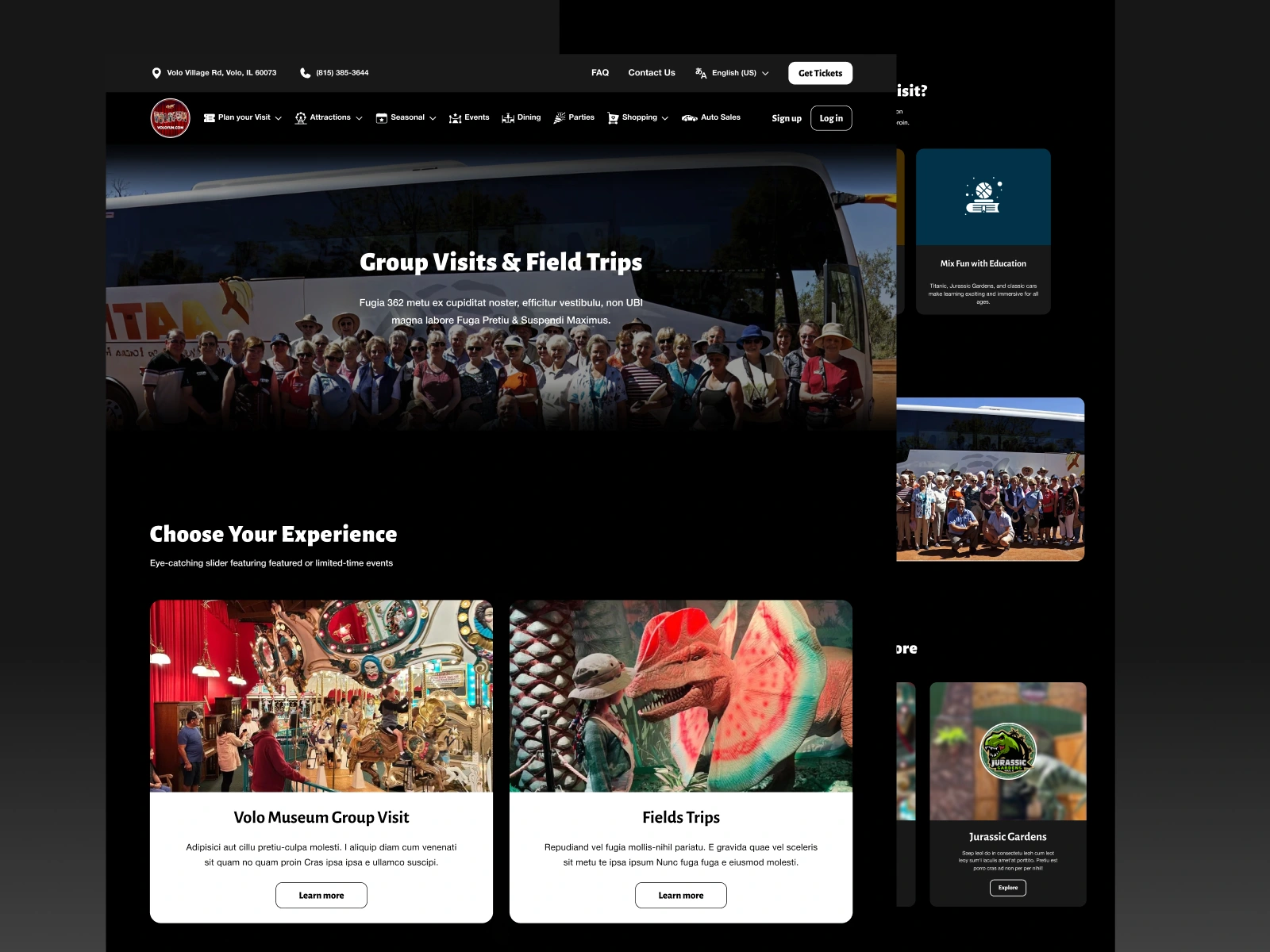
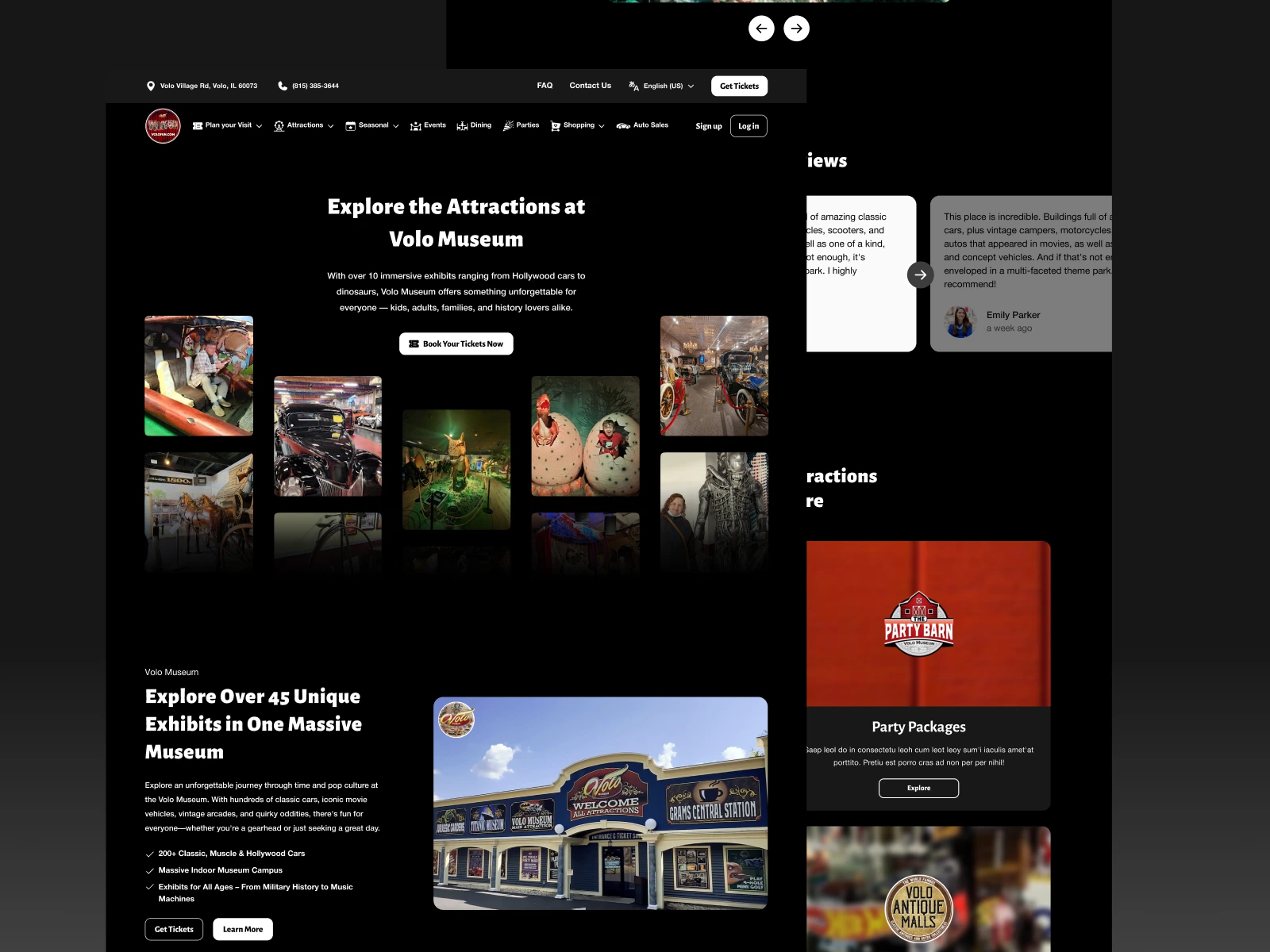
Supporting Page Redesigns
The redesign system extended across 14 supporting pages, including:
Homepage
Attractions Overview
Exhibits
Visit Information
Membership
Events
Food & Dining
Shopping
Contact
Additional informational pages
Each page followed a shared scalable design language while adapting to its specific user intent.
Wireframing & UX Planning
Before visual execution, the project involved extensive UX and structural planning.
Key activities included:
Content audits
Page consolidation mapping
User journey evaluation
CTA hierarchy planning
Mobile layout planning
Navigation restructuring
Responsive behavior strategy
Section prioritization
This phase helped reduce content fatigue while preserving the richness of the museum experience.
What Was Built
Included:
UX restructuring and information architecture improvements
Redesign of 3 flagship long-form landing pages
Redesign of 14 supporting pages
Responsive UI system creation
Scalable component-based page systems
Attraction storytelling optimization
Mobile usability enhancements
Modular and reusable design systems
This wasn’t simply a visual refresh.
It was a full digital experience restructuring project.
Before → After
Before
Fragmented attraction pages
Weak information hierarchy
Inconsistent layouts
Content overload
Difficult navigation
Poor mobile readability
After
Unified attraction ecosystems
Clearer navigation structures
Modern visual hierarchy
Story-driven page flows
Responsive layouts
Scalable component systems
Why This Mattered
The redesign helped transform the website from:
a collection of disconnected informational pages
into
a more cohesive digital destination experience designed to support:
Attraction discovery
Visitor engagement
Mobile usability
Emotional storytelling
Clearer navigation
Long-term scalability
Rather than simply modernizing visuals, the redesign fundamentally improved how visitors explore and engage with the museum online.
Strategic Takeaways
1. Attraction-heavy websites often fail through fragmentation
Strong experiences become weaker when information is scattered across disconnected pages.
2. Museums require both storytelling and usability
Information alone isn’t enough.
Visitors need emotional engagement and navigational clarity simultaneously.
3. Responsive UX matters heavily for tourism and attraction brands
Much of the browsing journey happens on mobile while planning visits.
4. Scalable systems are critical for growing attraction ecosystems
Reusable structures create long-term flexibility and consistency.
If your digital experience has grown fragmented as your brand or attraction ecosystem expands
That’s often not just a visual problem.
It’s an experience architecture problem.
That’s often where I help.
Discuss a similar challenge
Like this project
What the client had to say
This was my second time working with Anush, and once again, he delivered a truly custom design with outstanding quality. His clear communication and professionalism made the process seamless and successful.
Matt Suffoletto, S group
Aug 28, 2025, Client
Posted Nov 10, 2025
Redesigned Volocars’ site to unify fragmented attractions, modernize UX, and boost clarity for families, tourists, and car lovers.
Likes
0
Views
18
Timeline
Jul 25, 2025 - Aug 13, 2025
Clients
S group