Management Console Design for Streaming Data Platform

Jorge Tello Aliaga


Management console for a streaming data platform: from user flows to a working prototype and a tokenized design system
Client: An infrastructure startup (name withheld under NDA)
Role: Product Designer and Design Systems Lead (contract, 2026), sole designer
Tools: FigJam, Figma (variables and modes), Claude Cowork and Claude Code, HTML/CSS/JS, Untitled UI as the starting kit
Introduction
The client is an infrastructure startup whose product puts Kafka event streams behind standard APIs, so application teams can subscribe to a data product the way they subscribe to a REST or AsyncAPI service. The console is the web app where platform teams publish those API products and developers discover and subscribe to them.
I was the sole designer for the next version of the console: the user flows, the interface, a working prototype that engineering built from, and the design system behind it.
The problem
Three kinds of people use the console for three different reasons. A platform administrator has to stand up an environment, attach a gateway and connect Kafka before anything else works. An API producer publishes and versions API products backed by Kafka topics. An application developer wants to find an API product, subscribe and get credentials in under a minute. The first version of the console had been built without a shared flow or a system, so every new screen was a one-off.
1. Flows before screens
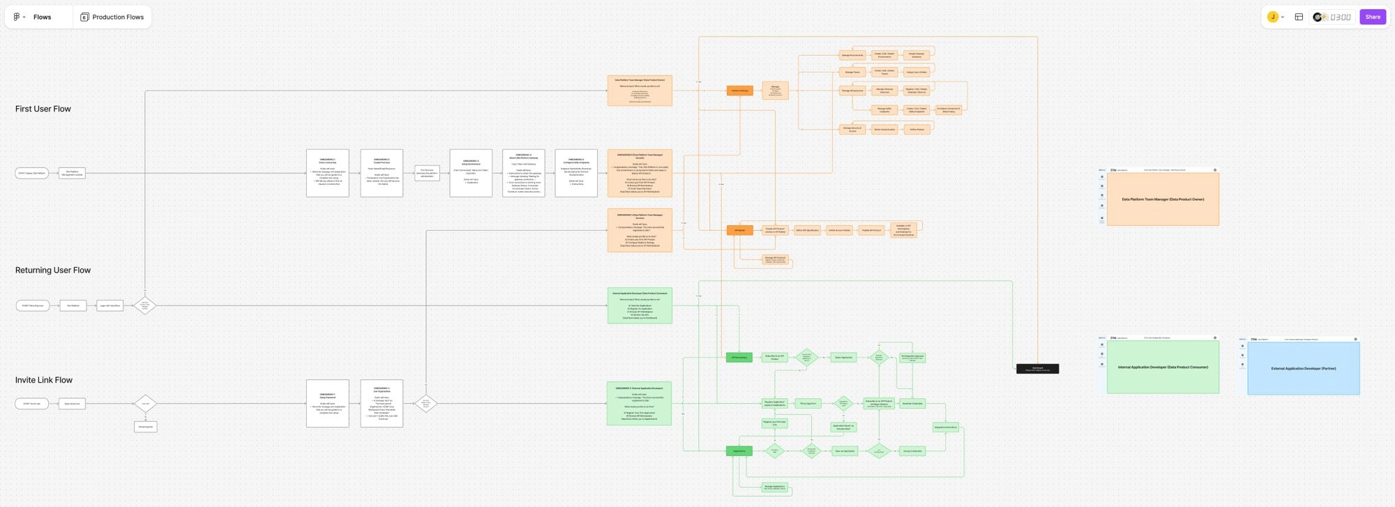
I mapped the first-run, returning-user and invite-link journeys in FigJam for each persona. The first run became a six-step onboarding: enter the license key, create the first user (who becomes the platform administrator), set up an environment, attach the gateway and confirm the connection, configure the Kafka endpoints (bootstrap servers, security protocol, authentication), and a success state that offers the three sensible next actions: create your first API product, browse the catalog, or invite your team.
2. Wireframes to settle the structure
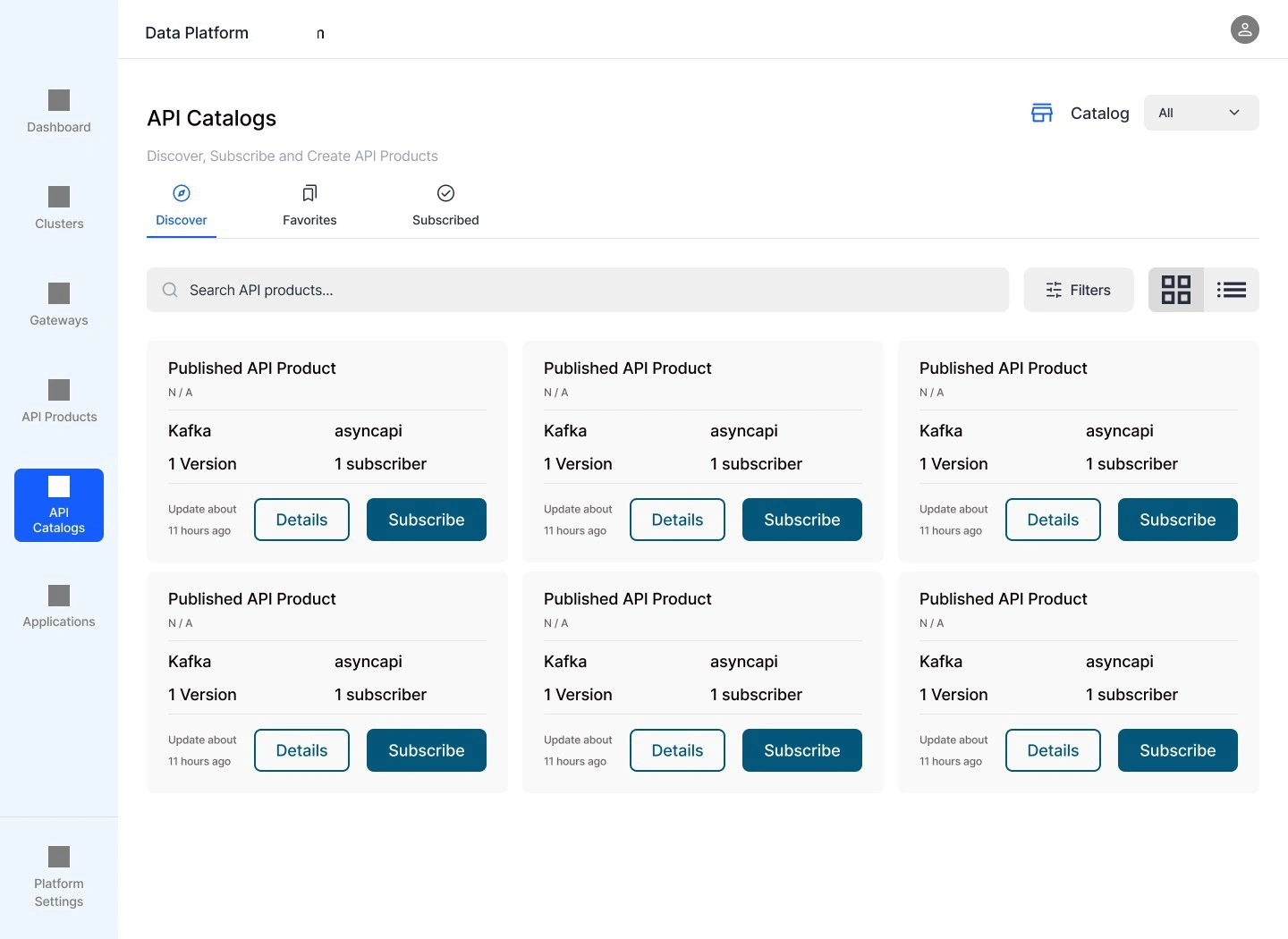
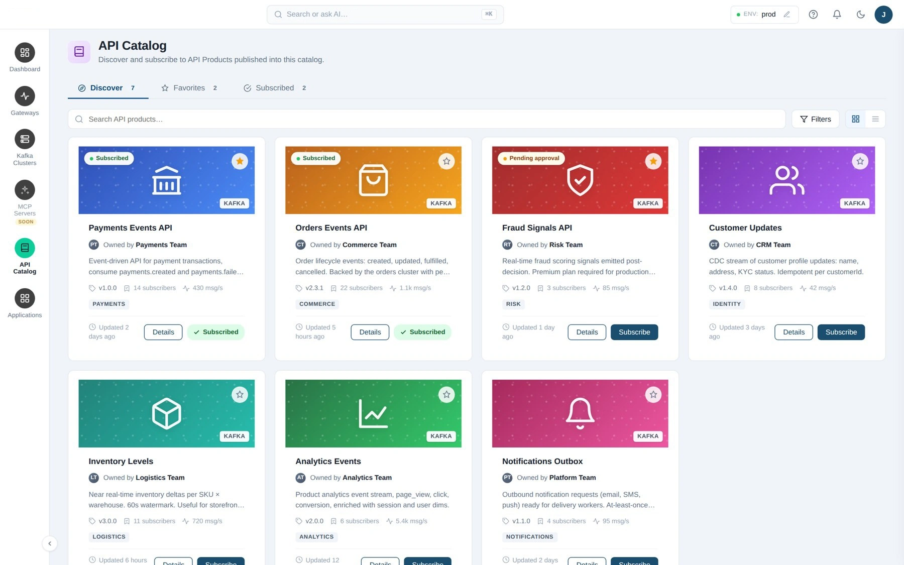
With the flows agreed I wireframed the API Catalog: left navigation (Dashboard, Clusters, Gateways, API Products, API Catalog, Applications, Platform Settings), Discover, Favorites and Subscribed tabs, search and filters, grid and list views, and a product card that carries protocol, spec type, version, subscribers and last update.
3. Visual directions on one wireframe
I explored several visual directions on the same structure so the team could choose on substance rather than taste. Three of them are shown here: a light shell with isometric card art, a full dark space-themed direction, and a dark direction with glass cubes and a violet accent. Because the information architecture did not change between them, the comparison was only about tone, density and legibility.
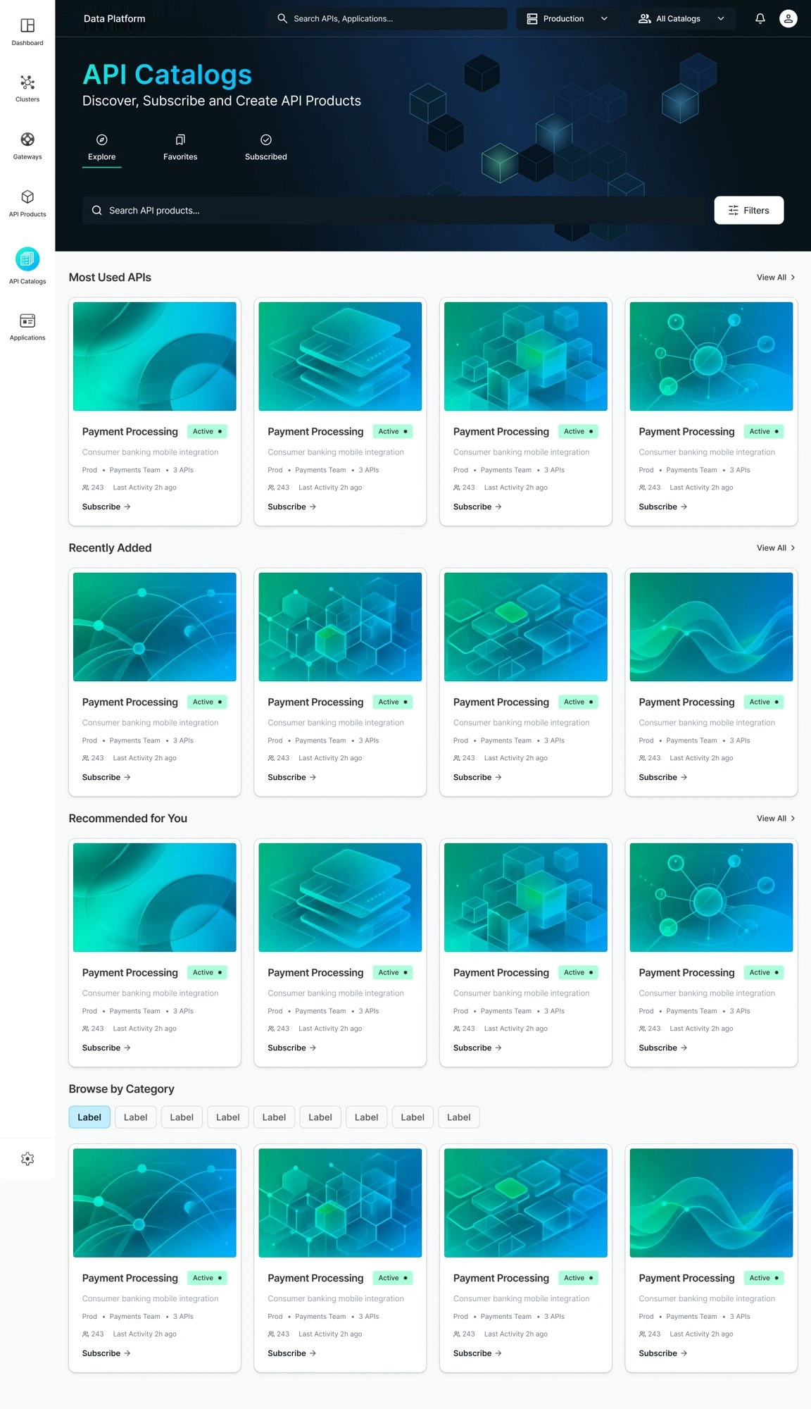
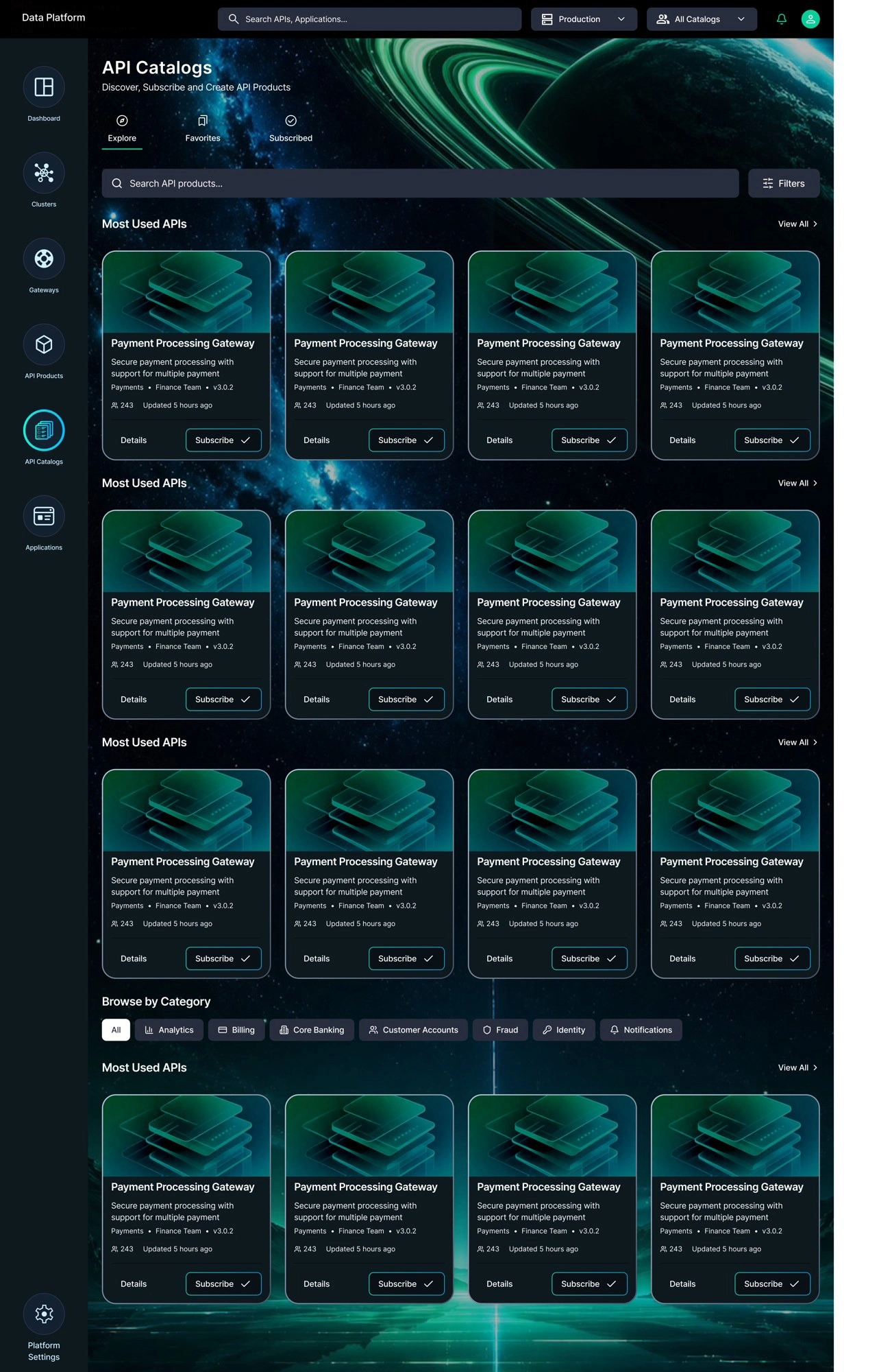
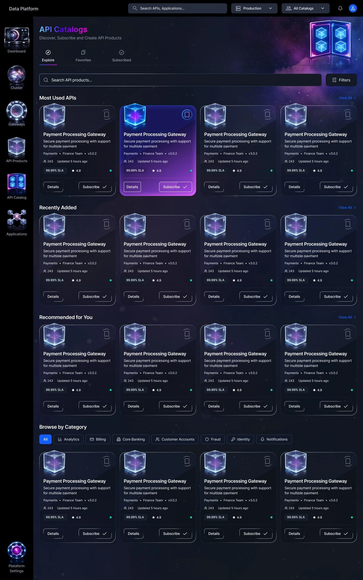
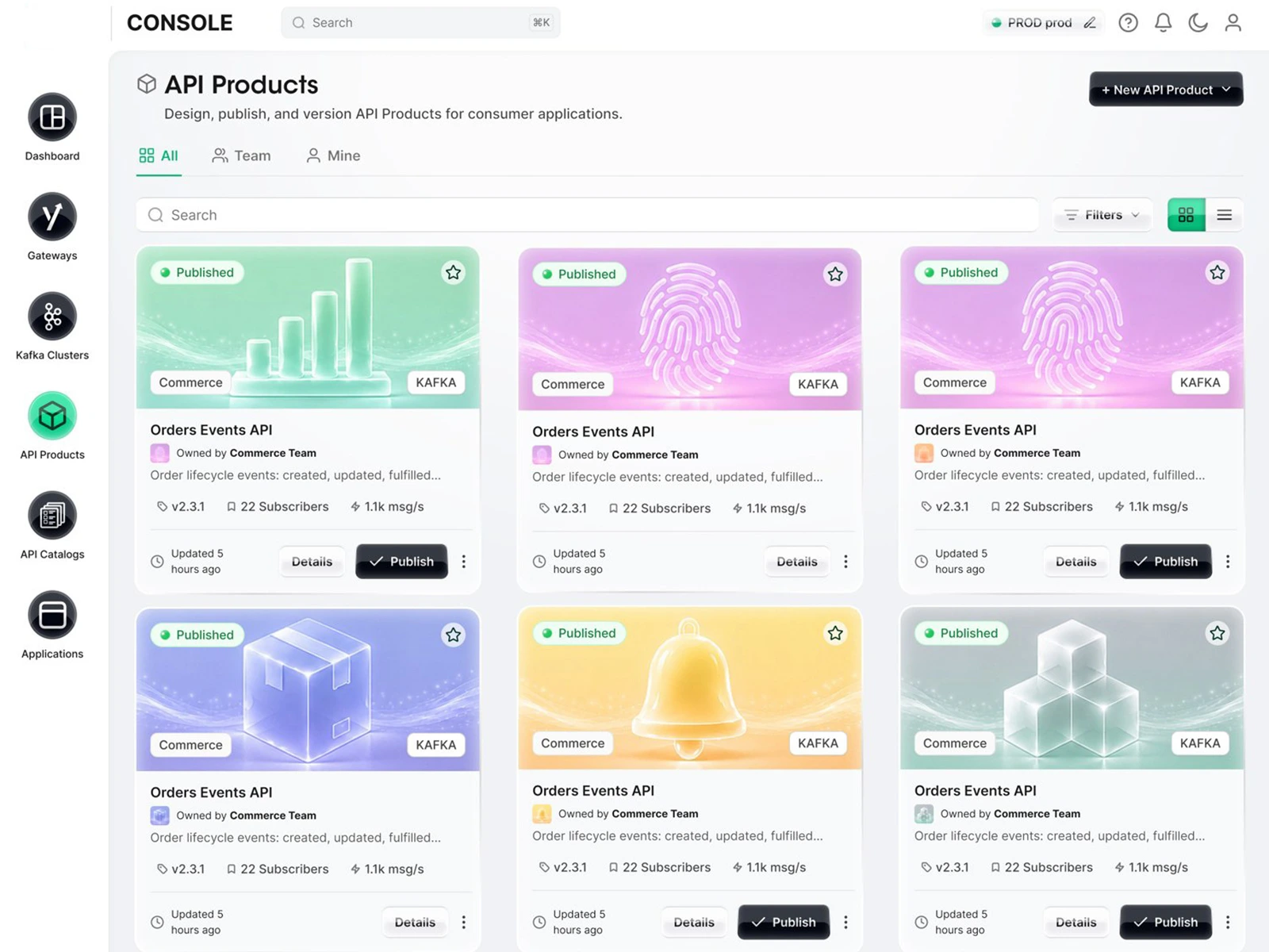
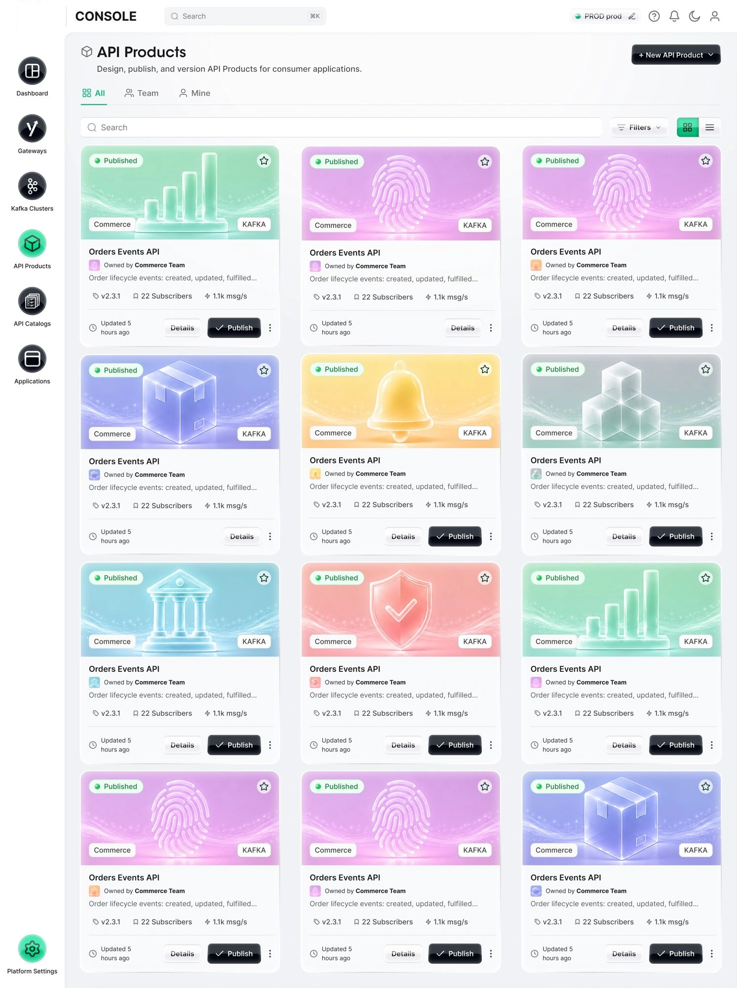
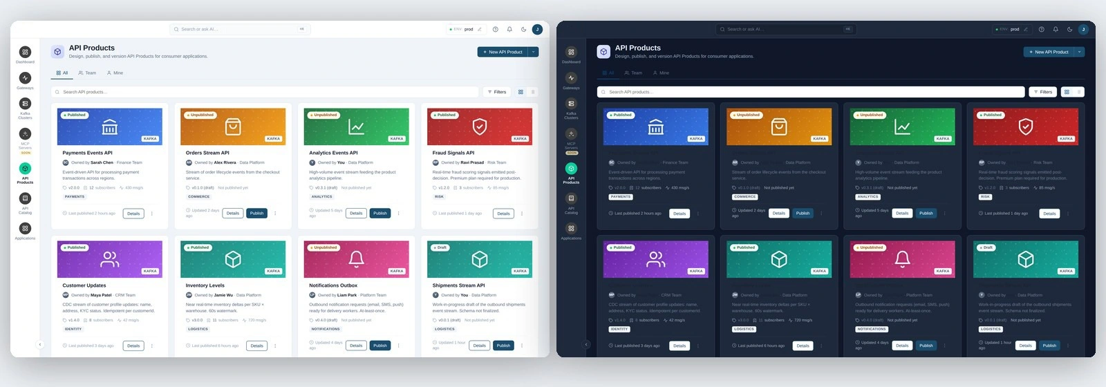
The direction we settled on was none of these: a light shell with soft gradient card art and black primary buttons, shown below. It became the basis for the prototype and the design system.
4. A working prototype, not a click-through
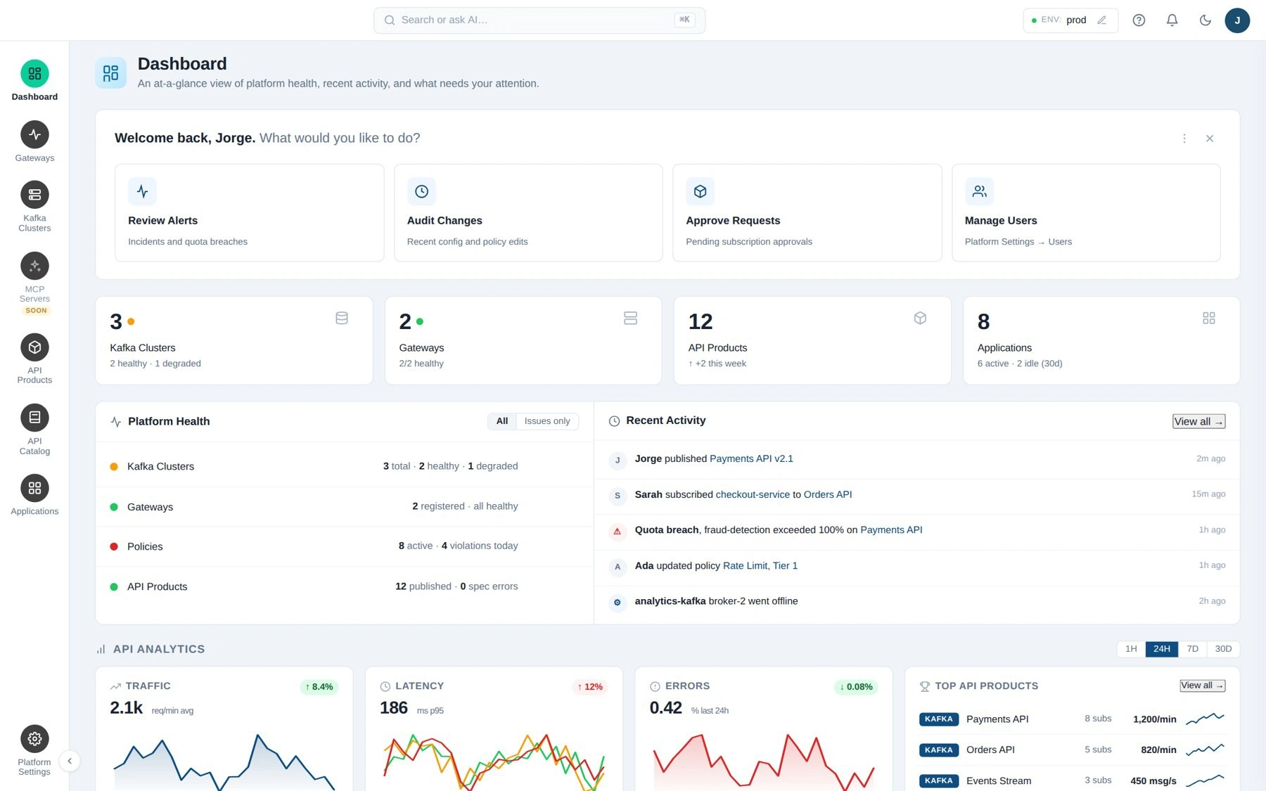
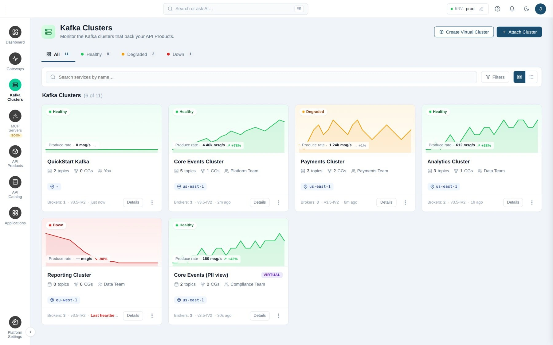
Instead of a Figma click-through I built the console as a working HTML, CSS and JavaScript prototype with Claude Cowork and Claude Code, on a shared chrome system with CSS tokens. Every non-runtime screen exists and works: dashboard, gateways, Kafka clusters, API products (create from a topic, author the spec, version, publish), API catalog (discover, subscribe, reveal-once SASL credentials), applications, platform settings (access, environments, security, audit, organization), inbox and profile. The URL carries the persona (admin, producer, consumer, viewer) and the sidebar adapts. The environment switcher, workspace switcher, dark mode, global search with deep links to every entity, and a three-phase Quickstart tour all work. Nothing is wired to a backend; everything else behaves like the product.
The team used it for stakeholder review and client demos, and I handed the code to engineering as the implementation reference, with a JSON file of curated help content for the in-app help panel.
5. The decision the prototype surfaced
Building the real flows exposed a modeling gap: the prototype had two contradicting credential concepts, an application-level API key and per-subscription SASL credentials. A thread with the engineering leads settled it against what the Kafka runtime actually uses: credentials are per subscription, and an application is only a grouping identity. I refactored every subscription path end to end, unified the credentials modal across both entry points, added a queue for registering an app with several subscriptions at once, and swept the copy for stale language. That is the kind of question a static mockup never asks.
6. Design principles that held the system together
Text buttons for row actions, never icons. Status pills for state, actions as explicit buttons. Muted pills for settled states, saturated pills for exceptions, so a problem is visible in a wall of healthy rows. Green is a signal, not decoration: it marks selected, active and healthy, and primary buttons went black so green keeps its meaning. One color per meaning: amber for waiting, red for critical, gray for inactive. Fill contrast instead of heavy strokes on cards and code blocks. A kebab menu only when there are two or more real secondary actions. Sentence case everywhere.
7. The design system
The client was in a hurry, so I started from the Untitled UI kit and re-tokenized it for the product rather than building from zero, then cut what the product did not need. In Figma variables:
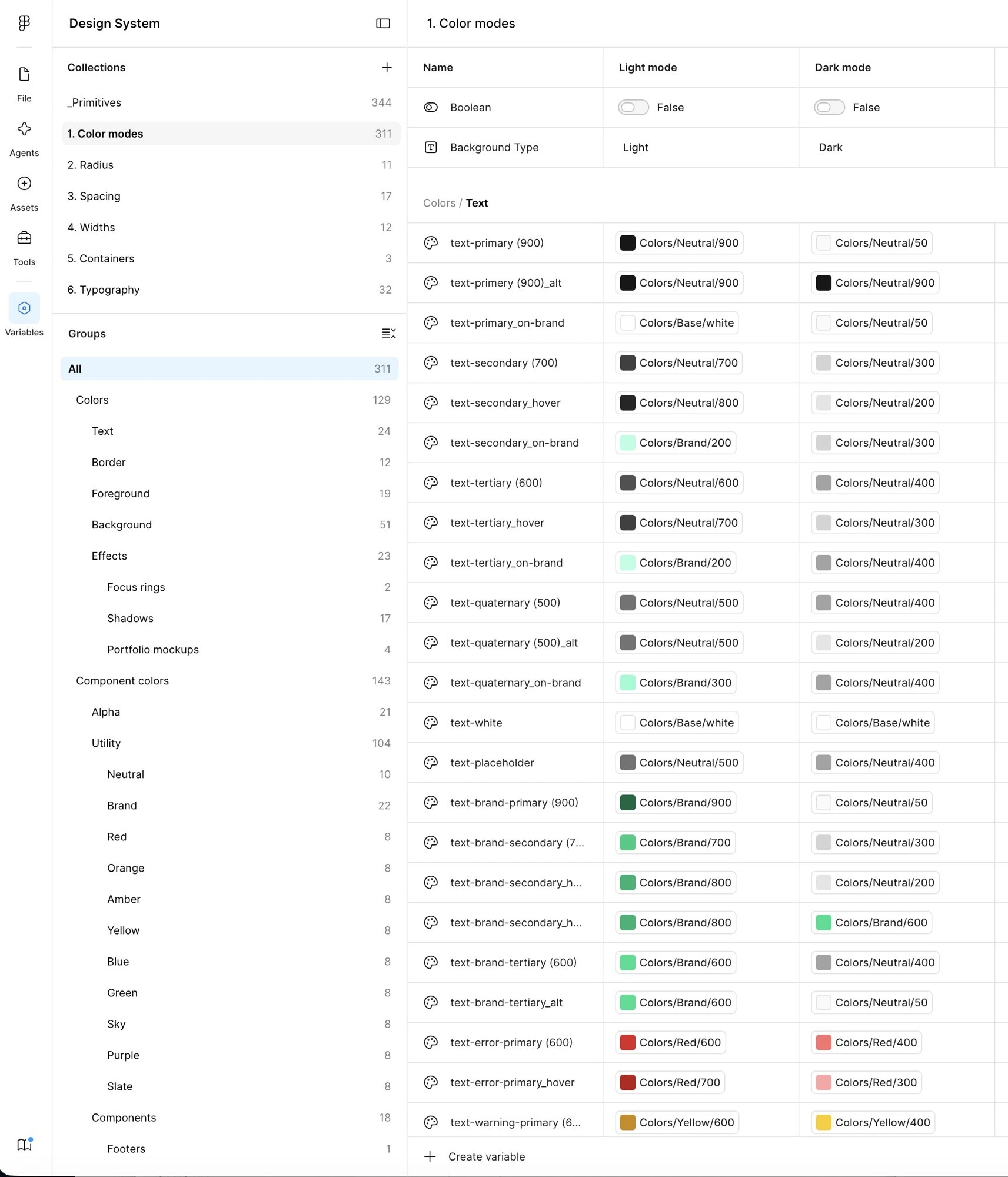
344 primitives: color scales for neutral, brand, red, orange, amber, yellow, blue, green, sky, purple and slate.
311 semantic color variables with Light and Dark modes: text, border, foreground, background and effects, plus 143 component colors. Every semantic token aliases a primitive, so dark mode is a mode switch, not a second file.
Radius, spacing, width and container collections.
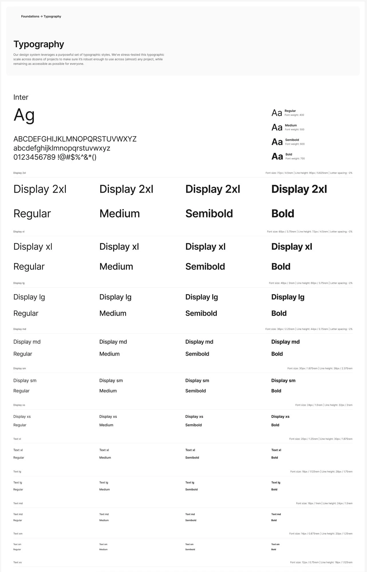
A 32-style type scale on Inter, Display 2xl through Text xs, four weights each, with JetBrains Mono for code.
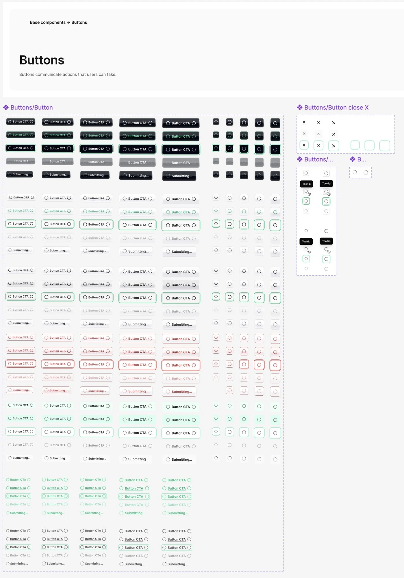
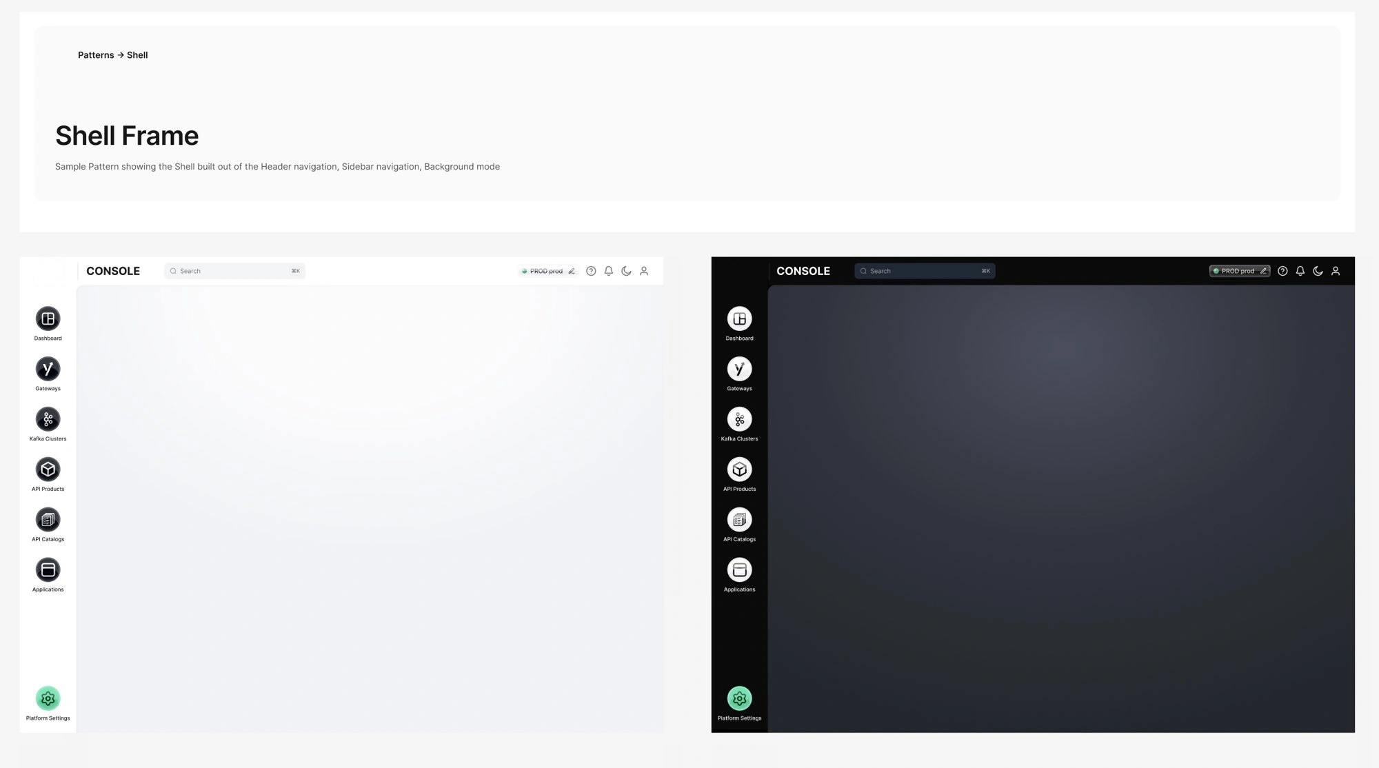
Base components with full state coverage: buttons in five hierarchies with hover, focus, disabled and loading states, icon-only and close variants; cards; the shell frame in light and dark; and the console patterns built from them.
The same tokens live in the prototype as CSS custom properties, so engineering maps Figma to code one to one.
Outcome
Engineering received a working reference for every screen, a token set that maps directly to CSS variables, a component library with states already defined, and the curated help content as data. The new console has since signed its first customer.
Like this project
Posted Sep 16, 2026
Designed a console from user flows to prototype with a design system for a streaming data platform.
Likes
0
Views
11