Freelancers using Figma in Miami
Sign Up
Post a job
Sign Up
Log In
Filters
2
Projects
People
Jeremie Lasnier
max
Miami, USA
Branding, Product & Web Design that convert
$100k+
Earned
16x
Hired
5.0
Rating
1.7K
Followers
expert
Follow
Message
Branding, Product & Web Design that convert
3
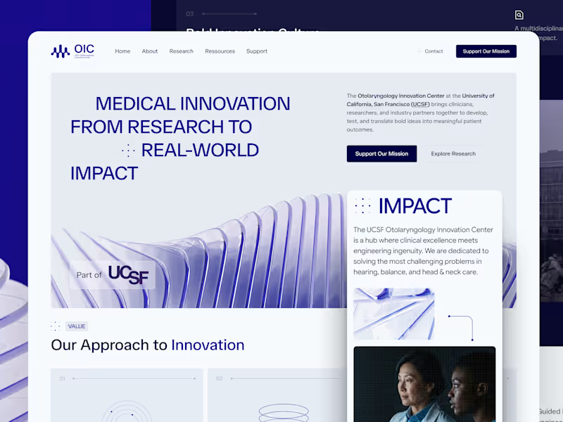
UCSF OIC Visual Identity and Digital Experience
3
59
11
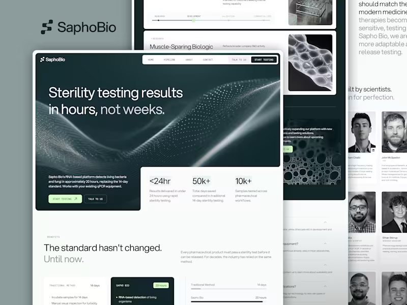
Sapho Bio | Brand & Website Design for Biotech Startup
11
172
18
Enterprise Website Redesign for 3-11 Cloud Consulting
18
205
22
Branding & Web Design SymphonIQ Enterprise AI Platform
22
262
Figma
(16)
Follow
Message
Carolina Rubio
pro
Miami, USA
Your brand shouldn’t feel assembled.
1x
Hired
5.0
Rating
25
Followers
Follow
Message
Your brand shouldn’t feel assembled.
0
Bilt2Travel
0
7
1
Vega Tax Solutions — Brand Strategy & Full Identity
1
18
1
Surface Glow: Brand Strategy, Identity and Website
1
21
1
C8SED Phone Case Brand Identity Development
1
25
Figma
(4)
Follow
Message
Lauren Holliday
Fort Lauderdale, USA
Journalist with a marketing mindset 🦄
$25k+
Earned
10x
Hired
5.0
Rating
91
Followers
Follow
Message
Journalist with a marketing mindset 🦄
3
Copywriting examples
3
120
1
Increasing Organic Traffic by 389% in 9 Months
1
27
2
A Website Transformation for a Local Indoor Playground
2
161
7
LinkedIn Organic Marketing for Tech Founder & Investor
7
113
Figma
(3)
Follow
Message
Jacob Howard
The Hammocks, USA
Graphic + UI Designer for brand, web, and motion
1x
Hired
113
Followers
Follow
Message
Graphic + UI Designer for brand, web, and motion
0
JOOPITER Digital Auction Redesign
0
18
0
Venice Biennale 2025 Web Platform Design
0
25
0
Green Snap Motion Graphic Design
0
11
0
Red Pulse Motion Graphic Design
0
19
Figma
(8)
Follow
Message
Anton Zalis
pro
Fort Lauderdale, USA
Design and development studio - web, mobile, AI.
5.0
Rating
35
Followers
Follow
Message
Design and development studio - web, mobile, AI.
0
REWHIP
0
12
0
Pink Wallet - AI Powered Crypto Wallet
0
17
1
For the uninitiated, NRFI is the "espresso shot" of sports betting. You’re betting that both teams will record three outs in the first inning without anyone crossing home plate. Six outs. Zero runs. Total chaos. In an age of TikTok-length attention spans, waiting three hours for a game to end feels like a lifetime. NRFI gives you a result before your DoorDash even arrives. The Market: Micro-betting is currently the fastest-growing segment in the $15B+ US sports betting industry. The Demographic: It captures the "second screen" generation that wants high-frequency engagement. The Problem: Until now, "researching" an NRFI bet meant having 14 browser tabs open, refreshing a weather map, and praying to a Twitter tipster named @BaseballBilly69. That’s why we built NRFI Zone. 🚀
1
292
2
Using the Bat-Signal was an outdated and impractical solution for Gotham City. It was bulky, difficult to set up, required miles of cabling, and offered zero customization for how Batman actually showed up. So Improvs.com (http://Improvs.com) built a custom mobile app — giving Gotham citizens a faster, smarter way to call their Batman… and even customize how he arrives. Because even heroes deserve better UX. Thoughts?
5
2
404
Figma
(10)
Follow
Message
Marcelo Russo
Miami, USA
Certified Webflow Professional Partner
5.0
Rating
38
Followers
Certified Partner
Follow
Message
Certified Webflow Professional Partner
0
Helping Scribe Launch Faster with Webflow
0
11
0
Multilingual Website Development for Higlobe
0
5
0
Interactive Digital Kiosk for AFLCMC
0
15
0
The Dominus Project: Building a Faith-Centered Digital Community
0
6
Figma
(13)
Follow
Message
Patrick Lopes
Miami, USA
Senior Product Designer + Frontend Developer | AI-Assisted
7
Followers
Follow
Message
Senior Product Designer + Frontend Developer | AI-Assisted
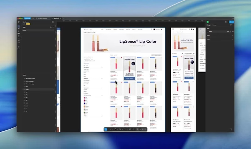
2
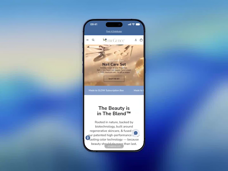
I started the SeneGence checkout redesign by looking at where people stopped. The behavior data and stakeholder feedback pointed to the same place. Navigation was confusing, mobile and desktop didn’t match, and checkout required an account before anyone could pay. I took the checkout first. Dropping the account requirement was the biggest change, and the rest was making each step clear about what was coming. The video is me going through the mobile checkout as it works now. It’s short, which is the point. The full redesign ran six months and ended up with 80K+ conversions and over $7M in revenue. I was the designer on it from problem definition through delivery, working with engineering and the business team. If you’re stuck on a conversion problem, start by finding the exact screen where people leave. Redesign that one first.
2
43
2
Every product page decision has a job to do before someone ever reaches checkout. On the SeneGence PDP, the job was simple to state and hard to execute: help someone choose a shade with confidence. That meant building the color swatch grid as the primary interaction, not a secondary detail, with limited edition tags called out clearly so nobody's disappointed after checkout. Related shades and complementary products show up right below, so discovery doesn't dead-end at one product. On the listing page, filters had to hold up across dozens of SKUs. Mobile users get a filter drawer with chips for active selections. Nothing gets buried behind a menu they'll forget to check. Case study here: patlopes.com/case/senegence-redesign
2
139
1
Almost 100K redemptions. 40K+ unique customers. Average of 2.3 plans per person. That's what happened when we gave Straight Talk prepaid customers a short-term bridge instead of forcing a full monthly commitment they couldn't afford. The flow sounds simple. Pick the plan, see clear pricing, know exactly what happens when it expires. But getting there meant working through eligibility rules, cross-channel consistency across web and app, and messaging that had to land for stressed out customers. The prototype in this video was one step in that process. Full case study at patlopes.com (http://patlopes.com).
1
196
6
The KFC product detail page had a problem that's pretty common in high-traffic ordering flows. It worked fine most of the time. But at the moment customers needed to make a decision like customizing a meal, confirming selections, adding to the cart, it introduced just enough confusion to slow things down or cause drop-off. Three specific issues: the mobile layout buried key content below an oversized image, customization options were duplicated in a way that felt broken, and there was no clear view of selections before checkout. The work focused on those three things only. No full redesign, no new features. Result: 88% task success across platforms, 20% faster completion, and 90% of participants reported higher satisfaction. Full breakdown on my portfolio: https://www.patlopes.com/case/kfc-pdp-redesign
4
6
252
Figma
(10)
Follow
Message
Julien Gray
Miami, USA
UX/UI Designer - Figma, Webflow, Gen AI Expert -15 years exp
5.0
Rating
38
Followers
Follow
Message
UX/UI Designer - Figma, Webflow, Gen AI Expert -15 years exp

3
Moolax | Personal Finance Platform Design
3
21
1
SeatTime | Brand Style Guide Development
1
13
0
YourSong | custom song
0
8
0
Rigfish | Music Gear Management Platform
0
14
Figma
(10)
Follow
Message
Explore people