SeatTime | Brand Style Guide Development
Julien Gray

Brand Style Guide Process for SeatTime
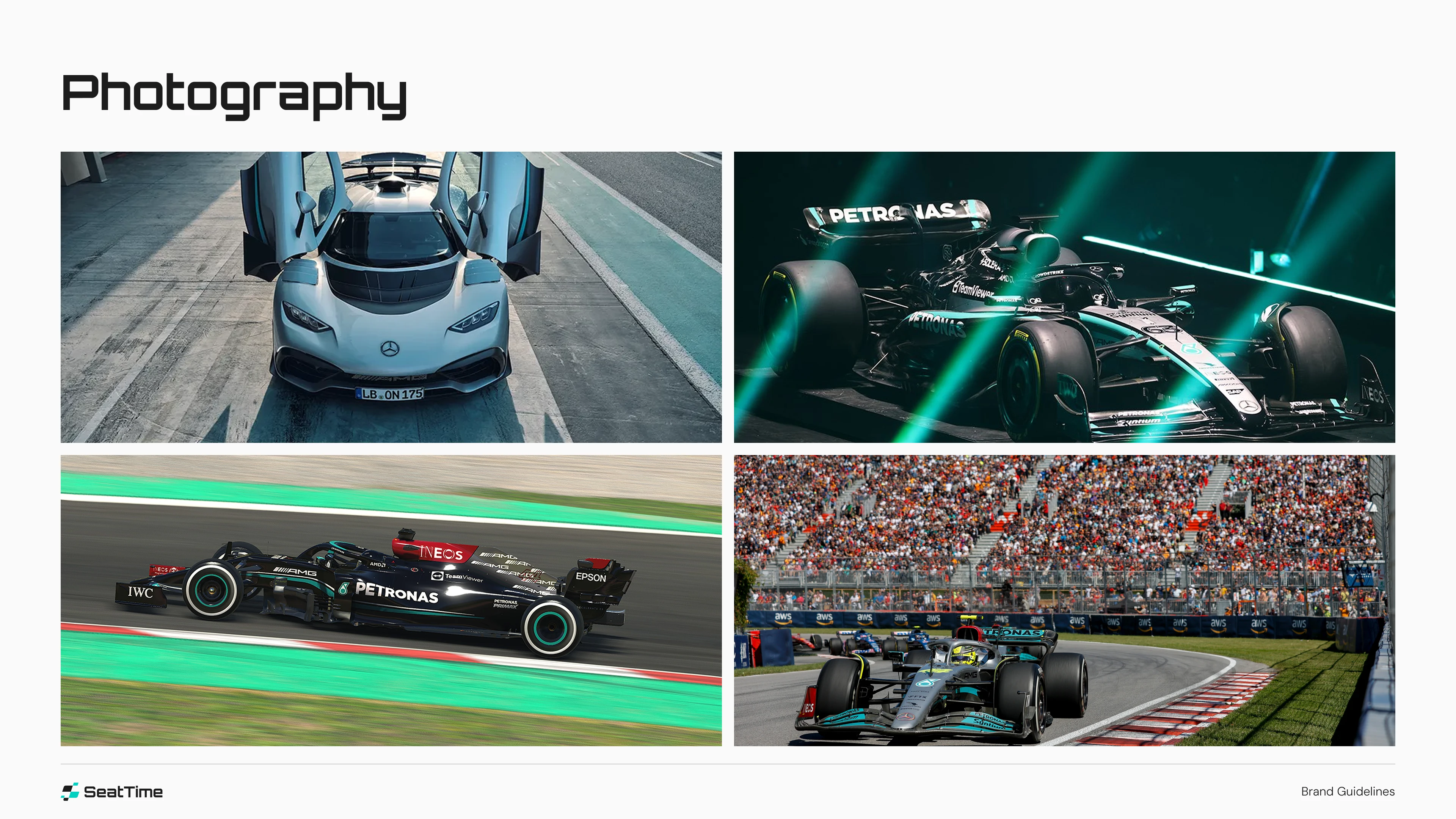
Creating the brand style guide for SeatTime began with a deep dive into the world of motorsports and the mindset of modern racing enthusiasts. The app's core mission — to help race drivers log lap times, fine-tune car configurations, and optimize performance — inspired a brand identity that feels precise, technical, and fast.
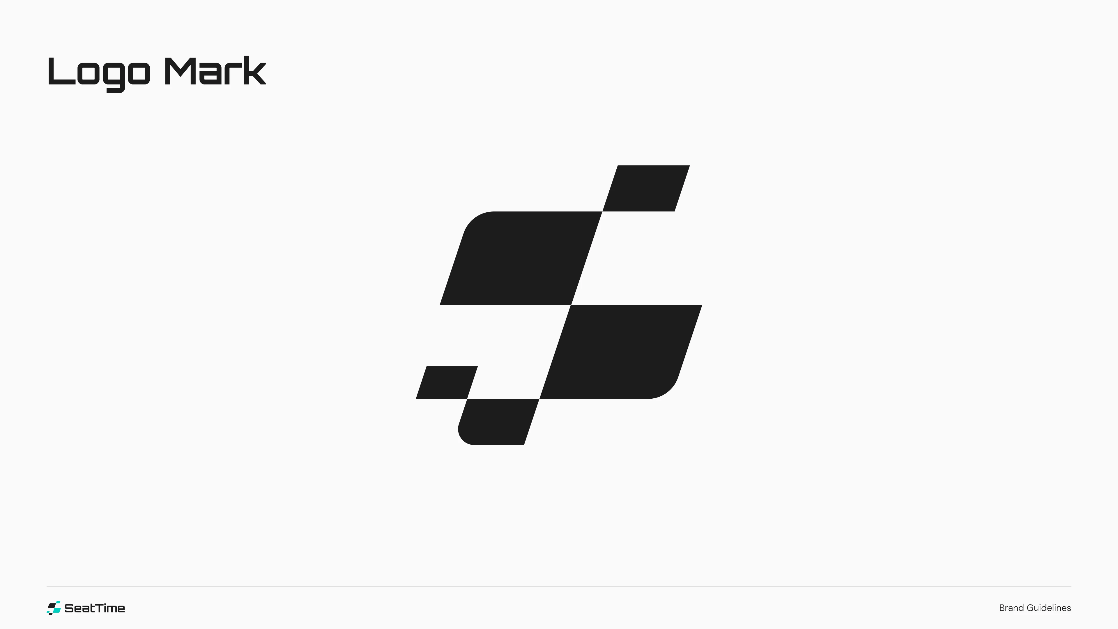
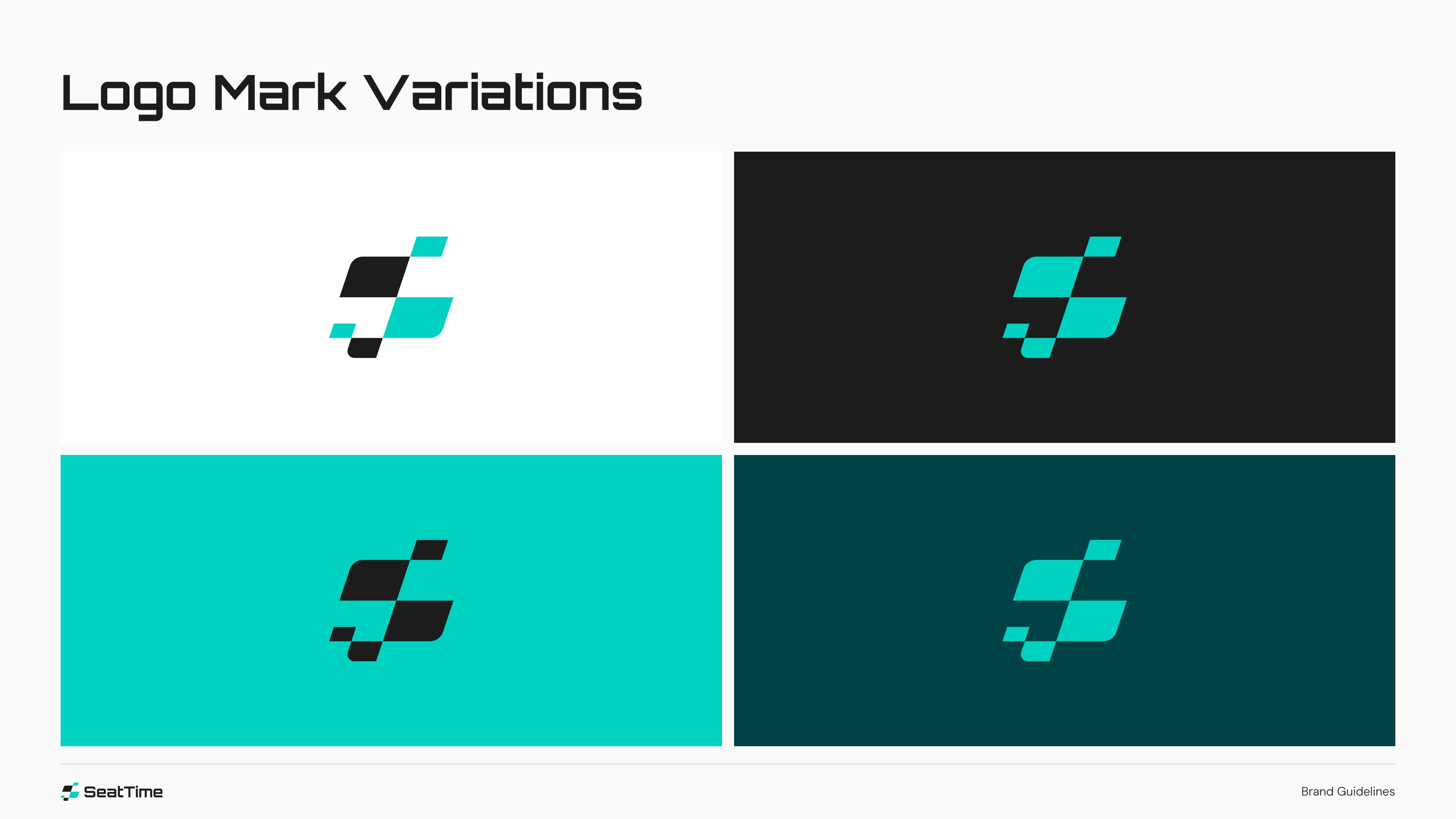
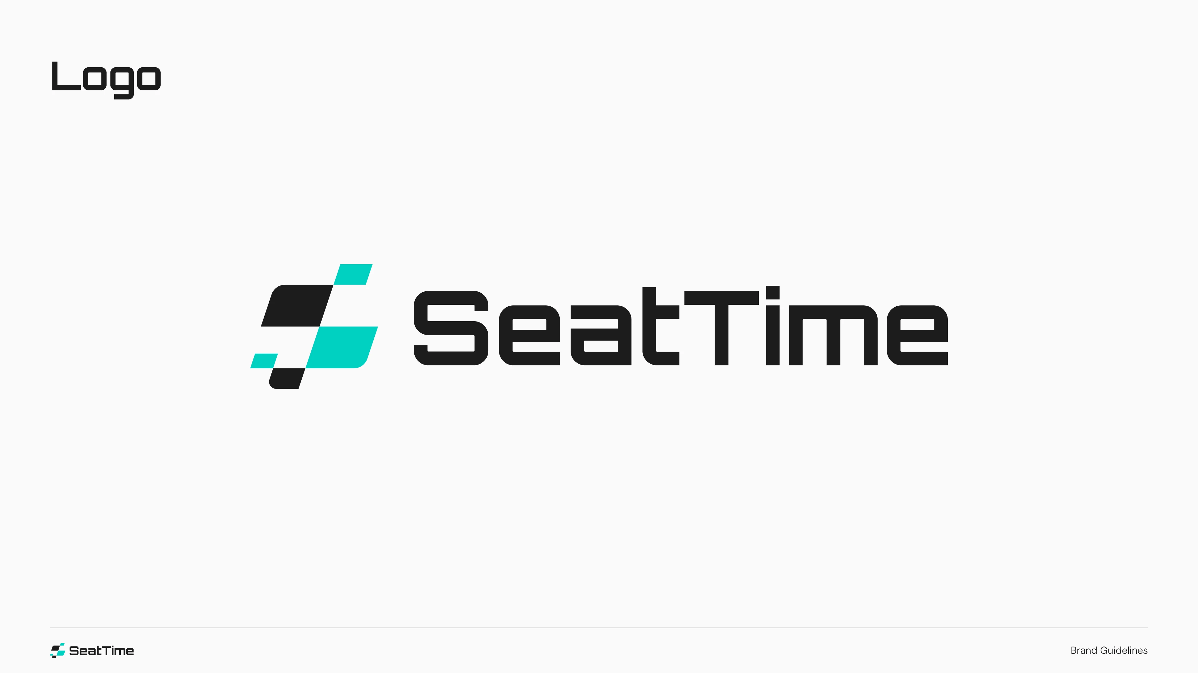
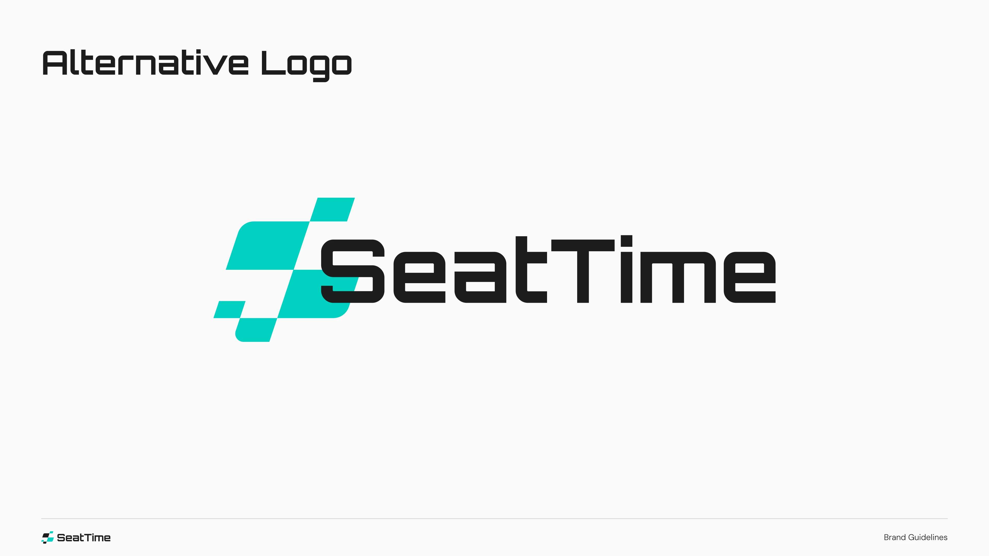
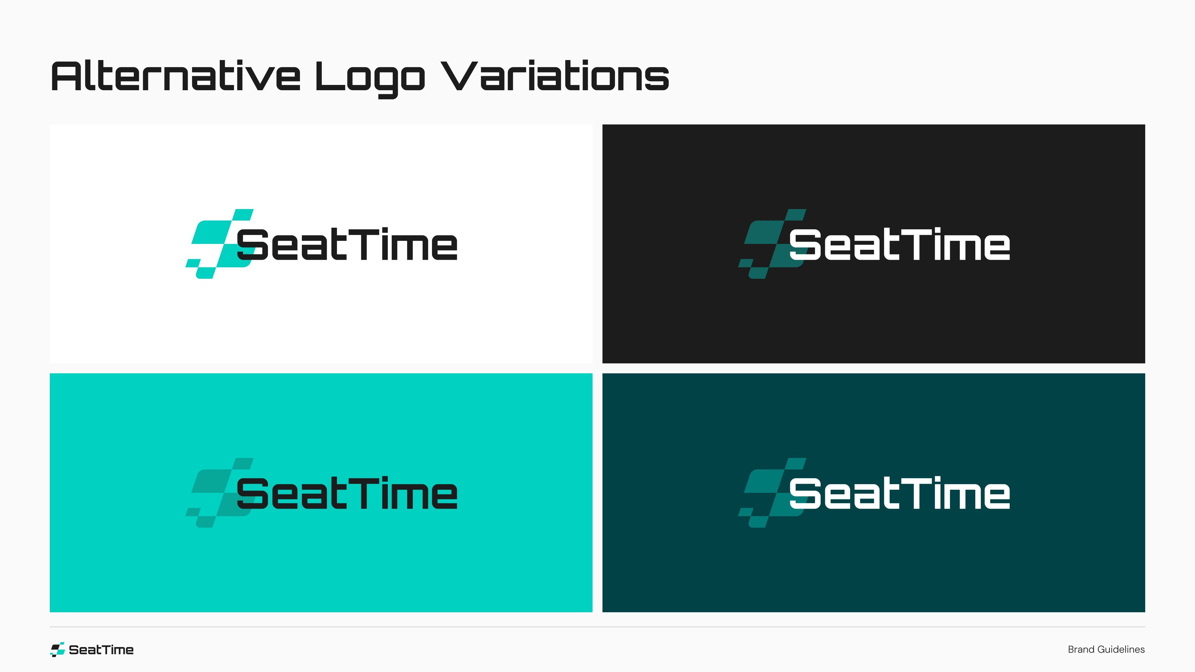
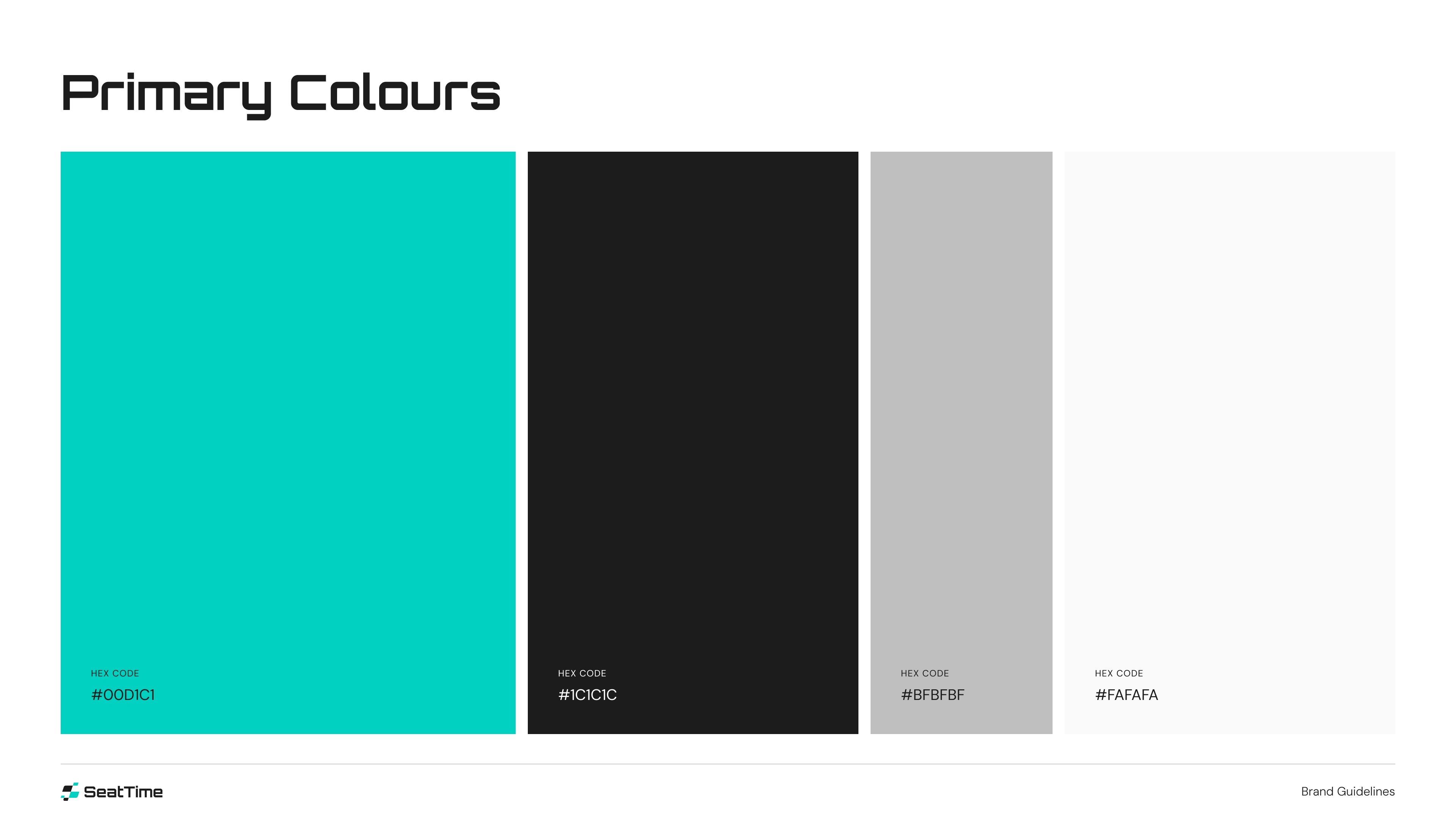
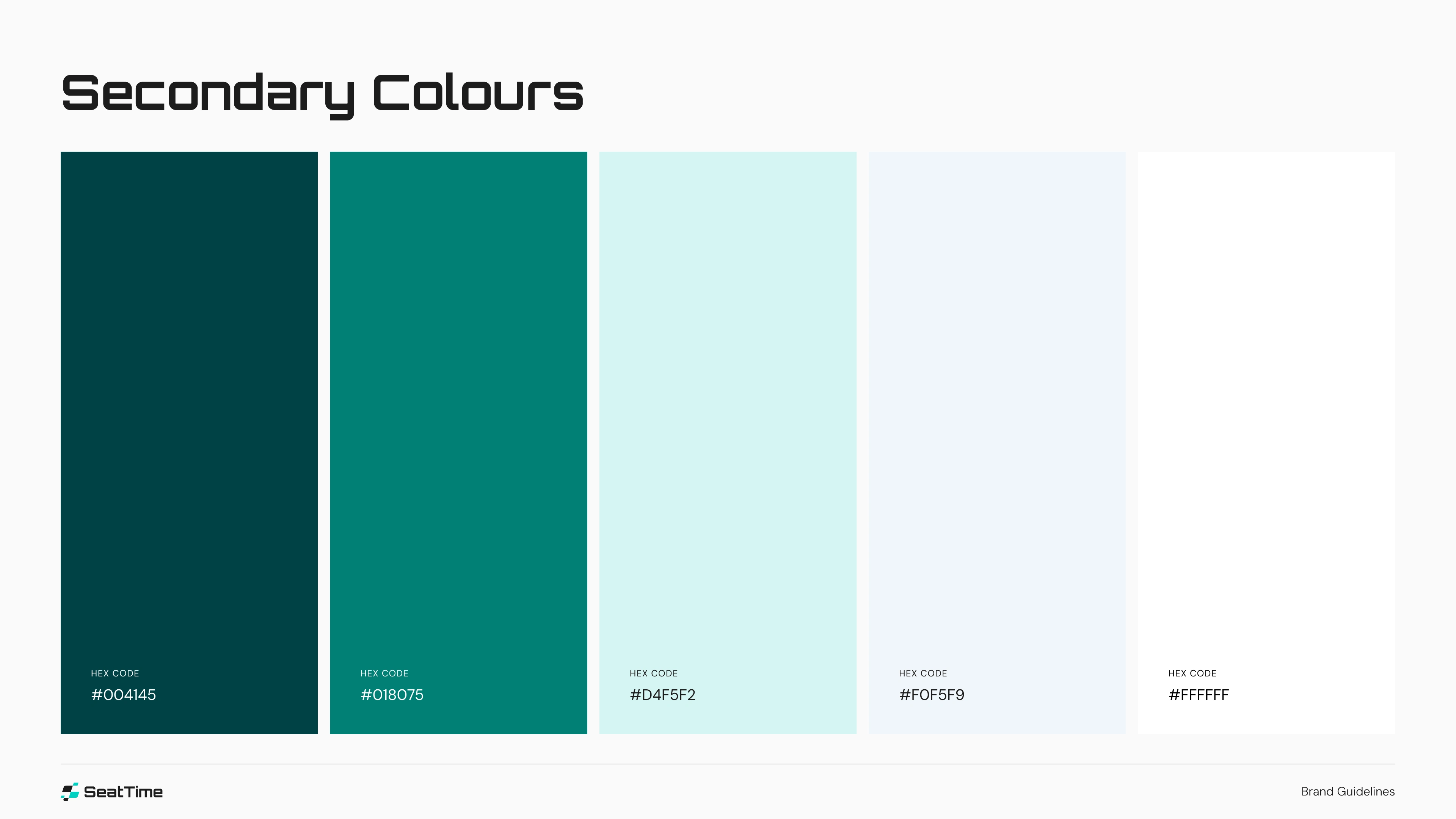
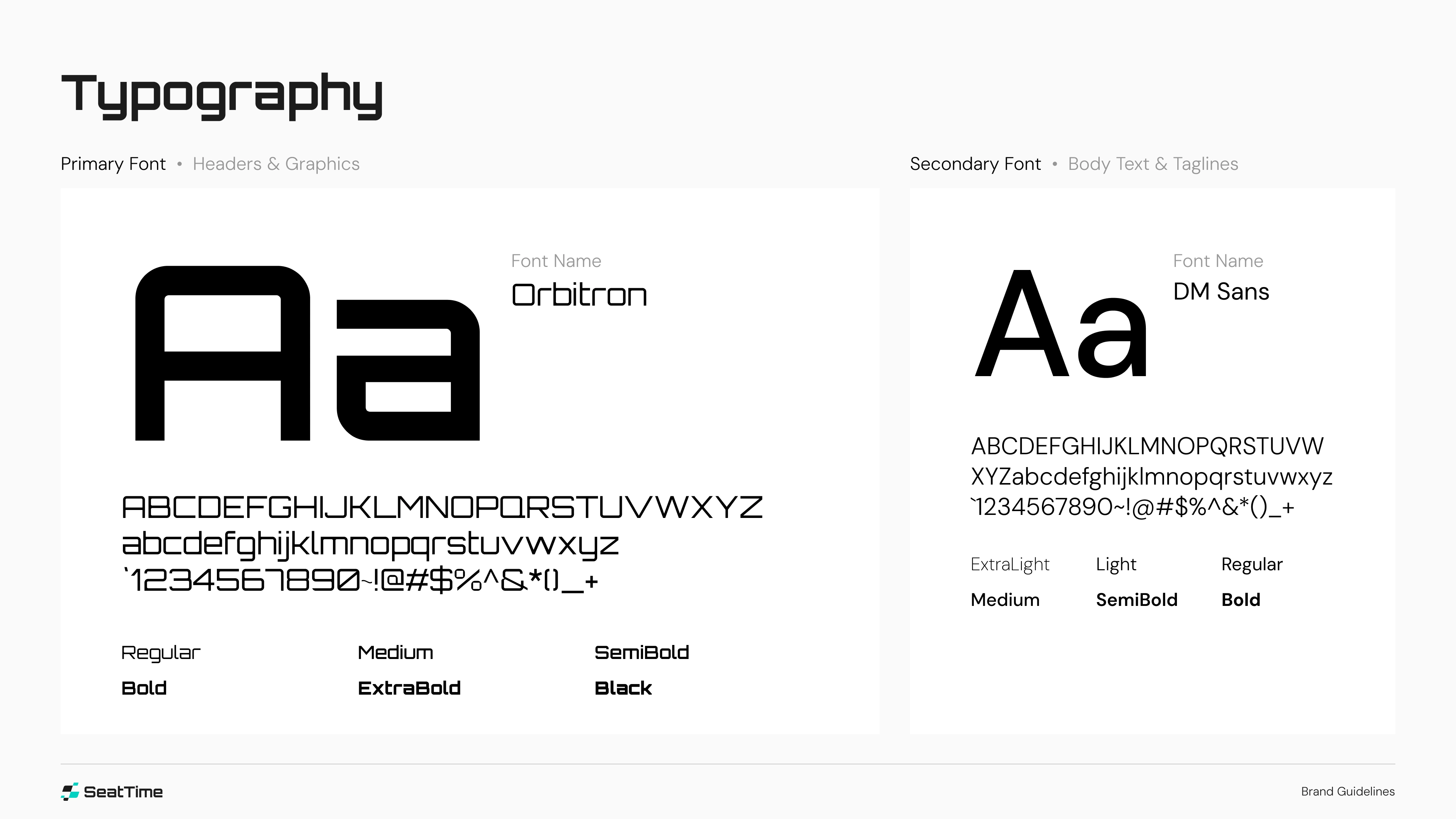
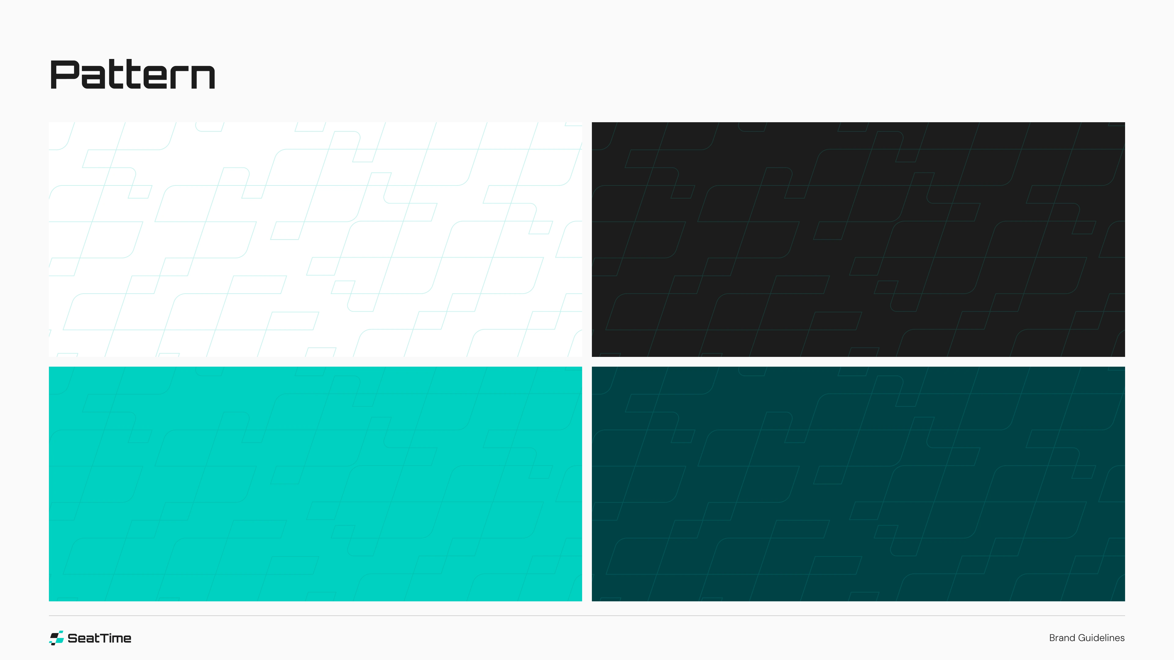
We started with brand strategy workshops to define SeatTime’s voice, values, and visual tone. From there, we developed a bold logo system built around clean geometry and motion-inspired forms — capturing both speed and structure. A refined color palette of deep racing greens and performance blues evokes both professionalism and high-octane energy, while a modern, monospaced typeface reinforces the app’s data-centric utility.
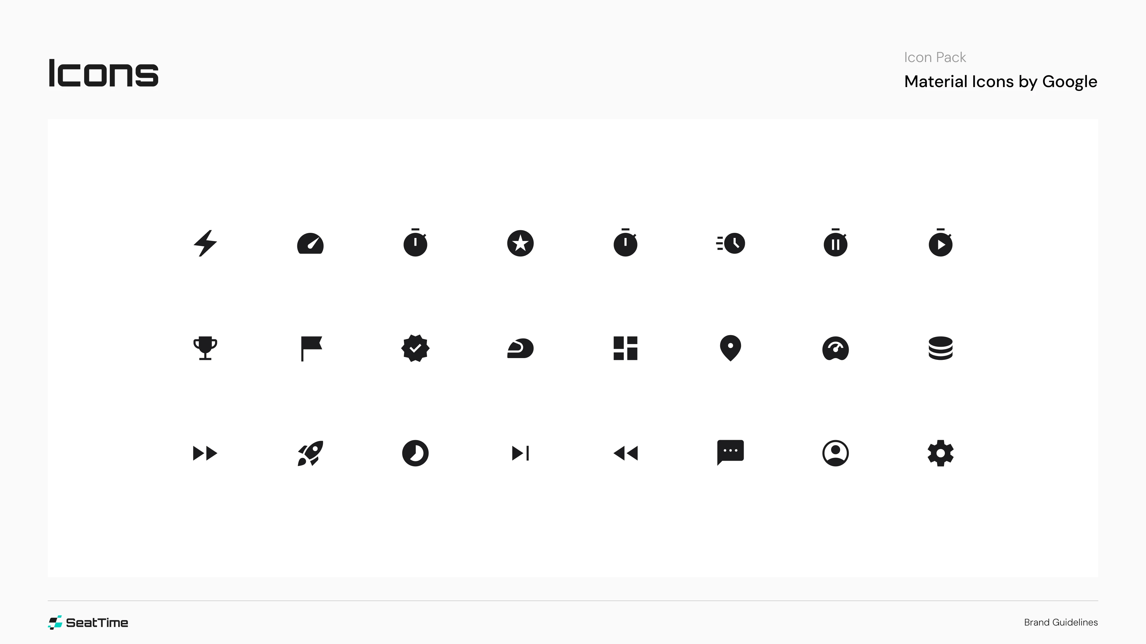
Every detail in the guide — from logo usage rules to UI iconography and typographic hierarchy — is built to ensure consistency across digital touchpoints. The final style guide is more than a visual manual; it's a pit crew playbook for building trust, recognition, and adrenaline in every interaction with the SeatTime brand.


Like this project
Posted Jul 2, 2025
Creating the brand style guide for SeatTime began with a deep dive into the world of motorsports and the mindset of modern racing enthusiasts.