The network for creativity
Join 1.25M professional creatives like you
Connect with clients, get discovered, and run your business 100% commission-free
Creatives on Contra have earned over $150M and we are just getting started
Back to feedPost

I started the SeneGence checkout redesign by looking at where people stopped.
The behavior data and stakeholder feedback pointed to the same place. Navigation was confusing, mobile and desktop didn’t match, and checkout required an account before anyone could pay.
I took the checkout first. Dropping the account requirement was the biggest change, and the rest was making each step clear about what was coming.
The video is me going through the mobile checkout as it works now. It’s short, which is the point.
The full redesign ran six months and ended up with 80K+ conversions and over $7M in revenue. I was the designer on it from problem definition through delivery, working with engineering and the business team.
If you’re stuck on a conversion problem, start by finding the exact screen where people leave. Redesign that one first.


The network for creativity
Join 1.25M professional creatives like you
Connect with clients, get discovered, and run your business 100% commission-free
Creatives on Contra have earned over $150M and we are just getting started








Related posts


This is what happens when payments meet motion 🔥.
Every tap. Every transition. Every sound effect 🎧.
Built a fully animated payment transfer prototype. Turn your sound ON. Trust me, you’ll feel the difference.


I love this


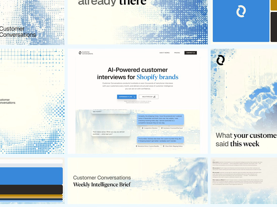
Customer Conversations is an AI that calls a store's customers and interviews them. Explaining that took half of every sales call.
Three weeks after Bryan Starck brought it to us, it had a brand and a homepage built to do the explaining. Answer three questions and the AI calls you for a real interview in 60 seconds.

Nice design


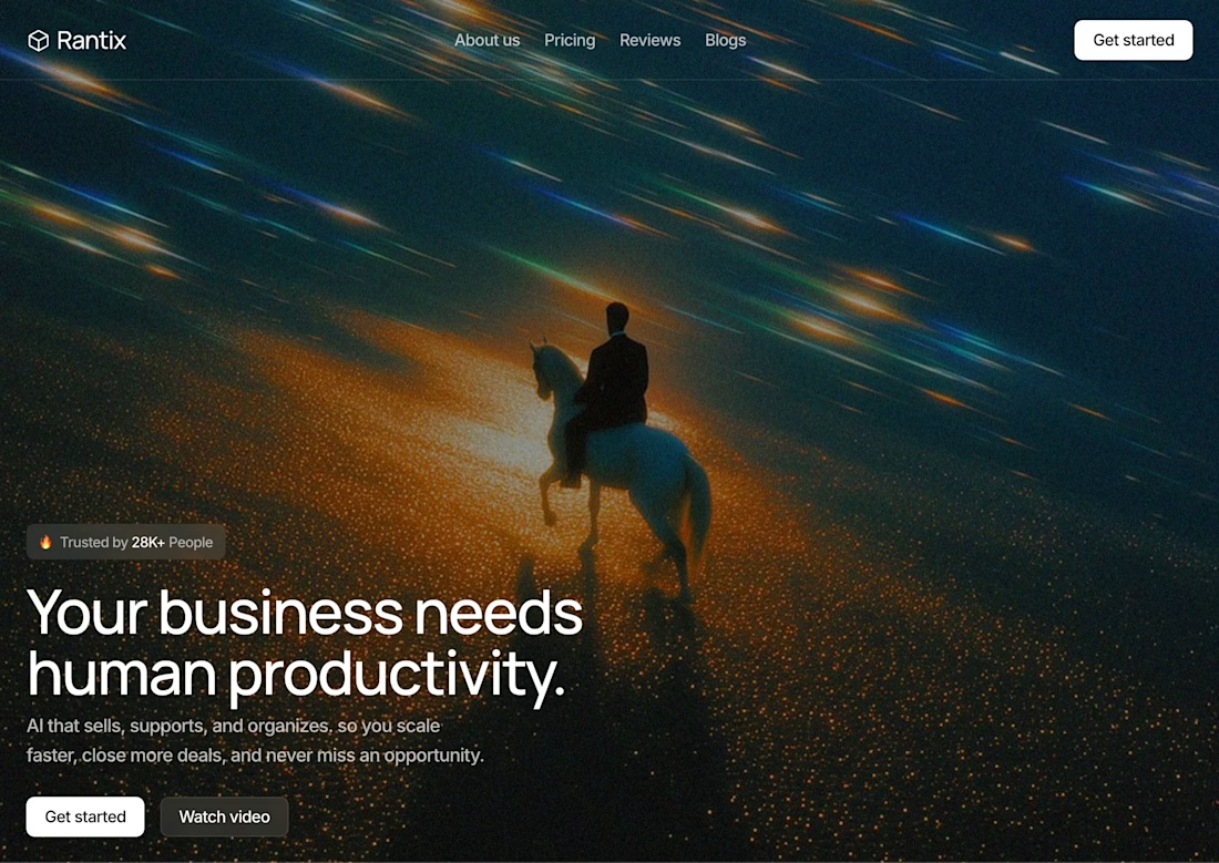

Great design the visual effects is unique 🎉🎉