A Website Transformation for a Local Indoor Playground
Lauren Holliday
Unlocking Conversions: The Strategic Website Redesign that Transformed a Failing Website
Discover the strategy behind a complete website overhaul that made booking $2,000+ birthday parties as simple as a click and increased time on site by more than 200% for the best indoor playground in south Florida.
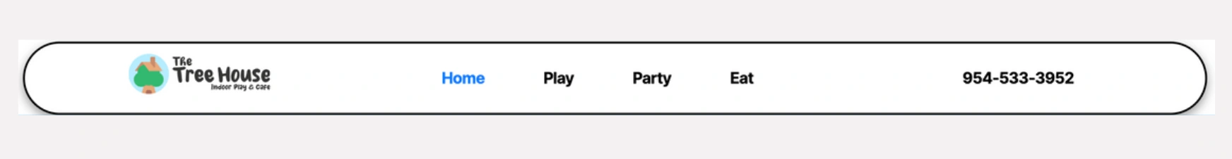
Quick walkthrough of the new site: treehouseindoorplay.com
I recently redesigned a website for the largest and most luxurious indoor playground for toddlers in south Florida.
The Tree House has three locations, all in high-end neighborhoods, and caters to parents with higher incomes, yet their website was cheaply slapped together and was impossibly frustrating to use. So even though they were ranking in SERPs and receiving a substantial amount of organic traffic, visitors were not converting, and bounce rates were extremely high.
Business Objective
Increase conversion rates and improve CX
The No. 1 goal of this redesign was to increase conversions for its three core offerings. In order of priority:
Birthday party bookings (Average party costs $2K)
Play day passes (Visitors must sign a waiver)
Play memberships
Website Issues
Unprofessional booking experience
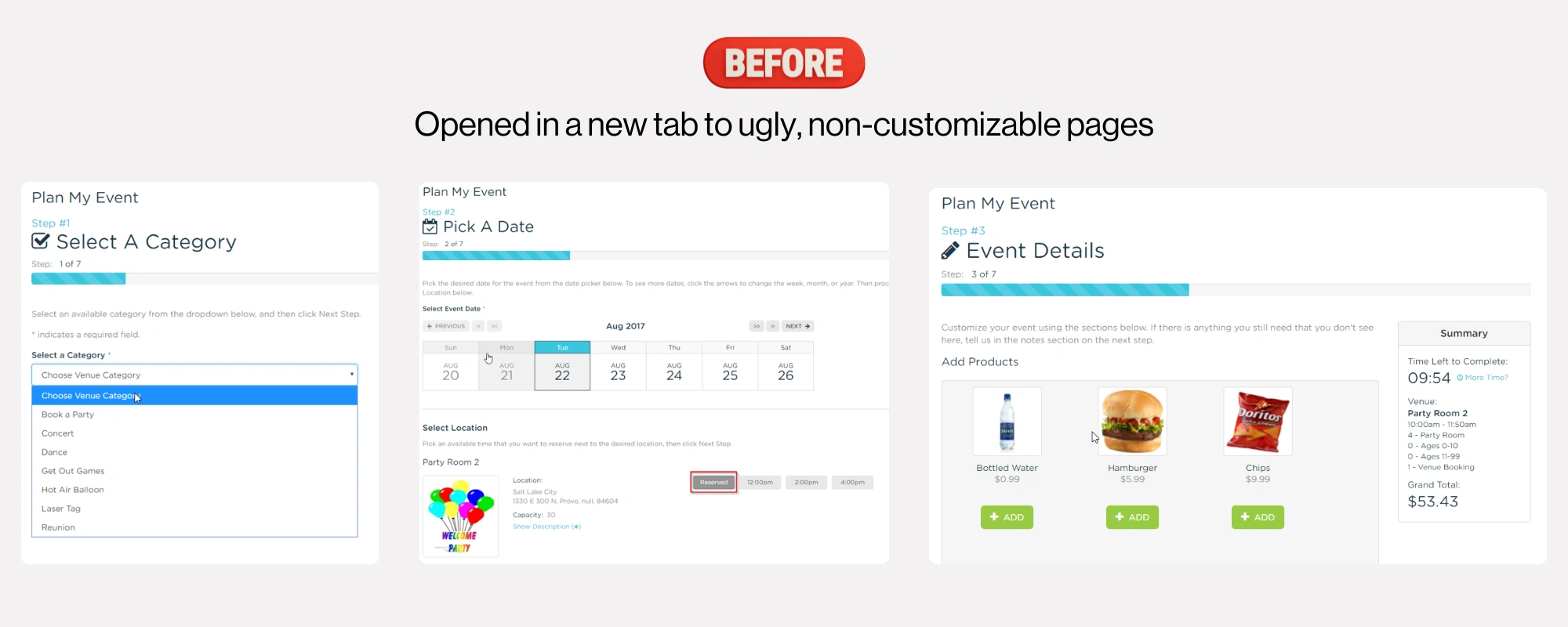
BEFORE booking experience redesign
AFTER the booking experience redesign on mobile and desktop.
They were using an archaic booking software, called Aluvvi, which integrated offline and online bookings.
To say the user experience was terrible is an understatement.
When visitors clicked on “Purchase a play pass,” “Purchase membership” or “Book now” (for birthdays), they were taken to a completely different site, on a different, weird, long domain, which opened in a new tab and featured no branding.
The experience felt extremely untrustworthy, unprofessional and unpolished, especially for a venue selling packages as highly priced as their birthday parties.
Because of all of the above, no one was utilizing the online booking system.
Skeleton-like, unstructured website pages
To paint a picture for you, the homepage hero section didn’t even have a headline (H1) or any text whatsoever.
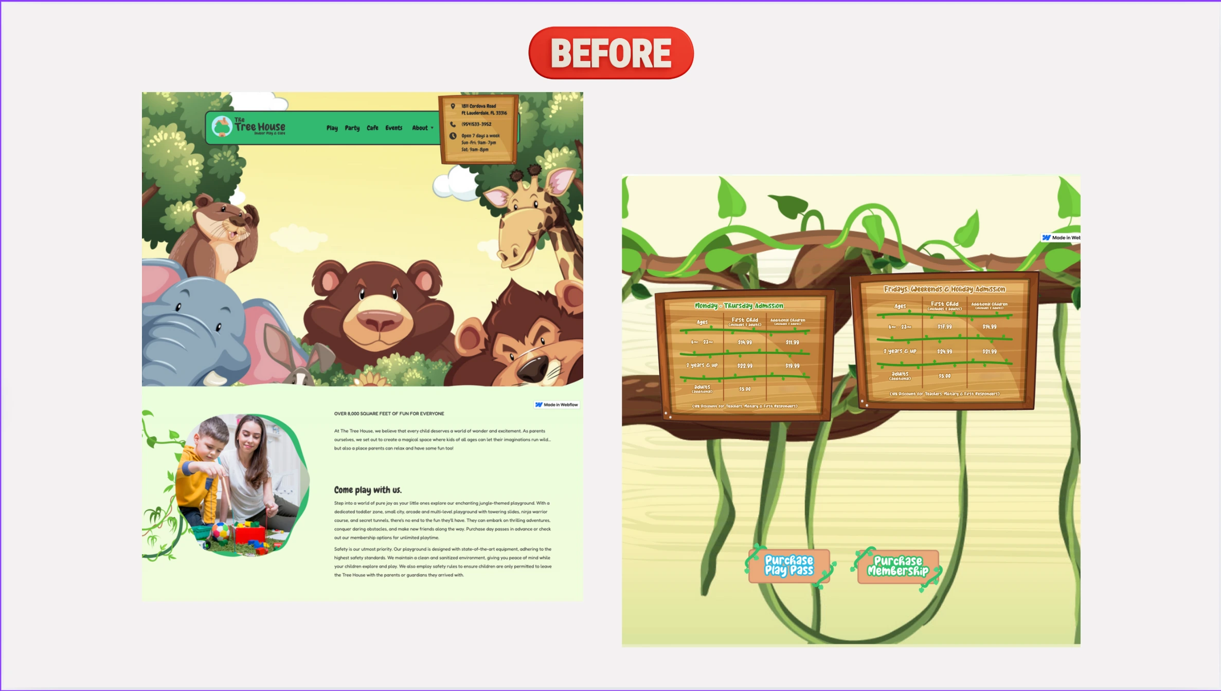
Homepage before redesign
And the text did not provide the relevant information that visitors would want to know. It was complete “fluff” -- filler text.
There was no page structure either, which is important for SEO.
By page structure, I mean breaking up on-page copy into H2s, H3s, etc. to tell Google what each section is about, and each heading should utilize a keyword variation of your target keywords, so long as it doesn’t sound awkward for the human reading it.
Poor design & UX
The site featured bad stock photos, and it was not responsive, which was a huge deal since 95% of visitors were on mobile devices.
Probably the worst part was the pricing tables, which were static images that did not scale. They were unreadable and impossible to digest because of this on all devices. Pretty big deal when you’re trying to optimize for sales/conversions.
Bad domain name
Their old domain was “thetreehouse-ftlauderdale.com” -- this was a) way too long, b) featured a hyphen and c) limited them to one city, which was especially bad because they’re expanding to other cities as we speak.
Their plan was to set up a different domain/website for each location/city.
This is the wrong approach for multiple reasons:
The more pages you have on your website, the better for SEO, more chances to rank on Google;
You can just create location-based landing pages all on the same site.
It’s easier to increase domain authority (DA), which also affects your search rankings, because you don’t have to get backlinks for multiple different domains, which is not easy for even just one (new) site.
Solution
Redesign the entire site from scratch
The old website was built in Webflow, and there was absolutely nothing that could’ve been the least bit salvaged or reused for the new website, so I proposed rebuilding the entire website from the ground up, using WordPress.org, and more specifically, the theme JupiterX, which uses the Elementor Pro page builder plugin.
I also suggested buying a shorter, more user friendly and non-location specific domain name, based on keyword research.
My Process
Find better booking software
Find an alternative, modern, user-friendly, industry-specific booking software, and seamlessly integrate it.
The big requirement was that the software had to work seamlessly with its in-store POS and would scale with them as they expanded locations. After doing my due diligence, I recommended Roller.
It was a no-brainer. The checkout experience is the best of any tool out there, featuring an overlay sidebar checkout that’s super easy for visitors to go through without any friction. They can even pay through Apple Pay.
I also liked this option because it came with onboarding support and their documentation and robust library of case studies made me feel confident in their solution and me being able to easily integrate it into the new site.
Conduct keyword research and a competitive analysis
Conduct keyword research and a deep industry competitive analysis.
I used the old site’s Google Search Console and Google Analytics’ insights as well as Google’s Keyword Planner and SemRush to conduct extensive keyword research.
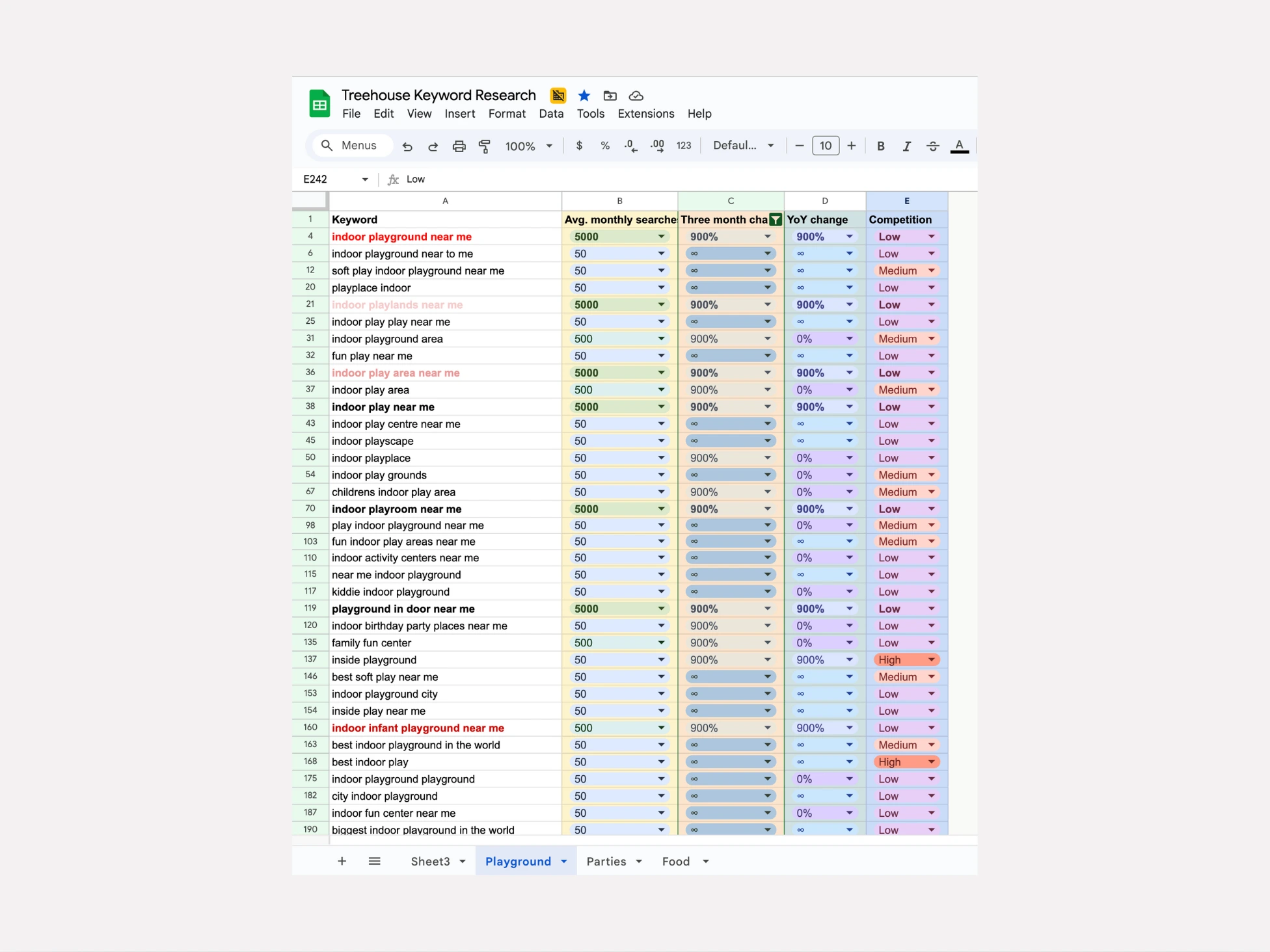
Additionally, I visited every (direct and indirect) competitor website I could find on Google and in related sites in SemRush.
Not only did I pay attention to the website’s copy and design but also their metadata, to see what, if any, keywords they were focusing on. Additionally, I reviewed websites outside of nearby cities, some even in different states, because it was impossible to find any inspiring website designs for this niche, as I had originally suspected.
Lastly, I did an analysis from the business/offering perspective, so I knew the key differentiators that made The Tree House better than all of its competitors.
This would allow me to create more compelling copy. I did this by reading every review I could find for Tree House and its competitors and scouring sites and Google My Businesses (GMBs) for key information, like cost, what you get, hours, ages, etc.
Recreate the site architecture
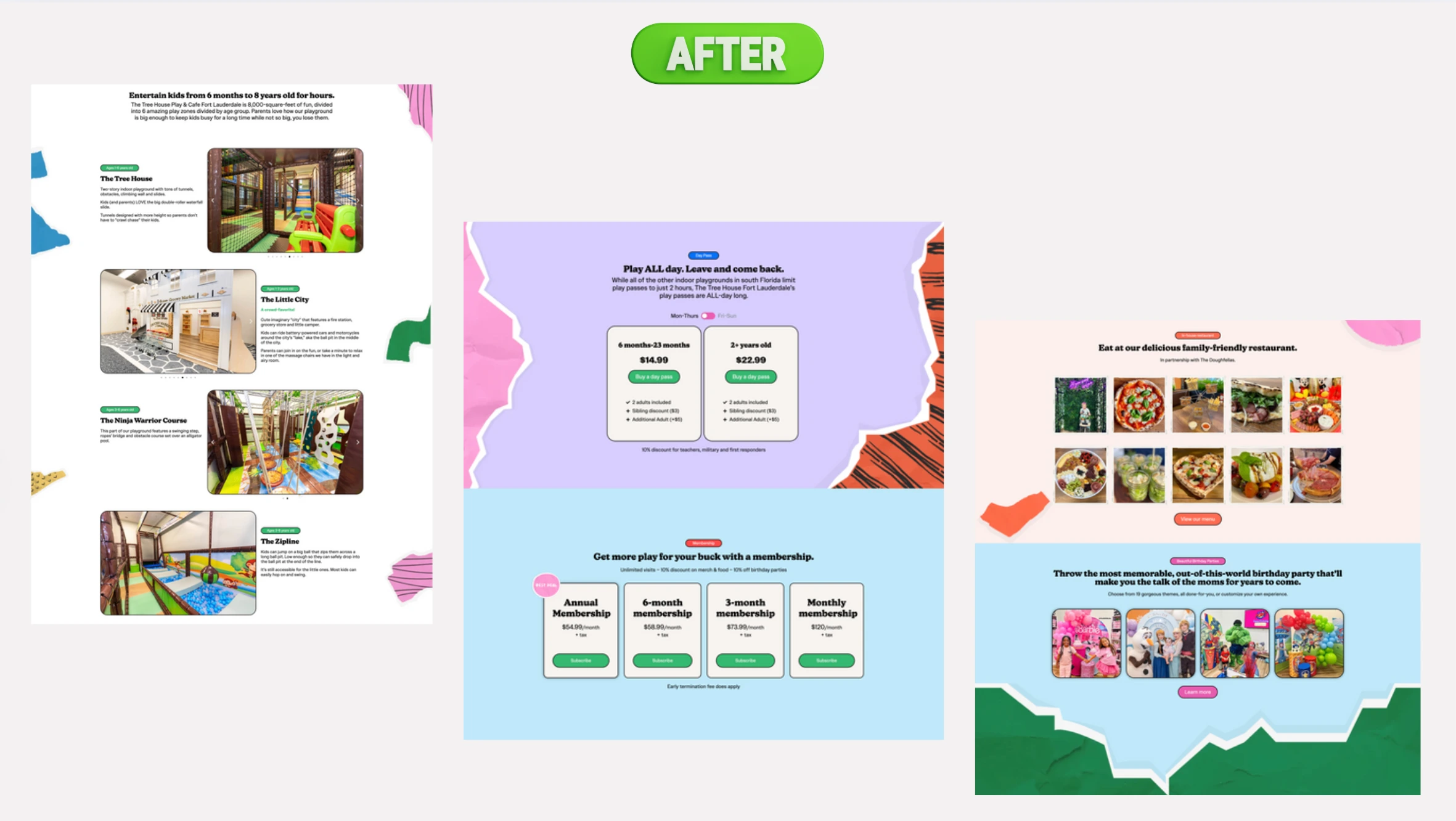
The old website had about eight pages but really only needed four (at the time):
Homepage
Play Pass / Membership page
Birthday Party page
Family-friendly restaurant page
This made for a nice, clean top navigation, making it easy to go to the page visitors want, with the information they’re looking for, without having to scroll up and down and click-through a bunch of useless pages that featured irrelevant, or, worse, no information at all.
Write website copy
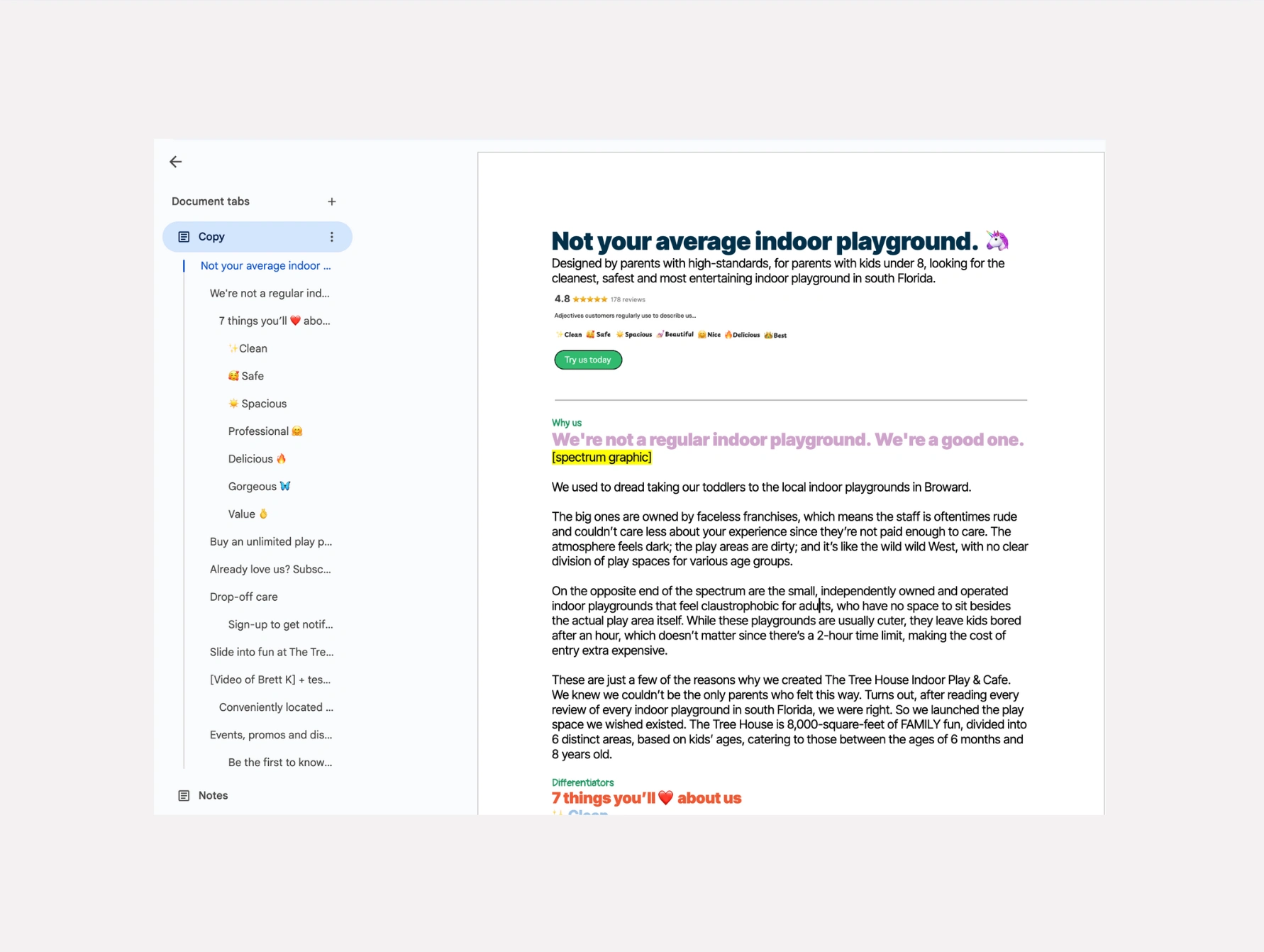
After I outlined the sitemap for the new site, it was time to write the page copy.
For each page, the client reviewed/added comments to the copy, and I edited, or explained why it’d be better to keep things the same in one instance or another.
Create Figma wireframes
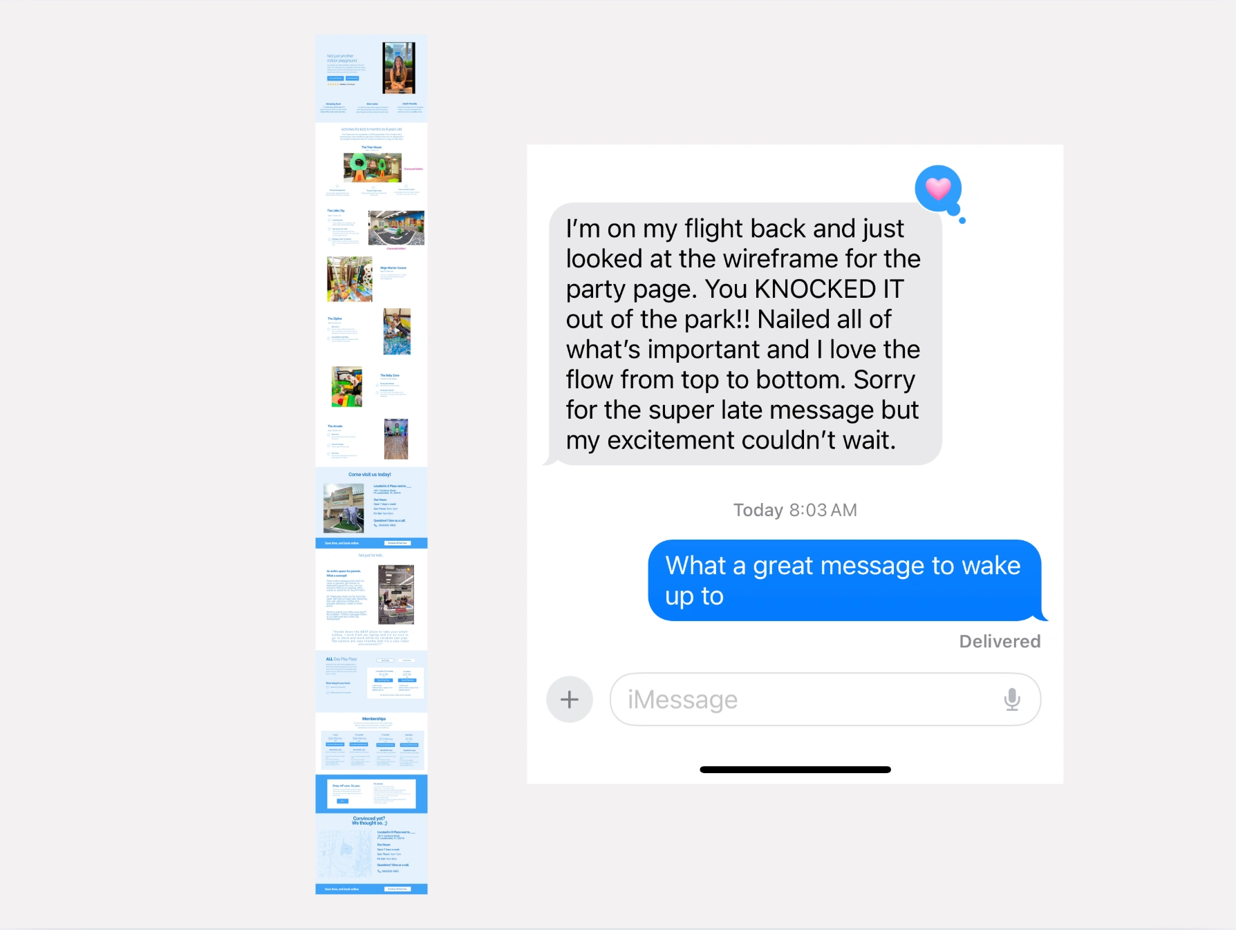
Once the copy was approved, I started creating the page layouts in Figma. These were not meant to be beautiful at all, but rather to give the client a visual of how the page would be laid out. Again, she reviewed each page before moving on.
Refresh brand identity
Next, I ideated a new site aesthetic that fit their jungle-themed playground and meshed cohesively with their current logo. Simultaneously, I visited all of my favorite curated design inspiration sites, such as Design Fuel, Awwwards among MANY others.
I took screenshots of everything I loved -- different elements from different sites -- fonts, color palettes, visuals, vibes, layout -- and I added them to a multi-page whiteboard in Canva (LOVE Canva’s whiteboard feature!).
I also searched Canva, Dribbble, Freepik and Adobe Stock to get inspiration for the overarching design, specifically for the page section backgrounds. I used keywords for certain aesthetics combined with words like “jungle” and “kids” and weeded through files until I felt I had something I liked.
I knew I wanted a less realistic jungle vibe, like the original site had so blatantly/lazily done before, with super basic and cringey huge static images of cartoon jungle animals.
Create the design elements
I found vector files that had a bunch of elements I loved on Freepik; downloaded them, and then customized the colors to my liking and separated them into individual files, using Illustrator, which I uploaded to Canva, so I could make my section backgrounds.
Curate images and videos
I collected and combed through the client’s images and videos to feature the best media on-site.
Because this was for a local business, and specifically for an indoor playground, where parents are going to take their kids, they’re most definitely going to want to see pictures of the establishment.
Fortunately, the client had a lot of pictures and videos for me to go through. Curating good visuals was extremely time consuming because there was just so much to look at.
Setup hosting
I recommended Hostinger because the pricing is a no-brainer, and their support is extremely fast and easy to get through-to via their on-site chat, which features real, live humans -- can you believe it?!
Build website
Finally, time to design!
With Hostinger, installing WordPress is a one-click experience. I installed the JupiterX theme next, created my four pages and began building the desktop site and then optimizing for mobile and tablets.
Integrate Roller software
Once the pages were built, and the client was reviewing, I started integrating Roller’s overlay checkout. It was a bit of a process, but it was worth it.
Their documentation was clear and their support team was nearby if I needed them. It required some JavaScript snippets and a little bit of code.
SEO-optimize the website
Next, I installed Yoast SEO and followed the setup instructions, inputting the codes I needed, making sure the sitemap was working, and robots.txt files were good. Lastly, I visited each page I’d created, and wrote unique meta data in Yoast for each one.
Setup Google Analytics
I set up a new instance of Google Analytics and Google Search Console for the new site and connected it to the website with the Monster Insights’ plugin.
Page speed optimization
I installed a page speed plugin, optimized images, deleted plugins I didn’t need and made sure to test the page speed with Pingdom, Google’s Page Speed tool and GTMetrix, because I’m OCD. 😜
Connect new domain name
Connect domain name. I recommended we go with treehouseindoorplay.com for the new domain name, based on the keyword research I conducted early on, what was available, the length and ease of remembering it.
Setup 301-redirects
Finally, I set up Cloudflare to do the page redirects, which was a very straightforward process. I also had to make sure their old emails were set up correctly in Cloudflare to ensure they didn’t go offline.
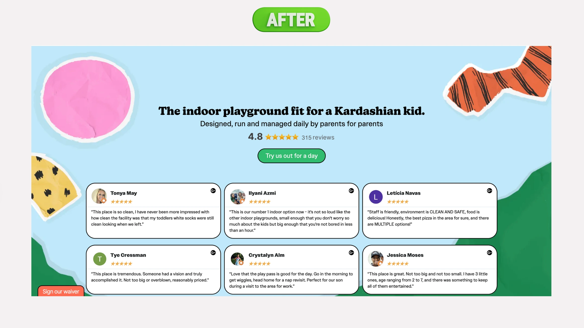
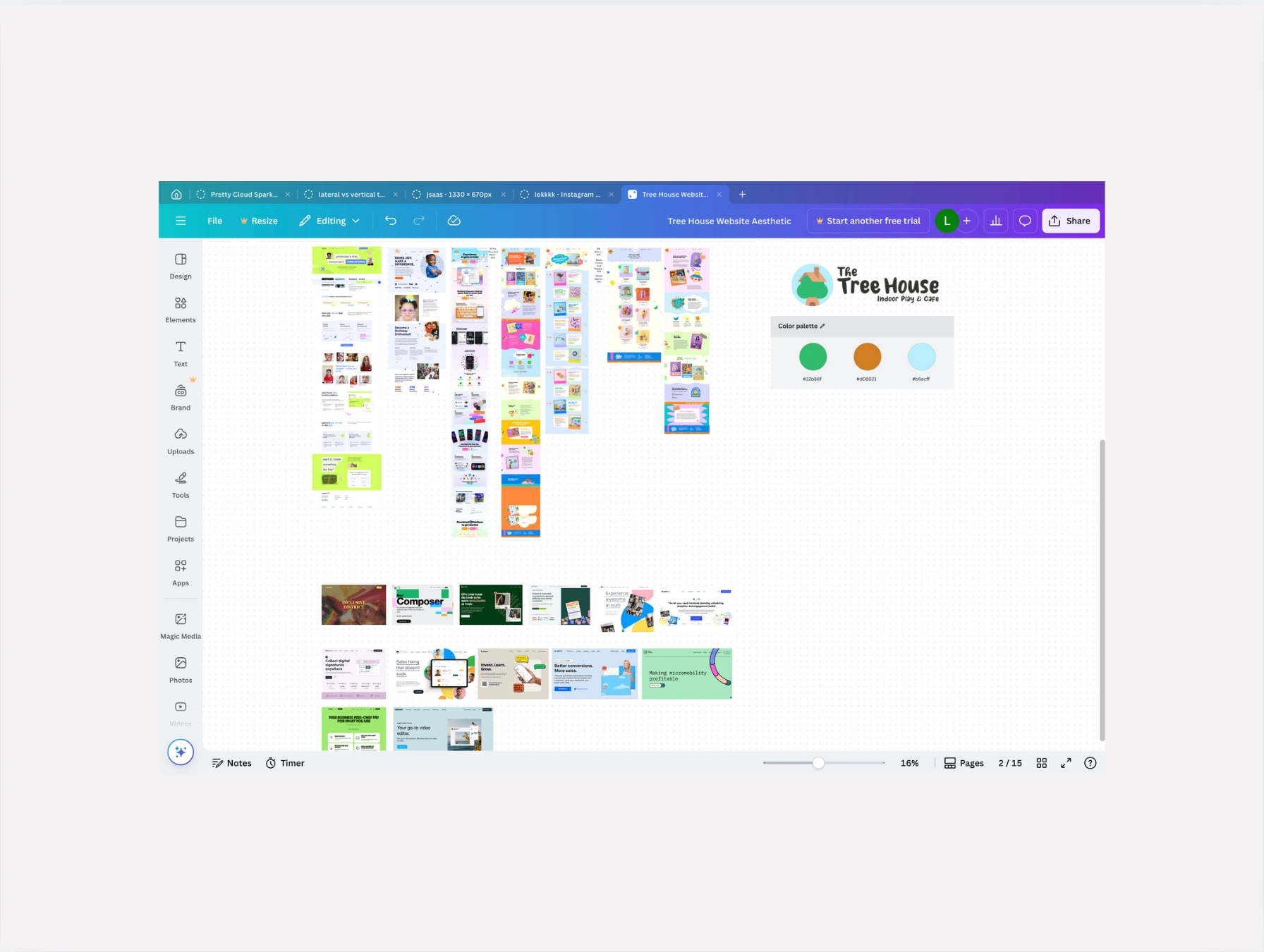
Final Designs
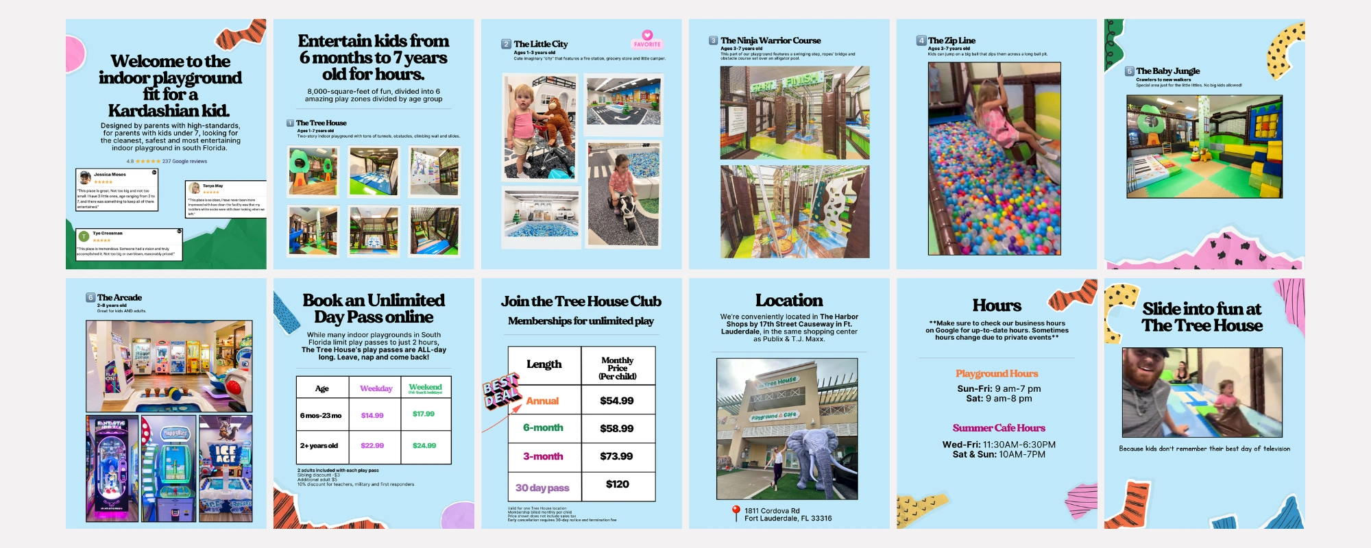
Instagram pinned post 1
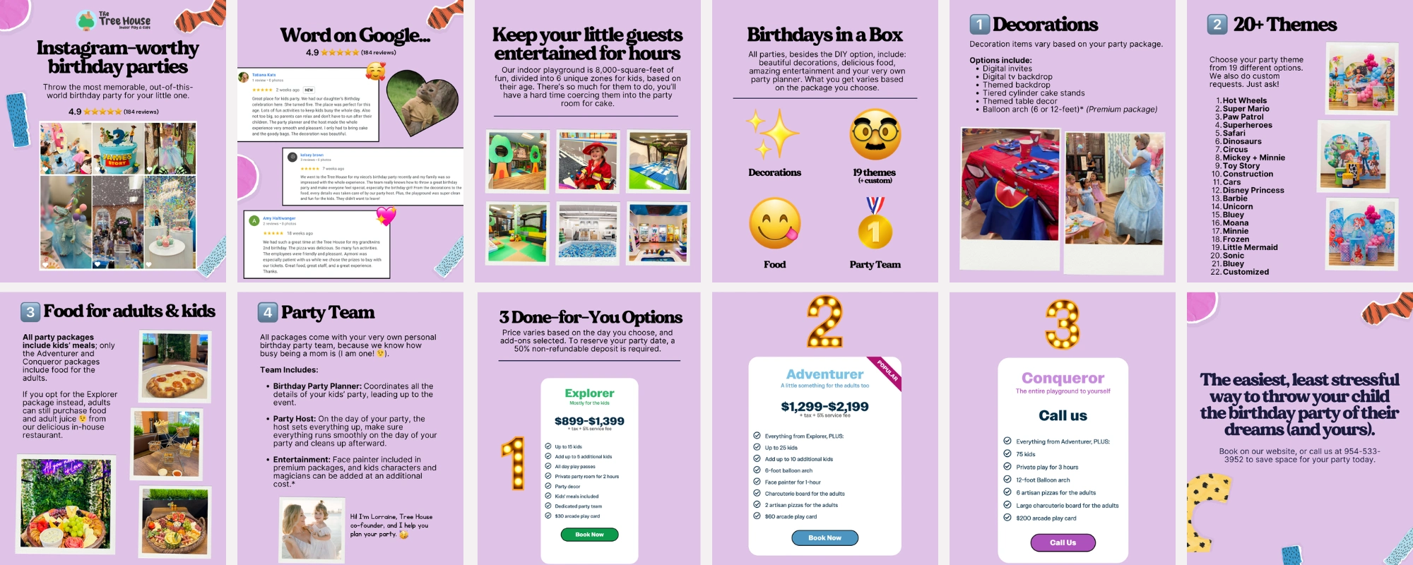
Instagram pinned post 2
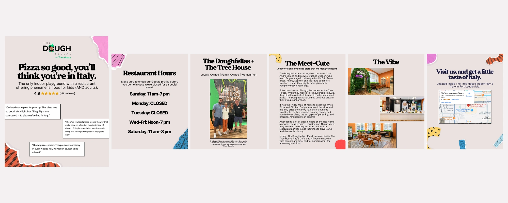
Instagram pinned post 3
Business Results
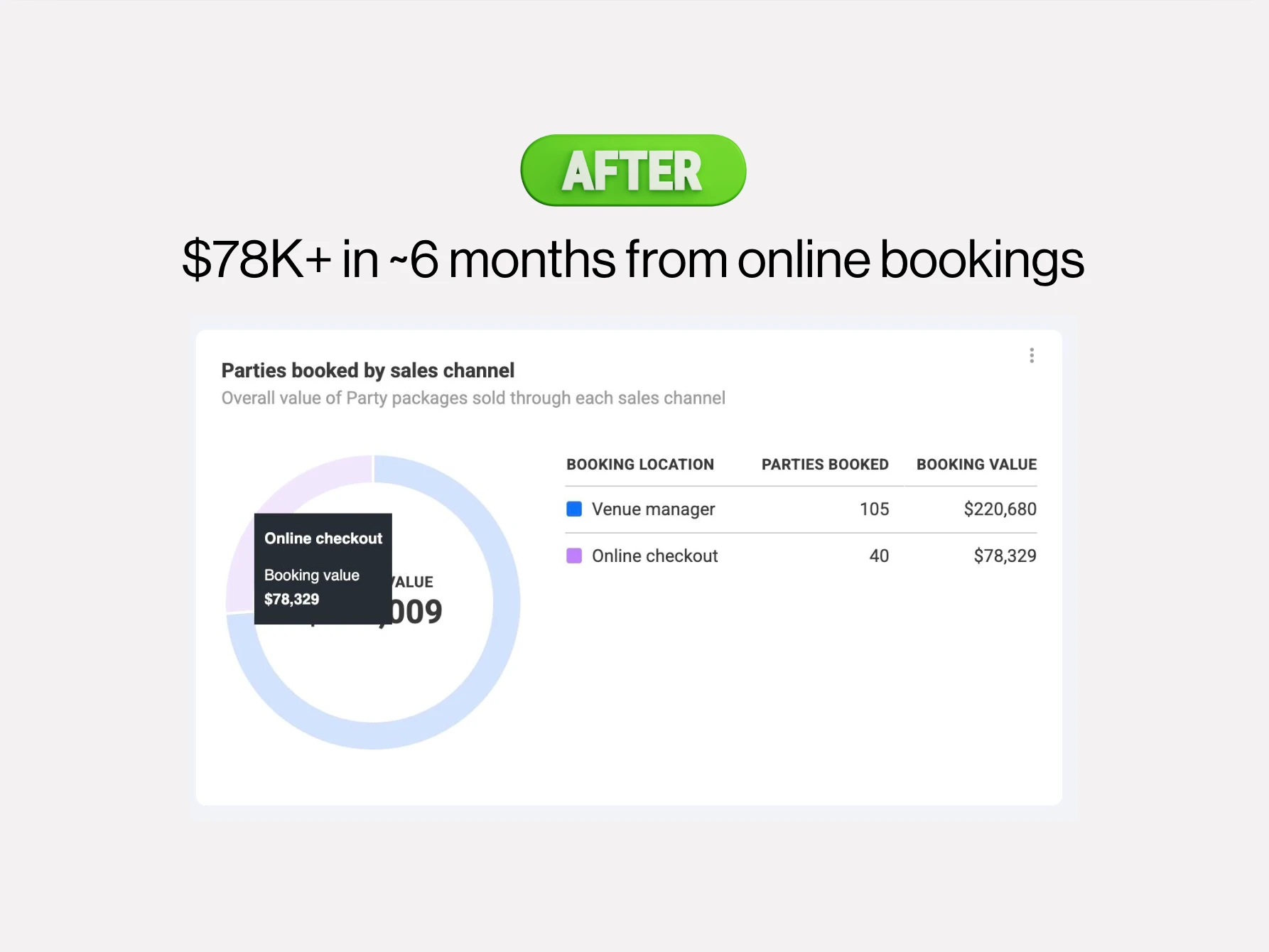
In the first six months of the new website's soft launch, The Tree House made $78,329 in ONLINE bookings, without having to speak with the customer before they made their purchase. And these were big purchases, with an average order value of $2,000.
Time on site has increased by 200%, and bounce rates have dropped significantly since the redesign as well.
Like this project
Posted Dec 5, 2024
Discover the strategy behind a complete website overhaul that made booking $2,000+ birthday parties as simple as a click and increased time on site by 200%.
Likes
2
Views
128