Creating bespoke brand identities and designs




Web Designer. Framer Expert and Partner.


Web Designer. Framer Expert and Partner.


Unforgettable Web & Brand Design for SaaS Products

Unforgettable Web & Brand Design for SaaS Products


Brand & Web Designer | Gold Laus Award | Ex-FutureBrand
Brand & Web Designer | Gold Laus Award | Ex-FutureBrand



Ethereal Filmmaker | Photographer | Creative Direction | AI
Ethereal Filmmaker | Photographer | Creative Direction | AI

✦ ✦ ✦ ✦ ✦ ✦a new series I'm thinking of makin: visual menu ✦ ✦ ✦ ✦ ✦ ✦
La Terraza de Alba, Madrid ✦ ✦ I love all kinds of photography, but food photography is my soft spot. Mostly because I’m obsessed with food, textures, light, and making every plate look like it deserves its own main character moment.
5
32
1.3K
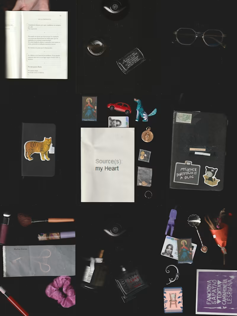
Hi, I’m Mont Carver ☆ Madrid-based, Mexico City-born.
I’m a photographer, filmmaker, and video editor; also an experimental audiovisual artist working with archives, text, and image manipulation.
This is a self-portrait made by scanning the objects I carry through my days: tiny relics, paper ghosts, lucky charms, proof of being here ୨୧⋆。˚♡
6
33
2K


a chapter from my ongoing project Crying Queens (2023 → now) ♡。゚
a parade of crowned faces, soft-focus tears, and dreamy “royal” archetypes—built like a glitchy beauty pageant that keeps repeating itself ✧₊˚
These images play with the way AI thinks it knows what a “woman” is: the same emotions, the same poses, the same aesthetics… multiplied into a template. I’m collecting them like an archive, then remixing them into collages, prints, video, and mixed media pieces.
sad queens / pretty crowns / algorithmic fantasy ✿
a tender + unsettling mirror of what gets rewarded, filtered, and standardized ♡
20
804

Brand & web design for premium businesses · Figma + Framer
- $5k+
- Earned
- 1x
- Hired
- 5.0
- Rating
- 24
- Followers
Brand & web design for premium businesses · Figma + Framer
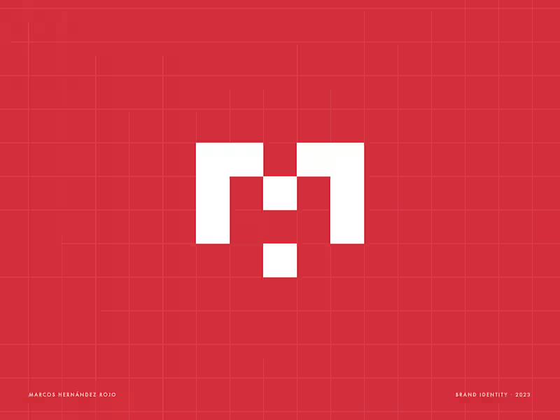


Brand Identity Designer & Art Director — Vidrio Studio
- 2x
- Hired
- 5.0
- Rating
- 57
- Followers
Brand Identity Designer & Art Director — Vidrio Studio
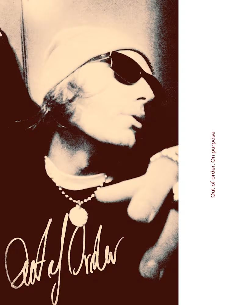
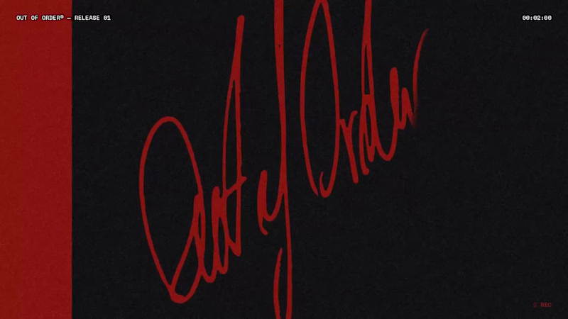
Out of Order® — Brand Identity & Label Design
Out of Order is a fictional streetwear brand created for the @designerbriefs weekly challenge (Brief 185): clothing for people inspired by the fear of being average.
The logo isn't designed, it's signed. I wrote it by hand with a felt-tip pen, inspired by the autographs scrawled across old photographs and signed band tees, then scanned and vectorised it without cleaning up the line. It works like a real signature: the last mark added to every photo, cap and tee. Everything around it stays quiet, with black-and-white imagery, heavy film grain, clean typography (Inter + Space Mono) and a single colour, a deep Out Red.
The campaign images follow my Augmented Art Direction process: AI generation guided by a defined art direction, then composited, retouched and signed by hand in Photoshop. The AI is the tool, and the hand is what makes it the brand.
Which shot would you wear?
2
165
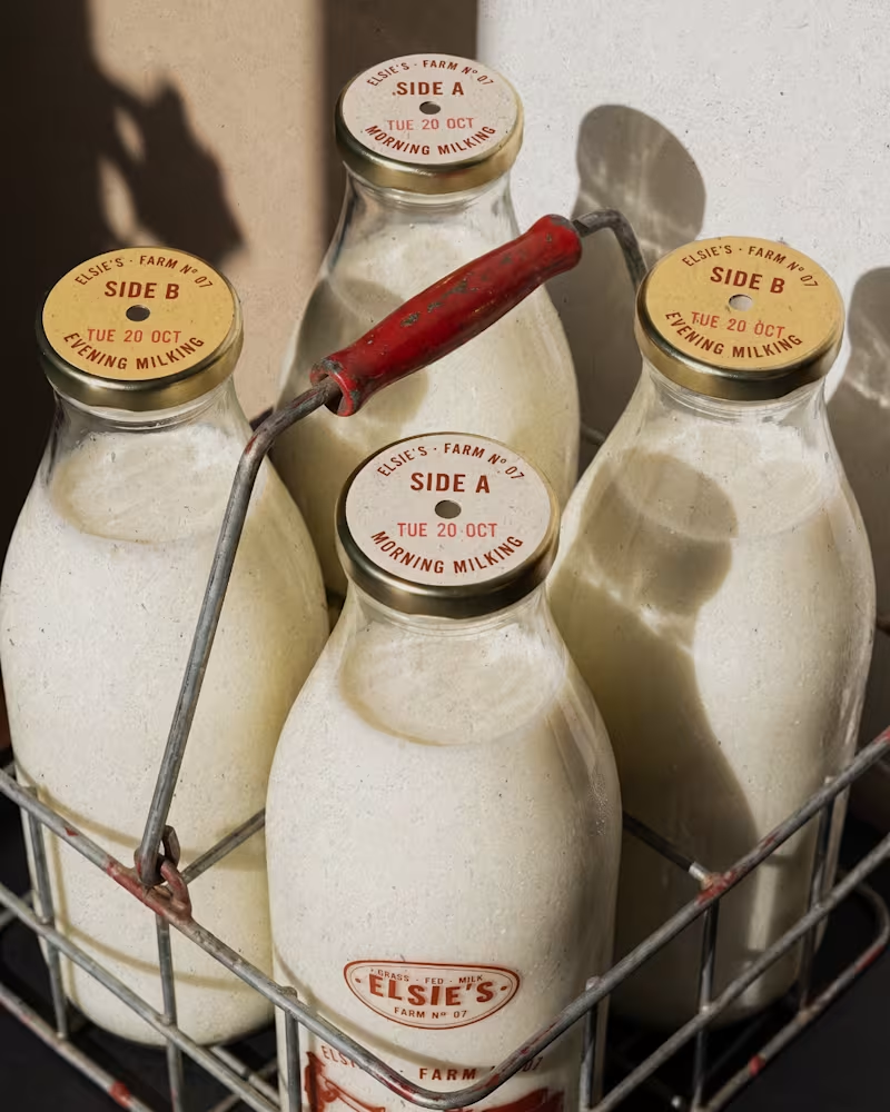
Elsie's: brand identity and packaging for the @designerbriefs weekly challenge (Brief 183). An organic milk brand from very happy cows who love fresh grass and good music.
The logo comes from the brass name plates farmers fixed to their milk cans, with every letter struck by hand. Then came a stamp-style illustration of a farmer playing to his herd, and a returnable glass bottle printed in barn red. All the imagery was made with my Augmented Art Direction process: AI as the tool, art direction and Photoshop retouching to finish every image by hand.
What song would you play to Elsie's cows? 🎺🐄
14
25
1.5K
Scott, founder of Glenwood Primary Care and Geriatrics, came to me looking for stock photos for his new website. I proposed building an image library for his brand instead, guided by a clear visual guide based on his patients, his logo and the local landscape. The result was 20 images made with AI, art direction and hand retouching, plus home page mockups on desktop and phone to help him choose the hero.
If you were Scott, would you have gone with stock photos or a custom image library?
5
9
1.3K

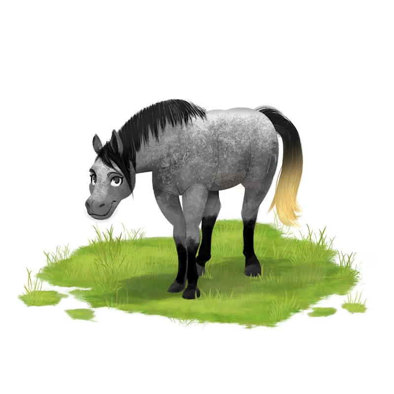
Children’s Book Illustration & Animation for Self-Published
- $25k+
- Earned
- 23x
- Hired
- 5.0
- Rating
- 43
- Followers
Children’s Book Illustration & Animation for Self-Published