Willander Farm: A Land-Led Identity Concept

Jorge Gutiérrez Marco


A land-led identity for a family farm
Willander Farm is a family-owned farming brand in Australia. The identity concept was designed to connect the business to the land it calls home, while giving the family a warm, considered visual system they could grow into.
The brief
The brand needed to feel human from its first touchpoint. With limited detail about the farm’s future operations, I focused on the one constant at its centre: the land.
That decision created a direction that could hold up over time, regardless of how the business evolved.
The idea
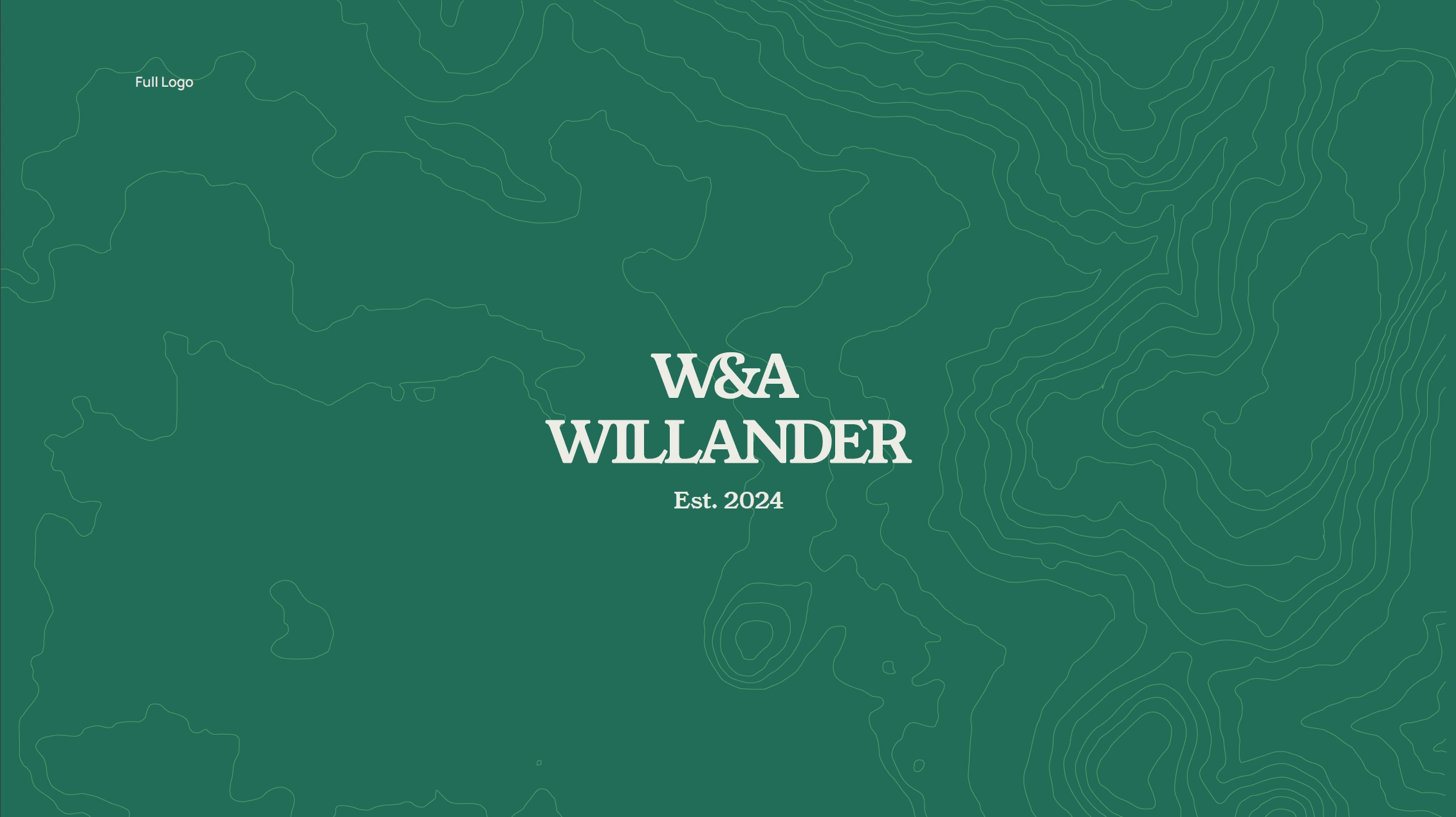
Willander Farm topographic identity exploration
The local topographic map became the foundation of the visual language. It gives the identity a direct connection to place and creates a flexible graphic texture for the wider system.
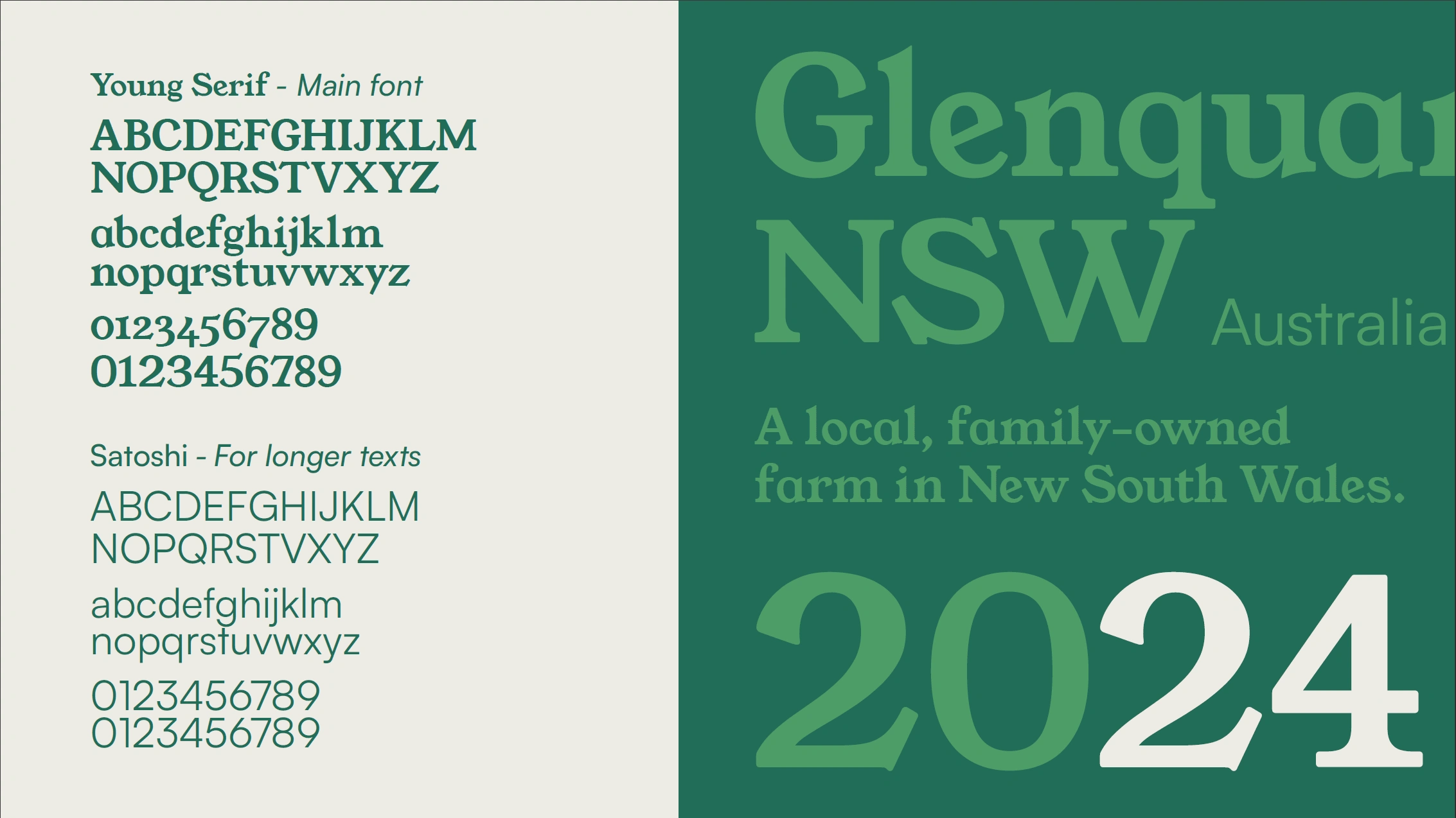
The wordmark uses ligatures to suggest family connection and continuity. A warm colour palette and restrained typographic system complete the identity, keeping it welcoming without losing clarity.
Built around what lasts
Rather than tie the brand to a specific type of livestock or product, the concept was built around the land itself. That gave Willander Farm an identity with room to adapt while staying grounded in its origin.

Willander Farm identity system
My contribution
Brand concept and visual direction
Logo and wordmark design
Typography and colour system
Topographic graphic language
Brand applications
Outcome
This shortlisted identity concept gave Willander Farm a friendly, place-led direction built around the values the family wanted to express.
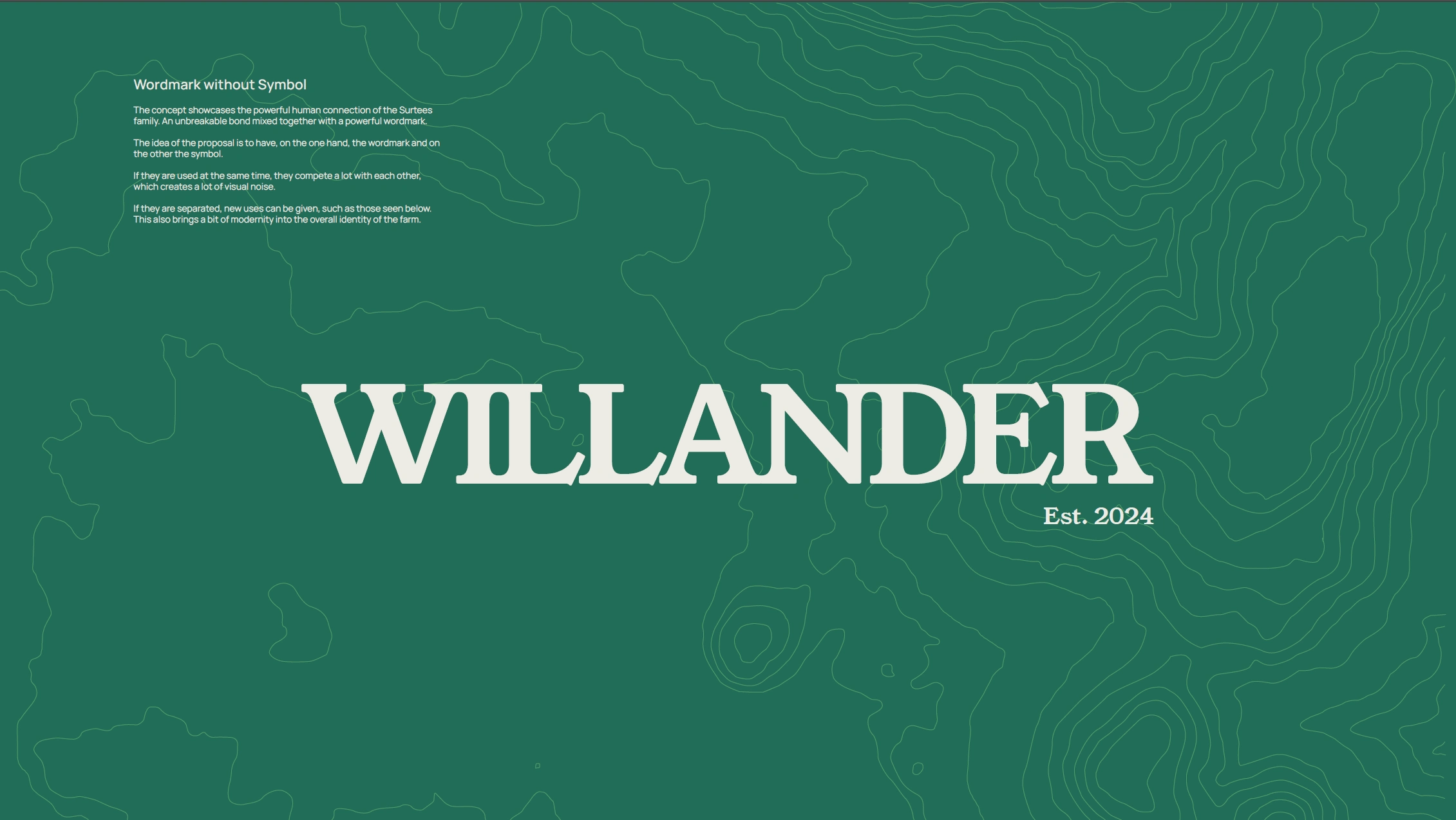
Willander Farm brand application
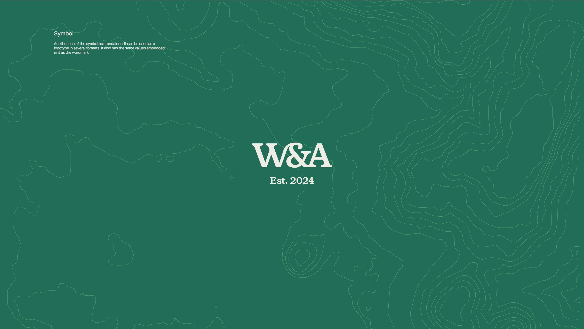
Willander Farm brand application
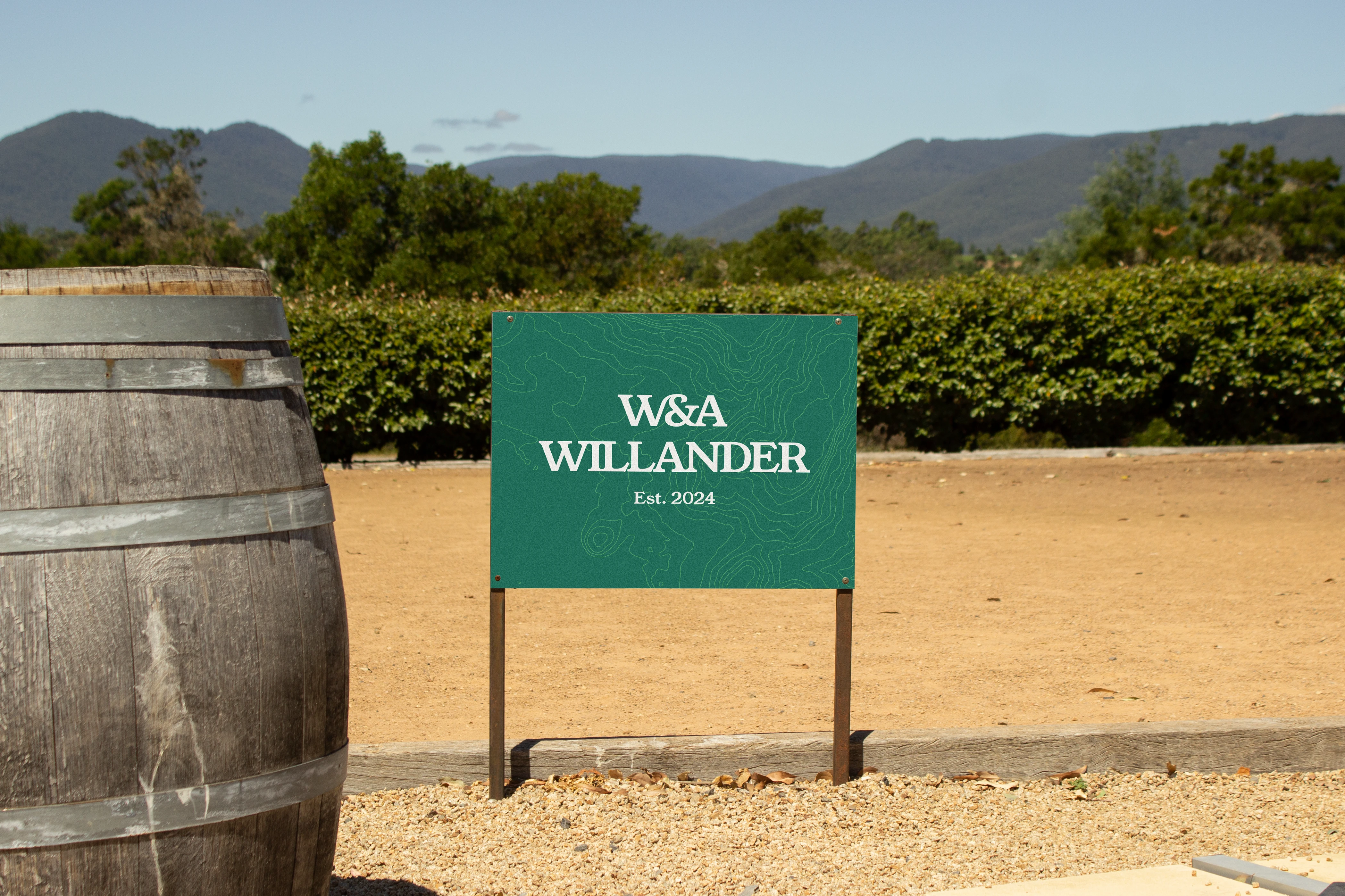
Willander Farm brand application
Willander Farm brand application
Like this project
Posted Oct 13, 2024
Shortlisted identity concept for an Australian family farm, rooted in the land’s topography and built for a growing business.
Likes
3
Views
68