Freelancers using WordPress in London
Sign Up
Post a job
Sign Up
Log In
Filters
2
Projects
People
Emily Power
London, UK
Creative Digital, Print and Web Design
5.0
Rating
45
Followers
Follow
Message
Creative Digital, Print and Web Design
1
Luxury Fashion Editorial WordPress Templates
1
27
0
Music Photography Portfolio WordPress Website
0
14
0
Wedding Celebrant WordPress Website
0
16
0
Art and Design Supplies Social Campaign
0
23
WordPress
(3)
Follow
Message
Ben Nelmes
pro
London, UK
WordPress Developer | Web Design | Plugins | SEO
New to Contra
Follow
Message
WordPress Developer | Web Design | Plugins | SEO

0
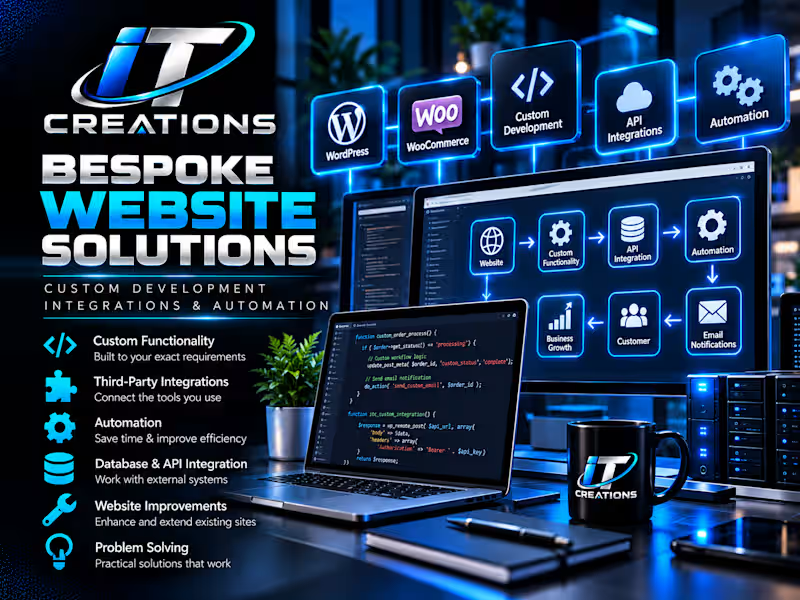
Bespoke Website Solutions Custom Development • Integrations • Automation • Problem Solving Not Everything Comes as a Plugin Some of the most valuable website work happens behind the scenes. A business may need its website to behave in a particular way, connect different services, automate a process or solve a problem that doesn't have an obvious off-the-shelf solution. That's where bespoke work comes in. What I Provide I take the requirement, understand what the business is trying to achieve and work out the most practical way of making it happen. That can involve: Custom website functionality WordPress configuration WooCommerce customisation Third-party integrations Payment systems Automation Backend workflows Troubleshooting Existing website improvements The Goal Technology should make running a business easier. My focus is on creating practical solutions that work behind the scenes — even when the most important part of the project isn't something visitors can actually see.
0
25
0
Complete Business Website & Online Sales Setup Website Development • E-Commerce • Payments • Launch The Project A complete online presence requires considerably more than an attractive homepage. I build websites around what the business actually needs customers to do — enquire, register, purchase, book or make a payment. My Work Can Include WordPress setup Website structure Responsive page development WooCommerce Products and services Payment processing Contact and enquiry forms Email configuration Automated workflows Analytics Security Domain and hosting configuration Testing and launch Approach Every business works differently, so I don't believe in forcing every client into exactly the same website template. The website and its backend are configured around the way the business needs to operate.
0
28
0
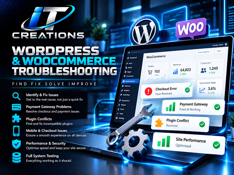
WordPress & WooCommerce Troubleshooting Problem Solving • WordPress • WooCommerce • Plugins The Challenge Complex WordPress websites can develop issues that aren't solved by simply changing one setting. Payment gateways, plugins, themes, caching, WooCommerce and third-party services all need to work together. What I Do I investigate the entire process to identify where the problem is actually occurring. This can involve testing checkout behaviour, plugin configuration, payment responses, automation rules, order statuses and interactions between different services. Typical Work Checkout problems Payment gateway issues WooCommerce configuration Plugin conflicts Order-processing problems Website errors Mobile usability issues Third-party integrations Backend configuration Result Problems are approached from the perspective of the complete system rather than applying temporary fixes without understanding the cause.
0
35
0
Website Automation & Business Workflows Automation • WordPress • E-Commerce • Email • Backend Systems The Challenge As online businesses grow, simple tasks can quickly become repetitive: processing orders, changing statuses, sending customer communications and keeping different systems working together. What I Did I created and configured automated website workflows designed to remove unnecessary manual work. The objective wasn't simply to build a website — it was to make the website perform useful business processes automatically behind the scenes. Solutions Included Automated order processing Customer email workflows Payment-to-order automation Website form workflows Backend process optimisation Plugin and service integrations Custom conditional behaviour Result Less repetitive administration, fewer opportunities for human error and a website that functions as part of the business rather than simply advertising it.
0
39
WordPress
(6)
Follow
Message
Taimur Iqbal
London, UK
Shopify, WordPress, Webflow & Framer Web Developer
80
Followers
Follow
Message
Shopify, WordPress, Webflow & Framer Web Developer
4
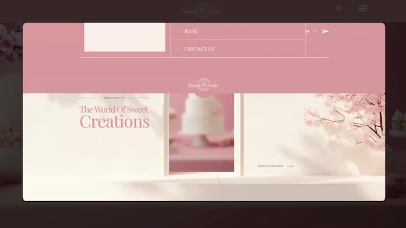
Samadi Sweets A soft, elegant website for a dessert and event-catering brand. It uses blush pink, cream and cherry blossom details, with smooth scroll animations and a full-screen menu. It's built to showcase the desserts and drive event quote requests. Services: UI/UX design, motion/interactions, web development
1
4
390
1
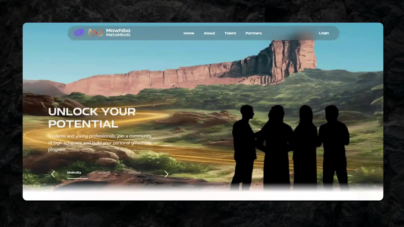
Mawhiba MetaMinds — Cinematic Hero & Landing Experience Designed and developed an immersive, story-driven hero section for Mawhiba MetaMinds, a platform connecting students and young professionals with a global community of high achievers. Built a dynamic carousel that transitions between cinematic scenes from desert landscapes symbolizing growth and diversity to a cosmic "infinite possibilities" sequence each paired with bold typography and a clear CTA. Focused on smooth transitions, responsive layout, and a premium visual identity that matches the platform's ambition to nurture and showcase talent.
1
1
208
0
Harfang Supplements — Ecommerce Website Designed and built a full ecommerce website for Harfang Supplements, a natural wellness brand offering vitamins, gummies, and targeted supplements for men, women, kids, and healthy aging. The site includes a WooCommerce shop with organized product categories, cart and checkout functionality, an evidence-based "why our ingredients work" section, blog integration, FAQs, and email capture all wrapped in a clean, health-focused brand design built to convert visitors into customers.
0
110
15
Olu Olu Poké — Restaurant Website (WordPress) Designed and developed a full WordPress website for Olu Olu Poké, a Hawaiian-inspired poke bowl restaurant with multiple locations in Montreal. The site features a vibrant, on-brand design with animated visuals, an online ordering integration, location finder, signature menu showcase, gift card system, testimonials, and a bilingual (EN/FR) setup built to drive online orders and boost local visibility for a growing food chain.
2
15
604
WordPress
(31)
Follow
Message
Nabeel Ahmed
London, UK
Product Designer · Web & App Developer · AI Automation
5.0
Rating
19
Followers
Follow
Message
Product Designer · Web & App Developer · AI Automation
0
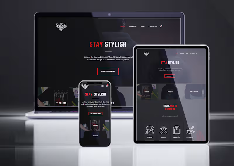
Mementomori Store — E-Commerce Website Design & Development
0
6
0
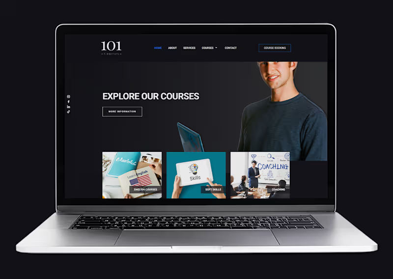
101 Courses — Website Design & Development
0
5
0
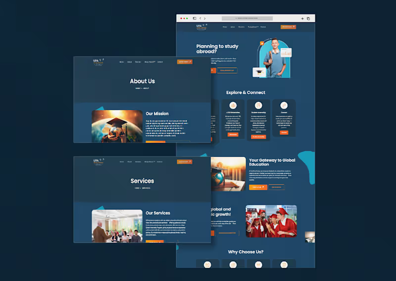
UPA Study Abroad Website Design & Development
0
9
0
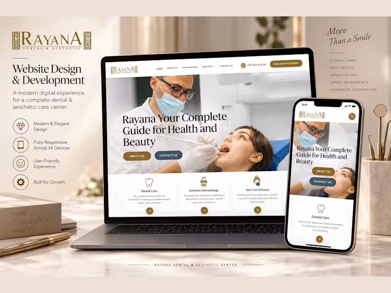
Rayana Dental & Aesthetic Center — Website Design & Development
0
5
WordPress
(10)
Follow
Message
Viktor Nyari
London, UK
UI/UX Designer & Front-End Developer
5.0
Rating
16
Followers
Follow
Message
UI/UX Designer & Front-End Developer
1
BlanX Teeth Whitening
1
4
1
ConfigureTek
1
5
1
UCation – Learning & Self-Improvement Platform Design
1
8
1
North Bay Village Continuum Website Design
1
7
WordPress
(7)
Follow
Message
doris james
London, UK
WordPress & WooCommerce Website Developer
11
Followers
Follow
Message
WordPress & WooCommerce Website Developer
0
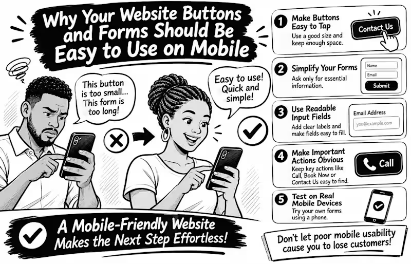
Why Your Website Buttons and Forms Should Be Easy to Use on Mobile Imagine a potential customer visiting your website, ready to contact you, but struggling to tap your tiny contact button or complete your enquiry form. What happens next? They may simply leave. Mobile usability goes beyond making your website fit a smaller screen. Every interaction should feel effortless. Here are 5 things every business website should get right Make buttons easy to tap. Avoid tiny buttons and keep enough space between clickable elements to prevent accidental taps. Simplify your forms. Ask only for information you genuinely need. Too many fields can make enquiries feel like hard work. Use readable input fields. Make text clear, provide visible labels, and ensure fields are easy to select and complete. Make important actions obvious. Your Call, Book Now, Contact Us, and Submit buttons should be easy to find. Test on real mobile devices. Don't rely only on desktop previews. Try completing your own contact form using your phone. Here's an important detail WCAG 2.2 recommends a minimum target size of 24 × 24 CSS pixels for many interactive controls, with certain exceptions. Bigger, well-spaced buttons can make mobile interactions even easier. Remember: A website shouldn't just attract visitors; it should make taking the next step easy. Have you ever abandoned a website because its buttons or forms were difficult to use on your phone? Share your experience
0
11
0
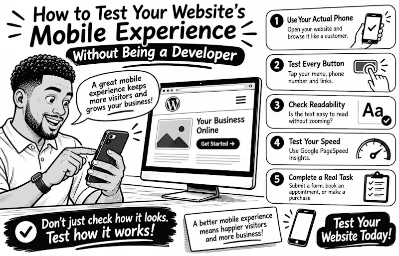
How to Test Your Website's Mobile Experience Without Being a Developer Your website may look perfect on a laptop but become frustrating on a phone Tiny buttons, unreadable text, and complicated forms can make simple tasks harder than they should be The good news? You don't need coding skills to test your mobile experience. Try these 5 simple checks Use your actual phone. Open your website and browse it like a customer. Can you find important information quickly? Test every button. Tap your menu, phone number, contact button, and links. Are they easy to press without accidentally clicking something else? Check readability. Is the text comfortable to read without zooming? Does anything extend beyond the screen? Test your speed. Enter your page URL at Google PageSpeed Insights (pagespeed.web.dev) and review its mobile performance report. Complete a real task. Try submitting a contact form, booking an appointment, or completing a test purchase. Don't stop at the homepage! Remember, a good mobile experience isn't just about fitting a smaller screen. It's about helping visitors accomplish what they came to do. Your turn: When did you last test your entire website on your phone? Try it today and tell me what you discover
0
15
1
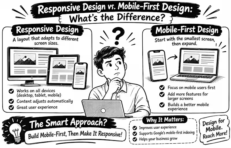
Responsive Design vs. Mobile First Design What's the Difference? Have you ever opened a website on your phone and had to zoom in just to read the text? That’s a reminder that website design must consider more than one screen size. But here’s something many business owners misunderstand: responsive design and mobile-first design are not the same thing. Responsive Design The website layout adjusts to different screen sizes, from smartphones and tablets to desktop computers. Images resize, columns rearrange, and content remains usable. Mobile First Design The designer starts with the smallest screen, prioritising essential content and features before expanding the layout for larger screens. Why does this matter? Google uses the mobile version of website content for indexing, making a good mobile experience important for search visibility. A mobile friendly design should also keep text readable, navigation simple, and buttons easy to tap. Here’s the secret: you don’t have to choose one over the other! Mobile-first is a strategy for building a responsive website. My advice: When building your next WordPress or WooCommerce website, start by asking Can my customers easily find what they need on their phones? Because a beautiful desktop website means little if the mobile experience feels frustrating Your turn When designing a website, do you start with mobile or desktop first? Tell me why in the comments
1
39
1
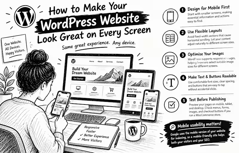
How to Make Your WordPress Website Look Great on Every Screen Have you ever opened a website on your phone and had to zoom in just to read the text or tap a button? Your visitors shouldn't have to struggle with your website. A professional WordPress website must work beautifully on phones, tablets, and desktops not just on the designer's computer. Here are 5 practical ways to achieve that: 1. Design for mobile first. Start with smaller screens, making essential information and actions easy to find. 2. Use flexible layouts. Avoid fixed-width sections that cause horizontal scrolling. Let your content adjust naturally to different screen sizes. 3. Optimise your images. WordPress supports responsive images, helping browsers select suitable image sizes for different screens. 4. Make text and buttons readable. Use comfortable font sizes, clear spacing, and buttons that are easy to tap without accidentally clicking something else. 5. Test before publishing. Preview your pages on mobile, tablet, and desktop. Check menus, forms, images, and checkout buttons if you run a WooCommerce store. Here's something important: Google uses the mobile version of a website's content for indexing. So mobile usability isn't just about appearance; it also matters for how your website is understood by search engines. Your turn: When you visit a website on your phone, what frustrates you most tiny text, slow loading, or confusing navigation? Share your answer below
1
49
WordPress
(27)
Follow
Message
James Allen
pro
London, UK
Experienced UI, web & branding designer focused on your why
1x
Hired
3
Followers
Follow
Message
Experienced UI, web & branding designer focused on your why
0
ConsoleConnect Website Design
0
12
0
HollieGuard Website Redesign
0
16
0
Recent Project Updates
0
7
0
PanicGuard Website Design and Build
0
15
WordPress
(5)
Follow
Message
Fred Oyetayo
London, UK
Experienced: Web and Software Developer
Follow
Message
Experienced: Web and Software Developer
0
Web Development for Fresible
0
31
0
Dlaw.ng Web Development
0
19
0
Patrick Row Maison Web Development
0
29
0
Dlaw.ng Mobile App
0
39
WordPress
(3)
Follow
Message
Explore people