The network for creativity
Join 1.25M professional creatives like you
Connect with clients, get discovered, and run your business 100% commission-free
Creatives on Contra have earned over $150M and we are just getting started
Back to feedPost

Responsive Design vs. Mobile First Design What's the Difference?
Have you ever opened a website on your phone and had to zoom in just to read the text? That’s a reminder that website design must consider more than one screen size.
But here’s something many business owners misunderstand: responsive design and mobile-first design are not the same thing.
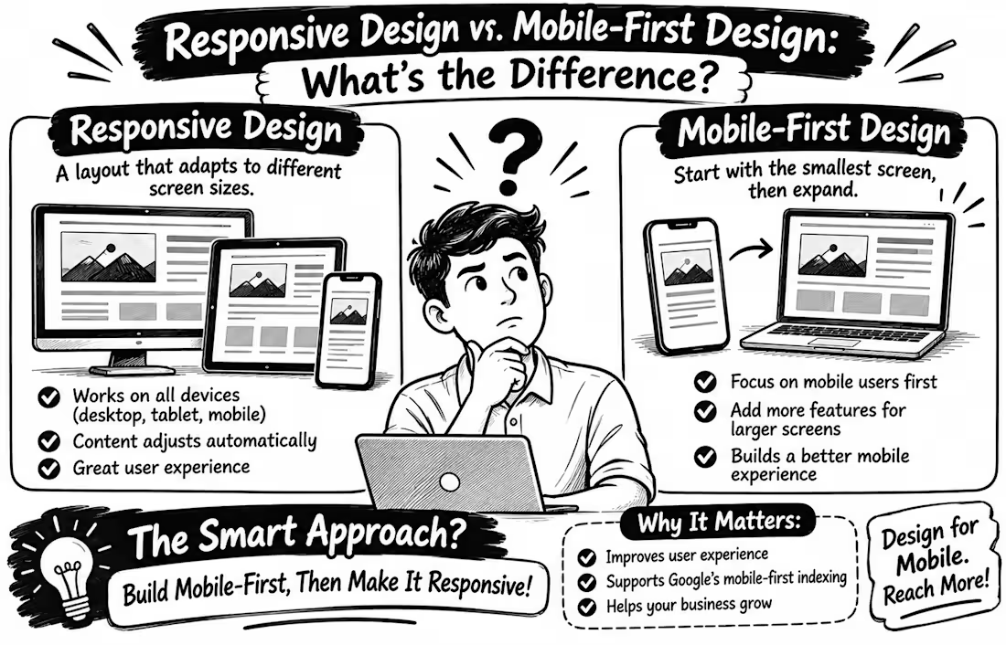
Responsive Design The website layout adjusts to different screen sizes, from smartphones and tablets to desktop computers. Images resize, columns rearrange, and content remains usable.
Mobile First Design The designer starts with the smallest screen, prioritising essential content and features before expanding the layout for larger screens.
Why does this matter?
Google uses the mobile version of website content for indexing, making a good mobile experience important for search visibility. A mobile friendly design should also keep text readable, navigation simple, and buttons easy to tap.
Here’s the secret: you don’t have to choose one over the other! Mobile-first is a strategy for building a responsive website.
My advice: When building your next WordPress or WooCommerce website, start by asking Can my customers easily find what they need on their phones?
Because a beautiful desktop website means little if the mobile experience feels frustrating
Your turn When designing a website, do you start with mobile or desktop first?
Tell me why in the comments


The network for creativity
Join 1.25M professional creatives like you
Connect with clients, get discovered, and run your business 100% commission-free
Creatives on Contra have earned over $150M and we are just getting started
Related posts

Kajabi Home Décor & Home Goods Store Website Design
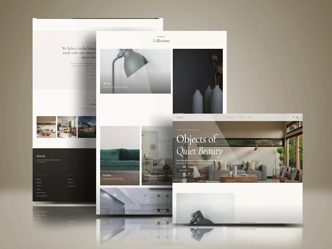
Designed a Kajabi website concept for a home décor and home goods brand, with a focus on presenting products through a clean, visually cohesive layout.
The design emphasizes product imagery, curated home collections, clear navigation, and organized content to help visitors explore items and discover pieces that complement their living spaces. The overall approach combines a refined visual style with a responsive layout to create a welcoming, professional brand experience across desktop and mobile.
The goal was to give the brand a polished online presence that reflects its style and makes browsing feel simple and engaging.
#Kajabi #KajabiWebsiteDesign #WebsiteDesign #WebDesign #HomeDecor #HomeGoods #InteriorDesign #HomeDecorStore #EcommerceWebsite #ProductWebsite #ResponsiveWebDesign #UIUXDesign #WebDevelopment #OnlineStoreDesign #BrandWebsite


Impressive Work

One photograph. Two ways to keep its colours.
Meet Afterimage — a colour-study app built in Flutter.
A — Light Table: calm and photo-first.
B — Pocket Collection: bold and playful.
Same features. Two different personalities.
Which would you choose — A or B?
Download the source code for both versions for free from my Contra products.


9 voted
90%
1 voted
10%
10 votes
Closed


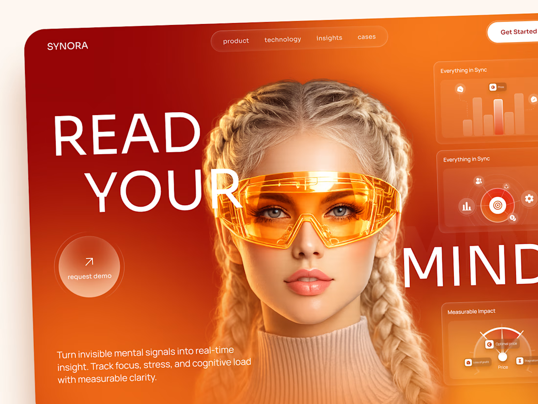
SYNORA — Futuristic Neurotechnology Landing Page
A bold landing page concept exploring the future of neurotechnology, cognitive insights, and human-centered innovation.
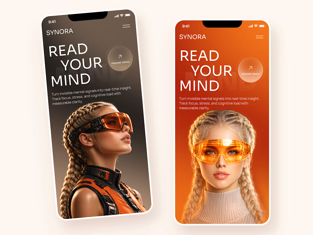
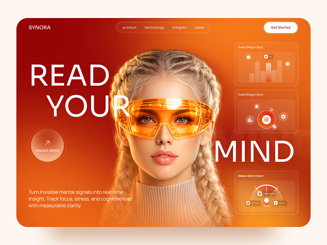
The visual direction combines vibrant orange gradients, futuristic eyewear, oversized typography, and floating data widgets to create a strong, technology-driven experience.
Special attention was given to:
• Bold hero section with futuristic imagery
• Vibrant orange and red color palette
• Oversized typography and strong visual hierarchy
• Floating analytics cards and glassmorphism elements
• Clear request demo CTA
• Responsive desktop and mobile layouts
• Clean navigation and immersive product presentation
The result is a striking landing page concept that makes complex technology feel exciting, modern, and approachable.
Looking to create a bold digital experience for an AI, tech, or innovative product? Let's connect 🚀



the contrast here is perfect